CHAPTER 11Creating a Pivot Chart
In this chapter, you'll create pivot charts using the food sales data you worked with in Chapters 8 and 9. A pivot chart paints a picture of the data in a pivot table and can make the data easier to understand. Instead of a table full of numbers, a pivot chart can use columns, bars, or pie slices to illustrate the numbers, and a pivot chart lets you easily compare results between years, regions, or products. Or, a pivot chart can use lines to show how results change over time (see Figure 11-1).
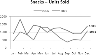
Figure 11-1. Pivot chart comparing 2006 vs. 2007 sales
To start, you'll create a simple column chart with the default ...
Get Beginning Pivot Tables in Excel 2007 now with the O’Reilly learning platform.
O’Reilly members experience books, live events, courses curated by job role, and more from O’Reilly and nearly 200 top publishers.

