Chapter 1. The Causal-Behavioral Framework for Data Analysis

As we discussed in the preface, understanding what drives behaviors in order to change them is one of the key goals of applied analytics, whether in a business, a nonprofit, or a public organization. We want to figure out why someone bought something and why someone else didn’t buy it. We want to understand why someone renewed their subscription, contacted a call center instead of paying online, registered to be an organ donor, or gave to a nonprofit. Having this knowledge allows us to predict what people will do under different scenarios and helps us to determine what our organization can do to encourage them to do it again (or not). I believe that this goal is best achieved by combining data analysis with a behavioral science mindset and a causal analytics toolkit to create an integrated approach I have dubbed the “causal-behavioral framework.” In this framework, behaviors are at the top because understanding them is our ultimate goal. This understanding is achieved by using causal diagrams and data, which form the two supporting pillars of the triangle (Figure 1-1).
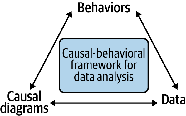
The causal-behavioral framework for data analysis
Figure 1-1. The causal-behavioral framework for data analysis

Over the course of the book, we’ll explore each leg of the triangle and see how they connect to each other. In the final chapter, we’ll see all of our work come together by achieving with one line of code what would be a daunting task with traditional approaches: measuring the degree to which customer satisfaction increases future customer spending. In addition to performing such extraordinary feats, this new framework will also allow you to more effectively perform common analyses such as determining the effect of an email campaign or a product feature on purchasing behavior.

Before getting to that, readers familiar with predictive analytics may wonder why I’m advocating for causal analytics instead. The answer is that even though predictive analytics have been (and will remain) very successful in business settings, they can fall short when your analyses pertain to human behaviors. In particular, adopting a causal approach can help us identify and resolve “confounding,” a very common problem with behavioral data. I’ll elaborate on these points in the rest of this first chapter.

Why We Need Causal Analytics to Explain Human Behavior

Understanding where causal analytics fits into the analytics landscape will help us better identify why it is needed in business settings. As we’ll see, that need stems from the complexity of human behavior.

The Different Types of Analytics

There are three different types of analytics: descriptive, predictive, and causal. Descriptive analytics provides a description of data. In simple terms, I think of it as “what is” or “what we’ve measured” analytics. Business reporting falls under that umbrella. How many customers canceled their subscriptions last month? How much profit did we make last year? Whenever we’re calculating an average or other simple metrics, we’re implicitly using descriptive analytics. Descriptive analytics is the simplest form of analytics, but it is also underappreciated. Many organizations actually struggle to get a clear and unified view of their operations. To see the extent of that problem in an organization, just ask the same question of the finance department and the operations department and measure how different the answers are.1

Predictive analytics provides a prediction. I think of it as “what will be, assuming current conditions persist” or “what we haven’t yet measured” analytics. Most machine learning methods (e.g., neural networks and gradient boosting models) belong to this type of analytics and help us answer questions like “How many customers will cancel their subscription next month?” and “Is that order fraudulent?” Over the past few decades, predictive analytics has transformed the world; the legions of data scientists employed in business are a testament to its success.

Finally, causal analytics provides the causes of data. I think of it as “what if?” or “what will be, under different conditions” analytics. It answers questions such as “How many customers will cancel their subscription next month unless we send them a coupon?” The most well-known tool of causal analytics is the A/B test, a.k.a. a randomized experiment or randomized controlled trial (RCT). That’s because the simplest and most effective way to answer the preceding question is to send a coupon to a randomly selected group of customers and see how many of them cancel their subscription compared to a control group.

We’ll cover experimentation in Part IV of the book, but before that, in Part II, we’ll look at another tool from that toolkit, namely causal diagrams, which can be used even when we can’t experiment. Indeed, it is one of my goals to get you to think more broadly about causal analytics rather than just equate it with experimentation.

Note

While these labels may give the impression of a neat categorization, in reality, there is more of a gradient between these three categories, and questions and methods get blurred between them. You may also encounter other terms, such as prescriptive analytics, that further blur the lines and add other nuances without dramatically altering the overall picture.

Human Beings Are Complicated

If predictive analytics has been so successful and causal analytics uses the same data analysis tools like regression, why not stick with predictive analytics? In short, because human beings are more complicated than wind turbines. Human behavior:

Has multiple causes

A turbine’s behavior is not influenced by its personality, the social norms of the turbine community, or the circumstances of its upbringing, whereas the predictive power of any single variable on human behavior is almost always disappointing because of those factors.

Is context-dependent

Minor or cosmetic alterations to the environment, such as a change in the default option of a choice, can have large impacts on behavior. This is a blessing from a behavioral design perspective because it allows us to drive changes in behaviors, but it’s a curse from a behavioral analytics perspective because it means that every situation is unique in ways that are hard to predict.

Is variable (scientists would say nondeterministic)

The same person may behave very differently when placed repeatedly in what seems like exactly the same situation, even after controlling for cosmetic factors. This may be due to transient effects, such as moods, or long-term effects, such as getting bored with having the same breakfast every day. Both of these can dramatically change behavior but are hard to capture.

Is innovative

When conditions in the environment change, a human can switch to a behavior they have literally never exhibited before, and it happens even under the most mundane circumstances. For example, there’s a car accident ahead on your normal commuting path and so you decide at the last minute to take a right turn.

Is strategic

Humans infer and react to the behaviors and intentions of others. In some cases, that can mean “repairing” a cooperation that was derailed by external circumstances, making it more robustly predictable. But in other cases, it can involve voluntarily obfuscating one’s behavior to make it unpredictable when playing a competitive game like chess (or fraud!).

All these aspects of human behavior make it less predictable than that of physical objects. To find regularities that are more reliable for analysis, we must go one level deeper to understand and measure the causes of behavior. The fact that someone had oatmeal for breakfast and took a certain route on Monday doesn’t mean that they will do the same on Tuesday, but you can be more confident that they’ll have some breakfast and will take some route to their work.

Confound It! The Hidden Dangers of Letting Regression Sort It Out

I mentioned in the previous section that causal analytics often uses the same tools as predictive analytics. However, because they have different goals, the tools are used in different ways. Since regression is one of the main tools for both types of analytics, it can be a great way to illustrate the difference between predictive and causal analytics. A regression appropriate for predictive analytics would often make a terrible regression for causal analytics purposes, and vice versa.

A regression for predictive analytics is used to estimate an unknown value (often, but not always, in the future). It does this by taking known information and using a variety of factors to triangulate the best guess value for a given variable. What is important is the predicted value and its accuracy, not why or how it was predicted.

Causal analytics also uses regression, but the focus is not on estimating a value of the target variable. Instead, the focus is on the cause of that value. In regression terms, our interest is no longer in the dependent variable itself but in its relationship with a given independent variable. With a correctly structured regression, the coefficient of correlation can be a portable measure of the causal effect of an independent variable on a dependent variable.

But what does it mean to have a correctly structured regression for that purpose? Why can’t we just take the regressions we already use for predictive analytics and treat the provided coefficients as measures of the causal relationship? We can’t do that because each variable in the regression has the potential to modify the coefficients of other variables. Therefore our variable mix has to be crafted not to create the most accurate prediction but to create the most accurate coefficients. The two sets of variables are generally different because a variable can be highly correlated with our target variable (and therefore be highly predictive) without actually affecting that variable.

In this section, we will explore why this difference in perspective matters and why variable selection is more than half the battle in behavioral analytics. We’ll do so with a concrete example from C-Mart, a fictional supermarket chain with stores across the United States. The first of two fictional companies used throughout the book, C-Mart will help us understand the opportunities and challenges of data analysis for brick-and-mortar companies in the digital age.

Data

The GitHub folder for this chapter contains two CSV files, chap1-stand_data.csv and chap1-survey_data.csv with the data sets for the two examples in this chapter.

Table 1-1 shows the information contained by the CSV file chap1-stand_data.csv at the daily level about sales of ice cream and iced coffee in C-Mart’s stands.

Table 1-1. Sales information in chap1-stand_data.csv
Variable name Variable description
IceCreamSales Daily sales of ice cream in C-Mart’s stands
IcedCoffeeSales Daily sales of iced coffee in C-Mart’s stands
SummerMonth Binary variable indicating whether the day is in the summer months
Temp The average temperature for that day and that stand

Table 1-2 shows the information contained in the CSV file chap1-survey_data.csv from a survey of passersby outside of C-Mart’s stands.

Table 1-2. Survey information in chap1-survey_data.csv
Variable name Variable description
VanillaTaste Interviewee’s taste for vanilla, 0-25
ChocTaste Interviewee’s taste for chocolate, 0-25
Shopped Binary variable indicating whether the interviewee has ever shopped at the local C-Mart stand

Why Correlation Is Not Causation: A Confounder in Action

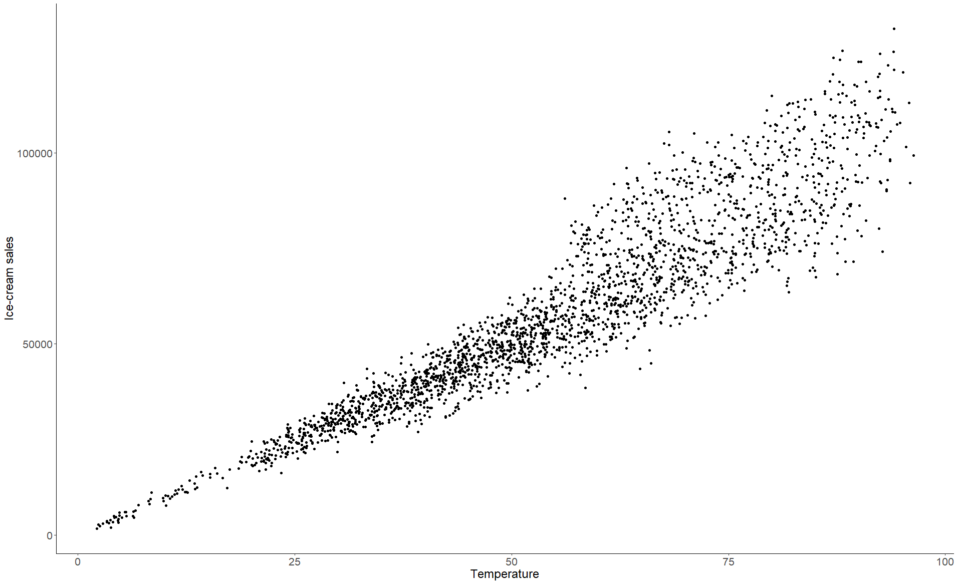
C-Mart has an ice cream stand in each store. It is the company’s belief that the weather influences daily sales—or, to cast it in causality jargon, that the weather is a cause of sales. In other words, everything else being equal, we assume that people are more likely to buy ice cream on hotter days, which makes intuitive sense. This belief is supported by a strong correlation in historical data between temperature and sales as shown in Figure 1-3 (the corresponding data and code are on the book’s GitHub).

Figure 1-3. Sales of ice cream as a function of observed temperature

As indicated in the Preface, we’ll be using regression as our main tool for data analysis. Running a linear regression of the sales of ice cream on the temperature takes a single line of code:

## Python (output not shown)
print(ols("icecream_sales ~ temps", data=stand_data_df).fit().summary())
## R
> summary(lm(icecream_sales ~ temps, data=stand_dat))
...
Coefficients:
             Estimate Std. Error t value Pr(>|t|)    
(Intercept) -6169.844    531.506  -11.61   <2e-16 ***
temps        1171.335      9.027  129.76   <2e-16 ***
...

For our purposes in this book, the most relevant piece of the output is the coefficients section, which tells us that the estimated intercept—the theoretical average ice cream sales for a temperature of zero—is −6,169.8, which is obviously a nonsensical extrapolation. It also tells us that the estimated coefficient for the temperature is 1,171, which means that each additional degree of temperature is expected to increase sales of ice cream by $1,171.

Now, let’s imagine that we’re at the end of a particularly warm week of October, and based on the predictions of the model, the company had increased the stock of the ice cream stands ahead of time. However, the weekly sales, while higher than usual for this week of October, have fallen quite short of the quantity predicted by the model. Oops! What happened? Should the data analyst be fired?

What happened is that the model doesn’t account for a crucial fact: most of the sales of ice cream take place during the summer months when kids are out of school. The regression model made its best prediction with the data available, but part of the cause of increased ice cream sales (summer break for students) was misattributed to temperature because summer months are positively correlated with temperature. Since the temperature increase in October did not suddenly make it summer break (sorry, kids!), we saw lower sales than we did on summer days at that temperature.

In technical terms, the month of the year is a confounder of our relationship between temperature and sales. A confounder is a variable that introduces bias in a regression; when a confounder is present in the situation you’re analyzing, it means that interpreting the regression coefficient as causal will lead to improper conclusions.

Let’s think of a place like Chicago, which has a continental climate: winter is very cold and summer is very hot. When comparing sales on a random hot day with sales on a random cold day without accounting for their respective month of the year, you’re very likely to be comparing sales on a hot day of summer, when kids are out of school, with sales on a cold day of winter, when kids are in school; this inflates the apparent relationship between temperature and sales.

In this example, we might also expect to see a consistent underprediction of sales in colder weather. In truth, there is a paradigm shift in summer months, and when that shift has to be managed exclusively through temperature in a linear regression, the regression coefficient for temperature will invariably be too high for warmer temperatures and too low for colder temperatures.

Too Many Variables Can Spoil the Broth

A potential solution to the problem of confounders would be to add to the regression all the variables we can. This mindset of “everything and the kitchen sink” still has proponents among statisticians. In The Book of Why, Judea Pearl and Dana Mackenzie mention that “a leading statistician even recently wrote, ‘to avoid conditioning on some observed covariates…is nonscientific ad hockery’” (Pearl & Mackenzie 2018, p. 160).2 It is also quite common among data scientists. To be fair, if your goal is only to predict a variable, you have a model that is carefully designed to generalize adequately beyond your testing data, and you don’t care about why the predicted variable is taking a certain value, then that’s a perfectly valid stance. But this does not work if your goal is to understand causal relationships in order to act upon them. Because of this, just adding as many variables as you can to your model not only is inefficient but can be downright counterproductive and misleading.

Let’s demonstrate this with our example by adding a variable that we might be inclined to include but will bias our regression. I created the variable IcedCoffeeSales to be correlated with Temperature but not with SummerMonth. Let’s look at what happens to our regression if we add this variable in addition to Temperature and SummerMonth (a binary 1/0 variable that indicates if the month was July or August (1) or any other month (0)):

## R (output not shown)
> summary(lm(icecream_sales ~ iced_coffee_sales + temps + summer_months))
## Python 
print(ols("icecream_sales ~ temps + summer_months + iced_coffee_sales", 
             data=stand_data_df).fit().summary())
...
                        coef   std err       t   P>|t|    [0.025    0.975]
--------------------------------------------------------------------------
Intercept           -15.8271   374.581  -0.042   0.966  -750.363   718.709
temps              2702.7885  2083.161   1.297   0.195 -1382.196  6787.773
summer_months      1.955e+04   361.572  54.064   0.000  1.88e+04  2.03e+04
iced_coffee_sales    -1.7011     2.083  -0.817   0.414    -5.786     2.383
...

We see that the coefficient for Temperature has shifted dramatically from our prior example, but in the wrong direction, and it’s now further away from the true value. And despite IceCreamSales and IcedCoffeeSales being positively correlated, the coefficient for the latter is negative. The high p-values for Temperature and IcedCoffeeSales would usually be taken as signs that something is amiss, but since the p-value for Temperature is worse than before, an analyst may conclude that they should remove it from the regression. How is this possible?

The truth behind the data (which is known, since I manufactured the relationships and randomized data around those relationships) is that when it is hot out people are more likely to buy iced coffee. On hot days, people are also more likely to buy more ice cream. But a purchase of iced coffee itself does not make customers any more or less likely to buy ice cream. Summer months are also not correlated with iced coffee purchases since schoolchildren are not a significant factor in the demand for iced coffee (see the sidebar for the details of the math at hand).

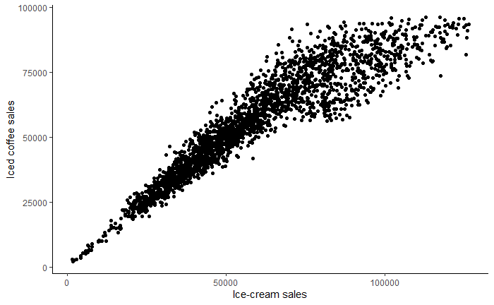
Figure 1-4 shows a positive correlation between iced coffee sales and ice cream sales since both increase when it is warmer out, but any increase in sales of iced coffee during summer months can be explained by a shared correlation with the temperature variable. When the regression algorithm tries to explain ice cream sales using the three variables at hand, the explanatory power of temperature on iced coffee sales was added to the temperature variable while iced coffee was forced to compensate for the overpowering of temperature. Even though iced coffee sales are not statistically significant and the coefficient is relatively small, the dollars of sales are much higher than degrees of temperature, so ultimately iced coffee sales cancel the inflation of the coefficient for temperature.

Plot of iced coffee sales versus ice cream sales
Figure 1-4. Plot of iced coffee sales versus ice cream sales

In the previous example, adding the variable IcedCoffeeSales to the regression muddled the relationship between temperature and ice cream sales. Unfortunately, the reverse can also be true: including the wrong variable in a regression can create the illusion of a relationship when there is none.

Sticking with our ice cream example at C-Mart, let’s say that the category manager is interested in understanding customer tastes, so they ask an employee to stand outside the store and survey people walking by, asking them how much they like vanilla ice cream and how much they like chocolate ice cream (both on a scale from 0 to 25), as well as whether they have ever purchased ice cream from the stand. To keep things simple, we’ll assume that the stand only sells chocolate and vanilla ice cream.

Let’s assume for the sake of the example that taste for vanilla ice cream and taste for chocolate ice cream are entirely uncorrelated. Some people like one but not the other, some like both equally, some like one more than the other, and so on. But all of these preferences impact whether someone buys from the stand, a binary (Yes/No) variable.

Because the variable Shopped is binary, we would use a logistic regression if we wanted to measure the impact of either of the Taste variables on shopping behavior. Since the two Taste variables are uncorrelated, we would see a regular cloud with no apparent correlation if we were to plot them against each other; however, they each impact the probability of shopping at the ice cream stand (Figure 1-5).

Left panel: tastes for vanilla and chocolate are uncorrelated in the overall population; middle panel: taste for vanilla is higher for people who shop at the ice cream stand than for people who don’t; right panel: same result for taste for chocolate
Figure 1-5. Left panel: tastes for vanilla and chocolate are uncorrelated in the overall population; middle panel: taste for vanilla is higher for people who shop at the ice cream stand than for people who don’t; right panel: same result for taste for chocolate

In the first graph, I added a line of best fit, which is almost perfectly flat, reflecting the lack of correlation between the variables (the correlation coefficient is equal to 0.004, reflecting sampling error). On the second and third graphs, we can see that taste for vanilla and chocolate is higher on average for customers (Shopped = 1) than for non-customers, which makes sense.

So far, so good. Let’s say that once you get the survey data, your business partner tells you that they are considering introducing a coupon incentive for the ice cream stand: when you purchase ice cream, you get a coupon for future visits. This loyalty incentive won’t impact the respondents who have never shopped at the stand, so the relevant population are those who have shopped at the store. The business partner is considering using flavor restrictions on the coupons to balance stock but does not know how much flavor choices can be influenced. If someone who purchased vanilla ice cream were given a coupon for 50% off chocolate ice cream, would it do anything beyond adding more paper to the recycle bin? How favorably do the people who like vanilla ice cream view chocolate ice cream anyway?

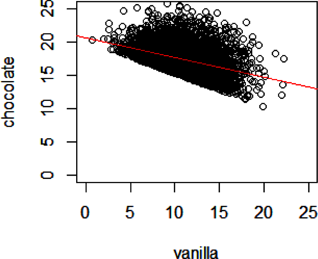
You plot the same graph again, this time restricting the data to people who have answered “Yes” to the shopping question (Figure 1-6).

Taste for vanilla and chocolate among shoppers
Figure 1-6. Taste for vanilla and chocolate among shoppers

There is now a strong negative correlation between the two variables (the correlation coefficient is equal to −0.39). What happened? Do vanilla lovers who come to your stand turn into chocolate haters and vice versa? Of course not. This correlation was artificially created when you restrained yourself to customers.

Let’s get back to our true causal relationships: the stronger someone’s taste for vanilla, the more likely they are to shop at your stand, and similarly for chocolate. This means that there is a cumulative effect of these two variables. If someone has a weak taste for both vanilla and chocolate ice creams, they are very unlikely to shop at your stand; in other words, most of the people with a weak taste for vanilla among your customers have a strong taste for chocolate. On the other hand, if someone has a strong taste for vanilla, they might shop at your stand even if they don’t have a strong taste for chocolate. You can see it reflected in the earlier graph: for high values for vanilla (say above 15), there are data points with lower values for chocolate (below 15), whereas, for low values of vanilla (below 5), the only data points in the graph have a high value for chocolate (above 17). No one’s preferences have changed, but people with a weak taste for both vanilla and chocolate are excluded from your data set.

The technical term for this phenomenon is the Berkson paradox, but Judea Pearl and Dana Mackenzie call it by a more intuitive name: the “explain-away effect.” If one of your customers has a strong taste for vanilla, this completely explains why they are shopping at your stand, and they don’t “need” to have a strong taste for chocolate. On the other hand, if one of your customers has a weak taste for vanilla, this can’t explain why they are shopping at your stand, and they must have a stronger than average taste for chocolate.

The Berkson paradox is counterintuitive and hard to understand at first. It can cause biases in your data, depending on how it was collected, even before you start any analysis. A classic example of how this situation can create artificial correlations is that some diseases show a higher degree of correlation when looking at the population of hospital patients compared to the general population. In reality of course, what happens is that either disease is not enough for someone to go to a hospital; someone’s health status gets bad enough to justify hospitalization only when they are both present.3

Conclusion

Predictive analytics has been extremely successful over the past few decades and will remain so. On the other hand, when trying to understand and—more importantly—change human behavior, causal analytics offers a compelling alternative.

Causal analytics, however, demands a different approach than what we are used to with predictive analytics. Hopefully, the examples in this chapter have convinced you that you can’t just throw a bunch of variables in a linear or logistic regression and hope for the best (which we might think of as the “include them all, God will recognize His own” approach). You may still wonder, though, about other types of models and algorithms. Are gradient boosting or deep learning models somehow immune to confounders, multicollinearity, and spurious correlations? Unfortunately, the answer is no. If anything, the “black box” nature of these models means that confounders can be harder to catch.

In the next chapter, we will explore how to think about the behavioral data itself.

1 To be fair, in many circumstances, they should be different, because the data is used for different purposes and obeys different conventions. But even questions that you would expect to have a single true answer (e.g., “How many employees do we have right now?”) will generally show discrepancies.

2 In case you’re wondering, the aforementioned statistician is Donald Rubin.

3 Technically speaking, this is a slightly different situation, because there is a threshold effect instead of two linear (or logistic) relationships, but the underlying principle that including the wrong variable can create artificial correlations still applies.

Get Behavioral Data Analysis with R and Python now with the O’Reilly learning platform.

O’Reilly members experience books, live events, courses curated by job role, and more from O’Reilly and nearly 200 top publishers.