The components discussed in Chapter 3 are just the beginning. Bootstrap comes bundled with 13 jQuery plugins that extend the features and can add more interaction to your site. To get started with Bootstrap’s JavaScript plugins, you don’t need to be an advanced JavaScript developer. In fact, by utilizing Bootstrap Data API, most of the plugins can be triggered without writing a single line of code.
Bootstrap can be included on your site in two forms, either compiled or raw. In Bootstrap 2.2.2, the uncompressed file is 59KB and the minimized version is only 32KB. All of the Bootstrap plugins are accessible using the included Data API. With this, you don’t need to include a single line of JavaScript to invoke any of the plugin features.
Typically, JavaScript lies in a either a separate file or at the bottom of the page before the closing </body> tag. You can either use the src attribute to link to another file, or you can write the contents of the file between the opening and closing tags:
<!-- To reference another JavaScript file --><scriptsrc="assets/js/javaScript.js"></script><!-- To write JavaScript to the page --><scripttype="text/javaScript">functionjs_alert{alert('Page has loaded');}</script>
Generally, it is best to include all JavaScript calls into a check that ensures that the DOM has been loaded on the page. If you have the JavaScript trying to fire earlier, it may miss elements as the browser parses the page. With jQuery, adding a check is easily done by selecting the document or the entire content of the page, and then applying the .ready() method:
$(document).ready(function(){alert('Page has loaded');// Once the page has loaded and is ready, an alert will fire.});
As mentioned above, Bootstrap has a Data API where you can write data attributes into the HTML of the page. If you need to turn off the Data API, you can unbind the attributes by adding the following line of JavaScript:
$('body').off('.data-api')
If you need to disable a single plugin, you can do it programmatically using the namespace of the plugin along with the data-api namespace:
$('body').off('.alert.data-api')
The developers of Bootstrap believe that you should be able to use all of the plugins throughout the JavaScript API. All public APIs are single, chainable methods and return the collection acted upon.
$('.btn.danger').button('toggle').addClass('active')
All methods should accept an optional options object, a string which targets a particular method, or nothing (which initiates a plugin with default behavior).
$("#myModal").modal()// initialized with defaults$("#myModal").modal({keyboard:false})// initialized with no keyboard$("#myModal").modal('show')// initializes and invokes show immediately
The transition plugin provides simple transition effects. A few examples include:
- Sliding or fading in modals
- Fading out tabs
- Fading out alerts
- Sliding carousel panes
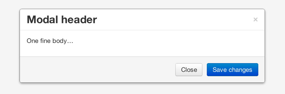
A modal is a child window that is layered over its parent window (see Figure 4-1). Typically, the purpose is to display content from a separate source that can have some interaction without leaving the parent window. Child windows can provide information, interaction, or more. I use them as a window for holding slideshows and login/registration information. The modal plugin is probably one of my favorite Bootstrap features.
To create a static modal window, use this code:
<divclass="modal hide fade"><divclass="modal-header"><buttontype="button"class="close"data-dismiss="modal"aria-hidden="true">×</button><h3>Modal header</h3></div><divclass="modal-body"><p>One fine body…</p></div><divclass="modal-footer"><ahref="#"class="btn">Close</a><ahref="#"class="btn btn-primary">Save changes</a></div></div>
To invoke the modal window, you need to have some kind of a trigger. Normally I use a button or a link. If you look in the code below, you will see that in the <a> tag, the href="myModal" is the target of the modal that you want to load on the page. This code allows you to create multiple modals on the page and then have different triggers for each of them. Now, to be clear, you don’t load multiple modals at the same time, but you can create many on the page to be loaded at different times.
There are three classes to take note of in the modal. The first is .modal, which is simply identifying the content of the <div> as a modal. The second is .hide, which tells the browser to hide the content of the <div> until we are ready to invoke it. And last, the .fade class. When the modal is toggled, it will cause the content to fade in and out.
<!-- Button to trigger modal --><ahref="#myModal"role="button"class="btn"data-toggle="modal">Launch demo modal</a><!-- Modal --><divid="myModal"class="modal hide fade"tabindex="-1"role="dialog"aria-labelledby="myModalLabel"aria-hidden="true"><divclass="modal-header"><buttontype="button"class="close"data-dismiss="modal"aria-hidden="true">×</button><h3id="myModalLabel">Modal header</h3></div><divclass="modal-body"><p>One fine body…</p></div><divclass="modal-footer"><buttonclass="btn"data-dismiss="modal"aria-hidden="true">Close</button><buttonclass="btn btn-primary">Save changes</button></div></div>
Using the Bootstrap JavaScript Data API, you simply need to pass a few data attributes to toggle the slideshow. To start with, set data-toggle="modal" on the link or button that you want to use to invoke the modal and then set the data-target="#foo" to the ID of the modal that you’d like to use.
To call a modal with id="myModal", use a single line of JavaScript:
$('#myModal').modal(options)
Options can either be passed in via data attributes or with JavaScript. To use the data attributes, prepend data- to the option name (e.g., data-backdrop=""). See Table 4-1 for descriptions of some modal options.
Table 4-1. Modal options
| Name | Type | Default | Description |
|---|---|---|---|
backdrop | Boolean | true | Set to false if you don’t want the modal to be closed when the user clicks outside of the modal. |
keyboard | Boolean | true | Closes the modal when escape key is pressed; set to false to disable. |
show | Boolean | true | Shows the modal when initialized. |
remote | path | false | Using the jQuery |
The following are some useful methods to use with modals.
Activates your content as a modal. Accepts an optional options object.
$('#myModal').modal({keyboard:false})
Bootstrap provides the events listed in Table 4-2 if you need to hook into the function.
Table 4-2. Modal events
| Event | Description |
|---|---|
show | Fired after the |
shown | Fired when the modal has been made visible to the user. |
hide | Fired when the |
hidden | Fired when the modal has finished being hidden from the user. |
As an example, after the modal is hidden, you could cause an alert to fire:
$('#myModal').on('hidden',function(){alert('Hey girl, I heard you like modals...');})
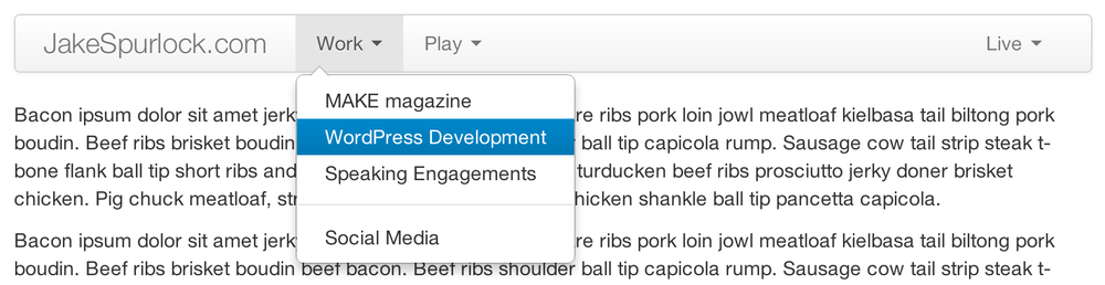
The dropdown was covered extensively in Chapter 3, but the interaction was glossed over. As a refresher, dropdowns can be added to the navbar, pills, tabs, and buttons.
To use a dropdown (Figure 4-2), add data-toggle="dropdown" to a link or button to toggle the dropdown.
Here’s the code for developing a dropdown with data attributes:
<liclass="dropdown"><ahref="#"id="drop"role="button"class="dropdown-toggle"data-toggle="dropdown">Word<bclass="caret"></b></a><ulclass="dropdown-menu"role="menu"aria-labelledby="drop"><li><atabindex="-1"href="#">MAKE magazine</a></li><li><atabindex="-1"href="#">WordPress DevelopmentS</a></li><li><atabindex="-1"href="#">Speaking Engagements</a></li><liclass="divider"></li><li><atabindex="-1"href="#">Social Media</a></li></ul></li>
If you need to keep links intact (which is useful if the browser is not enabling JavaScript), use the data-target attribute along with href="#":
<divclass="dropdown"><aclass="dropdown-toggle"id="dLabel"role="button"data-toggle="dropdown"data-target="#"href="/page.html">Dropdown<bclass="caret"></b></a><ulclass="dropdown-menu"role="menu"aria-labelledby="dLabel">...</ul></div>
The Scrollspy plugin (Figure 4-3) allows you to target sections of the page based on scroll position. In its basic implementation, as you scroll, you can add .active classes to the navbar based on the scroll position. To add the Scrollspy plugin via data attributes, add data-spy="scroll" to the element you want to spy on (typically the body) and data-target=".navbar" to the navbar that you want to apply the class changes to. For this to work, you must have elements in the body of the page that have matching IDs of the links that you are spying on.
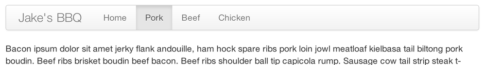
For Scrollspy, you will need to add data-spy="scroll" to the <body> tag, along with data-target=".navbar" that references the element that you are spying on:
<bodydata-spy="scroll"data-target=".navbar">...</body>
In the navbar, you will need to have page anchors that will serve as indicators for the element to spy on:
<divclass="navbar"><divclass="navbar-inner"><divclass="container"><aclass="brand"href="#">Jake's BBQ</a><divclass="nav-collapse"><ulclass="nav"><liclass="active"><ahref="#">Home</a></li><li><ahref="#pork">Pork</a></li><li><ahref="#beef">Beef</a></li><li><ahref="#chicken">Chicken</a></li></ul></div><!-- /.nav-collapse --></div></div><!-- /navbar-inner --></div>
When calling the scrollspy via the JavaScript method, you need to call the .refresh method to update the DOM. This is helpful if any elements of the DOM have changed.
$('[data-spy="scroll"]').each(function(){var$spy=$(this).scrollspy('refresh')});
Options can be passed via data attributes or JavaScript. For data attributes, prepend the option name to data-, as in data-offset="" (see Table 4-3).
Table 4-3. Scrollspy option
| Name | Type | Default | Description |
|---|---|---|---|
offset | number | 10 | Pixels to offset from top of page when calculating position of scroll. |
The offset option is handy when you are using a fixed navbar. You will want to offset the scroll by about 50 pixels so that it reads at the correct time (see Table 4-4).
Tabbable tabs were introduced in Chapter 3. By combining a few data attributes, you can easily create a tabbed interface (Figure 4-4). To do so, create the nav interface, and then wrap the content of the tabs inside a <div> with a class of .tab-content:
<ulclass="nav nav-tabs"><li><ahref="#home"data-toggle="tab">Home</a></li><li><ahref="#profile"data-toggle="tab">Profile</a></li><li><ahref="#messages"data-toggle="tab">Messages</a></li><li><ahref="#settings"data-toggle="tab">Settings</a></li></ul><divclass="tab-content"><divclass="tab-pane active"id="home">...</div><divclass="tab-pane"id="profile">...</div><divclass="tab-pane"id="messages">...</div><divclass="tab-pane"id="settings">...</div></div>
To enable the tabs, you can use the Bootstrap Data API or use JavaScript directly. With the Data API, you need to add data-toggle to the anchors. The anchor targets will activate the element that has the .tab-pane class and relative ID. Alternatively, data-target="" may be used instead of href="#" to apply the same action. Here is one way to enable tabs:
$('#myTab a').click(function(e){e.preventDefault();$(this).tab('show');})
Here’s an example of different ways to activate tabs:
$('#myTab a[href="#profile"]').tab('show');// Select tab by name$('#myTab a:first').tab('show');// Select first tab$('#myTab a:last').tab('show');// Select last tab$('#myTab li:eq(2) a').tab('show');// Select third tab (0-indexed)
Tabs panes have two different events that can be hooked into, as shown in Table 4-5.
Table 4-5. Toggleable tab events
| Event | Description |
|---|---|
show | This event fires on tab show, but before the new tab has been shown. Use |
shown | This event fires on tab show after a tab has been shown. Use |
Here’s a code example of a shown method:
$('a[data-toggle="tab"]').on('shown',function(e){e.target// activated tabe.relatedTarget// previous tab})
For information about the .on method, refer to the jQuery website.
Tooltips (Figure 4-5) are useful when you need to describe a link or (used in conjunction with the <abbr> tag) provide the definition of an abbreviation. The plugin was originally based on the jQuery.tipsy plugin written by Jason Frame. Tooltips have since been updated to work without images, animate with a CSS animation, and work with the Bootstrap JavaScript API.

To add a tooltip, add rel="tooltip" to an anchor tag. The title of the anchor will be the text of a tooltip. The following two examples show how to do this in the Bootstrap Data API and JavaScript, respectively:
<ahref="#"rel="tooltip"title="This is the tooltip">TooltipExample</a>
$('#example').tooltip(options)
Like all of the plugins, there are options that can be added via the Bootstrap Data API or invoked via JavaScript. All options need to have data- prepended to them. So, the title option would become data-title (see Table 4-6).
Table 4-6. Tooltip options
| Name | Type | Default | Description |
|---|---|---|---|
animation | Boolean | true | Applies a CSS fade transition to the tooltip. |
html | Boolean | false | Inserts HTML into the tooltip. If false, jQuery’s |
placement | string/function | ‘top’ | Specifies how to position the tooltip (i.e., top, bottom, left, or right). |
selector | string | false | If a selector is provided, tooltip objects will be delegated to the specified targets. |
title | string/function | '' | The title option is the default title value if the |
trigger | string | ‘hover’ | Defines how the tooltip is triggered: click, hover, focus, or manually. |
delay | number/object | 0 | Delays showing and hiding the tooltip in ms—does not apply to manual trigger type. If a number is supplied, delay is applied to both hide/show. Object structure is: |
Here are some useful methods for tooltips.
The popover (see Figure 4-6) is a sibling of the tooltip, offering an extended view complete with a heading. For the popover to activate, a user just needs to hover the cursor over the element. The content of the popover can be populated entirely using the Bootstrap Data API. This method requires a tooltip.
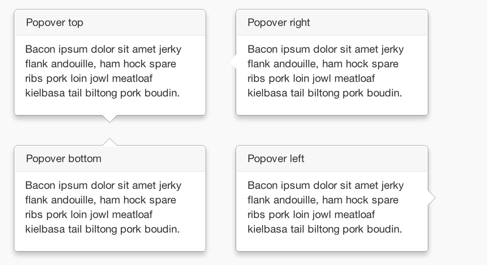
Use the following code for popover placement:
<ahref="#"class="btn"rel="popover"title="Using Popover"data-content="Just add content to the data-content attribute.">Click Me!</a>
To enable the popover with JavaScript, use the .popover() function, passing in any options that you might need:
$('#example').popover(options)
All options can be passed via the Bootstrap Data API, or directly with JavaScript (see Table 4-7).
Table 4-7. Popover options
| Name | Type | Default | Description |
|---|---|---|---|
animation | Boolean | true | Applies a CSS fade transition to the tooltip. |
html | Boolean | false | Inserts HTML into the popover. If false, jQuery’s |
placement | string | function | right |
Specifies how to position the popover (i.e., top, bottom, left, right) | selector | string | false |
If a selector is provided, tooltip objects will be delegated to the specified targets. | trigger | string | click |
How the popover is triggered (i.e., click, hover, focus, manual) | title | string | function |
'' | Default title value if title attribute isn’t present | content | string |
function | '' | Default content value if data-content attribute isn’t present | delay |
number | object | 0 | Delays showing and hiding the popover in ms—does not apply to manual trigger type. If a number is supplied, delay is applied to both hide/show. Object structure is: |
Here are some useful methods for popovers.
With the Data API, it is easy to add dismiss functionality to alert messages (Figure 4-7).
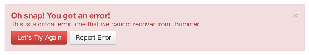
You can close an alert manually with the JavaScript .alert() method or use data attributes in conjunction with an anchor or button.
Here is how to dismiss via JavaScript:
$(".alert").alert()
Here is how to dismiss via Data API:
<aclass="close"data-dismiss="alert"href="#">×</a>
To enable all alerts to be closed, add the following method. To enable alerts to animate out when closed, make sure they have the .fade and .in class already applied to them.
$(".alert").alert('close')
There are two events that can be tied to Bootstrap’s alert class as shown in Table 4-8.
Table 4-8. Alert class events
| Event | Description |
|---|---|
close | This event fires immediately when the close instance method is called. |
closed | This event is fired when the alert has been closed (will wait for CSS transitions to complete). |
As an example, if you wanted to trigger a function after an alert has closed, you could use this function:
$('#my-alert').bind('closed',function(){// do something…})
Buttons were introduced in Chapter 3. With Bootstrap, you don’t need to do anything to make them work as links or as buttons in forms. With this plugin you can add in some interaction, such as loading states or button groups with toolbar-like functionality.
To add a loading state to a button (shown in Figure 4-8), simply add data-loading-text="Loading..." as an attribute to the button:
<buttontype="button"class="btn btn-primary"data-loading-text="Loading...">Submit!</button>
When the button is clicked, the .disabled class is added, giving the appearance that it can no longer be clicked.

When clicking on a button with the data-toggle="button" attribute (Figure 4-9), a class of .active is added:
<buttontype="button"class="btn btn-primary"data-toggle="button">Toggle</button>

Buttons can work like checkboxes (as in Figure 4-10), allowing a user to select many of the options in a button group. To add this function, add data-toggle="buttons-checkbox" for checkbox style toggling on .btn-group:
<divclass="btn-group"data-toggle="buttons-checkbox"><buttontype="button"class="btn btn-primary">Left</button><buttontype="button"class="btn btn-primary">Middle</button><buttontype="button"class="btn btn-primary">Right</button></div>

Radio buttons (Figure 4-11) function similarily to checkboxes. The primary difference is that a radio button doesn’t allow for multiple selections—only one button in the group can be selected. To add radio-style toggling on btn-group, add data-toggle="buttons-radio":
<divclass="btn-group"data-toggle="buttons-radio"><buttontype="button"class="btn btn-primary">Left</button><buttontype="button"class="btn btn-primary">Middle</button><buttontype="button"class="btn btn-primary">Right</button></div>

The .button method can be applied to any class or ID. To enable all buttons in the .nav-tabs via JavaScript, add the following code:
$('.nav-tabs').button()
The following methods are useful to use with buttons.
When loading, the button is disabled and the text is changed to the option from the data-loading-text attribute:
<buttontype="button"class="btn"data-loading-text="loading stuff...">...</button>
The collapse plugin makes it easy to make collapsing divisions of the page (see Figure 4-12). Whether you use it to build accordion navigation or content boxes, it allows for a lot of content options.
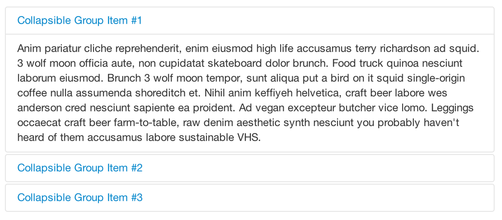
The following code creates collapsible groups:
<divclass="accordion"id="accordion2"><divclass="accordion-group"><divclass="accordion-heading"><aclass="accordion-toggle"data-toggle="collapse"data-parent="#accordion2"href="#collapseOne">Collapsible Group Item #1</a></div><divid="collapseOne"class="accordion-body collapse in"><divclass="accordion-inner">Anim pariatur cliche...</div></div></div><divclass="accordion-group"><divclass="accordion-heading"><aclass="accordion-toggle"data-toggle="collapse"data-parent="#accordion2"href="#collapseTwo">Collapsible Group Item #2</a></div><divid="collapseTwo"class="accordion-body collapse"><divclass="accordion-inner">Anim pariatur cliche...</div></div></div></div>...
You can also use the data attributes to make all content collapsible:
<buttontype="button"class="btn btn-danger"data-toggle="collapse"data-target="#demo">simple collapsible</button><divid="demo"class="collapse in">…</div>
Like all of the plugins that use the Data API, you can add all needed markup without writing any JavaScript. Add data-toggle="collapse" and a data-target to the element to automatically assign control of a collapsible element. The data-target attribute will accept a CSS selector to apply the collapse to. Be sure to add the class .collapse to the collapsible element. If you’d like it to default open, include the additional class .in.
To add accordion-like group management to a collapsible control, add the data attribute data-parent="#selector".
The options listed in Table 4-9 can be passed via data attributes or with JavaScript.
Table 4-9. Collapse options
| Name | Type | Default | Description |
|---|---|---|---|
parent | selector | false | If selector, then all collapsible elements under the specified parent will be closed when this collapsible item is shown. (Similar to traditional accordion behavior.) |
toggle | Boolean | true | Toggles the collapsible element on invocation. |
The following methods are useful to use with collapsible elements.
Activates your content as a collapsible element. Accepts an optional options object:
.collapse(options)
There are four events that can be hooked into with the collapse plugin, described in Table 4-10.
Table 4-10. Collapse events
| Event | Description |
|---|---|
show | This event fires immediately when the |
shown | This event is fired when a collapse element has been made visible to the user (will wait for CSS transitions to complete). |
hide | This event is fired immediately when the |
hidden | This event is fired when a collapse element has been hidden from the user (will wait for CSS transitions to complete). |
After a <div> has been collapsed, you could use the following code to execute a function:
$('#myCollapsible').on('hidden',function(){// do something…})
The Bootstrap carousel (Figure 4-13) is a flexible, responsive way to add a slider to your site. In addition to being responsive, the content is flexible enough to allow images, iframes, videos, or just about any type of content that you might want.

The following code creates the Bootstrap carousel:
<divid="myCarousel"class="carousel slide"><!-- Carousel items --><divclass="carousel-inner"><divclass="active item">…</div><divclass="item">…</div><divclass="item">…</div></div><!-- Carousel nav --><aclass="carousel-control left"href="#myCarousel"data-slide="prev">‹</a><aclass="carousel-control right"href="#myCarousel"data-slide="next">›</a></div>
To implement the carousel, you just need to add the code with the markup above. There is no need for data attributes, just simple class-based development. You can manually call the carousel with JavaScript, using the following code:
$('.carousel').carousel()
Options can be passed through data attributes or through JavaScript. The options are listed in Table 4-11.
Table 4-11. Carousel options
| Name | Type | Default | Description |
|---|---|---|---|
interval | number | 5000 | The amount of time to delay between automatically cycling an item. If false, carousel will not automatically cycle. |
pause | string | “hover” | Pauses the cycling of the carousel on mouseenter and resumes the cycling of the carousel on mouseleave. |
The following methods are useful carousel code.
The carousel has two events that can be hooked into, described in Table 4-12:
Typeahead allows you to easily create typeahead inputs in forms (Figure 4-14). For example, you could preload states in a state field or, with some JavaScript, get search results using some AJAX calls.
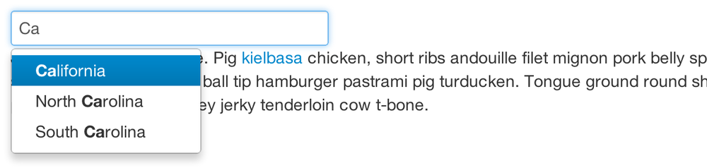
Using Data API, you can add sources via the data-source attribute. Items should be listed in either a JSON array or a function:
<inputtype="text"class="span3"data-provide="typeahead"data-items="4"data-source="['Alabama','Alaska','Arizona','Arkansas','California',...]">
To call directly with JavaScript, use the following method:
$('.typeahead').typeahead()
Table 4-13 shows a list of options.
Table 4-13. Carousel options
| Name | Type | Default | Description |
|---|---|---|---|
source | array, function | [ ] | The data source to query against. May be an array of strings or a function. The function is passed through two arguments: the |
items | number | 8 | The maximum number of items to display in the dropdown. |
minLength | number | 1 | The minimum character length needed before triggering autocomplete suggestions. |
matcher | function | case insensitive | The method used to determine if a query matches an item. Accepts a single argument, the item against which to test the query. Accesses the current query with |
sorter | function | exact match, case sensitive, case insensitive | Method used to sort autocomplete results. Accepts a single argument item and has the scope of the typeahead instance. Reference the current query with |
updater | function | returns selected item | The method used to return the selected item. Accepts a single argument item and has the scope of the typeahead instance. |
highlighter | function | highlights all default matches | Method used to highlight autocomplete results. Accepts a single argument item and has the scope of the typeahead instance. Should return HTML. |
The affix plugin allows a <div> to become affixed to a location on the page. A common example of this is social icons. They will start in a location, but as the page hits a certain mark, the <div> will become locked in place and will stop scrolling with the rest of the page.
To apply the affix plugin to a <div>, you can use either data attributes, or you can use JavaScript directly. Note that you must position the element so that it can be affixed to the page. Position is controlled by the data-spy attribute, using either affix, affix-top, or affix-bottom. You then use the data-offset to calculate the position of the scroll.
<divdata-spy="affix"data-offset-top="200">...</div>
| Name | Type | Default | Description |
|---|---|---|---|
offset | number/function/object | 10 | Pixels to offset from screen when calculating position of scroll. If a single number is provided, the offset will be applied in both top and left directions. To listen for a single direction or multiple unique offsets, just provide an object |
Get Bootstrap now with the O’Reilly learning platform.
O’Reilly members experience books, live events, courses curated by job role, and more from O’Reilly and nearly 200 top publishers.

