Building Android Apps with HTML, CSS, and JavaScript, 2nd Edition
by Jonathan Stark, Brian Jepson, Brian MacDonald
First Steps
Theory is great, but I’m a “show me, don’t tell me” kinda guy, so let’s dive in.
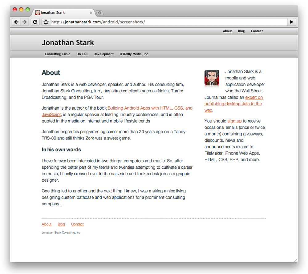
Imagine you have a website that you want to “mobile-ize” (Figure 2-1). In this scenario, there are a number of easy things you can do to optimize a site for Android. I’ll go over your options in this chapter. Example 2-1 shows an abbreviated version of the website shown in Figure 2-2. This is the HTML you’ll be working with in this chapter.
Figure 2-2 shows what the abbreviated version of the web page looks like on the Android phone, and Figure 2-3 shows it on the desktop version of Chrome for comparison. It’s usable, but far from optimized for Android.
Note
If you’d like to try styling this example as you go through the chapter, you can download the HTML and supporting files from this book’s website (see How to Contact Us). The desktop stylesheet (screen.css) is not shown as it is not essential, but you can use the stylesheet from the previous chapter if you’d like to have something to play with.

Figure 2-1. The desktop version of a typical website looks fine on a large screen
Example 2-1. The HTML document we’ll be styling
<html> <head> <link rel="stylesheet" href="screen.css" type="text/css" /> <title>Jonathan Stark</title> </head> <body> <div id="container"> <div id="header"> <h1><a href="./">Jonathan Stark</a></h1> <div id="utility"> <ul> <li><a href="about.html">About</a></li> <li><a href="blog.html">Blog</a></li> ...
Become an O’Reilly member and get unlimited access to this title plus top books and audiobooks from O’Reilly and nearly 200 top publishers, thousands of courses curated by job role, 150+ live events each month,
and much more.
Read now
Unlock full access