Mac OS X controls are on-screen graphical objects that perform like physical control devices we use every day. Consider a car stereo system that has an on-off switch with an indicator light, a row of buttons to select a radio station, a sliding knob to set volume, and a push button for ejecting an audio CD. Each of these devices is a control device with a different function. The on-off switch is a toggle, the radio buttons allow a choice of one out of many options, the slider sets a level or value, and the push button causes an action. All of these physical control devices have analogous on-screen controls that can be manipulated by the mouse in Mac OS X.
There are several common control types in the Mac OS X user interface, which we will discuss in the following sections:
Push buttons
Radio buttons and checkboxes
Pop-up menus, command pop-down menus, and combination boxes
Text fields and scrolling lists
Sliders and scrollers
Color wells and image wells
Disclosure triangles
There are several types of on-screen buttons. They fall into two main groups: action buttons and two-state buttons. An action button performs a single task, such as opening a dialog, saving a file, copying text, or closing a window. A two-state button sets a single feature or attribute on or off, such as whether text should be in bold font or a drawer should be displayed. In the car stereo analogy, the eject button is an action button, while the on-off switch is a two-state button. The set of car radio buttons is analogous to a matrix (group) of two-state buttons, each indicating whether the associated radio station is selected. There is more structure to this matrix of radio buttons, however, because only one of the two-state buttons may be selected at any one time. A checkbox is another example of a two-state button.
A push button looks like a rounded rectangle with a text label on it. Clicking a push button performs an immediate action, such as printing a document, canceling a dialog, or responding to an alert message. Push button names should be verbs (such as Open, Print, Save, or Cancel) that describe the action to be performed.
Push buttons should not be used to indicate a state such as on or off (use checkboxes instead). When a push button represents the default action that can be initiated by hitting the Return key, the button is shown in a darkened form. Push buttons are sometimes completely round, like the Back button , which was grabbed from a Finder window.
We discuss these two types of buttons together because they are often confused with one another. Radio buttons should be used for a group of mutually exclusive, but related, choices. As a group, they have functionality similar to the radio buttons on your car stereo. A group of radio buttons should contain at least two choices. If you need more than five choices, consider using a pop-up menu (discussed in the next section).
Checkboxes should be used to indicate options that must be either on or off (toggles). A checkbox can stand alone if appropriate to the application. Checkboxes in a group are almost always independent of one another (unlike radio buttons). Checkboxes should be labeled so that it is clear what actions the checked and unchecked choices will perform. In contrast to radio buttons, checkboxes usually initiate actions.
A pop-up menu is a menu-like list that appears on top of a button when the button is pressed. Like a set of radio buttons, a pop-up menu displays a list of mutually exclusive choices — only one can be chosen at a time. Pop-up menus are preferred over radio buttons when the number of choices is more than five, when the user doesn’t need to see the choices all the time, or when window or dialog real estate is at a premium. Unlike menu commands, a pop-up menu item should set a state rather than initiate an action.
A pop-up menu has a double-triangle indicator and a label that displays the currently selected choice, and it “pops up” when the double-indicator triangle is clicked. To select an item from a pop-up menu, a user must press the pop-up menu button, drag the mouse pointer to the desired item, and release the mouse button. The chosen item will be displayed on the pop-up menu button. Pop-up menus are sometimes given numeric keyboard equivalents (e.g., Command-1). See Figure 1-17 for an example of how a pop-up menu functions.
Command pop-down menus are like regular drop-down menus, but they appear in windows rather than in the menu bar. Command pop-down menus aren’t used very often and are sanctioned for use only in windows that are shared among multiple applications (e.g., the Font or Color utility window). The label of a command pop-down menu is similar to that of a regular menu (and unlike that of a pop-up menu) in that it doesn’t change.
A combination box is a combination of a text entry field and a pop-up menu or a drop-down scrolling list. A combination box is useful for displaying a list of common choices while still allowing the user to type in an item not in the list, sometimes with text completion, as in the “First” example . Text completion means that a user can quickly select an item by typing only the first few (unique) characters (this is similar to filename completion in a Unix shell and web-address completion in a web browser).
There are two types of text fields, input and static. A text input field is a rectangular area of text that is editable by the user, although it can be disabled in some contexts. The text is selectable, so the user can drag across it or multiple-click it for subsequent cut, copy, and paste operations. Some input text fields allow only one short line of text and can restrict input to certain characters and formats (e.g., uppercase letters only). Text input fields are often arranged in groups, where the Tab key can move the selection from one text field to the next. When the user types some text and then hits the Return key, the text field usually makes something happen; typically, the text is read and some action is performed with it (e.g., a file is saved under a name typed into a text field in a Save panel). This functionality makes the text field a control.
A static input field is a rectangular area of text that is not editable by the user but that may be selectable and may be dimmed in some contexts.
A scrolling list contains as many list items as needed and typically resides inside a scrolling area in a window or in a pop-down menu (see the next section). Both the list view and the column view in Finder windows use scrolling lists; another example is the list of running applications in the Finder’s Force Quit Applications utility window.
Scrollers let you scroll through a text or graphics area that is larger than the displayed view. Sliders let you set a value (e.g., floating point, integer) and are often accompanied by a text field displaying the value. You can grab a scroller or slider knob anywhere to drag it. You can also click anywhere in a scroller or slider well for larger movements. The center of the knob will move to the position clicked (this scroller behavior is called “scroll to here” and can be changed to “jump to the next page” in the General preferences pane in the System Preferences application).
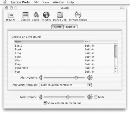
The size of a scroll knob within the scroller well indicates the relative size of what you see compared with the total area. For example, in Figure 1-18 the scroll knob fills about 60% of the scroller well, so we would expect that about 60% of the choices in the scrolling list are visible (in fact, 8 of 13 choices are visible in Figure 1-18). The position of the scroll knob indicates the relative location of what’s visible within the entire list or document. Thus, in Figure 1-18, the 8 visible choices are at the top of the list of 13 total choices. Scrollers usually contain scroll arrows for slow, consistent scrolling through a document. In some applications you can make the scroller move more quickly by holding down the Option key when pressing the scroll arrows.
Sliders can be horizontal or vertical and can be discrete or continuous. When they are discrete, they accept only grid values and should thus have tick marks. There are two continuous sliders in the window in Figure 1-18.
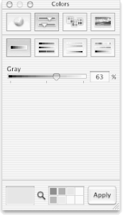
A color well is used to select and manipulate colors. If you press the mouse down inside the color area of a color well and drag outward, you will drag out a little chip of “color” that can then be dropped on certain other on-screen objects, such as an image well. Alternatively, you can click the mouse on the edge of a color well to bring up a Colors utility window, which can also be used to change the color well’s color. The Colors utility window itself has a color well in its lower-left corner, as shown in Figure 1-19.
Figure 1-19. Colors utility window with a color well (lower left) and eight image wells (lower center)
An image well serves as a drag-and-drop target for an icon, picture, or color chip (as shown at the bottom of the Colors window in Figure 1-19). Another example of an image well can be found in the Desktop pane of the System Preferences window. A set of image wells would serve well as a set of thumbnails for a photo album.
) are common in menus, the Finder, and many other applications that display hierarchical information. Clicking a disclosure triangle next to a folder in list view in a Finder window, for example, will “disclose” the files in the folder.
There are several other types of controls in Mac OS X:
- Bevel buttons
These display text, an icon, or a picture and usually replicate the behavior of a push button.
- View-control buttons
The button in the Finder’s toolbar is an example of three bevel buttons in a matrix.
- Tab controls
These change the view pane of a window (for example, the Alerts and Output tabs in Figure 1-18).
- Placards, progress indicators, and relevance controls
These are less-often-used controls; information about them can be found in the online reference materials.
Get Building Cocoa Applications: A Step by Step Guide now with the O’Reilly learning platform.
O’Reilly members experience books, live events, courses curated by job role, and more from O’Reilly and nearly 200 top publishers.


