Chapter 4. Customizing Your App for Mobile
So far we have gotten our example app onto a mobile device, but that doesn’t really make it ready for mobile. Mobile devices are different than desktop computers. Not only do they have smaller screens but they are also usually touch driven. Fingers are bigger than a mouse cursor. Certain actions, like scrolling, are easier to do with a finger, whereas other actions like opening drop down menus are harder or impossible to do without a mouse.
Finally, mobile devices typically have a slower network connection and less processing power than a full blown desktop or laptop. You must take all of these complications into account in order to create a great mobile experience, and that is before we even consider mobile specific features like GPS and accelerometers.
In this section we will take a look at the ways mobile devices are different and how to adapt content and applications to these new constraints.
CSS Overview
Fundamentally GWT builds apps with the technology of web pages. Even though we almost never have to touch the HTML markup directly, GWT is using HTML, JavaScript, and CSS underneath. Most modern web sites use HTML only to represent the content of a page or application. The visuals and styling are controlled using a separate document called a Cascading Style Sheet, or CSS file. A CSS file controls the drawing of each element on the screen. It controls both how it is drawn: the colors, backgrounds, fonts, and effects; as well as where it is drawn: the layout and sizing. CSS is a powerful technology that can completely transform HTML content for different target devices.
As a quick review, here is what CSS looks like:
div{font-size:200%;}div.foo{color:blue;}
A CSS file consists of a list of rules. Each rule has two parts: the
selector and the properties. The
selector determines what the rule affects. The selector div will apply the rule only to div elements. A selector of div.foo will apply the rule only to divs with a
css class of “foo”. For example:
<div> not affected by div.foo </div>
<div class="foo"> *IS* affected by div.foo </div>
The second part of a CSS rule is the list of property settings. A property is some attribute of an element, such as its color, font, width, or background image. Different elements support different properties and in different ways, though mostly this will be hidden for us by GWT.
The combination of selectors and properties let us style any element
in any way we choose with a very compact syntax. For example: to color all
text inside of a bold element b with
red and give it a solid one-pixel black border, we can use this
style:
b{color:red;border:1pxsolidblack;}
Styling GWT with CSS
So how does this apply to GWT? Remember that every GWT widget ultimately becomes an element in a web page, usually a DIV. GWT helpfully adds CSS style classes to every widget based on that widget’s Java class name. With this style class we can hang any style we want.
Suppose we want to make every text field in the app have a thick green border. We can do this with the following style:
.gwt-TextBox{border:5pxsolidgreen;}
Now that we have the mechanics of CSS working, let’s use CSS to restyle PerchSearch from last chapter.
To demonstrate the power of CSS I added a bit more to the UI of the PerchSearch app from the previous chapter. I added a header at the top and a navigation bar on the side. If I load it directly onto a 1024×768 tablet, it looks like Figure 4-1.
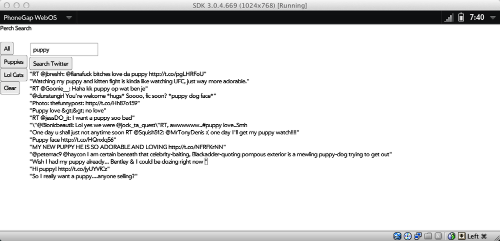
The basic UI is functional but ugly. Fortunately we can easily add
some style. First I added style names to the header, sidebar, and labels
for each tweet using the addStyleName
method on the widgets.
//in the init code
header.addStyleName("header");
...
nav.addStyleName("nav");
...
//in the tweet handler onSuccess callback
label.addStyleName("tweet");
Now we can hang some style on the UI. I want the header to be larger
and centered. The navigation buttons should be plain blue with white text
instead of the standard button look. The actual tweet text should be
bigger with a more spacing and subtle border. To do all of this I added
the following code to the PerchSearch.css file in the war directory.
.header {
    font-size: 200%;
    text-align: center;
}

.nav .gwt-Button {
    width: 100%;
    margin: 3px 0px 3px 0px;
    color: white;
    background: none;
    background-color: rgb(160,200,250);
    border: 0px solid black;
}


.tweet {
    color: black;
    padding: 0.3em;
    font-size: 130%;
    margin: 2px;
    border: 1px solid #e0e0e0;
    background-color: #fafafa;
}
Notice the buttons are styled with the selector .nav .gwt-Button. This is a compound selector.
It means that the properties will only affect elements marked with
gwt-Button that are
also inside of an element marked with nav. This restricts the style changes to only
the navigation buttons. The button next to the text field won’t be
affected.
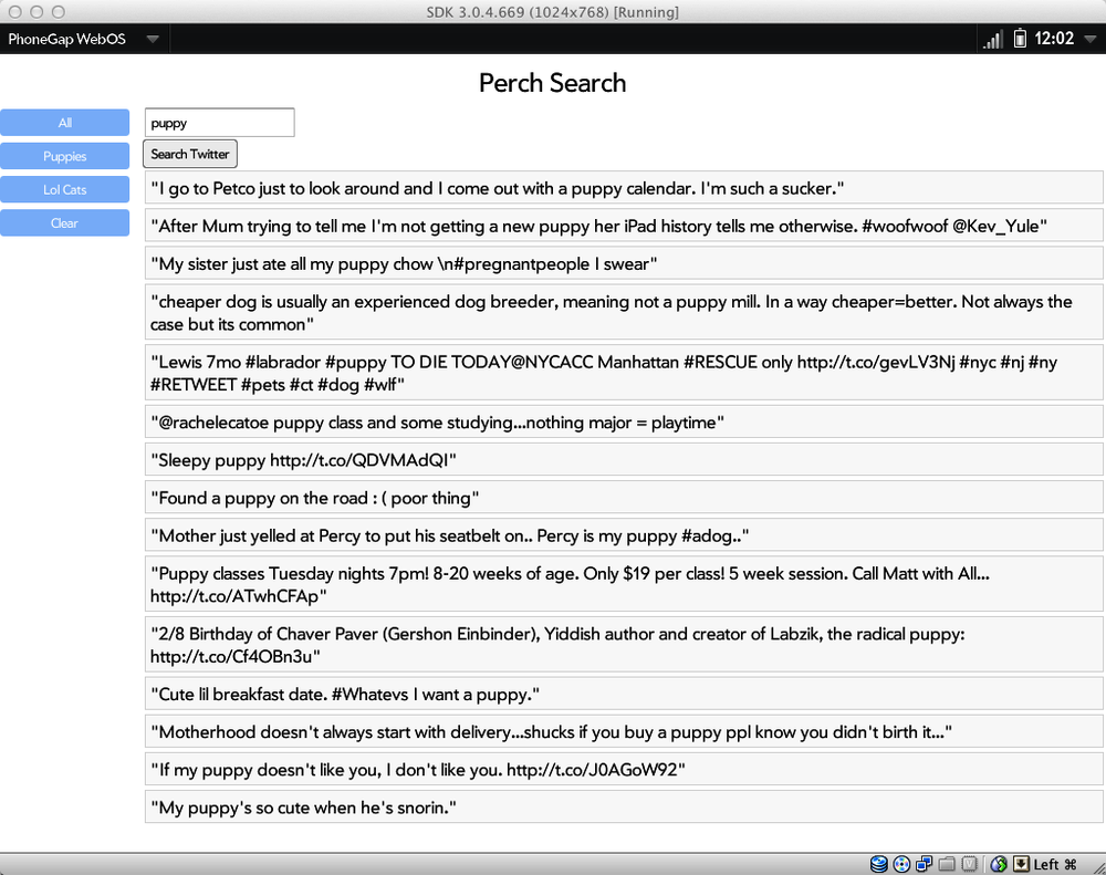
The final result is in Figure 4-2.
Adapting to Device Screen Sizes
The next consideration for any mobile app is screen size. Mobile devices have smaller screens with higher DPI than desktop monitors and they are usually viewed closer to the eye than a desktop. To account for this the web browser on most smart phones assumes a screen width of 960 pixels rather than the actual pixel width of the device (for example, 320px in portrait mode on the original iPhone). The browser allows the user to zoom in and out of the screen dynamically. This is great for random pages on the web but for a mobile app you want greater control over how the user sees your content.
The first adjustment we can make is to force the page to render at
the same size as the physical screen. We can do this by adding a meta tag
to the head section of the page. For a
GWT app this means adding the following to the war/PerchSearch.html file.
<meta name="viewport" content="width=device-width; initial-scale=1.0;
      user-scalable=no;" />
By setting width=device-width it
will tell the browser to make one pixel on your page equal one real pixel
on the device. The third command, user-scalable=no, disables user scaling. Since
we have the page at exactly the right width the user shouldn’t have to
scale. Instead we will make our text the right size for a mobile device.
This only disables scaling, though. The user can
still pan around. However, as long as we make sure there is no content
sticking off the edge page the user will only need to pan up and down,
which is the easiest gesture for a mobile device with a touch
screen.
So far we have restyled PerchSearch to run on a tablet at 1024×768, which is close enough to a desktop to work in both places. However, if we put it on a standard iPhone in portrait mode then we will have only 320 pixels across to work with. It will look like Figure 4-3.
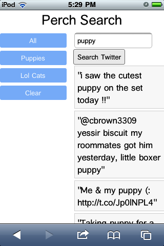
Not horrible but the sidebar really takes away from the tweets. We could change the fonts and layout to work on the phone, but then it would look wrong on the tablet again. We need a way to specify style for each device, preferably without hard coding it to specific brands of devices.
Fortunately CSS has a solution: media selectors. You can designate a block of CSS rules to apply only to a particular size of screen. For example, if we want to make the fonts smaller on a phone but larger on a tablet we can use this CSS.
@mediascreenand(max-width:1024px){.header{font-size:200%;}}@mediascreenand(max-width:320px){.header{font-size:120%;}}.header{text-align:center;}
The beauty of this approach is that the browser will ignore anything
that doesn’t match the current device. If you are on a phone then the
rules in the 320px block will override the rules from the 1024px block. If
you are on a tablet then you will get the 1024px block and the 320px block
will be completely ignored. The text-align rule is not inside any block so it
will always apply.
CSS media queries support conditions based on width, height, orientation, aspect ratio, and other device features. (See the full CSS spec here for details http://www.w3.org/TR/css3-mediaqueries/ ). Using media queries lets you completely customize the look of your app for each device size without changing your actual app code at all, and again it degrades gracefully on older devices.
Adjusting Layout for Mobile
Now that leads us into the next problem: layout. It is very common to create websites which have two or three columns. The left and right columns usually have navigation or sidebars while the center column contains the same information. Squishing this onto a mobile screen is never going to look good, as we can see on the iPhone screenshot. The user will either have to zoom out to see everything or pan to the left and right to see the navigation.
A better solution is to change the layout dynamically to fit the device. You can use the traditional three column layout on a desktop, but switch to two columns (nav + content) for a tablet and one column on a phone, putting the navigation and sidebar above or below the content. Thanks to CSS media selectors we can do this entirely with our style sheets, not changing the app code at all.
To adjust PerchSearch for a phone sized device we will make it fit into one column by moving the navigation to be between the header and content. To not waste vertical space we will also make the navigation be horizontal. To determine which CSS to use we need to know what markup GWT has generated for us.
If you use a desktop web browser with a page inspector like Chrome you can see the generated markup. The markup for the main DockLayoutPanel of PerchSearch looks like this:
<div style="position: absolute; left: 0px; top: 0px; right: 0px; bottom: 0px; "><div style="position: absolute; z-index: -32767; top: -20ex; width: 10em; height: 10ex; "> </div><div style="position: absolute; overflow-x: hidden; overflow-y: hidden; left: 0px; top: 0px; right: 0px; bottom: 0px; "><div style="position: absolute; left: 0px; right: 0px; top: 0px; bottom: 0px; " class="dock"><div style="position: absolute; z-index: -32767; top: -20ex; width: 10em; height: 10ex; "> </div><div style="position: absolute; overflow-x: hidden; overflow-y: hidden; left: 0em; top: 0em; right: 0em; height: 3em; "><div class="gwt-Label header" style="position: absolute; left: 0px; right: 0px; top: 0px; bottom: 0px; ">PerchSearch</div></div><div style="position: absolute; left: 0em; top: 3em; bottom: 0em; width: 5em; "><div class="nav" style="position: absolute; left: 0px; right: 0px; top: 0px; bottom: 0px; "><button type="button" class="gwt-Button">All</button><button type="button" class="gwt-Button">Puppies</button><button type="button" class="gwt-Button">Lol Cats</button><button type="button" class="gwt-Button">Clear</button></div></div><div style="position: absolute; overflow-x: hidden; overflow-y: hidden; left: 5em; top: 3em; right: 0em; bottom: 0em; "><table cellspacing="0" cellpadding="0" style="position: absolute; left: 0px; right: 0px; top: 0px; bottom: 0px; "><tbody><tr><td align="left" style="vertical-align: top; "><input type="text" class="gwt-TextBox"></td></tr><tr><td align="left" style="vertical-align: top; "><button type="button" class="gwt-Button">Search Twitter</button></td></tr><tr><td align="left" style="vertical-align: top; "><div class="gwt-Label"></div></td></tr><tr><td align="left" style="vertical-align: top; "><table cellspacing="0" cellpadding="0"><tbody></tbody></table></td></tr></tbody></table></div></div></div></div>
Uh oh. That’s not good. DockLayoutPanel generates many extra divs with lots of inline styles. That’s going to be very hard to override with CSS. We need another solution.
To tackle this problem we will use a technique called “tags first GWT”. For some applications you don’t care about the markup and can use whatever GWT generates. For other applications, like mobile ones, we want to specify some of the markup first, then tell GWT to work with what we created. GWT does this very easily using the RootPanel.
Normally we call RootPanel.get().add(panel) to add a panel to the
root of the page. RootPanel optionally lets us specify an id of the HTML
element we want to use instead of defaulting to the root of the page. With
this technique we can insert GWT markup inside of our own custom
page.
Let’s start by modifying the main app page in war/PerchSearch.html. Previously the body was
empty. Now let’s create our own set of divs, one for each major chunk of
the app.
<div id="dock_container">
    <div id="header_container"></div>
    <div id="nav_container"></div>
    <div id="content_container"></div>
</div>
Now modify the Java code to use these nice clean divs. First I removed all references to the dock panel.
Label header = new Label("PerchSearch");
header.addStyleName("header");

FlowPanel nav = new FlowPanel();
nav.add(new Button("All"));
nav.add(new Button("Puppies"));
nav.add(new Button("Lol Cats"));
nav.add(new Button("Clear"));
nav.addStyleName("nav");

VerticalPanel panel = new VerticalPanel();
panel.addStyleName("content");
queryField.setText("puppy");
panel.add(queryField);
final Button searchButton = new Button("Search Twitter");
panel.add(searchButton);
final Label errorLabel = new Label();
panel.add(errorLabel);
panel.add(resultsPanel);
Now I can add the header, panel, and nav to the page specifically
where I want them using RootPanel.get:
RootPanel.get("header_container").add(header);
RootPanel.get("nav_container").add(nav);
RootPanel.get("content_container").add(panel);
The app now has nice clean markup but no layout at all; just some unstyled divs. Now we can jump back into the CSS. For the desktop version we want the header on top, the navigation on the left, and the content in the center adjacent to the nav and below the header.
#header_container {
}
#nav_container {
    position: absolute;
    width: 10em;
    left: 0px;
    top: 4em;
}
#content_container {
    position: absolute;
    left: 11em;
    top: 4em;
}
I left the header alone since it looks fine. For the nav and content
containers I made them be absolutely positioned then hard coded a width, left,
and top value. The navigation will be
10 ems wide and 4 em from the top of the page to make room for the header.
The content_container div will be 11ems
from the left to make room for the navigation, and also 4 ems down. Notice
that I’m using em’s instead of pixels. This makes sure the page scales
nicely with the user’s preferred font.
The above CSS is now the default. When the screen is narrower than 480px we want the layout to change. That’s what this CSS does:
@media screen and (max-width: 480px) {
    #nav_container {
        width: 100%;
    }
    #content_container {
        top: 7em;
        left: 0em;
    }
    .nav .gwt-Button {
        width: auto;
        margin: 0.1em 0.5em 0.1em 0.5em;
    }

}
If the screen is narrower then the navigation will stretch
completely across the screen using width:100%. The content moves further down and
all the way to the left using top: 7em
and left:0em. We also set the width of
the navigation buttons to auto. Before they were 100% wide, meaning they
would each be as wide as the screen. Instead we want
them to be sized automatically based on the text in them, which is what
auto does. I also tweaked the margins a
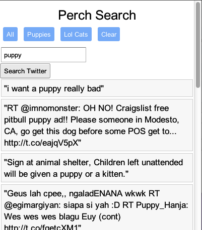
tiny bit to make them look prettier. The final results on a phone look
like Figure 4-4.
In all of this talk about screen size we have assumed that a particular device always has the same size but that’s not always true. Many devices can actually be rotated using an accelerometer, which is the device equivalent of resizing the browser window. You can create conditional styles to deal with this by sticking with the width media selector. The width will usually be updated when the user rotates the device. If you want to do something special just for portrait or landscape mode, rather than depending on the screen width you can do it with these media selector:
@media all and (orientation:portrait) {
}
@media all and (orientation:landscape) {
}
CSS is incredibly powerful. It can restyle almost anything on the page using a very simple syntax and degrades gracefully. All web renderers will ignore any CSS properties they don’t understand. This lets you add advanced features like animations for recent browsers and devices but still fall back gracefully to standard features on less sophisticated browsers.
Thanks to our tags first approach we can completely restyle the app without modifying code at all. This did require a bit of extra work to set up the tags , however. In the next chapter we will take a different approach to making apps ready for mobile.
Get Building Mobile Applications with Java now with the O’Reilly learning platform.
O’Reilly members experience books, live events, courses curated by job role, and more from O’Reilly and nearly 200 top publishers.

