August 2016
Intermediate to advanced
66 pages
1h 10m
English
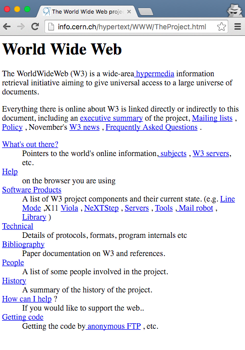
For more than a decade of the Web’s existence, we could safely assume that each user of our site would be accessing it through a computer screen. Despite this, early websites were, by default, adaptive to a variety of screen sizes. The Web’s first site, Tim Berners-Lee’s World Wide Web, works beautifully at a range of screen sizes (Figure 3-1).1
Despite this, we spent time researching and considering the typical browser width and assumed that our users would be perched in front of a reasonably large screen, with a dedicated keyboard. With the evolution of mobile devices, those assumptions have changed. Users may access our sites quickly, on the go, from a wide range of screen sizes. With the diversity of devices and screens, we can no longer safely make assumptions about the screen size of our users’ devices.
The initial reaction to the rise of smartphones was to create dedicated mobile versions of our sites. This often sat at a m. subdomain, such as http://m.example.com, and provided a mobile-optimized experience. At first, this seemed like a great solution because it allowed users to access our services in a format that was streamlined for their device. For developers, this also meant maintaining multiple codebases. For users, this often meant dealing with a limited subset of functionality when using a mobile device.
Read now
Unlock full access


 O’Reilly covers everything we've got, with content to help us build a world-class technology community, upgrade the capabilities and competencies of our teams, and improve overall team performance as well as their engagement.I wanted to learn C and C++, but it didn't click for me until I picked up an O'Reilly book. When I went on the O’Reilly platform, I was astonished to find all the books there, plus live events and sandboxes so you could play around with the technology.I’ve been on the O’Reilly platform for more than eight years. I use a couple of learning platforms, but I'm on O'Reilly more than anybody else. When you're there, you start learning. I'm never disappointed.I'm always learning. So when I got on to O'Reilly, I was like a kid in a candy store. There are playlists. There are answers. There's on-demand training. It's worth its weight in gold, in terms of what it allows me to do.