THE MISUNDERSTOOD AND MALIGNED PIE CHART
The pie chart is undoubtedly the graphical illustration with the worst reputation. Wilkinson (1999) points out that the pie chart is simply a bar chart that has been converted to polar coordinates. Therein lies the problem: most humans naturally think in Cartesian coordinates.
Focusing on Wilkinson’s point makes it easier to understand that the conversion of the bar height to an angle on the pie chart is most effective when the bar height represents a proportion. If the bars do not have values where the sum of all bars is meaningful, the pie chart is a poor choice for presenting the information (c.f. Figure 10.13).
FIGURE 10.13. Total number of goals scored by Teams 1 through 5. The legend indicates the Team number and associated slice color for the number of goals scored by the respective team. The actual number of goals is also included.Problem: The sum of the individual values is not of interest so that the treatment of the individuals as proportions of a total is not correct.
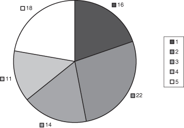
Rule 7: Do not use pie charts unless the sum of the entries is scientifically meaningful and of interest to the reader.
On the other hand, the pie chart is an effective display for illustrating proportions. This is especially true when we want to focus on a particular slice of the graphic that is near 25% or 50% of the data, since we humans are adept at judging ...
Get Common Errors in Statistics (and How to Avoid Them), 4th Edition now with the O’Reilly learning platform.
O’Reilly members experience books, live events, courses curated by job role, and more from O’Reilly and nearly 200 top publishers.

