TWO RULES FOR EFFECTIVE DISPLAY OF SUBGROUP INFORMATION
Graphical displays are very effective for communication of subgroup information, for example when we wish to compare changes in median family income over time of African-Americans and Hispanics. With a moderate number of subgroups, a graphical presentation can be much more effective than a similar tabular display. Labels, stacked bar displays, or a tabular arrangement of graphics can effectively display subgroup information. Each of these approaches has its limits, as we will see in the following sections.
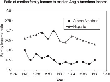
In Figure 10.14, separate connected polylines easily separate the subgroup information. Each line is further distinguished with a different plotting symbol. Note how easy it is to confuse the information due to the inverted legend. To avoid this type of confusion, ensure that the order of entries (top to bottom) matches that of the graphic.
FIGURE 10.14. Median family income of African American and Hispanics divided by the median family income for Anglo-American families for years 1976–1988.Problem: The legend identifies the two ethnic groups in the reverse order that they appear in the plot. It is easy to confuse the polylines due to the discrepancy in organizing the identifiers. The rule is that if the data follow a natural ordering in the plotting region, the legend should honor that order.
Rule 8: Put the legend items ...
Get Common Errors in Statistics (and How to Avoid Them), 4th Edition now with the O’Reilly learning platform.
O’Reilly members experience books, live events, courses curated by job role, and more from O’Reilly and nearly 200 top publishers.

