Before we look at how to answer these four questions in more detail, we need to talk about data analysis. Many of the monitoring technologies we’ll cover rely on statistics to analyze millions of pieces of data about thousands of visitors quickly and easily. If you don’t look at that data with an analytical eye, you can easily be misled.
Web analytics, EUEM, VOC, and WIA provide a tremendous amount of raw information about your website. You need to analyze and communicate it properly if it’s going to have an impact on your organization. That means comparing metrics to other things, segmenting measurements into useful groups, and using the right math for the job.
Data analysis is all about comparisons. You should always talk about data with words that end in “er”: better, faster, stickier, heavier, weaker, later. You can compare groups of visitors, periods of time, or versions of content. You can also compare yourself against your competitors.
To compare, you need a sense of what “normal” is—a baseline or control group. The “always compare” rule means your first job will be to establish baselines for key metrics like conversion rate, visitor traffic, web page performance, visitor satisfaction, email inquiries, and call center volume. Only then can you make useful comparisons in future reports.
Whether you’re trying to judge the effectiveness of a marketing campaign, the cause of a problem, the usability of a page, or the importance of customer feedback, you need to segment your measurements into several groups.
Grouping data into manageable, meaningful clumps is essential. As humans, we naturally try to cluster data into segments. The challenge is in knowing which of the thousands of possible segments is most likely to yield the right data.
Sometimes, the data will segment itself in obvious ways—by geography, browser type, referring site, carrier, and so on. Other times, you’ll have to create your own segments along which to analyze the measurements you collect. No matter what you’re trying to do, having several segments to compare shows you which is best and which is worst. From there, you can start to fix things.
Segmentation applies everywhere. If you’re trying to resolve a performance problem, your first question will be whether there is a particular segment for which the problem is more common: is it offshore visitors? Are all the affected visitors on the same broadband carrier? Is it always the same page, or the same server? Similarly, if users aren’t seeing part of the page, is the problem related to age groups? Browser types? Screen resolutions?
British Prime Minister Benjamin Disraeli once said, “There are three kinds of lies: lies, damned lies, and statistics” (or perhaps he didn’t, though Mark Twain attributed this famous quote to him). The really compulsive liars, however, are averages. Averages are misleading, often concealing important information.
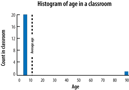
Consider, for example, a class of 20 children who are 5 years old. The average age in the room is five. When a 90-year-old grandparent comes to visit, the average age climbs to 9. This is misleading: we’d prefer to know that the average age is five, with one outlier, or that the most common age in the room is five.
For meaningful measurements, insist on histograms (frequency distributions) and percentiles. A histogram is simply a chart of how many times something happened. Figure 4-1 shows the age histogram for the classroom we just visited.
Histograms are particularly useful for analyzing quantitative information (like page load time), as they show us at a glance how many measurements fall outside a certain range or percentile of the samples we collected.
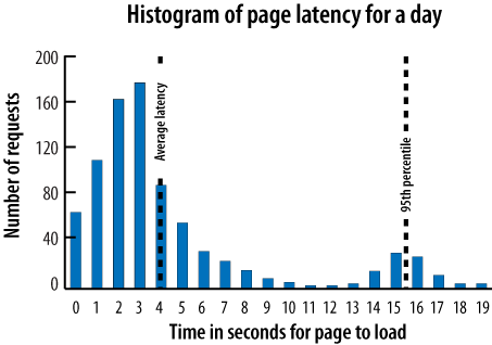
When we talk about “the 95th percentile of latency,” we mean the delay that 95 percent of visitors experienced. Figure 4-2 shows the distribution of performance across a day’s page requests, alongside the average latency and the 95th percentile latency.
Percentiles are good because they let us quantify the impact of a problem. If the 95th percentile page latency suddenly jumps to 16 seconds, as it has in this example, we now know that we have a serious problem affecting a broad swath of visitors (five percent of them, in fact). What do those page requests have in common? Are visitors all asking for the same page? Are they all from the same city? Are requests only from new visitors? This is where diagnosis begins—by identifying an issue and segmenting to find out what’s common across all those who experienced the issue.
Get Complete Web Monitoring now with the O’Reilly learning platform.
O’Reilly members experience books, live events, courses curated by job role, and more from O’Reilly and nearly 200 top publishers.

