Chapter 4. From Confidence to Trust
VISITORS WON’T BUY THINGS FROM YOU or give you contact information if they don’t trust you.
Before they buy, visitors need to feel secure and to trust sellers. Brand recognition lends credibility for larger companies, but many online stores do not have the luxury of having a recognizable name. Similar issues apply offline: you’re likely to lose visitors if your storefront looks sloppy or if your business is in a bad area of town. Every visitor to your online or offline store comes to you with specific intimidations and fears. They don’t want to be cheated or sold at; they want to have an enjoyable and simple shopping or browsing experience.
As you are able to successfully establish trust with your customers, you will build their confidence with your company. The more confidence a customer has in your store, the more likely she will purchase from you, often coming back for more or even recommending you to others. Although a conversion from a first-time customer is important, repeat customers are more valuable. The conversion value is multiplied if you are able to gain customer loyalty.
Gaining skeptical buyers’ trust is difficult, especially when you’re trying to sell something expensive. The level of skepticism generally increases as the price increases. Stores that sell jewelry online report a less than 0.5% average conversion rate. Does that number reflect only the lack of trust a visitor may have? Not necessarily, but trust plays an important role when guiding the user’s decision.
Consider buying a piece of expensive jewelry from an online store. You cannot see the ring up close, touch it, examine it, or try it on. You may wonder if the site is trustworthy and whether the company is honest and will deliver the item in a timely manner. How confident would you feel about the jewelry? Certainty about what you are buying would be much easier at an offline store. Of course, it is not impossible, and many online stores selling high-priced items are able to establish enough confidence with their visitors to convert.
Establishing trust with your visitors takes four steps. As you read about these steps, though, remember that this all unfolds in a matter of seconds online.
- Awareness
They can’t trust you before they know you.
This stage is all about driving traffic to your site through different sources and media (search engine optimization or SEO, paid advertising, banner ads, etc.). The awareness stage is about visibility and getting people to find you. You can achieve visibility through marketing and advertising, but be careful: users may trust you less if they feel they arrived at your site deceitfully.
- Knowledge
When a visitor first lands on your site, you have mere seconds to convince him to stay, and that’s when the knowledge stage begins. You must demonstrate your value proposition during this stage. Now that visitors are aware of you, it’s a matter of convincing them that you offer a unique value, unmatched anywhere else.
- Liking
As visitors get to know your business, they will decide whether to purchase from you. During the liking stage, you should address visitors’ questions, such as “Do I know enough about what they do or have to offer?” and “Can’t I go to a more well-known, established name and get these products or services?” If you succeed in moving visitors through the liking stage, you’ve gained them as customers, at least once.
- Trust
Once visitors have purchased from you, it’s important to ensure that they have a wonderful experience. Trust happens when users complete the shopping experience and successfully receive their product. Up to the point of having the product in their hands, visitors are still anxious about the purchase they just made. A good experience includes receiving the shipment in a timely manner, ensuring that the product is in pristine condition, and, if necessary, making an exchange or return as seamless as possible.
What will persuade and enhance trust in one site visitor versus the next varies tremendously, which goes back to the importance of personas. Many of these issues reflect on business operations beyond your website, but sites can demonstrate seven areas that enhance trust:
Value Proposition
Your value proposition says why a prospect should buy your product or service. What distinguishes your company from the rest of the competition? Customers always want to know the benefit of the product or service, but furthermore, they want to understand why they should do business with you and not with your competition.
Although a well-known company does not need to keep telling visitors who it is once they reach the site, it’s important to maintain relevance by alluding to the value proposition throughout the page. Value propositions are especially critical for newer sites competing against bigger names. They provide a way to conquer the initial online anonymity. Once users identify who you are, what you provide, and what you can do for them, they will overcome their first set of confidence issues.
Many companies define themselves as having “the best customer service” or “the lowest prices.” That’s not an issue as long as you do indeed uniquely offer that value. You must truly stand out in that area among the rest of your competition. We tend to encourage clients to shy away from such overused terms since these are repeated values that many competitors offer. The value proposition must put you at a level that is above the rest. Online, visitors can easily compare sites to figure out whether you really are unique.
Every element on your website, from the home page to the product pages to site navigation, should support that value proposition. It’s the message that you want your visitors not only to read, but also to experience throughout the site. Again, you are defining your company (not your products—there is a different value proposition for that) in a way that you’d like to be remembered by your site visitors.
Amazon.com offers a wide range of items. The site also offers community feedback and reviews on just about anything, positive or negative, throughout the site. Before many online shoppers make a purchase decision, they are likely to visit Amazon.com to comparison shop. The value proposition at Amazon.com could be that it is a community site, allowing you to purchase from a range of vendors, and get the feedback you need to make a more educated decision.
When Ebay.com was first launched, it was one of the first online marketplaces where items could be bought, sold, or traded. Users could successfully auction off items as large as a home (sold for $1) or as bizarre as the Virgin Mary Sandwich (sold for $28,000). There was little other value like that on the Web, and people came flocking as a result. The value that was being offered superseded any concerns users may have had about the site. Therein lies the power of a value proposition.
A well-stated value proposition throughout the site promotes visitor “confidence.” It does not necessarily build your visitors’ trust in your company. As mentioned earlier, confidence is only the second step toward the establishment of trust. If users have enough confidence, they will like you and make a purchase from your site.
Bluefly.com positioned itself as a company that offers only the latest high-end designer fashions. This is not enough to define the value proposition internally; it has to be present throughout your site. Bluefly.com does this beautifully, as you can see in Figure 4-1.
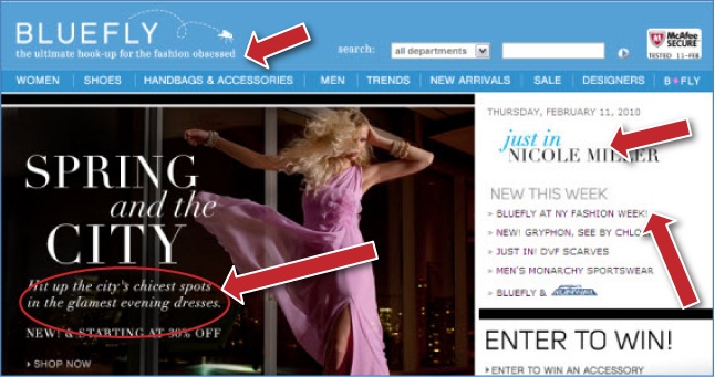
Several elements on the main home page of Bluefly.com communicate the value proposition clearly:
The website’s tagline below the logo, “the ultimate hook-up for the fashion obsessed”
The “New This Week” section allowing visitors to navigate to the latest items just released in the market
The main image displaying the latest models from the fashion world
Every element points to that value proposition. What does this mean for Bluefly customers? Visitors to the site are well aware of what this site has to offer. There is very little chance that visitors will leave the site because they do not know what Bluefly offers—the company clearly states what sets it apart from other apparel stores. This clear value proposition serves another vague purpose: since it caters to the fashion-hungry, visitors to whom this doesn’t apply will bounce off the site quickly. If a visitor does not fit within Bluefly’s niche market, this will become apparent as soon as the visitor sees Bluefly’s home page.
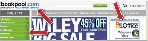
Figure 4-2 shows the main home page for Bookpool.com. The value proposition of the site is stated clearly in its tagline, “Discount Computer Books.” Every image or incentive on the page drives the point that it is a discount computer bookseller:
The main image of the site offers an incentive of a 45% discount on books by different publishers.
The site allows visitors to browse through technical books on Windows Vista.
The navigation panel on the lefthand side of the screen presents different categories of technical books.
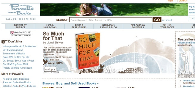
Compare Bookpool.com to Powell’s Books’ main home page in Figure 4-3. Visitors to the Powell’s Books website have no indication of what distinguishes this bookstore from the competition. Why would a visitor, who hadn’t encountered Powell’s Books before, select Powell’s over any other bookstore? The main home page does not communicate a clear value proposition. The only hint of a possible value proposition is the rather difficult-to-read tagline saying that the company was established in 1971. Is that enough for visitors who do not know Powell’s Books to judge whether it is a reputable and trustworthy bookstore?
Note
The Unique Selling Proposition (USP) is not the same as the value proposition. The USP refers to what is unique and attractive about a specific product, whereas the value proposition is the overall benefit and value a customer will derive from purchasing from your company. Although they are different, they do work hand in hand: the USP for varying advertisements and landing pages will be aligned with the value proposition.
During your initial conversion analysis of a client’s website, determine whether the site’s value proposition is unique. If it is not, work with the client to come up with a value proposition based on their offerings and their customers’ expectations and needs. If the client has a value proposition but it is not clearly stated on the site, focus your efforts on amplifying that value throughout the site.
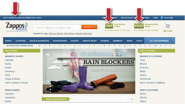
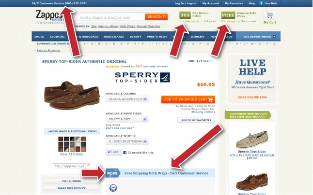
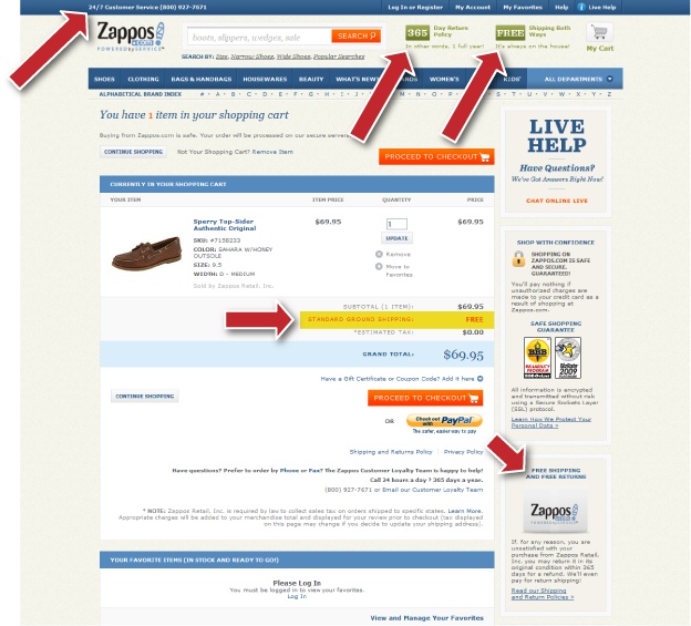
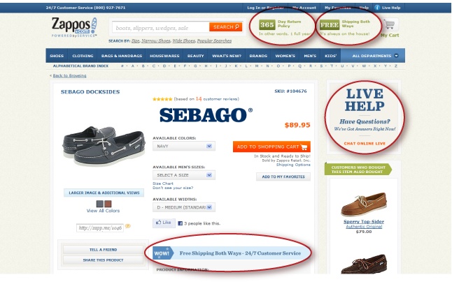
For example, Zappos.com is one of the few companies that is able to differentiate itself from its competition through excellence in customer service. It is one of the few large ecommerce sites that displays the customer service phone number in the header inviting visitors to call 24/7 if they have any issues. When shopping for shoes online, customers are worried that once the shoes arrive they will not fit correctly or will not be comfortable. Zappos’ unique value proposition addresses these concerns head-on: you can return an item within 365 days, and you get free shipping both ways.
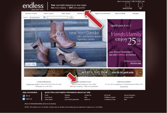
Figures Figure 4-4 through Figure 4-6 show how Zappos reiterates its excellent customer service. Figure 4-7 shows the home page of Endless.com, a direct competitor of Zappos.com. This site lets you know immediately what it is: a “shoes and handbags” site, which is stated in the tagline. The name “Endless” refers to the fact that the company sells anything and everything that falls under the umbrella of shoes and handbags. So, how does Endless deal with the Zappos value proposition? Endless offers:
Free overnight shipping on new styles
Free return shipping
A 100% price match
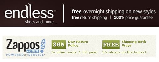
The free overnight shipping from Endless.com beats the free shipping from Zappos.com. However, the caveat is that overnight shipping is only available on new styles. Overnight shipping appeals to several personas, but it resonates very well with the spontaneous persona. Both sites offer free return shipping. Endless.com offers a 100% price match, which Zappos.com does not offer. Figure 4-8 shows the value propositions of the two sites against each other.
Like every element in optimization, a value proposition is a work in progress. Identify your value proposition and then test it to see its impact on your customers. Based on shifts within the market and changing customer expectations, you may need to readjust your value proposition to meet these changes. For instance, in 2009 many companies shifted their value to reflect the downturn of the economy. Wal-Mart has always been a company that “slashes” prices, so it was not much of a departure to bring that within the context of the economic downturn. Wal-Mart became the company that saves you money with a powerful value proposition: “Save Money, Live Better.”
Defining Your Value Proposition
What drives a customer to make a purchase decision? When visitors arrive to your site, they could have come for a few reasons:
They arrived by accident because they clicked on the wrong link or advertisement.
They are browsing.
They have a “problem” and your product will solve it.
It is rare for offline stores to have customers walk in “by accident.” Customers walking through the door either are browsing and window shopping, drawn in by your sale sign or featured product, or are coming specifically to your store to fill a need.
Understanding motivation is key to creating a clear value proposition. By identifying what brings different customers to your site or store, you can adjust your value proposition to meet the needs of every customer. The value proposition should state a value your customers are actually looking for. You can determine this by conducting surveys and field studies of your market. Tapping into your market is the best way to understand what motivates customers to make a purchase.
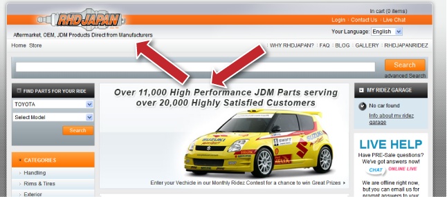
Our client, RHDJapan, offers the widest selection of Japanese domestic market (JDM) auto parts on the Web. Visitors arrive at the RHDJapan.com website with a number of motivations:
They are curious (browsing).
They have a knack for building race cars (problem).
They sell unique parts to customers (problem).
They have a vehicle they’d like to improve but are unsure of what they need (browsing).
Once you’ve identified the motivation, it’s time to evaluate your company: what value do you offer customers that no other competitor offers? If you have no distinguishing value, you are going to have a difficult time convincing visitors that you are better than the alternatives online or offline. Identifying your value proposition requires lengthy brainstorming discussions with key individuals within your company: C-level personnel, VPs, and marketing directors.
For RHDJapan, we discovered that the majority of customers were students, and cost was definitely an issue for them. Race car parts can get very expensive, so getting factory-direct brand-name parts from Japan at the lowest prices was a tremendous value to customers. Again, we do not recommend advertising “lowest prices” unless you really offer the lowest prices and can match a lower price offered elsewhere. Figure 4-9 shows how we communicated RHD’s value proposition on the main home page, giving users more confidence.
Value Proposition Matrix
As you work to identify your value proposition, evaluate it based on a scale of 1 to 5 in each of the following areas:
- Exceptional
Make your value proposition stand out to be exceptional. This area evaluates the value proposition’s originality as experienced by your customers, as well as within the marketplace. Overused value propositions, such as typical customer service, will get a score of 1. When Zappos first came out with its free shipping both ways, the company introduced an innovative value proposition to the marketplace that set it apart from the competition. Progressive Insurance positioned itself as the website that allows visitors to compare insurance quotes from different companies, which was novel and gave customers enough knowledge to develop a liking for and make a purchase from the company.
- Uniqueness
How unique is your value proposition compared to your competitors’? Your value proposition should distinguish you in at least one area from the rest of the competition. Consumers consider several companies before making a major purchasing decision because of the commonality these companies share, but the one they select is often the company that offers the most unique value to them. When we launched Invesp in 2006, we competed with few conversion optimization companies. But we suffered from lack of uniqueness. When we found we were most successful working with ecommerce companies on complex conversion optimization problems, we hit gold because none of our competitors positioned themselves that way.
- Excellence
How do you excel at your value proposition? Toyota’s value proposition focuses on quality and reliability. The company delivered on this value until it had major recalls in 2010, which shook consumer confidence in the company and its products.
- Desirability
How desirable is your value proposition to your customers? It is important to consider how relevant or desirable your value is to the various types of customers you have. The more desire you provide them, the more inclined they will be to purchase from your company. Netflix’s value proposition of never charging late fees resonates well with consumers who are tired of paying late fees. Compare that clear value proposition to the number of times Blockbuster had to change the way late fees are calculated in the past few years.
Different visitors will be interested in different aspects. Browsers who are just looking around your site appreciate the originality of your value proposition. Visitors in the early stage of the buying cycle will most likely give the same weight to the different factors. Visitors in the later stage of the buying cycle will most likely give “desirability” and “excellence” more weight.
Evaluate your value proposition through the lens of your personas. What’s the value for the individual persona versus the value for the entire market? Test the value proposition to understand how it will resonate best with each persona:
Does it appeal to the impulsive persona? Is it a value the customer can act upon immediately?
Does it appeal to the caring persona? How does it relate to other customers? Have other customers benefited from this value?
Does it appeal to the aggressive persona? Is this value unique? Do other competitors offer something similar? Why is this value better?
Does it appeal to the logical persona? What’s so useful about this value? Will this value truly impact this person’s conversion?
When evaluating your value proposition, you should also consider personas from the various buying stages.
Continuity
To understand visitors’ motivations or their “intent,” you must look at the keywords and ads that inspired visitors to click through to your site in the first place. Keywords are often loaded with meanings and particular motivations, so researching them is helpful. Companies build entire pay-per-click (PPC) campaigns on keywords that hold no relevance to what they offer. Furthermore, the keywords are important, but how relevant is your landing page to the keyword visitors used? Some companies use a single, general landing page for a variety of paid campaigns. Others use their main home page as the landing page. Funneling all sorts of personas—with varying motivations at different stages of the buying process—through a single common page usually results in a low conversion rate. The challenge is to cater the message and the unique selling proposition to satisfy various visitor intents.
Continuity is an important component of trust and is addressed by answering the following questions:
Continuity refers to maintaining relevance and scent at every touchpoint visitors have with your website or campaign. Relevance and scent reflect a continuous theme on the different pages the visitor navigates through, such as the pages’ look, feel, offers, and copy. Continuity becomes especially important when you have control over the ad that leads to the landing page. Both variables must work together to increase users’ trust by assuring them that they have not landed on the wrong page and that your page is relevant to what they are looking for. But it does not stop there. As visitors navigate through your website, the same themes should continue from one section to the next.
Continuity is equally relevant to any marketing and advertising. If your company promotes a service or product using a television commercial or magazine ad, the continuity is important when the user responds to that advertisement. How is the message continued between the advertisement and the actual store? How relevant is the prospect’s exposure to the ad? How relevant is the medium where the ad appears? Online marketing simplifies these processes because it provides greater control over how potential customers interact with your advertising and website. It also provides mechanisms to track actions to evaluate the effectiveness of advertisements and marketing efforts.
When visitors click on an online advertisement, they come with two emotions: hope that they will land on a page relevant to what they are looking for, and worry that the page will be a disappointment. Each of us can count the number of times we clicked on an ad and landed on a page that had nothing to do with the advertisement. Our research indicates that visitors judge the relevancy between the ad and the landing page in less than one second. The lack of continuity causes visitors to lose confidence in your site. Once they lose the scent of what you are trying to get them to do, once they do not see the relevance in your marketing campaigns, you have lost them, possibly forever.
How Do You Maintain Continuity in Online Advertising?
Conversion optimization goes well beyond a single landing page. It is an entire process that includes where the user came from, how the user got to your site, and what you will do to persuade the user to convert. Conversion optimization is about more than placing a button here and some text there; it’s about having a holistic approach to optimizing your online transactions. Continuity is one of the ways to have that holistic approach to and outlook on conversion optimization. To maintain continuity in any type of online advertising, use the same creative elements in both the ad and the landing page. These elements include the headline, keyword, message, and images. Remember, the first step in establishing trust is generating awareness. The ad that you display is the gateway to further awareness about your company.
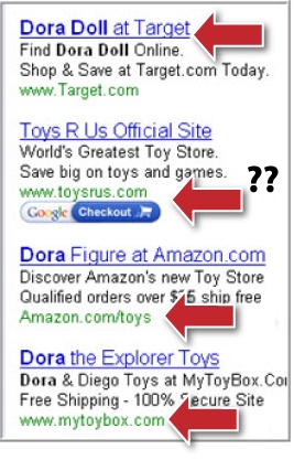
Figure 4-10 displays the PPC advertisements that appear when you search for the term “Dora Dolls.” What do you think is the user motivation behind this search?
The user could be interested in purchasing a doll.
The user may want to see if these types of dolls exist.
The user may want to find places where these dolls are sold.
The user may want to do some comparison shopping.
Which of the ads in Figure 4-10 does a better job of capturing the attention of users interested in purchasing Dora Dolls? The first ad for Target.com seems the most relevant. The remaining ads bear some relevance to the term, except for the Toys R Us ad: nothing in this ad relates to the search term “Dora Dolls.” The headline reads “Toys R Us Official Site,” and the ad copy reads “World’s Greatest Toy Store. Save big on toys and games.” Perhaps Toys R Us is relying on its well-known brand as opposed to ad scent to convince visitors to click through to its site.
The Amazon.com ad uses a different approach. The headline reads “Dora Figure at Amazon.com.” The ad copy states “Discover Amazon’s new Toy Store Qualified orders over $25 ship free.” The headline uses the word Dora, but the copy does not include the search term. Amazon.com compensates for that by including a free-shipping incentive to entice visitors to click.
Before we look at the actual landing pages, let’s take a look at a different ad that Amazon.com uses. Figure 4-11 shows two different ads for Amazon.com, both for the term “Dora Dolls.” Notice how the second ad flips the search term and displays “Doll Dora” instead of the term we searched for. Both ads use the same incentive of free shipping on orders of $25 or more. The first ad emphasizes an Amazon.com feature: “new Toy Store.” The second ad is more relevant to users by emphasizing low prices.
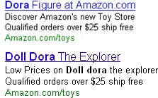
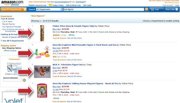
Figure 4-12 shows the MyToyBox.com landing page for the same search. The ad seems relevant and also includes the incentive of free shipping. However, the landing page is a different story. Although we see Dora items displayed on the landing page, the results do not directly relate to the term. The products on this page include Dora quilts, books, and even toy boxes, but no Dora dolls. So, although the ad is relevant, and the products on the landing are relevant to the term “Dora,” they certainly lose scent for the term “Dora Dolls.” The landing page has broken the cycle of continuity at this point.
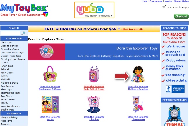
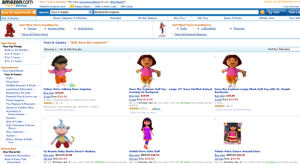
Figure 4-13 displays Amazon.com’s landing page, which has a similar problem to the landing page of MyToyBox.com. Although Amazon.com’s ad may have enticed the user to click through because of the free-shipping incentive, the lack of continuity on the landing page may result in a quick bounce off the page. The first six items on the page are “related” to Dora—Diego, Daisy, Dora furniture, etc.—but are not actual Dora dolls. Dora dolls didn’t appear until the bottom section of the page. Amazon.com is expecting visitors to be patient enough and scroll down to find these dolls. As a general rule, the landing page should be relevant immediately. Figure 4-14 shows a new and updated landing page from Amazon.com for the same term. The new page maintains relevance and avoids the mistakes we pointed out in the original design by displaying the Dora dolls first on the page.
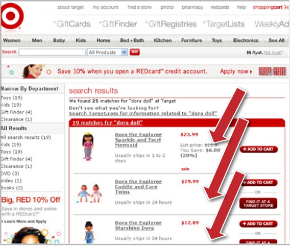
Finally, Figure 4-15 displays the landing page for Target.com. This page maintains the most relevance to this particular search term compared to the other sites. Target’s ad displays the keywords searched for. The landing page continues the scent to enhance the user’s confidence in the site.
Relevance of ad content to keyword is important; so is the geotargeting of your ads. Displaying French ads for a US resident, for example, has little relevance. Figure 4-16 shows a banner ad targeting US residents that appeared on the lefthand panel of Hotmail.com.

Scent does not end on the landing page. You must maintain the message throughout your site. Every site maintains a uniform design, because if each page had a different design, look, and feel, the site visitor would lose scent quickly. Your page is delivering a promise to the user; as the user clicks through to the next page on the site, you will need to anticipate what the user expects to see.
That is where personas play a key role when creating ad campaigns, landing pages, and entire sites. Ads must cater to specific personas, and your landing pages should address the issues that are relevant to that persona. Not all companies can create campaigns that target specific personality types, so the challenge is to make an ad and design a landing page that can address and maintain relevance to all your target personas. To do so, you should ask the following questions:
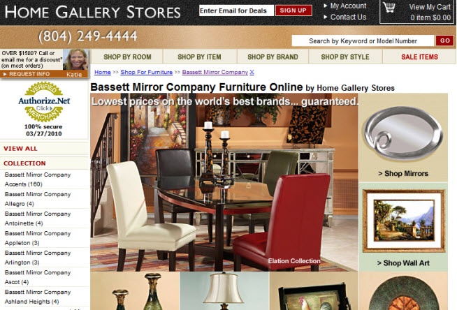
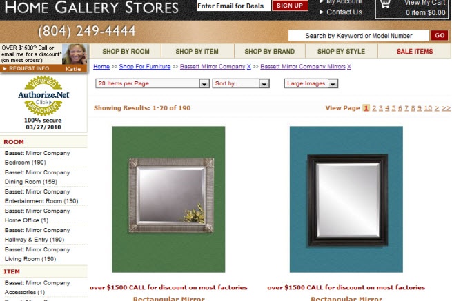
As visitors navigate through a site, continuity is as important, if not more so, than when visitors navigate from an online ad to a landing page. However, we spent most of this chapter reflecting on the continuum between ads and landing pages because there is often a lack of continuity within a site, and although it may be subtle, it is enough to lose a few potential buyers. Figure 4-17 shows the Bassett Mirror Company category page on the website of one of our clients, HomeGalleryStores.com. Analytics revealed that a large number of visitors were navigating to the mirror subcategory from this page. By following the continuity principle, the next page should show the same mirror that was displayed on the parent category page. Figure 4-18 shows the Bassett Mirror Company Mirrors on HomeGalleryStores.com, but the mirror that was displayed on the parent category page is nowhere to be found on this subcategory page. By merely adjusting the way items are listed on the subcategory page to maintain continuity, HomeGalleryStores.com increased its conversion rate by 10%.
The key is to ensure that whenever visitors click on your site, continuity doesn’t stop.
Typical Problems When Maintaining Continuity
Here are some of the problems our clients run into regarding continuity:
- Poorly designed ad campaigns
Ad campaigns should be monitored carefully to track what keywords visitors are using to land on the site. Adjust ad creative and landing pages to address user motives. Ensure that you geotarget your ads to the correct location where your offering is relevant. Finally, use negative keyword bidding to ensure that your ads are not displayed for terms that are not related to your offering.
- Poorly structured SEO campaigns that drive visitors to the wrong pages on the site
Don’t underestimate organic results. Ranking first in organic results for a term is a lot better than spending hundreds of dollars on a paid placement. The key is to attach the most relevant page on your site to the particular search term.
- Using the home page or category pages as a landing page
Home pages are wonderful, but they are multipurpose pages, and therefore they lack focus. The more focused a landing page is on the actual objective of the user, the more likely that visitor will convert.
- Using search results pages as the landing page
You might have noticed both Amazon.com and Target.com in the previous example used the search results page as a landing page for the term “Dora Dolls.” Sites resort to this approach because creating a custom landing page for tens of thousands of terms is not feasible. Although we understand the logic, you should make certain this works for your site. Driving visitors to your search results page will only make sense if you know your internal search technology and search results will display relevant results. You can rely on the internal search to display results, but add logic to your system so that the search results page adapts its look and feel for users landing on that page from an external source.
Congruency
Up to this point, we have focused on providing visitors with scent and relevance by maintaining continuity from an ad to the landing page. But how harmonious are the different elements on the landing page? Is there a congruent theme and message throughout the page and on every page throughout the site?
Visitors move to the knowledge stage of building trust the minute they land on your website. If your landing page does not address their questions, you have not succeeded in building trust. Congruency means maintaining a single harmonious message within the same page while answering the personas’ different questions. For the value proposition to transcend to visitors, every element on a single page has to support that value. Very often you’ll find that a site will have many competing messages on one page, or you’ll find a site in which the copy, images, and elements do not work together to fulfill the value proposition. The lack of congruency increases visitors’ anxieties and leads to more friction. Friction results when two forces collide. Online, the two forces colliding are the visitors’ anxieties and your landing page elements. The more friction that results from this collision, the more likely it is that visitors will abandon the site. It is impossible to completely eliminate friction, and every transaction will have some degree of it.
How can all the elements on the site support the present congruent message?
Every page on the site should serve two purposes:
Support the overall value proposition of the site
Move visitors toward the primary conversion goal for that particular page
When elements on the page work harmoniously toward these goals, you will achieve congruency. As you evaluate different pages on your website, you should ask the following questions:
What is the primary conversion goal for the page?
Do the different page elements (copy, images, and design) support the primary conversion goal as well as the value proposition of the site?
What page elements are distracting visitors from the primary goal or from the value proposition?
Do the different elements present a single congruent message?
Are the different elements relevant to each other?
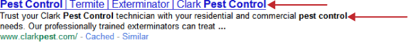
Figure 4-19 shows the organic results for the term “pest control.” There is enough continuity from the search term to the description displayed on the search engine results pages (SERPs). Figure 4-20 displays the page we landed on when we clicked on the ClarkPest.com organic result. Continuity is definitely lacking from the search results page to the landing page. The page is also not harmonious, as it lacks one consistent message throughout.
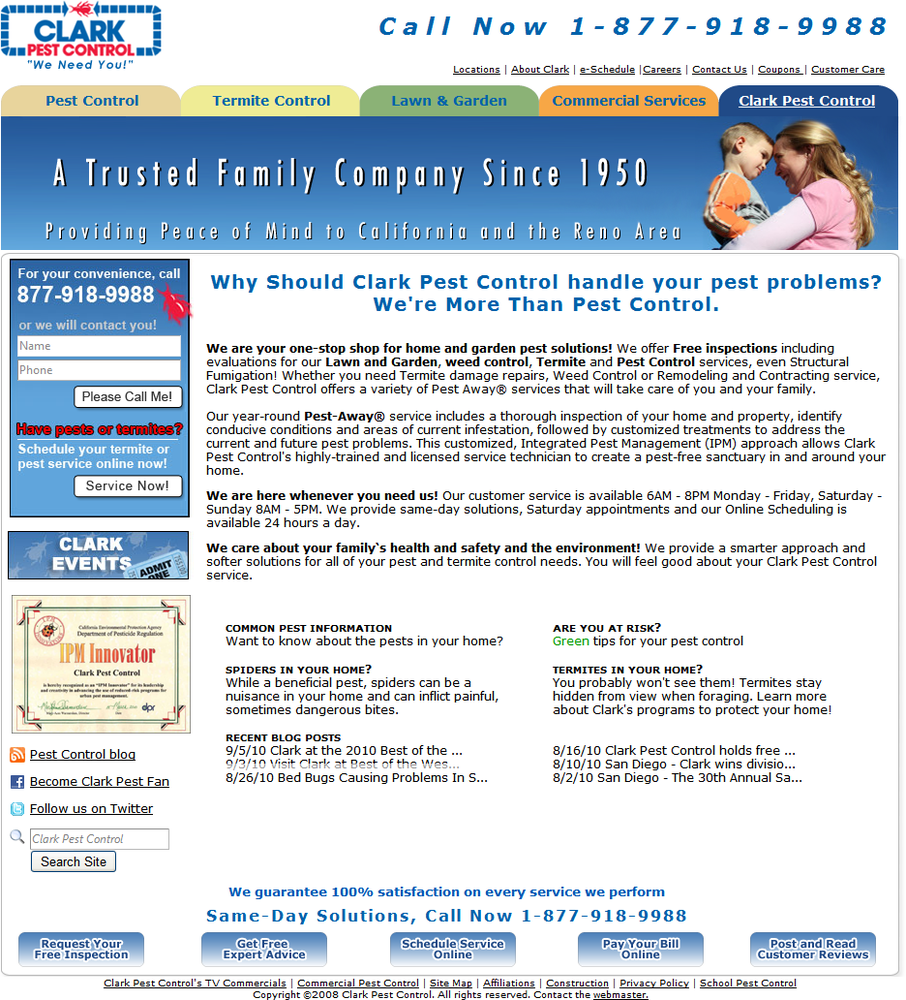
The page does not present a congruent message because:
Although peace of mind and being a trusted family company are values that are important to visitors, they are not the prime motivation for the visit.
The page is overwhelmed by the value proposition, which takes away from the actual service the site is offering.
Although this company presents a wonderful value proposition, it is increasing friction because of the disconnect among the search, the service, and the messages suggested on the page.
Can those messages work harmoniously? Yes, but you don’t want them to be competing and confusing the user. Again, congruency is achieved when all of the elements work together to support the value proposition and primary conversion goal of the page.
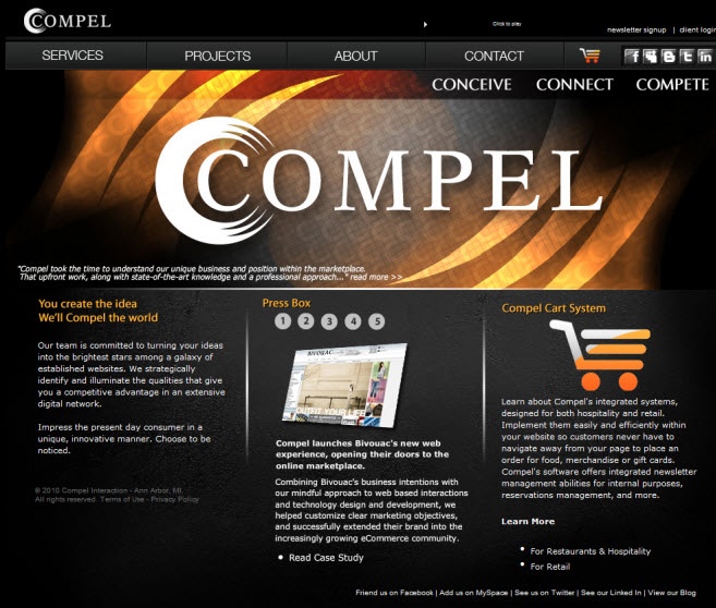
Your pages should be built to address visitor intent. The value proposition should tie in directly to the service or product you are offering. Figure 4-21 displays the landing page for Compel, a marketing and web design service. After an initial search for web design services on Google, Compel was listed as one of the first results in the area. The home page does not indicate what Compel offers. The headlines below the main image do not clearly indicate what the site is about. The words Conceive, Connect, and Compete are meaningless to a user looking for a design solution.
Product or service pages must maintain congruency as well. Every element on the page must reemphasize the importance of the product and service by giving the user the confidence to move through the conversion process. Figure 4-22 displays the different ways Zappos reemphasizes its commitment to unmatched customer care. Also notice how Zappos removed the left navigation panel on its product page to emphasize the product (primary conversion goal) and not take away from the overall value it is offering. Again, a value proposition has to support the main objective, which is ultimately to sell products on the site. Congruency lends credibility and authenticity to the value you are offering.
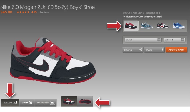
The Nike Shox product page, shown in Figure 4-23, displays the features, images, and a brief description of the product. All the elements on the page support one goal: to sell the shoe. You should use caution when attempting to cross-sell or upsell on product pages, since these promotional messages can distract the user from converting. Remember, there is no salesperson to convince the visitor that the product is right for her, so the page has to do all the talking. Congruency is essentially the salesperson attempting to convince the user that not only is the product offering wonderful, but the value is unattainable anywhere else.
Social Proof
Social proof refers to the influences that lend you credibility and authority within society; hopefully, but not necessarily, for a good reason. This phenomenon is especially important when people are not able to determine how to react to a specific person or entity, so they rely on the behavior of others to guide their actions. In many cases, your website visitors will evaluate your business based on how other people behave toward to you.
So, what are some social proof techniques that you can use on your website?
- Number of clients
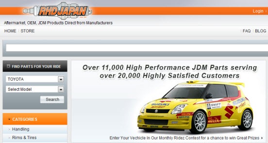
RHDJapan was serving thousands of customers internationally. We suggested that it use this as social proof to increase trust among new site visitors. Figure 4-24 shows the newly designed home page for RHD with the social proof as a main focus of the headline.
Visitors want to know they aren’t the only ones out there buying from you. If you drive by a restaurant that is buzzing, as opposed to one that has one or two cars in the parking lot, which one are you more likely to want to try? Few people would be willing to give the latter restaurant a chance. The majority will rely on the social proof of the busy restaurant—“a lot of people must love this restaurant, and I want to experience that, too.” This type of social proof appeals to the caring persona in particular. But ultimately, the majority of us have humanistic aspects to our behavior, which is why social proof is critical. If you have many clients or customers, list the exact numbers on your website and see what a difference this makes.
- Newspaper and PR mentions
How many times have you seen these words on an ad or website: “As Seen In…”? If your company is mentioned on CNN, in the New York Times, or in any other industry-related or reputable media outlet, definitely mention it. This is excellent social proof, and it will gain you the trust of your visitors and future customers.
- Expert status
In most industries, publishing research or speaking at industry conferences gives your visitors a boost in confidence in what you have to offer.
- Celebrity endorsements
When the Google phone came out, Google ran a number of ads featuring very well-known artists and actors using the device. This gave the new phone a ton of social proof. People want to be like celebrities. If they see a celebrity using and enjoying your product or service, you can be sure you’ve gained their trust and confidence.
For a very long time, Jessica Simpson was the face of the skin care product Proactiv. For young teens, her endorsement authenticated the product so much that it became one of the most popular skin care products on the market. Of course, Jessica Simpson was endorsing the product because Proactiv was paying her good money to be its spokesperson. Does that mean anything to young teens? Not really; as far as they’re concerned, her skin is flawless because she uses the product. Celebrity influence has a big impact on product success. Revlon, L’Oréal, and Garnier all feature celebrity spokespeople rather than no-name models to endorse their products. This type of social proof resonates well with customers who are more caring in nature.
- Well-known customers
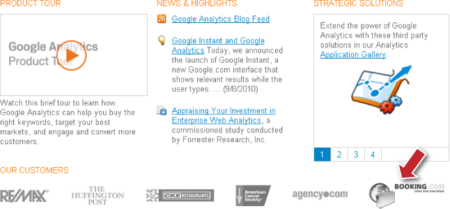
If you have a well-known client, don’t hesitate to make that clear to visitors and prospects. Figure 4-25 shows how Google Analytics uses its list of customers as social proof for its service. Much like celebrities, if a large client trusts you, you must be a good company to work with. This type of social proof resonates well with the aggressive and logical personality types.
- Social media following
Social media websites, such as Twitter and Facebook, have increased in popularity over the past few years. These websites allow your business to interact with potential as well as existing customers. Having a large following on these sites can indicate how popular your business is. Placing prominently on your site the logos of sites you are involved with can lend credibility to your site. The same applies if your business has a blog with a large RSS following.
We would caution against implementing any of the aforementioned suggestions without measuring their impact on visitors. Ultimately, every website activity, change, or enhancement should directly impact the goals of the site, the strongest of which is to increase the bottom line. Blindly adding elements that you may think will enhance trust and build more confidence in your users is not enough. Remember, customer-driven changes should influence decisions.
Social proof is very often abused, as witnessed in the Dr. Oz debacle that occurred in 2009. The name of this well-known celebrity was being plastered all over weight-loss products because he had endorsed a specific ingredient that these products were using. The offending companies were using social proof, Dr. Oz’s endorsement, to enhance trust in users and motivate them to purchase. Dr. Oz and Oprah ended up suing these companies over their claims.
The new age of digital photo editing and enhancement makes it even easier to plaster faces of celebrities on websites to try to promote and endorse products. Many times, these types of hoax companies get away with this practice since their products are not so popular, and it’s virtually impossible to monitor all activities over the Internet.
Membership/Professional Organizations or Affiliations
Memberships and affiliations with professional organizations can improve the odds that visitors will trust you. Similarly, many ecommerce companies use services to ensure the security of their websites and their compliance with Payment Card Industry (PCI) standards. These services scan websites on a regular basis to ensure that all transactions will be safe and secure. Using a well-named security service brings comfort to your visitors. Adding these security icons and seals has resulted in large increases in conversions for some of our clients.
It’s important to realize that you should not expect your visitors to do the digging and make sure you are a legitimate business. You can’t expect them to look up the various memberships and professional affiliations you have with different organizations. You can’t expect much from them because they have come with a purpose, and if you do not do all you can to address all of their concerns and remove anything that blocks their path, you will lose them as potential customers or clients.
It’s key to realize that not all memberships will resonate well with users. Some of your customers may appreciate your affiliation with the Better Business Bureau (BBB), whereas others will associate this affiliation with a small business and would not want to work with your company as a result.
External Reputation
Your reputation can vanish quickly and brutally. A single blog or video can go viral in a matter of minutes. To maintain trust, you need to realize that recovering from a negative campaign is important. With everything published online, it takes a shopper a simple search of your company’s name to see what others are saying about your service, products, or company in general.
What can you do about negative buzz? There are a few steps you should consider when trying to clean up a negative campaign:
- Get to the root of it
Companies have never been under such scrutiny as they are today. Users now recognize that they have some power, and if something they say about you goes viral on the Web, they can negatively impact your reputation. If you’ve received negative comments about your company, it’s important to get to the bottom of it and understand why clients or customers are reacting this way. Just being angry about the negative comments will not get you anywhere. Address any flaws in your products or services. The Toyota recalls in 2010 stirred up a lot of controversy. Toyota had always maintained a strong image, but that image quickly unraveled once news of the recalls got out. To clean up the damage, it launched a television ad campaign featuring its many happy customers (emulating Microsoft’s “I am a PC” ads).
- Get social
Many companies have moved into the social media space to mitigate complaints. Twitter allows companies to monitor any communication about them and address concerns immediately. The Facebook company page is another medium that can help you stay involved with the community. Companies are now hiring specialists to maintain a strong, socially connected image. One of the more recent successes has been with the Ford Motor Company, which has been able to successfully connect with customers like never before using social media platforms such as Facebook and Twitter. Ford’s social media team is always monitoring and engaging the community in discussions around the company.
- Get busy
Many times you’ll find that negative comments about your company are coming from a dissatisfied blogger or some sort of discussion on a forum. It’s important to set up alerts to receive notifications whenever anything is posted about your company. Also, visit these forums or blogs and interact with the community there. Show members that you are not only aware of their concerns, but that you will handle the situation. Again, it’s all about being present. The more customers feel you are not a big-shot corporation that couldn’t care less about the little guy, the more you can deflate some of the anger and begin to connect with customers at an entirely different level.
- Get ranked
Reputation management can be very expensive, online or offline. But to maintain trust, it’s important to consider setting aside some of your budget to handle these matters. We recommend that you hire experts to take care of the damages for you.
Design Aspects
Design is subjective, especially to online users. You may have been certain that users would respond positively to a redesign, but you discovered quickly that the new design only confused existing customers and did nothing to motivate new customers. What you may find as an appealing design may not resonate well with your visitors. This is when taking a client-centric, visitor-focused approach will help you deliver a design that works for your potential clients. As you work through your website design to enhance trust, we recommend the following guidelines:
- Start small
Start by making small changes on a page. You can use these changes to learn more about your visitors’ behavior, and then build upon these changes with further improvements to the site. Changing too many elements on your website will leave you confused about what worked and what did not. Small iterative changes will produce more results in the long run than drastic measures. By following this approach, you will arm yourself with the knowledge necessary to make educated changes instead of randomly throwing together combinations.
- Know when to redesign or not redesign
Many clients ask us whether they should focus on redesigning their websites or on using conversion optimization. Redesigning a website with no prior knowledge of user behavior has failed for a number of companies we talked to.
- Test your design
Chapter 9 is dedicated to testing because it is an integral part of the optimization process. Conversion optimization remains part art and part science. Testing will allow you to validate whether your design is working for your visitors.
The following discussion highlights some areas of design that you must consider from a trust and confidence perspective.
Functionality and Usability
Having a functional website with a user-friendly design is integral in terms of allowing your site visitors to have an enjoyable site experience. As visitors go through the site, their confidence in your brand increases. To continue growing that confidence, the site must be user-friendly. When we conduct an initial review of a website, one of the first areas we consider is the general functionality of the site. If an area is not working properly, it must be addressed immediately.
Site navigation
Users can take different navigational paths around your website. You should measure the effectiveness of each path in getting the user to the end conversion goal. One user may utilize left navigation, while another uses top navigation, and yet another uses the search functionality. Users can get to their desired service or product page in several other ways. Site navigation is one of the biggest culprits when it comes to usability. It is also an area where you might run into technology limitations when attempting to change it. Maintain that everything works properly by:
- Creating path scenarios
Before conducting a usability study, it’s important to create path scenarios based on analytics. What paths do users most commonly take to get to a conversion goal? Evaluate the paths along the way to determine whether the functionality is working properly. Common paths should have prominent placement for visitors to find what they are looking for faster.
- Analyzing the search functionality
Based on your vertical, 10% to 30% of your website visitors will rely on search functionality to find what they are looking for. If your search function does not display the most relevant results for visitors, you should consider removing it from the forefront of your page.
- Ensuring continuity
Continuity is crucial throughout the user’s experience on your site, up until the user reaches the order confirmation page. Provide continuity from page to page by ensuring that any images or text your users click on appears in some way on the next page.
Placing elements in the right place
There are common areas where users expect certain elements, such as descriptions, images, benefits, and call-to-action buttons. Visitors expect links to be underlined in blue, for example. However, some sites try to do things differently and present an unorthodox layout, navigation, and design. It’s important to measure the effectiveness of any changes and their impact on conversion. Online shoppers are generally unaccustomed to change, so when you present them with a different layout and design, they may not know what to do, which increases anxieties.
Other Design Factors
Here are some best practices that we like to consider early in the conversion process:
- Whitespace needs balance
Too much or too little whitespace can have a similar impact on users. Space between elements on a category page can give a page an “unpolished” look, which will damage visitors’ confidence in the site. Your goal is to have enough space so that a user can distinguish the different elements and you can avoid cluttering the page.
- Product images are key ingredients to successful selling online
The image can convince site visitors either to move forward with their purchase process or that the product is not for them. Figure 4-26 displays an image of an ecommerce site offering engraved and personalized gifts. Would you purchase from this site if this was the main image on the home page? Do the gifts look like something you would present to a loved one? It’s a matter of taste, but you can be certain that more optimized images and close-up options will build user confidence in the product.
- Product presentation is central
Building user confidence has never been a more enjoyable challenge than it is today because of all the technological advances that allow companies to sell more effectively. Apparel stores have taken products to an entirely different level with their virtual models. A user can select her body type and size, and in some cases upload a photo of herself to model the clothing—all from the comfort of her home. Although the technology still has its flaws, it allows users to leave nothing about the product to the imagination. So, do not clutter your page with competing images. All elements need to work harmoniously to support the value you offer your customers. This pertains especially to landing pages that are standalone (i.e., the subscription or email capture happens within one step). Since there is usually one primary goal for such a campaign, competing messages can deter from the main objective of the page and the value you are trying to reiterate.
- Avoid using flashing colors that distract visitors from the main purpose of the page
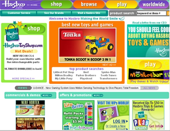
Figure 4-27 shows the main home page for Hasbro.com, the large toy manufacturer. Although flashy neon colors may work for Hasbro because of the products it sells, these colors can deter from the main objective for other websites. Can you determine by looking at Figure 4-27 what the designers of the site want visitors to do? The “Shop” feature, which might be one of the most important functions of the site, is crowded with too many competing elements.

Get Conversion Optimization now with the O’Reilly learning platform.
O’Reilly members experience books, live events, courses curated by job role, and more from O’Reilly and nearly 200 top publishers.

