Chapter 4. Page Elements
Introduction
From the most obvious design choices, such as selecting the appropriate typography and imagery, to those that are often overlooked, such as adjusting leading and color schemes, every decision affects the how the message in a web site is conveyed to the visitor.
This chapter covers page elements that help to Frame a web page like a frame for a painting. Page elements are items that affect the appearance of a web page, but aren’t necessarily thought of as comprising a web page’s design. For example, the appearance of the scrollbar is a page element.
By manipulating elements such as the margins and borders surrounding the contents of a web page, developers can effectively frame the content of the page without actually styling the content. Such simple changes can affect the page’s overall design in a profound way, or they can add a subtle detail that completes the design.
Eliminating Page Margins
Problem
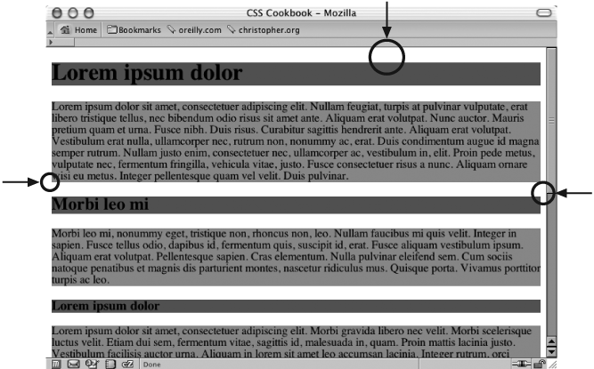
You want to get rid of the whitespace around the edges of a web page and between the browser chrome and the contents of the page (see Figure 4-1).
Solution
Set the value of the
margin and
padding properties for the html and body elements to zero:
html, body {
 margin: 0;
 padding: 0;
 position: absolute;
 top: 0;
 left: 0;
} 
Discussion
Setting the margin and padding properties of the body element to
0 helps create a
full-bleed effect—in other words, it eliminates the
whitespace around a web page (the units are unnecessary when specifying zero). Setting the
position to absolute and
the values for top and left to 0 helps remove the body margins in
Netscape Navigator 4.
However, depending on the content of the web page, the margin and padding properties may not be all you
need to change to get a full-bleed effect. Default properties on other elements can have
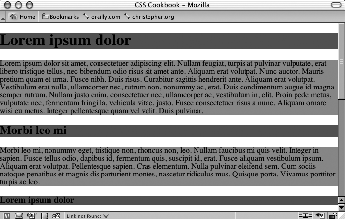
unexpected side effects when you attempt to change the page margin For example, if h1 is the body element’s first
child element, some unintended whitespace will appear above the headline and below the top of
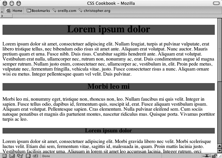
the browser’s viewport. Figure 4-2 shows
this undesired effect; the background color of the headings and paragraphs is gray so that you
can more clearly see the effect.
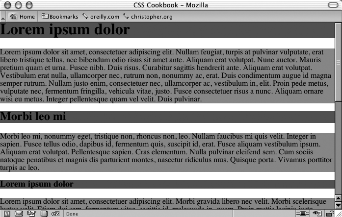
To ensure the full-bleed effect in this situation set the margin and padding of the
offending element (in this case, h1, h2, h3) to 0 as well as the body’s. This
sets all the sides of the element’s padding to 0. If that
setup isn’t possible (for example, if you need to have a value at the bottom padding or
margin), set the margin-top and padding-top values to 0 to maintain the
full-bleed effect:
html, body {
 margin: 0;
 padding: 0;
 position: absolute;
 top: 0;
 left: 0;
}
h1, h2, h3 {
 margin-top: 0;
 padding-top: 0;
 background-color: #666;
}
p {
 background-color: #999;
} 
As you can see in Figure 4-3, this accomplishes the full-bleed effect. Notice how the gray background color of the first heading now touches the top of the browser’s viewport.
See Also
Recipe 9.1 for writing one-column layouts by setting
the margin and padding
properties to a value other than 0.
Coloring the Scrollbar
Problem
You want to adjust the color of the scroll bar on a browser’s viewport, or the window on the browser.
Solution
Use the properties that manipulate scroll bar colors in browsers that support it:
body,html {
 scrollbar-face-color: #99ccff;
 scrollbar-shadow-color: #ccccff;
 scrollbar-highlight-color: #ccccff;
 scrollbar-3dlight-color: #99ccff;
 scrollbar-darkshadow-color: #ccccff;
 scrollbar-track-color: #ccccff;
 scrollbar-arrow-color: #000033;
}
Warning
Because these properties aren’t part of the W3C recommendations for CSS, browser vendors don’t have to put in support for these properties. This solution works only on the KDE Konqueror browser and on Internet Explorer 5.5+ for Windows. Other browsers will simply skip over the rules. However these rules won’t be validated by services such as http://jigsaw.w3.org/css-validator/validator-uri.html.
Discussion
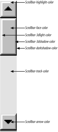
Although you may think of a scroll bar as a simple tool, it’s actually composed of several widgets that create a controllable 3D object. Figure 4-4 spotlights the different properties of a scroll bar. As you can see, to create a truly different color scheme for the scroll bar, you must alter the value of seven properties.
In addition to adjusting the scrollbar of the browser viewport, you also can adjust the
colors of the scroll bar in the textarea for a web form,
framesets, iframes, and
generally anything with a scroll bar:
.highlight {
 scrollbar-face-color: #99ccff;
 scrollbar-shadow-color: #ccccff;
 scrollbar-highlight-color: #ccccff;
 scrollbar-3dlight-color: #99ccff;
 scrollbar-darkshadow-color: #ccccff;
 scrollbar-track-color: #ccccff;
 scrollbar-arrow-color: #000033;
}

<form>
 <textarea class="highlight"></textarea>
</form>
When rendering a page that doesn’t contain a valid DOCTYPE, Internet Explorer for Windows
experiences what is known as quirks (nonstandard behavior) mode and looks
for the scrollbar properties in the body selector. When the
page contains a valid DOCTYPE, Internet Explorer for Windows is in standards mode and it obeys
the html selector. So, just in case the web document’s
DOCTYPE may change, it’s best to ensure that the
body and html selectors
are grouped and applied in one CSS rule:
html .highlight, body .highlight {
 scrollbar-face-color: #99ccff;
 scrollbar-shadow-color: #ccccff;
 scrollbar-highlight-color: #ccccff;
 scrollbar-3dlight-color: #99ccff;
 scrollbar-darkshadow-color: #ccccff;
 scrollbar-track-color: #ccccff;
 scrollbar-arrow-color: #000033;
}
See Also
The MSDN Scrollbar Color Workshop at http://msdn.microsoft.com/workshop/samples/author/dhtml/refs/scrollbarColor.htm to pick colors for a custom scroll bar.
Techniques for Centering Elements on a Web Page
Problem
You want to center parts of a web page, as in Figure 4-5.
Solution
To center text in a block-level element, use the
text-align property:
h1, h2, h3 {
 text-align: center;
}
Discussion
By using text-align, you can center text inside
block-level elements. However, in this example, the heading takes up the entire width of the
body element, and if you don’t apply a background color to
the element, you probably won’t even notice that this is happening. The gray background color
in Figure 4-6 shows the actual width of
the centered elements.
An alternative approach is to use margins to center text within its container:
h1, h2, h3 {
 margin-left: auto;
 margin-right: auto;
}
When you set the margin-left and margin-right properties to auto,
you center the element inside its parent element. However, older but still popular browsers
won’t render the presentation correctly. So, workarounds are needed for individual situations.
Tables
To center a table, place the table as the child of a div element:
<div class="center">
 <table width="50%" border="1" cellpadding="30">
  <tr>
   <td>This is the first cell</td>
   <td>This is the second cell</td>
  </tr>
  <tr>
   <td>This is the third cell, it's under the first cell</td>
   <td>This is the fourth cell, it's under the second cell.</td>
  </tr>
 </table>
</div>
Then write the following CSS rule:
.center {
  text-align: center;
}
.center table {
 width: 50%;
 margin-left: auto;
 margin-right: auto;
 text-align: left;
}
Although setting both sides of the margin to auto
works in newer generations of browsers, it doesn’t work in Internet Explorer 5 for Windows or
Netscape Navigator 4. To catch those two browsers and tell them to “do the right thing,” the
center class selector uses the text-align technique. However, if that were all you did, the contents of the table
cells would be centered as well. To counteract that effect, use a descendent selector,
.center table, to align the contents in the table cell
elements.
Note that if you use th elements in an HTML table, the
content inside those cells is centered by default. Setting the text-align property to a value of left in the
descendent selector .center table doesn’t counter that
effect. To left-align the content inside th, use this CSS
rule:
th {
 text-align: left;
}
To save a line or two of CSS code, you may want to incorporate the shorthand version of
the margin property, as shown here (although this works in
most browsers, it fails in Internet Explorer 5 for Macintosh):
.center table {
 margin: 0 auto;
 text-align: left;
}
Images
If you want to center an image, wrap a div element
around the img element first. This technique is required
because an img element, like em and strong, is inline. It rests in the flow
of the web page instead of marking off space like the p or
blockquote block-level elements do. The markup looks like
this:
<div class="flagicon"><img src="flag.gif" alt="Flag" width="160"
height="60" /></div>
And the CSS rule looks like this:
.flagicon {
 text-align: center;
}
To center elements with fixed widths, such as images, first set the value of the parent’s
padding-left property to 50%. Then determine half of the width of the element you are centering and set it
as a negative value in the margin-left property. That
prevents the element’s left side from resting on the 50% line caused by its padding and makes
it slide into the middle of the page. The markup for an image in a web page using this
technique looks something like this:
<img src="wolf.jpg" width="256" height="192" alt="Photo of wolf.">
The CSS rule to produce the result you see in Figure 4-7 looks like this:
body {
 padding-left: 50%;
}
img {
 /* equal to the negative of half its width */
 margin-left: -138px;
} 
Another way to center an image, but not as backwards compatible for Internet Explorer 5 for Windows, is to change the display and margin properties of the image.
First, apply a class attribute to the image that is
going to be centered:
<img src="flag.gif" alt="Flag" width="160" height="60"
class="blockimg" />
Then create a CSS rule that positions the image in the center:
.blockimg {
 display: block;
 margin: 0 auto;
}
Vertical centering
With the element
centered
horizontally, you can take this technique one step further and center the image (or any other
element) vertically as well. The difference with this method is that it uses the position property to make this work. The markup is the same as that
used for the image element in the previous example, but this time the CSS rule is for just one
selector (see Figure 4-8):
img {
 position: absolute;
 top: 50%;
 left: 50%;
 margin-top: -96px;
 margin-left: -138px;
 height: 192px;
 width: 256px;
}
With absolute positioning, you take the element out of the normal flow of the document and place it wherever you want.
If you want to center both text and an image (or other images) instead of just one image,
enclose all the content with a div element:
<div id="centerFrame">
 <p>Epsum factorial non deposit quid pro quo hic escorol. Olypian
quarrels et gorilla congolium sic ad nauseum. Souvlaki ignitus
carborundum e pluribus unum. Defacto lingo est igpay atinlay.</p>
 <img src="wolf.jpg" width="256" height="192" alt="Photo of
wolf." />
</div>
Then in the CSS rule, remove the height property and
adjust the negative value of the top margin to compensate for the additional elements on the
page:
#centerFrame  {
 position: absolute;
 top: 50%;
 left: 50%;
 /* adjust negative value until content is centered */
 margin-top: -150px;
 margin-left: -138px;
 width: 256px;
}
Keep the amount of content that you want centered short. This solution is only going to roughly center the text and the images because the text will render at different heights on different computers. If you have numerous images and long amounts of HTML text, users with small resolutions will have to scroll the page to see your centered content.
See Also
Chapter 9 for information on multicolumn
layouts, which deal with the position of elements in a web page; the CSS 2.1 specification for
text-align, online at http://www.w3.org/TR/CSS21/text.html#propdef-text-align.
Placing a Page Border
Problem
You want to place a visual frame or border around a web page, as in Figure 4-9.
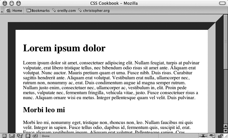
Solution
Use the
border property on the body element:
body {
 margin: 0;
 padding: 1.5em;
 border: 50px #666 ridge;
}
Discussion
The border property is a shorthand property, in that it enables you to set the width,
color, and style of the border around an element in one step instead of three. If you didn’t
use this shorthand property in the preceding solution, you would have to replace the line that
reads border: 50px
#666
ridge; with the following three lines:
border-width: 50px;
border-color: #666;
border-style: ridge;
You can create a framing effect with other styles as well, such as dotted, dashed, solid, double, groove, inset, and outset (see Figure 4-10).
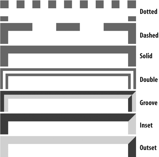
Note that groove style is the inverse of the shades of shadow as seen in the solution,
which uses the ridge value.
Warning
The only browser incompatibilities to worry about are in Internet Explorer 5 for Macintosh and Internet Explorer for Windows, where the dotted style appears as aliased circles, whereas in Netscape 6+, Firefox, Mozilla, and Safari, the dotted style appears as blocks.
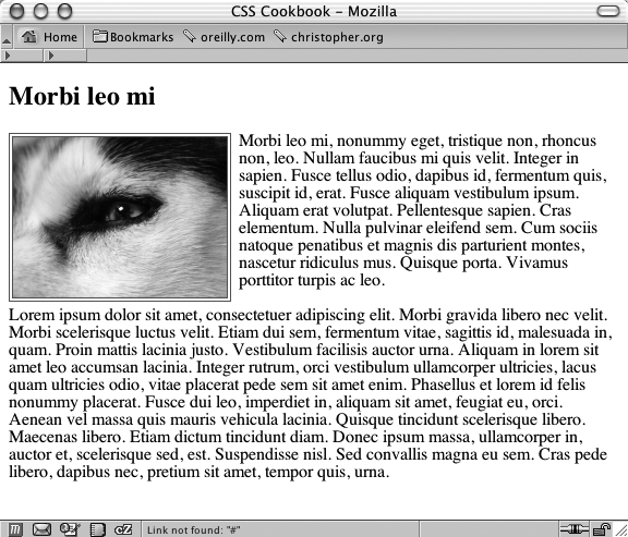
You also can place a stylized border on images as well. Instead of having a default solid line, try experimenting in your designs with groove or double borders like the one in Figure 4-11:
img.left {
 float: left;
 margin-right: 7px;
 margin-bottom: 3px;
 border: 4px double #666;
} 
See Also
Recipe 2.15 for creating pull quotes with different border styles.
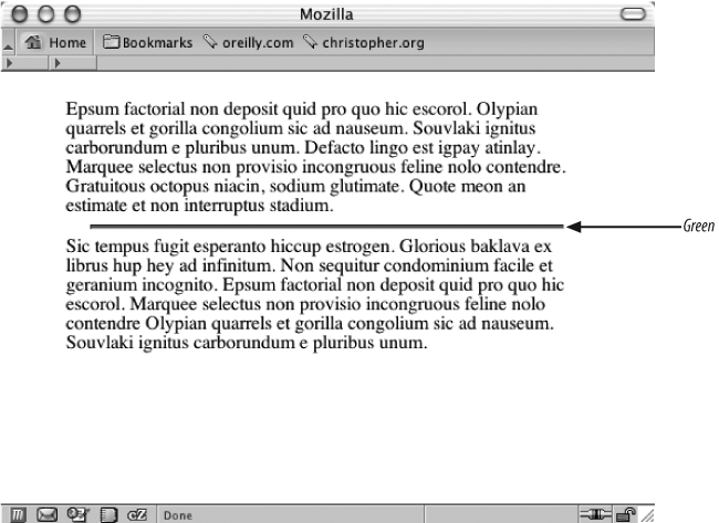
Customizing a Horizontal Rule
Problem
You want to change the look of a horizontal rule from the solid line in Figure 4-12 to something more interesting, for example the small centered rectangle in Figure 4-13.
Solution
Use a mixture of CSS properties on the hr element to
obtain a desired effect:
hr {
 margin-left: auto;
 margin-right: auto;
 margin-top: 1.25em;
 margin-bottom: 1.25em;
 width: 10px;
 height: 10px;
 background-color: #777;
}
Discussion
Before HTML 4.0, the presentation of horizontal rules could be manipulated through a set
of four attributes: align, width, size, and noshade. Since HTML is intended to mark up content and not the look of the content,
those values are no longer a part of the HTML specification. (Browser vendors may support the
values, but your mileage will vary.) With CSS rules controlling the presentation, you have far
greater control over the appearance of horizontal rules.
For example, you can set the height as well as the
width properties for horizontal rules through CSS:
hr {
 width: 80%;
 height: 3px;
 margin-left: auto;
 margin-right: auto;
}
Setting the margin-left and margin-right to auto centers the horizontal rule
in the web page for Safari, although it’s not required for Mozilla, Firefox, Navigator, and
Internet Explorer for Windows.
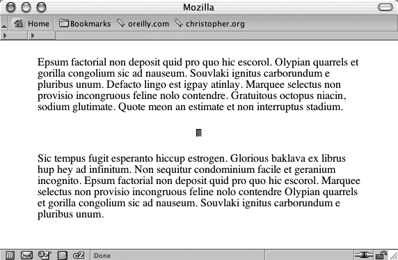
If you want to style an hr element with color (see
Figure 4-14), use the following code:
hr {
 color: green;
 background-color: green;
 width: 80%;
 height: 3px;
 margin-left: auto;
 margin-right: auto;
} 
The first property, color, is understood by Internet
Explorer for Windows while Safari, Mozilla, Firefox, and Netscape Navigator 6+ pick up the
second property, background-color.
To place an image instead of a horizontal bar, use the
background-image property:
hr {
 background-image: url(hr-decoration.gif);
 background-repeat: no-repeat;
 border: none;
 width: 76px;
 height: 25px;
 margin-left: auto;
 margin-right: auto;
}
However, Internet Explorer for Windows renders a border around the hr element in Figure 4-15 that can’t be removed through CSS properties.
See Also
The HTML 4.01 specification for
hr elements at http://www.w3.org/TR/html401/present/graphics.html#edef-HR; an
overview of styling an hr element, online at http://www.sovavsiti.cz/css/hr.html; another example
of refining the presentation of horizontal rules at http://www.sidesh0w.com/weblog/2004/03/17/sexily_styling_horizontal_rules.html.
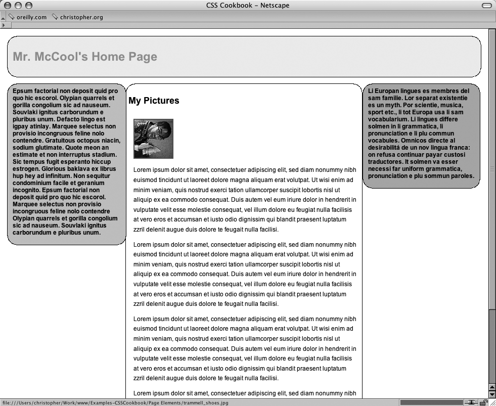
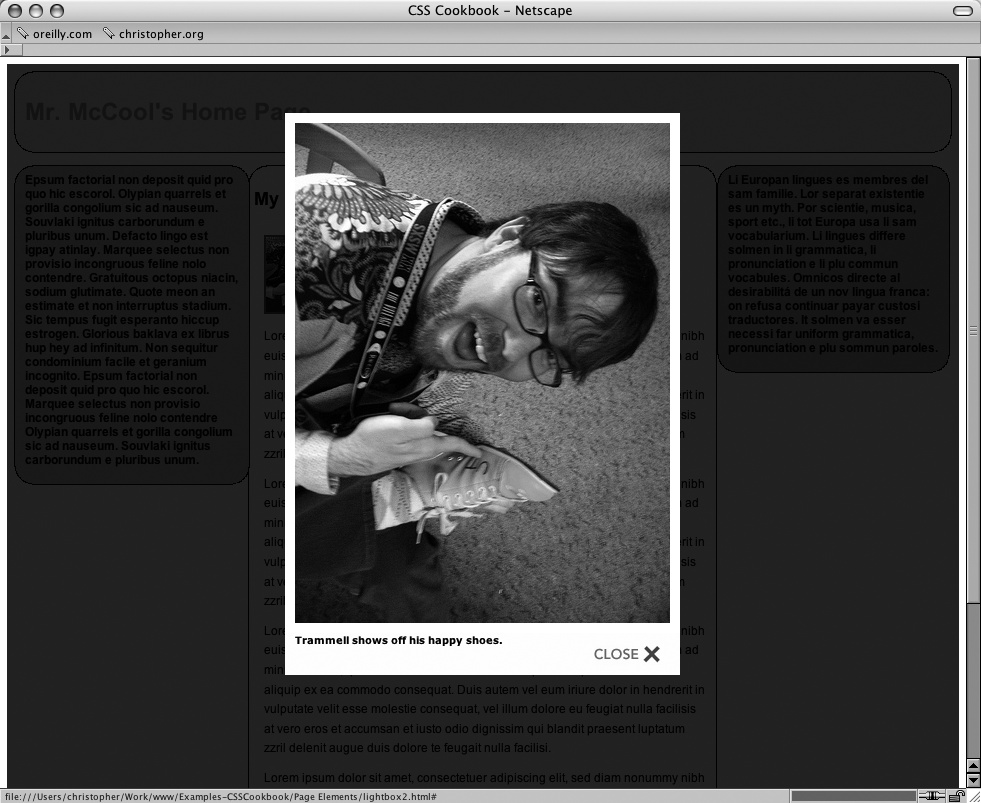
Adding a Lightbox
Problem
You want to overlay images on top of a current web page (see Figure 4-16) without popping a new browser window.
Solution
Download the source code the lightbox effect from http://www.huddletogether.com/projects/lightbox2/#download.
Along with the Prototype Framework and Scriptaculous Effects JavaScript libraries, include a specialized JavaScript for overlaying images:
<title>Mr. McCool's Homepage</title>
<!-- Structure for Lightbox effect -->
<script type="text/javascript" src="prototype.js"></script>
<script type="text/javascript" src="scriptaculous.js?load=effects"></script>
<!-- Script for Lightbox -->
<script type="text/javascript" src="lightbox.js"></script>
Next, link to style sheet that renders the look-and-feel of the overlay effect:
<title>Mr. McCool's Homepage</title>
<script type="text/javascript" src="prototype.js"></script>
<script type="text/javascript" src="scriptaculous.js?load=effects"></script>
<script type="text/javascript" src="lightbox.js"></script>
<link rel="stylesheet" href="lightbox.css" type="text/css" media="screen" />
Within the web page content, include a link to an image making sure to include a rel attribute with a value of lightbox. A common link example would be to wrap a link around a thumbnail image:
<a href="trammell_shoes.jpg" rel="lightbox" title="Trammell shows off
his happy shoes."><img src="trammell_shoes_tn.jpg" alt="Mark Trammel
is happy with his shoes." /></a>
Clicking on the link activates the lightbox effect, as shown in Figure 4-17.
Discussion
The lightbox effect is built on two core pieces: the Prototype JavaScript Framework and Scriptaculous.
Prototype creates a more object-oriented framework that allows developers to quickly build web-based applications based on JavaScript. For more information about Prototype, see the official site http://prototype.conio.net/.
Scriptaculous is a collection of JavaScript libraries. When used in conjunction of Prototype, Scriptaculous allows developers to build dynamic, Asynchronous JavaScript + XML (Ajax) interactions. For further information on Scriptaculous, see http://script.aculo.us/.
With the JavaScript foundations in place, web developer Lokesh Dhakar (see http://www.huddletogether.com/) developed a clever image viewer that displays a full-size image without having to leave the web page that displays the thumbnails.
Setting up the files
When you download and link the JavaScript files and a style sheet to a web page, make sure the files are properly linked. For example, if you place JavaScript and a style sheet in a separate folder locations, make sure the code reflect their locations:
<script type="text/javascript" src="/_assets/js/prototype.js"></script>
<script type="text/javascript" src="/_assets/js/scriptaculous.js?load=effects">
</script>
<script type="text/javascript" src="/_assets/js/lightbox.js"></script>
<link rel="stylesheet" href="/_assets/css/lightbox.css" type="text/css" media="screen" />
In the lightbox JavaScript file, also make sure the locations of the images are correct. If you need to edit the location of the images, look towards the top of the JavaScript file for the following lines to modify:
var fileLoadingImage = "/_assets/img/loading.gif";
var fileBottomNavCloseImage = "/_assets/img/closelabel.gif";
The style sheet for the lightbox utilizes the background image property three times. Make sure those images referenced in the properties are also set to the correct locations:
#prevLink, #nextLink {
 width: 49%;
 height: 100%;
/* Trick IE into showing hover */
 background: transparent url(/_assets/img/blank.gif) no-repeat;
 display: block;
}
#prevLink:hover, #prevLink:visited:hover {
 background: url(/_assets/img/prevlabel.gif) left 15% no-repeat;
}
#nextLink:hover, #nextLink:visited:hover {
 background: url(/_assets/img/nextlabel.gif) right 15% no-repeat;
}
Making a slideshow
In addition to showcasing one image at a time, the lightbox can be set up to display a slideshow like the one in Figure 4-18.
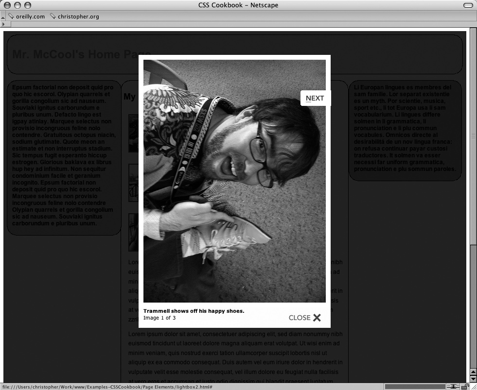
In order to achieve this affect, modify the value of the rel element by using right-angle brackets after lightbox and inserting a gallery name. In the code example, I used the gallery name
austin as I took the pictures in Austin, TX:
<ul> <li><a href="trammell_shoes.jpg"rel="lightbox[austin]"title="Trammell shows off his happy shoes."><img src="trammell_shoes_tn.jpg" alt="Mark Trammel is happy with his shoes." /></a></li> <li><a href="molly_andy.jpg"rel="lightbox[austin]"title="Molly and Andy pose for a shot."><img src="molly_andy_tn.jpg" alt="Molly and Andy pose for a shot." /></a></li> <li><a href="msjen.jpg"rel="lightbox[austin]"title="Ms. Jen at breakfast."><img src="msjen_tn.jpg" alt="Ms. Jen at breakfast." /></a></li> </ul>
The gallery name needs to be the same in order for related images to be put into the same slideshow presentation.
Known browser issues
Since the lightbox effect is built on Prototype framework, the lightbox effect’s support in browser is based on how many browsers Prototype supports. As of this writing the following browsers support Prototype:
Microsoft Internet Explorer for Windows 6+
Mozilla Firefox 1.0+
Mozilla 1.7+
Apple Safari 1.2+
The lightbox effect degrades gracefully. If a visitor’s browser does not support the
lightbox effect, the browser will follow the value of the href attribute.
<a href="trammell_shoes.jpg" rel="lightbox" title="Trammell shows off
his happy shoes."><img src="trammell_shoes_tn.jpg" alt="Mark Trammel
is happy with his shoes." /></a>
In this example, the browser pulls up the file trammel_shoes.jpg.
See Also
An overview of the Prototype JavaScript Library at http://blogs.ebusiness-apps.com/jordan/pages/Prototype%20Library%20Info.htm; an overview of Ajax at http://adaptivepath.com/publications/essays/archives/000385.php.
Get CSS Cookbook, 2nd Edition now with the O’Reilly learning platform.
O’Reilly members experience books, live events, courses curated by job role, and more from O’Reilly and nearly 200 top publishers.

