Chapter 4. Values and Units
In this chapter, we’ll tackle the elements that are the basis for almost everything you can do with CSS: the units that affect the colors, distances, and sizes of a whole host of properties. Without units, you couldn’t declare that a paragraph should be purple, or that an image should have 10 pixels of blank space around it, or that a heading’s text should be a certain size. By understanding the concepts put forth here, you’ll be able to learn and use the rest of CSS much more quickly.
Numbers
There are two types of numbers in CSS: integers (“whole” numbers) and reals fractional numbers). These number types serve primarily as the basis for other value types, but, in a few instances, raw numbers can be used as a value for a property.
In CSS2.1, a real number is defined as an integer that is optionally followed by a decimal and fractional numbers. Therefore, the following are all valid number values: 15.5, -270.00004, and 5. Both integers and reals may be either positive or negative, although properties can (and often do) restrict the range of numbers they will accept.
Percentages
A percentage value is a calculated real number followed by a
percentage sign (%). Percentage values are nearly
always relative to another value, which can be anything, including the value of another
property of the same element, a value inherited from the parent element, or a value of
an ancestor element. Any property that accepts percentage values will define any restrictions on the range of allowed
percentage values, and will also define the degree to which the percentage is relatively
calculated.
Color
One of the first questions every starting web author
asks is, “How do I set colors on my page?” Under HTML, you have two choices: you could
use one of a small number of colors with names, such as red or purple, or employ a vaguely cryptic
method using hexadecimal codes. Both of these methods for describing colors remain in
CSS, along with some other—and, I think, more intuitive—methods.
Named Colors
Assuming that you’re content to pick from a small, basic set of colors, the easiest method is simply to use the name of the color you want. CSS calls these color choices, logically enough, named colors.
Contrary to what some browser makers might have you believe, you have a limited palette of valid named-color keywords. For example, you’re not going to be able to choose “mother-of-pearl” because it isn’t a defined color. As of CSS2.1, the CSS specification defines 17 color names. These are the 16 colors defined in HTML 4.01 plus orange:
aqua
|
olive
|
black
|
orange
|
blue
|
purple
|
fuchsia
|
red
|
gray
|
silver
|
green
|
teal
|
lime
|
white
|
maroon
|
yellow
|
navy
|
So, let’s say you want all first-level headings to be maroon. The best declaration would be:
h1 {color: maroon;}Simple and straightforward, isn’t it? Figure 4-1 shows a few more examples:
h1 {color: gray;}
h2 {color: silver;}
h3 {color: black;}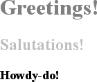
Of course, you’ve probably seen (and maybe even used) color names other than the ones listed earlier. For example, if you specify:
h1 {color: lightgreen;}It’s likely that all of your h1 elements will
indeed turn light green, despite lightgreen not
being on the list of named colors in CSS2.1. It works because most web browsers
recognize as many as 140 color names, including the standard 17. These extra colors are
defined in the CSS3 Color specification, which is not covered in this book. The 17
standard colors (as of this writing) are likely to be more reliable than the longer
list of 140 or so colors because the color values for these 17 are defined by CSS2.1.
The extended list of 140 colors given in CSS3 is based on the standard X11 RGB values
that have been in use for decades, so they are likely to be very well supported.
Fortunately, there are more detailed and precise ways to specify colors in CSS. The advantage is that, with these methods, you can specify any color in the color spectrum, not just 17 (or 140) named colors.
Colors by RGB
Computers create colors by combining different levels of red, green, and blue, a combination that is often referred to as RGB color. In fact, if you were to open up an old CRT computer monitor and dig far enough into the projection tube, you would discover three “guns.” (I don’t recommend trying to find the guns, though, if you’re worried about voiding the monitor’s warranty.) These guns shoot out electron beams at varying intensities at each point on the screen. Then, the brightness of each beam combines at those points on your screen, forming all of the colors you see. Each point is known as a pixel, which is a term we’ll return to later in this chapter. Even though most monitors these days don’t use electron guns, their color output is still based on RGB mixtures.
Given the way colors are created on a monitor, it makes sense that you should have direct access to those colors, determining your own mixture of the three for maximum control. That solution is complex, but possible, and the payoffs are worth it because there are very few limits on which colors you can produce. There are four ways to affect color in this manner.
Functional RGB colors
There are two color value types that use
functional RGB notation
as opposed to
hexadecimal notation. The generic syntax for this type of color value is rgb(color), where color is expressed using a triplet of either percentages or integers.
The percentage values can be in the range 0%–100%, and the integers can be
in the range 0–255.
Thus, to specify white and black, respectively, using percentage notation, the values would be:
rgb(100%,100%,100%)
rgb(0%,0%,0%)
Using the integer-triplet notation, the same colors would be represented as:
rgb(255,255,255)
rgb(0,0,0)
Assume
you want your h1 elements to be a shade of red
that lies between the values for red and maroon. red is equivalent to rgb(100%,0%,0%), whereas maroon is
equal to (50%,0%,0%). To get a color between
those two, you might try
this:
h1 {color: rgb(75%,0%,0%);}This
makes the red component of the color lighter than maroon, but darker than red. If, on
the other hand, you want to create a pale red color, you would raise the green and
blue
levels:
h1 {color: rgb(75%,50%,50%);}The closest equivalent color using integer-triplet notation is:
h1 {color: rgb(191,127,127);}The easiest way to visualize how these values correspond to color is to create a table of gray values. Besides, grayscale printing is all we can afford for this book, so that’s what we’ll do in Figure 4-2:
p.one {color: rgb(0%,0%,0%);}
p.two {color: rgb(20%,20%,20%);}
p.three {color: rgb(40%,40%,40%);}
p.four {color: rgb(60%,60%,60%);}
p.five {color: rgb(80%,80%,80%);}
p.six {color: rgb(0,0,0);}
p.seven {color: rgb(51,51,51);}
p.eight {color: rgb(102,102,102);}
p.nine {color: rgb(153,153,153);}
p.ten {color: rgb(204,204,204);}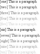
Of course, since we’re dealing in shades of gray, all three RGB values
are the same in each statement. If any one of them were different from the others,
then a color would start to emerge. If, for example, rgb(50%,50%,50%) were modified to be rgb(50%,50%,60%), the result would be a medium-dark color with just
a hint of blue.
It is possible to use fractional numbers in percentage notation. You might, for some reason, want to specify that a color be exactly 25.5 percent red, 40 percent green, and 98.6 percent blue:
h2 {color: rgb(25.5%,40%,98.6%);}A
user agent that ignores the decimal points (and some do) should round the value to
the nearest integer, resulting in a declared value of rgb(26%,40%,99%). In integer triplets, of course, you are limited to
integers.
Values that fall outside the allowed range for each notation
are “clipped” to the nearest range edge, meaning that a value that is greater than
100% or less than 0% will default to those allowed extremes. Thus, the following
declarations would be treated as if they were the values indicated in the
comments:
P.one {color: rgb(300%,4200%,110%);}   /*  100%,100%,100%  */
P.two {color: rgb(0%,-40%,-5000%);}   /*  0%,0%,0%  */
p.three {color: rgb(42,444,-13);}    /* 42,255,0  */
Conversion
between percentages and integers may seem arbitrary, but there’s no need to guess
at the integer you want—there’s a simple formula for calculating them. If you know
the percentages for each of the RGB levels you want, then you need only apply them
to the number 255 to get the resulting values. Let’s say you have a color of 25
percent red, 37.5 percent green, and 60 percent blue. Multiply each of these
percentages by 255, and you get 63.75, 95.625, and 153. Round these values to the
nearest integers, and voilà: rgb(64,96,153).
Of course, if you already know the percentage values, there isn’t much point in converting them into integers. Integer notation is more useful for people who use programs such as Photoshop, which can display integer values in the “Info” dialog, or for those who are so familiar with the technical details of color generation that they normally think in values of 0–255. Then again, such people are probably more familiar with thinking in hexadecimal notation, which is our next topic.
Hexadecimal RGB colors
CSS allows you to define a color using the same hexadecimal color notation so familiar to HTML web authors:
h1 {color: #FF0000;}   /* set H1s to red */
h2 {color: #903BC0;}   /* set H2s to a dusky purple */
h3 {color: #000000;}   /* set H3s to black */
h4 {color: #808080;}   /* set H4s to medium gray */
Computers have been using “hex notation” for quite some time now, and programmers are typically either trained in its use or pick it up through experience. Their familiarity with hexadecimal notation likely led to its use in setting colors in old-school HTML. The practice was simply carried over to CSS.
Here’s how it works: by stringing together three hexadecimal numbers in the
range 00 through FF, you can set a color. The generic syntax for this notation is
#RRGGBB. Note that there are no spaces,
commas, or other separators between the three numbers.
Hexadecimal notation is mathematically equivalent to the integer-pair notation
discussed in the previous section. For example, rgb(255,255,255) is precisely equivalent to #FFFFFF, and rgb(51,102,128) is
the same as #336680. Feel free to use whichever
notation you prefer—it will be rendered identically by most user agents. If you
have a calculator that converts between decimal and hexadecimal, making the jump
from one to the other should be pretty simple.
For hexadecimal numbers that are composed of three matched pairs of digits, CSS
permits a shortened notation. The generic syntax of this notation is #RGB:
h1 {color: #000;}   /* set H1s to black */
h2 {color: #666;}   /* set H2s to dark gray */
h3 {color: #FFF;}   /* set H3s to white */
As you can see from the markup, there are only three digits in each color
value. However, since hexadecimal numbers between 00 and FF need two digits each, and
you have only three total digits, how does this method work?
The answer is that the browser takes each digit and replicates it. Therefore,
#F00 is equivalent to #FF0000, #6FA
would be the same as #66FFAA, and #FFF would come out #FFFFFF, which is the same as white.
Obviously, not every color can be represented in this manner. Medium gray, for
example, would be written in standard hexadecimal notation as #808080. This cannot be expressed in shorthand; the closest equivalent
would be #888, which is the same as #888888.
Bringing the colors together
Table 4-1 presents an overview of
some of the colors we’ve discussed. These color keywords might not be recognized
by browsers and, therefore, they should be defined with either RGB or hex-pair
values (just to be safe). In addition, there are some shortened hexadecimal values
that do not appear at all. In these cases, the longer (six-digit) values cannot be
shortened because they do not replicate. For example, the value #880 expands to #888800, not #808000 (otherwise
known as olive). Therefore, there is no
shortened version of #808000, and the
appropriate entry in the table is blank.
|
Color |
Percentage |
Numeric |
Hexadecimal |
Short hex |
|
|
|
|
|
|
|
|
|
|
|
|
|
|
|
|
|
|
|
|
|
|
| |
|
|
|
|
|
|
|
|
|
|
|
|
|
|
|
|
|
|
|
|
|
|
|
|
|
|
|
|
| |
|
|
|
|
|
|
|
|
|
|
| |
|
|
|
|
| |
|
|
|
|
| |
|
|
|
|
| |
|
|
|
|
| |
|
|
|
|
| |
|
|
|
|
|
|
Web-safe colors
The “web-safe” colors are those colors that generally avoid dithering on
256-color computer systems. Web-safe colors can be expressed in multiples of the
RGB values 20% and 51, and the corresponding hex-pair value 33. Also, 0% or 0 is a safe value. So, if you use RGB percentages,
make all three values either 0% or a number
divisible by 20—for example, rgb(40%,100%,80%)
or rgb(60%,0%,0%). If you use RGB values on the
0–255 scale, the values should be either 0 or
divisible by 51, as in rgb(0,204,153) or rgb(255,0,102).
With hexadecimal notation, any triplet that uses the values 00, 33, 66, 99, CC, and FF is
considered to be web-safe. Examples are #669933, #00CC66, and #FF00FF. This means the shorthand hex values that are
web-safe are 0, 3, 6, 9, C, and F; therefore, #693, #0C6, and #F0F are
examples of web-safe colors.
Length Units
Many CSS properties, such as margins, depend on length measurements to properly display various page elements. It’s no surprise, then, that there are a number of ways to measure length in CSS.
All length units can be expressed as either positive
or negative numbers followed by a label (although some properties will accept only
positive numbers). You can also use real numbers—that is, numbers with decimal
fractions, such as 10.5 or 4.561. All length units are followed by a two-letter
abbreviation that represents the actual unit of length being specified, such as in (inches) or pt
(points). The only exception to this rule is a length of 0 (zero), which need not be followed by a unit.
These length units are divided into two types: absolute length units and relative length units.
Absolute Length Units
We’ll start with absolute units because they’re easiest to understand, despite the fact that they’re almost unusable in web design. The five types of absolute units are as follows:
-
Inches (
in) As you might expect, this notation refers to the inches you’d find on a ruler in the United States. (The fact that this unit is in the specification, even though almost the entire world uses the metric system, is an interesting insight into the pervasiveness of U.S. interests on the Internet—but let’s not get into virtual sociopolitical theory right now.)
-
Centimeters (
cm) Refers to the centimeters that you’d find on rulers the world over. There are 2.54 centimeters to an inch, and one centimeter equals 0.394 inches.
-
Millimeters (
mm) For those Americans who are metric-challenged, there are 10 millimeters to a centimeter, so an inch equals 25.4 millimeters, and a millimeter equals 0.0394 inches.
-
Points (
pt) Points are standard typographical measurements that have been used by printers and typesetters for decades and by word-processing programs for many years. Traditionally, there are 72 points to an inch (points were defined before widespread use of the metric system). Therefore, the capital letters of text set to 12 points should be one-sixth of an inch tall. For example,
p {font-size:18pt;}is equivalent top {font-size:0.25in;}.-
Picas (
pc) Picas are another typographical term. A pica is equivalent to 12 points, which means there are 6 picas to an inch. As just shown, the capital letters of text set to 1 pica should be one-sixth of an inch tall. For example,
p {font-size:1.5pc;}would set text to the same size as the example declarations found in the definition of points.
Of course, these units are really useful only if the browser knows all the details
of the monitor on which your page is displayed, the printer you’re using, or whatever
other user agent might apply. On a web browser, display is affected by the size of
the monitor and the resolution to which the
monitor is set—and there isn’t much that you, as the author, can do about these
factors. You can only hope that, if nothing else, the measurements will be consistent
in relation to each other—that is, that a setting of 1.0in will be twice as large as 0.5in,
as shown in Figure 4-3.
Working with absolute lengths
If a monitor’s resolution is set to 1,024 pixels wide by 768 pixels tall, its screen size is exactly 14.22 inches wide by 10.67 inches tall, and it is filled entirely by the display area, then each pixel will be 1/72 of an inch wide and tall. As you might guess, this scenario is a very, very rare occurrence (have you ever seen a monitor with those dimensions?). So, on most monitors, the actual number of pixels per inch (ppi) is higher than 72—sometimes much higher, up to 120 ppi and beyond.
As a Windows user, you might be able to set your display driver to make the display of elements correspond correctly to real-world measurements. To try, click Start → Settings → Control Panel. In the Control Panel, double-click Display. Click the Settings tab, and click Advanced to reveal a dialog box (which may differ on each PC). You should see a section labeled Font Size; select Other, and then hold a ruler up to the screen and move the slider until the onscreen ruler matches the physical ruler. Click OK until you’re free of dialog boxes, and you’re set.
If you’re a Mac Classic user, there’s no
place to set this information in the operating system—the Mac Classic OS (that is,
any version previous to OS X) makes an assumption about the relationship between
on-screen pixels and absolute measurements by declaring your monitor to have 72
pixels to the inch. This assumption is totally wrong, but it’s built into the
operating system, and therefore pretty much unavoidable. As a result, on many
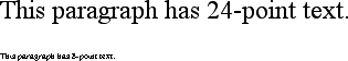
Classic Mac-based web browsers, any point value will be equivalent to the same
length in pixels: 24pt text will be 24 pixels
tall, and 8pt text will be 8 pixels tall. This
is, unfortunately, slightly too small to be legible. Figure 4-4 illustrates the
problem.
In OS X, the built-in assumed ppi value is closer to Windows: 96ppi. This doesn’t make it any more correct, but it’s at least consistent with Windows machines.
The Classic Mac display problem is an excellent example of why points should be strenuously avoided when designing for the Web. Ems, percentages, and even pixels are all preferable to points where browser display is concerned.
Tip
Beginning with Internet Explorer 5 for Macintosh and Gecko-based browsers such as Netscape 6+, the browser itself contains a preference setting for setting ppi values. You can pick the standard Macintosh ratio of 72ppi, the common Windows ratio of 96ppi, or a value that matches your monitor’s ppi ratio. This last option works similarly to the Windows setting just described, where you use a sliding scale to compare to a ruler and thus get an exact match between your monitor and physical-world distances.
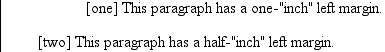
Despite all we’ve seen, let’s make the highly suspect assumption that
your computer knows enough about its display system to accurately reproduce
real-world measurements. In that case, you could make sure every paragraph has a
top margin of half an inch by declaring p
{margin-top: 0.5in;}. Regardless of
font size or any other circumstances, a paragraph will have a half-inch top
margin.
Absolute units are much more useful in defining style sheets for printed documents, where measuring things in terms of inches, points, and picas is common. As you’ve seen, attempting to use absolute measurements in web design is perilous at best, so let’s turn to some more useful units of measure.
Relative Length Units
Relative units are so called because they are measured in relation to other things. The actual (or absolute) distance they measure can change due to factors beyond their control, such as screen resolution, the width of the viewing area, the user’s preference settings, and a whole host of other things. In addition, for some relative units, their size is almost always relative to the element that uses them and will thus change from element to element.
There are three relative length units:
em, ex, and
px. The first two stand for “em-height” and
“x-height,” which are common typographical measurements; however, in CSS, they have
meanings you might not expect if you are familiar with typography. The last type of
length is px, which stands for “pixels.” A pixel
is one of the dots you can see on your computer’s monitor if you look closely enough.
This value is defined as relative because it depends on the resolution of the display
device, a subject we’ll soon cover.
em and ex units
First, however, let’s consider em and
ex. In CSS, one “em” is defined to be the
value of font-size for a given font. If the
font-size of an element is 14 pixels, then
for that element, 1em is equal to 14 pixels.
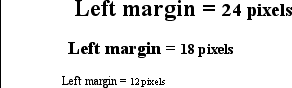
Obviously, this value can change from element to element. For example, let’s
say you have an h1 with a font size of 24
pixels, an h2 element with a font size of 18
pixels, and a paragraph with a font size of 12 pixels. If you set the left margin
of all three at 1em, they will have left
margins of 24 pixels, 18 pixels, and 12 pixels, respectively:
h1 {font-size: 24px;}
h2 {font-size: 18px;}
p {font-size: 12px;}
h1, h2, p {margin-left: 1em;}
small {font-size: 0.8em;}

<h1>Left margin = <small>24 pixels</small></h1>
<h2>Left margin = <small>18 pixels</small></h2>
<p>Left margin = <small>12 pixels</small></p>
When setting the size of the font, on the other hand, the value of em is relative to the font size of the parent
element, as illustrated by Figure 4-5.
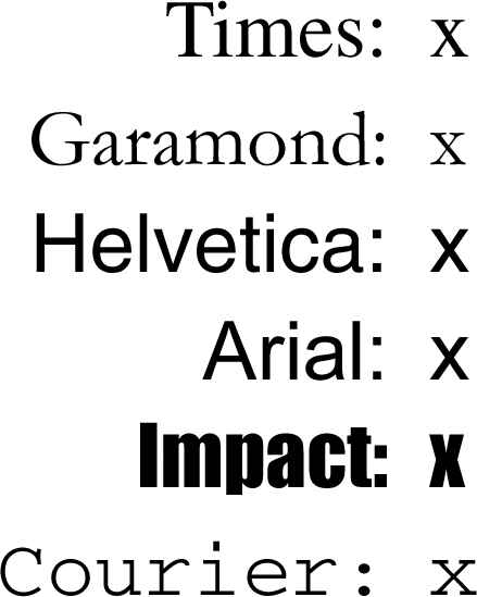
ex, on the other hand, refers to the height of
a lowercase x in the font being used. Therefore, if you have
two paragraphs in which the text is 24 points in size, but each paragraph uses a
different font, then the value of ex could be
different for each paragraph. This is because different fonts have different
heights for x, as you can see in Figure 4-6. Even though the examples use
24-point text—and therefore, each example’s em
value is 24 points—the x-height for each is different.
Practical issues with em and ex
Of course, everything I’ve just explained is completely
theoretical. I’ve outlined what is supposed to happen, but in
practice, many user agents get their value for ex by taking the value of em and
dividing it in half. Why? Apparently, most fonts don’t have the value of their
ex height built-in, and it’s a very
difficult thing to compute. Since most fonts have lowercase letters that are about
half as tall as uppercase letters, it’s a convenient fiction to assume that
1ex is equivalent to 0.5em.
A few browsers, including Internet Explorer 5 for Mac, actually attempt to
determine the x-height of a given font by internally rendering a lowercase
x and counting pixels to determine its height compared to
that of the font-size value used to create the
character. This is not a perfect method, but it’s much better than simply making
1ex equal to 0.5em. We CSS practitioners can hope that, as time goes on, more user
agents will start using real values for ex and
the half-em shortcut will fade into the past.
Pixel lengths
On the face of things, pixels are straightforward. If you look at a monitor closely enough, you can see that it’s broken up into a grid of tiny little boxes. Each box is a pixel. If you define an element to be a certain number of pixels tall and wide, as in the following markup:
<p>
The following image is 20 pixels tall and wide: <img src="test.gif"
  style="width: 20px; height: 20px;" alt="" />
</p>
then it follows that the element will be that many monitor elements tall and wide, as shown in Figure 4-7.
Unfortunately, there is a potential drawback to using pixels. If you
set font sizes in pixels, then users of Internet Explorer for Windows previous to
IE7 cannot resize the text using the Text Size menu in their browser. This can be
a problem if your text is too small for a user to comfortably read. If you use
more flexible measurements, such as em, the
user can resize text. (If you’re exceedingly protective of your design, you might
call that a drawback, of course.)
On the other hand, pixel measurements are perfect for expressing the size of images, which are already a certain number of pixels tall and wide. In fact, the only time you would not want pixels to express image size is if you want them scaled along with the size of the text. This is an admirable and occasionally useful approach, and one that would really make sense if you were using vector-based images instead of pixel-based images. (With the adoption of Scalable Vector Graphics, look for more on this in the future.)
Pixel theory
So why are pixels defined as relative lengths? I’ve explained that the tiny boxes of color in a monitor are pixels. However, how many of those boxes equals one inch? This may seem like a non sequitur, but bear with me for a moment.
In its discussion of pixels, the CSS specification recommends that in cases where a display type is significantly different than 96ppi, user agents should scale pixel measurements to a “reference pixel.” CSS2 recommended 90ppi as the reference pixel, but CSS2.1 recommends 96ppi—a measurement common to Windows machines and adopted by modern Macintosh browsers such as Safari.
In general, if you declare
something like font-size: 18px, a web browser will almost certainly use actual
pixels on your monitor—after all, they’re already there—but with other display
devices, like printers, the user agent will have to rescale pixel lengths to
something more sensible. In other words, the printing code has to figure out how
many dots there are in a pixel, and to do so, it may use the 96ppi reference
pixel.
Warning
One example of problems with pixel measurements can be found in an early
CSS1 implementation. In Internet Explorer 3.x, when a document was printed, IE3
assumed that 18px was the same as 18 dots,
which on a 600dpi printer works out to be 18/600, or 3/100, of an inch—or, if
you prefer, .03in. That’s pretty small
text!
Because of this potential for rescaling, pixels are defined as a relative unit of measurement, even though, in web design, they behave much like absolute units.
What to do?
Given all the issues involved, the best measurements to use are probably the
relative measurements, most especially em, and
also px when appropriate. Because ex is, in most currently used browsers, basically a
fractional measurement of em, it’s not all that
useful for the time being. If more user agents support real x-height measurements,
ex might come into its own. In general,
ems are more flexible because they scale
with font sizes, so elements and element separation will stay more consistent.
Other element aspects may be more amenable to the use of pixels, such as
borders or the positioning of elements. It all depends on the situation. For
example, in designs that traditionally use spacer GIFs to separate pieces of a
design, pixel-length margins will produce an identical effect. Converting that
separation distance to ems would allow the
design to grow or shrink as the text size changes—which might or might not be a
good thing.
URLs
If you’ve written web
pages, you’re obviously familiar with URLs (or, in CSS2.1, URIs). Whenever you need to
refer to one—as in the @import statement, which is
used when importing an external style sheet—the general format is:
url(protocol://server/pathname)
This example defines what is known as an absolute URL. By absolute, I mean a URL that will work no matter where
(or rather, in what page) it’s found, because it defines an absolute location in web
space. Let’s say that you have a server called www.waffles.org. On that
server, there is a directory called pix, and in this
directory is an image waffle22.gif. In this case, the absolute URL
of that image would be:
http://www.waffles.org/pix/waffle22.gif
This URL is valid no matter where it is found, whether the page that contains it is located on the server www.waffles.org or web.pancakes.com.
The other type of URL is a relative URL, so named because it specifies a location that is relative to the document that uses it. If you’re referring to a relative location, such as a file in the same directory as your web page, then the general format is:
url(pathname)This works only if the image is on the same server as the page that contains the URL. For argument’s sake, assume that you have a web page located at http://www.waffles.org/syrup.html and that you want the image waffle22.gif to appear on this page. In that case, the URL would be:
pix/waffle22.gif
This path works because the web browser knows that it should start with the place it found the web document and then add the relative URL. In this case, the pathname pix/waffle22.gif added to the server name http://www.waffles.org equals http://www.waffles.org/pix/waffle22.gif. You can almost always use an absolute URL in place of a relative URL; it doesn’t matter which you use, as long as it defines a valid location.
In CSS, relative URLs are relative to the style sheet itself, not to the HTML
document that uses the style sheet. For example, you may have an external style sheet
that imports another style sheet. If you use a relative URL to import the second style
sheet, it must be relative to the first style sheet. As an example, consider an HTML
document at http://www.waffles.org/toppings/tips.html, which has a
link to the style sheet http://www.waffles.org/styles/basic.css:
<link rel="stylesheet" type="text/css"
    href="http://www.waffles.org/styles/basic.css">
Inside the file basic.css is an @import statement referring to another style sheet:
@import url(special/toppings.css);
This @import will cause the browser to look for
the style sheet at http://www.waffles.org/styles/special/toppings.css,
not at http://www.waffles.org/toppings/special/toppings.css. If you have
a style sheet at the latter location, then the @import in basic.css should read:
@import url(http://www.waffles.org/toppings/special/toppings.css);
Warning
Netscape Navigator 4 interprets relative URLs in relation to the HTML document, not the style sheet. If you have a lot of NN4.x visitors or want to make sure NN4.x can find all of your style sheets and background images, it’s generally easiest to make all of your URLs absolute, since Navigator handles those correctly.
Note that there cannot be a space between the url
and the opening parenthesis:
body {background: url(http://www.pix.web/picture1.jpg);}   /* correct */
body {background: url  (images/picture2.jpg);}          /* INCORRECT */
If the space isn’t omitted, the entire declaration will be invalidated and thus ignored.
Keywords
For those times when a value needs to be described with a
word of some kind, there are keywords. A very common example is the keyword none, which is distinct from 0 (zero). Thus, to remove the underline from links in an HTML document,
you would write:
a:link, a:visited {text-decoration: none;}Similarly, if you want to force underlines on the links, then you would use the
keyword underline.
If a property accepts keywords, then its keywords will be defined only for the
scope of that property. If two properties use the same word as a keyword, the
behavior of the keyword for one property will not be shared with the other. As an
example, normal, as defined for letter-spacing, means something very different than the
normal defined for font-style.
inherit
There is one keyword that is
shared by all properties in CSS2.1: inherit.
inherit makes the value of a property the
same as the value of its parent element. In most cases, you don’t need to specify
inheritance, since most properties inherit naturally; however, inherit can still be very useful.
For example, consider the following styles and markup:
#toolbar {background: blue; color: white;}

<div id="toolbar">
<a href="one.html">One</a> | <a href="two.html">Two</a> |
<a href="three.html">Three</a>
</div>
The
div itself will have a blue background and a
white foreground, but the links will be styled according to the browser’s
preference settings. They’ll most likely end up as blue text on a blue background,
with white vertical bars between them.
You could write a rule that
explicitly sets the links in the “toolbar” to be white, but you can make things a
little more robust by using inherit. You simply
add the following rule to the style
sheet:
#toolbar a {color: inherit;}This
will cause the links to use the inherited value of color in place of the user agent’s default styles. Ordinarily, directly
assigned styles override inherited styles, but inherit can reverse that behavior.
CSS2 Units
In addition to what we’ve covered in CSS2.1, CSS2 contains a few extra units, all of which are concerned with aural style sheets (employed by those browsers that are capable of speech). These units were not included in CSS2.1, but since they may be part of future versions of CSS, we’ll briefly discuss them here:
- Angle values
Used to define the position from which a given sound should originate. There are three types of angles: degrees (
deg), grads (grad), and radians (rad). For example, a right angle could be declared as90deg,100grad, or1.57rad; in each case, the values are translated into degrees in the range 0 through 360. This is also true of negative values, which are allowed. The measurement-90degis the same as270deg.- Time values
Used to specify delays between speaking elements. They can be expressed as either milliseconds (
ms) or seconds (s). Thus,100msand0.1sare equivalent. Time values cannot be negative, as CSS is designed to avoid paradoxes.- Frequency values
Used to declare a given frequency for the sounds that speaking browsers can produce. Frequency values can be expressed as hertz (
Hz) or megahertz (MHz) and cannot be negative. The values’ labels are case-insensitive, so10MHzand10Mhzare equivalent.
The only user agent known to support any of these values at this writing is Emacspeak, an aural style sheets implementation. See Chapter 14 for details on aural styles.
In addition to these values, there is also an old friend with a new name. A
URI is a Uniform Resource
Identifier,
which is sort of another name for a Uniform Resource Locator (URL). Both the CSS2 and
CSS2.1 specifications require that URIs be declared with the form url(...), so there is no practical change.
Summary
Units
and values cover a wide spectrum of areas, from length units to special keywords that
describe effects (such as underline) to color units
to the location of files (such as images). For the most part, units are the one area
that user agents get almost totally correct, but it’s those few little bugs and quirks
that can get you. Navigator 4.x’s failure to interpret relative URLs correctly, for
example, has bedeviled many authors and led to an overreliance on absolute URLs. Colors
are another area where user agents almost always do well, except for a few little quirks
here and there. The vagaries of length units, however, far from being bugs, are an
interesting problem for any author to tackle.
These units all have their advantages and drawbacks, depending upon the circumstances in which they’re used. We’ve already seen some of these circumstances, and their nuances will be discussed in the rest of the book, beginning with the CSS properties that describe ways to alter how text is displayed.
Get CSS: The Definitive Guide, 3rd Edition now with the O’Reilly learning platform.
O’Reilly members experience books, live events, courses curated by job role, and more from O’Reilly and nearly 200 top publishers.

