Chapter 6. Formatting Text
Most websites still rely on words to get their messages across. Sure, people like to look at photos, movie clips, and animations, but it’s the reading material that keeps ’em coming back. People are hungry for Facebook updates, news, gossip, how-to articles, recipes, FAQs, jokes, information lists, and even 140-character tweets. With CSS, you can—and should—make your headlines and body text grab a visitor’s attention as compellingly as any photo.
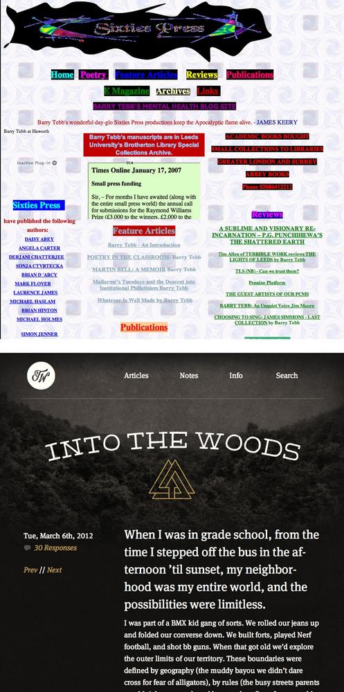
CSS offers a powerful array of text-formatting options, which let you assign fonts, color, sizes, line spacing, and many other properties that can add visual impact to headlines, bulleted lists, and regular old paragraphs of text (see Figure 6-1). This chapter reveals all, and then finishes up with a tutorial where you can practice assembling CSS text styles and put them to work on an actual web page.
Using Fonts
The first thing you can do to make text on your website look
more exciting is to apply different fonts to headlines, paragraphs,
and other written elements on your pages. To apply a font to a CSS
style, you use the font-family
property and specify the font you wish to use. For example, say you
want to use the Arial font for paragraphs on a page. You can create a
p tag style and use the font-family property like this:
p {
  font-family: Arial;
}
Figure 6-1. Good web typography makes sites that are easy to read ...
Get CSS3: The Missing Manual, 3rd Edition now with the O’Reilly learning platform.
O’Reilly members experience books, live events, courses curated by job role, and more from O’Reilly and nearly 200 top publishers.

