December 2012
Intermediate to advanced
648 pages
22h 14m
English
Web designers have always had to contend with designing for various screen sizes—from 760-pixel-wide laptops to gargantuan widescreen displays. However, the rise of smartphones and tablets has now made it even more imperative to design for a wide range of screen widths and heights. Some companies go so far as to create separate, mobile-only websites (see the top images in Figure 14-1). However, unless you have the time, money, and technical expertise to develop two sites and program your web server to provide the proper site to the proper device, a mobile-only website is probably out of reach.
Fortunately, there’s another, simpler approach that lets you build a single site that adapts to different device widths (see bottom images in Figure 14-1). Called responsive web design, this technique uses several different tricks to make a page change its layout based on the width of the browser screen. On a smartphone, for example, you can lay out a page in a single, easy-to-read column to fit the narrow width of the screen (bottom-left image in Figure 14-1), while maintaining a multicolumn layout on wider monitors (bottom-right image in Figure 14-1).
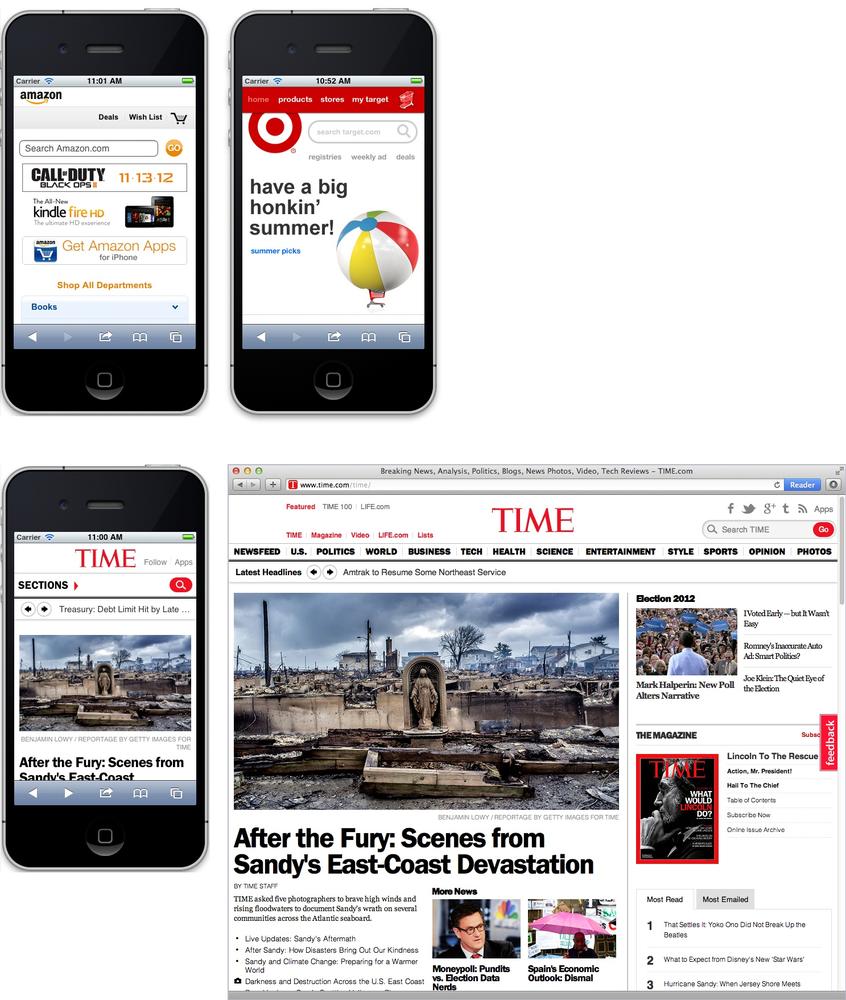
Figure 14-1. Many large companies, like Amazon and Target, create mobile versions of their sites, optimized for display on handheld devices like the iPhone (top). Fortunately, using responsive web design techniques, ...
Read now
Unlock full access


 O’Reilly covers everything we've got, with content to help us build a world-class technology community, upgrade the capabilities and competencies of our teams, and improve overall team performance as well as their engagement.I wanted to learn C and C++, but it didn't click for me until I picked up an O'Reilly book. When I went on the O’Reilly platform, I was astonished to find all the books there, plus live events and sandboxes so you could play around with the technology.I’ve been on the O’Reilly platform for more than eight years. I use a couple of learning platforms, but I'm on O'Reilly more than anybody else. When you're there, you start learning. I'm never disappointed.I'm always learning. So when I got on to O'Reilly, I was like a kid in a candy store. There are playlists. There are answers. There's on-demand training. It's worth its weight in gold, in terms of what it allows me to do.