Chapter 4. Organizing the Page: Layout of Page Elements
Page layout is the art of manipulating the user’s attention on a page to convey meaning, sequence, and points of interaction.
If the word manipulating sounds unseemly to you, think about it this way. Film and television directors make their living by manipulating your attention on the movie or TV screen, and you are presumably a willing participant. It is the same for editors who arrange articles, headlines, and ads in a newspaper. If all this content were presented in a drab monotone, with no graphic emphasis to grab and move your attention, you would find it harder to extract meaning—what’s supposed to be important, and what’s not?
Even though it is ultimately an art, there is more rationality to good page layout than you might think there is. Some important ideas from graphic design are explained in this chapter introduction; each can guide you in the layout of pages, screens, and dialog boxes. We’ll talk about visual hierarchy, visual flow and focal points, and grouping and alignment—all predictable and rational approaches to page design. This chapter’s patterns describe concrete ways to apply those high-level concepts to interface design.
But the changeable, interactive nature of computer displays makes layout easier in some ways, harder in others. We’ll talk about why that’s true. Some of these patterns work as well in print as they do on-screen, but most of them would be useless in print—they presume that the user will interact with the page.
The Basics of Page Layout
This section discusses several elements of page layout: visual hierarchy, visual flow, and how to use dynamic displays.
Visual Hierarchy: What’s Important? What’s Related?
Visual Hierarchy: What’s Important? What’s Related?
The concept of visual hierarchy plays a part in all forms of graphic design. Put simply, the most important content should stand out the most, and the least important should stand out the least. Also, titles ought to look like titles, subtitles ought to look like subtitles, and lists ought to look like lists—in other words, a reader should be able to deduce the informational structure of the page from its layout.
What is the most important thing on the page you’re designing? Make that the center of attention. Can you rank other things in declining order of importance? Arrange them on the page in ways that draw progressively less attention; make them look less interesting.
In short, a good visual hierarchy gives instant clues about:
The relative importance of page elements
The relationships among them
How to make things look important
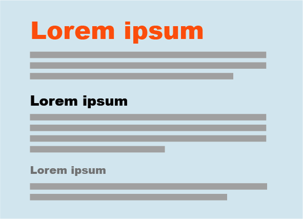
For short but large text—such as headlines and short phrases—use font size, contrasting color, and visual weight (see Figure 4-1). You can also make text look very dramatic by setting it off with generous whitespace or background color. Use two or more of these characteristics at a time on emphasized text to differentiate it from body text.
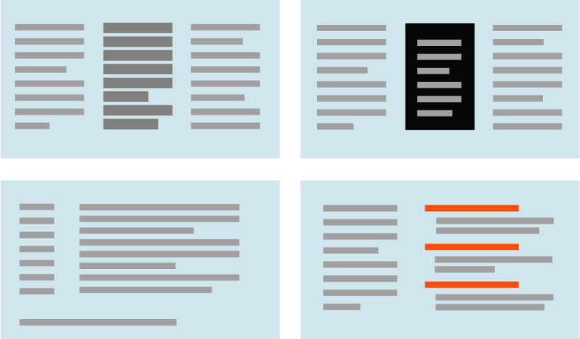
Blocks of smaller items—such as body text, links, or interactive tools—can be emphasized or deemphasized with these tools. See Figure 4-2 for examples of each.
- Density
A dense, heavy-looking block has stronger contrast with the surrounding page; an open look has less contrast.
- Background color
Contrast draws attention. Black on white, or vice versa, is the strongest contrast possible.
- Position and size
A medium or large text block, roughly in the center of the page, calls attention to itself as the primary content (like an article or blog post). But a small strip of text at the bottom of the page says quietly, “I’m just a footer” and begs to be ignored!
- Rhythm
Lists, grids, alternating elements such as headlines and summaries, and whitespace separation can create a strong visual rhythm that irresistibly draws the eye.
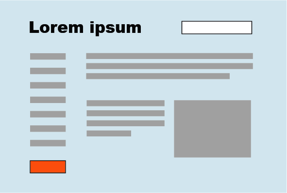
Put small but important items at the top of the page, along the left side, or in the top-right corner (see Figure 4-3). Give them high contrast and visual weight, and set them off with whitespace. But note that in a text-heavy screen, like most websites, certain controls—especially search fields, sign-in fields, and large buttons—tend to stand out anyway! This is less about raw visual characteristics than meaning: if someone is looking for a search box, for instance, her eyes will go straight to the text fields on the page. (She may not even read the labels for those text fields.)
High-contrast, dramatic images draw attention; so do pictures of faces. But much of the time, images on websites get ignored by viewers motivated to get information out of a page or to get a task done. Pictures are a wildcard in a visual hierarchy. Use them thoughtfully, and refer to Chapter 11 for a discussion on using visual elements to communicate branding, emotion, and other nonrational attributes.
One more thing: don’t discount “ad blindness.” Users may consciously ignore elements that look like ads, even if those elements carry important information! Again, this is about meaning, not visuals. If you’ve ever brought up an ad-filled web page and pointedly ignored the brightly colored moving ads (so you could read the monotonous blocks of text that you went there to read), you know that we’re not merely slaves to our hardwired visual systems! We can choose to ignore things that we think we don’t need to look at, and zero in on what we think is the important part of the page.
How to show relationships among page elements
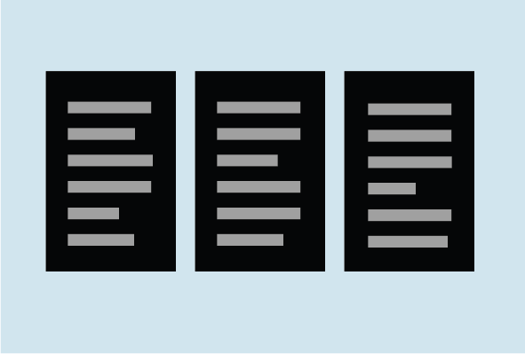
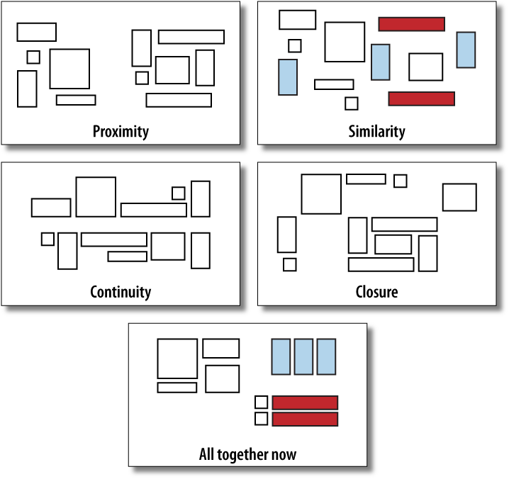
Grouped items look related (see Figure 4-4). Conversely, isolation implies distinction—in the previous section, I recommended that small but important items be set off with whitespace for this reason. This uses the Gestalt principles of proximity and closure (see the sidebar Four Important Gestalt Principles on page 139).
Similar items look like peers (see Figure 4-5). If you have a few things “of a type” and you want viewers to see them as equally interesting alternatives, give them an identical (and distinctive) graphic treatment.
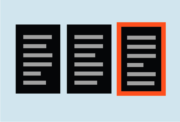
Is one item more “special” than the others like it? Give it a slightly different treatment, such as a contrasting background color, but otherwise keep it consistent with the others (see Figure 4-6). Or use a graphic element to disrupt the line along which the items are aligned, such as a bump-out, overlap, or something at an angle.
A list of many similar items, arranged in a strong line or column, becomes a set of peer items to be viewed in a certain order (see Figure 4-7). Align these items very precisely with each other to create a visual line (see the Gestalt principle of continuity in the upcoming sidebar). Examples include bulleted lists, navigation menus, text fields in a form, row-striped tables, and lists of headline/summary pairs. Note the alternating repetition used in the latter two examples. Alternating repetition can look beautiful when done well, and can set up a nice visual rhythm on the page.
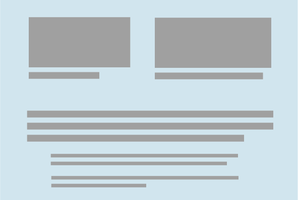
Indented and shrunken text tucked under a stronger element modifies that stronger element. Image captions, secondary text, comments, and so forth all behave this way (see Figure 4-8).
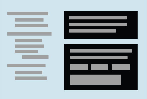
Containment implies a parent/child relationship (see Figure 4-9). Use boxes, blocks of background color, Module Tabs, Accordion, and text blocks or tool groups surrounded by whitespace to contain and nest related items (see the Gestalt principle of closure in the upcoming sidebar). Indenting also implies parent/child relationships in the context of an outline or a hierarchical menu.
Visual Flow: What Should I Look at Next?
Visual flow deals with the tracks that readers’ eyes tend to follow as they scan the page. It’s intimately related to visual hierarchy, of course—a well-designed visual hierarchy sets up focal points on the page wherever you need to draw attention to the most important elements, and visual flow leads the eyes from those into the less important information. As a designer, you want to be able to control visual flow on a page so that people follow it in approximately the right sequence.
Several forces can work against each other when you try to set up a visual flow. One is our tendency to read top to bottom and left to right. When faced with a monotonous page of text, that’s what you’ll do naturally; but if there are strong focal points on the page, they can distract you from the usual progression, for better or for worse.
Focal points are the spots your eyes can’t resist going to. You tend to follow them from strongest to weakest, and skillfully designed pages have only a few—too many focal points dilute the importance of each one. A good visual hierarchy uses focal points to pull eyes to the right places in the right order.
The next time you pick up a magazine, look at some well-designed ads, and notice what your eyes gravitate toward. The best commercial graphic artists are masters at setting up focal points to manipulate what you see first.
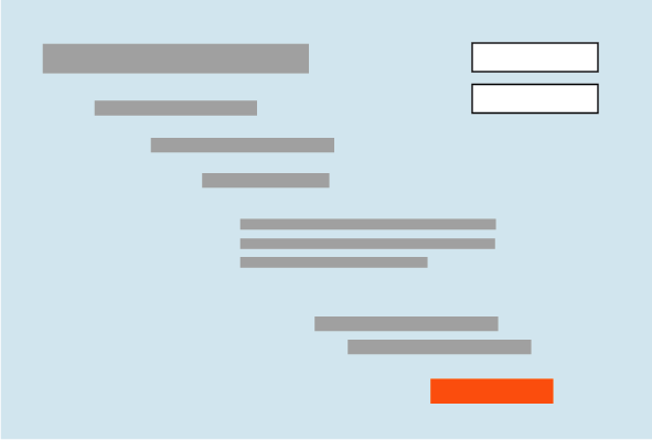
So how do you create a good visual flow? One simple way is to use implied lines, either curved or straight, to connect elements on the page (see Figure 4-10). This creates a visual narrative for the viewer to follow.
Put calls to action after the text you want viewers to read first. If you don’t care whether they read it or not, you can isolate the calls to action with whitespace (see Figure 4-11).
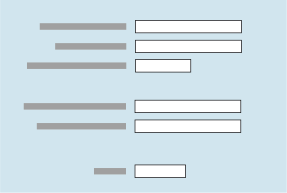
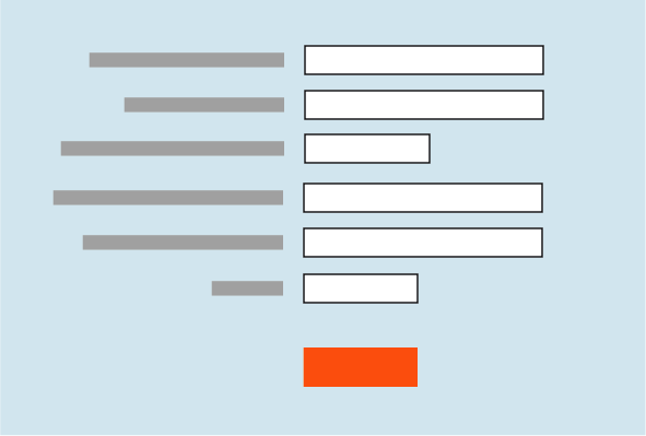
Likewise, if you’re designing a form, arrange the controls along a continuous path and put “I’m finished” buttons (OK, Cancel, Submit, Buy, etc.) at the end of that line (see Figure 4-12). See the patterns Right/Left Alignment and Diagonal Balance for two concrete approaches to form layout, and Prominent “Done” Button in Chapter 6.
It’s not hard to set up a layout that flows well, but be on your guard against layout choices that work counter to flow. If you want viewers to read a site’s story and value proposition, arrange the critical pieces of that narrative along a continuous line, and don’t interrupt it with eye-catching extras. If you’re designing a form or set of interactive tools, don’t scatter controls all over the page—that just forces the user to work harder to find them.
Figure 4-13 shows a distinctly poor example of visual flow and visual hierarchy. How many focal points are there, and how do they compete with one another? Where does your eye want to go first, and why? What does this page say is important?
Using Dynamic Displays
Everything I’ve discussed so far applies equally to UIs, websites, posters, billboards, and magazine pages. They deal with static aspects of layout. Ah, but you have a dynamic computer display to work with—and suddenly time becomes another dimension of design! Just as importantly, computers permit user interaction with the layout to an extent that most printed things can’t.
There are many, many ways you can take advantage of the dynamic nature of computer displays. Consider space usage, for example—even the biggest consumer-grade computer screens have less usable space than, say, a poster or a newspaper page. That’s life. If you design for mobile devices, you’ve got an especially tiny space to work in. There are many dynamic techniques for using that space to present more content than you can show at one time.
Scrollbars, of course, are one very common way of presenting a small “viewport” onto a large thing, such as text, an image, or a table. Scrollbars let the user move around at will, in one or two dimensions (but refrain from using horizontal scrolling with text, please).
Or, if you can carve up the content into coherent sections, you have several options—Module Tabs, Accordion, Collapsible Panels, and Movable Panels all put some layout control into the user’s hands, unlike the more static Titled Sections. (You can also split up content over multiple virtual pages and let the user navigate between them; see Chapter 3.) These patterns invoke time by letting the user see different content at different times of his choosing.
If you want to direct the user through a sequence of steps, Responsive Enabling and Responsive Disclosure are two time-honored ways of doing so.
The Patterns
This chapter’s patterns give you specific ways to put all these layout concepts into play.
The first three address the visual hierarchy of the whole page, screen, or window, regardless of the type of content you put into that page. You should consider Visual Framework fairly early in a project, since it affects all the major pages and windows in an interface.
Do you have a single important thing to show on the page, or several features or options of similar importance? Center Stage applies to pages that contain a single main item or task with other lesser items around it, whereas Grid of Equals makes several “peer” items look similar. (You could use both in separate sections of a large page, of course.)
The next group of patterns represents alternative ways of “chunking” content on a page or window. They’re useful when you have more content than you can comfortably put on the page at one time. Should the different sections all be visible at once, or can they be viewed independently? Is it OK for users to manipulate those sections on the page, or maybe overlook the hidden ones? These patterns deal with visual hierarchy too, but they also involve interactivity, and they can help you choose among the specific mechanisms available in UI toolkits.
Right/Left Alignment and Diagonal Balance draw on the concepts of visual flow, alignment, and other things discussed in the chapter introduction. They deal with the spatial relationships among the smaller, more static elements on a page, such as text and controls.
The last three patterns deal with the dynamic aspects of content layout. Responsive Disclosure and Responsive Enabling are two ways of directing a user through a series of steps or a set of options; they indicate what can be done at any point in time, while preventing the user from straying into areas that will get her into trouble. Liquid Layout is a technique for arranging a page that can change size and shape at the user’s whim.
Visual Framework
What
Design each page to use the same basic layout, colors, and stylistic elements, but give the design enough flexibility to handle varying page content.
Use when
You’re building a website with multiple pages, or a UI with multiple windows—in other words, almost any complex software. You want it to “hang together” and look like one thing, deliberately designed; you want it to be easy to use and navigate.
Why
When a UI uses consistent color, font, and layout, and when titles and navigational aids—signposts—are in the same place every time, users know where they are and where to find things. They don’t have to figure out a new layout each time they switch context from one page or window to another.
Have you ever seen a book in which the page numbers and headings were in a different place on each page?
A strong visual framework, repeated on each page, helps the page content stand out more. That which is constant fades into the background of the user’s awareness; that which changes is noticed. Furthermore, adding enough character to the design of the visual framework helps with the branding of your website or product—the pages become recognizable as yours.
How
Draw up an overall look-and-feel that will be shared among all pages or windows. Home pages and main windows are “special” and are usually laid out differently from inner pages, but they should still share certain characteristics with the rest of the site. For example:
- Color
Backgrounds, text colors, accent colors, and other colors
- Fonts
For titles, subtitles, ordinary text, callout text, and minor text
- Writing style and grammar
Titles, names, content, short descriptions, any long blocks of text, and anything else that uses language
All other pages or windows should also share the following, as appropriate:
“You are here” signposts, such as titles, logos, Breadcrumbs trails, global navigation with indicators of the current page, and Module Tabs
Navigational devices, including global and utility navigation, OK/Cancel buttons, Back buttons, Quit or Exit buttons, and navigational patterns such as Sequence Map and Breadcrumbs (all in Chapter 3)
Techniques used to define Titled Sections
Spacing and alignment, including page margins, line spacing, the gaps between labels and their associated controls, and text and label justification
Overall layout, or the placement of things on the page, in columns and/or rows, taking into account the margins and spacing issues listed previously
If you’re familiar with graphic design concepts, you may recognize some of these techniques as comprising a layout grid. A layout grid is a structural template for a set of pages or layouts. Each individual page is different, but all use specified margins and align their contents along invisible gridlines. A good Visual Framework does indeed include a layout grid, but it also includes other aspects of look-and-feel such as colors, visual details, and writing style.
Implementation of a Visual Framework should force you to separate stylistic aspects of the UI from the content. This isn’t a bad thing. If you define the framework in only one place—such as a CSS stylesheet or a Java class—it lets you change the framework independently from the content, which means you can tweak it and get it right more easily. (It’s also good software engineering practice.)
Examples
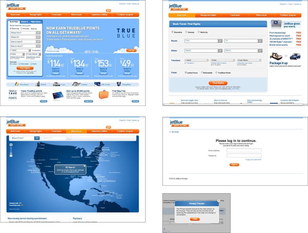
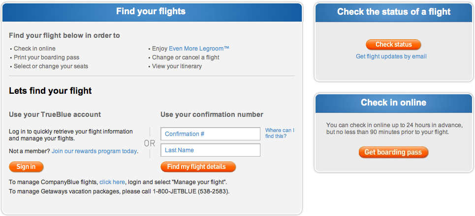
JetBlue’s site employs a restricted color palette, a strong header, and consistent use of fonts and curved rectangles in its Visual Framework (see Figure 4-16). Even the login page and modal dialogs use these elements; they don’t look out of place.
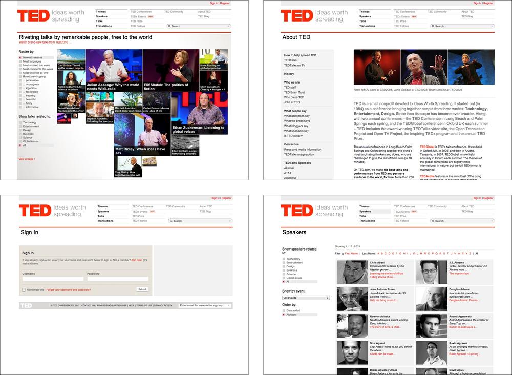
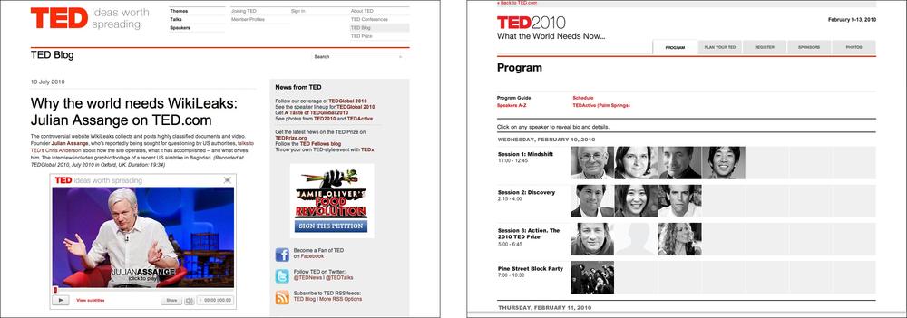
In the same way, TED’s site uses limited color and a layout grid to maintain consistency (see Figure 4-17). It has an interesting problem that’s more common than it might appear: its subsidiary or related sites (such as its blog and its conference site) must look somewhat like the main TED site, but still have distinct visual identities. In this case, the two related sites share most of their framework elements with the TED site, with some key differences (see Figure 4-18).
Center Stage
What
Put the most important part of the UI into the largest subsection of the page or window; cluster secondary tools and content around it in smaller panels.
Use when
The page’s primary job is to show a single unit of coherent information to the user, let him edit a document, or enable him to perform a certain task. Other content and functions are secondary to this one. Many types of interfaces can use a Center Stage—tables and spreadsheets, forms, and graphical editors all qualify. So do web pages that show single articles, images, or features.
Why
The design should guide the user’s eyes immediately to the start of the most important information (or task) rather than have them wandering over the page in confusion. An unambiguous central entity anchors the user’s attention. Just as the lead sentence in a news article establishes the subject matter and purpose of the article, so the entity in Center Stage establishes the purpose of the UI.
Once that’s done, the user will assess the items in the periphery in terms of how they relate to what’s in the center. This is easier for the user than repeatedly scanning the page, trying to figure it out. What comes first? What’s second? How does this relate to that? And so on.
How
Establish a visual hierarchy with the primary content or document dominating everything else. See the chapter introduction for a discussion of visual hierarchy. When designing a Center Stage, consider these particular factors, though none of them are absolutely required:
- Size
The Center Stage content should be at least twice as wide as whatever’s in its side margins, and twice as tall as its top and bottom margins. (The user may change its size in some UIs, but this is how it should be when the user first sees it.) Keep the fold in mind—when a small screen is used, where does the content get cut off at the bottom? Make sure the Center Stage still takes up more of the above-the-fold space than anything else.
- Color
Use a color that contrasts with the items in the margins. In desktop UIs, white works well against Windows gray, especially for tables and trees. As it happens, white often works in web pages too, since ads and navigation bars usually use other colors as their backgrounds; also, web users have been “trained” by convention to look for the plain text on a white background.
- Headlines
Big headlines are focal points, and can draw the user’s eye to the top of the Center Stage. That happens in print media too, of course. See the chapter introduction and Titled Sections for more.
- Context
What does the user expect to see when she opens up the page? A graphic editor? A long text article? A map? A filesystem tree? Work with her preconceptions; put that in Center Stage and make it recognizable. The user will look for it—this trumps all other rules about visual perception. (But it doesn’t mean you can frustrate her by hiding what she’s looking for! Some websites put their main content so far down the page that it’s below the fold in short windows, requiring the user to scroll down to find it. That’s just sadistic.)
Notice that I didn’t mention one traditional layout variable: position. It doesn’t much matter where you put the Center Stage—top, left, right, bottom, center, any can be made to work. If it’s big enough, it ends up more or less in the center anyway. Note that well-established genres have conventions about what goes into which margins, such as toolbars on top of graphic editors, or navigation bars on the left sides of web pages. Be creative, but with your eyes open. If you’re in doubt, take a screenshot of the layout, shrink it, blur it, and ask someone where he thinks the main content should start. Again, see the chapter introduction for an example.
Examples
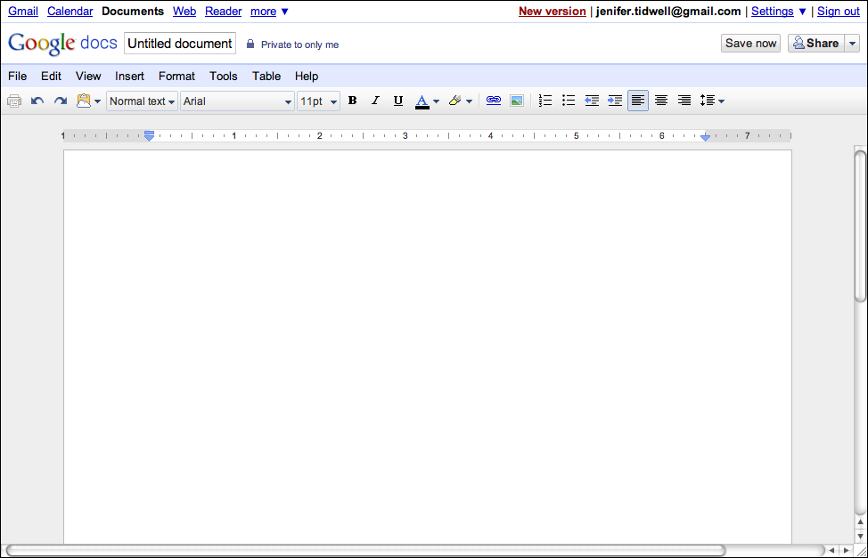
The Google Docs text editor devotes almost all of its horizontal space to the document being edited; so does its spreadsheet editor. Even the tools at the top of the page don’t take up a huge amount of space. The result is a clean and balanced look (see Figure 4-20).
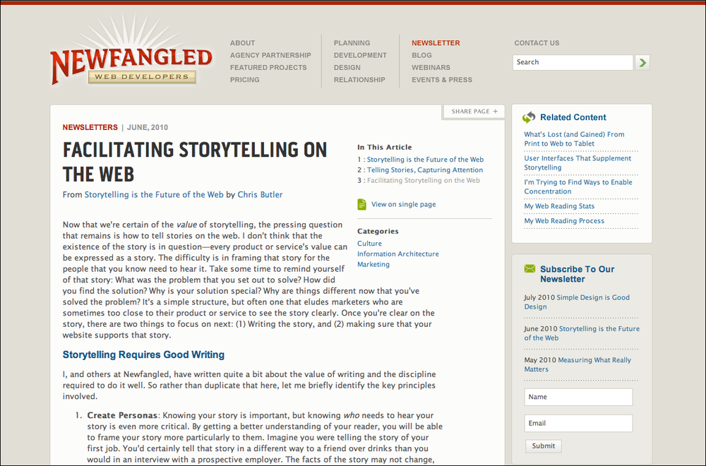
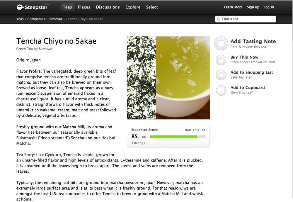
Text-based content such as blog articles is often crowded with too many items in the margins. The sites for Newfangled (Figure 4-21) and Steepster (Figure 4-22) give their main content enough space to compete with the navigation and other peripheral features. Notice the percentage of space devoted to the main article for both of these sites, and how high on the page the article starts.
In other libraries
http://www.welie.com/patterns/showPattern.php?patternID=center-stage
Grid of Equals
What
Arrange content items in a grid or matrix. Each item should follow a common template, and each item’s visual weight should be similar. Link to jump pages as necessary.
Use when
The page contains many content items that have similar style and importance, such as news articles, blog posts, products, or subject areas. You want to present the viewer with rich opportunities to preview and select these items.
Why
A grid that gives each item equal space announces that they have equal importance. The common template for items within the grid tells the user that the items are similar to each other. Together, these techniques establish a powerful visual hierarchy that should match the semantics of your content.
Grids look neat, ordered, and calming. That may suit the style of your site or app.
How
Figure out how to lay out each item in the grid. Do they have thumbnail images or graphics? Headlines, subheads, summary text? Links to jump pages (e.g., a page with the full story)? Render them with more than just blocks of body text: make headlines of different colors, be creative with whitespace, and use images if you can do so evenly across all items. Experiment with ways to fit all the right information into a relatively small space—tall, wide, or square—and apply that template to the items you need to display.
Now arrange the items in a grid. You could use a single row, or a matrix that’s two, three, or more items wide. Consider page width as you do this design work—what will your design look like in a narrow window? Will most of your users have large browser windows? What happens on tiny mobile devices?
You may choose to highlight grid items, either statically (to emphasize one item over others) or dynamically, as a user hovers over those grid items. Use color and other stylistic changes, but don’t change the positions, sizes, or other structural elements of the grid items—you don’t want content jumping around as the user hovers over different items!
A related pattern is Thumbnail Grid, in Chapter 5. This is a way of rendering a list in a 2D matrix of small pictures, perhaps with a small amount of text with each one. See also the Thumbnail-and-Text List pattern for mobile design (Chapter 10). It’s about a single column, not a grid, but the idea is the same: use a consistent, richly styled template for all the items in a list.
Examples
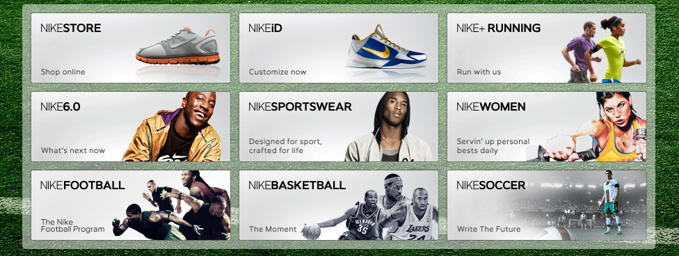
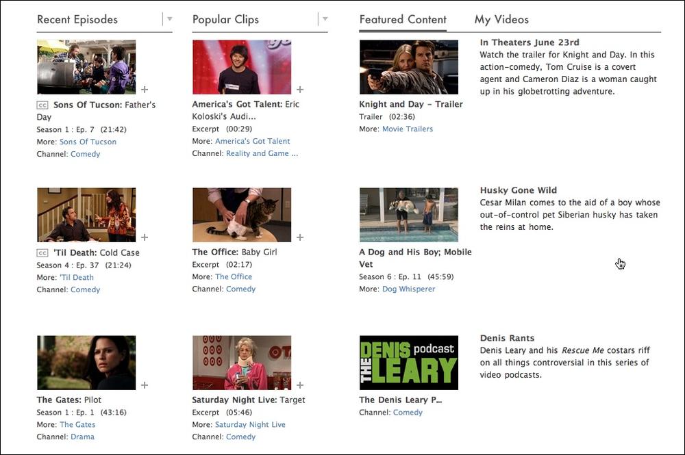
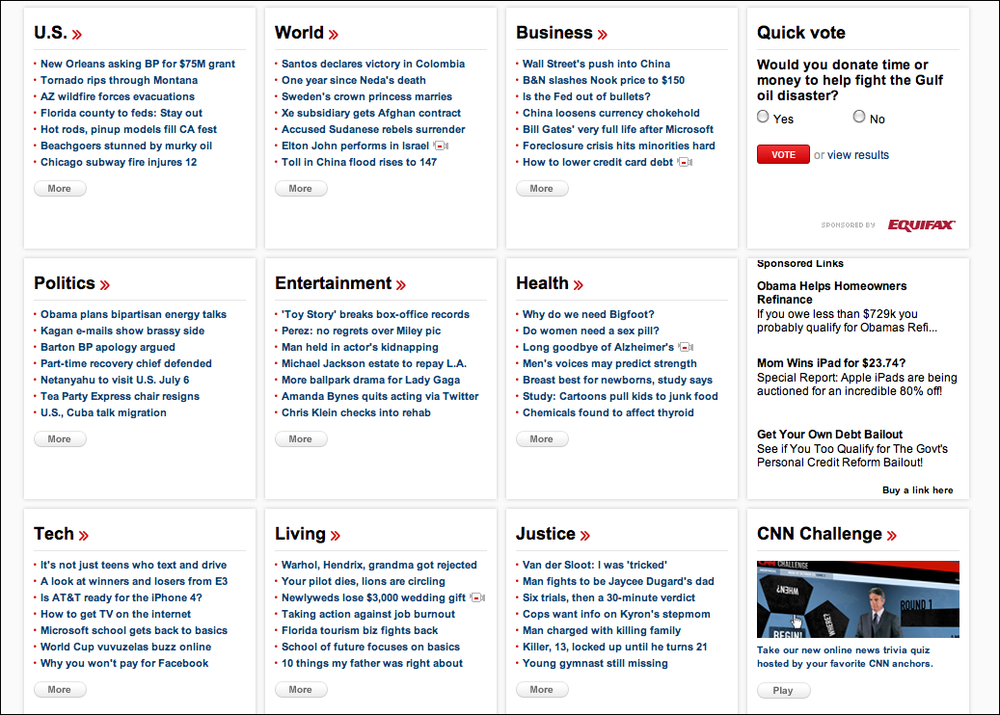
Hulu (Figure 4-24), CNN (Figure 4-25), and Nike (Figure 4-23, shown at the top of the pattern) use a rigid template for each item. The overall effect is rhythmic and calming. Note how each site uses a different balance of text and imagery.
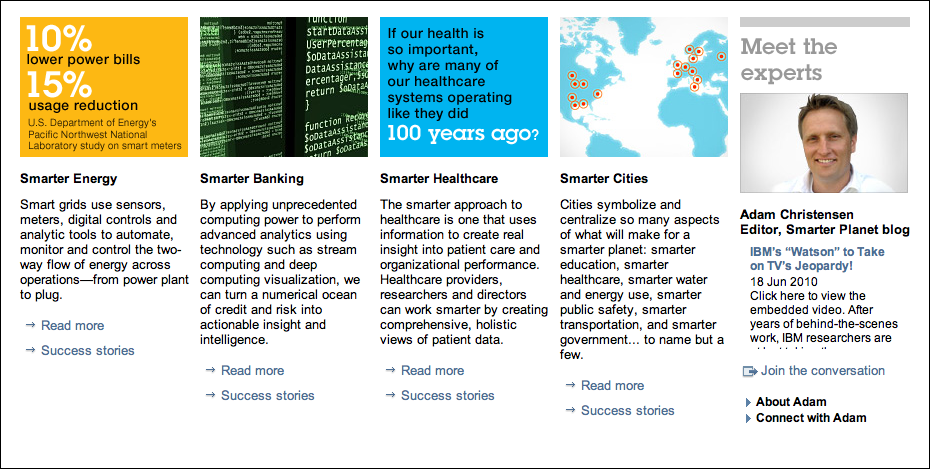
The examples from MapQuest (Figure 4-26) and IBM (Figure 4-27) show how to do this with only a single row of items. (Technically it’s still a “grid.”) The consistent visual treatment marks these items as peers of each other. Each item ends with one or more links—and that’s true of the Hulu and CNN examples, too. Most of the examples I’ve seen of this pattern use it to showcase linked content.
In other libraries
For some wonderful examples, see “15 Tips for Designing Terrific Tables,” by Joshua Johnson:
http://designshack.co.uk/articles/css/15-tips-for-designing-terrific-tables
Titled Sections
What
Define separate sections of content by giving each one a visually strong title, separating the sections visually, and arranging them on the page.
Use when
You have a lot of content to show, but you want to make the page easy to scan and understand, with everything visible. You can group the content into thematic or task-based sections that make sense to the user.
Why
Well-defined and well-named sections structure the content into easily digestible chunks, each of which is now understandable at a glance. This makes the information architecture obvious. (See this chapter’s introduction for a discussion of visual hierarchy, which is basically about rendering content in a way that communicates its actual structure. See also Chapter 2 for a definition of information architecture.)
When the user sees a page sectioned neatly into chunks like this, her eye is guided along the page more comfortably. The human visual system always looks for bigger patterns, whether they’re deliberate or not. So, put them in deliberately!
How
First, get the information architecture right—split up the content into coherent chunks, if it hasn’t already been done for you, and give them short, memorable names. Next, choose a presentation:
For titles, use typography that stands out from the rest of the content—bolder, wider, larger point size, stronger color, different font family, outdented text, and so on. See the chapter introduction for more on visual hierarchy.
Try reversing the title against a strip of contrasting color.
Use whitespace to separate sections.
Use blocks of contrasting background color behind the entire section.
Boxes made from etched, beveled, or raised lines are familiar on desktop UIs. But they can get lost—and just become visual noise—if they’re too big, too close to each other, or deeply nested.
If the page is still too overwhelming, try using Module Tabs, an Accordion, or Collapsible Panels to hide some of the content.
If you’re having trouble giving reasonable titles to these chunks of content, that may be a sign that the grouping isn’t a natural fit for the content. Consider reorganizing it into different chunks that are easier to name and remember. “Miscellaneous” categories may also be a sign of not-quite-right organization, though sometimes they’re genuinely necessary.
Examples
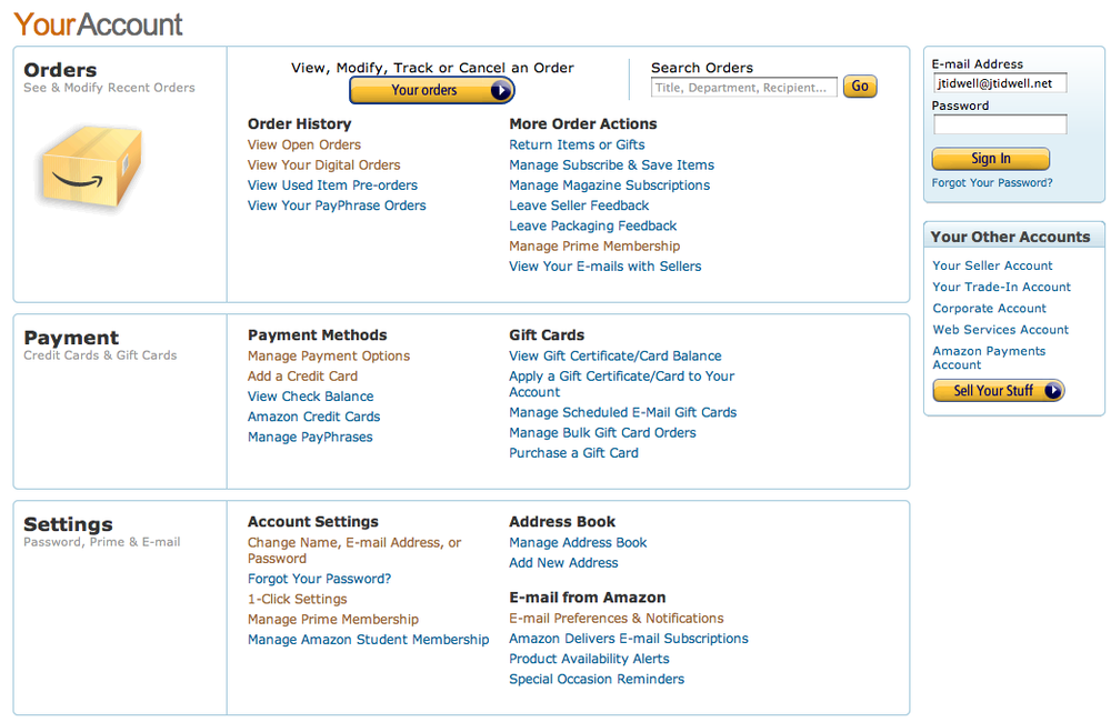
In its account settings page, Amazon shows three levels of titles corresponding to three levels of the visual hierarchy: the page title, section titles (Orders, Payment, Settings), and subtitles atop lists of links (see Figure 4-29). Note the use of whitespace, boxes, and alignment to structure the page.
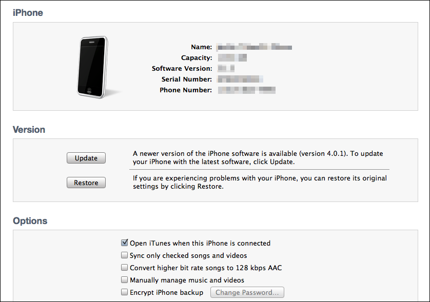
The iPhone sync utility shown in Figure 4-30 shows one nice-looking way to put very different kinds of content into titled boxes. These sections show very little internal consistency (other than typography)—they share no mutual grid, alignment, or layout plan. But the boxes and whitespace break up the page so much that this doesn’t really matter.
Module Tabs
What
Put modules of content into a small tabbed area so that only one module is visible at a time. The user clicks on tabs to bring different modules to the top.
Use when
You have a lot of heterogeneous content to show on the page, possibly including text blocks, lists, buttons, form controls, or images. You don’t have room for everything.
Some of the page content comes in groups or modules (or can be sorted into coherent groups). Those modules have the following characteristics:
Users only need to see one module at a time.
They are of similar length and height.
There aren’t many modules—fewer than 10, and preferably a small handful.
The set of modules is fairly static; new pages won’t be added frequently, nor will existing pages be changed or removed frequently.
The modules’ contents may be related or similar to each other.
Why
Tabs are now ubiquitous in desktop interfaces and websites. No one is going to be confused by how they work.
In general, grouping and hiding chunks of content can be a very effective technique for decluttering an interface. Tabs work well; so do Accordion, Movable Panels, Collapsible Panels, and simply arranging things into a clean grid of Titled Sections.
How
First, get the information architecture right. Split up the content into coherent chunks, if it hasn’t already been done for you, and give them short, memorable titles (one or two words, if possible). Remember that if you split up the content incorrectly, users will be forced to switch back and forth between tabs as they compare them or look for information they can’t find. Be kind to your users and test the way you’ve organized it.
Indicate the selected tab unambiguously, such as by making it contiguous with the panel itself. (Color alone isn’t usually enough. If you have only two tabs, make sure it’s abundantly clear which one is selected and which one isn’t.)
But the tabs don’t have to be literal tabs, and they don’t have to be at the top of the stack of modules. You can put them in a lefthand column, or underneath, or even turned 90 degrees with the text read sideways.
When deployed on web pages, Module Tabs tend to be distinct from navigational tabs (those used for global navigation, or separate documents, or for loading new pages). Tabs are useful there too, of course, but this pattern is more about giving the user a lightweight way to see alternative modules of content within a page.
If there are too many tabs to fit in a narrow space, you could do one of several things: shorten the labels with an ellipsis (and thus make each tab narrower), or use Carousel-like arrow buttons to scroll the tabs. You could also put the tab labels in a lefthand column, instead of putting them on top. Never double-row the tabs.
(In the first edition of this book, this pattern was named Card Stack. Most people now know this concept as simply “tabs,” however, and Module Tabs is a name used by at least two other pattern libraries.)
Examples
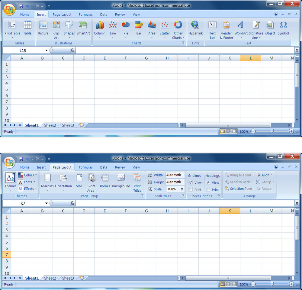
Microsoft Office for Windows 7 uses a “ribbon” atop documents, instead of the traditional menu and toolbars (see Figure 4-32). The ribbon is essentially a set of Module Tabs.
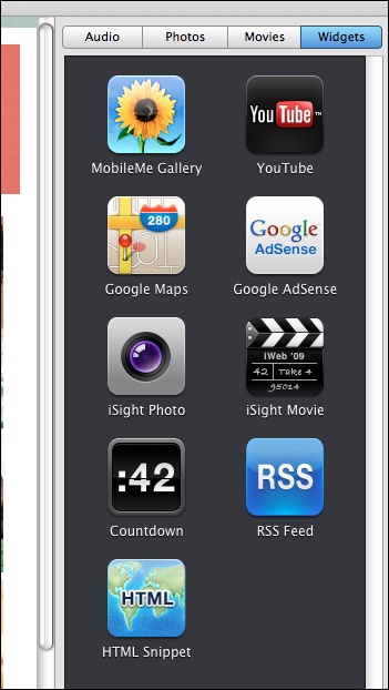
Some Module Tabs in Mac OS don’t look like tabs—they look like buttons. They behave exactly like tabs, however. The tabs are across the top, labeled “Audio,” “Photos,” “Movies,” and “Widgets,” as shown in Figure 4-33.
Tabs can work along the sides of a module too, as shown in Figure 4-34.
Accordion
What
Put modules of content into a collinear stack of panels that can be closed and opened independently of each other.
Use when
You have a lot of heterogeneous content to show on the page, possibly including text blocks, lists, buttons, form controls, or images. You don’t have room for everything.
Some of the page content comes in groups or modules (or can be sorted into coherent groups). Those modules have the following characteristics:
Users may want to see more than one module at a time.
Some modules are much taller or shorter than others, but they’re all of similar width.
The modules are part of a tool palette, a two-level menu, or some other coherent system of interactive elements.
The modules’ contents may be otherwise related or similar.
You may want to preserve the linear order of the modules.
Also note that when large modules are open or many modules are open, the labels on the bottom of the Accordion may scroll off the screen or window. If that’s a problem for your users, consider using a different solution.
Why
Accordion have become a familiar interactive element on web pages, almost as familiar as Module Tabs and drop-down menus. (They aren’t quite as straightforward to use, however.) Many websites use Accordion in their menu systems to manage very long lists of pages and categories.
In general, grouping and hiding chunks of content can be a very effective technique for decluttering an interface. Accordion are part of a toolkit that includes Module Tabs, Movable Panels, Collapsible Panels, and Titled Sections to do so.
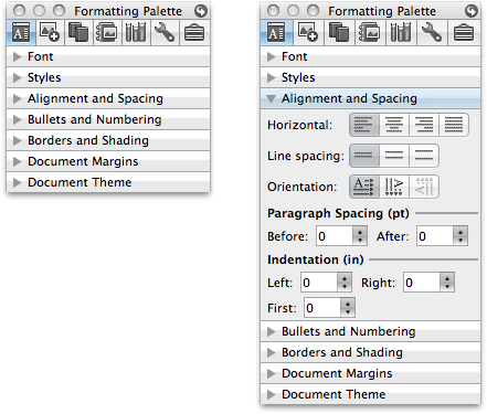
Accordion may be useful in web page navigation systems, but they really shine in desktop applications. Tool palettes in particular work well with Accordion (and Movable Panels as well, for similar reasons). Because users can open any set of modules and leave them open, Accordion help users modify their “living space” in a way that suits them. Yet it’s easy to reopen a rarely used module when it becomes needed.
How
Arrange the modules vertically, in an order that makes sense for your particular application or site. Give each module a short and descriptive title, and put that title into a horizontal bar that the user can click to toggle the module open and closed. You could indicate the “openability” of a module title bar with a rotating triangle icon: point it rightward when closed, and downward when open.
Allow more than one module to be open at a time. There are differing opinions on this—some designers prefer only one module to be open at a time, and some implementations only allow one (or have a switch that developers can set, at least). But in my experience, especially in applications, it’s better to let users open multiple modules at a time. It avoids the abrupt and unexpected disappearance of a previously open module: “Hey, where’d that other menu go? It was right here!”
When used in an application or when the user is signed in to a website, an Accordion ought to preserve its state of opened and closed modules between sessions. This isn’t as important for navigation menus as it is for tool palettes.
Accordion can be nested if the module contents need further subdivision, but they tend to look confusing. Users find it hard to tell the difference between an “outer” accordion panel and an “inner” accordion panel; with everything all in one column, there’s no clarity to the containment hierarchy. It’s better to use just one flat set of accordion modules, and to use some other structuring pattern inside a module (e.g., tabs) if necessary.
This technique has existed since at least 1993, and possibly earlier. The Motif-based GUI builder called UIM/X used closable panels—even with the twist-down arrows—for its widget palettes.
(In the first edition of this book, this pattern was named Closable Panels. During the years since then, the user experience community seems to have settled on the name Accordion instead.)
Examples
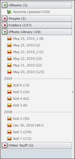
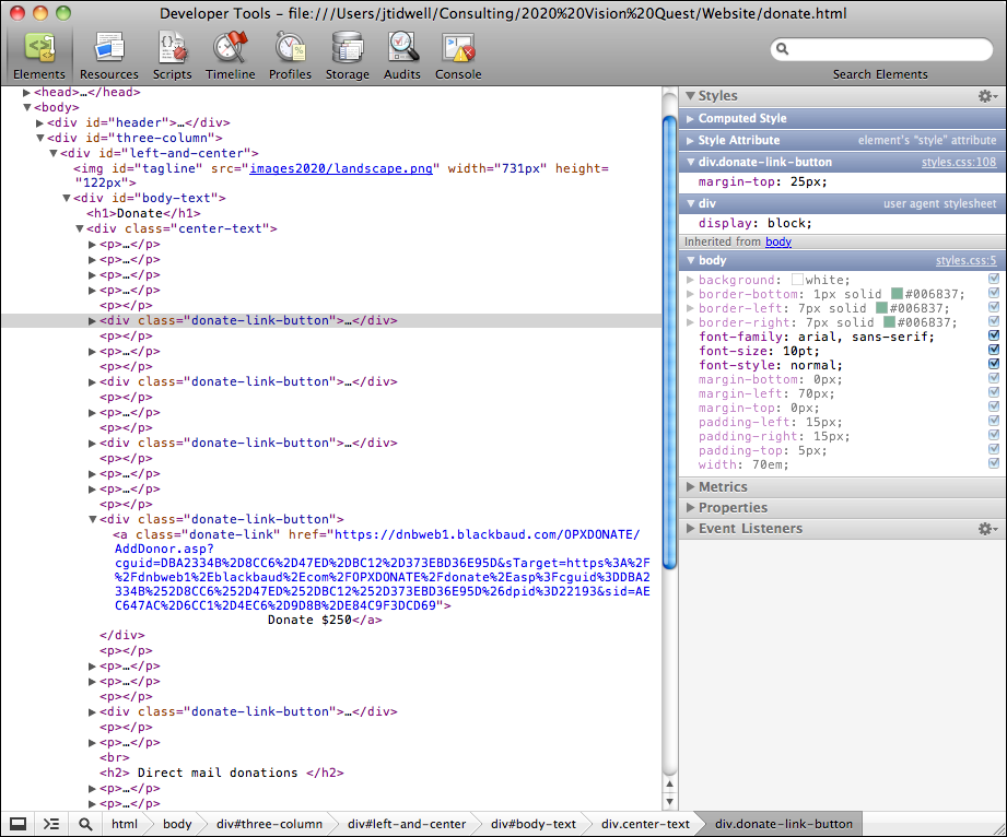
Picasa’s browsing window uses an Accordion to show several different ways of viewing a person’s images. Within each pane, content might be further subdivided or organized, which Picasa does in the example in Figure 4-36 with Titled Sections. Chrome’s developer tools, on the other hand, nest Accordion inside each other (see Figure 4-37). You can figure out the nesting scheme if you stare at it hard enough, but it’s not easy.
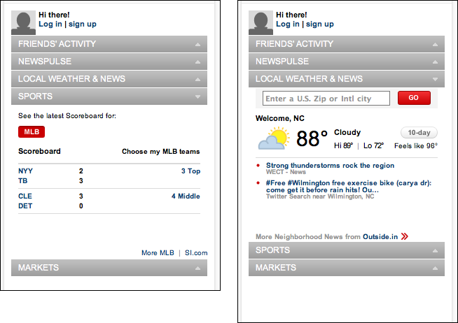
CNN uses an Accordion to show personalized material (see Figure 4-38). Only one panel can be open at once in this implementation. If it were up to me, I’d want to see both of these panels open at the same time, but maybe CNN had a very limited amount of vertical space to work with.
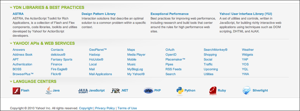
As shown in Figure 4-39, the Yahoo! Developer Network uses an Accordion in its footer to let users hide and show sections that they care about (or don’t). Note the use of a Sitemap Footer, described in Chapter 3.
In other libraries
http://developer.yahoo.com/ypatterns/navigation/accordion.html
http://ui-patterns.com/patterns/AccordionMenu
http://www.welie.com/patterns/showPattern.php?patternID=accordion
Designing Web Interfaces by Bill Scott and Theresa Neil (O’Reilly, http://oreilly.com/catalog/9780596516253/) also describes an Accordion pattern.
Collapsible Panels
Use when
You have a lot of heterogeneous content to show on the page, possibly including text blocks, lists, buttons, form controls, or images. You don’t have room for everything. You might, however, have Center Stage content that needs to take visual priority.
Some of the page content comes in groups or modules (or can be sorted into coherent groups). Those modules have the following characteristics:
Their content annotates, modifies, explains, or otherwise supports the content in the main part of the page.
The modules may not be important enough for any of them to be open by default.
Their value may vary a lot from user to user. Some will really want to see a particular module, and others won’t care about it at all.
Even for one user, a module may be useful sometimes, but not other times. When it’s not open, its space is better used by the page’s main content.
Users may want to open more than one module at the same time.
The modules have very little to do with each other. When Module Tabs or Accordion are used, they group modules together, implying that they are somehow related; Collapsible Panels do not group them.
Why
Hiding noncritical pieces of content helps to simplify the interface. When a user hides a module that supports the main content, it simply collapses, giving its space back over to the main content (or to whitespace). This is an example of the principle of progressive disclosure—show hidden content “just in time,” when and where the user needs it.
In general, grouping and hiding chunks of content can be a very effective technique for decluttering an interface. Collapsible Panels are part of a toolkit that includes Module Tabs, Accordion, Movable Panels, and Titled Sections to do so.
How
Put each supporting module into a panel that the user can open and close via a single click. Label the button or link with the module’s name or simply “More,” and consider using a chevron or rotating triangle to indicate that more content is hidden there. When the user closes the panel, collapse the space used by that panel and devote it to other content (such as by moving up the content below it on the page).
Consider animating the panels as they open and close. It appears less dislocating when they smoothly zip open and closed again.
If you have more than one module to hide in this way, you could either put the modules together on one panel with Module Tabs or an Accordion, or put them in separate places on the main page.
If you find that most users are opening up a Collapsible Panels that’s closed by default, switch it to being open by default.
Examples
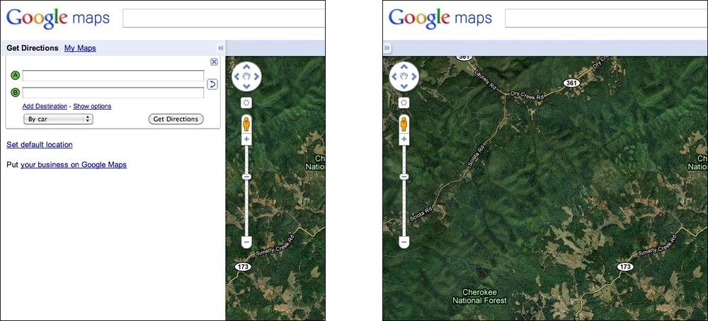
Google Maps, shown in Figure 4-40 at the top of the pattern, demonstrates how useful it can be to collapse a panel that’s outlived its usefulness—the visible map area is significantly bigger without the sidebar.
Some discussion forums, such as that shown in Figure 4-41, place long comments into Collapsible Panels. A visitor can skim the page’s short and truncated comments to get a sense of the discussion, and if a long comment attracts her attention, she can open the truncated comment to read the whole thing.
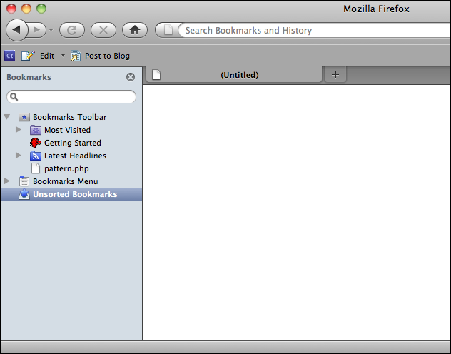
Many applications show optional sidebars attached to their Center Stage windows. Firefox’s sidebar, shown in Figure 4-42, is closed by a single click on the “X” button, and a user can bring it back by selecting a menu item (or by using a keyboard shortcut). Note the asymmetry—it’s much easier to hide it than to show it, at least until the user memorizes the keyboard sequence! With a web page, or with an app that isn’t frequently used, a visible button to bring back the panel would be a better choice.
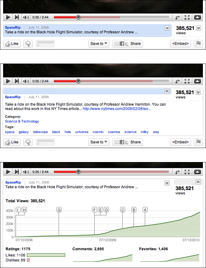
At the time of this writing, YouTube places many Collapsible Panels on a video’s page (see Figure 4-43). They contain extra content such as the video description, viewing statistics, and more videos from this poster (not shown in the figure). The page draws attention to these expandable areas by highlighting them in blue on rollover. They’re all closed by default, and they close themselves when the page is reloaded. The resultant page is less cluttered than it would otherwise be, while still providing interesting information to users inspired enough to open these panels.
Movable Panels
What
Put modules of content into boxes that can be opened and closed independently of each other. Arrange the boxes freely on the page, and let the user move them around into a custom configuration.
Use when
You’re designing either a desktop application, or a website that most users sign in to. News portals, Dashboard, and Canvas Plus Palette apps often use Movable Panels. You want users to feel a sense of ownership of the software, or at least have fun playing with it.
The page in question is a major part of the app or site—something that users see often or for long periods of time. You have a lot of heterogeneous content to show on the page, possibly including text blocks, lists, buttons, form controls, or images. You don’t have room for everything.
Some of the page content comes in groups or modules (or can be sorted into coherent groups). Those modules have some of the following characteristics:
Users will almost certainly want to see more than one module at a time.
Their value may vary a lot from user to user. Some people want modules A, B, and C, while others don’t need those at all and only want to see D, E, and F.
The modules vary a lot in size.
Their position on the page isn’t terribly important to you, but it might be to users. (By contrast, a page of static Titled Sections ought to be arranged with thought given to the importance of page position; important things go to the top, for instance.)
There are many modules—possibly so many that if all were shown at once, a viewer would be overwhelmed. Either you or the user should pick and choose among them.
You’re willing to let users hide some modules from view altogether (and offer a mechanism to bring them back).
The modules may be part of a tool palette or some other coherent system of interactive elements.
Why
Different users have different interests. Websites such as dashboards and portals are most useful to people when they can choose the content they see.
When they’ll be working on something for a while in a desktop application, people like to rearrange their environment to suit their working style. They can place needed tools close to where they work; they can hide things they don’t need; they can use Spatial Memory (Chapter 1) to remember where they put things. Rationally speaking, Movable Panels help users get things done more efficiently and comfortably (in the long run—once they’ve spent time rearranging their environment the way they like it!).
But this kind of personalization seems to appeal to people on some other level, too. They may do this on infrequently visited websites that provide some kind of entertainment, for instance. Personalization can increase engagement and buy-in.
Finally, a Movable Panels design easily accommodates new modules introduced over time, such as those contributed by third parties.
How
Give each module a name, a title bar, and a default size, and arrange them on the page in a reasonable default configuration. Let the user move modules around the page at will, via drag-and-drop if possible. Permit each module to be opened and closed with a simple gesture, such as a mouse click on a title bar button.
Depending upon the design you’ve chosen, you may want to give the user freedom to place these pieces anywhere at all, even if they overlap. Or you may want a predefined layout grid with “slots” where pieces can be dragged and dropped—this lets the page maintain alignment (and some sense of dignity!) without making the user spend too much time fiddling with windows. Some designs use ghosting—big drop targets that appear dynamically; for example, dotted rectangles—to show where a dragged module would go when dropped.
Consider letting users remove modules altogether. An “X” button in the title bar is the familiar way to remove one. Once a module is gone, how does a user bring it back? Let users add modules—including brand-new ones, perhaps—from a list of available modules that can be browsed and searched.
Modules may individually allow customization; they might offer Settings Editor (Chapter 2) to adjust various parameters for content or viewing. (A weather widget might ask the user to set a desired location, for instance.) Some designs make this available via another button or drop-down menu on the module title bar.
When used in an application or when the user is signed in to a website, Movable Panels must preserve the state of opened and closed modules between sessions. People will expect that, and they will be startled if it doesn’t work. (You may also put a “revert to defaults” function somewhere, in case a user gets tangled up in the customization and wants to start anew.)
Examples
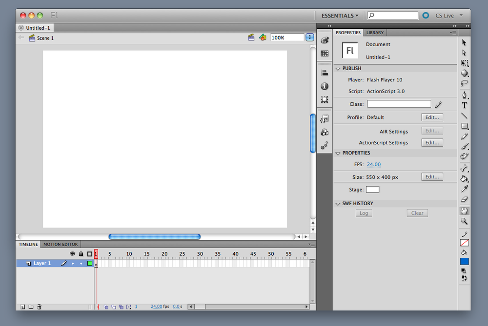
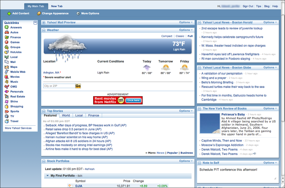
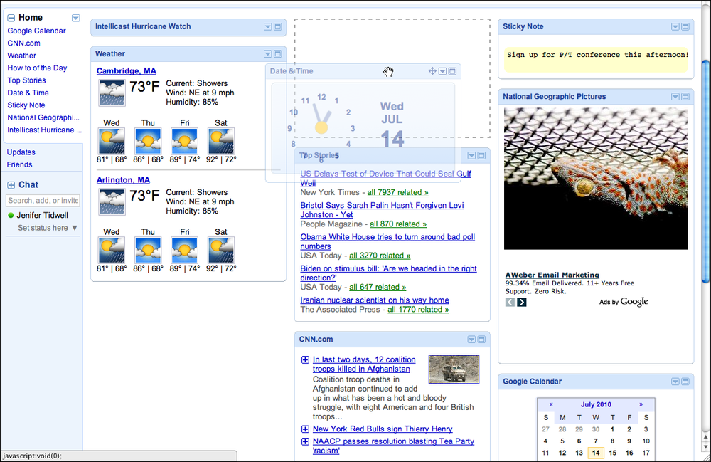
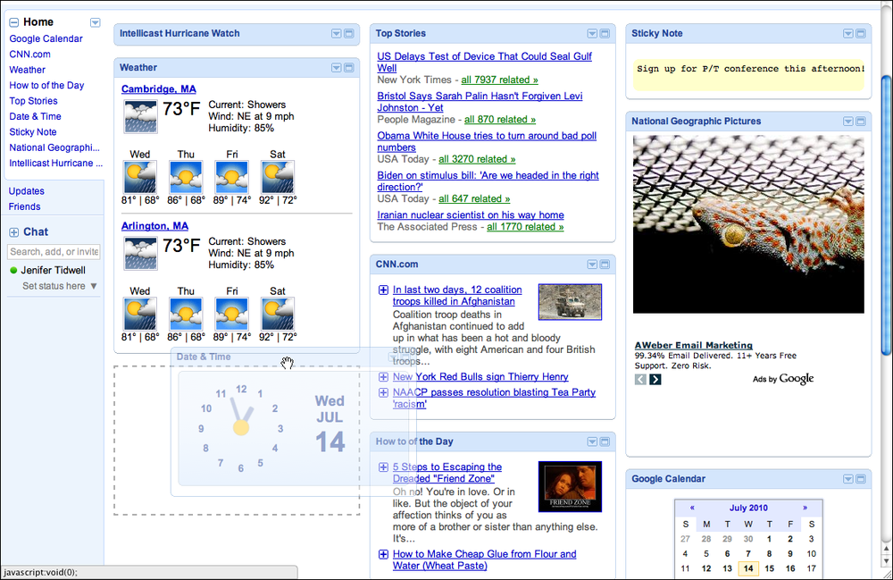
iGoogle, shown in Figures Figure 4-45 and Figure 4-46, demonstrates the mechanics of dragging and dropping a Movable Panels around a page. A user grabs the title bar of a panel; at the beginning of the drag operation, a dotted-line “ghost” shows the place where the panel had been. As the panel is dragged near another drop zone between panels, another “ghost” appears there—if the user lets go of the panel now, that’s where it will land.
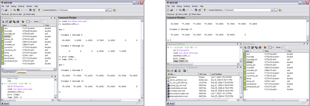
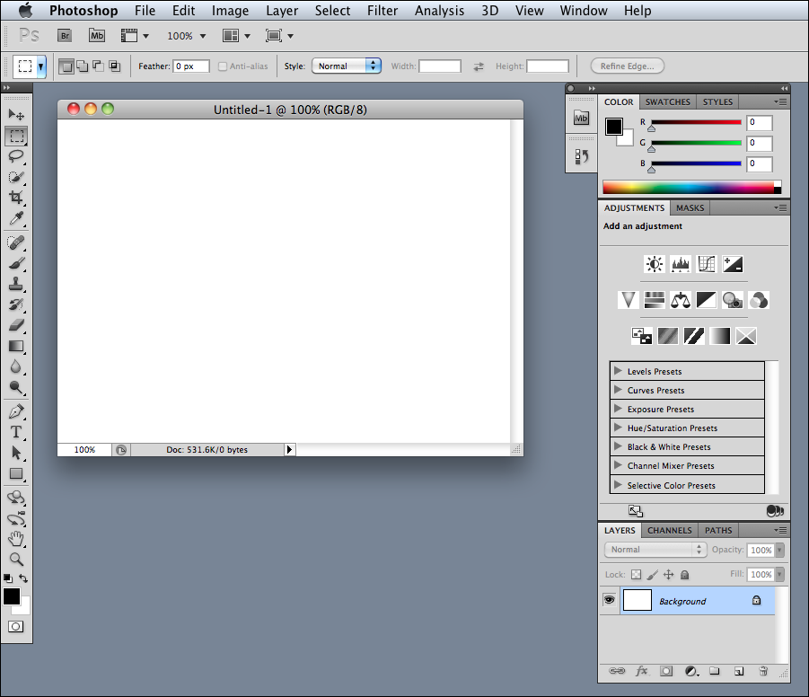
Desktop applications might use Movable Panels in a couple of ways: to show all the major tool windows in a complex application such as MATLAB, or to arrange small palette windows around a document, as Photoshop and other Canvas Plus Palette applications do. MATLAB (Figure 4-47) tiles the panels within one window, much like My Yahoo! and iGoogle—but each panel can be set to a custom size. Photoshop (Figure 4-48) puts the palette windows out on the desktop, where a user can freely move them, resize them, and stack them in Module Tabs.
In other libraries
http://quince.infragistics.com/Patterns/Movable%20Panels.aspx
http://www.welie.com/patterns/showPattern.php?patternID=customization-window
http://patternry.com/p=drag-and-drop-modules/
http://developer.yahoo.com/ypatterns/richinteraction/dragdrop/modules.html
In developer-oriented references, the term portlet is commonly used to describe the actual components that go into Movable Panels and thus compose a portal page.
Right/Left Alignment
What
When designing a two-column form or table, right-align the labels on the left and left-align the items on the right.
Use when
You’re laying out a form or any other set of items that have text labels in front of them. This could also apply to the internal structure of tables, or any other two-column structure in which the rows should be read left to right.
The labels come in many lengths—some are short, some long, some line-wrapped. Left-aligning the labels would put some of them too far away from their associated fields, leaving a gap too large for users’ eyes to span easily.
Why
When you put text right next to the thing it labels, you form a strong perceptual grouping of that pair—much more so than if they were separated by a large amount of space. If you align variable-length labels along their left sides, the short labels won’t be close enough to their controls, and the side-to-side grouping is broken. (This is the Gestalt principle of proximity at work.) In short, people will more easily connect each label to its associated control when the UI uses right/left alignment.
Meanwhile, you should always left-align the controls themselves. When combined with the right-aligned labels and a uniform spacing between them, they help form a nice strong double edge down the middle of the whole thing (taking advantage of continuity, another Gestalt principle). This powerful edge guides the viewer’s eyes smoothly down the page, supporting a good visual flow.
There are several cases in which you would not want right-aligned labels. For instance, there is good evidence that reading right-aligned labels is harder than reading left-aligned labels (which makes sense, because the eye has to work harder to find the beginning of the line). If your labels are long and need to be carefully read, consider left-aligning them instead.
If the labels will be localized into different languages, they’ll become different lengths. Layout becomes awkward when labels sit to the left of the controls—put them on top instead. (This is harder to read, and makes the page longer.)
In some layouts, right-aligning the labels just doesn’t look good. There might be a column of items just to the left of the labels, or perhaps the left-aligned titles separate the form’s sections—all of these, and more, can ruin a right/left alignment. Go with what works.
How
Instead of left-aligning each text label, right-align it. Bring it right up close to its control, separated by only a few pixels. The net effect will probably be a ragged (unaligned) left edge—that’s usually OK. If some labels are too long to make this work, try breaking them into multiple lines, or resort to putting the labels above the control, in which case this pattern becomes irrelevant.
Then left-align the controls against an imaginary line a few pixels away from the right edges of the labels. Make them precisely aligned, pixel-perfect—if they’re not, the controls will look messy. (The human visual system is really good at picking out slight misalignments!)
Again, the other edge of the control column may be ragged. That’s not so good if you’re dealing with text fields, combo boxes, and other visually “heavy” objects, as in Figure 4-49. Try to stretch them so that their right edges are aligned too, to whatever extent you can. You can try to align the short ones with one another, and the long ones with one another.
Examples
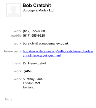
Right/Left Alignment also works with layouts that have no input controls at all. The Mac OS address book entry shown in Figure 4-50 has very little whitespace between the two columns, but the difference in color helps to separate them visually. Notice that the label “home page” is much longer than the others; this would have made a lefthand label alignment less pleasing to the eye and harder to read.
Diagonal Balance
What
Arrange page elements in an asymmetric fashion, but balance it by putting visual weight into both the upper-left and lower-right corners.
Use when
You’re laying out a page or dialog box that has a title or header at the top, and some links or action buttons—such as OK and Cancel, or Submit, or Back and Next—at the bottom. The page is short enough to fit on the screen without scrolling.
Why
Visually prominent features such as titles, tabs, and buttons should contribute to a balanced composition on the screen. They’re already at opposite ends of the page; when you put them on opposite sides, too, they often balance one another out. (Think of them as weights—the bigger or more “contrasty” the features are, the heavier they are; the closer to the edge they get, the more you need to put on the other side to compensate.)
Besides being nicer to look at, a diagonal balance also sets up the page so that the user’s eye moves easily from the top left to the bottom right—an ideal visual flow for users who speak left-to-right languages. (See the chapter introduction for a discussion of visual flow.) The rest of the page should support this visual flow, too. The eye finally comes to rest on elements representing actions that the user might do next, such as close this UI or go somewhere else.
How
Place the title, tabs, or some other strong element at the upper left of the page; place the button(s) at the lower right. Content of any width goes in between. If the content itself contributes to the balance of the page, so much the better—don’t put too much whitespace on only one side, for instance.
Consider what the dialog box in Figure 4-51 would look like if you placed the OK and Cancel buttons to the left edge instead of the right edge. The whole dialog would feel left-weighted and precarious.
In Windows, the placement of the title in the upper left and the conventional placement of buttons in the lower right do this for you automatically. In Mac OS, elements such as title bars, tabs, and action buttons are centered, so Diagonal Balance is much less common there.
Kevin Mullet and Darrell Sano’s classic pre-Web book Designing Visual Interfaces (Sun Microsystems) describes the ideas of diagonal balance:
Symmetrical layouts provide…visual equilibrium automatically. Asymmetrical layouts can achieve equilibrium as well, but their tenser, more dramatic form of balance, depends on careful manipulation to compensate visually for differences in the size, position, and value of major elements.
The following are examples of how you can achieve this balance.
Examples
The simple screen shown in Figure 4-52 directs the viewer’s attention to the lower right, where the call to action sits.
The focal points in the site shown in Figure 4-53 are the logo, the moving car, the “Let’s Motor” tag line, and the dealer-locator text field at bottom right—all in a diagonal line (approximately). The motion of the photograph pushes the eye down and right even more forcefully than the other examples. Undoubtedly, the designers of the site wanted to encourage people to use the text field. If it were at the bottom left instead, the page would lose much of its punch, and the text field might get lost in the page.
Responsive Disclosure
What
Starting with a very minimal UI, guide a user through a series of steps by showing more of the UI as he completes each step.
Use when
The user should be walked through a complex task step by step, perhaps because the task is novel, rarely done, or outside the user’s domain knowledge. But you don’t want to force the user to go page by page at each step—you’d rather keep the whole interface on one single page.
Alternatively, the task may be branched, with different types of information required “downstream” depending on a user’s earlier choices.
Why
In this pattern, the interface actually appears to be “created” in front of the user, one step at a time. At first, the user sees only those elements that are necessary for the first step. When the user takes that step, the next set of elements is displayed in addition to the first ones, then the next, and so on.
As the user sees the task unfolding directly in front of him via a dynamically growing UI, he can form a correct mental model of the task more quickly and easily. None of the awkward context switches that separate wizard screens impose exist here: when a user is yanked out of his workflow into a rigid set of modal screens shown one at a time, it feels like more of an imposition than if the UI had stayed within the user’s working context.
Furthermore, since the UI is kept together on one page, the user can easily go back and change his mind about earlier choices. As each step is redone, he immediately sees the effect on subsequent steps. This is better than jumping from one content-starved wizard screen to another.
For occasional tasks, Responsive Disclosure can work better than presenting a complex and interlinked set of controls all at once, because it’s always obvious what the first step is—and the next, and the next. The user never has to think too hard.
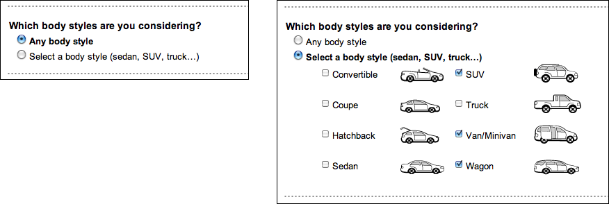
How should you choose between this pattern and Responsive Enabling? If you use Responsive Enabling, you will have to put all the controls for all choices on the UI—you’ll just disable the irrelevant ones until they become relevant (again, in response to the user’s choices). Sometimes that can make the UI too cluttered or complicated-looking. It’s a judgment call: if you need to fit the UI into a very small space, or if you think too many controls on the UI might look bad or make users nervous, use Responsive Disclosure instead.
How
Start by showing the controls and text for only the first step. When the user completes that step, show the controls for the next step, and so on. Leave the previous steps’ controls visible to let the user go backward if necessary. Keep it all on one page or dialog box so that the user isn’t abruptly pushed into a separate “UI space.”
In many such step-by-step designs, the choices the user makes at one step alter the rest of the task (i.e., the task is branched, not linear). For instance, an online order form asks whether the billing address is the same as the shipping address. If the user says yes, the UI doesn’t even bother showing entry fields for it. Otherwise, there’s one more step in the process, and the UI shows the second set of entry fields when appropriate.
The concept of responsive disclosure isn’t new. It was used in 1981 in the first commercial WIMP interface, the Xerox Star. Its designers considered “progressive disclosure,” a more general concept that includes responsive disclosure, to be a major design principle: “Progressive disclosure dictates that detail be hidden from users until they ask or need to see it. Thus, Star not only provides default settings, it hides settings that users are unlikely to change until users indicate that they want to change them.”[3] Indeed.
In the Star’s property sheets, for instance, blank space was reserved for controls that would appear as needed, in response to user choices. When a user chose from a set of values including the word Other, for instance, an extra text field would appear for the user to enter a number.
Examples
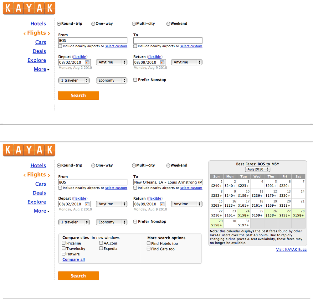
The Kayak example in Figure 4-55 hides the calendar and comparison box until the user has filled out enough of the form. Once they appear, the user will shift attention to them.
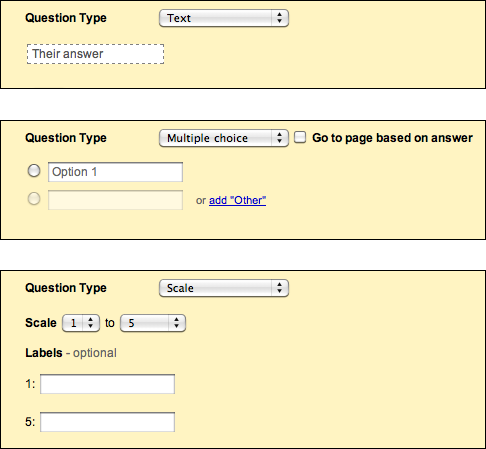
Another way to use Responsive Disclosure is to swap out a piece of a UI depending on the selection made in a drop-down or other limited-choice control. The examples in Figure 4-56, from Google Docs, do this: when the user changes the “Question Type” selection, the follow-on questions change accordingly. (So does the AutoTrader example, at the top of the pattern in Figure 4-54.)
Responsive Enabling
What
Starting with a UI that is mostly disabled, guide a user through a series of steps by enabling more of the UI as each step is done.
Use when
The user should be walked through a complex task step by step, perhaps because the user is computer-naive or because the task is rarely done (as in a Wizard). But you don’t want to force the user to go page by page at each step—you’d like to keep the whole interface on one page. Furthermore, you want to keep the interface stable; you’d rather not dynamically reconfigure the page at each step, as you would with Responsive Disclosure.
Why
Like Responsive Disclosure, this pattern takes advantage of the malleability of computer displays to interactively guide the user through the interface. The user thus gets a chance to form a correct mental model about cause and effect. The UI itself tells her the consequences of some choices: if I turn this checkbox on, I have to fill in these four text fields that just got enabled.
Furthermore, the user can’t do things that would get her into trouble, since the UI has “locked out” those actions by disabling them. Unnecessary error messages are thus avoided.
How
In some applications, most actions on the UI start off disabled—only the actions relevant to the user’s first step are available. As the user makes choices and performs actions, more disabled items should be enabled and brought into play. In this respect, it’s remarkably like Responsive Disclosure, in that the machine specifies a particular sequence through the interface.
A similar, less sequence-based technique is much more common in desktop UIs. As the user does things on the interface, certain actions or settings become irrelevant or impossible, and those actions get disabled until the user does whatever is necessary to reenable them. Overall sequence isn’t as important.
Whenever possible, put the disabled items in close proximity to whatever enables them. That helps users find the magic enabling operation and understand the relationship between it and the disabled items. The examples in Figures Figure 4-57 and Figure 4-58 place that text field (or checkbox, respectively) at the top or left of the disabled items, which follows the natural top-to-bottom and left-to-right “flow” of the interface.
When you design an interface that uses Responsive Enabling or Responsive Disclosure, be sure to disable only things that really can’t or shouldn’t be used. Be wary of over-constraining the user’s experience in an attempt to make the interface friendlier or easier to understand. When you decide what to disable, carefully consider each item. Is it being disabled for a really good reason? Can that functionality be enabled all the time? As usual, usability testing gives users a chance to tell you that you’ve done it wrong.
Another usability problem to avoid is what Bruce Tognazzini once called the “Mysteriously Dimmed Menu Items”—when the design offers no clue as to why a given item is disabled. Again, minimize the set of things that have to be disabled, especially when they’re far away from whatever operation turns them on. Also, somewhere in the interface or its help system, tell the user what causes a feature to be unavailable. Again, this whole problem can be avoided more easily when the disabled controls aren’t menus on a menu bar, but instead sit out on the main UI, collocated with whatever switches them on. Spatial proximity is an important clue.
Examples
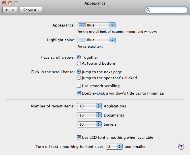
The Mac OS System Preferences, shown in Figure 4-58, provide a typical example of disabling based on a binary choice: should the desktop show the date and time on the menu bar, or not? If the user chooses to show it, she gets a panoply of choices about how it ought to be shown. If not, the choices are irrelevant, so they’re disabled. This behavior (plus the indenting of the options under the checkbox) tells the user that these choices affect the date/time display which the checkbox toggled—and nothing else.
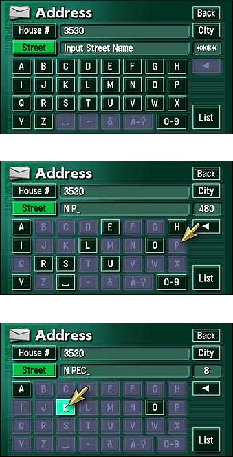
You can also reverse the sense of this pattern and do “responsive disabling.” The navigation system used in Toyota’s Prius and Lexus cars employs this technique when a user enters a destination address (see Figure 4-59). Knowing what streets exist in a given search area, the system narrows down the possible street names with each successive letter entered by the user. It then disables the letters that can’t possibly follow the currently typed string; the user has fewer buttons to think about, plus some assurance that the system “knows” what she’s trying to type. Address entry is thus made easier and more pleasant. (When only a few streets match, the system takes away the keyboard altogether and shows the streets as a list of choices—see the Autocompletion pattern in Chapter 8.)
In other libraries
http://quince.infragistics.com/Patterns/Responsive%20Enabling.aspx
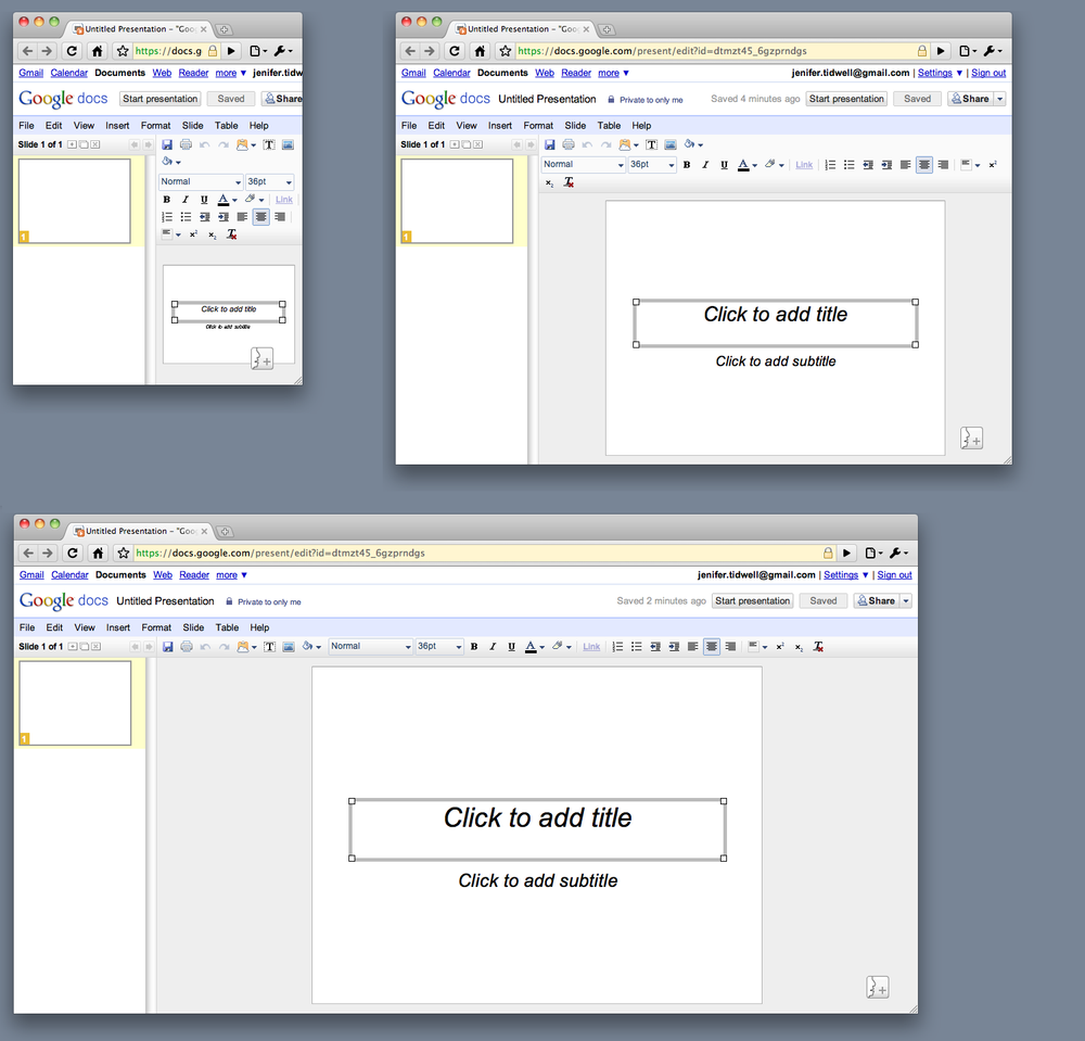
Liquid Layout
What
As the user resizes the window, resize the page contents along with it so that the page is constantly “filled.”
Use when
The user might want more space—or less—in which to show the content of a window, dialog box, or page. This is likely to happen whenever a page contains a lot of text (as in a web page), a high-information control such as a table or tree, or a graphic editor. This pattern doesn’t work as well when the visual design requires a certain amount of screen real estate, neither more nor less.
Why
Unless you’re designing a “closed” UI such as a kiosk or a full-screen video game, you can’t predict the conditions under which users will view your UI. Screen size, font preferences, other windows on the screen, or the importance of any particular page to the user—none of this is under your control. How, then, can you decide the one optimal page size for all users?
Giving the user a little control over the layout of the page makes your UI more flexible under changing conditions. It may also make the user feel less antagonistic toward the UI, since he can bend it to fit his immediate needs and contexts.
If you need more convincing, consider what happens to a fixed-layout “nonliquid” UI when the language or font size changes. Do columns still line up? Do pages suddenly become too wide or even clipped at the margins? If not, great; you have a simple and therefore robust design. But pages engineered to work nicely with window size changes generally also accommodate language or font size changes.
How
Make the page contents continuously “fill” the window as it changes size. Multiline text should wrap at the right margin until it becomes 10 to 12 words wide (more on that later). Text, trees, tables, graphs, and editors at “center stage” should enlarge generously while their margins stay compact. If the page has anything form-like on it, horizontal stretching should cause text fields to elongate—users will appreciate this if they need to type in anything longer than the text field’s normal length. Likewise, anything scrolled (such as lists or tables) should lengthen, and possibly widen, too.
Web pages and similar UIs should allow the body content to fill the new space, while keeping navigational devices and signposts anchored to the top and left margins. Background colors and patterns should always fill the new space, even if the content itself cannot.
What happens when the window gets too small for its content? You could put scrollbars around it. Otherwise, whitespace should shrink as necessary; outright clipping may occur when the window gets really tiny, but the most important content should hang in there to the end.
If the interface shows paragraphs of text, remember that they become nearly illegible when they’re too wide. Graphic designers target an optimal line length for easy reading of text; one metric is 10 to 12 average English words per line. Another metric is 30 to 35 em widths—that is, the width of your font’s lowercase m. When your text gets much wider than that, users’ eyes have to travel too far from the end of one line to the beginning of the next one; if it gets narrower, it’s too choppy to read easily.
(That being said, there is evidence that text with a longer line length, such as 100 characters per line, is faster to read than shorter lines, even though users prefer to read lines fewer than 55 characters long.[4])
Examples
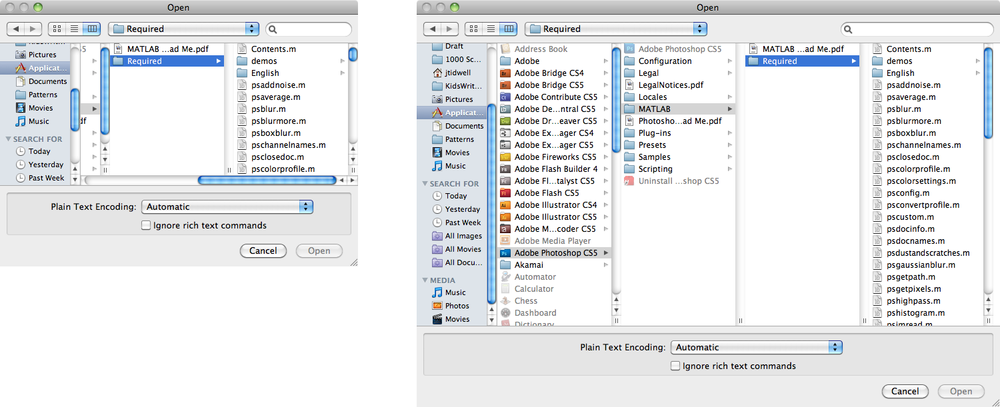
Mac OS allows you to resize the standard Open dialog box, which uses a Liquid Layout. This is good because the user can see as much of the filesystem hierarchy as he wants, rather than being constrained to a tiny predetermined space. See Figure 4-60 at the top of the pattern.
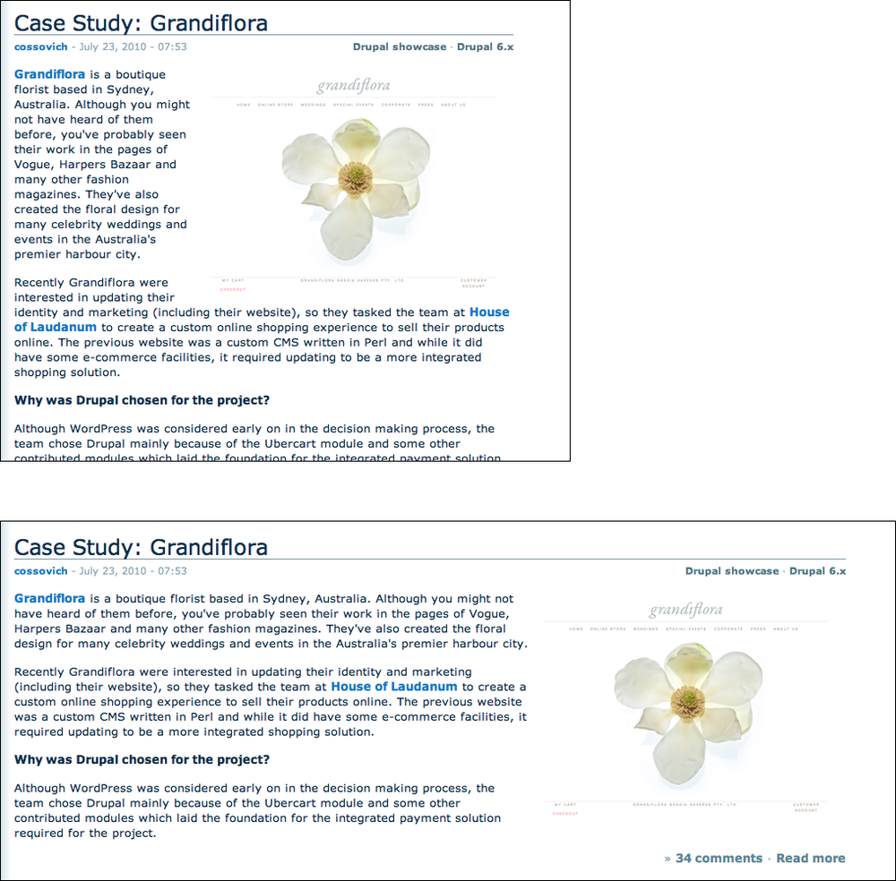
When a Liquid Layout is used on text in a browser, the floated elements should handle the resize gracefully, as in the Drupal.org example shown in Figure 4-61. Note also that the text in this article never gets so wide as to be unreadable, even when the window itself is very wide.
Google Docs allows the user to shrink the window to a very narrow size (see Figure 4-62). Though it places long toolbars across the top of the document, those toolbars wrap around and collapse gracefully as the window shrinks. (The user can’t resize it to be smaller than the smallest size shown here.)
[3] Johnson, J.A., et al. 1989. “The Xerox ‘Star’: A Retrospective.” IEEE Computer 22(9), 11–29. See also http://www.digibarn.com/friends/curbow/star/retrospect/.
[4] “Use Reading Performance or User Preference,” from http://usability.gov/guidelines/.
Get Designing Interfaces, 2nd Edition now with the O’Reilly learning platform.
O’Reilly members experience books, live events, courses curated by job role, and more from O’Reilly and nearly 200 top publishers.
