Navigation type and page type are closely related. A given navigational scheme may have two different purposes on different page types. For instance, visitors may expect contextual navigation on the home page to lead to pages within the site. But related links on a page deeper in the site may point to other sites or content formats. People understand navigation, in part, from the context of the page type on which it appears.
Each page in your site should have a purpose, a reason for being. It's critical to determine the purpose of each page while structuring a site. When this gets overlooked, the result may be unnecessary levels of structure. What's more, the purpose of the page should be immediately clear to visitors. People recognize different pages types quickly. This sets expectations for navigation and affects how people interact with the site.
Traditionally, there are three main categories of pages:
- Navigational pages
The purpose of navigational pages is to direct people to the content they are looking for; examples include home page, landing pages, and galleries.
- Content pages
Content pages are the substance of your site and why people are ultimately there; examples include articles and product pages.
- Functional pages
Functional pages allow people to perform a task, such as conduct a search or check email; examples include search pages, submission forms, and applications.
In practice these divisions are often blurred. Page types refer to the primary focus of the page or its primary purpose within the overall site.
Navigational pages point visitors to their ultimate goal: content or functional pages. They are stepping stones in information seeking. Designers may strive to reduce these pages in order to keep visitors closer to the site's content, but navigational pages aren't just necessary evils. They play an important role in telling the story of your site. They also support a range of seeking modes, help orientation, and even affect purchasing decisions. Key navigational pages include the home page, landing pages, and galleries.
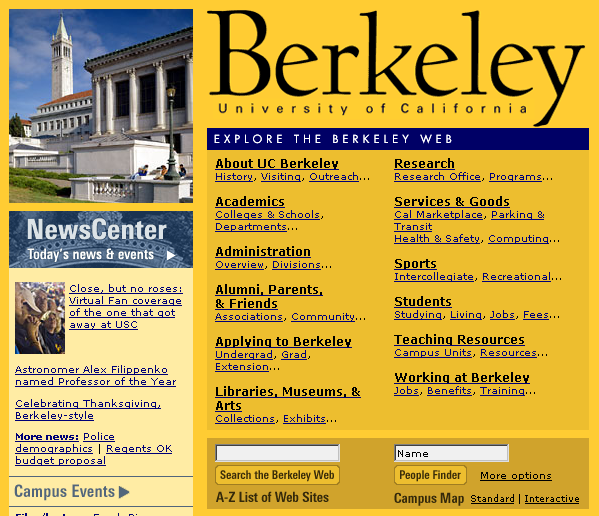
Providing a dashboard-like view into the rest of your pages, home pages direct visitors to key areas of your web site. A common strategy is to show lower levels of navigation directly on the home page. This aids in scanning and provides a path to content that may not otherwise surface immediately within the site. For example, the home page for the University of California, Berkeley (www.berkeley.edu, Figure 4-23) is a portal to the all of the other pages and sites maintained by the university.
A home page may also contain text content or functionality, but usually in an abbreviated format only. News sites, for instance, may present the first lines of top stories and then link to the full story elsewhere. E-commerce sites may feature a product on the home page, but link to the full details within the site. Or, travel sites may present a range of functions that visitors can perform right from the home page.
The home page is often viewed as a chance to market products or promote a brand image. However, visitors coming to site with a specific information need want to first get to their destination directly and quickly. For this reason, Forrester Research recommends merging the site map with the home page, arguing:
"Home pages tend to get cluttered with the latest marketing jargon from the firm, which Web users may have a hard time deciphering. Site maps, on the other hand, often organize links with simple labels like 'products,' 'services,' and 'help' — exactly the kind of language that customers understand.[54]"
Even if you aren't willing to give up that prized home page real estate for an entire site map, consider that visitors will see it as a navigational page nonetheless. You will need to provide the guidance and navigation they expect, or risk that they go somewhere else.
Also called: sub-section start pages, category pages, overview pages, department pages.
Landing pages provide an overview of main site categories. These often correspond to the options in a main navigation and might be departments of an online store or the main sections of an online newspaper. Similar to how a home page provides an overview of the entire site, landing pages provide an outline to the content in a given section.
Keep in mind that people arrive at sites in various ways, such as via bookmarks and search engine results. They may never see the site's home page, but instead arrive on a page somewhere in the middle. For this reason, landing pages must provide both local and global orientation.
With mechanisms such as dynamic menus, you may be tempted to omit landing pages completely. Instead, you can just bring visitors directly to the pages that correspond to the options in the menu. But if you skip landing pages, be aware of the consequences. Namely, you won't be able to link to a section overview page directly.
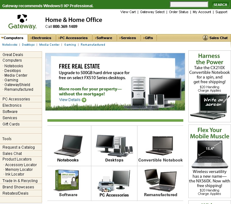
Gateway, a large mail-order computer distributor in the US, has a range of products on its site (www.gateway.com). Clicking on Computers in the main navigation brings you to the corresponding landing page (Figure 4-24). This provides an overview to the types of computers that are available.
Galleries are similar to landing pages, but provide an overview of a specific group of products or content instead of links to a site department or section. Gallery pages are more than just a means to navigate a product page: they contain critical shopping information and allow visitors to compare products. Shoppers may even decide to purchase from gallery page alone. They then go to the product page for more detailed information to confirm a decision.
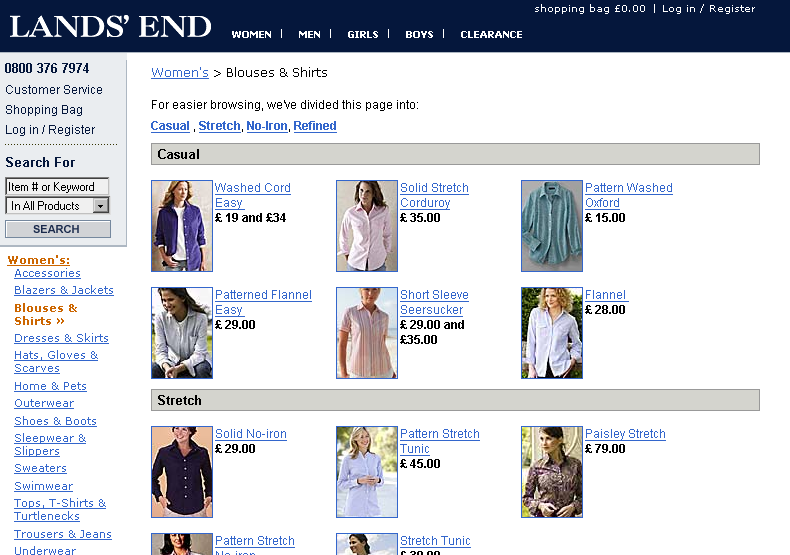
Figure 4-25 shows a gallery page for Lands' End in the UK for women's shirts (www.landsend.co.uk). Although it contains thumbnail images and price information, more basic details about each shirt might help this page be more effective. On the plus side, visitors can see nearly all of the products Lands' End offers in the category at a glance. Galleries like this one are vital for e-commerce sites and the online shopping process.
Search results pages resemble gallery pages, but are dynamically created based on user-entered keywords. The collection of resulting links doesn't necessarily have the benefit of handcrafted categories such as those found on gallery pages. Depending on the search terms, results may or may not be of a single product or content type.
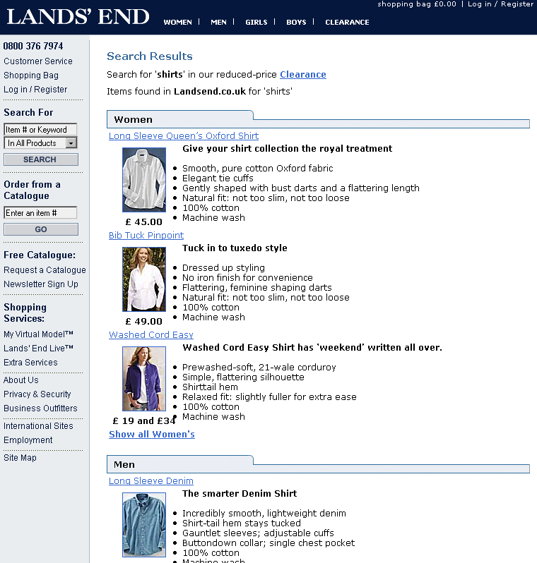
For example, compare Figure 4-26, which shows the search results for the term "shirts" on the Lands' End UK site, to Figure 4-25. Note that men's shirts are also included in the results and that the display and format of each of the hits is different than the setup of the gallery page. Within the search results, more detailed information is offered, but visitors initially get less of an overview of all available shirts.
For more about navigating from search results pages, see Chapter 11.
On information-rich web sites, content pages are ultimately what people are looking for: text, stories, articles, personal résumés, blogs, news, company histories, and how-to information are just some examples. Content pages are the fundamental currency of the Web. Accordingly, the focus of content pages should be the content. All too often, unnecessary navigation and graphics clutter the page.
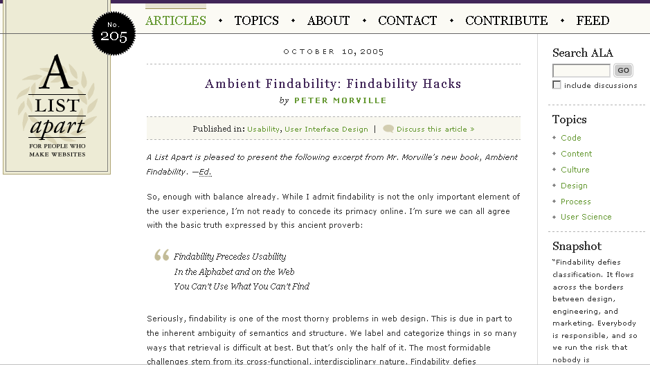
For instance, the content pages on A List Apart, a leading online magazine for web design and development, devotes most screen real estate to article text (www.alistapart.com, Figure 4-27). The navigation is kept to a minimum and there are no gratuitous graphics. This allows readers to engage the text without becoming distracted.
Product pages are obviously critical to e-commerce sites. There are many typical elements to product pages:
Product pictures
Product descriptions
Further details
Related products
In addition, product pages often contain several functional elements:
Add to a shopping cart or purchase
Save to a wish list
View larger images or zoom in
Change size or color
Email this page
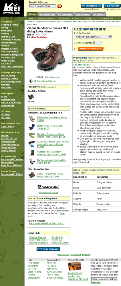
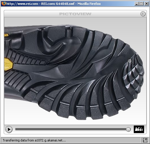
Figure 4-28 shows a product page for hiking books on the REI web site, a large U.S. outdoor goods retailer, as an example of an information-rich product page (www.rei.com). In addition to the many typical elements of a product page, note the good use of contextual navigation to point out related products in the center left of the page. Visitors can also look at products up close in a separate pop-up window, shown in Figure 4-29. This allows for examination of the hiking boot from all angles, mirroring how people scrutinize products in a brick-and-mortar store.
Functional pages allow people to complete a task online, such as conduct a search or send an email. Like content pages, they are often the destination page that fulfills a user need.
There may be little or no text on such pages, so they often lack embedded navigation and related links. Contextual navigation and cross-structural linking can be problematic when used from functional pages. First of all, users need to focus on completing the task at hand. Additionally, linking to another page while filling out a form or finishing a process may result in loss of input. Try to protect user-entered data so that visitors don't have to fill it in again after they navigate away from the page, accidentally erase the form, or interrupt a submission process.
It's quite typical for the site search feature to be a small input field on the home page or on all pages of a site. Sometimes, however, a more detailed search is required, typically called an advanced search. As the name implies, this offers more control than a simple search. An advanced search interface requires more space; consequently, a separate page is usually needed.
Navigation on a search form is often quite minimal. There might be links to search tips, help, and other explanations, or links that show or hide options or clear the form. Two types of navigation that can assist searchers are scoping options and word wheels, both discussed further in Chapter 11. Otherwise, it's appropriate to reduce, or even remove, main navigation mechanisms from a search page.
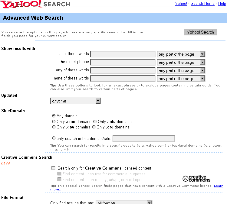
Figure 4-30 shows the advanced search form for Yahoo.com, which offers many specific search options. Navigation is limited to only few links for help and tips, as well as a way back the Yahoo! home page.
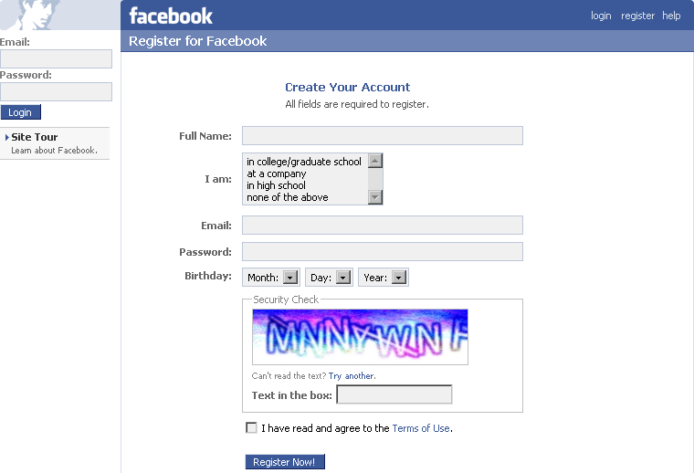
Forms allow people to submit information. This might be to create an online account or profile, to apply for a job, or to reserve a car, for example. Forms allow for transactions on the Web. As with search pages, associative navigation on forms is discouraged. You generally don't want to interrupt the task of filling out the form—this is particularly important on the Web, because such forms require explicit action to save data. If you do allow people to navigate away from a form in the middle of filling it out, be sure to maintain user-entered information when returning. It's extremely annoying to have to fill out a form again after reviewing terms and conditions or a help tip.
Figure 4-31 shows the registration form for Facebook (www.facebook.com), an online social networking platform. The navigation is limited to a few links only, including help and terms of use.
Web applications refer to a range of pages that contain interactive features and functionality. People accomplish tasks on these pages: they write emails, edit spreadsheets, manage projects, and so forth. As web technologies become more and more robust, online applications will become more common.
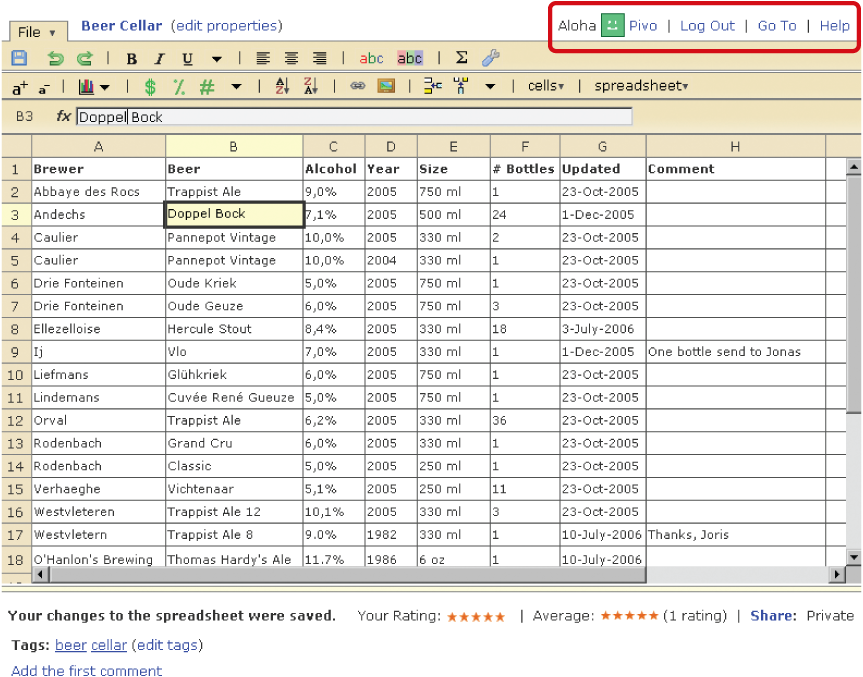
Web mail applications are a common type of application. For instance, you may have a Hotmail, Yahoo!, or Gmail account. More advanced types of applications are becoming more and more common, mirroring desktop programs. Figure 4-32 shown an example of an online spreadsheet using NumSum, a free spreadsheet sharing service (www.numsum.com). The functions to manipulate the datasheet at the top closely resemble software navigation. Notice, however, that there are a few links in the upper-right and at the bottom that navigate away from the workspace. If they have not saved their work, users are warned before they are allowed to navigate away from the page.
For more on navigation for applications, see Chapter 13.
When should one page become two? Will users scroll? The shorter the pages, the more of them. This will require more clicks and more page loads. The longer the pages, the fewer of them. But people then have to scroll. There is no single guideline for page length; many factors are influential:[55]
Screen size is problematic because there is no single screen size to design to. On the Web, a wide range of browser sizes exist and vary based on monitor resolution, the number of browser toolbars or sidebars a person has, and the size of the browser window on the desktop.
Content might not have the same impact or meaning when it's broken up into multiple smaller pages. Consider the REI example in Figure 4-28. If each element on that page—the photo, the description, the specifications, the related product, and so forth—were on a different page, the resulting experience would be quite different. Keeping things together creates a natural relationship between pieces of information.
People don't like to read online. For longer texts, it's safe to assume many people won't read from the computer screen. Reading longer documents offline is less problematic and preferred by most. It's acceptable to provide long text pages if people are going to print them anyway.
It may not be efficient to require people to download pages for small bits of content. Instead, sending more information with each page (i.e., longer pages) may reduce the number of calls to the server. But there's long and then there's long. At a certain point it makes sense to chunk volumes of information. Presenting an entire book as a single page, for instance, would cause performance problems.
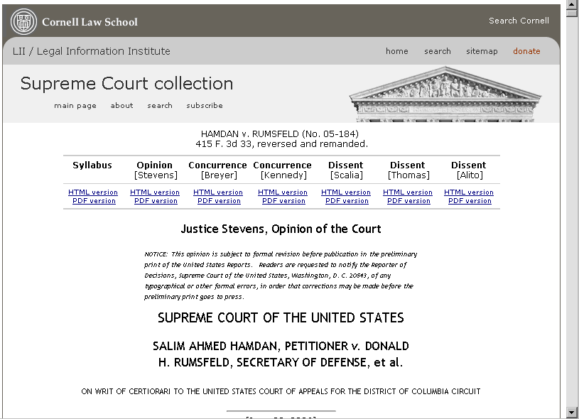
Figure 4-33 shows an example of a U.S. Supreme Court decision found on the web site for The Legal Information Institute of the Cornell Law School (www.law.cornell.edu). On this site, cases are generally given a single page. Note the size of the scrollbar in the upper right; this document is over 50 screens long, even at a fairly large browser size. For smaller resolutions it may occupy 100 screens. The nature of the content, however, calls for a single page. People doing legal research online need to see the entire document, even if they end up using only a single sentence from it for their own work. Additionally, it is probably safe to assume visitors will either download or print it for reading.
Page type is also a key factor in determining page length. Generally, it's best to use short pages when people need to browse and scan quickly, or when they are completing a task with an online application. Longer pages are good for content that is best presented together for context. For instance, visitors benefit from long product pages such as the one seen in Figure 4-28. It provides an overview and all of the context necessary to make a purchasing decision.
[54] Iris Cremers, "Merge Your Site Map with Your Home Page," Forrester Report (November 18, 2005).
[55] Patrick Lynch and Sara Horton, Yale Web Style Manual, 1997. www.info.med.yale.edu/caim/manual/contents.html.
Get Designing Web Navigation now with the O’Reilly learning platform.
O’Reilly members experience books, live events, courses curated by job role, and more from O’Reilly and nearly 200 top publishers.
