Chapter 23. Sparklines and Data Bars
Sparklines: Intense, Simple, Word-Sized Graphics
“For Excel 2010, we’ve implemented sparklines, 'intense, simple, word-sized graphics,’ as their inventor Edward Tufte describes them in his book, Beautiful Evidence. Sparklines help bring meaning and context to numbers being reported and, unlike a chart, are meant to be embedded into what they are describing...”
We’ll explore sparklines by creating a variant of our dashboard that shows trend over time for tickets by state using the second PivotTable. This example builds on our previous work in Part IV.
Right-click on and make a copy of your existing sheet and name it Sparklines (Figure 23-1).
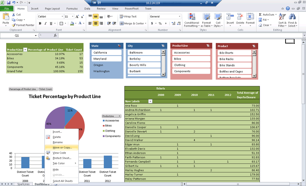
Figure 23-1. Launch the Move or Copy dialog
Right-click on the worksheet that contains your dashboard.
Select Move or Copy to show the Move or Copy menu (Figure 23-2).
Check Create a copy and click OK.
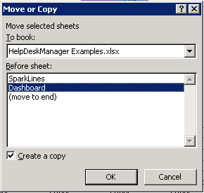
Figure 23-2. Move or Copy dialog
On the new copy of your dashboard, remove full name from the second PivotTable.
Add State from the People dimension (Figure 23-3).
Tweak the column width or slicer position as required.
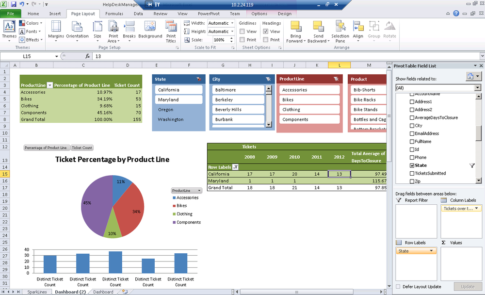
Figure 23-3. Pivoting by State
To add a sparkline, select the cell, you’d like to insert your sparkline.
Go to ...
Get Developing Business Intelligence Apps for SharePoint now with the O’Reilly learning platform.
O’Reilly members experience books, live events, courses curated by job role, and more from O’Reilly and nearly 200 top publishers.

