Chapter 4. Large-Scale CSS
In Chapter 3, you saw how a good information architecture based on well-constructed HTML provides a solid foundation on which we can layer other capabilities for modules within a large web application. In this chapter, we explore techniques for adding a layer of presentation.
The purpose of the presentation layer is to enhance usability and provide an aesthetic user experience by applying principles of good visual design. At its best, a good presentation plays a principal role in making a large web application more usable and appealing. At its worst, a poorly executed presentation can render an otherwise useful and meaningful information architecture completely worthless.
In web development, a well-defined presentation layer is implemented using CSS. This, in fact, was the original purpose of CSS when it first came on the scene in the late 1990s: it allowed for clear separation of a web application’s underlying information architecture from its presentation. However, this separation hasn’t necessarily guaranteed modularity. Our goal in developing large web applications is defined in the CSS-related tenet from Chapter 1:
Tenet 4: Large-scale CSS forms a layer of presentation that is separate from the information architecture, applied in a modular fashion, and free of side effects as we reuse modules in various contexts.
In this chapter, we begin by looking at the tradeoffs between the various ways to include CSS. We explore important techniques with selectors, standard module formats, and CSS scoping that help you apply CSS in a modular way. Next, we view some useful methods by which we can position elements outside the normal document flow. These are especially important in the creation of layouts and containers, which are reusable enclosures that allow you to organize modules across a large web application. Finally, we examine a few examples of layouts and containers, and discuss some practices to provide a clean, consistent slate on which to layer a presentation.
Modular CSS
Once you have divided the components of a web page into reusable modules that reflect the information architecture (see Chapter 3), you can focus on how to give the modules the desired presentation through CSS. As mentioned earlier in Tenet 4, the CSS should:
Have distinct modules of its own that apply to specific parts of the architecture (in other words, it should be well targeted), and
Not produce unexpected consequences as a module is reused in various contexts (in other words, it should be free of side effects).
In practice, you may need to alter your information architecture slightly over time to accommodate highly stylized presentations. But even when making such adaptations, always try to maintain a meaningful HTML structure upon which you can layer modular CSS.
Including CSS
Let’s look at three ways to include CSS in a web application: linking, embedding, or inlining. Although linking is generally the most desirable of these options, it is common to find some combination of these methods in use across a large web application, even within a single page, since each method has some benefits, depending on the specific situation.
Linking
Linking allows you to place CSS in a file, which you
then apply by placing a link tag in
an HTML file. This has desirable effects: architecturally, multiple
pages can share the same CSS, while in terms of performance, the
browser can cache the file after downloading it the first time. The
following example links a CSS file:
<link href="http://.../sitewide.css" type="text/css" rel="stylesheet" />
Linking also allows you to specify a media type so that you can
direct certain CSS rules at specific media (e.g., screens, printers,
etc.). For example, when displaying a file for printing, you can
remove nonessential items that would consume a lot of printer ink. To
achieve this flexibility, specify media="all" as an
attribute for the main stylesheets, then conceal certain parts of the
page during printing by including specific styles for this purpose in
a second stylesheet with the attribute media="print". For example:
<link href="http://.../sitewide.css" type="text/css" rel="stylesheet"
   media="all" />

<link href="http://.../printers.css" type="text/css" rel="stylesheet"
   media="print" />
Once you modify a file that browsers may have already cached, you need to make sure browsers know when to bust the cache and download the new copy. Version numbers help you manage this. Incorporating a date stamp into the CSS file’s name works well, and you can add a sequence number when updating the CSS file more than once a day (or you could use the version number from your source control system instead of the date stamp). For each new copy, simply bump up the version number as shown here:
<link href="http://.../sitewide_20090422.css" type="text/css"
   rel="stylesheet" />
Of course, each page that includes a link to the CSS file must also be updated to refer to the new version. Chapter 7 presents information on managing this in a centralized way.
Embedding
Embedding places CSS directly within a style block on a web page. One benefit of
this method is that you can generate and include CSS programmatically.
For example, PHP can generate CSS directly as it generates the HTML
for the page. It also provides an easy way to override the styles in a
linked CSS file on a per-page basis. Because browsers apply CSS rules
in order as they encounter them (after taking into account the rules
of specificity), the embedded styles must come after the link tags in order to override them. Example 4-1 defines a CSS rule for an element with the
ID nwcrev using embedded
CSS.
You can specify a media type with embedded CSS, just as when linking CSS. Example 4-2 illustrates embedding CSS for different media types.
Inlining
Inlining sets CSS styles for an individual element of an
HTML page using its style
attribute. You should use inlining very sparingly, because it requires
the most effort to override and provides little opportunity for reuse.
That said, you can make a good case for inlining in situations where
CSS serves more than just a purely presentational purpose. Some
examples include pop-up menus or tabbed interfaces in which certain
elements need to be concealed by default. Because the CSS in these
situations is more tightly coupled to the markup and behavior to begin
with, it may make sense to communicate this situation by inlining the
CSS. Another benefit in these situations is that inlining CSS also
prevents concealed menus or tabs from being revealed briefly in the
event that network latency keeps the linked CSS from being downloaded
immediately.
Example 4-3 illustrates inlining CSS to
conceal a pop-up menu. This technique is useful in that you can hide
or show the menu by simply toggling the CSS display property of its enclosing div from none to block via JavaScript rather than
reconstructing the menu in the DOM each time.
Applying CSS
However you include your CSS, you apply its rules to specific elements in the HTML markup with CSS selectors. A thoughtful use of CSS selectors is essential to the creation of modular CSS. Let’s review the basic, most widely supported selectors so that we can then see how to best use them in large web applications.
IDs
IDs are unique identifiers for elements specified using
an element’s id attribute. You
select an element based on its ID by preceding the element’s
identifier with a pound sign (#).
For example, to apply CSS to an element with id="nwcrev", specify the following:
#nwcrev
{
   /* Add styling for the element with the ID nwcrev. */
   ...
}
In large web applications, selection by ID plays a particularly important part in scoping CSS so that it is applied only within certain modules or certain pages (see Scoping with CSS).
Classes
Classes are identifiers for collections of semantically similar
elements and are applied to HTML elements using the class attribute. You select an element based
on its class by preceding the class identifier with a dot (.). For example,
to apply CSS to all elements with class="action", do the following:
.action
{
   /* Add styling for elements with the class action. */
   ...
}
Example 4-4 illustrates how you
can use classes to apply different styles to items that appear at
various positions within a list. Unlike with IDs, it is possible to
assign multiple classes to an HTML element. In addition to
beg, mid, and end, the example adds the classes odd and even for styling the list items based on
this distinction as well. You could use the odd and even classes to create a striped
list.
<div id="msgpop" style="display: none;">
   <ul class="menu">
      <li class="beg odd">
         <a href="http://...">Contact via Email</a>
      </li>
      <li class="mid even">
         <a href="http://...">Contact via IM</a>
      </li>
      <li class="end odd">
         <a href="http://...">Add to My Contacts</a>
      </li>
   </ul>
   <ul class="more">
      <li class="beg odd">
         <a href="http://...">View More Options</a>
      </li>
   </ul>
</div>
In large web applications, selection by class plays an especially important role in presentation switching (see Scoping with CSS).
Descendants
The descendants of an element are all the elements it
encloses. For instance, a ul
element has all its li elements as
descendants, as well as all the elements they enclose. You specify
descendants in CSS by placing them after the ancestor element, with
one or more spaces between them, as shown here:
#msgpop .beg
{
   /* Add styling for elements with class beg enclosed by msgpop. */
   ...
}
In large web applications, a good understanding of selection using descendants is especially important when working with standard module formats (see Standard Module Formats).
Elements
Elements can be selected based just on their type. CSS selects elements this way simply by listing them without any additional punctuation, as shown here:
a
{
   /* Add styling for all links wherever they appear. */
   ...
}
Pseudoclasses, which let you specify a state for the element, are appended to element selectors with a colon:
a:visited
{
   /* Add styling for all links that have been visited. */
   ...
}
You should use element selectors sparingly on their own in a large web application, because they potentially affect such a large number of elements, unless that is truly your intention and all developers are aware of that intent. A better option is to use them as part of a contextual selector that targets a specific pattern of descendants:
#msgpop ul .odd a
{
   /* Only style odd links within unordered lists inside msgpop. */
   ...
}
Appending a class selector to an element selector (using no space between the element and class) lets you achieve even further qualification, as shown here:
#msgpop ul.menu .odd a
{
   /* Only style odd links in uls with the class menu in msgpop. */
   ...
}
In large web applications, selection by element is primarily
useful when you have done a good job creating reasonably small,
well-constructed modules that each have a clearly defined scope (see
Scoping with CSS). You can also qualify an element
selector further by requiring the element to have a specific ID (e.g.,
div#nwcrev).
Specificity and Importance
Specificity is a value calculated to determine the winner when multiple selectors in a cascade of styles end up addressing the same element. For example, specifying an element by ID is more specific than using its class; specifying an element by its class is more specific than using an element selector. Because the rules for calculating specificity are often not at the top of a web developer’s mind (although not difficult to learn), it is good to avoid relying on them too heavily in large web applications.
Declaring a style with !important overrides
its selector’s specificity. Its use is almost always a bad idea, because
it hinders maintainability. In fact, it’s usually a sign that you’re
obscuring a mistake that will bite you later. Instead of using !important, interpret the urge as a warning to
look for a brittle section of your code. As the lifespan of the
application continues, one use of !important inevitably leads to others as
developers seek quick fixes in place of understanding the underlying
structure of the application. This situation quickly becomes
unwieldy.
Scoping with CSS
In a large web application, we expect modules to move around and be used in a variety of contexts over time. To keep your CSS reusable, you must always be aware of the scope in which your CSS applies.
Scoping within a module
In Chapter 3, we discussed the fact that because IDs never should be used on a page more than once, they provide a great way for us to identify modules in a unique way, provided we have a good naming convention. Assuming that a module’s ID is unique, we can use it to create a convenient scope of sorts for any CSS that we want to direct only at that module.
Example 4-5 illustrates defining the CSS for two modules, the New Car Reviews module and the New Car Queries module. Because each selector begins with the module ID, each rule is targeted specifically at the module we expect.
Scoping at the page level
If you want to apply CSS to a module only where it appears within a specific page, use CSS scoped at the page level. Scoping CSS at the page level is particularly useful when you desire slight differences in the way a module looks on various pages, which is a common issue with reusability in large web applications.
For example, suppose you want a left margin for a module when it
appears on the right side of a page and a right margin for the same
module when it appears on the left. One solution is to assign the
body element of each page a unique
page ID, which gives you a way to target CSS for modules on specific
pages where they appear. Examples 4-6 and 4-7 illustrate adding top and left
margins to the New Car Reviews module and top and right margins to the
New Car Queries module on the New Car Search Results page.
<body id="nwcsrspage">
...
         <div id="nwcrev">
            ...
         </div>

...

         <div id="nwcqry">
            ...
         </div>
...
</body>#nwcsrspage #nwcrev
{
/*
Only apply these margins to the New Car Reviews module on the New
Car Search Results page.
*/
margin: 10px 0 0 10px;
}
#nwcsrspage #nwcqry
{
/*
Only apply these margins to the New Car Queries module on the New
Car Search Results page.
*/
margin: 10px 10px 0 0;
}A good guideline is to apply styles that affect a module’s
border and everything inside its border at the module level, but leave
styles that apply outside a module’s border (e.g., margins, floating,
etc.) for each page to style based on how and where the module is
used. However, if something within the module requires styling on the
outermost div everywhere it is used
(e.g., it needs to be floated), style that at the module level.
Presentation switching
When variations in a module’s presentation
require multiple rules and when these rules are likely to be reused
across a variety of contexts, just relying on a page ID to achieve
alternate presentations is cumbersome. In these situations, a better
solution is to associate a class with each presentation and switch
between presentations by setting the appropriate class on the
outermost div for the
module.
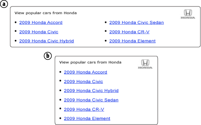
Figure 4-1 illustrates two
presentations for the Popular New Cars module. In Examples 4-8
and 4-9, we use the class default to switch to the CSS for the default
(wider) presentation. If we change the class to compact, we end up applying a different set
of CSS for the module. CSS that is the same in both presentations is
specified without qualifying it further as part of the default or compact classes. The CSS in Example 4-9 assumes that you
have first applied the browser reset and font normalization CSS
presented at the end of this chapter.
<div id="nwcpop" class="default">
   <div class="hd">
      <div class="tagline">
         <cite>
            View popular cars from Honda
         </cite>
      </div>
      <div class="logo">
         <img src="http://.../logo_honda.gif"/>
      </div>
   </div>
   <div class="bd">
      <ul class="pri">
         <li>
            <a href="http://...">2009 Honda Accord</a>
         </li>
         <li>
            <a href="http://...">2009 Honda Civic</a>
         </li>
         <li>
            <a href="http://...">2009 Honda Civic Hybrid</a>
         </li>
      </ul>
      <ul class="sec">
         <li>
            <a href="http://...">2009 Honda Civic Sedan</a>
         </li>
         <li>
            <a href="http://...">2009 Honda CR-V</a>
         </li>
         <li>
            <a href="http://...">2009 Honda Element</a>
         </li>
      </ul>
   </div>
</div>/* Apply this CSS to all presentations of the module. */
#nwcpop .hd
{
position: relative;
}
#nwcpop .hd .tagline
{
position: absolute;
padding: 5px 0 0 15px;
}
#nwcpop .hd .tagline cite
{
font: bold 77% verdana;
color: #000;
}
#nwcpop ul
{
list-style-type: disc;
margin: 0;
padding: 0;
}
#nwcpop li
{
margin-left: 15px;
line-height: 1.3em;
}
/* Apply this CSS to just the default version of the module. */
#nwcpop.default .hd
{
width: 630px;
background: url(http://.../top_630.gif) #fff no-repeat;
padding-top: 8px;
}
#nwcpop.default .tagline
{
width: 475px;
}
#nwcpop.default .logo
{
padding: 0 15px 0 0;
background: url(http://.../mid_630.gif) repeat-y;
text-align: right;
}
#nwcpop.default .bd
{
position: relative;
background: url(http://.../btm_630.gif) no-repeat;
background-position: bottom left;
padding: 10px 15px 15px;
}
#nwcpop.default .pri
{
width: 295px;
}
#nwcpop.default .sec
{
position: absolute;
top: 10px;
right: 15px;
width: 295px;
}
/* Apply this CSS to just the compact version of the module. */
#nwcpop.compact .hd
{
width: 300px;
background: url(http://.../top_300.gif) #fff no-repeat;
padding-top: 8px;
}
#nwcpop.compact .tagline
{
width: 145px;
}
#nwcpop.compact .logo
{
padding: 0 15px 0 0;
background: url(http://.../mid_300.gif) repeat-y;
text-align: right;
}
#nwcpop.compact .bd
{
background: url(http://.../btm_300.gif) no-repeat;
background-position: bottom left;
padding: 10px 15px 15px;
}In Chapter 7, we’ll examine how to manage presentation switching in a nicely encapsulated, programmatic way using PHP. In practice, highly stylized modules often require a combination of presentation switching and programmatic changes to the information architecture.
Standard Module Formats
As a general rule, it may be worthwhile to group parts of modules into some common divisions. Besides
adding further elements of structure to your information architecture,
they can provide additional hooks for styling. For instance, Examples
4-8 and 4-9 apply background images for the rounded borders in the
presentation. These are conveniently placed on the hd division (the header) and bd division (the body). Divisions of this type
often contain other divisions. For example, an outer division with
presentation for the header or body encapsulates an inner division that
contains the content for either section.
Some examples of divisions applicable to most modules (just as
they are to entire pages) are a header, a body, and a footer, to which you might give the classes hd, bd, and
ft, respectively. This is the case in
Example 4-8. Even when one of these
sections is empty, it may be useful to add the section for future use,
so we could have also added an empty division with the class ft after the bd division in Example 4-8. Undoubtedly, there are other
standard divisions that you may choose to apply to certain modules in
certain types of applications. Microformats are other examples of
standard formats that you might incorporate within some modules. You can
read more about microformats at http://microformats.org.
Examples 4-10 and 4-11 illustrate the use of standard
header, body, and footer divisions for a module. In these examples, a
module with the ID nwclst (New Car
Listings) is nested within a module with the ID nwcsrs (New Car Search Results). Examples
4-10 and 4-11 also demonstrate that, although
standard formats are useful, you do have to be mindful of side effects
when applying them within nested modules (in actuality, the same
problem exists when you use any commonly used class
within nested modules). In these situations, when you apply CSS to the
outer instance of the class, the cascading nature of CSS applies the same styles to any
inner instances as well because the inner instances are descendants,
too, just deeper ones.
<div id="nwcsrs">
   <div class="hd">
      ...
   </div>
   <div class="bd">
      <div class="pri">
         <div id="nwclst">
            <div class="hd">
               <!-- This hd gets styling from the outer hd too. -->
               ...
            </div>
            <div class="bd">
               <!-- This bd gets styling from the outer bd too. -->
               ...
            </div>
            <div class="ft">
               <!-- This ft gets styling from the outer ft too. -->
               ...
            </div>
         </div>
      </div>
      <div class="sec">
         ...
      </div>
   </div>
   <div class="ft">
      ...
   </div>
</div>#nwcsrs .hd
{
/* Add styling for the header section of the nwcsrs module. */
...
}
#nwclst .hd
{
/* The nwclst module hd gets styles from the nwcsrs hd too. */
...
}Fortunately, the solution for guarding against side effects within
nested modules is rather simple: use the unique module ID as a prefix
for the common classes that may occur within nested modules. Examples
4-12 and 4-13 illustrate how this resolves the
issue. Small, self-contained modules generally do not exhibit this
issue; therefore, we will leave the shorter classes for the nwclst module (the inner one) intact.
<div id="nwcsrs">
   <div class="nwcsrshd">
      ...
   </div>
   <div class="nwcsrsbd">
      <div class="nwcsrspri">
         <div id="nwclst">
            <div class="hd">
               <!-- This hd gets only its own stlying now. -->
               ...
            </div>
            <div class="bd">
               <!-- This bd gets only its own styling now. -->
               ...
            </div>
            <div class="ft">
               <!-- This ft gets only its own styling now. -->
               ...
            </div>
         </div>
      </div>
      <div class="nwcsrssec">
         ...
      </div>
   </div>
   <div class="nwcsrsft">
      ...
   </div>
</div>Positioning Techniques
When you eliminate presentation from your information architecture, a significant part of how you position your modules now must be accomplished within the presentation layer. The document flow that is inherent in your information architecture will dictate to some extent certain aspects of positioning intrinsically—for instance, by default, modules appear on the page in the order specified—but the rest must be accomplished using CSS. As a result, a good understanding of some basic positioning techniques in CSS is essential. These provide the foundation for creating the layouts and containers in which to arrange your modules. The same positioning techniques are useful for positioning elements within modules as well.
CSS Box Model
Because positioning techniques are often sensitive to the size of our elements, it is important at the outset to have a fundamental understanding of the CSS box model and how it affects an element’s size. The parts of an element that figure into an element’s size, working from the outermost edge of an element inward, are its margin, border, padding, and content area (see Figure 4-2).
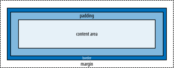
- Margin
The margin is the buffer zone between the element and others around it. You specify how much space to leave around each edge. Even if your element has a background, this margin is empty and transparent.
- Border
The border is the line (or other stylized decoration) that forms a perimeter. You can specify a thickness, style, and color for the border.
- Padding
The padding is the buffer zone that appears inside the border of an element. You specify how much space to leave within each edge before the content begins.
- Content area
The content area is the innermost region of an element, holding your content. You can set its width and height, among other properties.
The size of an element in either direction (width or
height) is the space in that direction (horizontally or vertically)
occupied by all four of these properties. If you don’t specify the size
of the content area explicitly (using the width or height properties), the
content area expands in that direction to fit the space required by the
content.
Although browsers used to be inconsistent in how they calculated the size of an element, all popular browsers now handle the calculation consistently as just described. Example 4-14 shows the CSS for a module that yields a width of 320 pixels:
10 pixels for the left margin
2 pixels total for left and right borders of 1 pixel each
18 pixels total for left and right padding of 9 pixels each
290 pixels for the content area
The overall height of the module expands to whatever height is needed for the content since the height is not specified; however, this height will include an additional 20 pixels (2 pixels total for both the top and bottom borders of 1 pixel each, plus 18 pixels total for both the top and bottom padding of 9 pixels each). In the layouts and containers presented later in the chapter, we will fix the widths and let the heights expand to fit the content as needed, which is a common approach. In Example 4-14, we’re setting the margin separately using CSS scoped at the page level to demonstrate margins changing based on where the module is used.
/* Styles for the module set for wherever the module will be used. */
#nwcqry
{
   width: 290px;
   border: 1px solid #fafafa;
   padding: 9px;
}

...

/* Scoping at the page level to target the margin for just one use. */
#nwcsrspage #nwcqry
{
   margin-left: 10px;
}
Document Flow
Although the goal is to keep information architecture and
presentation separate in a large web application, they are, of course,
related. The information architecture is largely responsible for the
normal flow of elements on a page, and many CSS rules are applied based
on the structure of the HTML markup. In the normal document flow, by
default, inline elements (e.g., span,
strong, img, etc.) flow side by side; block-level elements (e.g., div, p,
form, etc.) appear on their own line.
However, you can always alter this using CSS. To make an inline element appear as a block-level element, you can
set display: block for the element.
Similarly, to make a block-level element appear as an inline element,
you can set display: inline. If you
set display: none, you remove the
element from the document flow altogether, and elements around it are
closed up as if the element were never there. To conceal an element
without removing it from the document flow, use visibility:
hidden.
Note
Even though you can change the CSS display property for an element, you must
always honor the original HTML-level display of an element within your
information architecture. For example, regardless of what you do in
CSS, you cannot put block-level HTML elements within inline HTML
elements, because it may cause serious bugs in some scenarios.
You can also use CSS to move elements around the page and make them appear out of their normal order. The default, where elements flow down and across the page, is called static positioning. The most useful alternatives are relative positioning, absolute positioning, and floating.
Relative Positioning
You specify relative positioning by setting the CSS
property position to relative. Relative positioning lets you
position an element relative to where it would have appeared in the
normal document flow without disrupting the normal flow of other
elements on the page. It’s often used to nudge an element slightly into a desired position without
affecting neighboring elements. The following CSS uses relative
positioning to position a citation within the nwclst module five pixels higher than it would
appear otherwise.
#nwclst cite
{
   position: relative;
   top: -5px;
}
Absolute Positioning
You specify absolute positioning by setting the CSS
property position to absolute. Absolute positioning removes an
element from the normal document flow and positions it relative to the
containing block. Because absolutely
positioned elements are removed from the document flow, other elements
are superimposed on the same location as if the absolutely positioned
elements were not there.
The containing block is the first block-level ancestor of the
absolutely positioned element that has something other than static
positioning itself; if no ancestor qualifies, the absolutely positioned
element is positioned relative to either the html or body element, depending on the browser. This
lesser-known nuance of absolute positioning is very important because it
has dramatic implications for the actual location where an absolutely
positioned element ends up.
The logical choice, then, for establishing the containing block
explicitly is to apply relative positioning to a chosen ancestor
element. If you avoid specifying coordinates for the ancestor (i.e.,
using top, left, etc.), the element remains in its
original position within the document flow, visually unaffected.
One important use of absolute positioning is to position
block-level elements side by side, especially div elements with a set width (you cannot
simply set display: inline, because
for layout purposes, you usually require other benefits that block-level
elements provide related to margins, borders, and padding). As long as
you know which of the elements will be the tallest, you can use that
element to occupy the necessary vertical space in the document flow
while you absolutely position the other element or elements beside it.
This approach to positioning elements side by side provides you with the
benefit of not having to worry about special measures to get the parent
element to size itself
appropriately, unlike with floating elements (see Floating). Absolute positioning often works well for
positioning small sections of HTML markup side by side.
Examples 4-15 and 4-16 show the HTML markup and CSS relevant to absolutely positioning the tagline and logo blocks for the default presentation of the Popular New Cars module presented in Figure 4-1. Notice that the tagline block, the first division in the module’s normal flow, is the one that we absolutely position. This is required so that the logo block is superimposed at the same vertical position; otherwise, because the logo division follows the tagline division, the tagline would hog its own vertical block and the logo would get the next block down.
Now that we have positioned the tagline and logo at the same
position vertically, the text-align
attribute, applied to the logo block at the end of Example 4-16, pushes it to the
right. Also notice that the hd
division for the module has position
set to relative
so that it becomes the containing block for the tagline block.
<div id="nwcpop" class="default">
   <div class="hd">
      <div class="tagline">
         <cite>
            View popular cars from Honda
         </cite>
      </div>
      <div class="logo">
         <img src="http://.../logo_honda.gif" />
      </div>
   </div>

   ...

</div>#nwcpop .hd
{
position: relative;
}
#nwcpop .hd .tagline
{
position: absolute;
padding: 5px 0 0 15px;
}
#nwcpop .hd .tagline cite
{
font: bold 77% verdana;
color: #000;
}
...
#nwcpop.default .hd
{
width: 630px;
background: url(http://.../top_630.gif) #fff no-repeat;
padding-top: 8px;
}
#nwcpop.default .tagline
{
width: 475px;
}
#nwcpop.default .logo
{
padding: 0 15px 0 0;
background: url(http://.../mid_630.gif) repeat-y;
text-align: right;
}
...Floating
To float an element, set the CSS property float to left or right. In some ways, floated elements are
removed from the normal flow of the document, but they still affect the
document’s layout. In general, when you float an element, other content
flows around it. However, if you float a series of elements in sequence,
floating provides a powerful means of arranging block-level elements
side by side as well.
The rule with floating is that if multiple elements occupy the
same vertical location and all of them have float set to left, they appear in order from left to right.
Therefore, you can use this technique to place two elements side by side. You could float one to the left and one to
the right, but floating everything to the left makes for simpler code if
you want to expand the layout to include more than two sections.
Compared with absolute positioning for arranging block-level elements side by side, floating has the benefit of not requiring you to know which of the elements is the tallest. This makes floating especially well suited for creating highly reusable, generic layouts and containers, which we will discuss in a moment. Figure 4-3, presented in the next section, shows an example of floating within a layout.
Block-level elements containing floated elements need to be
floated as well to ensure that they expand as needed to fit the floated
content. Alternatively, you can set overflow to hidden and zoom to 1 for the parent of the floated elements. The
next section provides examples of floating in layouts and
containers.
Layouts and Containers
Layouts are generic templates that define the overarching structure of pages. Containers are generic groupings of modules that you can place within layouts to support common organizations. Together, layouts and containers play a vital role in fostering reusability, maintainability, and reliability in large web applications. You can use them to define the standard sections in which to place your modules on a page.
Chapter 3 mentions the importance of exploring the design of web pages to find ways to reuse as many components as possible. Ultimately, building a page as a set of individual components makes it easier to maintain and more reliable throughout its lifetime. In addition to developing reusable modules, you should consider reusable traits within the structure of pages across your entire application, which you can exploit through layouts and containers. Not only does this promote maintainability and reliability within the code, but it also fosters a more consistent user experience across the application and contributes to its overall usability. Furthermore, layouts and containers provide a good opportunity for engineers and designers to work together to establish standard guidelines for designing and building large web applications.
In this section, we explore layouts and containers that are fixed width, variable height, and grid-based. These are some of the most common layouts in large web applications. That said, the principles we will discuss apply equally well for other types of layouts (e.g., fluid layouts where sections grow or shrink as the window is resized, free-form layouts, etc.), despite different implementation details.
Note
No matter what type of layout you choose, it is important to remember the dynamic nature of layout on the Web. Fluid layouts require that you relinquish control to the browser for the sizing and flow of content within any portion of the layout that uses a relative unit (percentage, em, etc.). Fixed-width layouts add a certain amount of control in the horizontal direction, but you still must anticipate the impact of letting content flow as needed in the vertical direction.
Example Layouts
Figure 4-3 presents an example layout well suited to pages containing search results or various types of listings; we’ll call it the Results layout. Examples 4-17 and 4-18 present an implementation for the layout using the techniques discussed in Floating. In Chapter 7, we will explore techniques for inserting modules and containers into the layout dynamically. This way, you can reuse the layout for any page that needs the same overall structure. Let’s look at some examples of the types of content that might appear within each section of the layout.
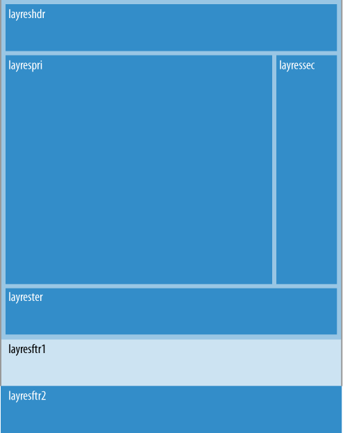
layres(outer wrapper)Contains no content directly, but provides overarching structure for the other sections in the layout.
layreshdr(header)Extends across the top of the page and might contain branding, banner advertising, primary navigation, and a query form for narrowing the search results.
layresmaj(major)Contains no content directly, but provides overarching structure for the major part of the page containing the
layrespri,layressec, andlayrestersections.layrespri(primary)Holds the primary content for the page, which is the set of search results or listings.
layressec(secondary)Holds the secondary content for the page, such as business partner callouts and additional advertising.
layrester(tertiary)Holds tertiary content, which, because of its position well down the page, is intended for less frequently used modules.
layresftr1andlayresftr2(footers)Sections for footers. We define two sections to provide slightly different styling options (the second footer does not have the border on the left and right). Both might contain helpful cross-linking to other parts of the site.
Within the CSS, we float all these sections to the left. Because
layrespri and layressec together fit within the width of
their container (layresmaj), the
result is that layressec appears to the right of
layrespri. Our hardcoded widths
ensure that the two layers take up the exact horizontal space we have
allocated. We float the other elements on the page to ensure each
section expands to fit any floated content within it. Recall our earlier
discussion about this in Floating.
The overflow attribute on
the inner elements is set to hidden
to guard against letting any content that happens to be too wide cause
problems when the content is placed within the layout. Setting
display to inline for floated elements with margins
avoids the infamous “double margin” bug in earlier versions of Internet
Explorer that doubled the margins for floated elements.
<div id="layres">
   <div class="layreshdr">

      ...

   </div>
   <div class="layresmaj">
      <div class="layrespri">

         ...

      </div>
      <div class="layressec">

         ...

      </div>
      <div class="layrester">

         ...

      </div>
   </div>
   <div class="layresftr1">

      ...

   </div>
   <div class="layresftr2">

      ...

   </div>
</div>#layres
{
float: left;
background: #e3e4e8;
}
#layres .layreshdr
{
float: left;
width: 950px;
overflow: hidden;
border-left: 1px solid #d1d6dc;
border-right: 1px solid #d1d6dc;
border-top: 1px solid #fff;
padding: 10px 9px 0;
}
#layres .layresmaj
{
float: left;
width: 968px;
border-left: 1px solid #d1d6dc;
border-right: 1px solid #d1d6dc;
background: #e3e4e6;
}
#layres .layrespri
{
float: left;
display: inline;
width: 750px;
overflow: hidden;
margin: 10px 10px 0 9px;
}
#layres .layressec
{
float: left;
display: inline;
width: 190px;
overflow: hidden;
margin: 10px 9px 0 0;
}
#layres .layrester
{
clear: both;
float: left;
display: inline;
width: 950px;
overflow: hidden;
margin: 10px 9px;
}
#layres .layresftr1
{
clear: both;
float: left;
width: 968px;
overflow: hidden;
border-left: 1px solid #d1d6dc;
border-right: 1px solid #d1d6dc;
}
#layres .layresftr2
{
clear: both;
float: left;
width: 970px;
overflow: hidden;
border-bottom: 1px solid #fff;
}Figure 4-4 presents an example layout that is well suited to pages containing details about a search result or listing; we’ll call it the Details layout.
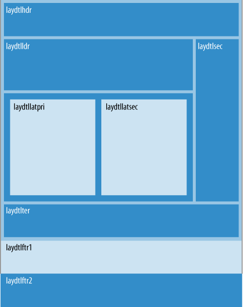
Let’s look at some examples of the types of content that might appear within each section of the layout:
laydtl(outer wrapper)Contains no content directly, but provides overarching structure for the other sections in the layout.
laydtlhdr(header)Extends across the top of the page and might contain branding, banner advertising, primary navigation, and header information.
laydtlmaj(major)Contains no content directly, but provides overarching structure for the major part of the page containing the
laydtlpri,laydtlsec, andlaydtltersections.laydtlpri(primary)Contains no content directly, but provides overarching structure for the leader and latter sections.
laydtlldr(leader)Contains no content directly, but provides overarching structure for the leader content.
laydtllat(latter)Provides overarching structure for the latter section containing the
laydtllatpriandlaydtllatsecsections.laydtllatpriandlaydtllatsec(latter primary and secondary)Holds the latter content, which is important content just beneath the leader section. In our example, the latter content will always be in a two-column format, which the layout reflects.
laydtlsec(secondary)Placed to the right to hold secondary content, such as business partner callouts and additional advertising.
laydtlter(tertiarty)Holds tertiary content, which, because of its position well down the page, is intended for less frequently used modules.
laydtlftr1andlaydtlftr2(footers)Sections for footers. These serve the same purpose as in the Results layout presented earlier.
Examples 4-19 and 4-20
present the implementation for the Details layout. For the same reasons
discussed earlier, this layout sets overflow to hidden and display to inline in certain places.
<div id="laydtl">
   <div class="laydtlhdr">

      ...

   </div>
   <div class="laydtlmaj">
      <div class="laydtlpri">
         <div class="laydtlldr">

            ...

         </div>
         <div class="laydtllat">
            <div class="laydtllatpri">

               ...

            </div>
            <div class="laydtllatsec">

               ...

            </div>
         </div>
      </div>
      <div class="laydtlsec">

         ...

      </div>
      <div class="laydtlter">

         ...

      </div>
   </div>
   <div class="laydtlftr1">

      ...

   </div>
   <div class="layresftr2">

      ...

   </div>
</div>#laydtl
{
float: left;
background: #e3e4e8;
}
#laydtl .laydtlhdr
{
float: left;
width: 950px;
overflow: hidden;
border-left: 1px solid #d1d6dc;
border-right: 1px solid #d1d6dc;
border-top: 1px solid #fff;
padding: 10px 9px 0;
}
#laydtl .laydtlmaj
{
float: left;
width: 950px;
border-left: 1px solid #d1d6dc;
border-right: 1px solid #d1d6dc;
padding: 10px 9px 0;
}
#laydtl .laydtlpri
{
float: left;
display: inline;
width: 750px;
overflow: hidden;
margin-right: 10px;
}
#laydtl .laydtlldr
{
float: left;
display: inline;
width: 750px;
overflow: hidden;
}
#laydtl .laydtllat
{
float: left;
display: inline;
width: 710px;
overflow: hidden;
padding: 20px;
background: #ccc;
margin-top: 10px;
}
#laydtl .laydtllatpri
{
float: left;
display: inline;
width: 310px;
overflow: hidden;
margin-right: 30px;
}
#laydtl .laydtllatsec
{
float: left;
display: inline;
width: 370px;
overflow: hidden;
}
#laydtl .laydtlsec
{
float: left;
display: inline;
width: 190px;
overflow: hidden;
}
#laydtl .laydtlter
{
clear: both;
float: left;
display: inline;
width: 950px;
overflow: hidden;
background: #fff;
margin-top: 10px;
}
#laydtl .laydtlftr1
{
clear: both;
float: left;
width: 968px;
overflow: hidden;
border-left: 1px solid #d1d6dc;
border-right: 1px solid #d1d6dc;
margin-top: 10px;
}
#laydtl .laydtlftr2
{
clear: both;
float: left;
width: 970px;
overflow: hidden;
border-bottom: 1px solid #fff;
}Example Containers
Figure 4-5 shows two presentations for an example container. This container holds two modules placed side by side in a single row. Examples 4-21 and 4-22 present an implementation for a 2×1 container using the techniques discussed in Floating. The examples also use the techniques discussed previously for presentation switching to achieve different versions of the container that fit within different sections of various layouts.
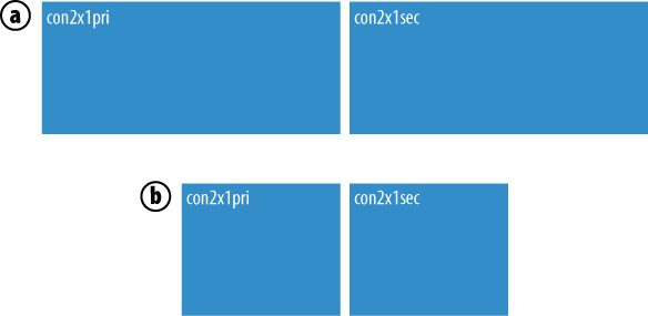
The presentation selected with the class default consists of two sections with room for
370 pixels of content each. The presentation selected with the class
minimum consists of two sections with
room for 150 pixels of content each. In Chapter 7, we will explore techniques for managing
various aspects of containers in a dynamic fashion. This way, containers
can be reused on any page that needs the same arrangement of modules.
Other containers might arrange three or four sections of modules.
<div id="con2x1" class="default">
   <div class="con2x1pri">

      ...

   </div>
   <div class="con2x1sec">

      ...

   </div>
</div>#con2x1.default
{
float: left;
width: 750px;
overflow: hidden;
}
#con2x1.default .con2x1pri
{
float: left;
display: inline;
width: 370px;
overflow: hidden;
margin-right: 10px;
}
#con2x1.default .con2x1sec
{
float: left;
width: 370px;
overflow: hidden;
}
#con2x1.minimum
{
float: left;
width: 310px;
overflow: hidden;
}
#con2x1.minimum .con2x1pri
{
float: left;
display: inline;
width: 150px;
overflow: hidden;
margin-right: 10px;
}
#con2x1.minimum .con2x1sec
{
float: left;
width: 150px;
overflow: hidden;
}Example 4-23 shows how you could use the default version of the 2x1 container within the primary content section of the Results layout presented earlier. From this example, coupled with what we observed in Chapter 3 about constructing an information architecture to create reusable modules, you can begin to see how a page built from a layout, with containers inserted as needed, and modules inserted into the layout and various containers, helps build modular web applications in which components are reusable, maintainable, and reliable.
<div id="layres">
   <div class="layreshdr">

      ...

   </div>
   <div class="layresmaj">
      <div class="layrespri">
         <div id="con2x1" class="default">
            <div class="con2x1pri">

               ...

            </div>
            <div class="con2x1sec">

               ...

            </div>
         </div>
      </div>
      <div class="layressec">

         ...

      </div>
      <div class="layrester">

         ...

      </div>
   </div>
   <div class="layresftr1">

      ...

   </div>
   <div class="layresftr2">

      ...

   </div>
</div>
Other Practices
To ensure browsers render your presentations in a pixel-perfect manner, use the following practices to help write reliable CSS as you develop large web applications. The goals of these practices are to establish a consistent platform on which to apply your styles and to address inconsistencies with the way browsers render fonts.
Browser Reset CSS
All browsers provide a default set of styles on which your own styles will be layered. Unfortunately, default styles are inconsistent across various browsers. Without a common starting point on which to layer the application’s own presentation, you end up making many more adjustments in CSS for particular browsers to maintain consistency. Fortunately, Yahoo! makes some CSS rules available in its YUI (Yahoo! User Interface) library to reset modern browsers to a consistent set of neutral styles. You can download the library and read its complete documentation at http://developer.yahoo.com/yui. To apply this CSS, simply add the following link before any CSS of your own:
<link href="http://yui.yahooapis.com/2.7.0/build/reset/reset-min.css"
   rel="stylesheet" type="text/css" media="all" />
Because it is helpful to see which properties must be reset, Example 4-24 lists the CSS. Alternatively, you can place this CSS directly in your own CSS file to avoid the additional server request with the previous link.
/*
Copyright (c) 2009, Yahoo! Inc. All rights reserved.
Code licensed under the BSD License:
http://developer.yahoo.net/yui/license.txt
version: 2.7.0
*/

html
{
   color: #000;
   background: #FFF;
}
body, div, dl, dt, dd, ul, ol, li, h1, h2, h3, h4, h5, h6, pre, code,
form, fieldset, legend, input, button, textarea, p, blockquote, th, td
{
   margin: 0;
   padding: 0;
}
table
{
   border-collapse: collapse;
   border-spacing: 0;
}
fieldset, img
{
   border: 0;
}
address, caption, cite, code, dfn, em, strong, th, var, optgroup
{
   font-style: inherit;
   font-weight: inherit;
}
del, ins
{
   text-decoration: none;
}
li
{
   list-style: none;
}
caption, th
{
   text-align: left;
}
h1, h2, h3, h4, h5, h6
{
   font-size: 100%;
   font-weight: normal;
}
q:before, q:after
{
   content: '';
}
abbr, acronym
{
   border: 0;
   font-variant: normal;
}
sup
{
   vertical-align: baseline;
}
sub
{
   vertical-align: baseline;
}
legend
{
   color: #000;
}
input, button, textarea, select, optgroup, option
{
   font-family: inherit;
   font-size: inherit;
   font-style: inherit;
   font-weight: inherit;
}
input, button, textarea, select
{
   *font-size: 100%;
}
Font Normalization
The ways in which browsers render fonts, especially when it comes to font size, are not consistent. Fortunately, Yahoo! makes CSS available in its YUI library to normalize fonts within the modern browsers. To apply this CSS, add the following link before any CSS of your own:
<link href="http://yui.yahooapis.com/2.7.0/build/fonts/fonts-min.css"
   rel="stylesheet" type="text/css" media="all" />
Example 4-25 lists the CSS for font normalization. As with the browser reset CSS shown earlier, you can place this CSS directly in your own CSS file to avoid the additional server request with the previous link.
/*
Copyright (c) 2009, Yahoo! Inc. All rights reserved.
Code licensed under the BSD License:
http://developer.yahoo.net/yui/license.txt
version: 2.7.0
*/

body
{
   font: 13px/1.231 arial, helvetica, clean, sans-serif;
   *font-size: small;
   *font: x-small;
}
select, input, button, textarea, button
{
   font: 99% arial, helvetica, clean, sans-serif;
}
table
{
   font-size: inherit;
   font: 100%;
}
pre, code, kbd, samp, tt
{
   font-family: monospace;
   *font-size: 108%;
   line-height: 100%;
}
Assuming you use the CSS from Example 4-25, Table 4-1 specifies the percentage to specify in your CSS to render a font in the number of pixels listed for today’s browsers. Research conducted at Yahoo! across many versions of the most popular browsers has shown that fonts render the most consistently across browsers when you specify font sizes using percentages as opposed to points or ems. This is the reason that we use percentages for fonts throughout this book.
To render in pixels | Use this percentage |
10 | 77% |
11 | 85% |
12 | 93% |
13 | 100% |
14 | 108% |
15 | 116% |
16 | 123.1% |
17 | 131% |
18 | 138.5% |
19 | 146.5% |
20 | 153.9% |
21 | 161.6% |
22 | 167% |
23 | 174% |
24 | 182% |
25 | 189% |
26 | 197% |
Get Developing Large Web Applications now with the O’Reilly learning platform.
O’Reilly members experience books, live events, courses curated by job role, and more from O’Reilly and nearly 200 top publishers.

