Chapter 4. Text
In this chapter you will learn how to draw text on a page. Drawing text is the most complex part of PDF graphics, but it is also what helped PDF beat its competitors to become the international standard that it is today. While the other original players converted text to raster images or vector paths (to maintain the visual integrity), the inventors of PDF knew that users needed text that could be searched and copied and didn’t just look pretty on the screen. With the depth of experience and understanding of fonts that Adobe’s engineers had, they were able to integrate actual text with visual presentation.
While the text support in PDF enables the rendering of any glyphs from any font representing any language, the mechanics (as you’ll see shortly) were all created prior to Unicode. This means that many things that developers working in other file formats take for granted, such as just putting down Unicode codepoints and letting the renderer do all the hard work, have to be done manually with PDF.
Now that you’ve been given fair warning, let’s start!
Fonts
In the previous chapters you learned how to draw vector graphics (or paths) as well as raster graphics (images) on a page. These types of drawing operations are fairly simple as they don’t normally need extra information—it’s just the instructions and (in the case of raster images) the image data. Text, however, requires more pieces. The most important of these pieces is the font.
Glyphs
A font, sometimes called a font program, is a collection of unique drawing instructions called glyphs. In general, each glyph is no different from the paths or rasters that you drew yourself in previous chapters. However, the font also contains a bunch of metadata about the various glyphs, including something called an encoding that provides a mapping from a known character set (such as ASCII, Unicode, or Shift-JIS) to the glyphs. Not every font has glyphs for every value in every encoding.
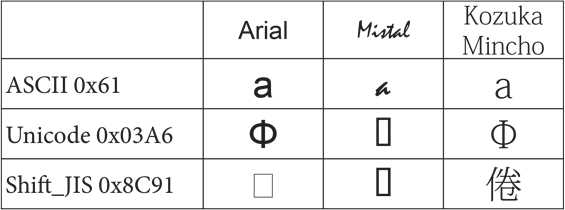
Figure 4-1 is an example of three common values in different encodings and their glyphs in different fonts.
Note
The glyphs that look like rectangles are commonly known as “notdef” glyphs. Notdef (short for not defined) is a special glyph present in all fonts for the specific purpose of filling in when the requested glyph doesn’t exist. If you see these in your PDFs, you know you did something wrong! (Though in this case, it’s on purpose.)
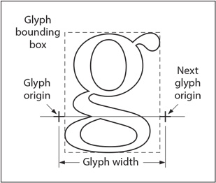
While a glyph is primarily concerned with its shape and appearance, it also has a set of values associated with it called glyph metrics. These metrics, some of which are explicitly defined in the font itself while others are computed from a series of values, enable software to do such things as lay out text. For example, to draw “Hello” you need to know where to place the “e” after the “H.” Figure 4-2 tells you to simply place the “e” at the “Next glyph origin.”
Font Types
When graphical interfaces such as the original Lisa and Macintosh first came into existence, the fonts that came with them were known as “bitmapped fonts,” because each glyph was described as a bitmap or raster image. While quite useful for the screen, this wasn’t flexible enough for printing, so the outline (path-based) font formats were born. PDF supports the three most common outline formats:
- Type 1
- This was the original outline format created by Adobe along with the Postscript language for printers. The glyph outlines are described using a simplified version of Postscript.
- TrueType
- Created by Apple and Microsoft for their operating systems, this is the most well known of the font formats. Glyph outlines are described using a special language that is unique to this font format.
- OpenType
- While Type 1 and TrueType fonts each have their advantages, the industry grew tired of the “font wars,” so OpenType was born. OpenType combines the best of the other formats, with the option of glyph outlines being described either as Type 1 or as TrueType.
For these font types, the actual font program is defined in a separate font file, which may be either embedded in a PDF stream object or obtained from an external source.
PDF also has two types of fonts that are specific to PDF, where the glyph data must be defined in the PDF:
- Type 3
- Originally provided as a way to embed bitmapped fonts, a Type 3 font is really a PDF dictionary where each glyph is defined by a standard content stream. This allows not only raster-based glyphs, but the use of any/all PDF graphic operators to define the glyph. Although they can be very powerful, they are not used in most PDF-producing systems today.
- Type 0
- Also known as a composite font or CIDFont, a Type 0 font is created by taking glyph descriptions from one or more other fonts and creating an amalgam or composite. This was originally necessary when working with fonts in Chinese, Japanese, or Korean (CJK) that didn’t also have English/Latin characters and a single font with both was desired. Though not used to actually amalgamate glyphs from multiple fonts, it is still the method used for Unicode fonts, especially when dealing with two-byte data.
The Font Dictionary
In Chapter 1, you saw our first PDF, which drew “Hello World” on the page. Example 4-1 shows a few relevant pieces that we’re now going to look at in more detail.
1 0 obj
<<
    /Type /Page
    /Parent 5 0 R
    /MediaBox [ 0 0 612 792 ]
    /Resources 3 0 R
    /Contents 2 0 R
>>
endobj
3 0 obj
<<
    /Font <</F1 4 0 R >>
>>
endobj
4 0 obj
<<
    /Type /Font
    /Subtype /Type1
    /Name /F1
    /BaseFont/Helvetica
>>
endobj
In this example, you know that object #1 is the page, and it has just the bare minimum necessary: a MediaBox (for the size of the page), the Contents (for the drawing instructions), and the Resources (needed by the Contents). There is a single resource type, Font, with a single entry, F1, which is the font dictionary at object #4.
A font dictionary contains information that specifies the type of font (i.e., Type 1 or TrueType), its PostScript name, its encoding, and information that can be used to provide a substitute when the font program is not embedded in the PDF file.
ISO 32000-1:2008, 9.6.2.2 describes the Standard 14 (aka Base 14) fonts that every PDF renderer is required to know about and provide either directly or via appropriate substitutes. Additionally, the renderer is supposed to know about their metrics, which will enable us (for now) to not have to determine those values from the font program and incorporate them into the font dictionary. Object #4 in our example is quite small because it is using one of those fonts (Helvetica). The full list of standard fonts is:
-
Times-Roman -
Times-Bold -
Times-Italic -
Times-BoldItalic -
Helvetica -
Helvetica-Bold -
Helvetica-Oblique -
Helvetica-BoldOblique -
Courier -
Courier-Bold -
Courier-Oblique -
Courier-BoldOblique -
Symbol -
ZapfDingbats
When creating a font dictionary for one of these fonts, there are only three required keys: Type (with a value of Font), Subtype (with a value of Type1), and BaseName (with one of the values from the preceding list).
You may have noticed that some of these fonts actually include what you might normally think of as a style (such as bold or italic). However, when working with PDF there are no styles, just fonts. So, if you want the Times font shown in italic, you need to use the font Times-Italic.
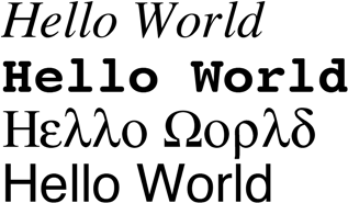
Example 4-2 is a variation of “Hello World” using a few different fonts.
9 0 obj
<<
    /Type/Page
    /Contents 24 0 R
    /MediaBox[0 0 612 792]
    /Parent 5 0 R
    /Resources 13 0 R
>>
endobj
13 0 obj
<<
    /Font <<
        /F1 14 0 R
        /F2 13 0 R
        /F3 12 0 R
        /F4 11 0 R
    >>
>>
endobj
14 0 obj
<<
    /Type /Font
    /Subtype /Type1
    /BaseFont/Helvetica
>>
endobj
13 0 obj
<<
    /Type /Font
    /Subtype /Type1
    /BaseFont/Symbol
>>
endobj
12 0 obj
<<
    /Type /Font
    /Subtype /Type1
    /BaseFont/Courier-Bold
>>
endobj
11 0 obj
<<
    /Type /Font
    /Subtype /Type1
    /BaseFont/Times-Italic
>>
endobj
24 0 obj
<</Length 182>>
stream
BT
    /F1 48 Tf
    1 0 0 1 10 100 Tm
    (Hello World)Tj


    0 50 Td
    /F2 48 Tf
    (Hello World)Tj


    0 50 Td
    /F3 48 Tf
    (Hello World)Tj


    0 50 Td
    /F4 48 Tf
    (Hello World)Tj
ET
endstream
endobj
Encodings
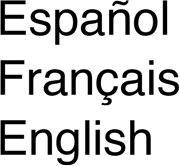
The text that we’ve used so far has been simple English text. PDF, however, considers text associated with the Standard 14 fonts to be in something called StandardEncoding, which is a subset of ISO Latin-1 (ISO 8859-1) defined in ISO 32000-1:2008, D.2. If all the text in your PDFs can be expressed in that encoding, then you’re good to go. However, most folks need at least the full Latin-1 to represent other standard characters used by other Roman/Latin-based languages such as French, Spanish, or German. To use those, you need to add an explicit encoding to the font dictionary, and continue to use simple text strings as you have done.
Here is an example of using WinAnsiEncoding (otherwise known as Windows code page 1252) to write out some text in other languages.
In order to support arbitrary non-Latin-based languages, it is necessary to use embedded fonts, a topic which is not covered in this edition of this book.
Text State
Now that you have a good handle on fonts and glyphs, let’s see how you can use them to actually draw text on the page (Example 4-4).
1 0 obj
<<
    /Type /Page
    /Parent 5 0 R
    /MediaBox [ 0 0 612 792 ]
    /Resources 3 0 R
    /Contents 2 0 R
>>
endobj
2 0 obj
<< /Length 53 >>
stream
BT
    /F1 24 Tf
    1 0 0 1 260 600 Tm
    (Hello World)Tj
ET
endstream
endobj
If you examine the content stream at object #2, you will see five new operators that you haven’t seen before. The first one, BT, appears all by itself (i.e., with no operands) on the first line. As you can probably guess, it is stands for “Begin Text” and is required to delineate a series of text-related instructions. It is paired with the ET (End Text) operator, which can be seen on the last line of the content stream.
Just as PDF has a graphic state (see Graphic State for more on this), it also has a text state that incorporates all the text–drawing-related attributes. The BT/ET pairing declares a new text state and then clears it, much as q and Q do with the graphic state. However, there is no push/pop. In fact, it is not permitted to have nested pairs of BT/ET.
Font and Size
While there are many attributes in a text state, and you’ll look at a few here, the three most important are the font to be used, the text size, and where to put the text.
The Tf operator specifies the name of a font resource—that is, an entry in the font subdictionary of the current resource dictionary. The value of that entry is a font dictionary (see The Font Dictionary). In the previous example, the font is named F1, and if you refer back to Figure 4-1 you can see that it is present in the Font resources in object #3.
As you learned in Transformations, PDF uses a general “user unit” concept for defining the size and location of objects. In PDF, the standard glyph size is 1 unit in user space, and the nominal height of tightly spaced lines of text is also 1 unit. Therefore, in order to draw a glyph at a specific size, you need to scale it. The scale factor is specified as the second operand of the Tf operator, thereby setting the text font size parameter in the graphic state. In our example, the font size is 24.
There is a second way to set the scale factor for the glyphs, which is similar to how other graphic objects are scaled—using a transformation matrix. For text-specific transformations, you use the Tm operator, which takes the same parameters as the cm operator we looked at in Chapter 2. In our example, no additional scaling is taking place but the text is being positioned at (260,600). This is the normal way of setting the scaling and position for your first glyph to be drawn. However, it could also be done this way:
/F1 1 Tf
24 0 0 24 260 600 Tm
(Hello World)Tj
Is one way better than the other? On modern systems and current implementations, the differences should be indistinguishable. If you are trying for the best possible implementation of your content, it will depend on how the font is used. If you are only using the text at a single size (on a given page), using the scale factor as part of the Tf is best, because then the glyphs will be prescaled by the font loader. However, should you be using the same font at multiple sizes on the page, then loading at 1 unit and using Tm to scale each time is probably more optimal—but only if you are switching back and forth a lot. Otherwise, just create a second instance of the font with a second Tf, as shown in Example 4-5.
Rendering Mode
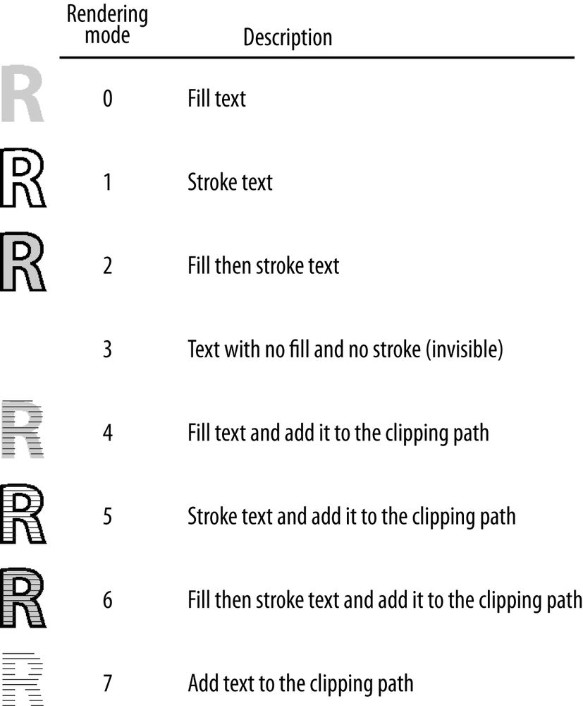
In The Painter’s Model, you learned that paths drawn in PDF can be filled, stroked, or both, based on the operator (e.g., f vs. S) that ends the path description. With text, instead of using different operators, there is a single operator (Tr) that sets the text rendering mode. Figure 4-3 lists the possible operand values that can be used with Tr and the impact they have on the text.
When you combine the rendering modes with the graphic state attributes that you already know about, you can create the text in Example 4-6.
Drawing Text
In case you hadn’t figured it out by now, the Tj operator is used to draw text (also known as “showing” a string) on a page. It is quite simple, in that the operator causes the PDF renderer to align the first glyph’s “glyph origin” with the current pen location and draw the glyph. Then the renderer advances the pen by the width of the glyph to the “next glyph origin” and draws the next glyph, and so on for the entire string.
For the majority of text rendering, this is perfectly acceptable and what most users are used to seeing on the screen. However, for those instances where you wish more precise control over glyph positioning, you will need to use the TJ operator.
Note
Many fonts include information about how to more precisely place certain glyphs in relation to each other, known as kerning. However, this is not supported by the Tj operator when drawing a string. If you want to use that information, you need to obtain it from the font yourself and then use the TJ operator to obtain the more visually appealing result.
The TJ operator, instead of taking a string as an operand, takes an array. The array consists of one or more strings interspersed with numbers, where the numbers serve to adjust the text position (Tm). The numbers are expressed in thousandths of a unit, and the value is subtracted from the current horizontal coordinate.
Note
This means that in the default coordinate system, a positive adjustment has the effect of moving the next glyph painted to the left by the given amount, while a negative adjustment will move the next glyph to the right.
Example 4-7 shows drawing a word using the simple Tj operator, and manually kerning it via TJ.
Positioning Text
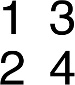
In all of the previous examples, the text has been explicitly positioned using the Tm operator. However, that is a fairly heavyweight operation if all you want to do is move the pen in a single direction (e.g., down to the next line, or over to the right). For simpler movements, the Td operator should be used. It takes two parameters, tx and ty, representing how to move the pen in the X and Y directions (respectively). If either parameter is 0, the pen isn’t moved in that direction. Example 4-8 illustrates using Td to draw a “4-square.”
What’s Next
In this chapter, you learned about fonts and glyphs and how to use them to draw text. Next you’ll move from putting content on a page to making your document more interactive with navigational features.
Get Developing with PDF now with the O’Reilly learning platform.
O’Reilly members experience books, live events, courses curated by job role, and more from O’Reilly and nearly 200 top publishers.
