Chapter 13. Building Fluid Grid Websites
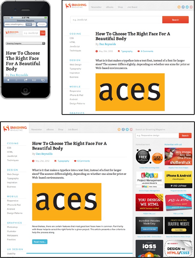
If you want to design a single set of web pages that people can read whether they’re on a smartphone, tablet, or desktop computer, you need the power of fluid grid layouts. Fluid grid layouts let you create a single HTML file whose design morphs to fit phone, tablet, and desktop browsers. They combine the results of a media query (Media Queries) with a fancy grid-based design to create pages customized for the destination device (a practice called “responsive Web design” in Internet argot). The page’s responsive layouts are based on three basic browser widths representing mobile, tablet, and desktop devices (see Figure 13-1). The pages then use percentage widths to scale the layout for specific devices—after all, not all mobile phones have screens that are precisely 320 pixels wide, nor do all tablets have displays that are exactly 760 pixels wide. Using fluid grid layouts, you can create designs that scale to a range of widths and adapt for the myriad screen sizes on mobile, tablet, and desktop devices.
Note
Responsive Web design (RWD) is a term coined by the web designer Ethan Marcotte. You can learn more about it from the article that kicked off the RWD movement at www.alistapart.com/articles/responsive-web-design/.

Get Dreamweaver CC: The Missing Manual, 2nd Edition now with the O’Reilly learning platform.
O’Reilly members experience books, live events, courses curated by job role, and more from O’Reilly and nearly 200 top publishers.

