jQuery Mobile
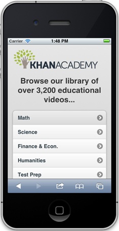
Media queries and the Fluid Grid layouts let you take one website and give it different designs for different devices. But what if you just want to create a mobile site from the get-go? Perhaps you want to design a “mobile-only” version of your site, one optimized to look and perform like a native phone application (see Figure 11-18). Dreamweaver lets you do just that with its support for jQuery Mobile.

Figure 11-18. Unlike a regular website, a jQuery Mobile site, like this one for the educational site Khan Academy (www.khanacademy.com), replicates the screen elements found in phone applications.
jQuery Mobile is a “mobile development framework,” which means that it provides the tools you need to build web pages that act more like mobile applications than traditional web pages. A page built with jQuery Mobile includes screen transitions (one web page slides into view as the old one slides out), a more phone-like interface (large, rounded-corner buttons and smooth color gradients), and support for non-mouse-like interactions (like screen taps and swipes).
jQuery Mobile (http://jquerymobile.com) is a project of the enormously popular JavaScript framework jQuery (http://jquery.com), which simplifies the process of writing JavaScript. jQuery solves cross-browser problems and makes normally complicated JavaScript programming a lot easier. It provides JavaScript programming specific ...
Get Dreamweaver CS6: The Missing Manual now with the O’Reilly learning platform.
O’Reilly members experience books, live events, courses curated by job role, and more from O’Reilly and nearly 200 top publishers.

