Modifying Cell and Row Properties in Standard View
Cells have their own properties, separate from the properties of the table itself. So do table rows— but not columns (see the box on page 165).
When you click inside of a cell, the top half of the Property inspector displays the cell’s text formatting properties; the bottom half shows the properties for that particular cell (see Figure 6-15).
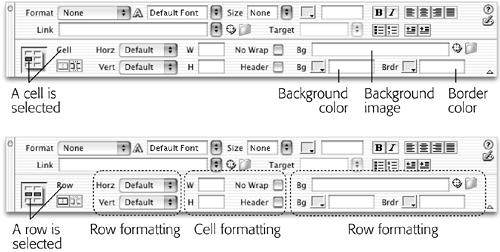
Figure 6-15. Rows have their own distinct properties that you can set independently of a cell. For example, a row can have its own, independent background color and border color. (However, not all of the properties visible in the inspector apply to a row. When a row is selected, the Width, Height, No Wrap, and Header options affect the individual cells in the row.)
Alignment Properties
At the outset, a cell’s contents hug the left wall of the cell and float halfway between the top and bottom of the cell. After selecting a row, a cell, or several cells, you can change these alignments using the Property inspector. For example, the Horz (Horizontal) pop-up menu in the Property inspector (see Figure 6-15) offers Left, Center, Right, and Default alignment options. (Default produces the same effect as Center without adding any extra HTML code.)
Note that these options are distinct from the paragraph alignment options discussed in Chapter 3. In fact, you can mix and match the two. Suppose, for example, ...
Get Dreamweaver MX: The Missing Manual now with the O’Reilly learning platform.
O’Reilly members experience books, live events, courses curated by job role, and more from O’Reilly and nearly 200 top publishers.

