Chapter 8. Charting Techniques and Tricks
In This Chapter
Adding lines and background elements to a chart
Working with single-point charts that resemble a thermometer or gauge
Using an XY series to simulate an axis
Creating specialty charts that make use of a variety of tricks
Stacking and overlaying charts
Putting more than one chart on a chart sheet
This chapter might best be described as the catch-all chapter. You'll find a wide variety of useful charting examples that incorporate various tricks of the trade. These examples may give you some new ideas and stimulate your imagination.
Many of the examples in this chapter assume that you're familiar with the material presented in previous chapters. In other words, I focus on the general technique and assume that you know the basic procedures.
Adding Lines and Backgrounds to a Chart
The following sections present examples of charts that have been augmented in a number of ways to display various types of lines and background elements. Several of the examples involve tricks that make use of combination charts.
Adding Horizontal Reference Lines to a Chart
Many charts benefit from adding one or more reference lines. Figure 8-1 shows an area chart that depicts a product's defect rate over a 20-day period. This chart displays an additional line. Data points that appear above this line represent an unacceptable level of defects.
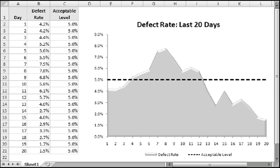
Figure 8-1. This combination ...
Get Excel® 2007 Charts now with the O’Reilly learning platform.
O’Reilly members experience books, live events, courses curated by job role, and more from O’Reilly and nearly 200 top publishers.

