24. Using 3D Maps
The Power Map add-in debuted with Excel 2013. You can pivot any data set on a globe and fly through the results. This add-in is incorporated into all editions of Excel 2016 with a new name of 3D Map.
Examples of 3D Maps
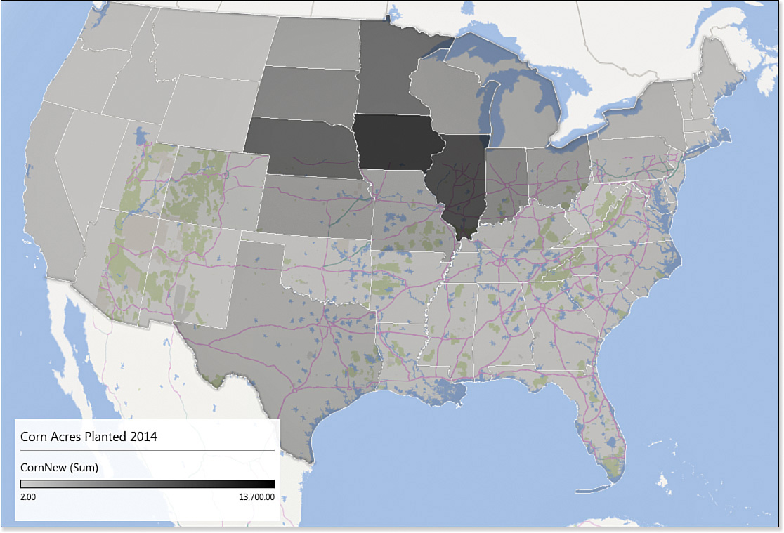
The first three figures represent corn acreage by state for the year 2014. Figure 24.1 shows a shaded area map. Iowa and Illinois are the leading producers of corn.

Figure 24.1 In a shaded area map, a darker color indicates a higher value.
Figure 24.2 shows a column chart. The height of each column correlates to acres of corn planted. Note that this visualization looks best when you tip the map to look at ...
Get Excel 2016 In Depth now with the O’Reilly learning platform.
O’Reilly members experience books, live events, courses curated by job role, and more from O’Reilly and nearly 200 top publishers.

