Chapter 5. Chart Annoyances
Confucius actually said a picture is worth 10,000 words. Yes, 10,000. The modern interpretation shorts you by 9,000 words. In Excel, you use charting tools to make those valuable and pretty pictures that summarize your data visually. A good chart can make your data infinitely more comprehensible. In this chapter, I’ll guide you past the many shoals along the way to creating charts quickly and efficiently. You’ll also learn how to add error bars, change the scale of an axis, replace stodgy bars and columns with images of your choice, and more.
There are more than a few twists and turns when it comes to manipulating charts in Excel, from moving a chart to a new location to pasting a chart into Word. This and other seemingly basic operations can send Excel to Crash Central, but fear not—crash-proof solutions do exist. We’ll show you those solutions and give you the scoop on some great third-party tools that help you create bigger and better charts than Excel can dream of.
CHART CREATION AND FORMATTING ANNOYANCES
INSTANT CHARTS
The Annoyance:
I’ve got a meeting in five minutes, and I need to create a column chart that shows how the operating costs of our auto dealership (utilities, rent, and taxes, as shown in Figure 5-1) have changed over the past few years. How do I create the chart and still have time for a cup of coffee before my meeting?
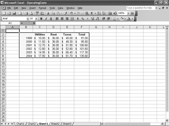
Figure 5-1. This data ...
Get Excel Annoyances now with the O’Reilly learning platform.
O’Reilly members experience books, live events, courses curated by job role, and more from O’Reilly and nearly 200 top publishers.

