Chapter 10. Chartless Visualization Techniques
In This Chapter
Creating dynamic labels
Using the Camera tool
Working with formula-driven visualizations
Using fancy fonts
Leveraging symbols in formulas
Up to this point, we've discussed the tools that you can use to build basic dashboard components: charts, pivot tables, pivot charts, and sparklines. In this chapter, you'll focus on components that are less apparent — chartless visualizations.
In contrast to the previous topics, chartless visualization is less a feature specific to Excel than it is a concept that you can apply to your dashboard presentation. With these types of visualizations, you can easily add layers of interactivity to your dashboard and take advantage of some common worksheet features that can simplify your work.
Dynamic Labels
A common place to add dynamic labels is to an interactive chart. In Figure 10-1, I have a pivot chart that shows the Top 10 Categories of sports product sales organized by a geographic market. When a user changes the market location in the drop-down list, the chart updates accordingly. Now, it would be helpful to add a label to the chart that clearly states the market that the user is viewing.
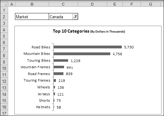
Figure 10-1. Interactive charts, such as this pivot chart, are ideal places to use a dynamic label that changes based on your current selection.
Note
For a complete discussion of pivot charts, see Chapter 8.
To ...
Get Excel® Dashboards & Reports now with the O’Reilly learning platform.
O’Reilly members experience books, live events, courses curated by job role, and more from O’Reilly and nearly 200 top publishers.

