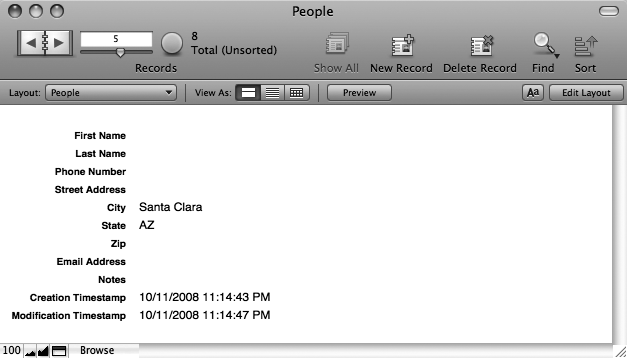
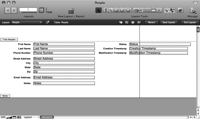
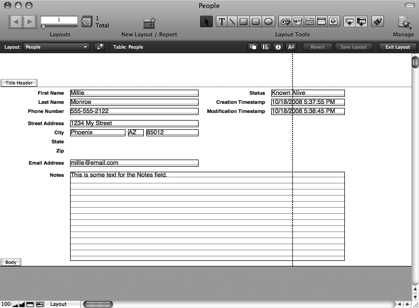
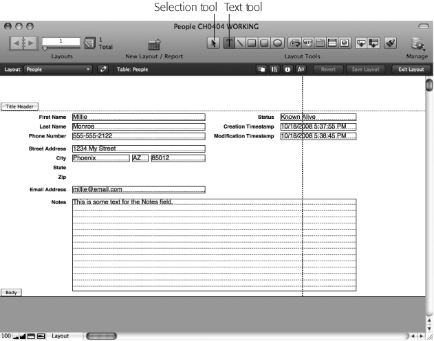
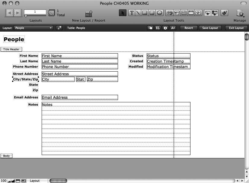
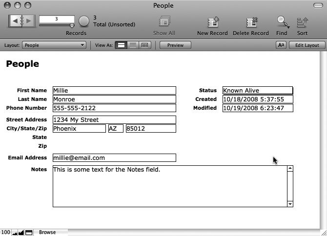
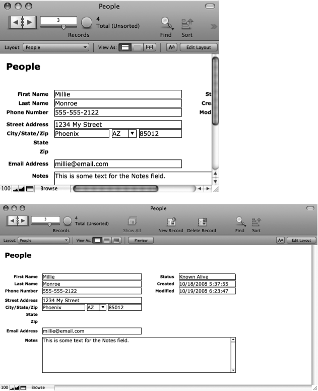
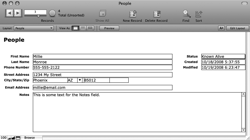
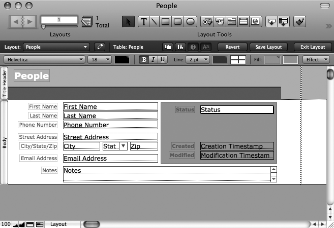
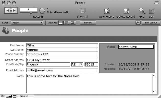
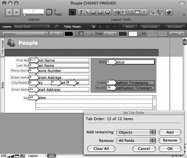
In the last chapter you created your first database, and it really works. Unfortunately, it doesn’t look all that great. For example, the Street Address field is the same width as the State field, even though street addresses are usually much longer than state names. The Zip Code field is much longer than it needs to be. And unless you’re a real minimalist, the whole thing just looks boring (see Figure 4-1).
Figure 4-1. This database works, but it could work—and look—better. What if you want to see lots of people at once? What if you want to print address labels for all these people? What if you want to arrange these fields in logical groups so they’re easier to figure out? This database can’t do any of those things, but if you give it a few new layouts, you can do all of them—and lots more.
You have other things to worry about as well. You have no good way to see lots of people at one time—in a nice list, for example. A list would also be handy for printing. As it stands, you have to print a whole page for each person in the database if you want a hard copy.
The FileMaker concept of layouts solves all these problems and more. While the Manage Database window lets you define the structure of your database (its fields and tables), layouts let you design the look and feel.
If the tables form the heart of a database, layouts give it a face. When you design a layout, you feel like you’re working in a graphics program: You can change the fonts, paste in your logo, make the background light fuchsia, and drag the fields around as though they’re little onscreen Lego blocks. A single database can look like a White Pages, a “Hello! My Name Is” name tag, a glossy brochure, or a library card catalog index card. FileMaker displays the same information—but how it displays that information is up to you.
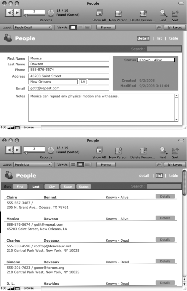
Better yet, a single database can contain as many layouts as you want; each shows the data in a certain way for a specific purpose. Figure 4-2 shows the People database with two possible layouts.
You can make layouts for just about anything. As far as FileMaker is concerned, a layout is a layout, but many of the layouts you’ll create fall into a few common categories:
Detail layouts show all (or nearly all) fields on the screen for one record at a time—a full employee profile, for example. You use Detail layouts for most, if not all, of your data entry. If you have a lot of fields, you can even create more than one Detail layout: Contact Info, Emergency Info, and Payroll Info, for example.
List layouts show multiple records at one time, in a scrolling list. These layouts usually show less information from each record than a Detail layout so more records can fit on the screen.
Report layouts are designed for printing (see Visualize the Result in Preview Mode). These layouts usually show multiple records in a list form, often with a title at the top and summary information at the bottom. Reports can even have groups of data and intermediate summaries or running totals.
Envelope and Label layouts format the data so that you can print it directly onto an envelope or a sheet of peel-and-stick labels. This layout makes addressing envelopes to people in your database a breeze. FileMaker can automatically create layouts for many envelope sizes and common label formats.
Figure 4-2. Top: The same People database looks a lot nicer if you customize the layout. This version also has pop-up menus to ease data entry, and buttons in the top-right corner to switch to other layouts. Bottom: Another layout shows the same data in a more compact form. It’s shown in List View here so you can see several records at the same time.
Most databases start off with the most basic layouts: one for a list of records, and one for a more detailed view. That way, you can quickly scroll through lots of records without getting data overload, and then jump to a more detailed layout for closer inspection.
Over time, you often add more layouts to meet specific needs. When thinking about layouts, you should be thinking about how you’ll want to see the data—what kinds of information should be onscreen at the same time, for example—and how you want to print your data.
As you build FileMaker databases, you’ll make a lot of layouts. For the most customized look and behavior, you often build layouts from scratch, adding the various parts and pieces one by one. But for the most common layout types, FileMaker can ask a few questions, and then do a lot of the dirty work for you.
Your People database, for instance, could really use a List layout so you can print lists of people for use on the go. It takes a few steps, but it’s really not difficult at all:
Choose View → Layout Mode.
The FileMaker window changes dramatically. You’re now in Layout mode, which has dozens of tools, commands, and buttons to help you create masterpieces. You’ll learn loads more about Layout mode soon.
In the Status toolbar, click New Layout/Report.
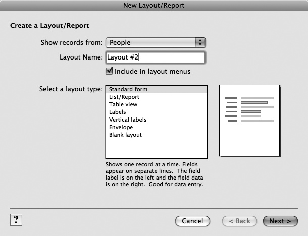
You can also choose Layouts → New Layout/Report or simply press Ctrl-N (⌘-N). FileMaker pops open the New Layout/Report dialog box pictured in Figure 4-3.
Figure 4-3. When you tell FileMaker you want to make a new layout, this dialog box is the first thing you see. In addition to a name and table, you tell FileMaker what kind of layout you’re making. It then asks you questions relevant to the type you choose, and makes a basic layout for you. If you want to work from scratch (as you’ll do on Creating a Layout from Scratch), then choose “Blank layout”.
In the Layout Name box, type People Report.
This name shows up in the in the Layout bar’s Layout pop-up menu (unless you turn off the “Include in layout menus” checkbox), so it should be something clear and relatively short.
In the “Select a layout type” list, click List/Report.
The List/Report item is highlighted.
Click Next.
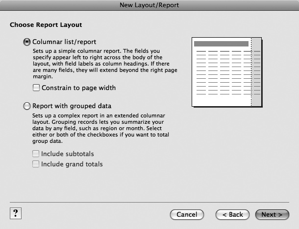
The window changes to look like Figure 4-4.
Figure 4-4. Once you tell FileMaker you want a List/Report type layout, it starts in with the questions. You’ll fly through seven screens in all before you’re done. This first one wants to know what kind of list you need. For now, choose “Columnar list/report”. You’ll learn about reports with grouped data in Chapter 6.
Make sure “Columnar list/report” is turned on, and then click Next.
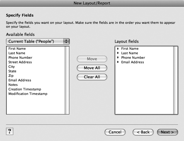
Now FileMaker needs to know what fields you want to include on the layout (Figure 4-5).
Select the First Name field, and then click Move.
The First Name field is added to the list on the right. It’ll be added to the new layout as well.
Repeat step 7 to add these fields: Last Name, Phone Number, and Email Address.
You can also double-click a field to move it more quickly. When you’re done, you should have four fields in the right-hand list.
Figure 4-5. This step in the process lets you decide which fields to include on the layout. You select one or more fields from the list on the left, and then click Move to add them to the list on the right. Every field you move is included on the new layout. If you select a field in the list on the right, then the Move button changes to a Clear button, and a click removes the field from the list.
Click Next.
FileMaker now asks you how you want to sort your list. Of course you already know you can sort any found set of records any time you want. So don’t bother with this step.
Click Next again.
This time, FileMaker asks you to select a theme. It gives you a couple dozen boring and mostly ugly themes to pick from. Feel free to choose any you like, or keep it simple, and choose Standard.
In the list, select a theme. If you can’t decide, just choose Standard. Then click Next.
Now FileMaker shows you some options to add header and footer information to your layout. You have a lot of choices to pick from here, so feel free to explore. For this layout, which isn’t intended for printing, you can simply leave everything set to None.
Leave every pop-up menu set to None, and then click Next.
FileMaker offers to create a script for you. If this were a printed report, the script might be handy: It automatically selects the new layout, sorts it, and shows it in a print preview mode. (You’ll learn all about scripting in Part 5.) But you don’t need any of that for a simple list.
Make sure “Do not create a script” is turned on, and then click Next.
You’re finally done with all the Q&A. Now FileMaker just wants to know if you intend to edit your layout further, or if you just want to see it in Browse mode right away. Reading this window, choosing and appropriate option, and clicking Finish takes about twice as long as just switching to Browse mode yourself, so feel free to consider this window a complete waste of your time.
Make sure “View the report in Browse mode to display and edit records” is turned on, and then click Finish.
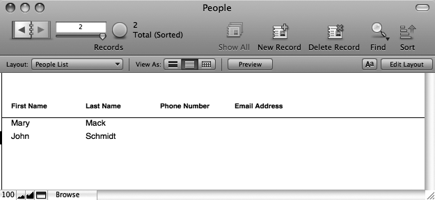
FileMaker shows you your shiny new List layout. You can see it in Figure 4-6, too.
FileMaker’s concept of views is closely related to layouts. So close, in fact, that people often get the two confused. While you can make as many layouts as you want, FileMaker has exactly three views: Form view, List view, and Table view. Each is really just a different way to look at any particular layout.
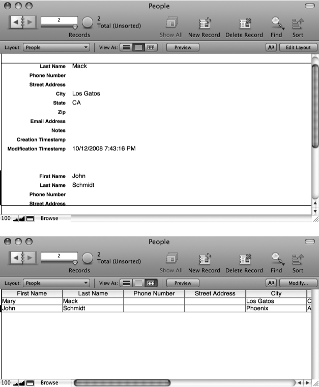
You’ve already seen views in action: Your new People List layout uses List view while the original layout (called simply People) uses Form view. You can look at a layout with a different view at any time: “From the View” menu, choose “View as Form”, “View as List”, or “View as Table”. Figure 4-7 shows the result.
When you switch views, FileMaker remembers the change, and associates it with the current layout. So if you come back to your layout later, then you’ll see it with the view you last used. Typically, you pick one view that makes most sense for a layout, and keep it that way.
Figure 4-7. Top: If you switch this layout to List view, things change only subtly. You now have a scroll bar on the right edge of the window, and you can scroll through all the records in one go. Normally, you use List view with a layout that’s more compact to make seeing lots of records easier. Bottom: Switch to Table view, and things get more dramatic. FileMaker completely ignores the structure of the layout, and instead shows all the fields in a spreadsheet-like view. Table view is so different from the other views, you’ll learn about it separately on Conditional Formatting.
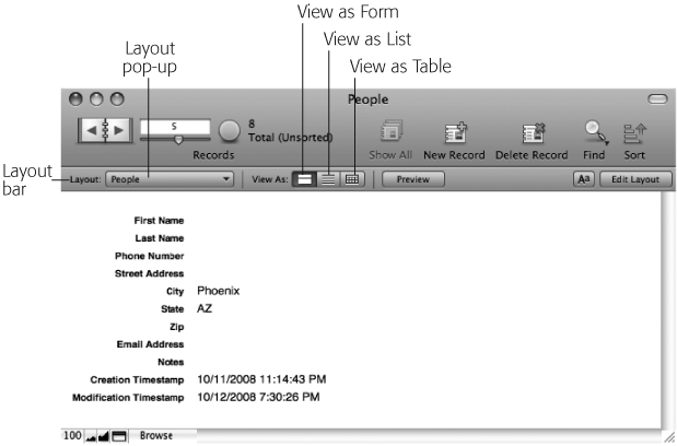
Your database now has two layouts, and FileMaker makes switching between layouts a breeze. Right below the Status toolbar, you find the handy Layout bar (Figure 4-8).
Note
The Layout pop-up menu doesn’t necessarily show every layout. You can actually tell FileMaker to hide certain layout names in this menu. You’ll learn how on Creating a Layout from Scratch.
To switch layouts, from the Layout pop-up menu, just pick the one you want. It couldn’t be simpler. The Layout bar also lets you easily switch between views. Just click one of the three View As buttons (they’re labeled in Figure 4-8).
Figure 4-8. The Layout bar—which appears and disappears along with the Status toolbar—gives you speedy access to all your layouts. Just click the Layout pop-up menu, and then choose a layout to switch to. Alas, your database has only one layout right now, but you’ll be changing that soon.
Now that you’ve discovered the Layout pop-up menu, you might feel like your layout names are imperfect. After all, the menu gives you these choices:
People
People List
It would be better if the first layout had a more meaningful name, like People Detail. To rename a layout, you need to revisit Layout mode. The Layout bar makes this easy too:
At the right end of the Layout bar, click the Edit Layout button.
The window switches to Layout mode. You can tell at a glance because the Layout bar turns black. It also gets several new buttons, including the one identified in Figure 4-9.
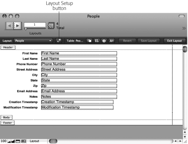
Click the Layout Setup button (Figure 4-9). It looks like a little pencil.
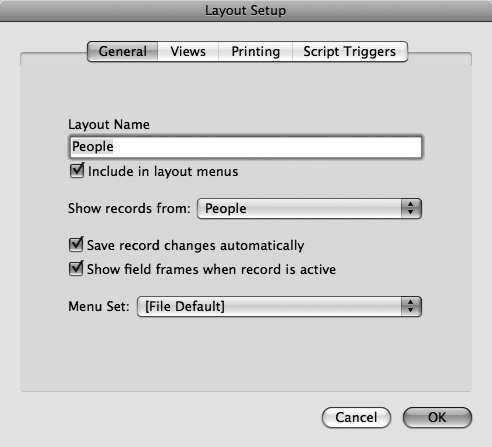
If you’re not the toolbar type, you can also choose Layouts → Layout Setup. Either way, you see the Layout Setup dialog box, shown in Figure 4-10.
In the Layout Name box, type People Detail.
This name more clearly indicates that this layout shows full details about a person.
Click OK, and then, in the Layout bar, click Exit Layout.
When you click Exit Layout, FileMaker asks if you want to save the change you’ve made to the layout.
Figure 4-9. When you switch to Layout mode to edit a layout, the Layout bar turns black. This strong visual cue helps you know where you are. It also adds several buttons, most of which you’ll learn about later. To rename a layout, click the Layout Setup button, shown here.
Figure 4-10. The Layout Setup dialog box has countless under-the-hood options for your layout. You can configure which views should be allowed for the layout, how big the print margins are, and which menus appear in the menu bar. And, as in step 3 on Renaming a Layout, you can type to change the layout’s name.
Click Save.
FileMaker is smart enough to know that the People List and People Detail layouts are showing the same records. In fact, you might use the People List layout to quickly find someone you want, and the switch to People Detail to make some changes.
To make switching back and forth as smooth as possible, FileMaker remembers which record you’re looking at, and which records are in your found set as you switch layouts. Prove it to yourself:
Switch to the People List layout.
Nothing new here. You see your records in a list.
Perform a simple find. For instance, find someone by first name.
The list changes to show only the matching records.
Click one of the records.
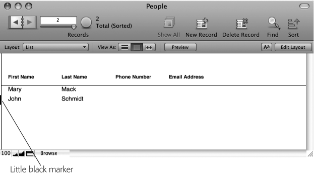
Even when you’re in List view, FileMaker has the notion of a current record. Since you can see several records at once, the program indicates which one you last clicked with a little black marker along the left edge of the record. You can see the marker in Figure 4-11.
Switch to the People Detail layout.
Notice that the record you’re looking at is the one you clicked when on the List layout. Also, if you use the book icon to change records, then you see that you have a found set just like you did on the List layout. If you perform a different find now, and then switch back to People List, FileMaker lists the records that match the new find as well.
Because FileMaker keeps all this in sync, you can use multiple layouts with ease. When you want to find things, use whatever layout makes it easiest. Need to print a sheet of labels? On the List layout, find what you want first, and then go to the Labels layout and print.
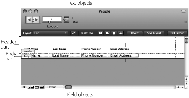
A layout is made up of layout parts—sections that each behave a little differently when displaying or printing multiple records. Even the simplest layout has at least one part, and each part has objects on it. One kind of object is a field, which you’ve seen plenty of so far in this book. Each field in your database has a little label beside it that tells you which field it is. These labels are another kind of object: They’re text objects. It just so happens those objects all belong to a part called the body, and if you need to talk about your layout, you’d say they’re on the body.
Parts tell FileMaker how to treat the objects inside them when it displays or prints the layout. To see parts in action, go to your People List layout, and then switch to Layout mode. Figure 4-12 shows its parts and objects.
Note
FileMaker gives you lots of ways to get to Layout mode. Namely, you can choose View → Layout Mode, or, in the window’s bottom-left corner, use the Mode pop-up menu (Keyboard Shortcuts). Finally, in the Layout bar, you can click the Edit Layout button. All these methods do the same thing.
Figure 4-12. Every layout is made up of parts like the Header part (which appears once at the top of the screen) and the Body part (which appears once for each record in List view). These parts hold various objects. This layout has only Field and Text objects, but FileMaker lets you add many different objects to your layout, from pictures and shapes to Web browsers.
FileMaker has eight different kinds of parts in all. Every layout uses at least one of these parts, and often several—although not all databases need all eight kinds of parts. Most types can occur only once on each layout (like a header), but some can appear several times:
Title Header. The title header part holds things you want to appear only at the top of the very first printed page. Use it for a descriptive title, larger column labels, a company logo, or you can even make it the height of your paper, and it acts as a cover page.
Header. The header part prints at the top of every page—unless you also use a title header, in which case the title header is on page one and the regular header is at the top of all other pages. In Browse mode, the header shows up at the top of the window. Here’s where you might put a date and time, small title, smaller column labels, and anything else that you want on every page of the printout.
Leading Grand Summary. This part prints below the header but above the records themselves. It’s meant to contain totals and similar fields that add up, average, or otherwise summarize the data.
Note
Leading grand summary and all the other “summary” parts are how FileMaker creates advanced reports. Reports, which help you compile and analyze your data, are nothing more than layouts designed for the job, as you’ll learn in Chapter 6.
Body. The body shows the actual record information. In List view, or when printed, it repeats once for every record.
Sub-Summary. These parts help you add things like subtotals to complex reports. You’ll learn all about this in Chapter 6.
Trailing Grand Summary. If you prefer totals and overall summary information at the bottom of a report, then they go in this part.
Footer. The footer prints at the bottom of every page—unless you also use a title footer, in which case, the title footer appears on page one, and the regular footer appears on all other pages. The footer also appears at the bottom of the window in Browse mode. The footer’s a perfect place for page numbers, copyright notices, and anything that ought to appear at the bottom of every page of your printout.
Title Footer. The Title Footer part shows at the bottom of just the first page. Use it for special footer info that needs to show only once.
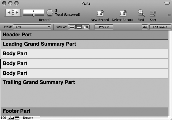
Figure 4-13 shows a layout with seven parts—one of each type except Sub-Summary.
When in Browse mode, and viewing the layout as a form, you see every part (sub-summary parts are a special exception, as you’ll learn in Chapter 6). You never use all these parts on a layout you plan on viewing in Form view. In general, if you only ever want to view a layout as a form in Browse mode, then you really need only a Body part, although if you plan to print, then you may want a Header part as well so logos, menus, and other user interface items don’t repeat for every record you print.
List view is a list because it shows several records at once. FileMaker accomplishes this magic by repeating the Body part once for each record. The database in Figure 4-13 has three records, so in effect, the Body part repeats three times. It has several other parts too, which appear in the same order they appear in Layout mode. (Any title header or title footer doesn’t appear in Browse mode.)
Figure 4-13. When you view a layout onscreen in List view, FileMaker arranges the parts like this example. Any title header or title footer doesn’t show up. The header sticks to the top of the window, and the footer sticks to the bottom. The leading grand summary appears right before the first record, and the trailing grand summary right after the last. The Body part repeats once for each record in the found set.
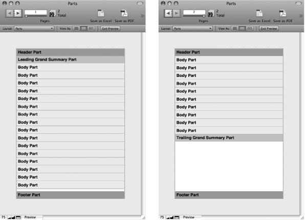
A quick glance at Preview mode might lead you to believe that it shows only the title header and the title footer (exactly the opposite of List view), but that’s not entirely true. Turn your eyes to Figure 4-14 for the whole story.
Just like List view, the grand summary parts place themselves before the first record and after the last record. Finally, scrolling in Preview mode just scrolls the current page. If you need to see other pages of your report while you’re in Preview mode, use the Book icon to move around.
While it’s perfectly legal to put any parts on any layout, you’ve probably figured out that some arrangements are more common than others:
Detail layouts usually have just a Body part, or some combination of header, body, and footer. These layouts may show only a single record, so there isn’t much point to Summary parts since you have no list of data to summarize.
Figure 4-14. Left: In Preview mode, the title header and title footer are at the top and bottom of the first page. The leading grand summary appears right before the first record, and FileMaker adds a copy of the body for every record until it fills up the page. Right: Every page thereafter shows the header and footer instead of the title header and title footer. If you don’t have a title header, then you get the regular header on the first page, too (and the same goes for the title footer). Also notice that the trailing grand summary appears after the last record.
List layouts usually have a header and a body, and sometimes a footer. Occasionally, you want a trailing grand summary on your List layout as well, since it can show summary information after all the records without taking up precious space like a footer.
Printed reports come in many forms. People often use all the parts shown above on a report: a large title header for the first page, and a smaller header for each additional page; a leading grand summary that shows below the title header and before the first record; a Body part for each record; a trailing grand summary to show totals from all records; and a footer to show page numbers and the like.
Envelopes and layouts often need headers and/or footers just to get the record data to align properly on the printed page. These parts are generally empty.
You may have a List layout that you use to browse your records, but you often print it as well. Make the layout do double duty by adding a title header or title footer. They’ll show only when you print, and you can save valuable screen real estate.
Parts aren’t so useful by themselves. Parts control how the items in your layout arrange themselves on the screen or on the page, but they need to have things in them to be really useful. You call those things layout objects. Layout objects come in seven flavors: Text objects, lines and shapes, images, fields, portals, tab controls, and Web viewers
Note
Portals are all about relationships, and you won’t learn about relationships—or portals—until Part 4. You’ll take up tab controls and Web viewers a little sooner—look for them in Chapter 5.
Almost every layout ever created has included text objects: little blocks of text that are the same on every record displayed using that layout. Think about what happens when you move from record to record. The text labels for each field stay the same, even though the data inside each field changes with every record. Text objects give you one form of stability in the ever-changing world of database records.
When you design a layout, you can control every aspect of a text object, from the words in it to the font, size, style, color, line spacing, tab stops, and so on. (In fact, everything you learned in Chapter 2 related to formatting text in fields applies to text objects on layouts as well.)
Tip
FileMaker’s spell checker works in Layout mode too. Just choose Spelling → Check Layout. It looks and works just as it does in Browse mode—except that it checks text objects on the current layout. Also, the visual spell-checking feature (see Checking Spelling) works in Layout mode as well, so watch for dotted red underlines if you’re a chronic misspeller.
If you need simple graphic embellishments in your layouts, FileMaker has built-in tools for making them. For example, you might want to put a box around a person’s address information, and another around the Notes field, so they’re visually separated. You can draw lines, rectangles, ovals, and round-cornered rectangles right on your layout. You can also control the line color, thickness, and pattern for lines and shapes; and the fill color and pattern for shapes.
If simple shapes can’t properly convey your artistic vision for your layout, you have recourse: You can paste any picture right onto the layout. You can also insert a picture from a file on your hard drive. Database developers often add icons, logos, and other decorations this way. For example, you might add your company logo to the top-right corner of your layout, or put a cute little envelope icon by the Email Address field. Just remember a little of this “eye candy” goes a long way. If you get carried away, then you can actually create so much visual clutter that people using the program are confused, instead of enlightened. Also, large images can make your layouts slow to load, especially when you share the database over a network (which you’ll learn how to do in Chapter 18).
A layout without fields is just a picture. Perhaps it’s a very complex picture that changes as you switch from List view to Form view, and has an entirely different effect when printed (thank you, parts!), but it’s a picture nonetheless.
To get data into your layout, you add field objects. For instance, if you make a new layout in the People database, and you want to show the person’s address, then you can add the Street Address, City, State, and Zip Code fields to the Body part of the layout. If the field is in the Body part (the most common place), then it shows data from the current record (or each record when you view the layout as a list). In list view, fields in Header, Footer, or Grand Summary parts show the values from the first or last record in the found set. In Preview mode (or when printing), headers and footers show data from the first or last record on each page.
Note
You don’t usually put ordinary fields in Header, Footer, and Grand Summary parts. These parts usually contain global fields, summary fields (see Summary Fields and Sub-Summary Parts), page numbering, dates, or text and pictures.
With a firm understanding of layouts, views, parts, and objects, you’re ready to get down to business. The next section shows you how to put all these ideas to work in your own databases.
Enough exposition. Chances are, you’re aching to get back to building your database. Building layouts is, by far, the most creative part of being a FileMaker Pro developer. You have the freedom to make subjective personal decisions about the style, arrangement, and even behavior of your database.
Some people choose to put a lot of work into the design side of things, using other graphics tools and an artistic eye to make gorgeous hand-crafted layouts. Others think, “What’s the point?” and are perfectly content with the spare black-and-white layouts that FileMaker creates all by itself. You may wind up somewhere in the middle: You want something more than what FileMaker gives you, but you don’t have the patience or skill to treat every layout like a work of art.
Luckily, you’re completely in charge. A FileMaker layout can look like just about anything you can imagine. Just remember that with all this flexibility, you can easily make bad choices. Layout design isn’t just about how things look. You need to think about how people will use the system. Have you arranged fields in meaningful groups to make it easier to find what you want? Is there too much visual noise? Is it hard to tell which field holds which kind of information? These questions are especially important if many other people use your database. As you work in Layout mode, step back every now and again, and try to view your layout with a new eye. Does it make sense?
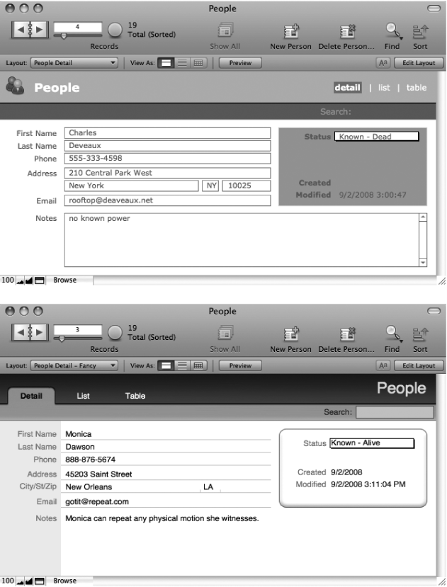
Figure 4-15 shows your People database with two possible layouts. They both have a lot in common, but the one on the bottom is decidedly harder to build, owing to its custom graphics and meticulous embellishments.
Figure 4-15. Top: This is the same People database you created in the last chapter. But in this version, the layout has been fully customized, and that’s made all the difference. Fields are easier to spot, things are arranged and grouped in meaningful ways, and things have been dressed up a bit. Bottom: This version of the layout serves the same purpose, but with a different style. Custom graphics created in a separate program give the layout a richer feel. This extra finesse takes time and effort.
Throughout this chapter, you’ll build the version on the top in Figure 4-15.
Note
To see how the dressier layout (on the bottom in Figure 4-15) was created, check out the screencast on the Missing Manuals Web site (go to http://missingmanuals.com/, and then, on the left, click the Screencasts link).
You already caught a glimpse of Layout mode when you were renaming the People layout on Renaming a Layout. Layout mode has a lot more going on than the other modes you’ve seen. For example, the Status toolbar is drastically different, and the Layout bar makes an appearance. Even the available menus and commands are different: two new menus (Layouts and Arrange) have appeared, the Records menu is gone, and you find many new commands in each menu.
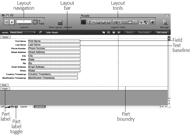
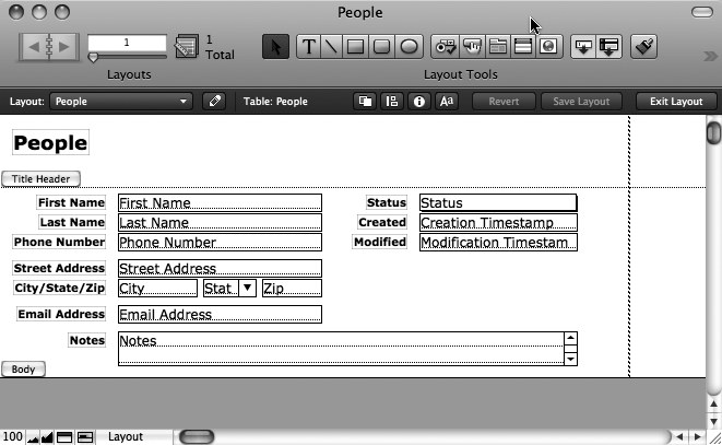
Inside the database window, things have changed as well. Fields now show their names, and include a dotted baseline. You can see dashed black page break lines, and labels for every layout part. Figure 4-16 marks each of these changes.
Figure 4-16. In Layout mode, things look a little different. The Status toolbar now lets you flip through layouts instead of records. It also includes a large collection of tools (you’ll learn about these soon). Fields look different in Layout mode too: They have borders and text baselines, and instead of data, each one shows its name. Finally, parts are clearly labeled, and a dotted line separates them.
Tip
Since the kind of work you do in Layout mode is so different from Browse mode, any changes you make to the Status toolbar don’t show here. Instead, you can customize the Status toolbar’s Layout mode version separately from the Browse mode version. (The same goes for Find mode and Preview mode.) Just choose View → Customize Status Toolbar. You get a different collection of possible toolbar buttons in Layout mode as well.
You don’t have to look too closely to see that the Status toolbar has changed significantly (Figure 4-16):
Instead of the current record number and record count, the Status toolbar now shows the current layout number and the layout count. You can now use the book icon to flip through layouts instead of records.
A handful of tools—little square buttons with icons on them—appear. (Read on to find out what they do.)
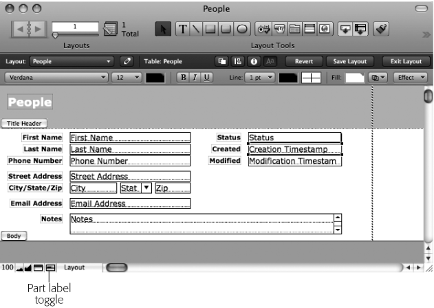
In the bottom-left corner of the window, a new control called the part label toggle has joined the usual zoom controls and Status toolbar control. You’ll see this widget in action on Adding pictures.
The Layout bar, with its associated menus, buttons, and icons, is in full view.
Note
You may need to make your window wider to see everything the Status toolbar has to offer in Layout mode. If the window isn’t wide enough, then FileMaker intelligently hides the least useful tools so things don’t crash into each other. As usual, on the Status toolbar’s far-right edge, you can click the arrow to see a pop-up menu of the missing items.
The process of building a layout isn’t always linear. Most people tend to bounce from task to task as they mold the layout to match their vision. You might arrange some parts, organize fields, do some decorating, and then revisit the fields. It is, after all, a creative process.
But usually, you first get the parts roughed out. Since you don’t know exactly how big things are going to end up, it isn’t critical that you get the parts exactly the right size right away. But you do want to decide which parts you’ll be using, get them in the right places, and take a guess at how big they need to be.
Note
FileMaker lets you move objects only into parts. Sometimes, as you’re arranging things, your layout can get cramped, so it’s helpful to start with parts that are a little bigger than you really need. You can shrink them up again later when you’ve finished laying things out.
If you view your People Detail layout in Layout mode right now (Figure 4-16), then you see FileMaker has given you three parts: a header, body, and footer. If you were to print some records while on this layout, the header would appear on the top of each page, and footer on the bottom of each page. Right now, though, the header and footer are both completely empty.
Since this layout is designed to be seen on screen in Form view, headers and footers may not be important to you. But you might consider using a title header just in case you decide to print this layout. That way the graphical embellishments you see on the top of the layout in Figure 4-15 print only at the top of the first page, leaving more room for record data, and using less ink. Here’s how to fix it up:
If you haven’t already, go to the People Detail layout, and then switch to Layout mode.
You’re now ready to work on your layout.
Choose Insert → Part.
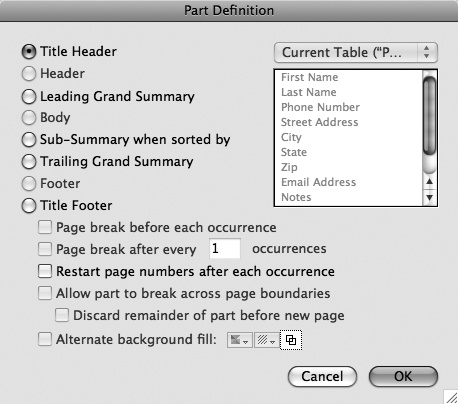
The Part Definition window appears (Figure 4-17). It wants to know what kind of part you want to add to the layout.
Make sure Title Header is turned on, and then click OK.
FileMaker adds a title header part to the very top of your layout. (When you use the Insert → Part command, the part is automatically inserted in the spot that makes sense. In this case, since this is a title header, it goes at the very top of the layout.)
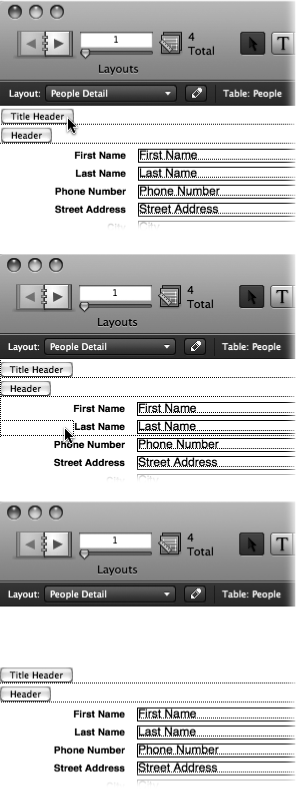
Drag the Title Header part label straight down to make the title header larger.
Use Figure 4-18 as a guide.
Figure 4-18. Top: To resize a part, you can simply drag its part label. (If you’re deft with the mouse, you can actually drag the thin dotted line that extends from the label.) Middle: As you drag, FileMaker shows an outline of the label, plus the new divider line. This line crosses right over the content of the layout, which can be disorienting. But when you’re done, FileMaker moves everything down to make room for the larger part, so things will be neat as a pin. Bottom: When you’re done, the part is bigger, and everything else is still intact.
Now that the title header is in place, you can get rid of the header and footer parts. This step is a snap:
Click the Header part label once.
FileMaker highlights the label to indicate that it’s selected.
Press the Delete or Backspace key on your keyboard.
Since this part is empty, it disappears right away.
Click the Footer part label to select it, and then press Delete or Backspace again.
Once again, the part disappears.
For more tips on arranging parts, see the box below.
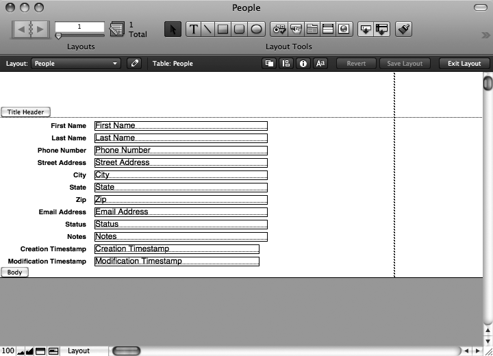
When you’re done, your layout should look like Figure 4-19.
Now that you have the parts where they belong, you can start moving and resizing objects, and adding new things to the layout. Obviously, the exact steps you take depend on what you want your layout to look like. But the kinds of steps you take are always the same.
Since FileMaker has no idea where you want things on the layout, you can spend a lot of time moving objects around. Luckily, if you’ve used a computer any time in the last 20 years, this is a snap.
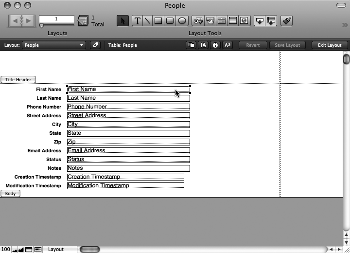
When you’re in Layout mode, you can select any object simply by clicking it. When you do, it scores four handles, which you can see in Figure 4-20.
Figure 4-19. Once you’ve added a title header and removed the header and footer, your layout should look like this example.
Figure 4-20. In Layout mode, when you select an object, a small square handle appears on each of its four corners. In this picture, the First Name field is selected. These handles server two purposes: First, they let you know at a glance what’s selected. Second, you can drag them to resize an object.
To move an object, just drag. A little outline follows you as you go, and when you release the mouse button, the object snaps to its new home.
In a new database like this one, the Object Grids are turned on, meaning FileMaker lets you move the object only in 6-pixel increments. This feature is timesaving—it’s easier to quickly drag dozens of objects around and keep them lined up if they stick to a grid of some kind. But sometimes you need a little finer control. You can bypass the grid in three ways:
If you just need to temporarily skirt the grid, press Ctrl (⌘) while you drag the object. As long as the key is down, you can drag the object smoothly to any spot on the layout.
Choose Arrange → Object Grids to turn the grid off more permanently. (You can always turn it on again any time you want by repeating this menu command.)
Press any of the arrow keys to move the selected object 1 pixel in any direction. You can press a key repeatedly to carefully nudge an object into place.
On the other hand, sometimes you need a little more help. FileMaker has a handful of special commands to make lining things up a breeze:
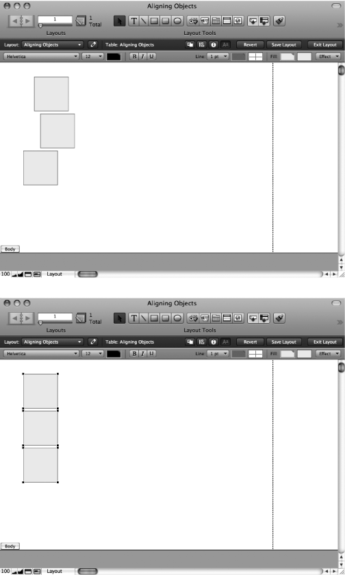
If you have several objects that should be lined up, but aren’t, you can snap them to attention with the options in the Arrange → Align menu. Figure 4-21 shows an example.
Figure 4-21. Top: These objects are all a-jumble, and lining them up one by one could be pretty tedious. But there’s a better way. First, select them all (see the box on Resizing objects for help). Then choose Arrange → Align → Left Edges. Bottom: When you run the Align command, FileMaker makes sure the left edge of each item is in a neat line. You can line things up on the left, right, bottom, top, or middle.
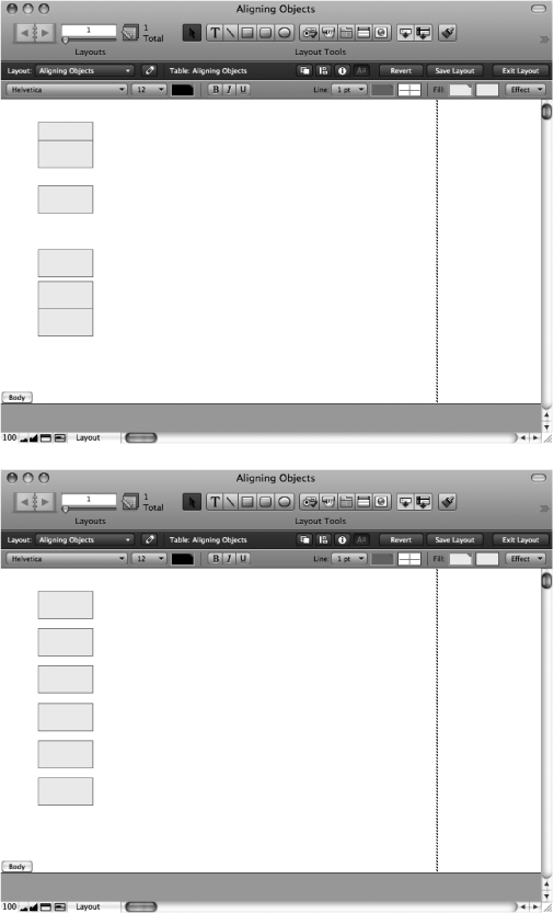
Sometimes the objects are aligned properly, but not evenly spaced. FileMaker has a magic tool to solve this problem too, as shown in Figure 4-22.
Figure 4-22. Top: This time, the trouble is spacing. You want these objects evenly spaced. Once again, select them all first. Then choose Arrange → Distribute → Vertically. Bottom: When you do, FileMaker makes sure there’s an equal amount of space between each item. If you’re spreading things out side to side, choose Arrange → Distribute → Horizontally instead.
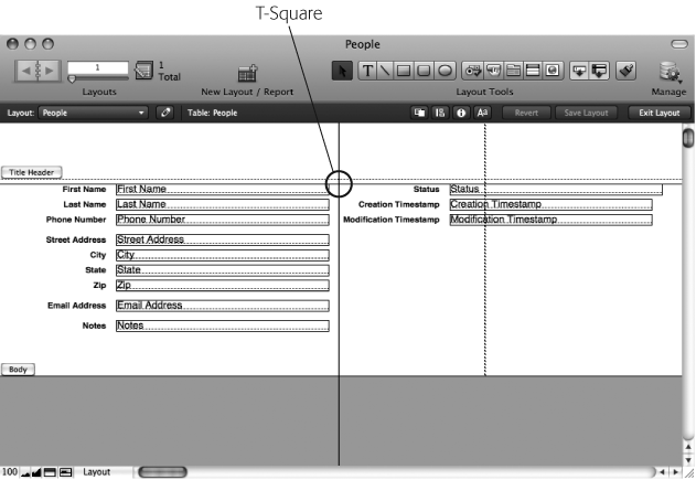
Sometimes you just need some visual aid. For instance, if two objects are far apart, and you want to line them up, it can be hard to see which way to go. FileMaker’s T-Squares come to your aid in this situation. You can see them by choosing View → T-Squares (Figure 4-23).
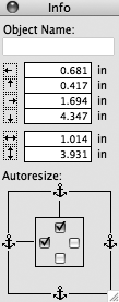
For the ultimate in precision, you can use the Object Info palette. To see this helper, choose View → Object Info, or turn to Figure 4-24. You can even control what units the palette uses. Just click the unit label (in, cm, or px) beside any box. Each time you click, the labels switch to another kind of unit so you can work comfortably.
Figure 4-23. When you choose View → T-Squares, FileMaker adds a horizontal and vertical black line to your layout. You can move these lines by dragging them, and they show you how things line up. When you drag an object near a T-Square, the object snaps to it as though it’s magnetized, making this a quick way to line up several objects.
Figure 4-24. The Object Info palette (View → Object Info) lets you position and resize the selected object numerically. First, make sure you have the object selected. Then, in one of the boxes, enter any number you want. They set the left, top, right, bottom, width, and height respectively.
Using these various tools, you can start to position the objects on your layout appropriately. Your first task is to move the fields and labels around so they look something like Figure 4-25.
As mentioned in Figure 4-16, you can resize an object by dragging one of its handles. Once again, FileMaker shows you a dotted outline while you drag so you know how big the object will be when you let go. Once again, the Object Grids (Resizing objects) constrains your freedom here, and you can bypass them by pressing Ctrl (⌘) while you drag.
Figure 4-25. Your next step is to put the fields roughly where they belong. In this picture, the Status and Timestamp fields are off to the side, and the other fields are grouped in a meaningful way.
The Arrange menu has some love for object resizers. With multiple objects selected, from the Arrange → Resize To menu, you can choose an option to quickly resize them all. You have several choices. Choose Smallest Width to make every selected object as narrow as the smallest of them. Choose Smallest Height to adjust the height of the objects instead of the width. Rounding out the Smallest options, choose Smallest Width & Height to do both at once. Each of these has a counterpart that makes the selected objects bigger instead. For instance, choose Largest Width to make every field expand to an equal width.
Finally, the two bottom boxes on the Object Info palette (View → Object Info; Figure 4-24) adjust the width and height of the selected object precisely.
Using these powers, you can now resize the fields on your layout (and move them a touch more). Figure 4-26 shows how your layout looks as things continue to come together.
Tip
Sometimes when you’re resizing fields, you might find it hard to judge how big a field should be, especially with date, time, and timestamp fields, where too little space cuts things off, and too much is never used. In Layout mode, choose View → Show → Sample Data, and FileMaker fills your fields with type-appropriate data. If you already have records in your database, then it shows real record data. Otherwise, FileMaker just makes stuff up. Either way, though, you can start to get an idea of how much will fit in the fields you’re sizing. When you’re ready to see the field names again, just choose View → Show → Sample Data again.
Figure 4-26. After a little resizing, your layout is starting to come together, structurally. The City, State, and Zip fields have been squeezed and lined up in typical address fashion. The Notes field is now big enough for a thorough treatise. And the Status and Timestamp fields are no longer excessively large.
With your fields in the right place, you can now turn your attention to the text on the layout: the field labels. You can easily edit the text, add new text objects, and modify fonts, sizes, and styles.
Editing text. This layout’s two timestamp field labels could use your help. Right now they say “Creation Timestamp” and “Modification Timestamp”, but those names are a bit nerdy for your average user. Instead, you label these fields “Created” and “Modified”. You’ll also change the “City” label to say “City/State/Zip” since these three fields are all on one line.
The tools are in the Status toolbar, as Figure 4-27 attests.
Click the Creation Timestamp field label once.
The object gets a dotted outline, and a blinking insertion point appears at the spot you clicked. You’re now editing the text object, and everything you know about editing text applies, as discussed in the box on Removing objects from a layout. You can type, use the Delete and arrow keys, and even drag or double-click to select text. Click anywhere outside the dotted line when you’re done editing.
Note
By almost every measure, a field label is just like any other text object. But the labels FileMaker creates for you have one hidden property that makes them special: When you change a field’s name in the Manage Database window, its label automatically changes to match. As soon as you edit the text in a field label, though, this magical bond is broken. This break may be a good thing or a bad thing depending on your point of view. Editing your field labels manually lets you pick just the right name, given the available space, and the nature of the layout. On the other hand, you may find that keeping your field labels and field names in sync helps you keep things straight in your head.
Choose Edit → Select All or press Ctrl+A (⌘-A).
Type Created.
FileMaker replaces the selected text with the new text you type, just like a word processor.
Click anywhere in the layout outside the text object you’re editing.
The dotted outline and insertion point disappear, and the object isn’t selected. You’re done editing its text.
Now repeat these steps, changing the Modification Timestamp object to say Modified. Finally, repeat the steps once more to change the City object so it reads City/State/Zip.
Tip
Sometimes it can be difficult to line up text objects since different letters have different shapes. When is a word that ends in a lowercase “i” lined up with a word that ends in a “w”? If you find yourself in this boat, choose View → Show → Text Boundaries. When you do, a faint gray box appears around every text object. You can use this box to see how things line up more easily. The boxes show up only in Layout mode, so you can leave this option on all the time if you want.
Adding new text. If you flip back to Figure 4-15, you see a few pieces of text that aren’t field labels. In the header section of the layout, a large bold “People” label lets you know what this database holds. Adding this to your layout is a snap.
First, select the Text tool. Then click anywhere on your layout. When you do, FileMaker makes a new text object and sets you up to edit it directly. The object appears wherever you click, so you’re probably best off clicking in the header near where you want it to end up. Once you click, you can begin typing. Type People. Then click outside the text object to tell FileMaker you’re done editing. Finally, style the text as you see fit. In Figure 4-15, it’s 18-point bold. (You can leave the text black for now. You’ll take care of colors shortly.)
The finished layout also includes three text objects on the right side of the header: Detail, List, and Table. These objects are actually buttons to help you switch layouts easily. You won’t create these until Chapter 6.
In Figure 4-28, you can see the layout with text changes in place.
You often have objects on your layout that you don’t need anymore. Sometimes you add an object, and then later change your mind. You might even create a text object temporarily just to jot down some notes, or peek at a field that’s normally not showing, or add a box to help yourself line things up.
But most often, you delete things because FileMaker created them for you, and you no longer need them. That’s the case right now with the State and Zip field labels. They’re no longer by the fields they label, and those fields are already labeled sufficiently by the City/State/Zip text object.
Luckily, removing a text object couldn’t possibly be easier. Just select the object (or objects) you want to delete, and then press the Delete or Backspace key on your keyboard. Instantly, the selected objects disappear.
To continue your work on the People layout, go ahead and remove the State and Zip field labels now.
With sizes, positions, and labels dialed out, you can now turn your attention to the fields. If you compare your layout with the goal laid out in the top window in Figure 4-15, then you see that your fields don’t quite live up to expectations. You’ll fix them up now.
Note
You can use all the same font, size, style, color, and other formatting commands for text objects on fields, too. Just select a field object, and then go to town with the Format menu. But since fields don’t contain real data until you go to Browse mode, you can format only the entire field. If you want to format parts of the text inside the field, you need to do it in Browse mode.
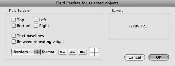
Field borders. In Browse mode, the fields in your People database are currently just floating blobs of text with no defined edges. So your first task is to give the fields visible borders. Adding borders to fields is a snap. First, select the field or fields in question. (In this case, go ahead and select every field.) Then choose Format → Field/Control → Borders. You see the dialog box in Figure 4-29.
Figure 4-29. When you choose Format → Field/Control → Borders, this window appears. Here, you can add borders and baselines to your fields. Just turn on the checkboxes corresponding to the borders you want. You can also set the color, pattern, and line thickness of the field borders using the “format” pop-up menus.
In the Field Borders dialog box, turn on the Top, Left, Bottom, and Right checkboxes. Then click OK. You don’t see much change at first because field borders appear in Layout mode even when they’re turned off (you can toggle them on and off by choosing View → Show → Field Boundaries). But if you switch to Browse mode, you see that each field now has a thin black border.
Field behavior. Previewing the People database in Browse mode reveals another problem. You can click into (and type into) the Created and Modified fields. But these fields are strictly informational: You should be able to see them and search them, but you don’t need to edit them, because FileMaker fills in the dates automatically when you create or modify a record. In fact, even though FileMaker lets you type into them, if you try to commit the record, then it displays an error message because when you created these fields, you told FileMaker to “prohibit modification of field value” (Modification values). Instead of letting people try to edit these fields and get a rude error message, you want to make it so they can’t click into these fields in the first place.
If you’re sharp-eyed, you might also notice that FileMaker is running its spell checker on the Email Address field. When you type in an email address, which is almost never a proper word, it gets a distracting red underline.
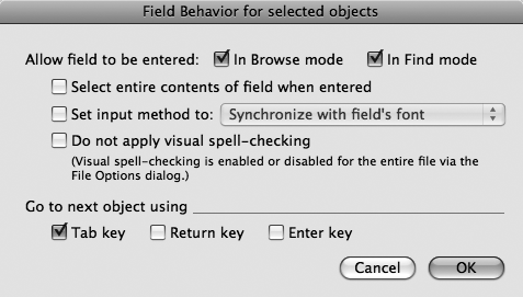
You can fix these problems (and more) by modifying the field behavior. To change it, first select a field, and then choose Format → Field/Control → Behavior. You can see the resulting dialog box in Figure 4-30.
Figure 4-30. The Field Behavior dialog box (Format → Field/Control → Behavior) lets you control how the field acts in Browse mode. The most common setting is the first set of checkboxes, “Allow field to be entered”. But each option here is useful under certain circumstances.
FileMaker lets you control five aspects of a field’s behavior:
The “Allow field to be entered” checkboxes prevent folks from being able to click into the Created and Modified fields. When you turn the “In Browse mode” box off, then clicking into the field in Browse mode doesn’t work, turning the field into a visual display of data, minus human interaction. Since you often want a field that can’t be edited, but can be searched, you’ll most often turn off “In Browse mode” and turn on “In Find mode”. But you’re free to turn on or off either checkbox in any combination that suits your needs.
Note
When you can’t enter a field, then you can’t select its text to copy and paste. So if you want to let people copy the information from an uneditable field, then you can leave a field enterable, but remove their ability to edit using field options (Working with fields) or security (How Security Works).
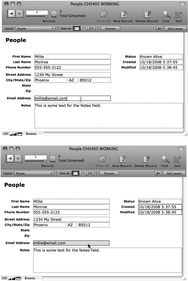
Normally when you click into a field, the insertion point appears right where you clicked. But sometimes you always want to edit the entire field value. For instance, you might have a set of records you update monthly with new sales totals, and you’re always typing over what’s there with new numbers. In cases like this, turn on “Select entire contents of field when entered”. Now, when you click into the field, FileMaker preselects the entire value, and you can simply start typing to replace what’s there. You can always click a second time to get an insertion point, or start making a new selection. Figure 4-31 shows this subtle difference in action.
The “Set input method” option deals with text entry in Asian languages. When this option is on, you can control which text “input method” is used for this field. If you need this ability, you know what it means. If not, just ignore this option.
Turn on “Do not apply visual spell checking” to turn off the dashed red lines that appear under misspelled words in that field. Many fields hold data that the spell checker doesn’t like, like part numbers, email addresses, and launch codes. Since the red underlines are just a distraction in these fields, you can turn them off. You can see the change in Figure 4-31.
Figure 4-31. Top: When you click a field, the flashing insertion point appears right where you clicked. In this image, you clicked at the end of the email address. Also notice that FileMaker has underlined the address because it thinks it’s misspelled. Bottom: By changing field behavior (Format → Field/Control → Behavior) the Email Address field now behaves differently. A click selects the whole address, making it a breeze to copy or replace. And the visual spell checker has been disabled for this field, so you’re no longer bothered with an underline. Also notice that there’s no longer a dotted outline around the Created and Modified fields, because they’re not enterable anymore.
As you learned early in this book, you can press the Tab key to jump to the next field when in Browse mode or Find mode. The Return key (or the Enter key by your main keyboard) inserts a new line into the field, and the Enter key by the number keypad commits the record, and takes you out of any field. But if you prefer, you can configure any or all of these keys to go to the next record instead. Just turn on the appropriate checkbox under “Go to next object using”. If you turn a checkbox off, then the key goes back to its normal behavior, so if you turn off the “Tab key” checkbox here, then the tab key inserts a tab into the field instead.
To tidy up your layout, follow these steps:
Click the Creation Timestamp field to select it.
The selection handles appear to let you know you’re on the right track.
While pressing Shift, click the Modification Timestamp field.
Because you pressed Shift, the Creation Timestamp stays selected, and the Modification Timestamp field is selected too.
Choose Format → Field/Control → Behavior.
The Field Behavior window (Figure 4-30) appears.
Turn off the “Browse mode” checkbox, and then click OK.
This prevents folks from accidentally typing in these fields.
Select the Email Address field, and then choose Format → Field/Control → Behavior again.
The dialog box appears again, but this time you’re configuring the Email Address field.
Turn on “Select entire contents of field when entered”.
An email address is exactly the kind of thing you often copy, but rarely edit.
Turn on “Do not apply visual spell checking”.
It would be awesome if FileMaker could tell you when you’ve mistyped an email address, but the spell checker just doesn’t cut it. There’s no sense spell checking something that’s never going to be correct.
Click OK, and then switch to Browse mode.
You can now try out your changes. Refer to Figure 4-31 if you’re not sure what you’re looking for.
Field controls. The Field Behavior dialog box is by no means the limit to what you can make a FileMaker field do. In fact, if you flip ahead to Figure 4-34, then you see that the Status field is something entirely different: a pop-up menu. In fact, a field can take on any of several forms, collectively referred to as controls. A control is something you click to manipulate the field data in some way. (Think about an airplane cockpit, whose instrument panel is covered with controls: switches, dials, and readouts of various types.)
FileMaker supports all the standard user interface controls you’re used to, like pop-up menus, checkboxes, and radio buttons. It also offers pop-up calendars. And if you want to type with just a little assistance, it has auto-completion, which works just like the address bar in your Web browser: As you type, FileMaker gives you options based on other values you’ve typed in the field before.
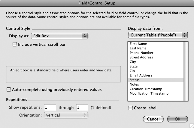
All this power lives behind the Format → Field/Control → Setup command. You can see the resulting dialog box in Figure 4-32.
Figure 4-32. The Field Control Setup dialog box (Format → Field/Control → Setup) lets you configure the type of control people use to enter data into the field. You’ll discover a lot of power behind this little window.
In general, picking a type is simple: First select the field you want to change. Then choose Format → Field/Control → Setup (or just press Ctrl+Shift+F or Option-⌘-F). Finally, from the “Display as” pop-up menu, make your choice.
But if you choose a pop-up menu, or radio buttons, or checkboxes, how does FileMaker know what choices to let someone pick from? The answer lies in something you’ve seen just briefly so far: a value list (basically, a list of text values). You made a value list of state abbreviations on Existing value as part of the validation for the State field—one of many good situations for a value list.
When you choose one of these choice-oriented field control types, you also pick a value list. FileMaker then lets anyone using the database choose from among the values you specify. To try it out in the People database, you can make your Status field into a pop-up menu offering a list of the following choices:
Known – Alive
Known – Dead
Missing
Here’s how:
In Layout mode, on the People Detail layout, select the Status field.
As usual, you need to tell FileMaker which field you want to change first.
Choose Format → Field Control → Setup (Ctrl+Shift+F or Option-⌘-F).
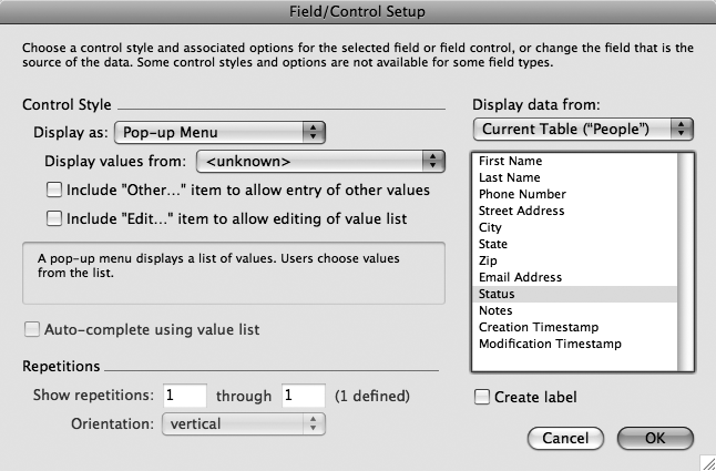
From the “Display as” pop-up menu, choose “Pop-up Menu”.
A few new options appear in the dialog box, as shown in Figure 4-33.
Figure 4-33. When you choose to display your field as a pop-up menu, FileMaker gives you a few new choices. Most importantly, you must pick a value list from the “Display values from” pop-up menu. You can also turn on “Include ‘Other…' item” to allow entry of other values” if you want your pop-up menu to include an extra choice called “Other…” that lets someone enter anything she wants. The second checkbox lets you add an “Edit…” item to the menu so database users can edit the choices in the menu at will.
From the “Display values from” pop-up menu, choose Manage Value Lists.
The Manage Value Lists dialog box appears. This window lists all the value lists you’ve created (you probably have only one right now). It’s perfectly OK to use the same value list in more than one place, but in this case, you don’t have one with the values you want, so you’ll make a new one.
Click New.
The Edit Value List window appears, ready for you to configure a fresh value list.
In the Value List Name box, enter Statuses.
You can name a value list just about anything you want. But for convenience in the future, name it something meaningful.
Make sure “Use custom values” is turned on.
Once again, you want to specify a custom list of values. You’ll learn about the other types on Creating Related Records.
In the box under “Use custom values”, type Known – Alive, Known – Dead, and Missing, each on a separate line.
Make sure you press Return between each value so FileMaker knows you have three separate items in your value list, not one long item.
Click OK, and then, in the Manage Value Lists window, click OK again.
Closing both dialog boxes gets you back to the Field/Control Setup window. In the “Display value from” pop-up menu, your Statuses value list should be selected. If it isn’t, select it now.
Click OK.
Your Status field looks a little different now. It has a small drop shadow, making it look like an old-school pop-up menu.
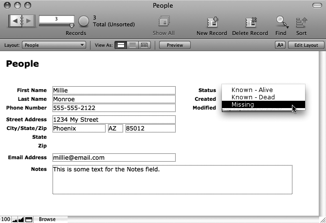
If you switch to Browse mode now, your pop-up menu should be fully functional. Figure 4-34 shows how it looks.
Figure 4-34. Your layout now has a functioning pop-up menu. The field looks different on the layout, with a drop shadow making the field appear to pop out of the screen a little. When you click the pop-up menu, a list of choices appears.
Your layout could use a few more field control enhancements while you’re here:
The Notes field is big, but is it big enough? You can add a scroll bar with just a few clicks. Then, if you happen to need more space, FileMaker lets you scroll through all the text you add.
Chances are you’re going to put the same stuff in the City field over and over, with a few occasional exceptions. If you turn on auto-completion, then FileMaker helps you type the common values, but stays out of your way when you type something unusual.
The State field, on the other hand, is always a standard state abbreviation (the validation sees to that), so a pop-up menu is usually great. But when you know the abbreviation you want, it’s much faster to simply type it than to pick from a list. Nevertheless, the list is helpful if you can’t remember whether Alaska is AK or AL (it’s AK). FileMaker has another control type—the drop-down list—that’s sort of like a combination pop-up menu and Edit box. It lets you either choose from the list or type for yourself.
Note
You rarely use every field control option in any one layout, and the layout you’re creating now is no exception. Fear not, though. You can read about each field control option in detail on Advanced Field Controls.
First up, here’s how to add a scroll bar to the People database’s Notes field:
Select the Notes field, and then choose Format → Field/Control → Setup (Ctrl+Shift+F or Option-⌘-F).
The Field/Control Setup window makes another appearance.
Turn on “Include vertical scroll bar”.
You’re done; simple as that.
Click OK, and then switch to Browse mode and behold the glory of your creation.
Your Notes field now has a little scroll bar along its right edge (Figure 4-35). (If you don’t see this, you don’t have field borders turned on. See Working with fields for the steps you missed.) If you type enough data to fill up the Notes field, the scroll bar kicks into action, making it a snap to scroll up and down through as much text as you can throw at it.
Figure 4-35. Any field can have a scroll bar—like the Notes field here—so long as it’s a standard Edit box field control.
Now you can add auto-completion to the City field. Select the field, and then choose Format → Field/Control → Setup (Ctrl+Shift+F or Option-⌘-F). This time, turn on “Auto-complete using previously entered values”. When you test this control, make sure you create some records first, if you don’t have any. The auto-completion is based on data in other records, so if you have no records, you don’t get any completions.
Assuming you do have cities entered in other records, when you start typing in the City field, FileMaker automatically fills in the full city name that starts with whatever you type. If it isn’t right, you can just keep typing. If it is right, press Tab, and FileMaker accepts the whole value.
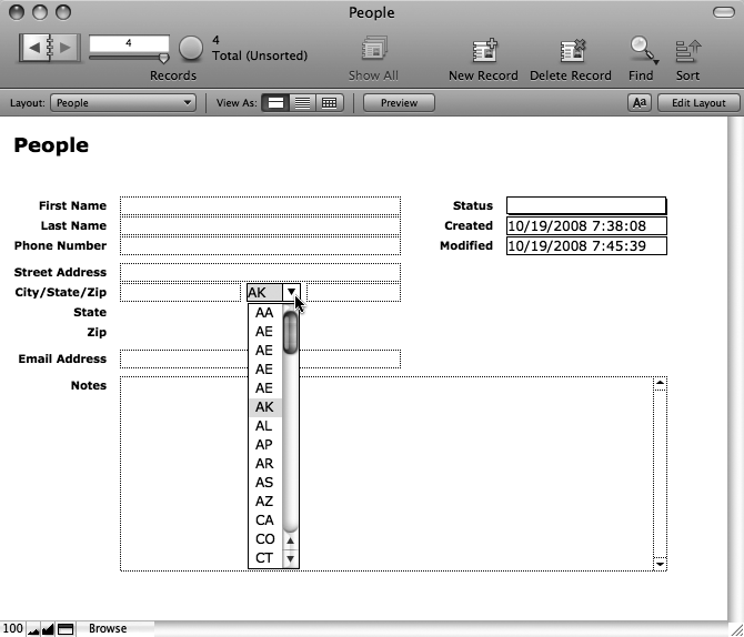
Now it’s time to tackle the State field. You know the drill: Select the field, and then press (Ctrl+Shift+F or Option-⌘-F). In the Field/Control Setup window, from the “Display as” pop-up menu, choose the "Drop-down List” option. From the “Display values from” pop-up menu, pick your State’s value list (it’s probably already selected since it’s first in the list). While you’re here, turn on “Include arrow to show and hide list”. That adds an arrow icon to the field to indicate it has a drop-down list. Finally, click OK.
Once you’ve made this change, you may need to make the State field a little bigger to accommodate the arrow icon. You can make room by shortening the City or Zip Code field. Figure 4-36 shows the result of these changes.
Figure 4-36. A drop-down list works a lot like a pop-up menu. Click the arrow, and you get a list of options. But unlike a pop-up menu, you can type directly into a drop-down list. For something short like a state abbreviation, typing is often faster than picking from a list, and the field’s validation ensures no bogus entries get through.
You’ve now mastered field controls. You’re almost ready to start decorating your layout visually, but before you add too much more, you’ll make one more major improvement.
Now is a good time to step back from layout design, and scrutinize your work in Browse mode. Although the layout isn’t much prettier than it was before, it does have a nicer feel. Things are aligned, grouped, and sized in a pleasing way. Your fields are more helpful to the data entry process than ever before.
But what about space efficiency? What happens if you make your database window bigger or smaller? Well, there’s no need to guess. Have a peek at Figure 4-37 to see the not-so-great news.
Figure 4-37. Top: When you resize the database window, FileMaker seems to make the worst choices possible. A smaller window leaves things out—like parts of the Notes, Status, Created, and Modified fields. Bottom: A bigger window, on the other hand, is just a waste of space. You don’t get any extra room where it counts (in the fields) so your window just takes up extra space for no good reason.
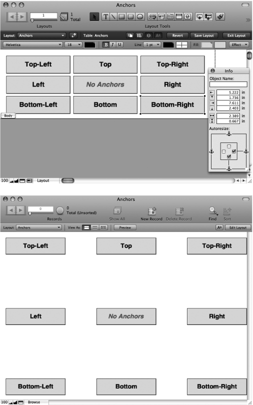
Obviously the behavior you see right now is not what you want. It isn’t that FileMaker’s dumb, though; it just needs a little guidance from you. Every object on the layout has a hidden set of anchors. These anchors connect the object to one or more sides of the window, so when you move and resize the window, the objects know how to move. Out of the box, FileMaker anchors each object to the top and left, meaning if you move the bottom or right edges (by making the window bigger), then nothing happens.
But you have complete control over these anchors. The Object Info palette (View → Object Info) holds the key. Its bottom half includes four checkboxes (complete with cute little anchor icons). Turn on a box, and the selected object or objects gets anchored to the associated side, as shown in Figure 4-38.
Figure 4-38. Top: The Object Info palette (shown floating in the bottom-right corner) has checkboxes to anchor the selected object to any side of the window. Right now the selected object is anchored to the bottom and right. Bottom: In fact, each object’s anchors are configured slightly differently (the text in each box tells you how it’s anchored). As you can see, the objects anchored to the bottom stay at the bottom of the window, even when you make it larger. The object in the middle has no anchors, so it stays in the middle.
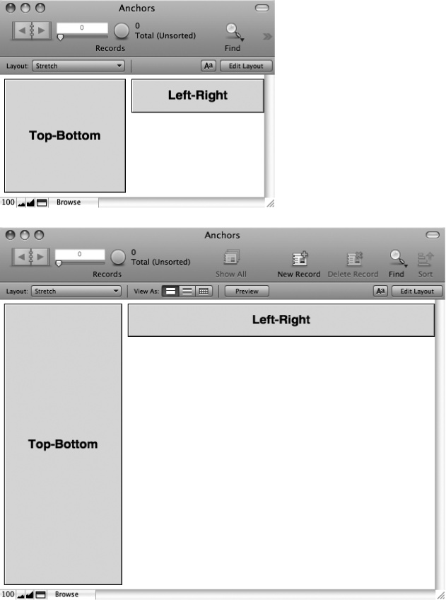
You have a lot of ways you can anchor an object, and each combination is useful in one situation or another. You can even anchor an object on competing sides (both top and bottom, or both left and right, or even all four). When you do this, the object doesn’t just move as the window gets bigger—it grows too, as Figure 4-39 shows .
Figure 4-39. When an object is anchored on the left and right, it stretches side to side as the window grows. Likewise, an object that’s anchored top and bottom gets taller. Of course, you can anchor an object on all four sides if you want. Then it grows in both directions as the window gets bigger.
Getting the desired results as you resize a window takes a little getting used to. The easiest approach is a four-step process:
Figure out which objects should grow.
For instance, would it make sense for the First Name field on your layout to get taller? Probably not. If you let something get taller, the best candidate is probably the Notes field, since you expect it to hold a lot of text. Likewise, the Status and Timestamp fields don’t benefit from extra width, so you don’t want to let them grow wider. But the remaining fields could all be bigger, space permitting.
Resolve conflicts among expanding objects.
You can have some objects stay left, some move right, and some grow. But FileMaker doesn’t let any two objects grow wider in the same horizontal space, because they’ll bump into each other. For instance, the City, State, and Zip Code fields all occupy the same horizontal space. So you need to decide which one should get the extra width. The obvious choice is the City field, since State and Zip Code always hold short values.
Note
If you have a series of side-by-side fields, then you might want them all to get a little wider together. But FileMaker doesn’t give you that power, so you have to be choosy. In the worst case, you can make your layout big enough to accommodate any reasonable data, and skip resizing windows altogether.
This process is tedious, but you can use the rubber band technique (Resizing objects) to grab collections of objects, and then set them all at once.
Test.
95 percent of the time, you’ll miss something the first time through. So switch to Browse mode periodically, and try resizing the window. You’ll instantly spot the objects that are misbehaving, and return to Layout mode to fix them.
The best anchoring approach for your layout may be as follows:
Anchor the First Name, Last Name, Phone Number, Street Address, City, and Email Address fields on the top, left, and right. This way, the fields stay near the top of the window, and grow wider as you make the window bigger.
Anchor the State, Zip Code, Status, and Timestamp fields on the top and right, but not the left, so they slide out of the way as the other fields get wider. You also need to anchor the Status, Created, and Modified text labels to the right for the same reason.
The Notes field will be anchored on all four sides. It’s the one field that holds a lot of information, so it benefits the most from the extra space.
Here’s how to make it happen:
Select the First Name, Last Name, Phone Number, Street Address, City, and Email Address fields.
It’s probably easiest to press Shift, and click the fields one by one. The fields should all have selection handles.
If the Object Info palette isn’t showing already, choose View → Object Info.
The palette appears somewhere on your screen (usually in the bottom-right corner).
In the Object Info palette, turn on the right anchor checkbox.
The top and left anchors are already on (if they aren’t for some reason, then turn them on so that the top, left, and right anchors are all on).
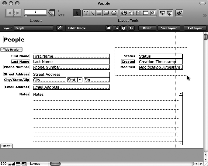
Using the rubber-band technique, drag a box around the Status field, the timestamps, and their three labels. Figure 4-40 shows how to do this.
Now the collection of fields and labels on the right side of the layout are all selected.
In the Object Info palette, turn off the left anchor, and turn on the right anchor.
Once again, the top anchor should already be turned on, so make sure you have just the top and right anchors in play.
Select the State and Zip Code fields, and then anchor them to the top and right.
You can leave the Object Info palette open, so it’s just a matter of select, configure, select, configure until the job is done.
Select the Notes field, and then turn on its bottom and right anchors.
This object should now be anchored on all four sides.
That should do it. If you try your layout in Browse mode now, it should use space wisely when you make the window bigger. You can see for yourself in Figure 4-41.
Figure 4-41. Now when you make the window bigger, the fields get bigger too. The fields on the right bump right into the edge of the window, which most people think looks funny. You’ll fix this when you decorate your layout in the next section.
If you make the window smaller now, though, then you see that the fields don’t shrink beyond a certain point. FileMaker never lets the objects in Browse mode get smaller than they are in Layout mode. This fact lets you establish a minimum size for your layout to keep things from getting too small, but it limits your flexibility. In general, design your layouts to be as small as they reasonably can be. That way, people who use your database can decide how big things should be by adjusting the window size. You could probably make your People Detail layout a little more flexible by shrinking the stretchy fields down a little, like the picture in Figure 4-42.
The layout you’ve created in this chapter is easy to use, has helpful field controls, and even adapts beautifully to any reasonable window size. Even so, it’s still lacking in the looks department. You’re going to fix that now.
In general, prettying things up involves five aspects of your layout:
Fonts. You can get creative with fonts for headers, field labels, and even field data. But remember, any font you choose has to be installed on any computer where your database is used, or FileMaker substitutes some plain font instead.
Colors. FileMaker loves color. You can color layout parts, text, field data, and even the background of fields and text objects.
Effects. You can apply three simple effects to any object: Drop Shadow to get a simple gray shadow, Embossed to make the object look like it sticks up off the page, and Engraved to make it look like it sinks down into the layout.
Shapes. For clean, simple graphical embellishments, FileMaker lets you draw lines, squares, rectangles, circles, ovals, and even rectangles with rounded corners right on the layout. So you can make separator lines, boxes to hold related content, or simple logos and graphics.
Pictures. If you need something more than simple geometry, then fire up your favorite graphics program and go nuts. FileMaker can import PNG, GIF, and JPEG images, and place them right on the layout, where they can be moved around and resized. And you can paste any graphic on your clipboard right on the layout too.
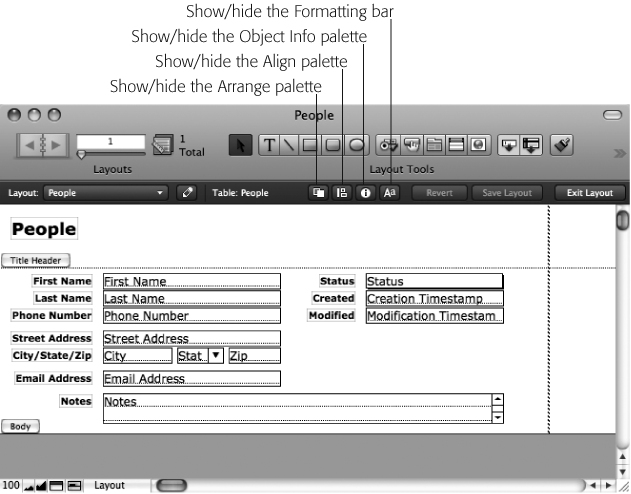
The first thing you’ll do to your layout is color the title header, giving the top portion of the layout a background color that sets it off from the rest of the layout. Any time you work with colors and effects in Layout mode, you first need to show the Formatting bar. This little buddy lives right below the Layout bar you’ve grown to love. But normally, when you first get started, it’s not showing. To call it up, choose View → Formatting Bar, or you can click the Formatting bar icon shown in Figure 4-43.
Figure 4-43. These icons in the Layout bar give you quick access to useful options. Did you know the Object Info palette (Resizing objects) is just a click away? You can learn more about the Align and Arrange palettes in the box below. The last button on the right opens the Formatting bar, which is a Layout mode essential.
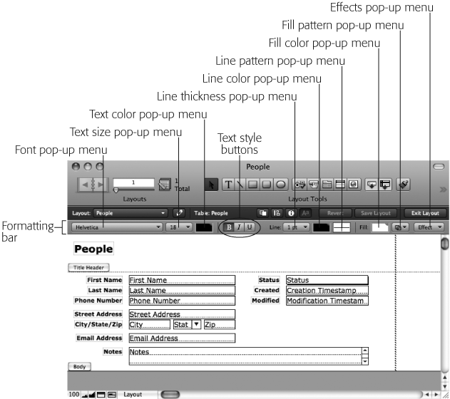
Once you click the icon, the Formatting bar appears right below the Layout bar. You can see it in Figure 4-44.
With the Formatting bar in view, coloring the title header part is a breeze:
Click the part label (the little gray box that says Title Header) to select it.
When you select the part label, it highlights.
Figure 4-44. The Formatting bar lets you style the selected objects. You can set colors (for the fill, outline, and text), patterns (for the fill and outline), and the thickness of the outline. From the Effects pop-up menu, you can also add special effects. This bar also gives you speedier access to fonts, styles, and sizes for your text and field objects.
In the Formatting bar, from the Fill Color pop-up menu (Figure 4-44), choose a color.
Instantly, the part fills in with the selected color.
If you selected a darkish color for your title header, then you may want to make the People text object white instead of black so it’s easier to read.
Select the People text object.
You know the drill: Now it has handles.
In the Formatting bar, from the Text Color pop-up menu, choose a light color or white.
Once again, the change happens instantly. Your text is now colored.
While you’re at it, you can color your field labels if you want. Be creative!
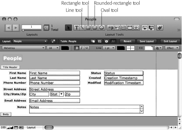
FileMaker’s shape tools are simple but effective. You can see them in Figure 4-45.
Figure 4-45. The collection of tools in the Status toolbar includes lines, rectangles (including the always elegant rounded rectangle), and ovals. Select a shape, and then drag to draw the shape on your layout.
Each tool works in the same way. First, click the tool to select it (highlighting its icon). Then drag the layout. As you drag, an outline of the shape you’re creating follows your mouse. When you release the button, FileMaker puts the shape in place.
Once you’ve added a shape, you can use the Formatting bar to style it:
The Line options (thickness, pattern, and color) style the border around the shape. If you don’t want a border, then set the thickness to zero.
The Fill options (color and pattern) style the inside of the shape. If you want the shape to be transparent, then click the Fill Pattern pop-up menu, and choose the double-overlapping-square icon, which is FileMaker’s way of saying “clear.”
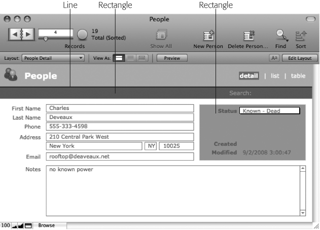
For your layout, you need three shape embellishments, as shown in Figure 4-46.
In general, it’s easiest to work from the bottom up. In other words, if one shape overlaps another, put the one that gets covered up on the layout first, and then add the second over it. Of course you can always shuffle how things stack up at any time using these four commands in the Arrange menu:
Arrange → “Bring to Front” makes the selected object over anything that overlaps it.
Arrange → Bring Forward moves the selected object up a notch in the pecking order. It covers one thing that overlaps it, but something else may still cover parts of it.
Arrange → “Send to Back” and Arrange → Send Backward work in exactly the opposite way, pushing the selected object behind things that overlap it.
So to get started, you’ll add the rectangle that spans the top of the layout:
Since the header part label covers the area you want to work in, click the part label toggle (Figure 4-47) to flip it out of the way.
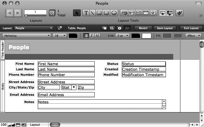
The part labels turn sideways so they don’t overlap the layout. Also, if you don’t have enough room in your title header part, drag its line down to make space. It’s easy to shrink it later, and you want plenty of room to work with right now.
In the Status toolbar, select the Rectangle tool.
When you click this tool, its icon highlights. If you ever decide you don’t want a shape after all, then you can just click the Selection tool again (the arrow icon).
Drag from the desired top-left corner to the bottom-right corner of the rectangle.
A rectangle appears where you dragged. It probably has a clear fill and thin black border, but if you’ve played with the Formatting bar, it may look different. You’ll style it next.
From the Line Thickness pop-up menu, choose None.
The border around the shape disappears. Be careful: with a stray click, you can deselect a shape a shape with no border and no fill, and then you may have a hard time selecting it again. The rubber-band technique is usually the easiest way, but a click exactly on its (invisible) border also selects it.
From the Fill Color pop-up menu, choose a color of your liking.
The rectangle fills with the selected color. The sample database uses a darkish brown, but use any color you like; it’s your database.
Using the mouse or arrow keys, nudge the rectangle into place.
It should be flush to the left edge of the window, and positioned nicely below the People text object. Feel free to shuffle the text around too, to make things look nice.
Using the selection handles, resize the rectangle so it has the shape and size you want.
The right edge of the rectangle should be a little further right than the Status and Timestamp fields.
In the Object Info palette, turn on the right anchor.
This shape should stretch when the window gets wider, so it always spans the window.
Figure 4-48 shows how things look now.
Figure 4-48. The first rectangle is now in place. If you try things out in Browse mode, then you see it now defines the width of the layout, so the field no longer runs into the side of the window. Using a shape or line like this to mark off the width of the layout is a common way to keep your resizing elements reigned in.
Next, using the Line tool, draw a line along the top of the rectangle. Set its color to a darker version of the rectangle, and make its thickness 2 pt. Anchor it on the top, left, and right.
Note
You may have a hard time getting the line exactly the width of the rectangle. If you use the Arrange → Resize To → Largest Width command, then you’ll find the line is a little wider than the rectangle. That’s because FileMaker’s resizing prowess doesn’t take line thickness into account. Since the rectangle has no border, and the line is relatively thick, the difference is visible. You can most easily fix it when you click near the end of the line, and then zoom in (View → Zoom In) a few times. Once you get a close look, you can manually shorten the line so it matches. Sometimes it’s easier to see what you’re doing if you make it significantly shorter first, so it doesn’t cover the corner of the rectangle, and then slide it back into place.
Finally, you need to add the box around the Status and Timestamp fields:
Select the Rectangle tool, and then drag a rectangle around the Status and Timestamp fields.
The rectangle covers right over the fields, which is probably not what you had in mind.
Choose Arrange → “Send to Back”.
The rectangle is now behind the fields and labels. Much better.
From the Line Thickness pop-up menu, choose “1 pt”.
Chances are the rectangle had a two-point border, so this setting puts it back where it belongs.
Give the rectangle a background color and line color as you see fit.
You’re the boss here.
Select the Status field, and then set its fill color to white.
The Status field probably had a clear fill, so the background showed through. Now it has a white fill, which looks more normal. (The Creation Timestamp and Modification Timestamp fields aren’t enterable, so you may want to make them something other than the same white as the enterable fields.)
Move or resize the rectangle and fields so they look something like Figure 4-49.
Whenever you do work like this, you inevitably get the rectangle in the wrong place, or make it too big, or have fields that don’t line up right. Fine-tuning is always the last step.
Anchor the rectangle on the top and right (but not the left or bottom).
The rectangle slides right along with the fields that live inside it.
Remove the borders from the Timestamp fields (Format → Field/Control → Borders).
Now that these non-enterable fields are tucked into a little box, they don’t really need their borders anymore.
If you want, color the field labels so they look nice against the rectangle background.
When you’re done, the layout should look like Figure 4-49. If you need to, do any fine-tuning to get everything in place.
The final layout has a little people icon in the top-left corner. You can find this icon (called People-Icon.png) on the Missing CD page at http://missingmanuals.com/cds/.
You can add an image like this to the layout in two ways:
If you created the icon in a graphics program, and you can copy it to your clipboard, then simply paste it while in Layout mode. It appears on the layout as an object that can be moved at will.
If you have the image in a file on the disk (like the People-Icon.png file), then you can insert it directly into the layout. You’ll use this technique in the upcoming steps.
Once you’ve downloaded the icon files (or located an image of your own), follow these steps:
In Layout mode, choose Insert → Picture.
A standard Open File dialog box appears.
Make sure “Store only a reference to the file” is turned off.
Just as with a container field, if you turn this setting on, then FileMaker doesn’t copy the file into the database. Instead, the program loads the file from its current location on your computer, and then displays it. If you later move, rename, or delete the picture file, then FileMaker can’t find and display it. You almost never want that scenario with a layout graphic.
In the dialog box, navigate to the file you want to insert, select it, and then click Open.
The icon appears somewhere on your layout. You may have to look around for it. It appears wherever you last clicked.
Move the icon to the top-left corner of the layout, moving the People text object out of the way as necessary.
You’re done now. The layout looks like Figure 4-50.
When you press Tab while editing a field, FileMaker automatically jumps you to the next field. But what does next mean? Normally, FileMaker moves through fields in a left-to-right, then top-to-bottom direction. That works well in many cases, but sometimes it falls short. For instance, on your People Detail layout, when you tab from the First Name field, it doesn’t go to the Last Name field next. Instead, it goes to the Status field (a pop-up menu, so you can’t type into it even if you want to), which is probably not what you want.
The solution to this predicament is to customize the tab order yourself. In other words, you tell FileMaker exactly what order it should tab through the fields on the layout.
FileMaker lets you completely customize the tab order for any layout. To fix the tab order on the Detail layout of your People database, first choose Layouts → Set Tab Order. A few things happen onscreen: You see the arrows indicating tab order, and the Set Tab Order dialog box appears (Figure 4-51). You tell FileMaker what order to use by putting appropriate numbers into the tab order arrows. Put a 1 in the arrow that points to the button or field that should get your attention when you first press Tab. Put a 2 in the next object in line, and so forth.
Chances are, all the arrows that point to fields already have numbers in them reflecting FileMaker’s automatic tab order. Clearing and typing into each arrow can thus be a form of digital torture. To ease the pain, FileMaker offers up the Set Tab Order window, which appears at the screen’s bottom-right corner. This window lets you make a few targeted bulk changes to the tab order.
First of all, you can clear the numbers from every arrow by clicking Clear All. This trick is great because once all the arrows are empty, then you no longer have to type. Just click each arrow (or the field it points to) in succession, and FileMaker enters the numbers for you.
If you click Add, and then choose from the “Add remaining” pop-up menu, you can add unnumbered fields to the order. FileMaker numbers them for you using the same right-to-left, top-to-bottom philosophy that the automatic tab order uses. This option comes in handy if, for example, you want to set up a specific tab order for a few fields first, and then use the automatic ordering for all fields thereafter.
When you’re done making changes, either in the window or by editing the arrows directly, click OK. If you decide you’ve caused more harm than good in this tab order editing session, then click Cancel instead, and the tab order reverts back to the way it was before you opened the Set Tab Order box.
Figure 4-51. When you choose Layouts → Set Tab Order, the Set Tab Order window appears. Meanwhile, FileMaker also adds arrows to the layout while this dialog box is open. From here, you can make bulk adjustments to the tab order, clear it, and start over, or manipulate the numbers one by one to get exactly the order you want.
On the People database, on the Detail layout, you want to fix the tab order so that Last Name comes after First Name. You can approach this task in several ways, but the following steps show you a trick that makes it easier. You may be tempted to Clear All, and then renumber all the arrows yourself. But since you’re removing only a field from the tab order (the Status field) you can save yourself the trouble. Here’s how:
Choose Layouts → Set Tab Order.
The Set Tab Order window and its flock of arrows appear.
Click the arrow pointing to the Status field, and then delete the number.
The arrow pointing to Status is now empty. Your order also now goes straight from 1 to 3, skipping right over 2. Pay no attention to this problem (that’s the trick).
Click OK in the Set Tab Order window.
If you switch to Browse mode and try out your tab order, then you see that you can now tab right from First Name to Last Name.
This trick works because FileMaker establishes the tab order by following the numbers in the arrows in order. It doesn’t give a hoot whether those numbers are contiguous. You’ve fixed your layout with a minimum of clicks.
The same basic trick applies if you need to insert a field into the tab order too. For instance, if you add a new field that should go between 2 and 3 in the tab order, just give it the number 3 spot. When you do, FileMaker automatically bumps number 3 up to 4 (and so on) for you.
As long as you never choose the Set Tab Order command on a particular layout, FileMaker automatically manages the tab order for you. For example, if you add a Middle Name field to the layout, and place it between the First Name and Last Name fields, it automatically goes into the right spot in the tab order—between First Name and Last Name. If you switch the positions of the First Name and Last Name fields, Last Name becomes the first field in the tab order, and First Name comes next.
Once you click the Set Tab Order window’s OK button, though, FileMaker hands full responsibility thereafter over to you. If you add a new field to the layout, then it just gets stuck to the end of the tab order, no matter where you put that field on the layout. If you move fields around so that the tab order makes absolutely no sense, FileMaker doesn’t care. It keeps the tab order exactly as you specified in Set Tab Order.
Get FileMaker Pro 10: The Missing Manual now with the O’Reilly learning platform.
O’Reilly members experience books, live events, courses curated by job role, and more from O’Reilly and nearly 200 top publishers.
