Chapter 4. Flexbox Examples
You now have a complete understanding of the CSS Flexible Box Layout Module Level 1 specification. Now that you’ve been introduced to all of the flex layout properties, it’s time to put this newfound knowledge into practice by implementing a few flex solutions.
Responsive Two-Column Layout
We covered a typical layout in Chapter 3. Let’s take a look at a similar example. In this scenario we will have the navigation appear between the header and main content on wide screens, with the navigation below the content in both the markup and on narrow screens (see Figure 4-1):
<body><header><h1>Document Heading</h1></header><main><article><h2>This is the heading of the main section</h2><p>This is a paragraph of text.</p></article><aside>Here is the aside</aside></main><nav><ahref="/">Home</a><ahref="/about">About</a><ahref="/blog">Blog</a><ahref="/jobs">Careers</a><ahref="/contact">Contact Us</a></nav><footer><p>Copyright©2017<ahref="/">My Site</a></p></footer></body>
We lay the site out for smaller devices, then alter the appearance for larger screens. In just a few lines of CSS, we can make this layout completely responsive:
html{background-color:#deded8;font-family:trebuchet,geneva,sans-serif;}body{margin:0;}article,aside,footer,header{padding:0.5rem;box-sizing:border-box;}header{background-color:#333;color:#ccc;text-align:center;border-bottom:1pxsolid;}aside{background-color:white;}/* default navigation values */nav{display:flex;background-color:black;padding:10px0;}nava{flex:auto;text-align:center;background:#ccc;color:black;margin:05px;padding:5px0;text-decoration:none;}nava:hover{outline:1pxsolidred;color:red;text-decoration:underline;}/* larger screen */@mediascreenand(min-width:30rem){body{display:flex;flex-direction:column;max-width:75rem;margin:auto;}main{display:flex;flex-wrap:wrap;box-sizing:border-box;border-bottom:0.5remsolid;}nav,header{order:-1;}article{flex:75%;}aside{flex:25%;}}
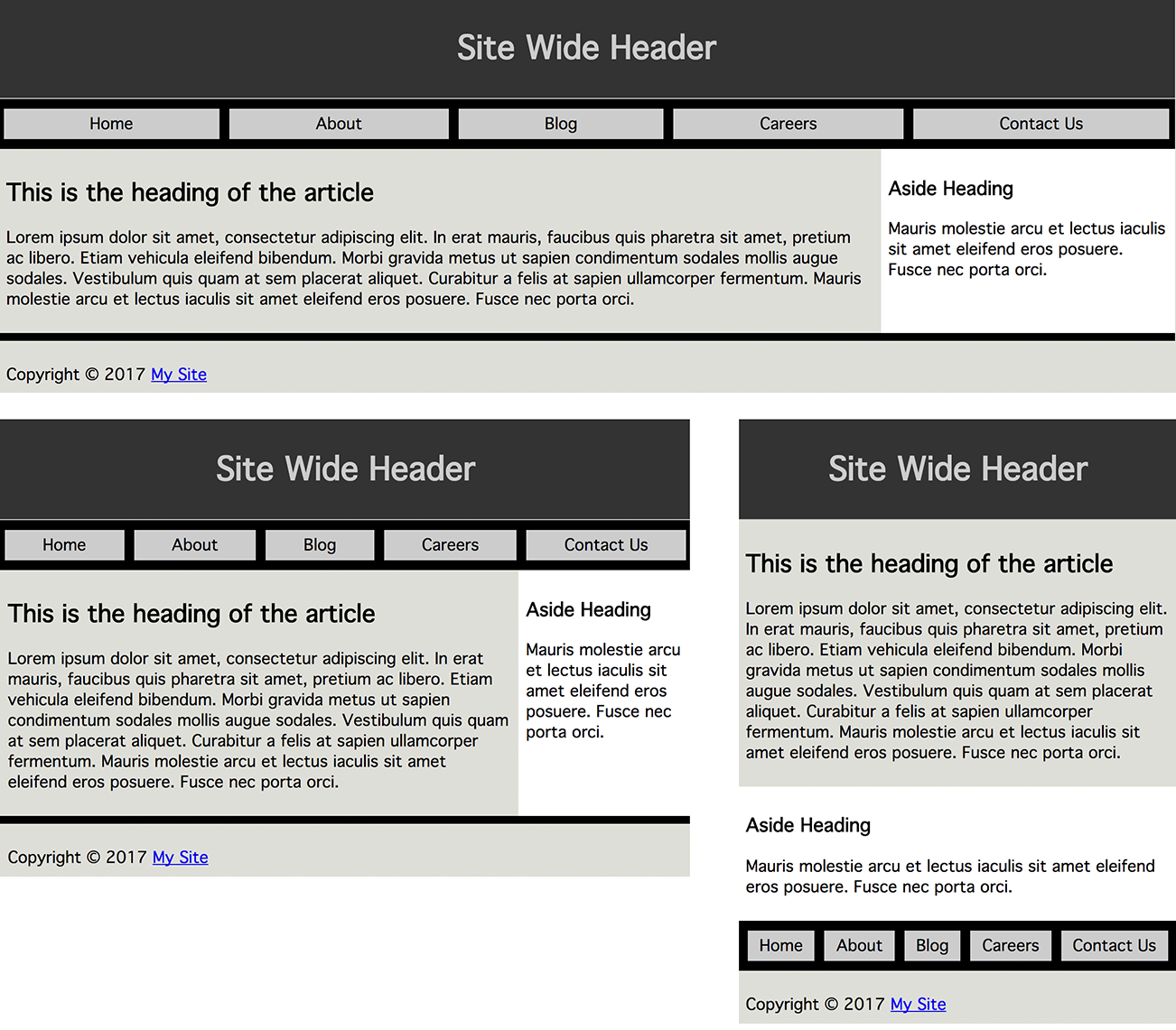
Figure 4-1. Slightly different layouts based on device width
By default, sectioning elements are displayed block, taking up 100% of the width. For our layout, there may appear to be no reason to declare the following:
body{display:flex;flex-direction:column;}
When we declare this, the layout looks the same: we don’t need it for
the narrow layout. We include it for the wider version in which we
change the order of the navigation. The nav in the source code comes after the
main content, which is what we want for narrow viewports, screen
readers, and our search-engine friends. Visually, in wider browsers,
we’ll reorder it, which we’ll cover in a bit. For the narrow viewport,
we only need flex for the layout of the navigation:
nav{display:flex;}nava{flex:auto;}
The five links of the navigation, based on how we marked it up, appear
by default on one line, with the widths based on the width of the text
content. With flex display: flex on the nav and flex: auto on the
links themselves, the flex items grow to take up all the available
horizontal space.
Had we declared:
nav{display:block;}nava{display:inline-block;width:20%;box-sizing:border-box;}
all the links would be the exact same width—20% of the parent. This looks perfect if we have exactly five links, but isn’t robust: adding or dropping a link would ruin the layout.
Remember, when flex basis is 0, the available space of the container
(not just the extra space) is distributed proportionally based on the
growth factors present. This is not what we want in this case either. We want
the longer content to take up more space than the shorter content. In
the case of flex-basis: auto;, the extra space is distributed
proportionally based on the flex growth factors.
With all the links set to flex: auto;, the space not consumed by actual content is divided equally among the links.
The links all have the same growth and shrink factors. The links
will look like they all have equal left and right padding, with the
“padding” changing dynamically based on the available space.
Wider Screen Layout
For devices with limited real estate, we want to content to appear before the links, aside, navigation, and footer. When we have more room available, we want the navigation bar to be directly below the header and the article and aside to share the main area, side by side.
While all the CSS for the responsive layout change is posted above, the important lines include:
@mediascreenand(min-width:30rem){body{display:flex;flex-direction:column;max-width:75remmargin:auto;}main{display:flex;}nav,header{order:-1;}article{flex:75%;}aside{flex:25%;}}
We used media queries to define a new layout when the viewport is 30 rem wide or greater. We defined the value in rems instead of pixels to improve the accessibility of the page for users increasing the font size. For most users with devices less than 500 px wide, which is approximately 30 rem when a rem is the default 16 px, the narrow layout will appear. However, if users have increased their font size, they may get the narrow layout on their tablet or even desktop monitor.
While we could have turned the body into a column-direction flex
container, with only sectioning level children, that’s the default
layout, so it wasn’t necessary on the narrow screen. However, when we
have wider viewports, we want the navigation to be between the header
and the main content, not between the main content and the footer, so we need to
change the order of the appearance. We set
nav, header { order: -1px; } to make the <header> and <nav> appear
before all their sibling flex items. The siblings default to order: 0; which is the default and a greater value. The group order puts those
two elements first, with header coming before nav, as that is the order of the source code, before all the
other flex item siblings, in the order they appear
in the source code.
We did want to prevent the layout from getting too wide as the
navigational elements would get too wide, and long lines of text are hard to
read. We limit the width of the layout to 75 rems, again, using rems to
allow the layout to remain stable if the user grows or shrinks the font
size. With a margin: auto; the body is centered within the viewport,
which is only noticeable once the viewport is wider than 75 rems. This
isn’t necessary, but demonstrates that flex containers do listen to
width declarations.
We turn the main into a flex container with display: flex. It has
two children. The article with flex: 75% and aside with
flex: 25% will fit side by side as their combined flex bases equals
100%.
Had the nav been a child of main instead of body, we could use flex-wrap to maintain the same appearance. In this scenario, for the
nav to come first on its own line, we would have made the navigation
take up the full width of the parent main, wrapping the other two
children onto the next flex line. We can force the flex container to
allow its children to wrap over two lines with the flex-wrap
property.
We could have resolved nav being a child of main by including:
main{flex-wrap:wrap;}nav{flex-basis:100%;order:-1;}
To ensure the nav was on its own line, we would have included a flex
basis value of 100% with flex: 100%;. The order: -1 would have made
it display before its sibling aside and article.
In our next example, our HTML is slightly different: instead of an
article and an aside, we have three sections of content in the main part of
the page.
Power Grid Home Page
With flexbox for layout, adding three articles to the home page describing three sections of our site with three calls to action can be accomplished with just a few lines of CSS. With flexbox, we can easily make those three modules appear to be the same height, as if they all had the same amount of content. This is the layout shown in Figure 4-2.
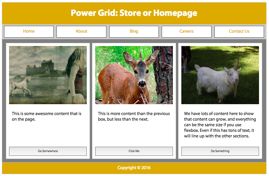
Figure 4-2. Power grid home page 
On a narrow screen, we can display all the sections in one column. On wide screens, we lay those three sections next to each other in text direction. Using flex, by default, those three sections are the same height. That’s what we want. We can make those sections’ width proportional to their content, or make them all the same width, forcing them to be as tall as the section with the most content, all while making sure the call to action buttons are flush to the bottom of the containing sections.
This is the underlying HTML:
<body><header><h1>Document Heading</h1></header><main><section><imgalt=""src="img1.jpg"><p>Shortest content</p><ahref="somewhere">Go Somewhere</a></section><section><imgalt=""src="img2.jpg"><p>Medium content.</p><button>Click Me</button></section><section><imgalt=""src="img3.jpg"><p>Longest content</p><button>Do Something</button></section></main><nav><ahref="/">Home</a><ahref="/about">About</a><ahref="/blog">Blog</a><ahref="/jobs">Careers</a><ahref="/contact">Contact Us</a></nav><footer><p>Copyright©2017<ahref="/">My Site</a></p></footer></body>
We have the same basic CSS for the inner page layout as we do for this home page, without additional flex layout properties to display our sections as if they were all of equal height, and optionally of equal width (Figure 4-3):
nav{display:flex;}nava{flex:0%;}section>img,section>button,section>a{width:100%;display:inline-block;}
We code mobile first, which gives us the look of Figure 4-3. Very little CSS is needed for the mobile version. By default, everything is laid out as if we had set flex: column. The only place we need to create a flex container is the navigation, which needs to be display: flex for the control we need.
We want all the links in the navigation to be the same width, no matter the number of characters, so we need to use 0 for the basis. We declared flex: 0% on all the links in the navigation, which equally distributes all the container’s space to the items, no matter how many we have. We could have also declared flex: 1 1 0%;, flex: 15 78 0%;, or flex: 18; (or any other random number) to get the same effect—as long as the same flex value was used on all the flex items.
To create links that are proportional to their content, we would have
set the flex-basis to auto with no inherited width value. When
supported, we’ll be able to use content as the flex-basis value.
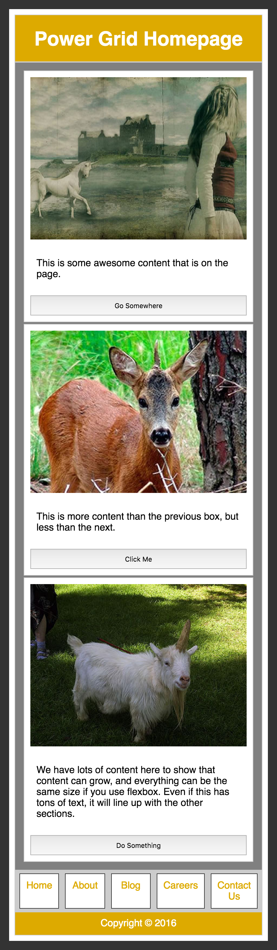
Figure 4-3. Develop mobile first; add wide-screen features later
We added a button width of 100%. We also turned the navigation into a flex container for all screen sizes.
@mediascreenand(min-width:40em){body,main,section{display:flex;}body,section{flex-direction:column;}header,nav{order:-1;}}
On wider screens we want the navigation to appear on top, and we want the three sections to be the same height with the images on top and button on the bottom. On large screens we create three new flex containers:
-
the
<body>needs to be turned into a flex container so we can reorder the children to make the<nav>appear between the<header>and the<main>. -
the
<main>needs to be a flex container so the three<section>s can be side by side and of equal height, and -
each same-height
<section>needs to be a flex container to enable lining up the buttons on the bottom.
We add flex-direction: column to the <body> and each <section>, but
not <main> or <nav>, which we allow to default to flex-direction: row.
Turning the <body> into a flex container wasn’t necessary when the nav
appeared on the bottom as this is where it appears in the source order.
However, on wider screens we want the navigation to appear above the
<main> content, not below it. By turning the <body> into a flex
container the children—the <header>, <main>, <nav>, and <footer>—are orderable flex items.
By default, all flex items are order: 0;. In the last section of the
wide-screen media query, we put both the <header> and <nav> into the
same ordinal group, making them appear before <main> and <footer>.
We have to put both the header and nav, not just nav, into this lower
numbered ordinal group, as if we had just set the nav to -1, it would
have come before the header. Remember from “The order property” that flex items will be
displayed in order-modified document order, starting from the lowest
numbered ordinal group and going up: flex items appear in order by
ordinal group, with the items in each ordinal group appearing in source
order.
Note that the keyboard user, navigating through the page, will tab through the main content before tabbing through the navigation, as the tab order is the same as the source order.
Because we turned the <body> into a flex container to enable the
appearance of a reordering, we had to declare flex-direction: column;
to maintain the look and feel.
On the home page, on wider screens, we want the three sections of the main area to
appear side by side, stretched to all be equal height. We set
display: flex; on main globally. Similar to <body>, there
should only be one <main> per page. If we’re using a site-wide
stylesheet, this declaration should still be OK; but if we don’t have
multiple-column layout for the inner pages, we should change the first
selector list to read body, .home main, section.
We didn’t declare flex-direction: row; as that is the default, so
isn’t necessary. Similarly, we could have declared
align-items: stretch, but there was no need to as it’s also the
default. If you remember from the
“The align-items Property”, by default flex items stretch to be height of the flex line. This is what we want: we want the sections to be the same height, no matter their
content.
We are 95% of the way to creating our layout as seen in Figure 4-4 with a
simple declaration of display: flex;, but we can perfect our layout a
bit. Making the sections all the same width and aligning the buttons on
the bottom of the sections would look better.
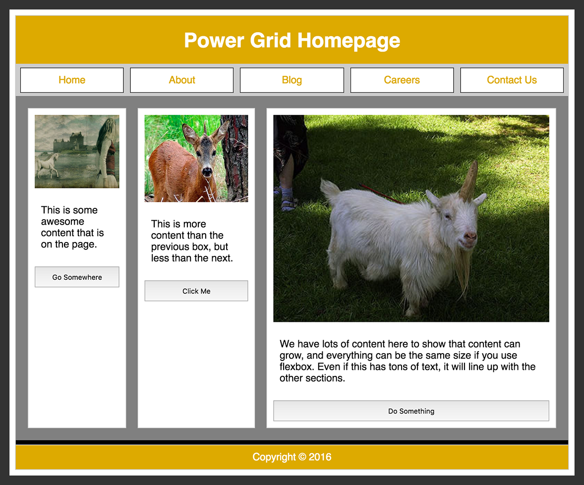
Figure 4-4. Declaring display: flex gives us the multicolumn layout, but we still have a bit of work to do
Sections
By default, the three sections will stretch to be as tall as the flex line. That’s good. Their flex basis, which helps determine the width, is based on the content. In this case it is the width of the paragraph. As Figure 4-4 shows, that’s not what we want.
To set the width of those sections to be proportional, such as 1:1:1, 2:2:3, or 3:3:5, we set the basis to 0 and set growth values reflective of those proportions.
We want them to be of equal widths, so we give them all the same basis and growth factor (the two declarations are equal):
main>section{flex:1;/* is the same as */flex:100%;}
Had we wanted the proportions to be 2:2:3, we could have written:
main>section{flex:2;}main>section:last-of-type{flex:3;}
Remember, the flex property, including the
basis (see “The flex-basis Property”), is set on the flex items, not the container.
In our home page example, the three <section>s are all both flex items and flex
containers. We turned them into flex containers with a direction of
column to enable forcing the buttons to the bottom. The
paragraphs are of differing heights, so the buttons aren’t by default
aligned at the bottom. By only allowing the paragraphs to grow by giving
them a positive growth factor, while preventing the image and button from growing with a null growth factor, the paragraphs grow to take up
all the distributable space, pushing the button down to the bottom of
the section:
main>section>p{flex:1;}
Now the buttons are always flush to the bottom. The CSS to make the link look like a button is in the live example. When the link is not a flex item it is an inline item, so we change its display property so it heeds our width declaration. Now our layout is done, as shown in Figure 1-1. The relevant CSS for our power grid homepage is only a few lines:
nav{display:flex;}section>img,section>button,sectiona{width:100%;display:inline-flex;}nava{flex:1;}@mediascreenand(min-width:40em){body,main,section{display:flex;}body,section{flex-direction:column;}main>section,main>section>p{flex:1;}header,nav{order:-1;}}
In “Sticky Footer with flex”, we showed a simple mobile example in which the footer
would always be glued to the bottom of the page no matter the height of
the device. That visually more complex example is
equally easy to code: no matter how tall the browser got, and no matter
how little content the main content had, the footer would always be
glued to the bottom of the browser. As noted before, these are called “sticky footers” (see Figure 4-5).
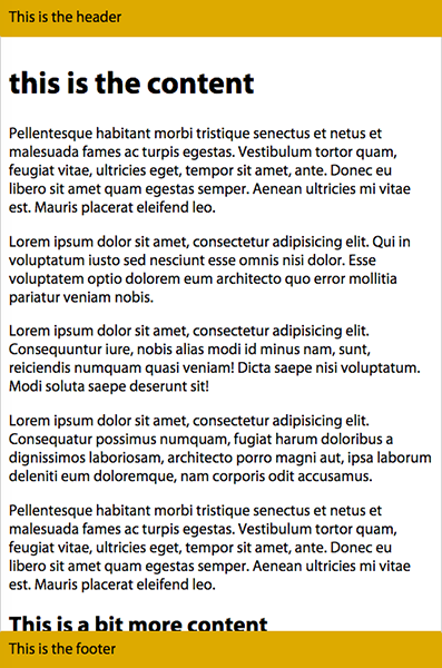
Figure 4-5. Sticky header and footer on mobile using flexbox instead of position: fixed
Prior to flexbox being supported, we were able to create sticky footers, but it required hacks, including knowing the height of the footer. Flexbox makes creating sticky footers much simpler. In our first example, the footer always sticks to the bottom of the viewport. In our second example, the footer will stick to the bottom of the viewport if the page would otherwise be shorter than the viewport, but moves down off screen, sticking to the bottom of the page, not the viewport, if the content is taller than the viewport.
Both examples contain the same shell:
<body><header>…</header><main>…</main><footer>…</footer></body>
We turn the body into a flex container with a column direction:
body{display:flex;flex-flow:column;}
We also direct the <main> to take all the available space: it is the
only flex item with a non-null growth factor.
The key difference between a permanent sticky footer and a page growing to push the footer to the bottom of the screen only when necessary is whether the height of the body is 100 vh or at
minimum 100 vh, and whether the <main> is allowed to shrink.
In our first example, in Figure 4-6, we want the sticky footer to always be present. If there is too much content in the main area, it should shrink to fit. If there isn’t enough text to fill the screen, it should grow, making our footer always visible:
body{display:flex;flex-flow:column;height:100vh;}header,footer{flex:00content;}main{flex:110;overflow:scroll;}
To create a sticky footer that is always visible, we set the height to always be exactly the height of the viewport with
height: 100vh. We dictate that the header and footer can neither
grow nor shrink, but rather must always be the height of the content.
The <main> can both grow and shrink, absorbing all the
distributable space, if any, scrolling if too tall.
In our second example, if we are OK with the footer being out of view, below the page fold, we set the minimum height to 100 vh, and dictate that the <main> can grow, but is not required to shrink:
body{display:flex;flex-flow:column;min-height:100vh;}header,footer{flex:00content;}main{flex:1;}
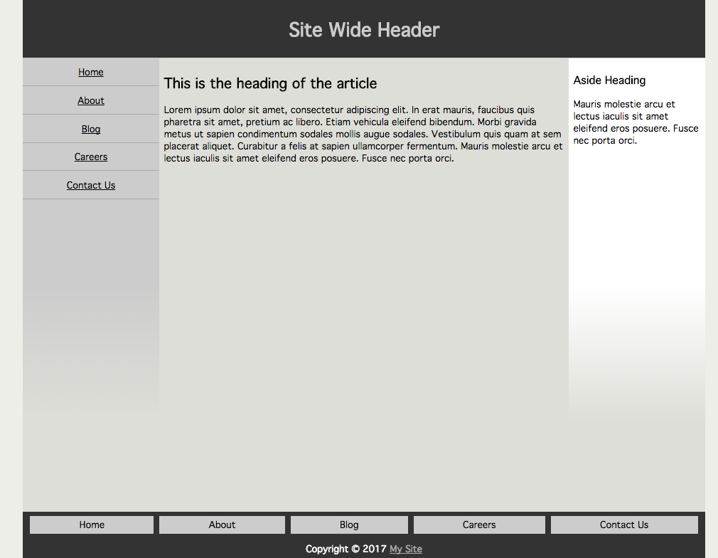
Figure 4-6. Complex page with a sticky footer
Using both a sticky footer and sticky header isn’t recommended: if the screen isn’t tall, and the user increases the font, they may end up unable to see any of the main content. For this reason, the second example, with min-height instead of height set—enabling the page to grow—is recommended.
Vertical Centering
With the align-items, align-self, and justify-content properties, we can now vertically and horizontally center items.
With a few lines of CSS, you can vertically center content, as shown in Figure 4-7:
container{display:flex;align-items:center;justify-content:center;}
The display: flex; turns the element into a flex container. The
justify-content: center; centers the item across the main axis. The
align-items: center; centers it across the cross-axis.
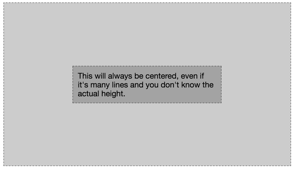
Figure 4-7. Vertical centering is easy with flexbox
We did set flex: 0 0 50%; on the flex item; otherwise its
main-dimension would have grown to be 100% of the container’s main
dimension.
Inline Flex Example
In Figure 1-3, we demonstrated an example of what not to do in terms of user experience, but a common feature nonetheless.
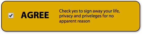
Figure 4-8. Widget with many components neatly vertically centered
You never want to include a checkbox, or any form control, within a link or button. While you should encourage the firing of any designer who creates such a widget, you still may need to code it. (When I was asked to create such a thing and refused, I was asked, “Are you incompetent? Do I need to code it for you?” Being me, I responded, “Sure. Go for it.”)
The code is semantic, even though the appearance is bad UX:
<label><inputtype="checkbox"name="agree"value="yes"><h3>agree</h3><small>Check yes to sign away your life...</small></label>
This code example is an “implicit label”: there is no for attribute, as the
form control is associated with the label by being inside it:
label{display:inline-flex;align-items:center;}small{width:10rem;flex:00auto;}
We turn the label into an inline-flex container and set the flex items
to be vertically centered within that container. By default, the width
of the inline flex container is the width of the content. We therefore
specifically declare how wide we want the <small> to be, and then
set it to not grow or shrink, but be exactly the size of the width
property by declaring flex: 0 0 auto;.
Now that you know how that is done, don’t do it.
Calendar
For a little bit of fun, let’s create a calendar with flexbox and CSS counters, like the one shown in Figure 4-9.
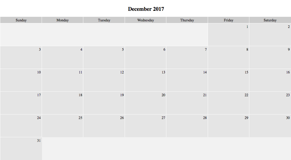
Figure 4-9. Calendar created with flexbox
With clean, semantic HTML we create an accessible calendar. The class is the day of the week that is the first day of the month:
<articleclass="calendar friday days31"><h1>December 2017</h1><ulclass="days"><li>Sunday</li><li>Monday</li><li>Tuesday</li><li>Wednesday</li><li>Thursday</li><li>Friday</li><li>Saturday</li></ul><ol><li></li>...<li></li></ol></article>
With a little flexbox magic, we turn this heading, unordered list, and ordered list into a responsive calendar:
.calendar{flex-direction:column;width:75%;counter-reset:calendar;}.calendar,.calendarul,.calendarol{text-align:center;display:flex;list-style-type:none;margin:0;padding:0;}.calendarol{flex-flow:wrap;}
The shell <article>, with a class of .calendar, is turned into
into a flex container 75% of the width of the parent. We also reset our
counter every time we encounter a new calendar. The <ol> of dates
and <ul> of days are both flex items and flex containers. Only the
ordered list of dates is allowed to wrap onto multiple lines:
.calendarol::before,.calendarol::after{content:'';outline:1pxsolidtransparent;box-sizing:border-box;background-color:rgba(0,0,0,0.05);}.mondayol::before,.wednesday.days31ol::after,.thursday.days30ol::after{flex:0014.25%;}.tuesdayol::before,.tuesday.days31ol::after,.wednesday.days30ol::after{flex:0028.5%;}.wednesdayol::before,.monday.days31ol::after,.tuesday.days30ol::after{flex:0042.75%;}.thursdayol::before,.sunday.days31ol::after,.monday.days30ol::after{flex:0057%;}.fridayol::before,.saturday.days31ol::after,.sunday.days30ol::after{flex:0071.25%;}.saturdayol::before,.friday.days31ol::after,.saturday.days30ol::after{flex:0085.5%;}
With both the <ol> and <ul> being flex containers, every
<li> is a flex item. There are 7 days in a week, so we set each day
and date to be 14.25%, or one-seventh, of the width of the parent. We do
want the first day of the month to fall in the correct location, so we
add a generated content flex item to preceded the <ol> of dates.
If you recall from Chapter 2, the
children of flex containers are flex items, including generated content.
The width of this pre-date box depends on the class of the calendar and
is set by the flex basis of that ol::before declaration. This is what
we used to make sure the first day of the month falls under the right
day of the week. Declaring a Sunday class is not necessary, as the
flex-basis will default to auto, and with no content and no width set
on the generated content, the basis will be 0px:
.calendarli{flex:0014.25%;box-sizing:border-box;text-align:center;padding:5px;outline:1pxsolid#FFFFFF;background-color:rgba(0,0,0,0.1);}
We set all the flex items, other than the generated content spacer, to
have a flex basis of 14.25%, which is approximately one-seventh of 100%.
We then add a few features to make the whole thing look nice. Both the
days and the dates will be centered with 5 px of padding. A background of
a very light alphatransparent black along with a 1 px-wide white outline
improves the appearance. As we want to add padding, we include the
box-sizing property to ensure the padding is included in the width
rather than added:
.calendarulli{text-overflow:ellipsis;overflow:hidden;background-color:rgba(0,0,0,0.2);}
We make the days a little darker than the dates and enable the text to
shrink with ellipses if the text would otherwise overflow the flex item
as the page narrows, as shown in Figure 4-10. We set overflow: hidden to
prevent the text from overflowing the flex item. This clips the text,
hiding anything that would overflow on the right (since this example is
left to right). The text-overflow: ellipsis declaration, while not
covered in this chapter, helps us make that text clipping look good.
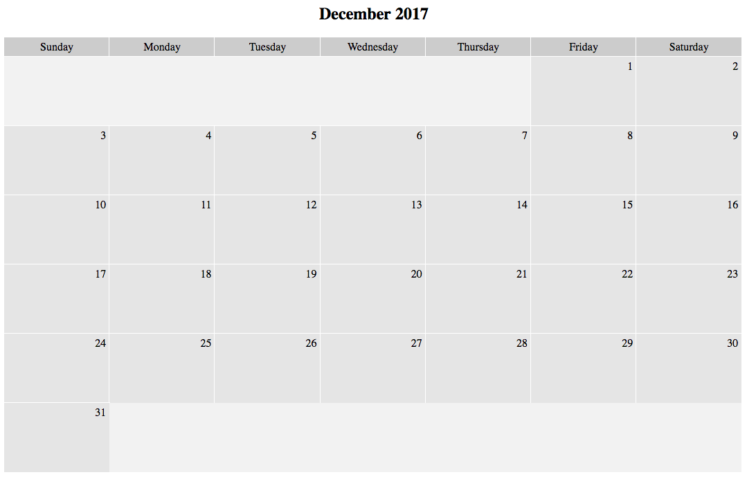
.calendarolli::before{counter-increment:calendar;content:counter(calendar);}
Finally, we add the date to the box. Earlier we removed the <ol>
counter with list-style-type: none; set on both the <ol> and
<ul>. We add the date back to each list item with generated
content. The counter-increment: calendar; declaration increments the
counter we called calendar. Instead of adding an empty content: ''
which is commonly used for styling, and is used in our day spacer on the
first flex line, we set content: counter(calendar);, which provides
the current value of the counter as the content of the generated
content:
.calendarolli{text-align:right;height:100px;}
We add a few extra lines to make it look even better, and we’re good to go.
Magic Grid
One of the more difficult layouts to create with flexbox is a responsive grid of items, which was showing in Figure 1-2. In fact, this is why the grid layout module has been a work in progress. Grid provides for creating a flexible design grid for an element so that the descendants of the element can be positioned relative to that grid. Descendant elements can be aligned to each other in two dimensions. Areas of the grid can be assigned names both for ease of use and to create a level of indirection that facilitates reordering of elements.
While I’ve been waiting for grids to be fully supported, I’ve been using a clever little hack to create magic grid layouts.
The magic grid layout is a responsive layout in which any number of
module flex items, with a minimum and maximum allowed width, can fully
fill the available space, wrapping on as many flex lines as needed, with
each line of modules, including the last line of modules lining up
perfectly with the line of flex items preceding it. Normally, if the
last line of flex items does not contain the same number of flex items
as preceding lines, the last line of flex items will grow the
maximum allowable width, not necessarily lining up with the flex items
in other flex lines. The magic grid is shown in Figures 4-11, 4-12, and 4-13.
Figure 4-11. 11 flex items on a wide screen
Figure 4-12. 11 flex items on a medium screen
Figure 4-13. 11 flex items on a smaller screen
With a few lines of CSS, you can create a layout in which your flex items are laid out in a neat grid, even if you have a prime number of items, as these three examples show.
The code is several <article> elements nested within a <main>. Each <article> has an image with a width of 100% and a paragraph, but as long as none of the articles contain nonwrappable or shrinkable content, the content has no bearing on the magic grid layout:
main{display:flex;flex-wrap:wrap;}article{flex:1;max-width:300px;min-width:200px;}
We turn the <main> parent into a flex container, with the flex
items able to wrap over as many lines as need be.
We set the flex basis on all the flex items to the same number: the
convention is one. This is the same as setting flex: 1 0 0%;. While
the basis may be 0, the minimum width a flex item will grow to is 200 px,
and they can’t grow to wider than 300 px. This is a good way of
developing responsive content.
The problem is, with only these values (and a few other values like border and padding to make the markup look like Figures 4-11, 4-12, and 4-13), the bottom row spreads out to be 300 px wide each, no matter how wide the flex items are on other lines, as shown in Figure 4-14. This is not what we want.
If you look at the last flex line in Figure 4-14, you’ll note the flex
items are not nicely lined up with the flex items in the preceding flex
lines. That’s because the flex items with a positive growth factor will
grow as much as allowed. In our case they are 300 px wide, the value of
the max-width property.
To force the two flex items on the last flex line to be the same width
as all the other flex items so they line up nicely, there’s a little
hack. The trick is to add a few invisible flex items, with 0px default cross dimension.
Figure 4-14. When the flex growth factor is a positive non-null number, the flex item will grown to be as wide (or tall) as it can
Our markup looks like this:
<main><article><imgalt=""src="src"/><p>text</p></article>...<articleclass="magic"></article>...</main>
For this layout we’ve included 11 articles without the magic class which include an
image and a paragraph, and at least 6 empty articles with the magic class:
.magic{visibility:hidden;padding:010px;border-width:01px;}
We add several magic flex items. You have to ensure you zero out the cross-dimension, box-model properties while maintaining the properties contributing to the main-size. In this case, we maintain the left and right border widths and padding while zeroing out the top and bottom border widths and padding. We want the magic flex items to be the same width as all the other flex items, while ensuring they have a height of 0 px, in the case they end up on a flex line filled only with magic flex items.
The flex items on the last flex line containing content will be as wide as the flex items on the previous flex line. The last flex line will contain one or more magic flex items, which is OK. The width of the magic flex items will be the same as all the other flex items, but the height is 0 px, so that line takes up no space.
Note this is a hack, but it works.
Performance
While flexbox is a brilliant solution to many of your layout problems, Jake Archibald has argued you shouldn’t use it for laying out your entire application.
Browsers don’t wait for all of your content to finish loading before rendering content. Rather, they progressively render content as it arrives, enabling users to access your content before it is fully downloaded. With some flexbox layouts, however, your content may experience horizontal shifting and content misalignment on slower connections.
Why did the shifting happen? As content loads, you will first download the opening of the container and the first child. At this point, this first child is the only flex item, and, depending on your flex properties, will likely take up 100% of the available space. When the opening of the next flex item downloads, there are now two flex items. Again, depending on your declarations, the content that has already been rendered likely has to resize to make room for it, which causes re-layout. If the users connection is slow, this may be noticeable. If noticeable, it is likely ugly. If noticeable, there’s also likely something else going on with your server or code: a lower-hanging fruit in terms of performance that badly needs to be addressed.
Browsers have improved since Jake’s original post was published, so this is now less of an issue. Grid will be faster for these types of layouts, both in terms of performance and even in the time it takes to write the CSS, so it’s definitely worth learning and implementing, even though this performance problem is pretty much resolved.
Good to Go
That said, flexbox is well supported, so go ahead and use it.
When not supported (in older browsers that browser developers don’t support anymore), browsers must treat as invalid any declarations it doesn’t support. Browsers shouldn’t ignore unsupported values and honor supported values. In other words, if you’re going to include prefixed flexbox properties (not discussed in this book), put them before the nonprefixed standard versions. Also, there’s really no need to include prefixed properties.
And remember, in a single multivalue property declaration, like flex,
if any value is invalid, CSS requires the entire declaration be ignored,
so put flex: content last, after the fallback of flex: auto, so that
browsers supporting content will get the content, and older browsers
will fall back to auto.
Get Flexbox in CSS now with the O’Reilly learning platform.
O’Reilly members experience books, live events, courses curated by job role, and more from O’Reilly and nearly 200 top publishers.

