Chapter 4. Flex Controls and Layout
The first step in building a Flex application is to create the user interface. Flex not only has a rich set of controls. It also has a complete set of layout mechanisms that make it easy to build user interfaces that look good and can scale appropriately as the display area of the Flash application is resized.
This chapter covers both layout mechanisms and controls. We will start by covering the layout mechanisms, and then we will discuss the available controls.
The Application Container
At the root of a Flex application is a single container,
called the Application container, which
holds all other containers and components. The Application container lays out all its children
vertically by default (when the layout
property is not specifically defined). There are three possible values for
the Application component’s layout property:
verticalLays out each child component vertically from the top of the application to the bottom in the specified order
horizontalLays out each child component horizontally from the left of the application to the right in the specified order
absoluteDoes no automatic layout, and requires you to explicitly define the location of each child component
If the Application component’s
layout property is absolute, each child
component must have an x and y
coordinate defined; otherwise, the component will be displayed in the
(0,0) position.
The Application container can
also be formatted using any of the several style parameters that are available, including backgroundGradientColors and verticalGap. In Example 4-1, the Application tag is used to lay out the child
controls.
<?xml version="1.0" encoding="utf-8"?>
<mx:Application xmlns:mx="http://www.adobe.com/2006/mxml"
 backgroundGradientColors="[#FFFFFF, #FFDE00]" verticalGap="15"
 layout="horizontal">
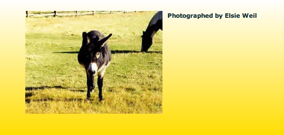
 <mx:Image source="assets/animals03.jpg" />
 <mx:Label text="Photographed by Elsie Weil" fontSize="15"
   fontWeight="bold" />
</mx:Application>
Figure 4-1 shows the result of this code.
The Box Class
The Box class is the base class for the VBox and HBox classes:
The
VBoxcontainer renders all child display objects vertically.The
HBoxcontainer renders all child display objects horizontally.
The Application object behaves
like a VBox by default (vertical
layout), but you can also set it to use absolute or horizontal
layout.
VBox and HBox flow like HTML, only in one
direction.
Example 4-2 shows the default layout
method used by the VBox container
(vertical).
<?xml version="1.0" encoding="utf-8"?>
<mx:Application xmlns:mx="http://www.adobe.com/2006/mxml"
backgroundColor="#FFFFFF" backgroundAlpha="0">
<mx:VBox>
<mx:Button label="< prev" left="10" top="120" />
<mx:Image source="assets/animals03.jpg" horizontalCenter="0"
top="30"/>
<mx:Label text="Photographed by Elsie Weil"
horizontalCenter="0" top="250"/>
<mx:Button label="next >" right="10" top="120"/>
</mx:VBox>
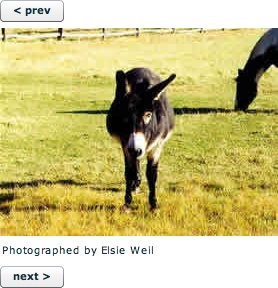
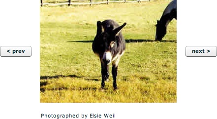
</mx:Application>Figure 4-2 shows the result of this code.
Example 4-3 shows the default layout
method used by the HBox container
(horizontal).
<?xml version="1.0" encoding="utf-8"?>
<mx:Application xmlns:mx="http://www.adobe.com/2006/mxml"
backgroundColor="#FFFFFF" backgroundAlpha="0">
<mx:HBox>
<mx:Button label="< prev" left="10" top="120" />
<mx:Image source="assets/animals03.jpg" horizontalCenter="0"
top="30"/>
<mx:Label text="Photographed by Elsie Weil"
horizontalCenter="0" top="250"/>
<mx:Button label="next >" right="10" top="120"/>
</mx:HBox>
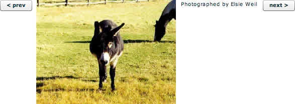
</mx:Application>Figure 4-3 shows the result.
You can also use both VBox and
HBox to achieve a desired layout. For
instance, Example 4-4 nests
an HBox inside a VBox, demonstrating that container controls can
have other containers as children.
<?xml version="1.0" encoding="utf-8"?>
<mx:Application xmlns:mx="http://www.adobe.com/2006/mxml"
backgroundColor="#FFFFFF" backgroundAlpha="0">
<mx:VBox horizontalAlign="center" verticalGap="15">
<mx:HBox verticalAlign="middle" horizontalGap="15">
<mx:Button label="< prev" left="10" top="120" />
<mx:Image source="assets/animals03.jpg"
horizontalCenter="0" top="30"/>
<mx:Button label="next >" right="10" top="120"/>
</mx:HBox>
<mx:Label text="Photographed by Elsie Weil"
horizontalCenter="0" top="250"/>
</mx:VBox>
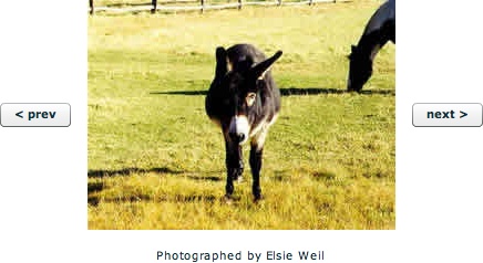
</mx:Application>Figure 4-4 shows the result of Example 4-4.
The Canvas Container (Absolute Positioning)
Canvas is the only container that lets you explicitly specify the
location of its children within the container. The Canvas object has only one layout value:
absolute. You can use the x and y
properties of child components for pixel-perfect layouts. If the display
window is resized, the child components stay fixed in place and may appear
cut off. Using absolute positioning you can make child controls overlap if
desired.
Example 4-5 is some sample code for an absolutely positioned layout.
<?xml version="1.0" encoding="utf-8"?>
<mx:Application xmlns:mx="http://www.adobe.com/2006/mxml"
layout="absolute" backgroundColor="#FFFFFF"
backgroundAlpha="0">
<mx:Canvas x="23" y="34">
<mx:Button label="< prev" x="4" y="97" />
<mx:Image source="assets/animals03.jpg" x="85" y="4" />
<mx:Label text="Photographed by Elsie Weil" x="85"
y="230" />
<mx:Button label="next >" x="381" y="97" />
</mx:Canvas>
</mx:Application>Figure 4-5 shows the result.
The Canvas Container (Relative Positioning)
With relative positioning, also called constraint-based layout, you can
anchor the sides or center of a component to positions which are relative
to the component’s container. The size and position of the components
change when the user resizes the application window. The container’s
layout property must be set to absolute. All constraints are set relative to
the edges of the container, not to other controls in the
container. The left, right, top,
bottom, horizontalCenter, and verticalCenter properties are anchors in
constraint-based layouts.
Example 4-6 shows the code for positioning
children in a constraint-based layout using the top, bottom,
left, right, horizontalCenter, and verticalCenter styles.
<?xml version="1.0" encoding="utf-8"?>
<mx:Application xmlns:mx="http://www.adobe.com/2006/mxml"
layout="absolute backgroundColor="#FFFFFF"
backgroundAlpha="0">
<mx:HDividedBox width="100%" height="300">
<mx:Canvas backgroundColor="#FFFFCC" width="150"
height="100%">
<mx:Label text="Adjust this section" left="15" />
</mx:Canvas>
<mx:Canvas>
<mx:Button label="< prev" left="10" top="120"/>
<mx:Image source="animals03.jpg" horizontalCenter="0"
top="30"/>
<mx:Label text="Photographed by Elsie Weil"
horizontalCenter="0" top="250"/>
<mx:Button label="next >" right="10" top="120"/>
</mx:Canvas>
</mx:HDividedBox>
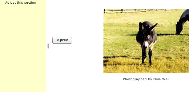
</mx:Application>When you launch this application you should see something similar to Figure 4-6.
You can adjust the size of the panel on the right by grabbing the control and moving the mouse to the left or right. This will move the image to match the size of the panel.
The Form Container
The Form container lets you control the layout of a form, mark form fields as
required or, optionally, handle error messages, and bind your form data to
the Flex data model to perform data checking and validation.
The Form container, like all
containers, encapsulates and lays out its children. The Form container controls the size and layout of
the contents of the form. The FormHeader defines a heading for your Form. Multiple FormHeading controls are allowed. A FormItem container specifies a Form element
consisting of the following parts:
A single label
One or more child controls or containers, such as input controls
You can also insert other types of components into a Form container.
The code in Example 4-7 demonstrates use of
a Form container control.
<?xml version="1.0" encoding="utf-8"?>
<mx:Application xmlns:mx="http://www.adobe.com/2006/mxml"
 layout="absolute" backgroundColor="#FFFFFF"
   backgroundAlpha="0">
 <mx:Form x="50" y="50" verticalGap="15">
  <mx:FormHeading label="Send us comments" />
  <mx:FormItem label="Full Name:">
   <mx:TextInput id="fullName" />
  </mx:FormItem>
  <mx:FormItem label="Email:">
   <mx:TextInput id="email" />
  </mx:FormItem>
  <mx:FormItem label="Comments:">
   <mx:TextArea id="comments" />
  </mx:FormItem>
  <mx:FormItem>
   <mx:Button id="submit" label="submit" />
  </mx:FormItem>
  </mx:Form>
</mx:Application>
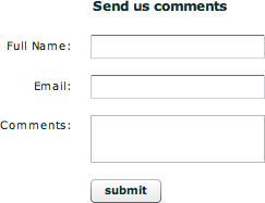
Figure 4-7 shows the result of this code.
Combined Layouts
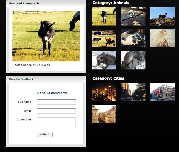
Containers can hold other containers. You can nest them to create sophisticated layouts, and you can create custom components that are made up of existing components. Example 4-8 shows an example of a complex nested layout. You should take care to use these container classes wisely and not to overuse them. Using too many nested containers can be the cause of performance problems in your application.
<?xml version="1.0" encoding="utf-8"?>
<mx:Application xmlns:mx="http://www.adobe.com/2006/mxml"
 backgroundColor="#000000" layout="horizontal"
   horizontalGap="25">
 <mx:Style> Panel { backgroundAlpha: 1; borderAlpha: 1;
   headerColors: #c7c7c7, #ffffff;
   footerColors: #ffffff, #c7c7c7;
   paddingTop: 15; paddingRight: 15;
   paddingLeft: 15; paddingBottom: 15;
   shadowDirection: "right"; }
  .header { color: #ffffff; fontSize: 15;
   fontWeight: "bold"; }</mx:Style>
 <mx:VBox verticalGap="10">
  <mx:Panel title="Featured Photograph">
   <mx:Image source="assets/animals03.jpg" horizontalCenter="0"
     top="30" />
   <mx:Label text="Photographed by Elsie Weil"
     horizontalCenter="0" top="250" />
  </mx:Panel>
  <mx:Panel title="Provide feedback">
   <mx:Form x="50" y="50" verticalGap="15">
   <mx:FormHeading label="Send us comments" />
   <mx:FormItem label="Full Name:"><mx:TextInput
     id="fullName" />
   </mx:FormItem>
   <mx:FormItem label="Email:"><mx:TextInput id="email" />
   </mx:FormItem>
   <mx:FormItem label="Comments:"><mx:TextArea
     id="comments" />
   </mx:FormItem>
   <mx:FormItem><mx:Button id="submit" label="submit" />
   </mx:FormItem>
   </mx:Form>
  </mx:Panel>
 </mx:VBox>
 <mx:VBox verticalGap="25">
  <mx:Canvas>
   <mx:Label text="Category: Animals" styleName="header"  />
   <mx:Image source="assets/animals03_sm.jpg" y="30" />
   <mx:Image source="assets/animals08_sm.jpg" y="120" />
   <mx:Image source="assets/animals09_sm.jpg" y="120"
     x="120" />
   <mx:Image source="assets/animals10_sm.jpg" y="120"
     x="240" />
   <mx:Image source="assets/animals11_sm.jpg" y="211" />
   <mx:Image source="assets/animals12_sm.jpg" y="211"
     x="120" />
   <mx:Image source="assets/animals06_sm.jpg" y="30"
     x="120" />
   <mx:Image source="assets/animals07_sm.jpg" y="30"
     x="240" />
  </mx:Canvas>
  <mx:Canvas>
   <mx:Label text="Category: Cities" styleName="header" />
   <mx:Image source="assets/city01_sm.jpg" y="30" />
   <mx:Image source="assets/city02_sm.jpg" y="30"  x="120"/>
   <mx:Image source="assets/city03_sm.jpg" y="30" x="240" />
   <mx:Image source="assets/city04_sm.jpg" y="120" x="0" />
  </mx:Canvas>
 </mx:VBox>
</mx:Application>
Figure 4-8 shows the result of Example 4-8.
The Panel Container
The Panel container consists
of a title bar, a caption, a status message, a border, and a content area
for its children. You can use Panel
containers to wrap self-contained application modules. You can control the
display layout by using the layout property set
to vertical (the default), horizontal, or absolute. Each child must have its
x and y positions set when using
an absolute layout, or they must use anchors for a constraint-based
layout.
Example 4-9 shows a sample Panel layout.
<?xml version="1.0" encoding="utf-8"?>
<mx:Application xmlns:mx="http://www.adobe.com/2006/mxml"
 backgroundGradientColors="[#FFFFFF, #000000]">
 <mx:Panel title="Featured Photograph"
  backgroundAlpha=".25" borderAlpha="1"
  headerColors="[#c7c7c7, #ffffff]"
  footerColors="[#ffffff, #c7c7c7]"
  paddingTop="15" paddingRight="15" paddingLeft="15"
    paddingBottom="15"
  shadowDirection="right">
   <mx:Image source="assets/animals03.jpg"
     horizontalCenter="0" top="30" />
   <mx:Label text="Photographed by Elsie Weil"
     horizontalCenter="0" top="250" />
 </mx:Panel>
</mx:Application>
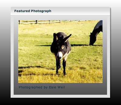
Figure 4-9 shows this
Panel-based layout.
In addition to panels, you also can use a TitleWindow class to provide windowing-style
functionality. This can come in handy when you want to bring up an alert,
or a modal dialog.
Controls
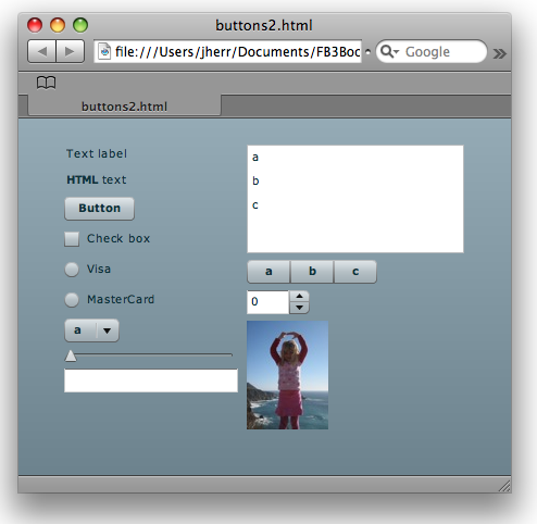
So many controls are available for you to use with Flex that it’s almost hard to know where to begin. I suppose the best place to start is with the basic controls, such as labels, buttons, checkboxes, and so on. Example 4-10 shows an MXML application that provides a heaping helping of the basic control types.
<?xml version="1.0" encoding="utf-8"?>
<mx:Application xmlns:mx="http://www.adobe.com/2006/mxml"
layout="horizontal">
<mx:VBox horizontalAlign="left">
<mx:Label text="Text label" />
<mx:Label htmlText="<b>HTML</b> text" />
<mx:Button label="Button" />
<mx:CheckBox label="Check box" />
<mx:RadioButtonGroup id="cardType"/>
<mx:RadioButton label="Visa" groupName="cardType" />
<mx:RadioButton label="MasterCard" groupName="cardType"/>
<mx:ComboBox dataProvider="{['a','b','c']}" />
<mx:HSlider />
<mx:TextInput />
</mx:VBox>
<mx:VBox horizontalAlign="left">
<mx:List dataProvider="{['a','b','c']}" width="200"
height="100" />
<mx:ButtonBar dataProvider="{['a','b','c']}" />
<mx:NumericStepper />
<mx:Image source="@Embed('megan.jpg')" />
</mx:VBox>
</mx:Application>When I run this in Flex Builder I see Figure 4-10.
As you would expect, in addition to these controls, you also have available labels with flat text and HTML, push buttons, checkboxes and radio boxes, combos, text inputs, and lists, as well as some cool new controls such as sliders, numeric steppers, button bars, and images, among others.
Data Grids
We regularly have to build tables of structured information.
This is easy in Flex, thanks to two controls: the DataGrid and the AdvancedDataGrid. I’ll start by showing the
DataGrid control (see Example 4-11).
<?xml version="1.0" encoding="utf-8"?>
<mx:Application xmlns:mx="http://www.adobe.com/2006/mxml"
  layout="vertical">
 <mx:XMLList id="employees">
  <employee>
   <name>Christina Coenraets</name>
   <phone>555-219-2270</phone>
   <email>ccoenraets@fictitious.com</email>
   <active>true</active>
  </employee>
  ...
 </mx:XMLList>
 <mx:DataGrid width="100%" height="100%" dataProvider=
   "{employees}">
  <mx:columns>
   <mx:DataGridColumn dataField="name" headerText="Name"/>
   <mx:DataGridColumn dataField="phone" headerText="Phone"/>
   <mx:DataGridColumn dataField="email" headerText="Email"/>
  </mx:columns>
 </mx:DataGrid>
</mx:Application>
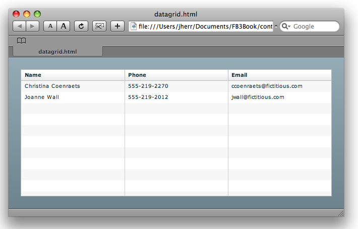
When I run this in Flex Builder I see Figure 4-11.
You don’t even have to define the columns in the DataGrid unless you want to. The DataGrid control is smart enough to detect the
columns from the data and set itself up if you haven’t defined the
columns.
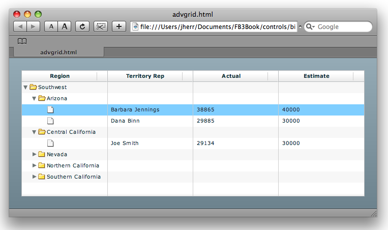
The AdvancedDataGrid is just like
the DataGrid but with a more powerful
set of features. For example, it has the ability to roll up sections of
the data and provide users with spinners so that they can drill down into
the data.
Example 4-12 shows AdvancedDataGrid in action.
<?xml version="1.0" encoding="utf-8"?>
<mx:Application xmlns:mx="http://www.adobe.com/2006/mxml"
  layout="vertical">
<mx:Script>
<![CDATA[
import mx.collections.ArrayCollection;
[Bindable]
private var dpHierarchy:ArrayCollection = new ArrayCollection([
  {Region:"Southwest", children: [ ... ]}
]);
]]>
</mx:Script>

<mx:AdvancedDataGrid width="100%" height="100%">
 <mx:dataProvider>
  <mx:HierarchicalData source="{dpHierarchy}"/>
 </mx:dataProvider>
 <mx:columns>
  <mx:AdvancedDataGridColumn dataField="Region"/>
  <mx:AdvancedDataGridColumn dataField="Territory_Rep"
   headerText="Territory Rep"/>
  <mx:AdvancedDataGridColumn dataField="Actual"/>
  <mx:AdvancedDataGridColumn dataField="Estimate"/>
 </mx:columns>
</mx:AdvancedDataGrid>
</mx:Application>
When I run this in the browser and click around a little bit I get something similar to Figure 4-12.
As with any control, you can use the itemRenderer functionality in Flex Builder to
format each cell however you choose.
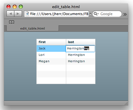
In-Place Editing
The DataGrid control
also allows for editing cell contents in place. Example 4-13 shows just how easy this is.
<?xml version="1.0" encoding="utf-8"?>
<mx:Application xmlns:mx="http://www.adobe.com/2006/mxml"
  layout="vertical">
  <mx:XMLList id="customers" xmlns="">
    <customer><first>Jack</first>
    <last>Herrington</last></customer>
    <customer><first>Lori</first>
    <last>Herrington</last></customer>
    <customer><first>Megan</first>
    <last>Herrington</last></customer>
  </mx:XMLList>
  <mx:DataGrid dataProvider="{customers}" editable="true">
  <mx:columns>
    <mx:DataGridColumn dataField="first" />
    <mx:DataGridColumn dataField="last" />
  </mx:columns>
  </mx:DataGrid>
</mx:Application>
All I needed to do was add the editable attribute to the DataGrid and
set it to true.
When I bring this up in the browser and double-click on a cell, I see something similar to Figure 4-13.
Of course, to make the example functional I would need to listen to the editing events and update the backend data store to match.
By default, the DataGrid uses a
text editor to edit the cell contents, but you can provide your own
editor renderer to use whatever controls you like to edit the value in
the cell.
Tabs and Accordions
Sometimes you have more content than you can reasonably fit on the screen, so you need some way to let the user navigate around groupings of content. Flex provides several solutions, two of which, tabs and accordions, I’ll demonstrate here.
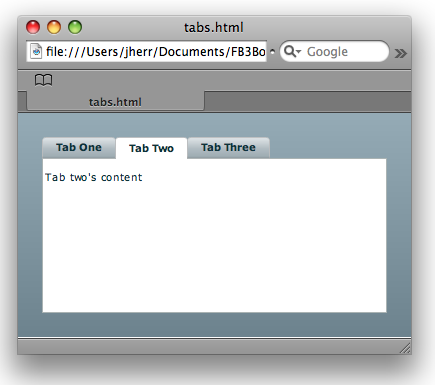
Tabs are very easy to create, as you can see in Example 4-14.
<?xml version="1.0" encoding="utf-8"?>
<mx:Application xmlns:mx="http://www.adobe.com/2006/mxml"
  layout="vertical">
 <mx:TabNavigator borderStyle="solid" width="100%"
   height="100%">
   <mx:VBox label="Tab One">
     <mx:Label text="Tab one's content" />
   </mx:VBox>
   <mx:VBox label="Tab Two">
     <mx:Label text="Tab two's content" />
   </mx:VBox>
   <mx:VBox label="Tab Three">
     <mx:Label text="Tab three's content" />
   </mx:VBox>
 </mx:TabNavigator>
</mx:Application>
When I run this example from Flex Builder I see Figure 4-14.
Yep, it’s really that easy. And you can reskin the tabs to be in whatever form you please with CSS and skinning (more on that shortly).
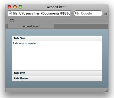
An accordion works exactly the same way, as you can see in Example 4-15.
<?xml version="1.0" encoding="utf-8"?>
<mx:Application xmlns:mx="http://www.adobe.com/2006/mxml"
  layout="vertical">
 <mx:Accordion borderStyle="solid” width="100%” height="100%">
   <mx:VBox label="Tab One">
     <mx:Label text="Tab one's content" />
   </mx:VBox>
   <mx:VBox label="Tab Two">
     <mx:Label text="Tab two's content" />
   </mx:VBox>
   <mx:VBox label="Tab Three">
     <mx:Label text="Tab three's content" />
   </mx:VBox>
 </mx:Accordion>
</mx:Application>
All I did was change the tag name from TabNavigator to Accordion and the example works, as you can see
in Figure 4-15. These are just two of the
controls that you can use to manage the presentation of large sets of
interface elements in a way that doesn’t overwhelm the user.
Menus
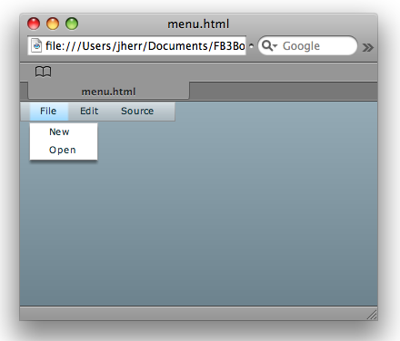
Flex also has support for menus, including those that appear at the top of the window as well as pop-up menus. Example 4-16 shows how to create a menu bar along the top of the window.
<?xml version="1.0" encoding="utf-8"?>
<mx:Application xmlns:mx="http://www.adobe.com/2006/mxml"
  layout="absolute">
 <mx:MenuBar labelField="@label">
  <mx:XMLList>
   <menuitem label="File">
    <menuitem label="New" />
    <menuitem label="Open"/>
   </menuitem>
   <menuitem label="Edit"/>
   <menuitem label="Source"/>
  </mx:XMLList>
 </mx:MenuBar>
</mx:Application>
When I run this in Flex Builder I see something similar to Figure 4-16.
There is also a handy control called ApplicationControlBar that gives a nice-looking
control set along the top of the window. Example 4-17 is
the code for a sample ApplicationControlBar.
<?xml version="1.0" encoding="utf-8"?>
<mx:Application xmlns:mx="http://www.adobe.com/2006/mxml"
  layout="vertical">
<mx:ApplicationControlBar dock="true">
    <mx:ButtonBar dataProvider="{['People','Places',
      'Things']}" />
</mx:ApplicationControlBar>
</mx:Application>
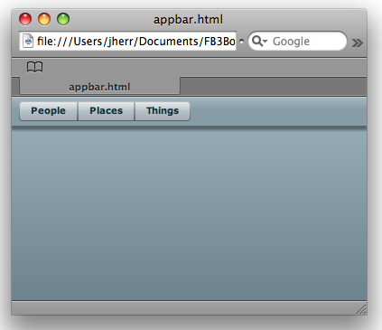
When I launch this example in Flex Builder I see the nice presentation shown in Figure 4-17.
One thing I love about Flex is that even by default, it looks really good. I’m not a graphic designer by any stretch, so I like the fact that Figure 4-17 looks very slick but required absolutely no effort on my part.
Divider Boxes
Flex provides an easy way for your users to customize their own layout with divider boxes. The code in Example 4-18 shows just how easy it is to use a divider box.
<?xml version="1.0" encoding="utf-8"?>
<mx:Application xmlns:mx="http://www.adobe.com/2006/mxml"
  layout="horizontal">
<mx:HDividedBox width="100%" height="100%">
<mx:HBox backgroundColor="#ff9999" width="50%" height="100%"
  borderStyle="solid">
    <mx:Label text="Left part" />
</mx:HBox>
<mx:HBox width="50%" height="100%" borderStyle="solid">
    <mx:Label text="Right part" />
</mx:HBox>
</mx:HDividedBox>
</mx:Application>
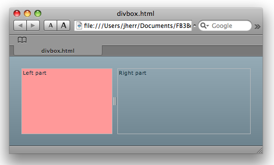
When I run this in Flex Builder I see something similar to Figure 4-18.
I can the drag the divider control to adjust the size of the left and right parts to match my needs.
CSS
The best way to control the look of your Flex application is through CSS. If you are familiar with CSS for HTML you will find the CSS that’s supported by Flex to be very familiar.
To demonstrate I’ll take a very simple data entry form, make the font size huge, and change the colors of the text inputs based on CSS classes (see Example 4-19).
<?xml version="1.0" encoding="utf-8"?>
<mx:Application xmlns:mx="http://www.adobe.com/2006/mxml"
  layout="absolute">
<mx:Style>
Application { font-size: 30; }
TextInput { color: #0000ff; }
.important { color: #ff0000; }
</mx:Style>
  <mx:Form>
    <mx:FormItem label="First Name">
      <mx:TextInput id="first" width="300" />
    </mx:FormItem>
    <mx:FormItem label="Last Name">
      <mx:TextInput id="last" width="300" />
    </mx:FormItem>
    <mx:FormItem label="Email">
      <mx:TextInput id="email" styleName="important"
        width="300" />
    </mx:FormItem>
    <mx:FormItem>
      <mx:Button label="Subscribe" />
    </mx:FormItem>
  </mx:Form>
</mx:Application>
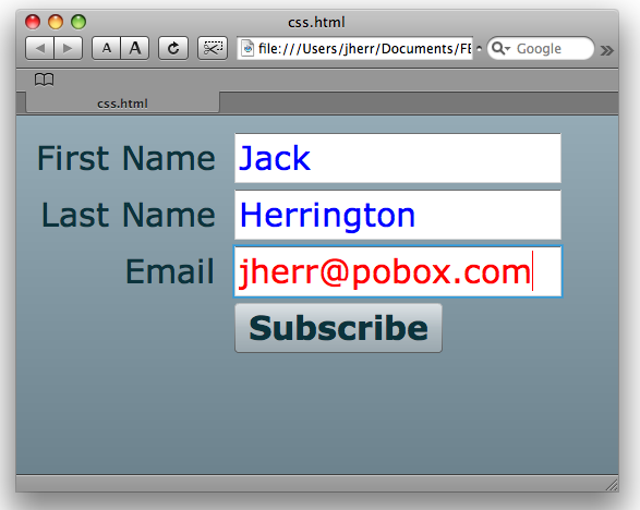
The CSS styles are defined in the mx:Styles tag. I’ve defined three classes. The Application class, which controls all of the
content within the Application tag,
increases the font size. For the TextInput colors I specify that the text should
be blue. For any control of the class important, the color should be red.
When I launch this in Flex Builder I see Figure 4-19 in my browser.
In this example, I’ve defined the CSS inline, but you can reference an external CSS file if you want to maintain styles across several applications. In addition, Flex Builder can help you manage your classes in Design mode.
Skinning
Flex also allows you to change the look of your whole application in a process called skinning. You can use CSS to apply new skins to your Flex controls. Skins are available for free as well as for purchase on the Web. A good repository for Flex skins is Scale Nine (http://www.scalenine.com/).
To demonstrate this I went to the Scale Nine website and found a pretty skin called “blue plastic.” I downloaded the ZIP file and copied the contents into my Flex Builder 3 project folder via drag-and-drop.
I then modified my form by adding a Panel and replacing my own styles with a
reference to the “blue plastic” skin (see Example 4-20).
<?xml version="1.0" encoding="utf-8"?>
<mx:Application xmlns:mx="http://www.adobe.com/2006/mxml"
  layout="vertical">
<mx:Style source="/blueplastic/blue_plastic.css" />
<mx:Panel title="Subscription form" paddingTop="20">
  <mx:Form>
    <mx:FormItem label="First Name">
      <mx:TextInput id="first" width="300" />
    </mx:FormItem>
    <mx:FormItem label="Last Name">
      <mx:TextInput id="last" width="300" />
    </mx:FormItem>
    <mx:FormItem label="Email">
      <mx:TextInput id="email" styleName="important"
        width="300" />
    </mx:FormItem>
    <mx:FormItem>
      <mx:Button label="Subscribe" />
    </mx:FormItem>
  </mx:Form>
</mx:Panel>
</mx:Application>
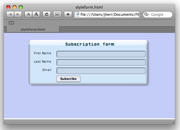
Figure 4-20 shows the result.
As you can see, the panel has gotten a bit glossy. The font of the title of the panel has changed, and the background color for the entire design has also changed.
Filters and Effects
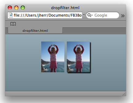
Flex supports a wide variety of filters and effects that you can apply to any user interface object. Take, for example, how easy it is to add a drop shadow to an image. The code for two images, one with a shadow and one without, appears in Example 4-21.
<?xml version="1.0" encoding="utf-8"?>
<mx:Application xmlns:mx="http://www.adobe.com/2006/mxml"
  layout="horizontal">
 <mx:Image source="@Embed('megan.jpg')" />
 <mx:Image source="@Embed('megan.jpg')">
   <mx:filters>
     <mx:DropShadowFilter />
   </mx:filters>
 </mx:Image>
</mx:Application>
It’s almost as easy to apply filters and effects to text-based controls, but in many cases you’ll have to embed the font. The result, when I look at it in the browser, looks like Figure 4-21.
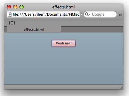
You can also apply filters based on certain events, such as rollovers, to provide interactive effects. Example 4-22 shows a button that glows when you roll your mouse pointer over it.
<?xml version="1.0" encoding="utf-8"?>
<mx:Application xmlns:mx="http://www.adobe.com/2006/mxml"
  layout="horizontal">
 <mx:Button label="Push me!">
   <mx:rollOverEffect>
     <mx:Glow blurXTo="5" blurYTo="5" color="#ff0000" />
   </mx:rollOverEffect>
 </mx:Button>
</mx:Application>
As I roll my mouse pointer over the button, the effect looks similar to Figure 4-22.
These kinds of effects can bring an interface to life for your customers. It’s worth taking the time to learn how to use them effectively so that you have a complete set of tools at your disposal to make your applications grab people’s attention.
Get Getting Started with Flex 3 now with the O’Reilly learning platform.
O’Reilly members experience books, live events, courses curated by job role, and more from O’Reilly and nearly 200 top publishers.
