June 2012
Beginner to intermediate
70 pages
1h 33m
English
Visualizing data is now an old trade. We have, in one way or another, been visualizing collected data for a long time—the year of this writing is the 143rd birthday of Minard’s famous Napoleon’s March flow map shown in Figure 1-1. Lately, though, we’ve gone into overdrive, as the amount of data we capture increases without bound and our ability to glean insights from it develops and matures. The Internet, combined with the latest generation of browsers, gives us a fantastic opportunity to take our urge to visualize to the next level: to create live, interactive graphics that have the opportunity to reach millions of people.
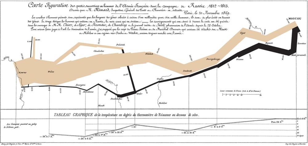
Figure 1-1. Minard’s flow map depicting Napoleon’s dwindling army as he marches toward, and retreats from, Moscow. “Drawn up by M. Minard, Inspector General of Bridges and Roads in retirement. Paris, November 20, 1869.”
JavaScript is the language of the modern browser. As such, it is the most installed language in the world: the one language you can be confident is installed on the user’s computer. Similarly, all modern browsers (with the introduction of IE9 in 2011) can render Scalable Vector Graphics (SVG), including mobile devices that are unable to render Flash. Together, the combination of JavaScript and SVG allows us to create sophisticated charts that are accessible by a majority of Internet users. And, thanks to D3, bringing these ...
Read now
Unlock full access


 O’Reilly covers everything we've got, with content to help us build a world-class technology community, upgrade the capabilities and competencies of our teams, and improve overall team performance as well as their engagement.I wanted to learn C and C++, but it didn't click for me until I picked up an O'Reilly book. When I went on the O’Reilly platform, I was astonished to find all the books there, plus live events and sandboxes so you could play around with the technology.I’ve been on the O’Reilly platform for more than eight years. I use a couple of learning platforms, but I'm on O'Reilly more than anybody else. When you're there, you start learning. I'm never disappointed.I'm always learning. So when I got on to O'Reilly, I was like a kid in a candy store. There are playlists. There are answers. There's on-demand training. It's worth its weight in gold, in terms of what it allows me to do.