So far, we have reproduced the basics: lists, bar charts, scatter graphs, and line charts. While it’s important to have these fundamental building blocks in our toolkit, arguably we’ve not done a great deal more than one could do with standard graphing libraries. The key difference between D3 and earlier generation graphing methods is that our canvas is a web page in a modern browser—a piece of technology that is fundamentally interactive. This means that, with very little effort, we can introduce basic user interactions using standard browser events. By combining interaction with D3’s capability to animate the elements of the web page, we are able to build up rich visualizations that would have been next to impossible with earlier tools.
The MTA Subway Wait Assessment is defined as “the percent of actual intervals between trains that are no more than the scheduled interval plus 25%” (i.e., the percentage of trains that were more or less on time). The data is collected once a month and made available, per subway line, to the public. We are going to create a User Interface (UI) using D3 in order to help the public explore this data.
The aim for this example is to provide a simple UI that allows a user to investigate and compare the data, to explore the data in more detail via interaction. This is a very powerful way of presenting data, as it allows the user to choose what they feel is important, and what will help them make decisions. Ben Shneiderman has been teaching this for at least 15 years: “Overview first, zoom and filter, then details-on-demand.”[1] With D3 we can achieve this sort of interaction without much more work than we’ve already done in earlier chapters.
There are two data sets we’re going to use in this example. One is the top-level summary statistics data, called subway_wait_mean.json, of which one entry looks like the following:
{"line_id":"6_Line""line_name":"6 Line","mean":73.400000000000006}
The second data set is the lower-level detail, which contains the subway wait assessment at a monthly level for the last year. The file is called ’subway_wait.json’ and an individual record from that looks like:
{"line_id":1_Line"line_name":"1 Line","late_percent":73.1,"month":1}
We’re going to build a time series graph where the user can select those time series they’d like to see. The wait assessment available online right now runs from 2009 through to spring of 2011. We have 22 separate lines excluding the shuttles (which seem to be on-schedule most of the time!), motivating the interactive piece of this graph: showing all the lines at once would be a bit of a mess! We will have a time series plot on the left hand side of the screen, with a clickable key of lines on the righthand side. This example will have a slightly more complex layout than the earlier examples, so we sketch out the structure first shown in Example 4-1.
Example 4-1. Structure of the time series UI layout
<divid="timeseries"><svg><gid="chart"></g></svg></div><divid="key"><divclass="key_line"><divclass="key_square"></div><divclass="key_label"></div></div><divclass="key_line"><divclass="key_square"></div><divclass="key_label"></div></div>...</div>
So we will have two top-level div tags, with IDs timeseries and key. Inside the key will be one row per subway
line, containing the key_line div
tag, which in turn contains the key_square, which will have color code and the
key_label, which will have the line
name.
The time series plots will all live inside the timeseries div tag, which is, in turn, inside
the svg element. This example uses a
more robust idiom for placing the plot elements—the plot will live
inside an SVG group element, which will be positioned inside the root
SVG element to take into account the necessary margins for the axis
ticks and labels.
We begin with the following HTML, which has two extra div tags and some basic style:
<!DOCTYPEhtml><html><head><metacharset="utf-8"i/><scripttype="text/javascript"src="d3.js"></script></head><style>.axispath,line{stroke:black;}.line{float:left;}.line_container{width:150px;height:20px;}path{fill:none;}.key{float:right;}.key_line{font-size:17px;width:100%;}.key_square{height:10px;width:10px;outline:solid1pxblack;float:left;margin:6px10px0px10px;}#timeseries{float:left;}><script>functiondraw(data){// script starts here}</script><body><divid="timeseries"></div><divid="key"></div><script>d3.json("data/subway_wait_mean.json",draw);</script></body></html>
which sets up the top-level divs. The CSS in this example lives in
the top style tag and the JavaScript
lives in the top script tag. The
first thing we will do in the script is set up the SVG viewport. So,
inside the draw function:
varcontainer_dimensions={width:900,height:400},margins={top:10,right:20,bottom:30,left:60},chart_dimensions={width:container_dimensions.width-margins.left-margins.right,height:container_dimensions.height-margins.top-margins.bottom};varchart=d3.select("#timeseries").append("svg").attr("width",container_dimensions.width).attr("height",container_dimensions.height).append("g").attr("transform","translate("+margins.left+","+margins.top+")").attr("id","chart");
A number of new things are happening here. First, we specify two sets of dimensions: the dimensions of the SVG container and then the dimensions of the chart itself. The point here is that we build the chart inside an SVG group with enough space around the edges of the group for the axis and axis labels to live in, avoiding annoying corrections later on in the script. Having set up the dimensions, we add an SVG element to the page, then a group element, which is translated right and down by the appropriate number of pixels.
We have also assigned a selection to a variable for the first
time. Each append returns the D3
selection of that element, so here we are assigning the selection of the
g element to the chart variable. This avoids having to
continually reselect the chart group to hang new elements from
it.
Next, we need to set up scales and axes, which we do as usual. The one difference here is that we are manually setting the domains of the scales rather than using the extent of the data set. In this case we know the domains ahead of time, and want to frame all the different time series nicely:
vartime_scale=d3.time.scale().range([0,chart_dimensions.width]).domain([newDate(2008,0,1),newDate(2011,3,1)]);varpercent_scale=d3.scale.linear().range([chart_dimensions.height,0]).domain([65,90]);vartime_axis=d3.svg.axis().scale(time_scale);varcount_axis=d3.svg.axis().scale(percent_scale).orient("left");chart.append("g").attr("class","x axis").attr("transform","translate(0,"+chart_dimensions.height+")").call(time_axis);chart.append("g").attr("class","y axis").call(count_axis);d3.select(".y.axis").append("text").attr("text-anchor","middle").text("percent on time").attr("transform","rotate (-270, 0, 0)").attr("x",container.height/2).attr("y",50);
Next we need to build the key. For this we will use the summary
JSON and iterate through in much the same way as we did for the bar
chart in Chapter 2. Note that the draw function is called with this summary JSON
file as its data variable. We first
append the div.key_line tags and
store the resulting selection in a variable:
varkey_items=d3.select("#key").selectAll("div").data(data).enter().append("div").attr("class","key_line").attr("id",function(d){returnd.line_id});
Note that each div has the same class but a unique ID. The
key_items variable now stores the
selection of all the elements of class .key_line with their associated data. Using
this variable it becomes easy to hang the .key_square and .key_label elements from each key_line element:
key_items.append("div").attr("id",function(d){return"key_square_"+d.line_id}).attr("class","key_square");key_items.append("div").attr("class","key_label").text(function(d){returnd.line_name});
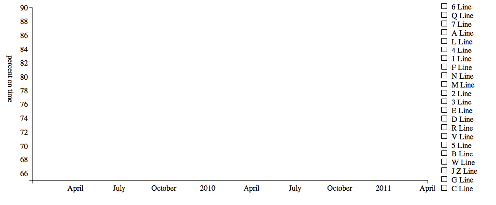
This gives us our empty (and not terribly well-styled) stage shown in Figure 4-1. We now need to add some interaction to allow the user to choose which line to draw.
The browser is constantly firing events in response to user
behavior. Every time the user passes their mouse over an element, a
mouseover event is fired in the context of that
element. Every time a user clicks on an element, a
mousedown event is fired as the mouse button is
depressed, a mouseup event is fired as the mouse
button is released, and a click event is fired
immediately thereafter.
The browser is capable of firing a large number of events (see the
DOM Level 2 Events Specification for a full list) though the examples
below will focus on the “click” and “mouseover” events. For each element
in the page, we can register an event handler that listens for a
specific type of event emanating from that element and then, when the
event is fired, runs a callback function that performs the desired
actions. The D3 library provides a handy .on() method that can be called on a
selection, attaching an event handler to the elements in that
selection.
We’ll start by adding a click event to the .key_line elements:
d3.selectAll(".key_line").on("click",get_timeseries_data);
This simply says for each .key_line element in the selection, add an
event handler that listens for the click event and,
when that event is fired, call get_timeseries_data, which we will write next.
The function is referred to as the “listener” and is called just like
all the other callbacks, with that element’s data passed in as the first
argument, the index as the second (always referred to herein and
elsewhere as d and i). Importantly, it also sets the this keyword to be the element to which we’ve
attached the handler.
Warning
The this keyword is a
notorious stumbling block when learning JavaScript. Generally, its
value is dependent on the execution context and the syntax of the
function call. When using callbacks in D3, this is always set to the current element,
allowing us to select the element directly while inside the callback.
It’s always worth using console.log(this) in more complex
situations, if only to make sure you’re not going crazy!
The callback’s job is to toggle the timeseries line on and off as the key gets clicked on. In order to do this, it will need to test if the line exists already on the page and, if not, fetch the timeseries data and draw the requested time series. Here’s the callback that performs this check and filters the JSON file for the requested time-series data:
functionget_timeseries_data(){// get the id of the current elementvarid=d3.select(this).attr("id");
// see if we have an associated time seriesvarts=d3.select("#"+id+"_path");if(ts.empty()){
d3.json("data/subway_wait.json",function(data){filtered_data=data.filter(function(d){returnd.line_id===id});
draw_timeseries(filtered_data,id);})}else{ts.remove();
}}
There are four new things going on here:

We have selected the element that was clicked on using the
thiskeyword. This gives us access to its ID, which is how we tie everything together.
We have used D3’s
selection.empty()to test if the selection we made actually contains any elements. If the line had not been drawn, then the selectiontsis empty andts.empty()will return true. In this case, we then need to extract the data for that line and draw it. If, on the other hand, the line had already been drawn, the selection stored intswill contain the line elements, andts.empty()will return false. In this case, we need to simply remove the line in the selection from the visualization.
We have used JavaScript’s
array.filter()method to pick out the data whose ID is equal to the ID of the current element. The.filter()method works simply by evaluating the callback function on each element of the data set, keeping only those elements that returntrue. This is a bit of a shortcut; ideally we’d only request the data we needed, keeping the memory footprint of the page lower.
We have used D3’s
selection.remove()method to remove the element if it already exists on the page. This simply removes all the elements in the selection from the page.
Having filtered out the correct data we call draw_timeseries passing in the data and the
ID. This function is very simple, it just draws the line defined by the
data. The problem, though, is that as it stands we do not have access to
the scale objects we created when setting the stage above. We need to
make the scale objects global, which requires two edits. The first, is
that we need to declare the scale objects outside the draw function, inside the script tags:
<script>vartime_scale,percent_scale;functiondraw(data){...
This declares two global variables that can be accessed anywhere
inside the JavaScript on this page. The second is we need to go to where
we defined the scales and remove the var keyword when we assign the variable names
to the scale objects:
time_scale=d3.time.scale().range([0,chart_dimensions.width]).domain([newDate(2008,0,1),newDate(2011,3,1)]);percent_scale=d3.scale.linear().range([chart_dimensions.height,0]).domain([65,90]);
This prevents them from being defined only in the scope of the
draw function, making them available
to our draw_timeseries function,
which is now simply:
functiondraw_timeseries(data,id){varline=d3.svg.line().x(function(d){returntime_scale(d.time)}).y(function(d){returnpercent_scale(d.late_percent)}).interpolate("linear");varg=d3.select("#chart").append("g").attr("id",id+"_path").attr("class",id.split("_")[1]);g.append("path").attr("d",line(data));}
Note that there’s a seemingly unnecessary SVG group element in
there. This has been dropped in for the example in the next section,
where we shall add in some transitions. For now, though, we have a fully
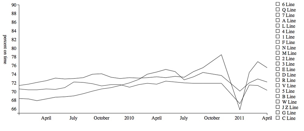
functional interactive visualization! When the user clicks on a key_line, they will now get to see the wait
assessment over 2009 and 2010 corresponding to that subway line. Figure 4-2 shows the result of clicking on the 4, 5, and 6
lines—something happened in January of 2011 that caused a sharp drop in
the punctuality of these lines!
We have now made a user interface that is serviceable—it provides a basic way for a user to explore the MTA Subway Wait Assessment data. However, we can introduce a richer level of interaction by using a few basic animations, known as “transitions” in D3. Transitions work by changing properties of the web page element, typically by transitioning between one set of properties to another in a smooth manner.
We can use transitions to highlight important aspects of our data, especially when time is involved, to advertise the fact that something should be clicked on, to keep track of constant elements in the visualization[2], or to just be downright flashy. In practice we should stick exclusively to the first three uses, though in this section we will let ourselves get ever so slightly carried away and make something a little cheesy.
A useful interaction for someone who needs to find out individual
values is to provide a small label when the user mouseovers the data
point. So let’s start by throwing in some circles for each data point.
Inside the draw_timeseries function,
after we’ve added in the path, we can easily throw in some
circles:
g.selectAll("circle").data(data).enter().append("circle").attr("cx",function(d){returntime_scale(d.time)}).attr("cy",function(d){returnpercent_scale(d.late_percent)}).attr("r",5);
The first transition we will build is a simple mouseover transition, that will grow the circle a bit to give the user some visual feedback as to the fact that the graph is interactive. The code is nice and straightforward, transitions being one of D3’s strengths:
g.selectAll("circle").on("mouseover",function(d){d3.select(this).transition().attr("r",9);}).on("mouseout",function(d){d3.select(this).transition().attr("r",5);});
The transition method smoothly
interpolates between the initial condition of an attribute to the value
specified after the transition. So in our case, during the mouseover we transition from a radius of 5px
to a radius of 9px. On mouseout we
transition back down to 5px.
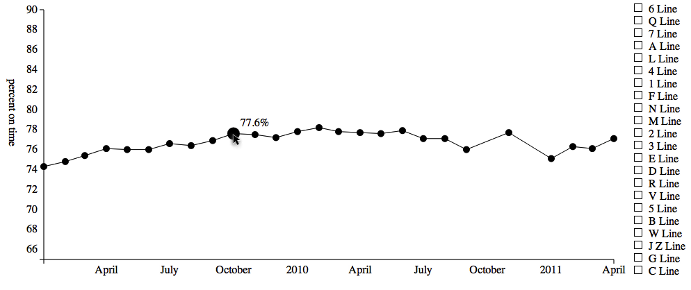
Let’s add a tool tip-style label for the data point so the user can get a more accurate reading by inspection. We shall simply have the tool tip appear on mouseover:
g.selectAll("circle").on("mouseover.tooltip",function(d){d3.select("text#"+d.line_id).remove();d3.select("#chart").append("text").text(d.late_percent+"%").attr("x",time_scale(d.time)+10).attr("y",percent_scale(d.late_percent)-10).attr("id",d.line_id);});
Nothing terribly new here: we append an SVG text element just up
and to the right of the circle and set the id of the text to the line_id. The one odd-looking line here is
first line in the mouseover callback; before we add a new tool tip, we
remove any tool tips that already exist on that line. This is good
practice if we know we only ever want one tool tip on at a time, and
also corrects any corner-case interaction bugs that can occur if the
transition below is interrupted.
On mouseout we shall fade the label out and, because it is so easy to get carried away with transitions, we shall transform the position of the label up and to the right a bit, giving the label fade a bit of drama:
g.selectAll("circle").on("mouseout.tooltip",function(d){d3.select("text."+d.line_id).transition().duration(500).style("opacity",0).attr("transform","translate(10, -10)").remove();});
Here we transition to 0 opacity, transition from translate(0,0) to translate(10,-10) and then, at the end of the
transition, remove the element from the page. Note that here the
duration of the transition is set explicitly to 500ms. This gives the
transition ever so slightly more time to perform the interpolation than
the default of 250ms. These two transitions occur at the same time as
each other, and over the same 500ms period. We end up with a time series
with responsive, informative data points, shown in Figure 4-3.
Note
The .remove() method works a
little differently on a transition. When called on a selection, remove
immediately removes the element. When called on a transition, the
.remove() method runs only at the
end of the transition.
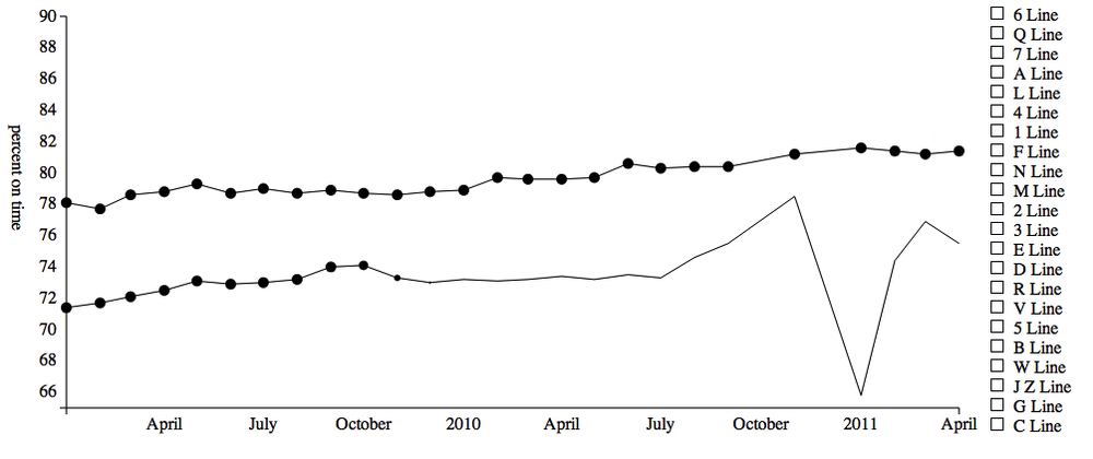
It’s often useful to highlight the fact that something is interactive, which is often simply drawing the users attention to it. To do this, we’re going to introduce the circles, one after the other, in a quick animation when the user chooses a line. It would be easy to go overboard with this animation, though here that’s left as an exercise for the reader.
Before we do anything, we need to alter the appending code above in A Simple Interactive Transition. Instead of adding circles with a radius of 5, we add them in with a radius of 0px, so they can’t be seen. We then immediately run:
varenter_duration=1000;g.selectAll("circle").transition().delay(function(d,i){returni/data.length*enter_duration;}).attr("r",5);
Here the .delay() method is
used to delay the transition by the number of specified milliseconds.
This code generates a per-element delay that increases as the index into
the set of circles increases. The index starts at zero, meaning that the
first circle appears immediately. The second circle starts with index
one so, because we have 26 elements, the delay is 1/26th of a second,
the third circle starts after 2/26ths of a second and so on. As our data
comes ordered by time, setting the delay to be per-item in this manner
gives the impression that the circles appear quickly one by one over the
course of a second. A screen capture of this animation is shown in Figure 4-4.
The last thing we shall add to this UI before styling it is to put a label at the end of the line. We’d like to do this after the circles have appeared along the length of the line. We shall use the final circle to give the line a label by making it a little bigger than the others and adding some text indicating which line it is. After we style this it will look like the MTA subway symbol!
In order to draw this after the entry
animation, we need to use the .each()
method at the end of the entry transition. So, here’s the entry
animation again except this time we call some more code that will take
place after the transition has completed:
g.selectAll("circle").transition().delay(function(d,i){returni/data.length*enter_duration;}).attr("r",5).each("end",function(d,i){if(i===data.length-1){add_label(this,d);}});
The .each() method is called
for each element in the transition, and takes as its first argument
either "start" or "end". If "start" is specified the callback in the
second argument will be fired at the start of the transition. If
"end" is specified the callback will
be triggered once the transition has completed. This is commonly used to
chain together animation events.
The callback first checks to see if the current element is the final circle in the array. If it is, the function below is called, which makes that circle a bit bigger and fades in the label:
functionadd_label(circle,d){d3.select(circle).transition().attr("r",9);g.append("text").text(d.line_id.split("_")[1]).attr("x",time_scale(d.time)).attr("y",percent_scale(d.late_percent)).attr("dy","0.35em").attr("class","linelabel").attr("text-anchor","middle").style("opacity",0).style("fill","white").transition().style("opacity",1);}
Warning
The .attr("dy", "0.35em")
serves to vertically center the SVG text in the line label. It’s a bit
magical, but is better supported than the dominant-baseline style.
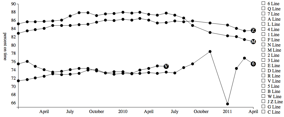
This gives us some nice line labels, shown in Figure 4-5. They appear after the circles have populated the line, and they fade in nicely. Finally, we need to tell the browser to not shrink the circles on mouseout, using:
g.selectAll("circle").on("mouseout",function(d,i){if(i!==data.length-1){d3.select(this).transition().attr("r",5);}})
We can’t, in good conscience, leave the graph as it is. Stylewise
it’s still a disaster, and we can make it so much nicer without much
effort. First, we have train_colours.css, which contains all the
official MTA subway colors, using rules like:
.Line_1,.Line_2,.Line_3{stroke:#EE352E;fill:#EE352E;background-color:#EE352E;}
Hopefully you noticed that we set each line’s group class, and
each key_square’s class, to be
compatible with stylesheet so simply by including it we get a marked
improvement in the look of the UI. A final touch of CSS finishes off
this example:
.timeseriespath{stroke-width:3px;}.timeseriescircle{stroke:white;}.timeseriestext{fill:white;stroke:none;font-size:12px;font-weight:bold;}
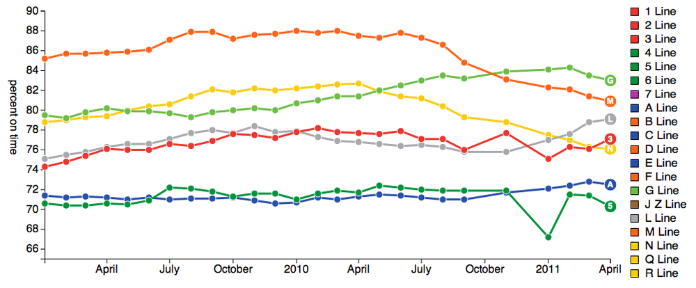
This produces the screenshot in Figure 4-6, allowing us to investigate the wait assessment of each subway over time.
[1] Ben Shneiderman. A Thousand Fold Increase in Human Capabilities. Educom Review, 32, 6 (Nov/Dec 1997), 4-10.
[2] See http://bost.ocks.org/mike/constancy/ for more on constancy.
Get Getting Started with D3 now with the O’Reilly learning platform.
O’Reilly members experience books, live events, courses curated by job role, and more from O’Reilly and nearly 200 top publishers.
