Hey there! Are you ready to jump into mobile? Mobile web development is a wildly exciting way of life. There’s glamour and excitement, and plenty of Eureka! moments. But there is also mystery and confusion. Mobile technology is evolving at bewildering speed, and there’s so much to know! Hang tight. We’ll start our journey by showing you a way of making websites called Responsive Web Design (RWD). You’ll be able to adapt websites to look great on a whole lot of mobile devices by building on the web skills you already have.
There’s a pretty good chance you own a mobile phone. We know that not simply because you bought this book (smart move, by the way!), but because it’s hard to find someone who doesn’t own a mobile phone.
It doesn’t matter where you go in the world. Mobile phones are being used everywhere, from farmers in Nigeria using their mobiles to find which market has the best price for their crops, to half of Japan’s top 10 best-selling novels being consumed and written—yes, written—on mobile phones.
At the beginning of 2011, there were 5.2 billion phones being used by the 6.9 billion people on Earth. More people use mobile phones than have working toilets or toothbrushes.
So yeah, mobile is huge, but it’s been big for years. Why should you get on the mobile bandwagon now?
Because the iPhone changed everything. It sounds clichéd, but it is true. There were app stores, touchscreens, and web browsers on phones before the iPhone, but Apple was the first to put them together in a way that made it easy for people to understand and use.
The iPhone is fantastic, but people use a lot of different phones for a lot of different reasons. And the most popular phones are likely to change.
We have no way of knowing what the the leading phones will be when you read this book. Three years ago, Android was a mere blip on the radar. In 2011, it is a leading smartphone platform worldwide.
Mobile technology changes quickly, but there are a few things we feel confident about:
Every new phone has a web browser in it.
You can probably find a new phone that doesn’t have a web browser in it, but you have to look pretty hard. Even the most basic phones now come with decent browsers. Everyone wants the Web on their phone.
Mobile web usage will exceed desktop web usage.
Soon the number of people accessing the Web via mobile phones will surpass those who use a computer. Already, many people say they use their phones more frequently than their PCs.
The Web is the only true cross-platform technology.
iPhone, Android, BlackBerry, Windows Phone, WebOS, Symbian, Bada—there are more phone platforms than we can keep track of. Each one has its own specific programming hooks, meaning that if you want to write software for each, you have to start from scratch each time.
Mobile web has its own challenges, but there is no other technology that allows you to create content and apps that reach every platform.
So you’re in the right spot at the right time. Mobile web is taking off, and you’re ready to ride the rocketship. Let’s get started!
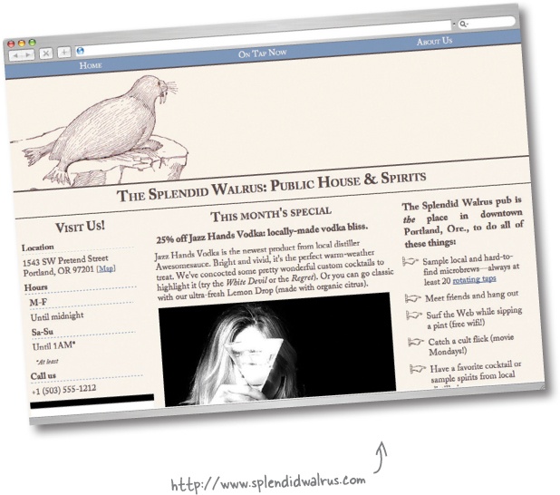
Mike is the proprietor of The Splendid Walrus, a pub with a clever name and a cult-like following of local beer enthusiasts. Mike always has unusual beers on tap and highlights several of them on his website.
Before he realized his lifelong dream of pub ownership, Mike was a web developer. So he had no trouble putting together a respectable website for The Splendid Walrus himself.
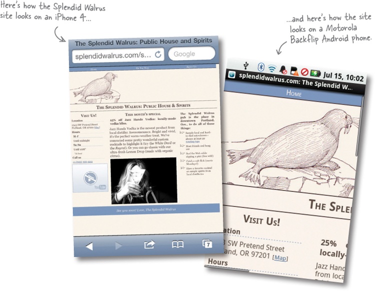
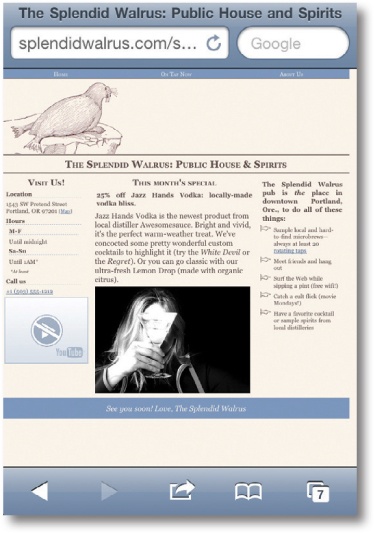
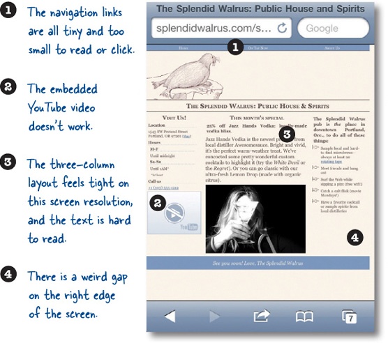
Mike built the Splendid Walrus website several years ago, when mobile browsing was still rudimentary and uncommon. It was made for—and tested in—desktop browsers like Firefox, Internet Explorer, and Safari.
Lots of newer mobile browers have good reputations. They’re increasingly sophisticated and powerful, and starting to feel like some of their desktop counterparts.
There are 86 billion different mobile web browsers.
OK, not quite that many. But when you’re developing for the mobile web, sometimes it feels this way. Unlike the handful of leading desktop browsers, there are hundreds of different mobile browsers. Yikes.
Support for web technologies varies wildly.
On older mobile browsers (or even recent ones on less powerful devices), you can pretty much forget about reliable CSS or JavaScript. Even the newest browsers lack support for some things, support them in bewilderingly different ways, or have weird bugs. It’s the Wild West out here, folks!
Mobile devices are smaller and slower.
Yeah, we know. Newer mobile devices are state-of-the-art pocket computers. But they still pale in comparison to desktop (or laptop) computers in terms of processing power. Mobile networks can be flaky and downright poky, and data transfer is not necessarily free or unlimited. This means we’ll need to think about putting our sweet but enormous, media-rich, complex sites on a performance-savvy diet.
Mobile interfaces require us to rethink our sites.
Just because a mobile browser can render a desktop website with few hiccups doesn’t mean it necessarily should. Screens are smaller; interactions and expectations are different.
People with mobile devices use all sorts of input devices: fingers, stylus pens, the little nubbins they have on BlackBerry devices. Typing and filling out forms can be tedious at best. Squinting at type designed to fit a desktop browser window can give your users headaches and fury. You get the idea.
Frank: Hold on a minute. We know that Mike makes a big deal out of using clean, semantic HTML markup and uses CSS to control layout and styling as much as possible.
Jim: And? That’s great and professional, but how does it help us make this better?
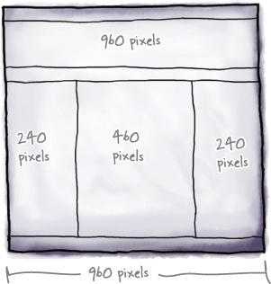
Frank: Well, let’s think about this a bit. When I look at the CSS he’s using for the Splendid Walrus site, I see a lot of widths and sizes defined to fit within a 960-pixel box. It looks like he’s designed the site on a 960-pixel grid, with three main columns.
Jim: ...and most mobile devices have resolutions considerably less than 960 pixels. Also, three columns seems like a lot for a smaller screen.
Frank: So... I have to wonder... what if we could use different CSS for mobile devices? Say, maybe, CSS designed to lay out in 320 pixels, which is the width of a lot of smartphone screens? And maybe reduce the number of columns?
Jim: Nice idea, Frank. But I don’t see how we could do that without a lot of server-side programming. I mean, how do we get mobile devices to use completely different CSS?
Frank: You know how Jill just got back from the Awesome Cool Mobile Web Camp conference and is all excited about that thing called Responsive Web Design?
Jim: How could I forget? It’s all she’s been talking about.
Frank: Well, she says it’s getting a lot of attention from web developers and it sounds like it involves, at least in part, applying different CSS for different situations, without having to do heavy-duty programming. Apparently it’s especially useful for developing mobile websites. I can’t really remember the details, but maybe we should check it out.
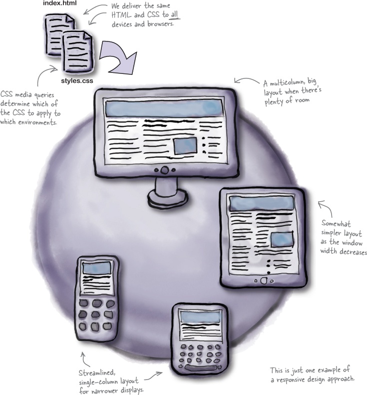
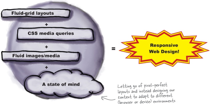
Responsive Web Design (RWD) is a set of techniques championed by web designer Ethan Marcotte. Sites designed with this approach adapt their layouts according to the environment of the user’s browser, in large part by doing some nifty things with CSS.
Note
Read Ethan’s original article for A List Apart about RWD at http://bit.ly/nRePnj.
Depending on the current value of certain browser conditions like window size, device orientation, or aspect ratio, we can apply different CSS in different circumstances. By rethinking the way we do page layouts, we can make formerly one-size-fits-all column and grid layouts flow more naturally across a continuum of browser window sizes.
RWD is one of the simplest and quickest ways to make a website work handsomely on a lot of devices—and you can use the web skills you already have.
There are three primary techniques for building a responsively designed website:
CSS3 media queries
Evaluating certain aspects of the current browser environment to determine which CSS to apply.
Fluid-grid layouts
Using relative CSS proportions instead of absolute sizes for page layout elements.
Fluid images and media
Making our images and media scale to fit within the size constraints of their containers by using some CSS tricks.
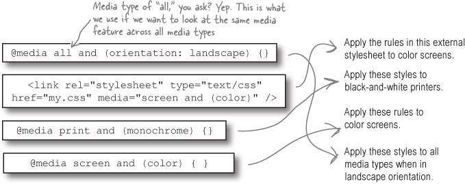
If you’ve been doing web development for some time (and are CSS-savvy), you might be friends with CSS media types already. We can use @media rules to apply CSS selectively.
CSS media type declarations inside of a CSS file look like this:
Media Types Up Close
Common (and useful) media types include screen, print, and all. There are other, less common media types like aural, braille, and tv.
Curious? If you’re the kind of person who reads technical specs for fun or to satisfy curiosity, you can see all of the media types defined in CSS2 on the W3C’s site at www.w3.org/TR/CSS2/media.html.
Another way to use media types to apply CSS selectively is from within a <link> in your HTML document.
Referencing the print media type like this is a common approach to creating print stylesheets—that is, CSS styles that only get applied when the content is printed.
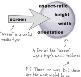
You have certain features—your age, your height—and so do media types. And just like The Splendid Walrus might want to establish a rule that requires the minimum age of patrons to be 21 before they apply alcohol, we might want to define certain CSS that we only apply to browser window widths within a certain range.
We’re in luck! width, along with color and orientation, is one of the media features defined in CSS3 for all common media types. So, again, media types have media features.
Media features on their own don’t get us very far. We need a way to ask the browser about the states of the ones we care about and, well, do something about it. That’s where CSS3 media queries come in.
This means: are we presently rendering content on a screen, AND is the window currently at least 480 pixels wide? Yes? OK! Apply these CSS rules.
Another example:
Is this being rendered on a printer OR is it being rendered on a screen that is monochrome (black and white)? Yes? Use these styles!
CSS3 media queries are logical expressions that evaluate the current values of media features in the user’s browser. If the media query expression evaluates as TRUE, the contained CSS is applied.
We have a tool that lets us apply different CSS to different situations. But now what?
Don’t panic. We do need to write some mobile-friendly CSS, but we’re not going to have to start from scratch. Nor are we going to have to have totally different CSS for our mobile devices—we can share a lot of what’s already there.
To generate our mobile-friendly layout, we’ll:
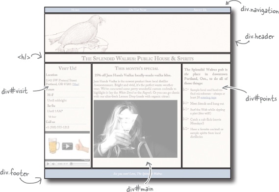
Take a peek at the index.html file for the Splendid Walrus site in the chapter1 directory. If you use your imagination and strip out the content, you can see a basic HTML page structure like this:
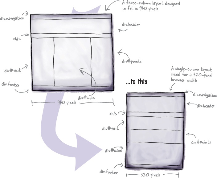
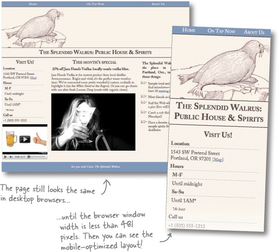
The current, desktop-oriented CSS lays out the page like this:
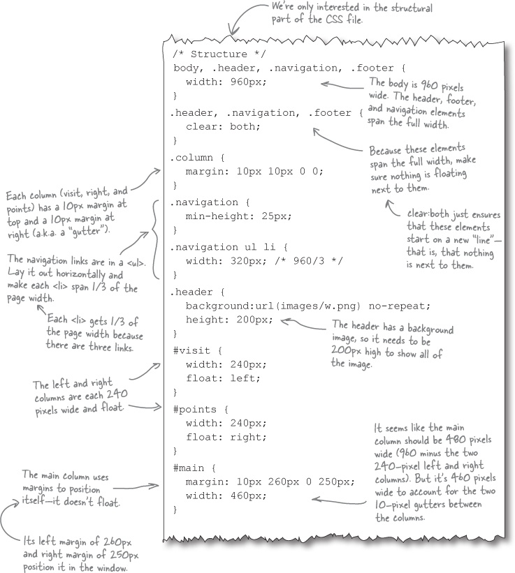
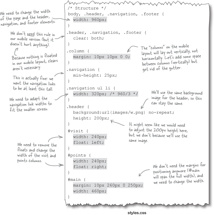
Let’s go look at the CSS that defines the layout and figure out what needs to change to adapt it to be mobile-sized.
Open the styles.css file for the Splendid Walrus site.
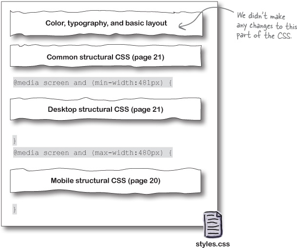
There’s a bunch of CSS at the top of the file, but we don’t have to worry about that. We can share the same colors, typography, and styling across both desktop and mobile variants.
What we care about is the structural CSS, near the bottom of the file.
Make the page and its structural elements fit within 320 pixels.
As Frank mentioned before, 320 pixels is a common screen resolution for mobile devices.
Reduce three columns to a single column.
In the original, desktop layout, three columns felt “crunched” on a mobile screen.
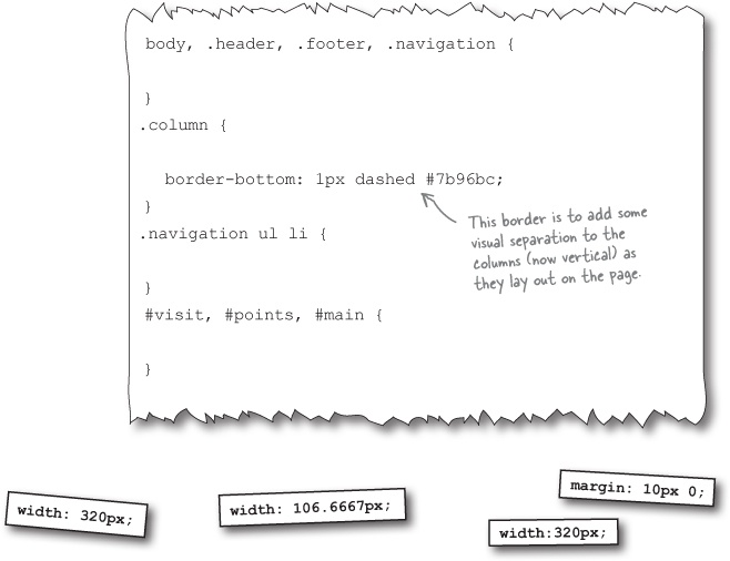
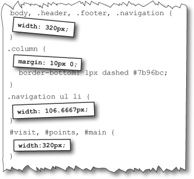
And we’re done! These four CSS rules are all the mobile-specific layout we’ll need. Now we need to be sure they’ll get used by mobile devices.
And how will we do that? Our old friend Mr. Media Query to the rescue! We’ll generate a media query shortly to apply this CSS to devices with a browser window of 480 pixels wide or narrower.
Note
Why 480 pixels? That’s the resolution for the “long side”(a.k.a. “landscape orientation”) of many popular smartphones.
They didn’t disappear...
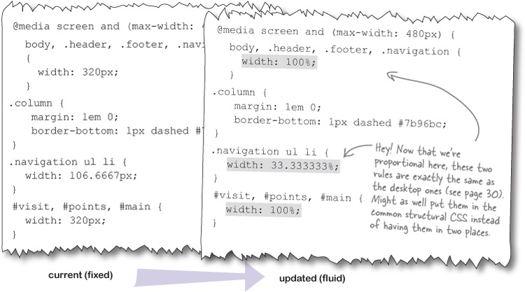
...they just don’t need to be contained inside our mobile-specific CSS. Why? Because the CSS rules in question are going to be the same for both layouts (desktop and mobile).
We’ll put the shared CSS outside the media queries so that we don’t have to have the same CSS rules in two places. Let’s do that now.
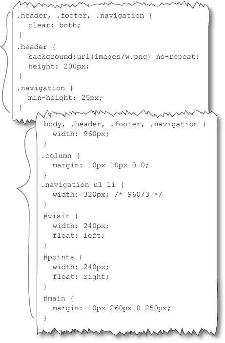
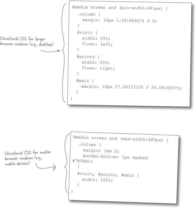
See? Told you! None of the CSS actually disappeared. Here’s the shared structural CSS that we identified in Identify the CSS that needs to change, factored out and ready to go.
We still need to have good CSS for desktop browsers!
After we remove the common structural CSS rules, here’s what we end up with for the desktop-specific CSS structure.
We’ll need to use a media query so that only viewports 481 pixels and wider apply this CSS.
Let’s check in on our to-do list for creating structural CSS that works for both desktop and mobile browsers:
Here’s how we’ll put together the updated version of styles.css.
You’re going to need a viewport <meta> tag in the index.html file. These tags help tell the browser how “zoomed in” to render the content. We’ll be taking a look at these guys a bit later on, but for now, just take our word for it: you’ll want one of these.
Do this!
Drop in the
viewport <meta>tag from Put it together.Open the styles.css file.
You’ll be replacing the structural CSS rules near the bottom of the file. Remove the existing rules for structural elements.
Add the common rules.
Add the shared structural CSS rules from The rest of our structural CSS.
Add the desktop- and mobile-specific CSS.
Add the desktop rules (The rest of our structural CSS) and mobile rules (Mobile CSS Magnets Solution).
Wrap the desktop- and mobile-specific CSS in media queries.
Add the media queries (Put it together).
Frank: This is really frustrating. I thought the mobile CSS we created would fix this.
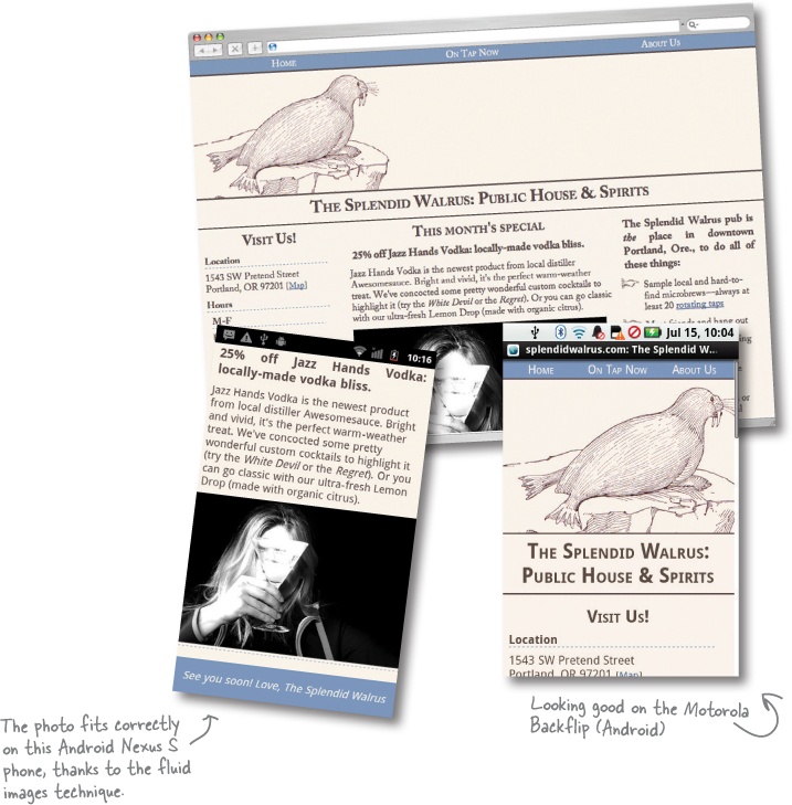
Jill: Your CSS makes the layout fit on a smaller screen, but it’s still pretty rigid. I mean, look what happens if I put my iPhone in landscape orientation.
Frank: Ugh. The layout is still 320 pixels wide...but on a 480-pixel screen. Am I going to have to write different CSS for every single different possible viewport size?!
Jill: See, this is where Responsive Web Design practices could help us. Right now, you’re delivering a rigidly sized structure to all browsers whose current window is 480 pixels wide or smaller, no matter what the actual specific browser window width is. That’s not very flexible. I mean, not all mobile devices have a 320-pixel-wide browser window.
Responsive design helps us adapt our layout to different situations. Instead of dictating the exact size of elements—that is, using pixel-based measurements in our structural CSS like we are now—we can use a proportional layout, which adapts much better for different users.
Frank: Proportional? Is that like ems and percentages and stuff in CSS?
Jill: Yeah, sort of. We can use percentages instead of pixels when we code up our layout. That way, content stretches and shrinks to fill available space—kind of like water filling in gaps. That’s why this kind of layout is often called a fluid layout. And, by the way, this will help us fix that wayward image as well.
Frank: So, all of that work with media queries was wasted time.
Jill: Not at all! Media queries are a big part of what makes responsive design work.
The next step to move toward a responsive design—one that will work more comfortably on more devices and browsers—is to convert our fixed, pixel-based layout to a proportional, fluid-grid layout.
If the whole world were full of browsers whose windows were always the same size, it would be a safe, pretty world in which designers could have pixel-perfect control over what a website looked like.
Unfortunately, the Web has never been this controllable. Sometimes we try to design around “standard” window widths like 640, 960, or 1,024 pixels. But that is mostly an illusion: there is no standard browser window size. And that’s before you even start thinking about mobile devices.
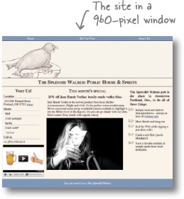
Sure, the fixed-grid layout for The Splendid Walrus looks fine at 960 pixels wide.
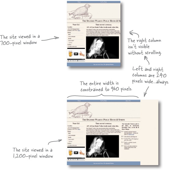
But in a narrower window, look what happens. The column widths stay the same, which means content gets cut off and the user has to scroll horizontally. Ick.
In a wider window, the entire layout is still only 960 pixels wide, leaving a blank gap of wasted space at the right side of the screen. Hmmm.
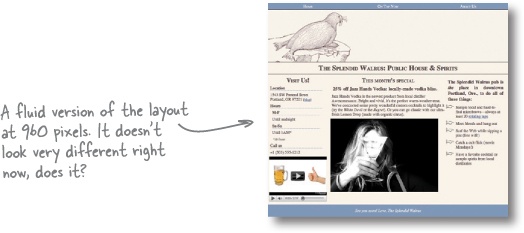
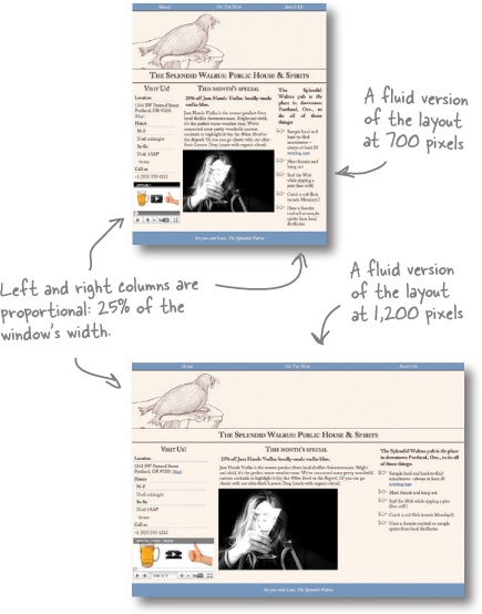
Fluid-grid layouts use proportional units (percentages) instead of pixels for widths. We can stay true to the designer’s vision of having the left and right columns span one-quarter of the page width by defining their widths as 25%, instead of 240 pixels.
In different window widths, the content flows, like water, to fill the available spaces in the layout. The left and right columns always take up 25% of the window, and content is not clipped in narrower windows, nor is there any empty space in wider windows.
There are a number of things we’ll need to do to address the problems Jill found and move toward a responsive design.
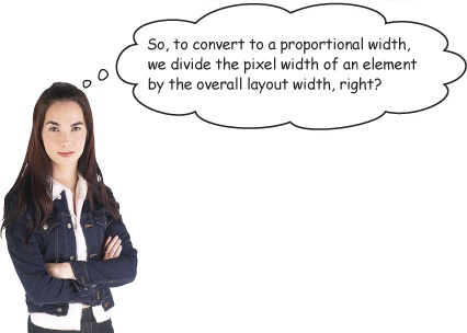
To convert a pixel-based layout to a proportional, fluid one, use this formula:
Let’s take a look at what this means, using the Splendid Walrus site’s desktop layout.
We start with a context on which to base our proportions. In this case, our reference design is 960 pixels wide. We want our resulting, fluid layout to have the same proportions as the current design does. So we’ll base our calculations on that 960-pixel baseline.
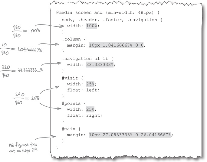
The navigation, header, and footer all span the full width of the page. That makes the fluid formula very easy to apply indeed!
The left and right columns are both supposed to be 240 pixels wide, relative to the 960-pixel containing context. To get a proportional measurement, use the fluid formula again:
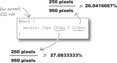
The main, center column is a bit different. It doesn’t float. Instead, margins are used to position the element. But that’s just fine. We can still use the fluid formula to convert the pixel-based margin sizes to percentages:
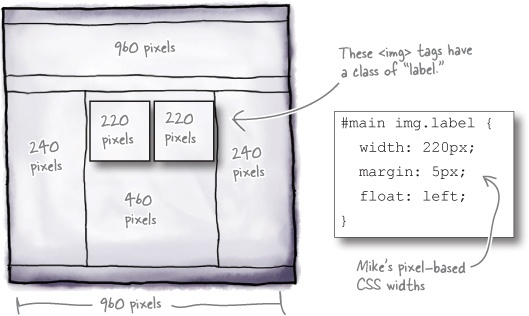
Mike has a new monthly special that he wants to post on the Splendid Walrus site. Instead of text and a single image in the main column, as it is now, he wants to display the beer labels of two very special, limited-edition stouts—floated next to each other. In our pixel-based reference design, this looks like:
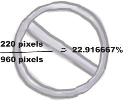
It’s tempting to think that the formula for converting these image widths to be fluid would be:
Does this formula look right to you?
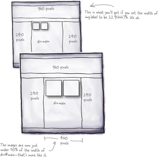
The context changed!
If we set the images to span 22.9166667%, they will span 22.916667% all right—22.916667% of their containing element.
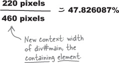
The containing element of these images isn’t body (100% width, or 960 pixels in our reference design), it’s div#main, which has a width of about 460 pixels (47.91667% of 960 pixels in proportional parlance). So we have just told the images to span a little less than 23% of 460 pixels—too small!
Instead, we set the context in our formula to be the reference width of the containing element, which in this case is 460 pixels.
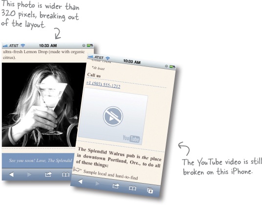
Setting image widths as percentages? Turns out, this is on the right track to fixing one of our other problems with the mobile layout. Remember that photo that is too big and messes up the page width? We can use a variant of what we’re doing here to fix that!
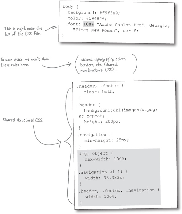
There’s a lot of power in this little gem of CSS:
Fluid images and media, like fluid grids, scale proportionally within the layout.
With this quick addition, we help to prevent any image or embedded media object from being wider than its containing element. Because they are limited to 100% width—100% of the width of their containing element—images and media obey their parents and don’t try to break outside of the boundaries. Nice!
Most great things don’t come without a bit of sacrifice. To use the fluid technique on images and media, we have to forego our old friends: the width and height attributes.
The CSS rule above will override a width attribute but will not affect a height attribute. That means that, if we use height and width attributes, we could end up with an image that scales its width but not its height. End result: a sad-looking squished image in the wrong aspect ratio.
OK, there are some workarounds for this, and removing these attributes is not awesome. But we’re going to jettison the height and width attributes for now.
Watch it!
Fluid images are not a get-out-of-jail-free technique.
Just because an image scales down on a narrower screen doesn’t mean that it isn’t still, at heart, a large image. An 800 KB JPEG is still an 800 KB JPEG, even if it’s crammed down into a 120-pixel-wide column.
In Chapter 2, we’ll talk about techniques to deliver different images to different devices and browsers, saving on otherwise wasted bandwidth and processor power (required to do the actual scaling).
Still, it’s a powerful technique, and one definitely worth having in your arsenal.
We’re making progress toward a responsive design that adapts to more devices. But we have a few things left to track down:
There are just a few mobile-specific CSS rules we need to convert to be fluid.
Let’s take care of a few remaining details to make our updated version of the Splendid Walrus site totally responsive.
So far, our layout is adaptive, but the fonts are stodgy and rigid. Just as percentages are the fluid ying to pixels’ fixed-width yang, ems are proportional font-size units. Mike used ems in his original CSS, so we’ll just add the following rule to the <body> element to be extra thorough:
body {
  background: #f9f3e9;
  color: #594846;
  font: 100% "Adobe Caslon Pro",
  "Georgia", "Times New Roman", serif;
}
This baseline font-size reset is the CSS equivalent of dotting our i’s and crossing our t’s: it’s setting an explicit reference against which the other font sizes in the CSS are defined. Not a big deal; just keeping things tidy!
Font Sizes Up Close
With this edit to the CSS rule for the <body> element, we’re setting the baseline font size for the page to be 100%. But what does 100% mean? Here’s a quick-and-dirty (and approximate) rule of thumb:
1em = 100% ≈ 12pt ≈ 16px
But recall that we aim to adapt our content to the user’s environment. If a user has changed the browser’s font size, 100% is going to represent a different absolute size.
Also keep in mind that fonts on mobile devices are a complex thing, and that in some cases, 1em might equate to a (significantly) different point or pixel size.
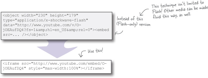
Lots of mobile devices don’t support Adobe Flash. The markup for the embedded YouTube is out of date: YouTube now provides an iframe-based embedding snippet that will work just fine on an iPhone (and other modern devices). We need to edit the index.html file and replace the current embed code.
YouTube’s newer embed code determines the appropriate video format to use depending on the browser. It can supply HTML5 video instead of Flash for devices—like Mike’s iPhone—that support it. We simply grabbed this newer snippet from the “embed” section of this video’s YouTube page.
Just like fluid image resizing doesn’t actually reduce the file size of images, neither does fluid media change the size of the actual media. It’s up to you to determine whether using video (or other multimedia) on mobile devices is worth the file size and processor oomph required for playback.
Get Head First Mobile Web now with the O’Reilly learning platform.
O’Reilly members experience books, live events, courses curated by job role, and more from O’Reilly and nearly 200 top publishers.


