Chapter 1. Visualizing Information: First Impressions
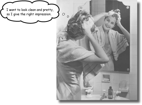
Can’t tell your facts from your figures?
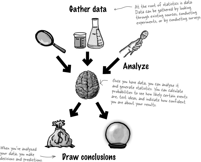
Statistics help you make sense of confusing sets of data. They make the complex simple. And when you’ve found out what’s really going on, you need a way of visualizing it and telling everyone else. So if you want to pick the best chart for the job, grab your coat, pack your best slide rule, and join us on a ride to Statsville.
Statistics are everywhere
Everywhere you look you can find statistics, whether you’re browsing the Internet, playing sports, or looking through the top scores of your favorite video game. But what actually is a statistic?
Statistics are numbers that summarize raw facts and figures in some meaningful way. They present key ideas that may not be immediately apparent by just looking at the raw data, and by data, we mean facts or figures from which we can draw conclusions. As an example, you don’t have to wade through lots of football scores when all you want to know is the league position of your favorite team. You need a statistic to quickly give you the information you need.
The study of statistics covers where statistics come from, how to calculate them, and how you can use them effectively.
But why learn statistics?
Understanding what’s really going on with statistics empowers you. If you really get statistics, you’ll be able to make objective decisions, make accurate predictions that seem inspired, and convey the message you want in the most effective way possible.
Statistics can be a convenient way of summarizing key truths about data, but there’s a dark side too.
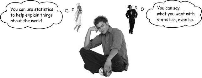
Statistics are based on facts, but even so, they can sometimes be misleading. They can be used to tell the truth—or to lie. The problem is how do you know when you’re being told the truth, and when you’re being told lies?
Having a good understanding of statistics puts you in a strong position. You’re much better equipped to tell when statistics are inaccurate or misleading. In other words, studying statistics is a good way of making sure you don’t get fooled.
As an example, take a look at the profits made by a company in the latter half of last year.
Month | Jul | Aug | Sep | Oct | Nov | Dec |
Profit (millions) | 2.0 | 2.1 | 2.2 | 2.1 | 2.3 | 2.4 |

How can there be two interpretations of the same set of data? Let’s take a closer look.
A tale of two charts
So how can we explore these two different interpretations of the same data? What we need is some way of visualizing them. If you need to visualize information, there’s no better way than using a chart or graph. They can be a quick way of summarizing raw information and can help you get an impression of what’s going on at a glance. But you need to be careful because even the simplest chart can be used to subtly mislead and misdirect you.
Here are two time graphs showing a companies profits for six months. They’re both based on the same information, so why do they look so different? They give drastically different versions of the same information.
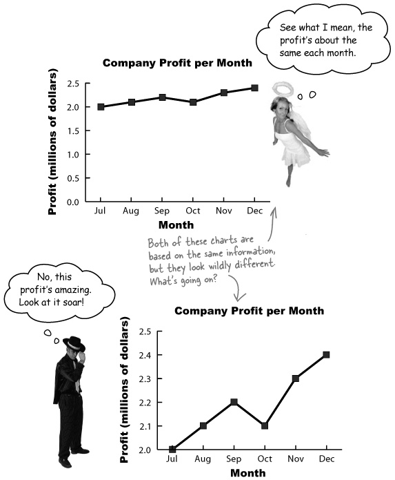
Take a look at the two charts. What would you say are the key differences? How do they give such different first impressions of the data?
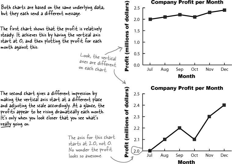
Software can’t think for you.
Chart software can save you a lot of time and produce effective charts, but you still need to understand what’s going on.
At the end of the day, it’s your data, and it’s up to you to choose the right chart for the job and make sure your data is presented in the most effective way possible and conveys the message you want.
Software can translate data into charts, but it’s up to you to make sure the chart is right.
Manic Mango needs some charts
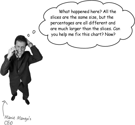
One company that needs some charting expertise is Manic Mango, an innovative games company that is taking the world by storm. The CEO has been invited to deliver a keynote presentation at the next worldwide games expo. He needs some quick, slick ways of presenting data, and he’s asked you to come up with the goods. There’s a lot riding on this. If the keynote goes well, Manic Mango will get extra sponsorship revenue, and you’re bound to get a hefty bonus for your efforts.

The first thing the CEO wants to be able to do is compare the percentage of satisfied players for each game genre. He’s started off by plugging the data he has through some charting software, and here are the results:
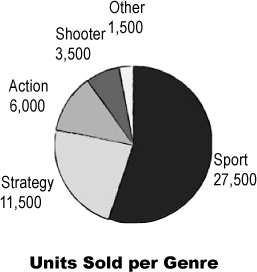
The humble pie chart
Pie charts work by splitting your data into distinct groups or categories. The chart consists of a circle split into wedge-shaped slices, and each slice represents a group. The size of each slice is proportional to how many are in each group compared with the others. The larger the slice, the greater the relative popularity of that group. The number in a particular group is called the frequency.
Pie charts divide your entire data set into distinct groups. This means that if you add together the frequency of each slice, you should get 100%.
Let’s take a closer look at our pie chart showing the number of units sold per genre:
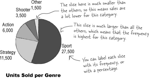
Genre | Units sold |
Sports | 27,500 |
Strategy | 11,500 |
Action | 6,000 |
Shooter | 3,500 |
Other | 1,500 |
So when are pie charts useful?
We’ve seen that the size of each slice represents the relative frequency of each group of data you’re showingg. Because of this, pie charts can be useful if you want to compare basic proportions. It’s usually easy to tell at a glance which groups have a high frequency compared with the others. Pie charts are less useful if all the slices have similar sizes, as it’s difficult to pick up on subtle differences between the slice sizes.
So what about the pie chart that the Manic Mango CEO has created?
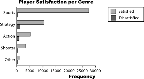
Chart failure
Creating a pie chart worked out so great for displaying the units sold per genre that the CEO’s decided to create another to chart consumer satisfaction with Manic Mango’s game. The CEO needs a chart that will allow him to compare the percentage of satisfied players for each game genre. He’s run the data through the charting software again, but this time he’s not as impressed.
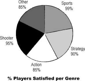
Pie charts are used to compare the proportions of different groups or categories, but in this case there’s little variation between each group.
It’s difficult to take in at a glance which category has the highest level of player satisfaction.
It’s also generally confusing to label pie charts with percentages that don’t relate to the overall proportion of the slice. As an example, the Sports slice is labelled 99%, but it only fills about 20% of the chart. Another problem is that we don’t know whether there’s an equal number of responses for each genre, so we don’t know whether it’s fair to compare genre satisfaction in this way.
Pie charts show proportions
Bar charts can allow for more accuracy
A better way of showing this kind of data is with a bar chart. Just like pie charts, bar charts allow you to compare relative sizes, but the advantage of using a bar chart is that they allow for a greater degree of precision. They’re ideal in situations where categories are roughly the same size, as you can tell with far greater precision which category has the highest frequency. It makes it easier for you to see small differences.
On a bar chart, each bar represents a particular category, and the length of the bar indicates the value. The longer the bar, the greater the value. All the bars have the same width, which makes it easier to compare them.
Bar charts can be drawn either vertically or horizontally.
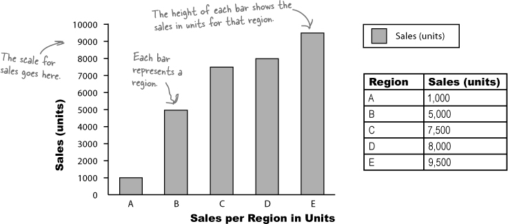
Vertical bar charts
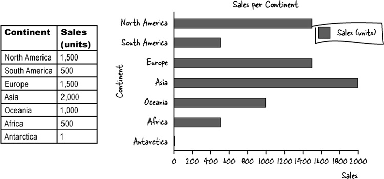
Vertical bar charts show categories on the horizontal axis, and either frequency or percentage on the vertical axis. The height of each bar indicates the value of its category. Here’s an example showing the sales figures in units for five regions, A, B, C, D, and E:
Horizontal bar charts
Horizontal bar charts are just like vertical bar charts except that the axes are flipped round. With horizontal bar charts, you show the categories on the vertical axis and the frequency or percentage on the horizontal axis.
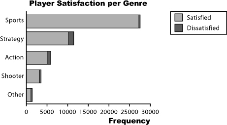
Here’s a horizontal bar chart for the CEO’s genre data from Chart failure. As you can see, it’s much easier to quickly gauge which category has the highest value, and which the lowest.
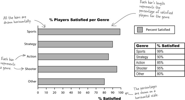
Vertical bar charts tend to be more common, but horizontal bar charts are useful if the names of your categories are long. They give you lots of space for showing the name of each category without having to turn the bar labels sideways.
It depends on what message you want to convey.
Let’s take a closer look.
It’s a matter of scale
Understanding scale allows you to create powerful bar charts that pick out the key facts you want to draw attention to. But be careful—scale can also conceal vital facts about your data. Let’s see how.
Using percentage scales
Let’s start by taking a deeper look at the bar chart showing player satisfaction per game genre. The horizontal axis shows player satisfaction as a percentage, the number of people out of every hundred who are satisfied with this genre.
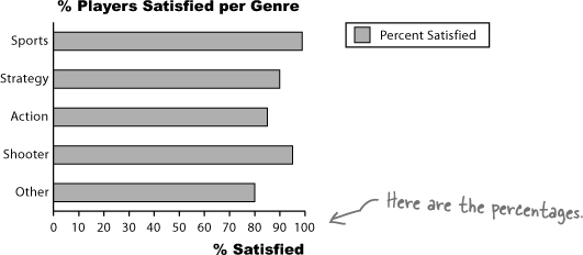
The purpose of this chart is to allow us to compare different percentages and also read off percentages from the chart.
There’s just one problem—it doesn’t tell us how many players there are for each genre. This may not sound important, but it means that we have no idea whether this reflects the views of all players, some of them, or even just a handful. In other words, we don’t know how representative this is of players as a whole. The golden rule for designing charts that show percentages is to try and indicate the frequencies, either on the chart or just next to it.
Watch it!
Be very wary if you’re given percentages with no frequencies, or a frequency with no percentage.
Sometimes this is a tactic used to hide key facts about the underlying data, as just based on a chart, you have no way of telling how representative it is of the data. You may find that a large percentage of people prefer one particular game genre, but that only 10 people were questioned. Alternatively, you might find that 10,000 players like sports games most, but by itself, you can’t tell whether this is a high or low proportion of all game players.
Using frequency scales
You can show frequencies on your scale instead of percentages. This makes it easy for people to see exactly what the frequencies are and compare values.
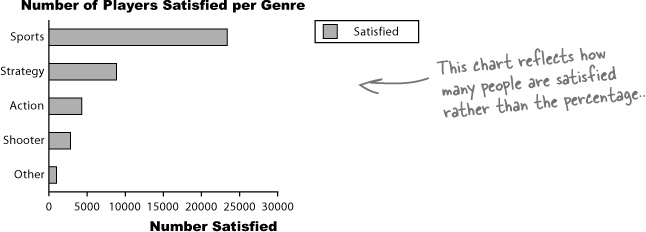
Normally your scale should start at 0, but watch out! Not every chart does this, and as you saw earlier in Sharpen your pencil Solution, using a scale that doesn’t start at 0 can give a different first impression of your data. This is something to watch out for on other people’s charts, as it’s very easy to miss and can give you the wrong impression of the data.
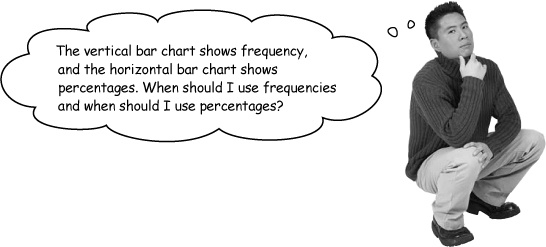
There are ways of drawing bar charts that give you more flexibility.
The problem with these bar charts is that they show either the number of satisfied players or the percentage, and they only show satisfied players.
Let’s take a look at how we can get around this problem.
Dealing with multiple sets of data
With bar charts, it’s actually really easy to show more than one set of data on the same chart. As an example, we can show both the percentage of satisfied players and the percentage of dissatisfied players on the same chart.
The split-category bar chart
One way of tackling this is to use one bar for the frequency of satisfied players and another for those dissatisfied, for each genre. This sort of chart is useful if you want to compare frequencies, but it’s difficult to see proportions and percentages.
The segmented bar chart
If you want to show frequencies and percentages, you can try using a segmented bar chart. For this, you use one bar for each category, but you split the bar proportionally. The overall length of the bar reflects the total frequency.
This sort of chart allows you to quickly see the total frequency of each category—in this case, the total number of players for each genre—and the frequency of player satisfaction. You can see proportions at a glance, too.
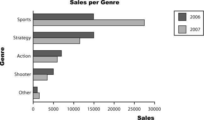
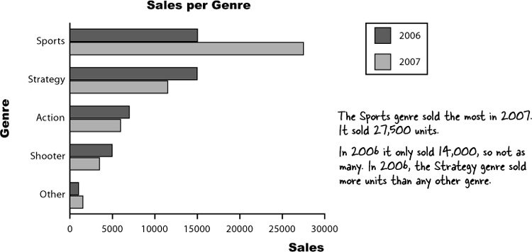
Here’s another chart generated by the software. Which genre sold the most in 2007? How did this genre fare in 2006?
Your bar charts rock
The CEO is thrilled with the bar charts you’ve produced, but there’s more data he needs to present at the keynote.
Categories vs. numbers
When you’re working with charts, one of the key things you need to figure out is what sort of data you’re dealing with. Once you’ve figured that out, you’ll find it easier to make key decisions about what chart you need to best represent your data.
Categorical or qualitative data
Most of the data we’ve seen so far is categorical. The data is split into categories that describe qualities or characteristics. For this reason, it’s also called qualitative data. An example of qualitative data is game genre; each genre forms a separate category.
The key thing to remember with qualitative data is that the data values can’t be interpreted as numbers.
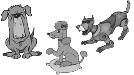
breed of dog
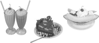
type of dessert
Numerical or quantitative data
Numerical data, on the other hand, deals with numbers. It’s data where the values have meaning as numbers, and that involves measurements or counts. Numerical data is also called quantitative data because it describes quantities.
weight
length
time
So what impact does this have on the chart for Manic Mango?
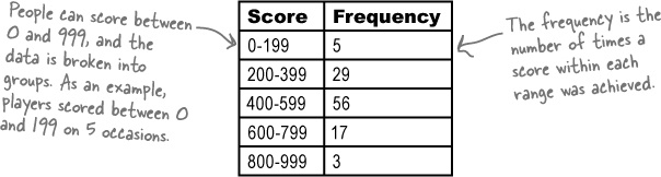
Dealing with grouped data
The latest set of data from the Manic Mango CEO is numeric and, what’s more, the scores are grouped into intervals. So what’s the best way of charting data like this?
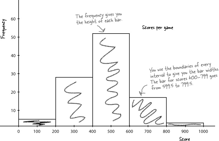
Score | Frequency |
0-199 | 5 |
200-399 | 29 |
400-599 | 56 |
600-799 | 17 |
800-999 | 3 |
We could, but there’s a better way.
Rather than treat each range of scores as a separate category, we can take advantage of the data being numeric, and present the data using a continuous numeric scale instead. This means that instead of using bars to represent a single item, we can use each bar to represent a range of scores.
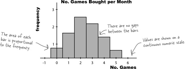
To do this, we can create a histogram.
Histograms are like bar charts but with two key differences. The first is that the area of each bar is proportional to the frequency, and the second is that there are no gaps between the bars on the chart. Here’s an example of a histogram showing the average number of games bought per month by households in Statsville:
To make a histogram, start by finding bar widths
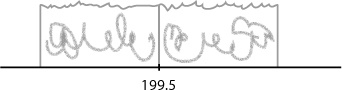
The first step to creating a histogram is to look at each of the intervals and work out how wide each of them needs to be, and what range of values each one needs to cover. While doing this, we need to make sure that there will be no gaps between the bars on the histogram.
Let’s start with the first two intervals, 0–199 and 200–399. At face value, the first interval finishes at score 199, and the second starts at score 200. The problem with plotting it like this, however, is that it would leave a gap between score 199 and 200, like this:
Score | Frequency |
0–199 | 5 |
200–399 | 29 |
400–599 | 56 |
600–799 | 17 |
800–999 | 3 |
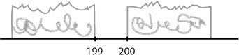
Histograms shouldn’t have gaps between the bars, so to get around this, we extend their ranges slightly. Instead of one interval ending at score 199 and the next starting at score 200, we make the two intervals meet at 199.5, like this:
Doing this forms a single boundary and makes sure that there are no gaps between the bars on the histogram. If we complete this for the rest of the intervals, we get the following boundaries:
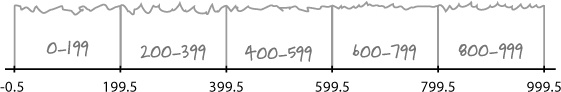
Each interval covers 200 scores, and the width of each interval is 200. Each interval has the same width.
As all the intervals have the same width, we create the histogram by drawing vertical bars for each range of scores, using the boundaries to form the start and end point of each bar. The height of each bar is equal to the frequency.
Manic Mango needs another chart
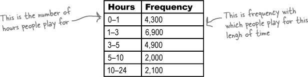
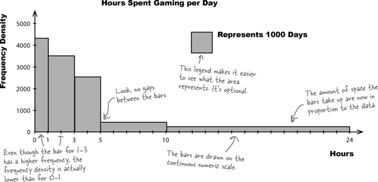
The CEO is very pleased with the histogram you’ve created for him—so much so, that he wants you to create another histogram for him. This time, he wants a chart showing for how long Manic Mango players tend to play online games over a 24-hour period. Here’s the data:
He’s right, the interval widths aren’t all equal.
If you take a look at the intervals, you can see that they’re different widths. As an example, the 10–24 range covers far more hours than the 0–1 range.
If we had access to the raw data, we could look at how we could construct equal width intervals, but unfortunately this is all the data we have. We need a way of drawing a histogram that makes allowances for the data having different widths.
Brain Power
For histograms, the frequency is proportional to the area of each bar. How would you use this to create a histogram for this data? What do you need to be aware of?
Here’s a sketch of the chart, using frequency on the vertical scale and drawing bar widths proportional to their interval size. Do you see any problems?
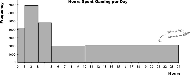
A histogram’s bar area must be proportional to frequency
The problem with this chart is that making the width of each bar reflect the width of each interval has made some of the bars look disproportionately large. Just glancing at the chart, you might be left with a misleading impression about how many hours per day people really play games for. As an example, the bar that takes up the largest area is the bar showing game play of 10–24 hours, even though most people don’t play for this long.
As this is a histogram, we need to make the bar area proportional to the frequency it represents. As the bars have unequal widths, what should we do to the bar height?
Make the area of histogram bars proportional to frequency
Up until now, we’ve been able to use the height of each bar to represent the frequency of a particular number or category.
This time around, we’re dealing with grouped numeric data where the interval widths are unequal. We can make the width of each bar reflect the width of each interval, but the trouble is that having bars of different widths affects the overall area of each bar.
We need to make sure the area of each bar is proportional to its frequency. This means that if we adjust bar width, we also need to adjust bar height. That way, we can change the widths of the bars so that they reflect the width of the group, but we keep the size of each bar in line with its frequency.
Let’s go through how to create this new histogram.
For histograms, the frequency is represented by bar area
Step 1: Find the bar widths
We find how wide our bars need to be by looking at the range of values they cover. In other words, we need to figure out how many full hours are covered by each group.
Let’s take the 1–3 group. This group covers 2 full hours, 1–2 and 2–3. This means that the width of the bar needs to be 2, with boundaries of 1 and 3.
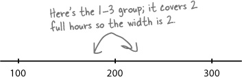
If we calculate the rest of the widths, we get:
Hours | Frequency | Width |
0–1 | 4,300 | 1 |
1–3 | 6,900 | 2 |
3–5 | 4,900 | 2 |
5–10 | 2,000 | 5 |
10–24 | 2,100 | 14 |
Now that we’ve figured out the bar widths, we can move onto working out the heights.
Step 2: Find the bar heights
Now that we have the widths of all the groups, we can use these to find the heights the bars need to be. Remember, we need to adjust the bar heights so that the overall area of each bar is proportional to the group’s frequency.
First of all, let’s take the area of each bar. We’ve said that frequency and area are equivalent. As we already know what the frequency of each group is, we know what the areas should be too:
Area of bar = Frequency of group
Now each bar is basically just a rectangle, which means that the area of each bar is equal to the width multiplied by the height. As the area gives us the frequency, this means:
Frequency = Width of bar × Height of bar
We found the widths of the bars in the last step, which means that we can use these to find what height each bar should be. In other words,
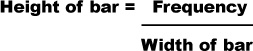
The height of the bar is used to measure how concentrated the frequency is for a particular group. It’s a way of measuring how densely packed the frequency is, a way of saying how thick or thin on the ground the numbers are. The height of the bar is called the frequency density.
Step 3: Draw your chart—a histogram
Now that we’ve worked out the widths and heights of each bar, we can draw the histogram. We draw it just like before, except that this time, we use frequency density for the vertical axis and not frequency.
Here’s our revised histogram.
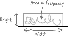
Frequency density refers to the concentration of values in data. It’s related to frequency, but it’s not the same thing. Here’s an analogy to demonstrate the relationship between the two.
Imagine you have a quantity of juice that you’ve poured into a glass like this:
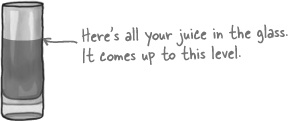
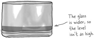
What if you then pour the same quantity of juice into a different sized glass, say one that’s wider? What happens to the level of the juice? This time the glass is wider, so the level the juice comes up to is lower.
The level of the juice varies in line with the width of the glass; the wider the glass, the lower the level. The converse is true too; the narrower the glass, the higher the level of juice.
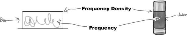
So what does juice have to do with frequency density?
Juice = Frequency
Imagine that instead of pouring juice into glasses, you’re “pouring” frequency into the bars on your chart. Just as you know the width of the glass, you know what width your bars are. And just like the space the juice occupies in the glass (width x height) tells you the quantity of juice in the glass, the area of the bar on the graph is equivalent to its frequency.
The frequency density is then equal to the height of the bar. Keeping with our analogy, it’s equivalent to the level your juice comes to in each glass. Just as a wider glass means the juice comes to a lower level, a wider bar means a lower frequency density.
Frequency density relates to how concentrated the frequencies are for grouped data. It’s calculated using
A histogram is a chart that specializes in grouped data. It looks like a bar chart, but the height of each bar equates to frequency density rather than frequency.
When drawing histograms, the width of each bar is proportional to the width of its group. The bars are shown on a continuous numeric scale.
In a histogram, the frequency of a group is given by the area of its bar.
A histogram has no gaps between its bars.
Here’s a histogram representing the number of levels completed in each game of Cows Gone Wild. How many games have been played in total? Assume each level is a whole number.
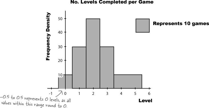
Here’s a histogram representing the number of levels completed in each game of Cows Gone Wild. How many games have been played in total? Assume each level is a whole number.
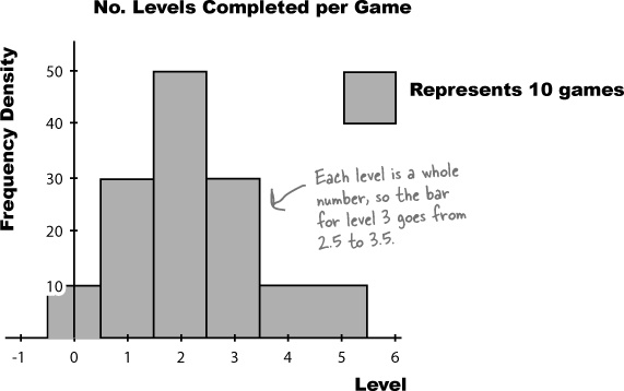
We need to find the total number of games played, which means we need to find the total frequency.
The total frequency is equal to the area of each bar added together. In other words, we multiply the width of each bar by its frequency density to get the frequency, and then add the whole lot up together.
Level | Width | Frequency Density | Frequency |
0 | 1 | 10 | 1x10 = 10 |
1 | 1 | 30 | 1x30 = 30 |
2 | 1 | 50 | 1x50 = 50 |
3 | 1 | 30 | 1x30 = 30 |
4–5 | 2 | 10 | 2x10 = 20 |
Total Frequency | = 10 + 30 + 50 + 30 + 20 |
= 140 |
Histograms can’t do everything
While histograms are an excellent way to display grouped numeric data, there are still some kinds of this data they’re not ideally suited for presenting—like running totals...
Let’s see if we can help the CEO out. Here’s the histogram we had before.
It’s tricky to see at a glance what the running totals are in this chart. In order to find the frequency of players playing for up to 5 hours, we need to add different frequencies together. We need another sort of chart...but what?
Introducing cumulative frequency
The CEO needs some sort of chart that will show him the total frequency below a particular value: the cumulative frequency. By cumulative frequency, we basically mean a running total.
What we need to come up with is some sort of graph that shows hours on the horizontal axis and cumulative frequency on the vertical axis. That way, the CEO will be able to take a value and read off the corresponding frequency up to that point. He’ll be able to find out how many people play for up to 5 hours, 6 hours, or whatever other number of hours he’s most interested in at the time.
Before we can draw the chart, we need to know what exactly we need to plot on the chart. We need to calculate cumulative frequencies for each of the intervals that we have, and also work out the upper limit of each interval.
Let’s start by looking at the data.
Vital Statistics: Cumulative Frequency
The total frequency up to certain value. It’s basically a running total of the frequencies.
Hours | Frequency |
0–1 | 4,300 |
1–3 | 6,900 |
3–5 | 4,900 |
5–10 | 2,000 |
10–24 | 2,100 |
So what are the cumulative frequencies?
First off, let’s suppose the CEO needs to plot the cumulative frequency, or total frequency, of up to 1 hour. If we look at the data, we know that the frequency of the 0–1 group is 4300, and we can see that is the upper limit of the group. This means that the cumulative frequency of hours up to 1 is 4300.
Next, let’s look at the total frequency up to 3. We know what the frequencies are for the 0–1 and 1–3 groups, and 3 is again the upper limit. To find the total frequency of hours up to 3, we add together the frequency of the 0–1 group and the 1–3 group.
Can you see a pattern? If we take the upper limit of each of the groups of hours, we can find the total frequency of hours up to that value by adding together the frequencies. Applying this to all the groups gives us
Hours | Frequency | Upper limit | Cumulative frequency |
0 | 0 | 0 | 0 |
0–1 | 4,300 | 1 | 4,300 |
1–3 | 6,900 | 3 | 4,300+6,900 = 11,200 |
3–5 | 4,900 | 5 | 4,300+6,900+4,900 = 16,100 |
5–10 | 2,000 | 10 | 4,300+6,900+4,900+2,000 = 18,100 |
10–24 | 2,100 | 24 | 4,300+6,900+4,900+2,000+2,100 = 20,200 |
Drawing the cumulative frequency graph
Now that we have the upper limits and cumulative frequencies, we can plot them on a chart. Draw two axes, with the vertical one for the cumulative frequency and the horizontal one for the hours. Once you’ve done that, plot each of the upper limits against its cumulative frequency, and then join the points together with a line like this:
Watch it!
Cumulative frequencies can never decrease.
If your cumulative frequency decreases at any point, check your calculations.
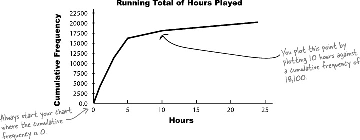
The CEO wants you to find the number of instances of people playing online for less than 4 hours. See if you can estimate this using the cumulative frequency diagram.
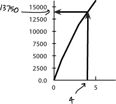
To do this, we find 4 on the horizontal axis, find where this value meets the line of the graph, and read off the corresponding cumulative frequency on the vertical axis.
This gives us an answer of approximately 13,750. In other words, there are approximately 13,750 instances of people playing online for under 4 hours.
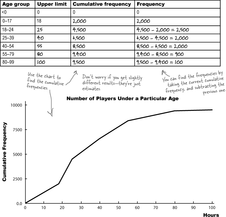
During the Manic Mango keynote, the CEO wants to explain how he wants to target particular age groups. He has a cumulative frequency graph showing the cumulative frequency of the ages, but he needs the frequencies too, and the dog ate the piece of paper they were written on. See if you can use the cumulative frequency graph to estimate what the frequencies of each group are.
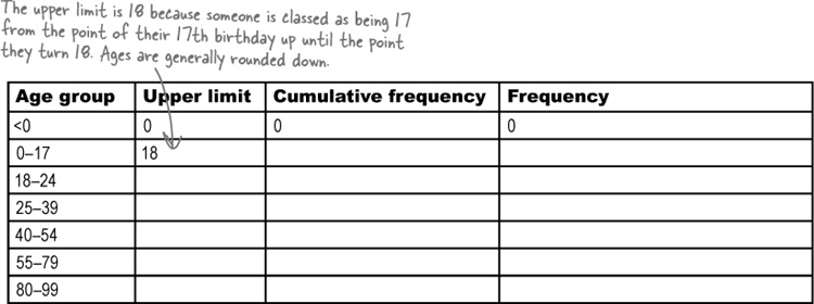
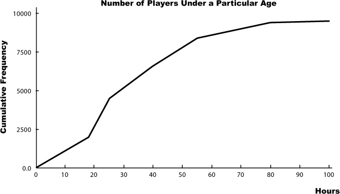
During the Manic Mango keynote, the CEO wants to explain how he wants to target particular age groups. He has a cumulative frequency graph showing the cumulative frequency of the ages, but he needs the frequencies too, and the dog ate the piece of paper they were written on. See if you can use the cumulative frequency graph to piece together what the frequencies of each group are.
Choosing the right chart
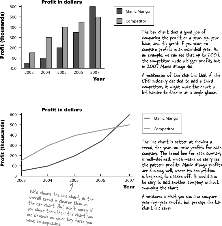
The CEO is really happy with your work on cumulative frequency graphs, and your bonus is nearly in the bag. He’s nearly finished preparing for the keynote, but there’s just one more thing he needs: a chart showing Manic Mango profits compared with the profits of their main rivals. Which chart should he use?
Here are two possible charts that the CEO could use in his keynote. Your task is to annotate each one, and say what you think the strengths and weaknesses are of each one relative to the other. Which would you pick?
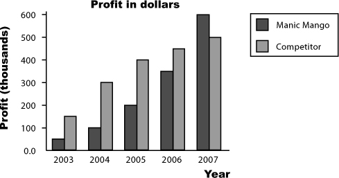
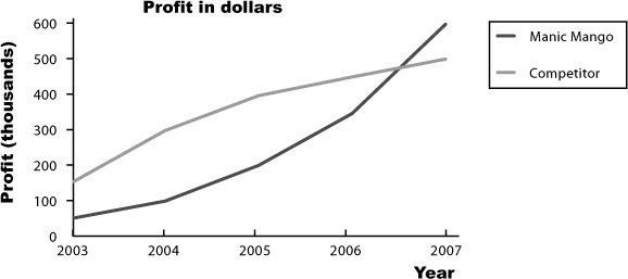
Here are two possible charts that the CEO could use in his keynote. Your task is to annotate each one, and say what you think the strengths and weaknesses are of each one relative to the other. Which would you pick?
Line charts are good at showing trends in your data. For each set of data, you plot your points and then join them together with lines. You can easily show multiple sets of data on the same chart without it getting too cluttered. Just make sure it’s clear which line is which.
As with other sorts of charts, you have a choice of showing frequency or percentages on the vertical axis. The scale you use all depends on what key facts you want to draw out.
Line charts are often used to show time measurements. Time always goes on the horizontal axis, and frequency on the vertical. You can read off the frequency for any period of time by choosing the time value on the horizontal axis, and reading off the corresponding frequency for that point on the line.
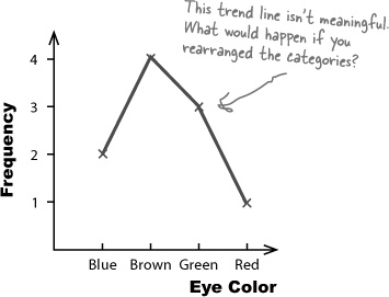
Line charts should be used for numerical data only, and not categorical. This is because it makes sense to compare different categories, but not to draw a trend line. Only use a line chart if you’re comparing categories over some numerical unit such as time, and in that case you’d use a separate line for each category.
Manic Mango conquered the games market!
You’ve helped produce some killer charts for Manic Mango, and thanks to you, the keynote was a huge success. Manic Mango has gained tons of extra publicity for their games, and money from sponsorship and advertising is rolling in. The only thing left for you to do is think about all the things you could do and the places you could go with your well-earned bonus.
You’ve had your first taste of how statistics can help you and what you can achieve by understanding what’s really going on. Keep reading and we’ll show you more things you can do with statistics, and really start to flex those statistics muscles.


Get Head First Statistics now with the O’Reilly learning platform.
O’Reilly members experience books, live events, courses curated by job role, and more from O’Reilly and nearly 200 top publishers.

