Chapter 4. The Backend
The thesis of this chapter—and really that of the entire book—is that to think about responsive web design as a frontend-only skill set is to limit the scope of what you can do and what tools are available to you. We are web developers, and as such we should be able to take advantage of the entire web stack in everything that we do. This chapter outlines how we can start thinking responsively from the backend.
The Web Stack
Before we begin, I should define what the web stack is, because it is in fact a collection of several stacks. And, as we are talking about the Web, let’s start with the network stack.
The Network Stack
The network stack is a collection of protocols that outline how networked systems communicate. It is made up of the following layers:
- Data link layer
This usually corresponds the standard way that hardware connects to the network. For our purposes, this is either via Ethernet, specifically the IEEE 802.3 standard for physically interconnected devices (http://bit.ly/ethernet-standards), or via WiFi, specifically the IEEE 802.11 standard for wirelessly interconnected devices (http://bit.ly/1p8UW6P).
- Network layer
This layer corresponds to the standards that define communication and identification of nodes on a network, specifically the protocol IP, or Internet Protocol. It is through the Internet Protocol that nodes are identified via IP addresses and data is sent via packets between these hosts. The standard for Internet Protocol is maintained in IETF RFC 794, which you can read at http://bit.ly/11j3ouQ.
- Transport layer
This usually corresponds to TCP, or Transmission Control Protocol, defined in IETF RFC 793 (http://www.ietf.org/rfc/rfc793.txt). TCP is the protocol used to establish connections between hosts. Whereas IP handles transmitting the data as packets, TCP divides the packets into segments, attaches headers to each segment to identify the destination IP address of the segment, and re-assembles and verifies the segments upon delivery.
- Application layer
This top layer corresponds to HTTP, or Hyper Text Transport Protocol. The standard for HTTP is IETF RFC 2616, which you can see at http://tools.ietf.org/html/rfc2616. HTTP is the language of the Web, made up of verbs that make up the request/response structure.
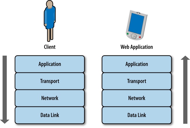
Together this stack represents the steps that are traversed when sending and receiving data over the Internet, as illustrated in Figure 4-1.
The Application Layer
Knowledge of all of the stacks is important, but for our purposes, as web developers, the primary layer with which we interface and have programmatic control is in the application layer, specifically HTTP.
Chapter 2 shows that an HTTP transaction happens within a TCP connection. It consists of a request from a client and a response from a server, but let’s take a deeper dive into what constitutes a request and a response.
The HTTP Request
An HTTP request is made up of two parts: a request line, and a set of request headers. The request line specifies the HTTP method, or verb, used in the request as well as the URI of the requested resource; or more plainly, it specifies what action I am looking to perform (get a file, send a file, get information about a file) and where I am looking to perform this action (the location of the file or resource). The following are some of the methods that are supported in HTTP 1.1:
- OPTIONS
Queries the HTTP request methods that a server will support.
- GET
Requests a remote resource. This becomes a conditional GET when you specify If-Modified-Since, If-Unmodified-Since, If-Match, If-None-Match, or If-Range in the HTTP header section, at which point the server will only return the resource if it has satisfied those requirements. Usually, you use conditional GETs when checking whether to retrieve a new asset or use the asset currently in cache.
- HEAD
Requests only the HTTP header of a remote resource. This is used mainly to check the last modified date or to confirm that a URI is valid.
- POST
Requests that the server update or modify an existing resource.
- PUT
Requests that the server create a new resource.
- DELETE
Requests that the server remove a resource.
The request header allows the client to specify parameters that augment the request, similar to how you can pass in parameters to a function. The following are some of the more interesting request headers:
- Host
The domain name specified in the URI.
- If-Modified-Since
This instructs the server to return the asset only if it has been updated since the date specified in this request header field. If the asset has been updated the server should respond with the asset and a status of 200; if it has not, the server simply responds with a status of 304.
- User-Agent
A string that identifies characteristics of the client making the request. This is the header that we will make the most use of this chapter.
By using network tracing tools such as Charles or Fiddler, you can inspect the contents of an HTTP request. The following example shows an HTTP request:
GET /style/base.css HTTP/1.1
Host: www.tom-barker.com
User-Agent: Mozilla/5.0 (Macintosh; Intel Mac OS X 10.7; rv:27.0) Gecko/20100101 Firefox/27.0
Accept: text/css,*/*;q=0.1
Accept-Language: en-US,en;q=0.5
Accept-Encoding: gzip, deflate
Referer: http://www.tom-barker.com/blog/?p=x
Connection: keep-alive
The HTTP Response
When the server receives and processes a request, it sends a response to the client that issued the request. Just like the HTTP request, the HTTP response is made up of two parts: the status line and the header fields.
The status line lists the protocol version (HTTP 1.1), the status code, and a textual phrase that describes the status of the request.
The status codes consist of three-digit numeric values that are broken up into five distinct high-level categories of response. The first digit of the status code indicates its category. Per the W3C’s HTTP specification, which you can reference at http://bit.ly/rfc-http, the categories are the following:
- 1xx: Informational
Request received, continuing process
- 2xx: Success
The action was successfully received, understood, and accepted
- 3xx: Redirection
Further action must be taken to complete the request
- 4xx: Client Error
The request contains bad syntax or cannot be fulfilled
- 5xx: Server Error
The server failed to fulfill an apparently valid request
The header fields are much like the request headers in that they are passed name-value pairs with which the server can specify additional information about the response. Here are some of the more interesting response headers are:
- Age
Denotes the server’s estimate of the amount of time since the requested resource was created or update.
- ETag
Lists the entity tag identifier that the server assigns to a resource. This is useful for conditional matching.
- Vary
Indicates what request headers should be used to determine if a request can be served by cache. Later in the chapter, we look at sending different responses from the server based on user agent information. The Vary header is important because it allows us to specify the User-Agent request header to be part of the cache evaluation.
Here’s a sample HTTP response:
HTTP/1.1 200 OK
Date: Sat, 29 Mar 2014 19:53:24 GMT
Server: Apache
Last-Modified: Sat, 05 May 2012 22:11:12 GMT
Content-Length: 2599
Keep-Alive: timeout=10, max=100
Connection: Keep-Alive
Content-Type: text/css
Charles
There are a number of tools available for inspecting your network traffic. There are the in-browser developer tools (covered in Chapter 2), but there are also more in-depth traffic analysis tools; one of the favorites among web developers is Charles (see Figure 4-2).
Charles is an HTTP monitoring tool that you can use to watch and edit HTTP traffic over the network. Charles is also an HTTP proxy that you can use to throttle the bandwidth and latency of connections, intercept requests, spoof DNS calls, and even map local files to appear as if they are part of a remote website. Charles is available to download from http://www.charlesproxy.com/.
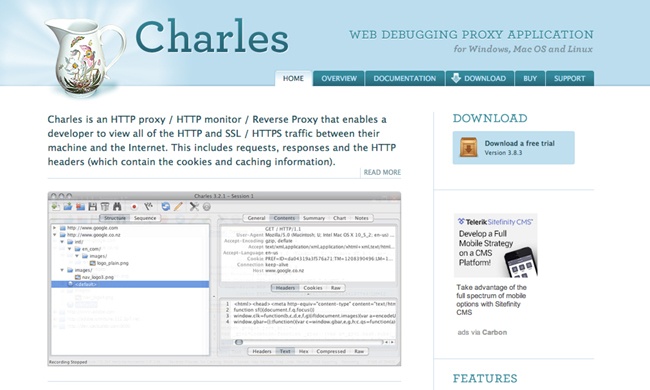
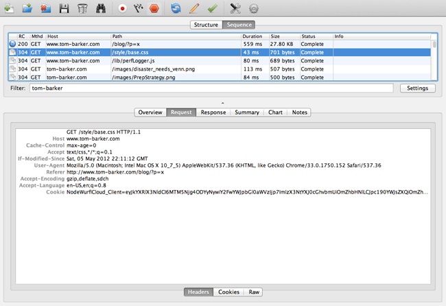
Figure 4-3 depicts the Charles interface. This particular screenshot is showing all of the transactions that were recorded in a given section, in sequence; note the fields that are exposed, including HTTP status, HTTP method, host, payload of the transaction, and duration.
Web Application Stack
So far, we’ve talked about the underlying infrastructure and networking protocols on which our web applications run. Let’s make sure we understand the software stack that our web applications run on.
Most, if not all, web applications operate in a client-server model, which is just a distributed computing methodology in which, if I were to describe it in grossly oversimplified terms, clients request data from servers. Servers process the requests and respond; oftentimes, these servers are distributed across a network for the sake of scalability.
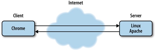
In the interest of giving concrete examples of this model, let’s assume that a browser is a client, and a web server is a server. When I say web server, I can be referring to either a piece of software such as Apache (https://httpd.apache.org/) or Microsoft’s Internet Information Server (http://www.iis.net/), or I can be referring to the actual hardware on which the software runs on.
Continuing with our example scenario, the web servers listen on certain ports—application endpoints denoted by number—for HTTP requests to come in; HTTP requests come in on port 80, and HTTPS requests come in on port 443. When the web server gets a request it routes the request to the appropriate resource.
The resource could be code that is evaluated and interpreted on the server side, as in the case of Ruby or PHP, or it could be static content such as an HTML page. Either way, the routed request is met with a response from the server that goes back to the client.
In the case of a response that has an HTML document as its body, the HTML is parsed and rendered on the client device. If there is any JavaScript on the page, that is interpreted on the client side as well.
Responding on the Server Side
Now that you understand the protocol and software stacks in the web stack, the first thing you should establish is the earliest point in the stack at which you can determine client capabilities. Right now, the norm for responsive design is to determine client capabilities on the client side after the server has sent the HTTP response and the client has received, parsed, and rendered contents of the response. Architecturally, that looks like Figure 4-5, in which the browser requests the page; the web server receives the request at port 80 and passes it to the web application, the web application processes the request and responds, the client receives the response, parses the page, renders the page, runs the code on the client device to determine capabilities, and then finally reacts appropriately based on those capabilities.
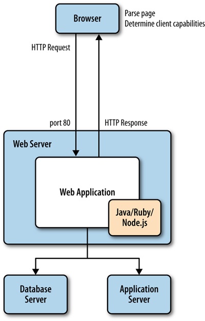
Even just describing all of that in written words feels overly and unnecessarily complicated.
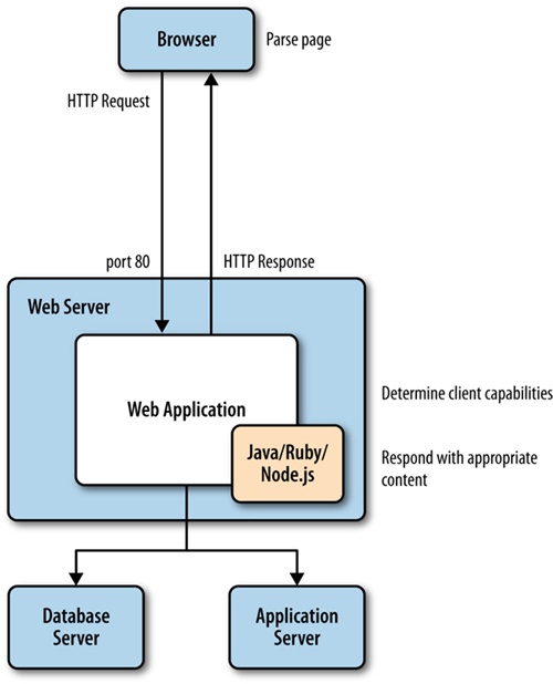
But what we can glean from the HTTP request description is that the user agent is passed to the web server and the web application, and that the user agent describes the client. We could instead push the logic to determine client capabilities to our backend, our server side. This would make it possible for us to streamline what we send to the client, sending device-specific code instead of all of the code for all of the devices (see Figure 4-6 for what that amended architecture would look like).
To understand how we determine client capabilities based on the User Agent, let’s first take a look at the User Agent.
Inspecting the User Agent
The specification for the User Agent field is defined in section 14.43 of RFC 2616, the HTTP specification, which you can read at http://bit.ly/1tDGOZ0.
The User Agent is a string that is composed of different tokens that describe the browser, browser version, and system information such as operating system and version. Some example User Agent strings are presented in Table 4-1.
User Agent string | |
Chrome 34 on a Mac |
|
Safari on an iPhone running OS 7 |
|
Safari on an iPad running OS 6 |
|
Chrome on an Android phone running Ice Cream Sandwich |
|
You can fairly easily parse the string and pull out the relevant information by using regular expressions. As an example, you could craft a function to determine an idea of the client device, and from there establish an idea of client capabilities. A simple example, using JavaScript, of a function that checks for mobile devices might look like the following:
function detectMobileDevice(ua){
    var re = new RegExp(/iPhone|iPod|iPad|Android/);
    if(re.exec(ua)){
        return true;
    }else{
        return false;
    }
}
Note that we pass the User Agent into the detectMobileDevice() function, search through the User Agent with a regular expression for instances of the strings iPhone, iPad, or Android, and return true if any of those strings are found.
This is a fairly rudimentary example that only cares about the platform or operating system of the client device. A much more robust example would check for capabilities, such as touch support, and for the maximum size that a device would support.
Both Google and Apple publish their User Agent string standards at http://bit.ly/1u0cHqv and http://bit.ly/ZXVAhT, respectively
A word of caution about the reliability of User Agent strings: when reading the specification, you will notice that clients SHOULD include the User Agent information with their request. That is a very explicit declaration in the spec, in fact SHOULD is listed as a keyword by the IETF and there is a specification around what keywords mean, which you can see at http://tools.ietf.org/html/rfc2119. The specification for the word SHOULD states the following:
... there may exist valid reasons in particular circumstances to ignore a particular item, but the full implications must be understood and carefully weighed before choosing a different course.
Stated plainly, this just means that clients are not obligated to use the User Agent field, or even to correctly represent themselves with the correct User Agent. Users can spoof their User Agent if they choose to, bots or spiders can and often will give unexpected results. But these are the exceptions, and when developing for the general public there is nothing wrong with trusting what you get as the User Agent. The biggest pain point with User Agents is keeping current with all of the new ones as they come out, and being able to correlate User Agents to a known feature and capability set. Which is why we may want to use a device detection service.
Device Detection Services
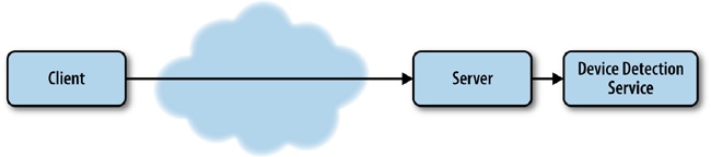
The previous example is great if we only care to establish that our clients are coming from a known set of devices, but what if we wanted to instead check for the capabilities and size of the devices? We could either use the User Agent to look up a table of our own design that lists User Agents and client capabilities, or we could take advantage of a service that provides that table and look-up capability for us.
There are several such services, called device detection services, to which we can pass the request to ascertain the client’s capabilities for us.
The architecture for such a solution is depicted in Figure 4-7, where client requests come over the Internet, are received by our server, and at the server level we make a back door call out to the device detection service.
One of the oldest and widely used device detection services is theWurfl.
The Wurfl
Prior to 2011, the Wurfl, which stands for Wireless Universal Resource FiLe, was an open and freely available XML file that listed devices and capabilities. It looked something like the following:
<device id="generic_android_ver3_0" user_agent="DO_NOT_MATCH_ANDROID_3_0" fall_back="generic_android_ver2_4">
  <group id="product_info">
   <capability name="is_tablet" value="true"/>
   <capability name="device_os_version" value="3.0"/>
   <capability name="can_assign_phone_number" value="false"/>
   <capability name="release_date" value="2011_february"/>
  </group>
  <group id="streaming">
   <capability name="streaming_preferred_protocol" value="http"/>
  </group>
  <group id="display">
   <capability name="columns" value="100"/>
   <capability name="physical_screen_height" value="217"/>
   <capability name="dual_orientation" value="true"/>
   <capability name="physical_screen_width" value="136"/>
   <capability name="rows" value="100"/>
   <capability name="max_image_width" value="980"/>
   <capability name="resolution_width" value="1280"/>
   <capability name="resolution_height" value="768"/>
   <capability name="max_image_height" value="472"/>
  </group>
  <group id="sms">
   <capability name="sms_enabled" value="false"/>
  </group>
  <group id="xhtml_ui">
   <capability name="xhtml_send_mms_string" value="none"/>
   <capability name="xhtml_send_sms_string" value="none"/>
  </group>
 </device>
Since 2011, however, the founders of the Wurfl formed the company Scientiamobile to provide services based around the Wurfl and ceased supporting the open document for individual consumption. They instead provide a series of products around the Wurfl, including Wurfl Cloud, which provides access to the device database via an API; Wurfl Onsite, which is a local install of the device database; and Wurfl Infuze, which makes the Wurf database available via environmental variables on the server side.
In theory, the best performing solution should be Wurfl Infuze because there would be no file I/O or transactional latency costs involved when querying for device data. But the solution with the lowest barrier to entry—because it involves no internal hosting, no infrastructure setup, and even has a free option—is the Wurfl Cloud. As such, we will look at how to integrate with the Wurfl Cloud in this chapter.
To begin, take a moment and go to the Scientiamobile home page at http://www.scientiamobile.com/, which you can see in Figure 4-8.

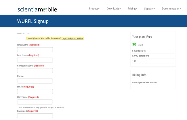
From there, we can click on the Wurfl Cloud link at the bottom of the page, which takes us to a pricing page. We can click on the Sign Up link under the free option, which takes us to the page we can see in Figure 4-9, where we create our account. This screen is available at http://bit.ly/1x34Psg.
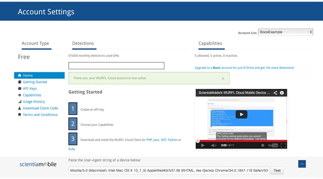
After you have set up an account, you need to get an API key. You can do this on the Account Settings page, shown in Figure 4-10.
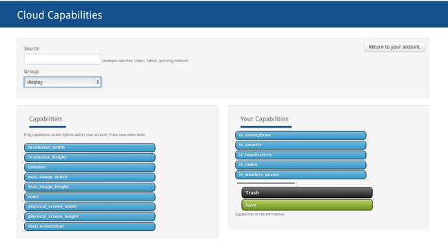
From the Account Settings page, you can also choose what device capabilities you will want to be able to test for (the free account offers only five capabilities). To choose capabilities, drag them from an available capabilities list to your own selected capabilities list. The names of the capabilities will also be how you reference them in your code, as you can see in Figure 4-11.
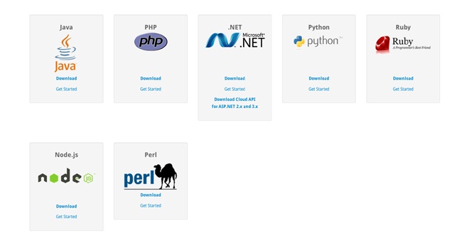
The final step you will need to take will be to download the Wurlf Cloud client code for the language that you will be using and then start to code your solution. As of this writing, the Wurfl Client code is available for the following languages and technologies:
Java
PHP
Microsoft .Net
Python
Ruby
Node.js
Perl
Figure 4-12 depicts the Wurfl Cloud client download page.
The Wurfl Cloud client downloads as a ZIP file and contains classes that you can use in your projects to interface with the Wurfl Cloud.
Sample Code
Let’s next take a look at how we can create an application that uses the Wurfl Cloud. Before we dive into the code, let’s first cover some assumptions.
You will use Node.js and have downloaded the Wurfl Cloud client for Node.js. The Wurfl Cloud client comes in a ZIP file that you just have unzipped and placed somewhere that is accessible to the Node.js application. Like most Node.js applications, you already have a server.js that listens for incoming requests and a router.js that routes requests appropriately. You already have an index.js file that pulls together your server.js and application logic (from a file named responsiveApp.js that you will be creating shortly). Here’s the content of index.js:
var server = require('./server/server.js');
var router = require('./server/router.js');
var responsiveApp = require("./responsiveApp.js");

var handle = {}
handle["/"] = responsiveApp.start;
handle["/start"] = responsiveApp.start;
handle["/favicon.ico"] = responsiveApp.favicon;

server.start(router.route, handle);
The index.js file loads the server.js and router.js files, as well as the responsiveApp.js file (even though you haven’t yet created it). It creates an object that you call handle and then pass into the server to instruct it how to handle paths that could be called; in this example, we just map all requests (except the favicon request) to the start function in the responsiveApp.js file. And finally, you call the server.start function to get started.
The server.start function just creates an event handler that fires whenever HTTP requests come in. The event handler passes requests to router.js, which examines the request, compares it to the handler object, and calls the appropriate function.
Exploring a deep dive into Node.js is beyond the scope of this book, if you would like further reading to learn more about Node.js definitely check out Learning Node by Shelley Powers (O’Reilly).
OK, let’s create the application logic that will reside in the responsiveApp.js file. First, load the HTTP module. Then load the two main files that came with the download (i.e., WurflCloudClient.js and Config.js):
var http = require('http');
var wurfl_cloud_client = require("./NodeWurflCloudClient/Wurfl
CloudClient");
var config = require("./NodeWurflCloudClient/Config");
Next, we’ll create the start function, but we will have it just call a function that we will create called getCapabilities. We will also create our favicon function to respond with our favicon file if we have one:
function start(response, request) {
  getCapabilities(response, request);
}

function favicon(response) {
  response.writeHead(200, {
'Content-Type': 'image/x-icon'
} );
//write favicon here
  response.end();
}
Now let’s get to the meat of the functionality. We’ll create our getCapabilities function. Remember that the start function passes the response and request objects into this function:
function getCapabilities(response, request) {

}
We’ll begin by creating two variables: one an object that called result_capabilities, and the other an array that we’ll call request_capabilities. The request_capabilities array lists out the capabilities for which we want to check—the same capabilities that you configured in your Wurfl account earlier in the chapter:
function getCapabilities(response, request) {
  var result_capabilities = {};
  var request_capabilities = ['is_smartphone','is_tablet',
'is_touchscreen', 'is_wireless_device']
Create a variable called api_key in which you enter the API key that you got from the Wurfl Account Configuration screen. We will also create a variable called configuration that will hold the configuration object that is returned when we call config.WurflCloudConfig with the API key:
  var api_key = "XXXXX ";
  var configuration = new config.WurflCloudConfig(api_key);
We will next instantiate an instance of wurfl_cloud_client.WurflCloudClient with the configuration object (with the API key) and the request and the response objects all passed in. Call this object WurflCloudClientObject.
This object is the key to accessing the capabilities from the Wurfl. We need to call the detectDevice method of that objet, pass in the request, request_capabilities, and an anonymous function that will be fired when the results of our query return:
WurflCloudClientObject.detectDevice(request, request_capabilities, function(err, result_capabilities){Within that anonymous function, we will put our logic to render the correct HTML, CSS, and JavaScript tailored for that experience. In our simplified example, we are just calling functions that will output the correct data (drawSmartphoneHomepage, etc.), but with the idea being that instead of putting all of our device- or experience-specific code in media queries and as part of client-side interpretation, we instead have the server output only the device- or experience-specific code in this branching logic:
    if(err!=null){
      console.log("<br>Error: " + err + " <br/>");
    }
    else{
        if(result_capabilities['is_smartphone']){
            drawSmartphoneHomepage(response);
        }else if(result_capabilities['is_tablet']){
            drawTabletHomepage(response);
        }else{
            drawDesktopHomepage(response);
        }

    }
For reference, the complete code example looks like the following:
var http = require('http');
var wurfl_cloud_client = require("./NodeWurflCloudClient/Wurfl
CloudClient");
var config = require("./NodeWurflCloudClient/Config");

function start(response, request) {
  getCapabilities(response, request);
}

function favicon(response) {
  response.writeHead(200, {
'Content-Type': 'image/x-icon'
} );
//write favicon here
  response.end();
}

function getCapabilities(response, request) {
  var result_capabilities = {};
  var request_capabilities = ['is_smartphone','is_tablet',
'is_touchscreen', 'is_wireless_device']
  var api_key = "XXXXX ";
  var configuration = new config.WurflCloudConfig(api_key);
  var WurflCloudClientObject = new wurfl_cloud_client.WurflCloudClient(configuration, request, response);
  WurflCloudClientObject.detectDevice(request, request_capabilities, function(err, result_capabilities){
        console.log(result_capabilities);
    if(err!=null){
      console.log("<br>Error: " + err + " <br/>");
    }
    else{
        if(result_capabilities['is_smartphone']){
            drawSmartphoneHomepage(response);
        }else if(result_capabilities['is_tablet']){
            drawTabletHomepage(response);
        }else{
            drawDesktopHomepage(response);
        }
            }

  });
}

exports.start = start;
exports.favicon = favicon;
exports.getCapabilities = getCapabilities;
Implications of Cache
When you develop websites for an enormous scale, you tend to rely very heavily on cache to minimize the hits to your origin servers. The danger here is that when we move our responsiveness to the server side but we are caching our responses, we serve the cached version of whatever our last response was, regardless of what the User Agent information being passed in from the client is.
To get around this, we can use the Vary HTTP response header when sending our responses from the server. This informs the cache layers that the server does some negotiating based on the User Agent string, and to cache responses based on the User Agent field when requests come in.
Tip
As of this writing, most content delivery networks (CDNs) will not cache responses that use the Vary response header. If this is the case for your CDN, you should be able to work with it for alternate solutions, potentially moving the User Agent detection to the CDN’s edge layer by using Edge Side Includes.
Edge Side Includes
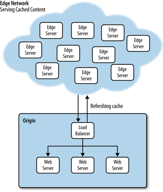
Using CDNs such as Akamai to serve your content cached from the edge is a great strategy to reduce traffic to your origin servers. This lessens the amount of hardware that you need to maintain, and makes it possible for you to deliver content to your end users much faster.
Figure 4-13 provides a high-level overview of what this architecture might look like.
As just stated a moment ago, the problem we could run into with this architecture is that if the CDN provider doesn’t allow us to cache User Agent–specific content (again by using the Vary HTTP header), all of our clients will get the same cached content, not device-specific content.
A solution around this is to use Edge Side Include (ESI) language. ESI was created by a consortium of companies, including Akamai and Oracle, and submitted to the W3C. You can read the specification for ESI at http://bit.ly/1rY5WUO.
ESI is a mark-up–based language that is embedded inline in an HTML document. The edge servers have an ESI processor that reads the ESI tags, interprets the logic, and renders the output inline in the HTML. ESI functions very much like a server-side scripting language such as PHP that can be interpreted on the server side and output inline in the HTML. Just like PHP, the ESI tags are not shown to the client; only their output is rendered.
The following code is an example of an ESI script that looks at incoming User Agent data and loads appropriate content:
<html>
<head></head>
<body>
<esi:choose>
 <esi:when test="$(HTTP_USER_AGENT{'os'})=='iPhone'">
     <esi:comment text="Include iPhone specific resources here" />
    ...
 </esi:when>
 <esi:when test="$(HTTP_USER_AGENT{'os'})=='iPad'">
     <esi:comment text="Include iPad specific resources here" />
    ...
 </esi:when>
 <esi:when test="$(HTTP_USER_AGENT{'os'})=='Android'">
     <esi:comment text="Include Android specific resources here" />
    ...
 </esi:when>
 <esi:otherwise>
     <esi:comment text="Include desktop specific resources here" />
    ...
 </esi:otherwise>
</esi:choose>
</body>
</html>
Summary
This chapter widened the lens through which we look at our applications. We explored the protocol and software stack on which our applications reside, and over which transactions to and from our applications need to traverse. With this larger perspective, we asked this question: how soon from the user’s initial request can we know the capabilities of the client device, and most important, how soon can we begin to act upon that request?
To answer that question we looked at inspecting the User Agent field of the incoming HTTP request, and even utilizing a third-party device detection service such as the Wurlf.
One potential pitfall of this solution is how to handle highly cached content. One solution is to use the Vary HTTP response header to instruct our cache servers that responses should be cached differently based on the User Agent. Another solution is to push the device or capabilities detection logic from our origin servers out to our CDN edge servers by using ESI.
Whatever our solution, if we can push our responsiveness upstream in the HTTP transaction, to the server (or edge) and not have it all take place on the client side, we can avoid the anti-patterns of serving double the content or extraneous content in our payload to the client, instead serving a more streamlined tailored response that perform better because it is respectful of both the bandwidth, battery life, and CPU limitations of the end user’s device.
Get High Performance Responsive Design now with the O’Reilly learning platform.
O’Reilly members experience books, live events, courses curated by job role, and more from O’Reilly and nearly 200 top publishers.

