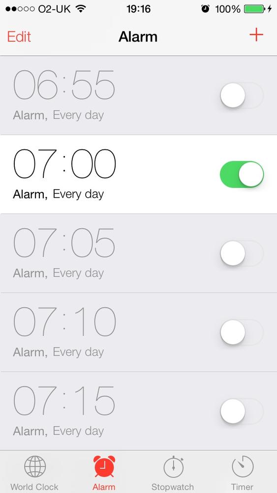
You have placed UISwitch instances on your UI
and would now like to customize them to match your UI.
Use one of the tint/image customization properties of the
UISwitch, such as the tintColor or the onTintColor.
Apple has done a fantastic job of bringing customization to UI
components such as the UISwitch. In previous SDKs,
developers were going as far as subclassing UISwitch
just to change its appearance and color. Now the iOS SDK makes this much
simpler.
There are two main ways of customizing a switch:
- Tint Colors
Tint colors are colors that you can apply to a UI component such as a
UISwitch. The tint color will be applied on top of the current color of the component. For instance, in a normalUISwitch, you will be able to see different colors. When you apply the tint color on top, the normal color of the control will be mixed with the tint color, giving a flavor of the tint color on the UI control.- Images
- On Image
The image that represents the on state of the switch. The width of this image is 77 points, and its height is 22.
- Off Image
The image that represents the switch in its off state. This image, like the on state of the switch, is 77 points in width and 22 points in height.
Figure 1-9 shows an example of the on and off images of a switch.
Now that we know the two states (on and off) of a switch, let’s
get started by learning how we can change the tint color of the switch
UI component. This can be achieved by the use of three important
properties of the UISwitch class.
Each this property is of type UIColor.
tintColorThis is the tint color that will be applied to the off state of the switch. Unfortunately, Apple has not taken the time to name this property
offTintColorinstead oftintColorto make it more explicit.thumbTintColorThis is the tint color that will be applied to the little knob on the switch.
onTintColorThis tint color will be applied to the switch in its on state.
Here is a simple code snippet that will change the on-mode tint color of the switch to red, the off-mode tint color to brown, and the knob’s tint color to green. It is not the best combination of colors but will demonstrate what this recipe is trying to explain:
-(void)viewDidLoad{[superviewDidLoad];/* Create the switch */self.mainSwitch=[[UISwitchalloc]initWithFrame:CGRectZero];self.mainSwitch.center=self.view.center;[self.viewaddSubview:self.mainSwitch];/* Customize the switch *//* Adjust the off-mode tint color */self.mainSwitch.tintColor=[UIColorredColor];/* Adjust the on-mode tint color */self.mainSwitch.onTintColor=[UIColorbrownColor];/* Also change the knob's tint color */self.mainSwitch.thumbTintColor=[UIColorgreenColor];}
Now that we are done with the tint colors on a switch, let’s
move on to customizing the appearance of the switch using its on and off
images, bearing in mind that custom on and off images are only for iOS 6
or older. iOS 7 ignores on and off images and uses only tint colors to
customize its appearance. As mentioned before, both the on and the off
images in a switch should be 77 points wide and 22 points tall. For
this, I have prepared a new set of on and off images (in both normal and
Retina resolutions). I have added them to my Xcode project under the
(Retina) names of On@2x.png and
Off@2x.png and I’ve also placed the
non-Retina flavor of the same images in the project. Now we have to
construct our switch but assign our custom on and off images to the
switch, using the following properties on UISwitch:
onImageAs explained before, this will be the image that is displayed when the switch is in its on mode.
offImageThe image that represents the switch when it is in off mode.
And here is our code snippet to achieve this new look:
-(void)viewDidLoad{[superviewDidLoad];/* Create the switch */self.mainSwitch=[[UISwitchalloc]initWithFrame:CGRectZero];self.mainSwitch.center=self.view.center;/* Make sure the switch won't appear blurry on iOS Simulator */self.mainSwitch.frame=[selfroundedValuesInRect:self.mainSwitch.frame];[self.viewaddSubview:self.mainSwitch];/* Customize the switch */self.mainSwitch.onImage=[UIImageimageNamed:@"On"];self.mainSwitch.offImage=[UIImageimageNamed:@"Off"];}
Get iOS 7 Programming Cookbook now with the O’Reilly learning platform.
O’Reilly members experience books, live events, courses curated by job role, and more from O’Reilly and nearly 200 top publishers.


