You would like to allow your users to specify a value within a range, using an easy-to-use and intuitive UI.
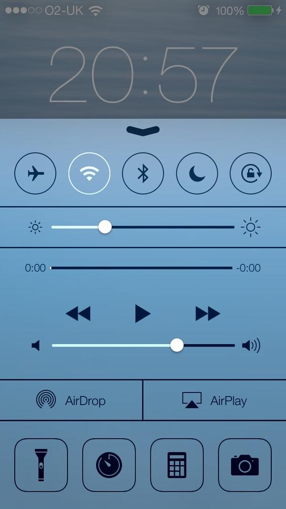
You’ve certainly seen sliders before. Figure 1-17 shows an example.
To create a slider, instantiate an object of type UISlider. Let’s dive right in and create a
slider and place it on our view controller’s view. We’ll start with our
view controller’s implementation file:
#import "ViewController.h"@interfaceViewController()@property(nonatomic,strong)UISlider*slider;@end@implementationViewController...
And now let’s go to the viewDidLoad method and create our slider
component. In this code, we are going to give our slider a range between
0 and 100 and set its default position to be halfway between start and
end.
Note
The range of a slider has nothing to do
with its appearance. We use the range specifiers of a slider to tell
the slider to calculate its value based on the relative position
within the range. For instance, if the range of a slider is provided
as 0 to 100, when the knob on the slider is on the leftmost part, the
value property of the slider is 0,
and if the knob is to the rightmost side of the slider, the value property would be 100.
-(void)viewDidLoad{[superviewDidLoad];self.slider=[[UISlideralloc]initWithFrame:CGRectMake(0.0f,0.0f,200.0f,23.0f)];self.slider.center=self.view.center;self.slider.minimumValue=0.0f;self.slider.maximumValue=100.0f;self.slider.value=self.slider.maximumValue/2.0;[self.viewaddSubview:self.slider];}
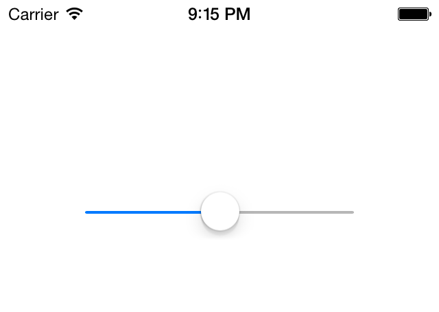
What do the results look like? You can now run the app on the simulator and you’ll get results like those shown in Figure 1-18.
We used a few properties of the slider to get the results we wanted. What were they?
minimumValueSpecifies the minimum value of the slider’s range.
maximumValueSpecifies the maximum value of the slider’s range.
valueThe current value of the slider. This is a read/write property, meaning that you can both read from it and write to it. If you want the slider’s knob to be moved to this value in an animated mode, you can call the
setValue:animated:method of the slider and passYESas theanimatedparameter.
The little knob on a slider is called the
thumb. If you wish to receive an event whenever the slider’s thumb
has moved, you must add your object as the target of the slider,
using the slider’s addTarget:action:forControlEvents: method:
-(void)sliderValueChanged:(UISlider*)paramSender{if([paramSenderisEqual:self.slider]){NSLog(@"New value = %f",paramSender.value);}}-(void)viewDidLoad{[superviewDidLoad];self.slider=[[UISlideralloc]initWithFrame:CGRectMake(0.0f,0.0f,200.0f,23.0f)];self.slider.center=self.view.center;self.slider.minimumValue=0.0f;self.slider.maximumValue=100.0f;self.slider.value=self.slider.maximumValue/2.0;[self.viewaddSubview:self.slider];[self.slideraddTarget:selfaction:@selector(sliderValueChanged:)forControlEvents:UIControlEventValueChanged];}
If you run the application on the simulator now, you will notice
that the sliderValueChanged: target
method gets called whenever and as soon as the
slider’s thumb moves. This might be what you want, but in some cases,
you might need to get notified only after the user has let go of the
thumb on the slider and let it settle. If you want to wait to be
notified, set the continuous property
of the slider to NO. This property,
when set to YES (its default value),
will call the slider’s targets continuously while
the thumb moves.
The iOS SDK also gives you the ability to modify how a slider
looks. For instance, the thumb on the slider can have a different image.
To change the image of the thumb, simply use the setThumbImage:forState: method and pass an
image along with a second parameter that can take any of these
values:
UIControlStateNormalThe normal state of the thumb, with no user finger on this component.
UIControlStateHighlightedThe image to display for the thumb while the user is moving her finger on this component.
I have prepared two images: one for the normal state of the thumb and the other one for the highlighted (touched) state of the thumb. Let’s go ahead and add them to the slider:
[self.slidersetThumbImage:[UIImageimageNamed:@"ThumbNormal.png"]forState:UIControlStateNormal];[self.slidersetThumbImage:[UIImageimageNamed:@"ThumbHighlighted.png"]forState:UIControlStateHighlighted];
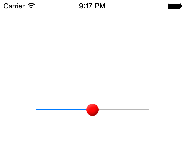
And now let’s have a look and see how our normal thumb image looks in the simulator (Figure 1-19).
Get iOS 7 Programming Cookbook now with the O’Reilly learning platform.
O’Reilly members experience books, live events, courses curated by job role, and more from O’Reilly and nearly 200 top publishers.


