Adding a Chart to Your Spreadsheet
In Numbers, charts help visualize data from one or more of your tables, showing all of a table’s data or just a portion. Because table data feeds your charts, every chart is associated with a table, a link that you create when you first add the chart to your spreadsheet.
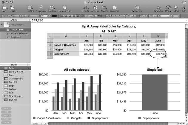
To add a chart, first select the table that you want to graph—the source table. The way you select the table matters: When you select all of a table’s cells, or when you select the table at the object level so that its eight selection handles are visible, Numbers adds a chart that includes all of the table’s data. If you create a chart with only a portion of cells selected—even only one cell—then the chart shows the data for that selection of cells. As you’ll learn on Working with a Chart’s Table Data, you can change the selection of charted cells anytime, so you’re not locked into your original choice, but you can save yourself time by making the right selection from the get-go. Figure 22-1 shows the striking difference between creating a chart based on all of a table’s cells versus just a single cell.

Figure 22-1. When you add a new chart, it always starts off showing the data for the table’s selected cells. Here, two charts show data for the same table. The chart on the left was added with all of the table’s cells selected, and the chart on the right was created with only a single ...
Get iWork '09: The Missing Manual now with the O’Reilly learning platform.
O’Reilly members experience books, live events, courses curated by job role, and more from O’Reilly and nearly 200 top publishers.

