A MIDlet written using the high-level API
typically consists of one or more screens built using the
Form, List, or
TextBox classes, together with a set of
Commands that allow the user to tell the MIDlet
what actions to perform and how to navigate from screen to screen.
Let’s start our examination of the high-level API by
creating a simple MIDlet with a single screen containing a
TextBox.
TextBox
is a component used to display and modify text. Since it is derived
from Screen, TextBox occupies
the entire screen of the device and therefore can accomodate
relatively large amounts of text spread over several lines. Most of
the API provided by TextBox is identical to that
of a similar component called TextField, which is
covered in detail in Section 4.2.9,
later in this chapter. In this example, we use only the features that
TextBox inherits from Screen
(and which are not available to TextField, because
it is not derived from Screen). The code for this
example is shown in Example 4-1.
Example 4-1. Creating and Using a TextBox
package ora.ch4;

import java.io.InputStream;
import java.io.InputStreamReader;
import java.io.IOException;
import javax.microedition.lcdui.Display;
import javax.microedition.lcdui.TextBox;
import javax.microedition.lcdui.TextField;
import javax.microedition.lcdui.Ticker;
import javax.microedition.midlet.MIDlet;

public class TextBoxMIDlet extends MIDlet {

    // Maximum size of the text in the TextBox
    private static final int MAX_TEXT_SIZE = 64;

    // The TextBox
    protected TextBox textBox;

    // The MIDlet's Display object
    protected Display display;

    // Flag indicating first call of startApp
    protected boolean started;

    protected void startApp( ) {
        if (!started) {
            // First time through - initialize
            // Get the text to be displayed
            String str = null;
            try {
                InputStream is = getClass( ).getResourceAsStream(
                    "resources/text.txt");
                InputStreamReader r = new InputStreamReader(is);
                char[] buffer = new char[32];
                StringBuffer sb = new StringBuffer( );
                int count;
                while ((count = r.read(buffer, 0, buffer.length)) > -1) {
                    sb.append(buffer, 0, count);
                }
                str = sb.toString( );
            } catch (IOException ex) {
                str = "Failed to load text";
            }

            // Create the TextBox
            textBox = new TextBox("TextBox Example", str,
                                MAX_TEXT_SIZE, TextField.ANY);

            // Create a ticker and install it
            Ticker ticker = new Ticker("This is a ticker...");
            textBox.setTicker(ticker);

            // Install the TextBox as the current screen
            display = Display.getDisplay(this);
            display.setCurrent(textBox);

            started = true;
        }
    }

    protected void pauseApp( ) {
    }

    protected void destroyApp(boolean unconditional) {
    }
}
In this simple MIDlet, all of the code is in the startApp( ) method, which simply reads some text from a file,
installs it in a TextBox, and arranges for the
TextBox to appear on the screen. Since the
startApp( ) method could be called more than once
during the lifetime of a MIDlet, this initialization code is
protected by a boolean flag that ensures that it is performed only on
the first invocation of startApp( ).
Skipping for a moment the code that obtains the actual text,
let’s look at how the user interface is created. The
TextBox
is
created using its only constructor:
public TextBox(String title, String text, int maxSize, int constraints)
The title argument sets the title that appears
above the TextBox; you can set it to
null if no title is required. The second argument
specifies the text that will initially be displayed in the
TextBox, and the final two arguments allow you to
exercise some control over what the TextBox is
allowed to contain, as follows:
- maxSize
Specifies the maximum number of characters that the
TextBoxcan contain at any time. Once theTextBoxcontains the maximum number of characters, the user will not be allowed to enter any more. The same restriction also applies to the text supplied to the constructor and to all the other methods that allow you to change programmatically the content of theTextBox, which you’ll see later when we look at theTextFieldcomponent. There is no way to avoid specifying an upper bound on the number of characters that theTextBoxcan hold; specifying 0, for example, creates aTextBoxthat cannot contain any text at all! Furthermore, the implementation is permitted to apply a smaller upper bound than the one you specify, so trying to avoid this constraint by setting a large maximum size is unlikely to work. You can find out the actual maximum size that applies to aTextBoxby calling itsgetMaxSize( )method.- constraints
Specifies the type of content that should be allowed in the
TextBox. Using this argument, you can, for example, restrict the user to entering only numbers or more complex things such as phone numbers or URLs without having to write the code to validate the content yourself. Since this is another feature thatTextBoxshares withTextField, we’ll defer further discussion of it until later in the chapter. In this example, the constraint has the valueTextField.ANY, which places no restriction on what theTextBoxcan contain.
TextBox inherits the ability to display a title
from its superclass (Screen). Here is how
Screen
itself
is defined:
public abstract class Screen extends Displayable {
    public Ticker getTicker( );
    public String getTitle( );
    public void setTicker(Ticker ticker);
    public void setTitle(String title);
}
You can change the title associated with the
TextBox at any time by calling the
setTitle( )
method, and you can also use the
setTicker( )
method to add a Ticker to
the screen. Ticker
is a very simple class that displays a
string that continuously scrolls across the screen area allocated to
it, which is usually at the top. Here’s the
definition of this class:
public class Ticker {
    public Ticker(String str);
    public String getString( );
    public void setString(String str);
}
You’ll notice that there is no way to explicitly
start or stop the ticker or to control the direction or rate at which
it scrolls its content; these aspects are all controlled by the MIDP
implementation itself. This lack of direct control is a deliberate
design feature of the high-level API, which emphasizes simplicity,
partly to minimize the size of the API and partly to make it possible
to port both the platform itself and the MIDlets that rely on it to
devices with varying user interface capabilities. In this example, we
add a Ticker to the TextBox so
that you can see how it works and where it is placed:
Ticker ticker = new Ticker("This is a ticker...")
textBox.setTicker(ticker);
It is worth noting that a single Ticker can be
associated with any number of screens at the same time. This is a
very useful feature, not only because it potentially saves resources,
but also because any changes made to the Ticker by
calling its setString( ) method (e.g., updating
stock prices) takes effect immediately for all the screens on which
the Ticker appears.
To run this example, you can use the Run MIDP Application utility
that comes with the Wireless Toolkit. Point it at the file
ora\ch4\Chapter4.jad in the example source code
for this book and select TextBoxMIDlet. The
MIDlet’s user interface, as seen on the default
color phone, is shown in Figure 4-3.
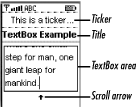
This phone arranges the three parts of the screen so that the
Ticker is placed at the top with the title below
it and the content of the TextBox itself at the
bottom. Other devices might take a different approach. For example,
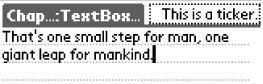
if you run this code on a PalmOS-based handheld, the result looks
like Figure 4-4, where the title and ticker are
placed side by side. Notice also that because less space is allocated
for the title on the PalmOS platform, the text is truncated..
Although the text used in this example is fairly short due to the
small size of the phone’s screen and the space taken
up by the title and ticker, it isn’t possible for
the TextBox to show all of the text at once. When
this happens, the TextBox allows the user to
scroll its content using the up and down arrow keys on the keypad and
draws a scroll arrow on the screen to indicate that there is more
text to be seen. On other devices, such as handhelds with pointing
devices, a scrollbar that could be dragged using the pointer might be
provided. The presence and nature of these visual cues and the way in
which they work is transparent to the MIDlet, which
doesn’t need to include any code to deal with them
or even be concerned about whether they are required.
Since TextBox provides editing facilities, you can
use the keys on the emulated phone’s keyboard to
change the text or add extra characters. If you try to add more than
6 characters, however, you will fail, because this
TextBox has a capacity of only 64 characters, and
the initial text is 58 characters long. Using the arrow keys, you can
move the insertion point around within the TextBox
and insert or delete characters anywhere you like, provided you
don’t exceed the 64-character limit.
The emulated devices provided by the Wireless Toolkit attempt to
mimic the input mechanisms of the real devices. In the case of a cell
phone, the small number of keys available means that most of the
keys
are overloaded to perform several functions. Most of the keys give
numbers when pressed, but if you press them repeatedly, they yield
other characters. On the default color phone, for example, the 2 key
can be used to input the number 2 or the letters A, B, or C, provided
you press the key quickly enough. You can use the
MODE key to shift
into a separate mode to make the input of alphabetics quicker or to
force each key to represent only the number on its face. You can also
use the MODE key to select a screen that contains special symbols.
The RIM wireless handheld, on the other hand, has a larger set of
keys that include alphabetics, with numbers and special characters
accessible via a mode shift. When you use the
TextBox or TextField
components, you don’t need to concern yourself with
the details of the keypad or keyboard, because the mapping from key
strokes to Unicode characters is handled for you in a manner
appropriate to the device that your MIDlet is running on.
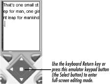
When you are using the cell phone emulator, you will probably find it
tedious and quite time-consuming to use the phone’s
keypad to enter text. In the real world, this would not be quite so
difficult, because you are probably used to using the real keypad of
your own phone, but it is inconvenient to use such a slow approach
when developing MIDlets. To alleviate this problem, the emulators
allow you use your PC’s keyboard to edit the content
of the TextBox instead of having to resort to the
mouse. The quickest way to enter this mode is to press the Return key
on your keyboard. This replaces the MIDlet’s screen
with a full-screen editor that accepts keystrokes from your keyboard,
as shown in Figure 4-5. When you have finished
editing, you can return to normal mode by pressing Return again. You
can also abandon any changes you have made by pressing the Escape
key. Another way to enter and leave full-screen editing mode is to
use the mouse to “press” the key
that corresponds to the SELECT action on the
emulator’s keypad. In the case of the default color
phone, this is the round white button just below the screen, as shown
in Figure 4-5. The full-screen editing facility is,
of course, not available on real devices, and you should perform some
testing without using this facility before deciding that your MIDlets
are error-free.
Once you’ve created the
TextBox
, the
next step is to make it visible to the user, which requires two lines
of code:
display = Display.getDisplay(this);
display.setCurrent(textBox);
The static getDisplay( )
method of Display gets the
Display object for the MIDlet passed as its only
argument. Since this call is made directly from the
MIDlet’s startApp( ) method, it
is appropriate to use this as the MIDlet
reference. It is necessary to call getDisplay( )
only once in the lifetime of a MIDlet, because the returned reference
is valid until the MIDlet is destroyed. Most MIDlets, therefore,
simply store the reference in an instance variable, as shown in this
example. To make the TextBox visible, the
Display
setCurrent( )
method is used with the TextBox reference supplied
as the argument. The TextBox will appear on the
user’s screen sometime shortly after the
setCurrent( ) method returns.
For this example, instead of hard-coding the text to be displayed in
the TextBox, I put it into a text file that is
included in the MIDlet JAR file. Separating text from code is a
useful technique that can be used to allow tailoring of a MIDlet
suite to meet locale- or customer-specific requirements, such as the
need to translate text in the user interface into other languages.
The only problem with this approach is getting access to the file
while the MIDlet is executing.
To solve this problem, the CLDC version of the class
java.lang.Class provides an implementation of the
J2SE method getResourceAsStream( )
:
public InputStream getResourceAsStream(String name);
Given the name of a resource, this method returns an
InputStream that can be used to read its content.
To use this method, however, you need to have a
Class object on which to invoke it and a properly
formed resource name.
Warning
CLDC/MIDP does not provide an implementation of the other J2SE method that is commonly used to access resources in JAR files:
public URL getResource(String name)
Supporting this method would require the URL
class, which is not part of either CLDC or MIDP. Another reason for
not providing it is that it is of limited use even in J2SE, because
some web browsers did not support it for applets but did implement
getResourceAsStream( ). Therefore, probably much
less existing code uses getResource( ) than
getResourceAsStream( ).
There are two different ways to specify the resource: with a relative
name or an absolute name. To see how the resource name is
constructed, you need to keep in mind how the JAR file is logically
arranged. The simplest way to understand the layout is simply to
imagine the JAR file expanded out into a filesystem hierarchy. This
is usually very easy to do, because most JAR files are constructed
from a filesystem anyway. In this example, the MIDlet class file is
in a package called ora\ch4 and, therefore, in
terms of a filesystem layout, the class file would be called
ora\ch4\TextBoxMIDlet.class. The text file is
called text.txt and was placed in a package
called ora\ch4\resources. Therefore, the
filesystem pathnames for these two files would be:
ora\ch4\TextBoxMIDlet.class
|
ora\ch4\resources\text.txt
|
For the purposes of this example, we want to access the latter of these files while executing the code of the former. The simplest way to do this is to use an absolute resource name for the text file, which can be created by taking the logical pathname of the file, replacing all the “\” characters with “/”, and prefixing the result with a “/” to form an absolute pathname:
/ora/ch4/resources/text.txt
|
When you use an absolute resource name, you can invoke the
getResourceAsStream( ) method of any class in the
same JAR file to get an InputStream for the
resource. In this example, the simplest approach to take is to use
the Class object of the MIDlet itself. Hence, one
way to locate the text file is to write the following:
InputStream is = getClass( ).getResourceAsStream(
    "/ora/ch4/resources/text.txt");
Alternatively, you can use a relative resource name. Normally, you
use a resource name that is relative to the class whose code is using
it, so in this case you need a resource name relative to
ora\ch4\TextBoxMIDlet.class. If you view the JAR
as a filesystem, it is easy to see that the appropriate relative
resource name would be resources/text.txt. Note
that relative resource names do not begin with a
“/” character. Because this name is
relative to TextBoxMIDlet.class, you need to use
the Class object of that class (or, in fact, any
other class in the same package, since all such classes are in the
same directory in a filesystem representation of the JAR file
structure). Hence, to use a relative pathname, you would code the
following:
InputStream is = getClass( ).getResourceAsStream("resources/text.txt");Relative resource names are a little more flexible than absolute
names because they are unaffected by package name changes, provided
that you keep the relative locations of the class file and the target
file unchanged. Hence, if the MIDlet were moved from the package
ora.ch4 into a different package called
ora.ch8, the relative resource name would continue
to work, provided that the text file is moved to
ora/ch8/resources. No code changes would need to
be made, other than to change the package line at the top of the
source file and recompile. If you use absolute resource names,
changing the package hierarchy requires that you search for and
change all affected instances of getResourceAsStream( ).
Once you have an InputStream for the resource, you
can use the usual mechanisms to load its content. Here, we simply
wrap the InputStream with an
InputStreamReader to convert the content of the
file into Unicode characters and read it into a
StringBuffer a piece at a time.
The MIDP specification allows you to use
getResourceAsStream( ) to access anything in the
JAR file apart from the class files. This includes the
JAR’s manifest file, which can be obtained as
follows:
InputStream is = getClass( ).getResourceAsStream("/META-INF/MANIFEST.MF");
The
TextBoxMIDlet example allows you to view and edit
text, but there is no way to tell the MIDlet to save your changes in
persistent storage, and it is not possible to terminate the MIDlet in
an orderly manner. To provide this functionality, you need to use
Commands. Commands are a
feature of the Displayable class, so you can add
them to any user interface, even those created using the low-level
API.
The
Command
class has a single constructor:
public Command(String label, int type, int priority);
The label argument supplies the text that will be
used to represent the Command in the user
interface, and the type and
priority arguments are hints that the MIDP
implementation can use when deciding where the
Command will be placed. The
type and priority arguments are
required because of the diversity of the devices on which MIDP is
intended to be used. Following construction, you cannot change the
label, type and
priority attributes of a
Command.
If you were writing a J2SE application using AWT or Swing, you would add a command action to the user interface by creating a button or a menu item and connecting to it a listener that would perform the action associated with the command upon activation by the user. The limited capabilities of most MIDP devices make it impossible to rely on the general availability of anything that resembles a menu, nor do you have the screen space to display more than a couple of buttons. Cell phones, for example, typically have only two soft keys to which application actions can be assigned. PalmOS applications are more fortunate: they have access to a traditional pull-down menu system and a larger number of buttons that can be drawn on the screen.
Clearly, a portable MIDlet cannot be coded in such a way as to assign
command actions explicitly to individual menus or buttons, because
these may not be available on any given device. On the other hand,
forcing all MIDlets to work to the lowest common denominator (i.e.,
two soft keys) would be overly restrictive, especially for PDAs. For
this reason, the responsibility for mapping
Commands to
GUI resources rests with the MIDP implementation, which is specific
to each platform and, therefore, aware of what is available. MIDlets
can use the type and priority
constructor arguments to supply hints to the MIDP implementation
regarding the semantic meanings of Commands and
their relative importance, so that those likely to be most frequently
used can be made most easily accessible to the user.
The type
argument is used to convey the meaning of a
Command in terms of a small set of commonly
required application operations. The possible values for this
argument and their interpretations are given in Table 4-1.
Table 4-1. The Command type Parameter
|
type Paramter Value |
Meaning |
|---|---|
|
OK |
Implies agreement by the user for some operation to be performed. Commands of this type would normally be placed to be easily accessible to the user. |
|
BACK |
Replaces the currently displayed screen with the one that preceded it. |
|
CANCEL |
Abandons an operation before it has been initiated. This command, along with the OK command, is typically made available while setting up the parameters for the operation. It might also be available on an Alert screen used to explicitly prompt the user for confirmation of an operation that might not easily be reversible. |
|
STOP |
Stops an operation that is already in progress. |
|
EXIT |
Requests that the MIDlet stop all outstanding operations and terminate in an orderly manner. |
|
HELP |
Requests general or context-sensitive help. |
|
SCREEN |
Relates to the function of the current screen, but does not fit into one of the specific categories listed previously. Most application-specific actions are of this type. |
|
ITEM |
Indicates a command that is associated with a particular user interface component. |
Once you have created a
Command object, the next step is to arrange for it
to appear in the user interface. This is achieved by calling the
addCommand( )
method of Displayable:
public void addCommand(Command cmd);
MIDP platforms are allowed to follow their own rules when determining
how to represent Commands in the user interface.
In general, however, the choice is made first based on the
Command
type and then on the
priority, where lower priority values tend to
result in a more favorable placement. The order in which
Commands are added to a
Displayable is not usually of any significance in
the determination of placement, and the label text is not used at
all, because the semantic meaning of the command is supposed to be
conveyed via the type attribute.
On a cell phone, for example, the
type might be used to favor well-known operations
(such as OK, CANCEL, BACK, etc.) that the user would normally expect
to be able to access via a soft key. Where the number of these
Commands exceeds the number of soft keys
available, the phone might use the priority to
determine which Commands should be installed on
the soft keys, with lower values increasing the likelihood of
assignment to a soft key. The remaining Commands
would then be placed on a menu that would itself be accessible via a
soft key. When the number of Commands does not
exceed the number of soft keys, they can all be allocated a soft key.
When a platform has both soft keys and pull-down menus, it may choose
to place Commands on menus as well as, or instead
of, on soft keys, with the choice again being made usually based on
the type and priority
attributes.
Some commands, such as EXIT, might need to appear on more than one
application screen. When this is the case, it is not necessary to
create a dedicated instance for each screen, because a single
Command can be added to any number of screens:
Command exitCommand = new Command("Exit", Command.EXIT, 0);
form1.addCommand(exitCommand);
form2.addCommand(exitCommand);In order to be notified when the user activates a
Command, you have to register a
CommandListener
with the
Displayable
to which the
Command was added. You do this by invoking its
setCommandListener( )
method:
public void setCommandListener(CommandListener l);
CommandListener is an interface with a single
method:
public void commandAction(Command c, Displayable d)
The commandAction( )
method is called when any Command on the
Displayable is activated. The first argument is
the more useful, because it allows you to determine which operation
the user wants to perform. The Displayable
argument is useful if you add the same Command to
more than one screen, and the resulting action is dependent on the
current screen. It can also be useful if the action needs a reference
to the screen in order to perform its assigned function.
Note that the setCommandListener() method allows
only a single CommandListener to be registered at
a time. Calling this method again replaces any existing listener with
the new one, and calling it with a null argument
removes the previous listener. This is very different from J2SE event
handling, which normally allows you to add as many listeners as you
like and requires you to register with the component itself rather
than an enclosing container. Although it is very flexible, the J2SE
model tends to result in the creation of lots of small event handler
classes, which is very expensive in terms of memory and class-loading
time; it is therefore not suitable for small-memory devices. MIDlets
can get away with only one listener per screen and, if the MIDlet
itself implements the CommandListener interface,
this won’t even entail creating a new class. If a
MIDlet has several screens, it can choose to create a single listener
class for each, or it can save even that overhead by subclassing the
screen class to implement CommandListener, as
follows:
public class MyTextBox extends TextBox implements CommandListener {
    public MyTextBox(String title, String text, int maxSize,
        int constraints) {
        super(title, text, maxSize, constraints);
        setCommandListener(this);
                             // Add Commands (not shown)
 }
    // Handle command actions
                         public void commandAction(Command c, Displayable d) {
                             // Code not shown
                         }
}
We can
easily illustrate the use of Commands by extending
the TextBoxMIDlet example to include four
operations:
An Exit command that terminates the MIDlet.
An OK command that prints a message to standard output. (In a real MIDlet, this would obviously do something a little more useful!)
A Clear command that removes all of the text from the
TextBox.A Reverse command that reverses the text in the
TextBox.
The implementation of this modified example is shown in Example 4-2.
Example 4-2. Adding Commands to the TextBoxMIDlet Example
package ora.ch4;

import javax.microedition.lcdui.Command;
import javax.microedition.lcdui.CommandListener;
import javax.microedition.lcdui.Displayable;

import javax.microedition.lcdui.*;

public class TextBox2MIDlet extends TextBoxMIDlet implements CommandListener {

    // Exit command
    private static final Command EXIT_COMMAND =
                        new Command("Exit", Command.EXIT, 0);

    // OK command
    private static final Command OK_COMMAND =
                        new Command("OK", Command.OK, 0);

    // Clear text box content
    private static final Command CLEAR_COMMAND =
                        new Command("Clear", Command.SCREEN, 1);

    // Reverse the content of the text box
    private static final Command REVERSE_COMMAND =
                        new Command("Reverse", Command.SCREEN, 1);

    protected void startApp( ) {
        boolean firstTime = !started;
        super.startApp( );

        // If this is the first execution of startApp, install commands
        if (firstTime) {
            textBox.addCommand(OK_COMMAND);
            textBox.addCommand(EXIT_COMMAND);
            textBox.addCommand(CLEAR_COMMAND);
            textBox.addCommand(REVERSE_COMMAND);
            textBox.setCommandListener(this);
        }
    }

    // Command implementations.
    public void commandAction(Command c, Displayable d) {
        if (c == EXIT_COMMAND) {
            destroyApp(true);
            notifyDestroyed( );
        } else if (c == OK_COMMAND) {
            System.out.println("OK pressed");
        } else if (c == CLEAR_COMMAND) {
            textBox.setString(null);
        } else if (c == REVERSE_COMMAND) {
            String str = textBox.getString( );
            if (str != null) {
                StringBuffer sb = new StringBuffer(str);
                textBox.setString(sb.reverse().toString( ));
            }
        }
    }
}
Notice that this example is implemented by deriving it directly from
the TextBoxMIDlet class from the previous example.
Of course, you wouldn’t normally have to do this in
the real world, but here it serves to show how easy it is to add
command handling to an existing class, and you don’t
need to replicate code that you saw earlier!
The four Commands are defined as static class
members, for example:
private static final Command EXIT_COMMAND = new Command("Exit",
    Command.EXIT, 0);
Since Commands are simply constant-valued objects,
you can usually define them in this way and then reuse them wherever
you need to, which would include adding the same instance to more
than one screen, if necessary. You can see from Example 4-2 that the EXIT and OK commands use the standard
types Command.EXIT and
Command.OK, respectively, which allows the device
on which the MIDlet will be run to represent them in whatever way it
would normally present EXIT and OK actions. By constrast, the other
two commands are of type Command.SCREEN, because
they are application-defined actions that have no generic meaning.
Notice that the OK and EXIT actions have priority 0, whereas the
other two have priority 1. This hints to the device that if it has no
built-in preferences, we would rather have the OK and EXIT actions
more quickly accessible to the user than Clear and Reverse. However,
there is no guarantee that the device will take this hint.
Making these operations available from the user interface is a simple
matter of adding the Command instances to the
TextBox and registering the MIDlet class itself as
the CommandListener:
textBox.addCommand(OK_COMMAND);
textBox.addCommand(EXIT_COMMAND);
textBox.addCommand(CLEAR_COMMAND);
textBox.addCommand(REVERSE_COMMAND);
textBox.setCommandListener(this);
The last step is to implement the CommandListener
interface by providing a commandAction method,
which is responsible for carrying out the operations associated with
the Commands. The commandAction
method shown in Example 4-2 is typical of most event
handling in MIDlets. Because there is only a single command handler
for each screen, its first task is to determine which operation the
user wants to perform. To do this, it examines the first method
argument to see which Command has been activated. The neatest way to
do this is with a switch statement, but this is
not possible because Command is not an integral
value. Instead, MIDlet event handlers tend to consist of
if statements that compare the first method
argument with each of the possible Commands. Once
the correct operation is found, the code that performs the required
function is trivial.
You can try this example by selecting
TextBox2MIDlet from the MIDlet suite for this
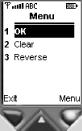
chapter. On the default color phone, the result is shown in Figure 4-6.
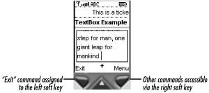
The default color phone, like most cell
phones, has two soft keys to which Commands can be
assigned, but the TextBox used in this example has
four Commands. As a result, the Exit command has
been mapped to the left soft key, and the right key provides access
to a menu of the remaining three Commands, as
shown in Figure 4-7. The fact that the Exit command
has been given its own key in preference to the OK command is a
feature of this particular MIDP implementation. The result might not
be the same on other devices, and the menu might also not look the
same as it does in Figure 4-7. The MIDlet
developer, of course, has no real control over these decisions and
can only provide hints in the form of the type and
priority arguments to the Command constructor.
The same MIDlet looks slightly different
when run on a
PalmOS platform, where the larger
screen space means that more Commands can be
assigned to buttons that are always visible to the user. Figure 4-8 shows two views of this MIDlet running on a
PalmOS-based handheld. In this case, three of the four
Commands have been assigned to buttons below the
TextBox. Commands are assigned to buttons based on
their types, as listed here in descending order of preference:
Command.BACKCommand.OKCommand.CANCELCommand.STOPCommand.SCREENCommand.CANCEL
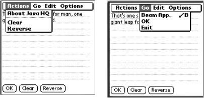
If the number of commands exceeds the number of buttons that can be
created in the button area, the command priority is also taken into
account when assigning commands to buttons. Note, however, that
commands of type Command.EXIT and
Command.HELP are never mapped to buttons.
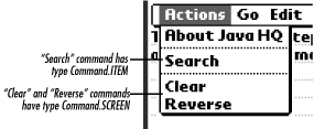
PalmOS also has pull-down menus, and, as these two views show, the
application-specific Commands have been assigned
to the Actions menu, while the OK and Exit commands appear on a menu
labeled Go. In this implementation, the Actions menu is used to hold
application-specific commands of type
Command.SCREEN or Command.ITEM.
If both types of Command are installed in the same
screen, they all appear on the same menu, with
Commands of the same type grouped together, and
the two groups separated by a horizontal line, as shown in Figure 4-9. Commands of type
Command.BACK, Command.OK,
Command.CANCEL, Command.STOP,
and Command.EXIT are placed on the Go menu, and
Command.HELP appears in the Option menu.
Form
is a subclass of
Screen that can be used to construct a user
interface from simpler elements such as text fields, strings, and
labels. Like TextBox, Form
covers the entire screen and inherits from its superclasses the
ability to have a title, display a Ticker, and be
associated with Commands. The elements that you
can add to a Form are all derived from the
abstract class Item:
public abstract class Item {
    public String getLabel( );
    public void setLabel(String label);
}
On its own, Item provides only the ability to
store and retrieve a text label, but because each component that can
be added to a Form is derived from
Item, it follows that all of them can have an
associated label. The implementation displays this somewhere near the
component in such a way as to make the association between the label
and the component clear. The components that MIDP provides are
described briefly in Table 4-2; each of them will
be discussed in greater detail in later sections of this chapter.
Table 4-2. Items That Can Be Added to a Form
|
Item |
Description |
|---|---|
|
|
An item that allows a text string to be placed in the user interface |
|
|
A single-line input field much like the full-screen
|
|
|
A version of |
|
|
A component that can be used to show the progress of an ongoing operation or allow selection of a value from a contiguous range of values |
|
|
A component that provides a set of choices that may or may not be mutually exclusive and therefore may operate either as a collection of checkboxes or radio buttons |
|
|
A holder that allows graphic images to be placed in the user interface |
The Form
class
has two constructors:
public Form(String title);
public Form(String title, Item[] items);
The first constructor creates an empty Form with a
given title, which may be null in the unlikely
event that no title is required; the second constructor can be used
to install an initial set of Items on the
Form. The
Item
s that
are associated with the Form are held in an
internal list, the order of which determines how they are placed on
the form. Form has three methods that allow items
to be added to the end of this internal list, which causes them to
appear on the Form itself:
public void append(Item item);
public void append(Image image);
public void append(String string);
The second and third methods provide a quick and convenient way to
include an image or string on the Form: just
create and append an ImageItem containing a
supplied Image or a StringItem
containing the given string.
Unlike an AWT container, Form does not have the
concept of a separate layout manager that you can select to control
how items are arranged on the screen. Instead,
Form has a few simple rules that determine how
items are arranged:
Items that involve user input (that is,
TextField,DateField,Gauge, andChoiceGroup) are laid out vertically, with the first item in theForm’s internal list at the top of the screen, the second one directly below it, and so on.Adjacent
StringItems andImageItems that have anullor empty label are laid out horizontally. If there is insufficient space to fit a completeStringItemin the horizontal space remaining in a row, the text is wrapped to the next line, and the implementation breaks at whitespace where possible. If there is insufficient space to fit an entireImageItem, the image is simply clipped.StringItems andImageItems with a nonempty label cause a line break before the label is rendered.Newlines in
StringItems cause a line break. A similar effect can be obtained using layout directives of theImageItemclass, as described in Section 4.2.11, later in this chapter.The width of the
Formis always the same as that of the screen. TheFormmay, however, be taller than the screen. If so, the implementation provides a means for the user to scroll theFormvertically. Horizontal scrolling is not provided.Where it is necessary to scroll vertically, the implementation attempts to ensure that scrolling never obscures the label associated with a visible item, if the item has one.
To clarify how these rules work in practice, let’s
look at a simple example that places strings and
TextFields on a Form.. The code
that builds the Form is shown in Example 4-3. You can run it by selecting
FormExampleMIDlet from the MIDlet suite in
Chapter4.jad.
Example 4-3. A Demonstration of Form Layout Rules
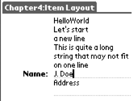
Form form = new Form("Item Layout");

form.append("Hello");
form.append("World");

form.append("\nLet's start\na new line\n");
form.append("This is quite a long string that may not fit on one line");

form.append(new TextField("Name", "J. Doe", 32, TextField.ANY));
form.append("Address");
form.append(new TextField(null, null, 32, TextField.ANY));
The first four append( ) calls add text strings to
the Form, the results of which can be seen in the
leftmost two screenshots in Figure 4-10. These
screenshots show the MIDlet running on the relatively small screen of
the default color phone emulator from the Wireless Toolkit. The top
line of the screen holds the two separate items
“Hello” and
“World”, which have been laid out
horizontally because they are string items. Note that, even though
they were added separately, no space has been left between them.
The next item to be added begins and ends with newline characters; you can see that it is placed vertically below the first two items because of the leading newline, and the trailing newline also causes a line break. Notice that in this string, and in the next, rather longer, one, the text is automatically wrapped, and line breaks are placed between words.
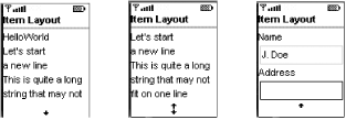
Since the Form is too large to fit on the screen,
the implementation draws an arrow at the bottom to indicate that the
screen can be scrolled vertically, as has been done in the middle and
right views.
Following the text strings, a TextField is added:
form.append(new TextField("Name", "J. Doe", 32, TextField.ANY))The constructor supplies both the Item label
(“Name”) and the initial content of
the field itself (“J. Doe”). As you
can see, the label has been placed below the previous text string,
even though the string did not end with a newline, but above the
input field itself. If you scroll the screen up and down,
you’ll find that it is impossible to arrange for the
label to be visible without the text field, and vice versa.
The last two items are the text string
“Address” and another
TextField. Because this device’s
screen is so narrow, it would be difficult to see the difference
between the effect of the code used here:
form.append("Address");
form.append(new TextField(null, null, 32, TextField.ANY));
and the apparently similar:
form.append(new TextField("Address", null, 32, TextField.ANY));which includes the string “Address” as the item’s label. To see the difference, you need to run this example using the PalmOS emulator. Because this emulator has a much larger screen, it can lay out the items differently, as shown in Figure 4-11.
Most of the items are shifted over to the right side of the screen,
leaving mostly blank space to the left. This is because the MIDP for
PalmOS implementation allocates the left side of the screen to the
label part of each Item and places the active part
of the Item to the right. Hence, all the strings
(which are actually StringItems with no label)
appear on the right side of the screen. The only
Item with a real label is the first
TextField, and its label has been placed on the
left of the input field itself, rendered in a bold font, and been
appended with a colon. Compare this to the next
TextField: the
“Address” string was added as a
separate string and not installed as the Item
label, and it therefore appears above the input field itself.
Although the difference between using a label and using a separate
text string was hard to detect with the cell phone emulator, here it
becomes very obvious and underlines the fact that the
Item label should be used instead of installing a
separate a text string to describe the following input field. Another
important reason to take advantage of the Item
label is the automatic font highlighting provided for the label. You
cannot achieve this in any other way, because the high-level API does
not allow you to select fonts or colors.
Form has a small number of other methods, in
addition to the three variants of append( ), that
allow the list of Items it contains to be
manipulated:
public void delete(int index);
public Item get(int index);
public void insert(int index, Item item);
public void set(int index, Item item);
public int size( );
Most of these methods use an index argument to specify the list
position to be operated on, where the first item has index 0. The
delete( ) method removes the
Item at the given index; like all the other
methods that change the Item list, it causes the
screen layout to be updated immediately to reflect the change. The
get( ) method returns the Item
at the given index without modifying the list at all. The
insert( ) method places a new
Item at the given index within the list, moving
the Item at that index and greater indices down by
one position. The set( ) method, by contrast,
replaces the Item at the index supplied as its
first argument and does not affect any other Item
in the Form. Finally, the size( ) method returns the number of Items on
the Form.
Warning
A single Command or Ticker
instance can be shared between multiple screens simply by adding it
to each screen in turn. However, an Item is
allowed to be on only one Form at any given time.
If you try to add the same Item to another
Form without first removing it from the original,
an IllegalStateException is thrown.
Since Form is
subclassed indirectly from Displayable, it is
possible to add a Command to a
Form to allow the user to request that values
entered into it be processed. The logic for this processing is
implemented in the commandAction method of a
CommandListener attached to the
Form, as illustrated in Example 4-2. Sometimes, however, it is necessary to take
action as soon as the value in an input field is changed. Changes in
the state of Items that accept user input are
notified to an ItemStateListener registered with
the Form.
ItemStateListener
is an interface with a single method, which is called when any
Item on the Form has a state
change to report:
public void itemStateChanged(Item item);
An ItemStateListener is registered using the
following Form method:
public void setItemStateListener(ItemStateListener l);
As was the case with CommandListeners, only one
ItemStateListener can be associated with a
Form at any time and calling
setItemStateListener( ) removes any listener that
was previously installed. Calling this method with the argument
null removes any existing listener.
The conditions under which the ItemStateListener
is notified of a state change are specific to each individual type of
Item; these conditions are described in the
sections that follow. It is important to note, however, that only
user actions result in the listener’s
itemStateChanged method being called. Changing the
state of an Item programmatically does
not cause notification to the
listener.
In the rest of this section, we take a closer look at each of the
Items you can use with the Form
class, together with the TextBox and
List components. TextBox and
List are derived from Screen,
so they are not suitable for use with Forms, but
they have Form-based counterparts that are
sufficiently similar that they are best described together.
The examples used in this section are all part of a single MIDlet
called ItemMIDlet. You can run it with the
Wireless Toolkit by opening the project called
Chapter4 and pressing the Run button, then
selecting ItemMIDlet. This displays a screen
(actually a List) that has an entry that runs the
example for each of the following sections. To run the example code
for these sections, simply highlight the appropriate entry in the
list and press the SELECT button on the emulated
phone’s keypad, as shown in Figure 4-5.[13]
StringItem
,
the simplest of the MIDP user interface components, provides the
ability to place a string or pair of strings on a
Form. Initial values for both strings may be
supplied to the constructor:
public StringItem(String label, String text)
The label part is the label that is inherited by all
Items from their base class; its value can be
retrieved or changed using the Item
getLabel( ) and setLabel( )
methods. StringItem provides similar methods for
its own text attribute:
public String getText( )
public void setText(String text)
Either or both of the label and text string may be
null.
A technique often used when adding text to a Form
is simply to use the variant of the append method
that accepts a String argument:
form.append("Name");This code, in fact, amounts to the use of a
StringItem with a null label
and so could also be written like this:
form.append(new StringItem(null, "Name"));
It might seem strange to provide a component that displays two text
strings, when the same effect could apparently be achieved by
creating a component that supports only one string and the ability to
place two of them next to each other. In fact, this would not lead to
the same result, because the label and text string parts of a
StringItem are not equivalent. The difference
between the label and the text is the same for
StringItem as it is for the label and content of
any Item, namely:
The layout management code of the MIDP platform should attempt to display the label close to the text and ensure that they are either both visible or both not visible when scrolling takes place.[14]
The platform may choose to render the label differently from the content to make clear the distinction between them.
As described in Section 4.2.5, the layout policy for
StringItems required by the MIDP specification
results in a horizontal arrangement, unless a line break is forced by
the use of newline characters within the label or text, or if there
is insufficient space to fit the entire StringItem
in the current line. Additionally, the Sun reference implementations
force a line break before a StringItem that has a
non-null label.
A typical example in which it would be advantageous to use both the
label and text attributes of a StringItem is a
labeled item in which the content can be updated by the MIDlet but
must not by the user. Such a StringItem might be
used to show the state of a connection to a web server:
StringItem status = new StringItem("Status ", "Not connected");
status.setText("Connecting");  // Change the state
In Example 4-3, you’ve already seen
several examples of the use of StringItem created
indirectly by appending a String to a
Form. ItemMIDlet includes a
screen that has a few more StringItem examples.
The code that creates this Form is shown in Example 4-4.
Example 4-4. Using StringItem
Form form = new Form("StringItem");
form.append(new StringItem("State ", "OK"));
form.append(new StringItem(null, "No label\n"));
form.append(new StringItem(null, "Line\nbreak"));
form.append(new StringItem("Label", "Text."));
form.append(new StringItem("Label2 ", "Text2."));
The results of running this example on both the default color phone
and on the PalmOS device are shown in Figure 4-12.
The first StringItem uses both the label and text
attributes. Notice that the color phone doesn’t
distinguish between the label and the text in any way, whereas the
PalmOS MIDP implementation uses a bold font to represent the label,
adds a colon, and places all the labels in a dedicated area on the
left side of the screen. The second StringItem
contains only the text and is placed immediately after the text of
the first StringItem, with no line break. Because
the text ends with a newline character, however, it is followed by a
line break.
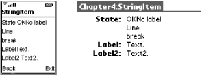
The third example shows the effect of embedding a newline in the text, which results in a line break on the screen. Although it isn’t illustrated here, you can also include a newline in the label part, and the effect is the same. The final two examples illustrate an important difference in the handling of labels between the PalmOS platform and the cell phone version. In the first case, the label and text are set up as follows:
form.append(new StringItem("Label", "Text."));As you can see, the color phone does not interpose any whitespace between the label and text, whereas the PalmOS version displays them with a clear gap, owing to its special handling for labels. In most cases, you want to clearly separate the label from the text; you can do this by adding a space at the end of the label:
form.append(new StringItem("Label2 ", "Text2."));This produces the desired effect on the color phone and also works on the PalmOS platform, which strips out trailing whitespace before appending the colon that marks the end of the label, as you can see on the right side of Figure 4-12.
TextField
and
TextBox are two very similar components that have
almost the same programming interface. The differences between them
are as follows:
TextBoxis derived fromScreenand therefore occupies the entire display.TextFieldis anItemthat occupies space on aForm. Usually, aTextFieldappears as a single-line input field, but some implementations spread its content over extra lines if a single line is not sufficient.TextBoxdoes not have a way to report changes in its content to a listener, but modifications to aTextFieldare reported to theItemStateListenerassociated with theFormon which theTextFieldis displayed.
Since the specifics of TextBox have already been
covered, the rest of this section focuses on the common features of
these two components and illustrates them with
TextFields.
TextField
has only one constructor:
public TextField(String label, String text, int maxSize,
    int constraints);
The label and text arguments
specify, respectively, the Item label to be placed
near the component and the string to be placed initially in the
TextField; either or both of these arguments may
be null. The constraints
argument can be used to limit the type of data that can be entered
into the TextField. See Section 4.2.9.3, later in this chapter, for
details.
The maxSize argument determines the maximum number
of characters that the TextField can hold. The
MIDP implementation is allowed to place an upper limit on the allowed
values of maxSize and may therefore impose a lower
limit than the one specified in the constructor. The actual limit
applied to a particular TextField can be obtained
by calling the getMaxSize( ) method. The maximum
size is applied whenever the field content is changed, that is:
When the initial value is set at construction time
When a new value is supplied by calling the
setString( )methodWhen some or all of the field content is modified using the
insertorsetCharsmethodsAs the user amends the content of the
TextFieldby adding characters anywhere in the string
In the first three cases, the result of attempting to install a value
whose length exceeds the capacity of the TextField
is an IllegalArgumentException. If the user tries
to type more characters than the field can hold, the extra characters
are ignored, and the device may supply audible feedback.
The capacity of the TextField can be changed by
calling the setMaxSize( ) method. If the number of
characters in the TextField exceeds the new
capacity, it is truncated to the maximum size.
If the Form that contains the
TextField has an
ItemStateListener installed, it will be notified
of changes made by the user to its content. You can get the value
held in the TextField by calling its
getString( )
or getChars( )
methods, which return a String or an array of
characters, respectively:
public String getString( )
public int getChars(char[] chars)
To use the getChars( ) method, you have to
allocate the character array to be filled. The return value of this
method is the number of characters of the array that were used. If
the array is too short to hold the content of the
TextField, an
ArrayIndexOutOfBoundsException
is thrown. You can avoid this by using the size( )
method
to get the number of characters that are currently in the
TextField:
char[] chars = new char[textField.size( )];
int copied = textField.getChars(chars);
The following code extract shows how a listener might use
getString( ) to retrieve the last value that the
user entered as a String:
public void itemStateChanged(Item item) {
    if (item instanceof TextField) {
        System.out.println("Text field content: <" +
                        ((TextField)item).getString( ) + ">");
    }
}
The point at which the ItemStateListener is called
following a change in the content of the TextField
is implementation-dependent. The MIDP specification requires only
that this should happen no later than when the user moves the input
focus away from the TextField or activates a
command on the Form. The reference implementation
provides notification when the user completes an editing operation in
the TextField; the MIDP for PalmOS version does it
after any character has been inserted or deleted.
The TextField
(and TextBox) API
contains several methods that allow programmatic changes to its
content.[15] All of these methods
throw an IllegalArgumentException and leave the
TextField content unchanged if the result of
performing the requested operation would make the content
inconsistent with the constraint, if any, applied to the
TextField. This means, for example, that an
exception would be thrown if an attempt were made to insert
non-numeric characters into a TextField to which
the TextField.NUMERIC constraint has been applied.
Constraints are described in Section 4.2.9.3.
The following are the methods that enable programmatic changes to
TextField and TextBoxes:
-
public void delete(int offset, int length) Removes
lengthcharacters from theTextField, starting with the character at positionoffset.-
public void insert(char[ ] chars, int offset, int length, int position) Inserts the characters from
chars[offset]throughchars[offset+length-1]into theTextField, starting at the givenposition. The characters that originally occupied offsetspositionand higher are moved to the right to make room for the new characters. AnIllegalArgumentExceptionis thrown if this operation would make the content of theTextFieldexceed its maximum size.-
public void insert(String src, int position) Inserts the characters that make up the given
Stringinto theTextField, starting at the givenposition. The characters that originally occupied offsetspositionand higher are moved to the right to make room for the new characters. AnIllegalArgumentExceptionis thrown if this operation would make the content of theTextFieldexceed its maximum size.-
public void setChars(char[ ] chars, int offset, int length) Replaces the content of the
TextFieldwithchars[offset]throughchars[offset+length-1]of the given character array. AnIllegalArgumentExceptionis thrown if this operation would make the content of theTextFieldexceed its maximum size.-
public void setString(String src) Replaces the content of the
TextFieldwith the characters from the givenString. AnIllegalArgumentExceptionis thrown if this operation would make the content of theTextFieldexceed its maximum size.
Note that programmatic changes are not notified
to ItemStateListeners.
In general, application code that modifies the content of a
TextField uses either the setString( ) or setChars( ) methods to replace its
entire content. Less frequently, it is necessary to insert content
starting at the location of the
TextField’s insertion point,
which is indicated on the screen by a cursor, otherwise known as a
caret. You can get the offset of the cursor
within the TextField using the following method:
public int getCaretPosition( );
The following code could be used to insert three characters starting at the cursor position:
textField.insert("ABC", textField.getCaretPosition( ));The constraints
argument of the constructor or the
setConstraints
method can be used to limit the characters
that the user can type into a TextField. The
effect of each constraint may be device-dependent. Table 4-3 describes what these constraints do in the
MIDP reference implementation.
Table 4-3. TextField Input Constraints
When input is constrained, the user cannot type any characters that
would result in the field content becoming inconsistent with the
constraint. Calling a method to change the field content results in
an IllegalArgumentException if the result would
not match the constraint.
You can change the constraint associated with a
TextField or TextBox at any
time by calling the setConstraints( ) method:
public void setConstraints(int constraints);
When this method is called, the current content of the control is checked to ensure that it is consistent with the new constraints; if not, the field is cleared.
The effect of some of the constraint values can be seen by launching
the ItemMIDlet and selecting the
TextField example. This example contains four
TextFields with different constraints, as shown in
Figure 4-13.
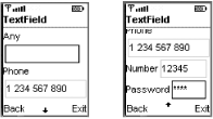
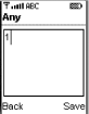
The first field, shown at the top on the left side of Figure 4-13, has constraint
TextField.ANY, which permits any characters to be
entered. If you start typing into this field, either by clicking with
the mouse on the emulator’s onscreen keypad or using
your PC keyboard, the display switches to a full-screen
TextBox that you can use to type and edit the
value that you want, as shown in Figure 4-14. To
enter the displayed value into the TextField,
press the Save soft key, or press Back to abandon editing and leave
the field content unchanged.
The second TextField has the
TextField.PHONENUMBER constraint. In the reference
implementation, this constraint limits the characters that can be
typed to the digits 0 through 9 and the characters
+, *, and #.
This constraint also causes the content of the
TextField to be displayed so that it looks like a
telephone number by separating the digits into groups separated by
space characters. The appropriate grouping depends entirely on the
part of the world in which the cell phone or PDA is being used, since
different conventions apply in different countries. The reference
implementation uses the following rules:
If the first digit is zero, the number is assumed to be for international dialing and is represented in the form “0xx xxx xxxx . . . “.
If the first digit is 1, the number is formatted as “1 xxx xxx xxxx . . . “.
In all other cases, the number is displayed as “xxx xxx xxx . . . “.
Note that the spaces used to separate the number groups are purely
visual and do not appear in the TextField content.
For example, if the TextField displayed
“044 171 1234567”, the result of
calling the getString( ) method would be
“0441711234567”. Similarly, an
attempt to store a value containing spaces would result in an
IllegalArgumentException. If you run this example
using the Wireless Toolkit, you can observe the results of typing
different values into this field or any of the other fields by
looking at the Wireless Toolkit console, to which a message is
written whenever any of the fields calls the
ItemStateListener registered with this screen.
The third field has the constraint
TextField.NUMERIC applied to it. As you can verify
for yourself, this field will allow you to type only positive and
negative integer values and zero.
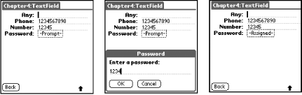
The final field is set up with the constraint
TextField.PASSWORD|TextField.NUMERIC, which limits
the user to numeric values but also displays each character that is
typed as an asterisk, as shown on the right side of Figure 4-13. On PalmOS, a field that includes the
constraint TextField.PASSWORD is handled slightly
differently. When the field is empty, its content is shown as
“-Prompt-”, as shown on the left
side of Figure 4-15. When an attempt is made to
enter a value, a separate window opens up to allow you to type the
required password. As you can see from the screen shot in Figure 4-15, this window displays the actual password
value instead of disguising it. Once a password has been entered, the
TextField displays
“-Assigned-”, as shown at the right
side of the figure.
DateField
is a component that allows you to display and edit the value of an
object of type Date. The
DateField class has two constructors:
public DateField(String label, int mode)
public DateField(String label, int mode, TimeZone timeZone)
The date and time value held in a Date object is
always relative to midnight UTC on January 1, 1970. When displaying
the time, a correction needs to be made for the time zone in which
the user is working. On the east coast of the United States, for
example, a Date value that corresponds to 9:00
P.M. on January 31, 2002 (UTC), would need to be displayed as 4:00
P.M., January 31, 2002, and in Tokyo, it would need to be shown as
6:00 A.M., February 1, 2002. You can use the
timeZone argument to supply a
TimeZone object that can be used to determine how
to display the date and time for a specific location in the world. If
this argument is not supplied (or is null), the
device’s default TimeZone is
used, which should properly display local time. Therefore, it should
be necessary to supply a TimeZone value only when
the date and time for a different time zone are to be displayed.
Warning
The DateField component works with any valid
TimeZone object and therefore should be able to
properly display the date and time anywhere in the world. However,
the CLDC specification requires only that the time zone for GMT be
supported. Practical considerations dictate that a device also
support the time zone in which it normally operates, but there is no
guarantee that other time zones will be available.
The mode argument determines what the
DateField will display and takes one of the
following values:
- DateField.TIME
The
DateFieldshould display only the time.- DateField.DATE
The
DateFieldshould display only the date.- DateField.DATE_TIME
The
DateFieldshould display both the date and time.
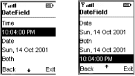
An example of a DateField in each of these three
modes can be seen by running the ItemMIDlet and
selecting the DateField screen. The result is
shown in Figure 4-16. The left side of this figure
shows DateFields configured with mode
DateField.TIME at the top and
DateField.DATE at the bottom, while the bottom
DateField on the right side has mode
DateField.DATE_TIME.
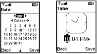
DateField allows the user to edit the date and/or
time that it displays. In the reference implementation, if you start
pressing keys or press the SELECT button on the emulator keypad while
a DateField has the input focus, a full-screen
editor appears. There are separate editors for dates and times, as
shown in Figure 4-17.
Note that DateField is derived from
Item and not from TextField, so
it is not possible to gain access to the characters displayed on the
screen as would be the case with TextField.
Like all Items, when the user changes the date
and/or time displayed by a DateField, the change
is reported to the ItemStateListener, if any,
registered with the Form that the
DateField is displayed on. The value of the
Date object associated with the
DateField can be obtained or changed using the
following methods:
public void setDate(Date date);
public Date getDate( );
When the setDate method is called, the
DateField does not store a reference to the
Date that is passed to it. Instead, it copies the
value so that changes made within the DateField
component are not reflected in the Date object
supplied. Similarly, the value returned by getDate( ) is a newly created object that reflects the date and/or
time in the DateField at the time of the method
call.
The setDate method may be called with argument
null. In this case, the
DateField is considered to be in an uninitialized
state and does not display a valid value. The
DateField is also in this state following
construction and until setDate( ) is called with a
valid Date. The getDate method
returns null when the DateField
is in this state, and, in the reference implementation, the time part
displays the string <time> while the date
part displays <date>.
DateField has a very simple programming interface,
but there are some traps waiting for the unwary. The nature of these
traps depends on the mode in which the DateField
is operating.
This is the simplest case to handle. The only possible problem here
arises from the fact that the DateField does not
preserve the seconds and milliseconds value of the
Date object that is passed to it. As a consequence
of this, for example, if the setDate( ) method is
called with a Date object for 10:04:03 P.M. on
January 31, 2002, and no changes are made by the user, the value
returned by the getDate( ) method corresponds to
10:04 P.M. on the same date.
In this mode, the DateField works only with the
year, month, and date parts of the time and does not preserve the
time elements. Therefore, the value returned by getDate( ) in this mode reports zero values for the time.
TIME mode causes the greatest inconvenience.
According to the specification, in this mode, the
Date passed to the setDate( )
method must have the date parts initialized to
the “epoch” date, January 1, 1970,
and the Date returned by getDate( ) contains this same date. The problem with this is that
code like the following does not necessarily work as you might want
it to:
Date now = new Date( );  // Current date and time
dateField.setDate(now);  // We want to display only the time
Ideally, the setDate method would ignore the date
and display only the time. Unfortunately, the specification excludes
this possibility. For predictable results, you have to pass in a
Date value with the date parts set to those for
the epoch. In the reference inplementation, if you fail to do this,
the DateField considers its content to be invalid
and puts itself into the uninitialized state, as if
setDate(null) had been called. The following code
extract can be used to create a Date object that
contains the current time and the year, month, and day values for the
epoch, without assuming what the epoch date is:
// Get Calendar for the epoch date and time
Calendar baseCal = Calendar.getInstance( );
Date baseDate = new Date(0);
baseCal.setTime(baseDate);

// Get Calendar for now and use the epoch
// values to reset the date to the epoch.
Calendar cal = Calendar.getInstance( );
Date now = new Date( );
cal.setTime(now);

// Set the year, month and day in month from the epoch
cal.set(Calendar.YEAR, baseCal.get(Calendar.YEAR));
cal.set(Calendar.MONTH, baseCal.get(Calendar.MONTH));
cal.set(Calendar.DATE, baseCal.get(Calendar.DATE));
Under most circumstances, the DateField mode would
not be changed following construction. If required, however, the mode
can be changed using the setInputMode( ) method:
public void setInputMode(int mode);
where the mode argument is
DateField.DATE, DateField.TIME,
or DateField.DATE_TIME. Changing the mode affects
the visual appearance of the component and may also affect the
Date value that it contains, as follows:
ImageItem
lets you place an image on a Form with some
limited control over how it is placed relative to other Items. The
ImageItem class has a single constructor:
public ImageItem(String label, Image image, int layout, String altText)
Adding an ImageItem to a Form
causes the optional label and the image to be placed subject to the
constraints specified by the layout argument. The
device is free to ignore the layout argument and
apply its own layout rules. It may also use the text supplied by the
altText argument in place of the image when, in
the words of the MIDP specification, “the image
exceeds the capability of the device to display it.”
The image is supplied in the form of an Image
object, which will be described in detail when we discuss the
low-level API in Chapter 5. There are several ways
to create an Image, including loading data over a
network connection, using graphics primitives to compose the
Image from lines, points, curves and solid shapes,
and loading encoded data from a file. For the purposes of
illustration, we will use the last of these methods in this chapter
because it is easy to demonstrate and creates an immutable image,
which is a requirement for ImageItem.
[16]
To load an image from a file, use the following static method of the
Image class:
public static Image createImage(String name) throws IOException
name is a resource name that corresponds to the
location of the file in the MIDlet suite’s JAR file.
The name parameter is used as the argument to the
getResourceAsStream( ) method that was described
in Section 4.2.3, earlier in this
chapter. Although getResourceAsStream( ) can be
given either an absolute or relative resource name, the
name parameter should always be absolute in this
case, because a relative name would not be interpreted as being
relative to your MIDlet’s class (and, in fact, the
class relative to which a relative resource name would be interpreted
is implementation-dependent). The indicated file must contain an
image encoded in Portable Network Graphics (PNG) format, since this
is the only graphics file format that MIDP devices are required to
support. Most of the commonly used utilities that allow you to design
graphics or manipulate images provide the option to save in PNG
format.
The layout parameter is a bitmask made up from
legal combinations of the following values:
- ImageItem.LAYOUT_DEFAULT
The image should be placed according to the platform’s default layout policy.
- ImageItem.LAYOUT_LEFT
The image should be left-justified in the space available to it.
- ImageItem.LAYOUT_RIGHT
The image should be right-justified in the space available to it.
- ImageItem.LAYOUT_CENTER
The image should be centered in the space available to it.
- ImageItem.LAYOUT_NEWLINE_BEFORE
A line break should occur before the image is drawn.
- ImageItem.LAYOUT_NEWLINE_AFTER
A line break should occur after the image is drawn.
When LAYOUT_DEFAULT is used, the device places the
image according to implementation-dependent rules. In the reference
implementation, this value causes the ImageItem to
be handled in the same way as
StringItem -- that is, it is placed on the same
horizontal line as the Item that precedes it,
providing that both of the following conditions are met:
The
ImageItemdoes not contain a nonempty label, because this always forces a line break.The space remaining in the current line is not less than the width of the image.
If these conditions are not met, a line break occurs before the optional label and image are drawn. The remaining layout constraints may be mixed together subject to the following rules:
LAYOUT_LEFT,LAYOUT_RIGHT, andLAYOUT_CENTERare mutually exclusive. They determine how the image is placed within the remaining space on the current line.LAYOUT_NEWLINE_BEFOREandLAYOUT_NEWLINE_AFTERcan be used separately or together; they may also be used in conjunction with eitherLAYOUT_DEFAULTor one ofLAYOUT_LEFT,LAYOUT_RIGHT, orLAYOUT_CENTER. BecauseLAYOUT_DEFAULThas value 0, alayoutvalue ofLAYOUT_NEWLINE_BEFOREis equivalent toLAYOUT_NEWLINE_BEFORE | LAYOUT_DEFAULT.
As a shorthand, you can add an image to a Form
using the following Form method:
public void append(Image image);
This is equivalent to creating and appending an
ImageItem with layout
LAYOUT_DEFAULT and no label, that is:
form.append(new ImageItem(null, image, ImageItem.LAYOUT_DEFAULT, null));
You can see some examples of ImageItems by
selecting the ImageItem entry from the list
presented by ItemMIDlet. The result of running
this example on the default color phone is shown in Figure 4-18 and on the PalmOS platform in Figure 4-19.
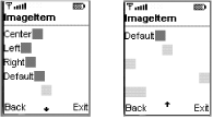
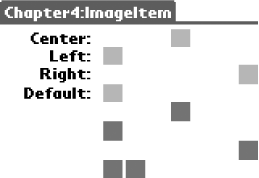
The top four lines all contain ImageItems that
have both an image and a label. These components were created as
follows:
Image red = Image.createImage("/ora/ch4/resources/red.png");
Image blue = Image.createImage("/ora/ch4/resources/blue.png");

// ImageItems with labels
form.append(new ImageItem("Center", red, ImageItem.LAYOUT_CENTER, null));
form.append(new ImageItem("Left", red, ImageItem.LAYOUT_LEFT, null));
form.append(new ImageItem("Right", red, ImageItem.LAYOUT_RIGHT, null));
form.append(new ImageItem("Default", red, ImageItem.LAYOUT_DEFAULT,
    null));
The layout arguments used here do not include
LAYOUT_NEWLINE_BEFORE, so the images directly
follow their labels. However, each ImageItem is
placed on a line of its own even though
LAYOUT_NEWLINE_AFTER is not specified, because
each has a label, which forces a line break.
If you compare Figure 4-18 and Figure 4-19, you’ll notice that the image
placements on the default color phone do not correspond to those
requested by the layout argument: they all appear
to be left-aligned, whereas the PalmOS implementation places them
properly. This is not inconsistent with the MIDP specification, which
allows a device to treat the layout parameter as a
hint. It serves to illustrate that you cannot rely on having images
placed exactly where you want them.
The last five ImageItems differ from the first
four in two respects:
They do not have labels.
Three of them have
layoutvalues that include bothLAYOUT_NEWLINE_BEFOREandLAYOUT_NEWLINE_AFTER.
The code used to add these components is as follows:
form.append(new ImageItem(null, blue, ageItem.LAYOUT_NEWLINE_BEFORE |
    ImageItem.LAYOUT_CENTER |ImageItem.LAYOUT_NEWLINE_AFTER, null));
form.append(new ImageItem(null, blue, mageItem.LAYOUT_NEWLINE_BEFORE |
    ImageItem.LAYOUT_DEFAULT | ImageItem.LAYOUT_NEWLINE_AFTER, null));
form.append(new ImageItem(null, blue, ImageItem.LAYOUT_NEWLINE_BEFORE |
    ImageItem.LAYOUT_RIGHT | ImageItem.LAYOUT_NEWLINE_AFTER, null));
form.append(new ImageItem(null, blue, ImageItem.LAYOUT_DEFAULT, null));
form.append(new ImageItem(null, blue, ImageItem.LAYOUT_DEFAULT, null));
Because these ImageItems do not include labels,
they would normally be laid out on a single line with no line breaks.
The LAYOUT_NEWLINE_BEFORE and
LAYOUT_NEWLINE_AFTER values cause each image to be
preceded and followed by a line break. Note that only a single line
break is used between each pair of images, even though it might
appear that two newlines have been requested (i.e., one after each
image and one before the image that follows it). The last two
ImageItems are created with the
layout argument set to
LAYOUT_DEFAULT only. As a result, no line breaks
are added, and, as you can see, they appear on the same line. The
line break before the first ImageItem is due to
the LAYOUT_NEWLINE_AFTER part of the
layout attribute of the
ImageItem on the line above.
Notice that the default color phone has obeyed the positioning
constraints when placing these ImageItems, as you
can see from the right side of Figure 4-18. At the
time of writing, the MIDP reference implementation honors the
LAYOUT_RIGHT and LAYOUT_CENTER
constraints only if the layout attribute also includes both
LAYOUT_NEWLINE_BEFORE and
LAYOUT_NEWLINE_AFTER.
A Gauge provides a way to represent a single
selected value from a contiguous range of integers starting from 0
and ranging up to an application-supplied maximum. The
Gauge
class has a single constructor:
public Gauge(String label, boolean interactive, int maxValue,
    int initialValue);
The maxValue and initialValue
arguments specify, respectively, the largest value of the range
covered by the gauge and the value that will be displayed initially.
The minimum value is always implicitly zero, and the current value
must always be positive and not greater than the maximum.
The interactive argument determines whether the
user can adjust the value in the gauge. To use a gauge as a slider,
you should set this argument to true. Adjustments
made by the user are reported to the
ItemStateListener attached to the
Form on which the gauge is displayed. If
interactive is false, the value of the gauge can
be adjusted only under application control. In this mode, the gauge
acts more like a progress bar.
The current value of a gauge can be obtained or changed using the following methods:
public int getValue( );
public void setValue(int value);
The value passed to the setValue( ) method must be
nonnegative and less than or equal to the maximum value. The maximum
value can itself be manipulated using similar methods:
public int getMaxValue( );
public void setMaxValue(int value);
The value passed to setMaxValue( ) must be greater
than 0. If the new maximum value is less than the current value, the
current value is reduced to the new maximum. Note that, as with all
programmatic changes, this change in the current value is not
reported to ItemStateListeners.
There is also a method that allows you to determine whether a gauge is interactive:
public boolean isInteractive( );
However, you cannot change this attribute: a gauge is either always interactive or always not interactive.
If you run the ItemMIDlet and select the
Gauge example, you’ll see a
screen displaying three gauges, all of which have a maximum value of
100, as shown in Figure 4-20. The code used to
create this Form is as follows:
Form form = new Form("Gauge");
form.append(new Gauge(null, true, 100, 50));
form.append(new Gauge(null, true, 100, 25));
form.append(new Gauge(null, false, 100, 50));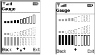
The top two gauges are interactive, and the bottom one is not. Notice
first that the Gauge that has the focus is
distinguished from the the others in that its bars are fully drawn,
while those of the other two are not. Also, the two interactive
gauges have bars that increase in size from left to right, but the
noninteractive one has bars of constant height.
These gauges represent their complete range using 10 bars, so that each bar corresponds to a range of 10 values. For a larger value range, each bar would correspond to a wider range of values. On the default color phone, the number of filled bars gives a guide to the current value of the gauge, but the user can see only an approximation of the real value, because each bar represents more than one possible value (a range of 10 possible values, in this case). On other devices, the gauge might use a different total number of bars to represent the same total value range, or it might not use bars at all. On the PalmOS platform, for example, both interactive and noninteractive gauges are represented quite differently from those on the default color phone, as shown in Figure 4-21.
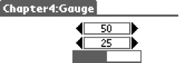
On the default color phone, you can use the up and down arrow keys to move the input focus from gauge to gauge. When an interactive gauge has the focus, you can use the left and right arrow keys to adjust the current value up or down; horizontal arrows are drawn on the screen as a visual cue, as you can see at the bottom of the left screenshot in Figure 4-20. When the gauge is at its maximum value, the right-pointing arrow is not shown, and the right arrow key has no effect; the left arrow and key show similar behavior when the gauge is at its minimum value. No visual cues are shown when the input focus is assigned to a noninteractive gauge, as is the case in the right screen shot in Figure 4-20, because the user cannot change the value of this gauge.
If you change the value of either of the top two gauges with the
arrow keys, you’ll notice that a message is written
to the Wireless Toolkit console window to reflect every value change.
This value is obtained by calling the Gauge.getValue( ) method from the
Form’s itemStateChanged( ) method:
public void itemStateChanged(Item item) {
    if (item instanceof Gauge) {
        int value = ((Gauge)item).getValue( );
        System.out.println("Gauge value set to " + value);
    } else {
        // Other code not shown here
    }
}
You have to click the right or left arrow key 10 times to affect the
visual representation of the gauge, but the
ItemStateListener is notified of each individual
change.
An interactive gauge generally is used to allow the user to select one of a range of values, and the MIDlet usually interacts with it only when the user changes the value or when it is necessary to set a new value programmatically. By contrast, when the gauge is used as a progress bar, the MIDlet updates it regularly to reflect the state of an operation that it is performing.
ChoiceGroup and List are two
similar components that present the user with a set of choices and
allow one or more them to be selected. The relationship between them
is similar to that between TextField and
TextBox: ChoiceGroup is an
Item to be used as part of a
Form, while List is derived
from Screen and is therefore a freestanding
component that occupies the entire screen. Most of the programming
interface is common and is described by an interface called
Choice. For simplicity, we’ll
cover the common features by examining ChoiceGroup
and then look at how List differs from it.
There are two types of ChoiceGroup
, distinguished by the number of items
within the group that can be selected at the same time. The choice
between these two types is made when the
ChoiceGroup is created with one of its two
constructors:
public ChoiceGroup(String label, int choiceType);
public ChoiceGroup(String label, int choiceType, String[] strings,
    Image[] images);
The choiceGroup parameter takes one of the
following values, defined in the interface Choice,
which ChoiceGroup implements:
- Choice.EXCLUSIVE
Creates an exclusive
ChoiceGroupin which only one item can be selected and which, therefore, acts like a collection of radio buttons- Choice.MULTIPLE
Creates a multiple-selection
ChoiceGroup, which is like a set of check boxes, in which any number of items can be selected.
You can see examples of both types of ChoiceGroup
by running the ItemMIDlet and choosing the
ChoiceGroup entry. The result of running this on
the default color phone is shown in Figure 4-22,
with an EXCLUSIVE
ChoiceGroup
on the left and a MULTIPLE
ChoiceGroup on the right.
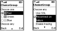
There are two ways to initialize a ChoiceGroup:
the selections can be added using the second of the constructors
shown above, or they can be added following construction. The left
ChoiceGroup in Figure 4-22 was
initialized at construction time:
Image red = Image.createImage("/ora/ch4/resources/red.png");
Image green = Image.createImage("/ora/ch4/resources/green.png");
Image blue = Image.createImage("/ora/ch4/resources/blue.png");

// Exclusive choice group
String[] strings = new String[] { "Red", "Green", "Blue" };
Image[] images = new Image[] { red, green, blue };
ChoiceGroup exGroup = new ChoiceGroup("Choose one",
    ChoiceGroup.EXCLUSIVE, strings, images);
Each element of a ChoiceGroup consists of a string
and an optional Image that the device may display
near the string, although it is not obliged to display the
Image at all. When using the constructor to
initialize a ChoiceGroup, the following rules must
be followed:
The
stringsargument must not benulland no element of thestringsarray can benull. This restriction implies that image-only entries are not supported.The
imagesargument may benullif images are not required.If the
imagesargument is notnull, it must have the same number of elements as thestringsarray. The image at indexNof theimagesarray corresponds to the string at elementNof thestringsarray.Images must be immutable. Any element in theimagesarray may benullif an image is not required for that entry of theChoiceGroup.
The device is responsible for rendering the
ChoiceGroup in such a way as to visually
distinguish an EXCLUSIVE
ChoiceGroup from a MULTIPLE
one. As shown in Figure 4-22, the default color
phone achieves this by following the common convention of using a
circle to represent a radio button in the
EXCLUSIVE group and a square for a check box in
the MULTIPLE group. This is not the only way to
achieve this differentiation, however, as you can see in Figure 4-23, later in this chapter, which shows the same
ChoiceGroups as those in Figure 4-22 as they appear on the PalmOS platform. Note
that the EXCLUSIVE
ChoiceGroup
is represented in the form of a popup menu, which shows only the
selected item when the menu is not visible. This figure also
illustrates that a platform is not obliged to use
Images even if they are supplied.
An alternative way to initialize a ChoiceGroup is
to add entries after construction. This is how the multiple-choice
group shown on the right side of Figure 4-22 was
created:
ChoiceGroup multiGroup = new ChoiceGroup("Choose any",
    ChoiceGroup.MULTIPLE);
multiGroup.append("Use SSL", null);
multiGroup.append("Reconnect on failure", null);
multiGroup.append("Enable tracing", null);
The append( ) method supplies both the string and
the optional image, in that order:
public int append(String string, Image image);
This method requires that the string argument is
not null. The image argument
may be null if no image is required; if it is not
null, the Image that it refers
to must be immutable. The value returned by this method is the index
of the entry created within the ChoiceGroup, so
the first call in the code example would return 0, the second would
return 1, and so on. The append( ) method is one
of several methods from the Choice interface that
can be used to change the content of the
ChoiceGroup at any time. The other methods are
described in Section 4.2.13.4, a little later in the
chapter.
When a ChoiceGroup has the input focus, the user
can navigate from item to item within it with the up and down arrow
keys (or their equivalents) on the phone keypad. These internal
navigation operations are not visible to application code. To change
the selected state of an entry, the user must press the
device’s SELECT button. The location of the
SELECT button on the default color phone is shown
in Figure 4-5. The effect that this has depends on
the ChoiceGroup type:
- MULTIPLE ChoiceGroup
Pressing the SELECT button when an element that is not currently selected has the focus results in that element being selected, but it does not affect the state of any other item. Pressing the SELECT button for an item that is already selected has the effect of deselecting it.
- EXCLUSIVE ChoiceGroup:
Because only one item in an exclusive group may be selected at any time, selecting an element clears the previous selection. Attempting to select an element that is already selected has no effect. (It does not deselect the entry; this would result in no element being selected, which is not allowed.)
Changes in the selection state of an element within a
ChoiceGroup are reported to the
ItemStateListener of the Form
on which the ChoiceGroup is displayed. In the case
of a multiple-selection group, notification occurs whenever an
element is selected or deselected. For an exclusive group, selecting
one element implicitly deselects another element, but only one
notification takes place.
Handling state changes using an ItemStateListener
is appropriate for applications where an immediate response is
required, perhaps to update some other part of the user interface to
reflect the user’s selection. On the other hand, the
ChoiceGroup might be part of a larger input form
whose contents will be processed as a single unit when all fields
have been filled in. In this case, you add a
Command (typically Command.OK)
to the Form and implement the logic of the
Form in its commandAction( )
method. Whichever approach you take, you need to be able to find out
which elements of the ChoiceGroup are selected.
ChoiceGroup has three methods that can be used to
get the current selection state:
public boolean isSelected(int index);
public int getSelectedIndex( );
public int getSelectedFlags(boolean[] flags);
The isSelected( ) method returns
true if the element with the given index is
selected, false if it is not. This method is most
often used with multiple-selection ChoiceGroups
where each check box represents a different program action that is
likely to be independent of the others. Typical code for this case
might look like this:
public static final int USE_SSL = 0;
public static final int RECONNECT_ON_FAILURE = 1;
public static final int TRACING_ENABLED = 2;
....
do {
    if (multiGroup.isSelected(USE_SSL)) {
        // Connect using SSL
    } else {
        // Connect using vanilla sockets
    }
    if (failed && multiGroup.isSelected(TRACING_ENABLED)) {
        // Log failure
    }
} while (failed && multiGroup.isSelected(RECONNECT_ON_FAILURE));
In the case of an EXCLUSIVE
ChoiceGroup, since only one element can be
selected, the getSelectedIndex( ) method can be
used to determine its index:
public static final int RED = 0;
public static final int GREEN = 1;
public static final int BLUE = 2;
....
int index = exGroup.getSelectedIndex( );
if (index == RED) {
    // Act on red selection
}
This method always returns -1 if it is called for a multiple-choice
ChoiceGroup because there could be more than one
selected element. It also returns -1 if the
ChoiceGroup has no elements at all (which is
unlikely in practice).
If you need to get the selection state of every element in the
ChoiceGroup, the getSelectedFlags( ) method should be used. This method requires an array of
booleans that has at least as many elements as
there are items in the ChoiceGroup; it sets each
entry in the array to true or
false depending on whether the corresponding entry
is selected. The return value is the number of items that are
selected. Before invoking this method, you need to allocate a boolean
array of the appropriate size. If the number of elements in the
ChoiceGroup is not constant, you can use the
size( ) method to find out how many there are:
boolean[] flags = new boolean[multiGroup.size( )];
int count = multiGroup.getSelectedFlags(flags);
do {
    if (flags[USE_SSL]) {
            // Connect using SSL
        } else {
            // Connect using vanilla sockets
        }
    if (failed && flags[TRACING_ENABLED]) {
        // Log failure
    }
} while (failed && flags[RECONNECT_ON_FAILURE]);
This technique works for both types of ChoiceGroup.
Finally, to get the value of an element within the
ChoiceGroup, use the getString( ) method:
public String getString(int index);
The following code extract returns either “Red”, “Green”, or “Blue”:
String color = exGroup.getString(exGroup.getSelectedIndex( ));
The code that handles selection changes for the
ChoiceGroups used in the
ItemMIDlet is shown in Example 4-5.
Example 4-5. Handling Selection Changes in a ChoiceGroup or List Component
// Handles the selection for a Choice
private void handleChoiceSelection(Choice choice) {
    int count = choice.size( );
    boolean[] states = new boolean[count];
    int selCount = choice.getSelectedFlags(states);
    if (selCount > 0) {
        System.out.println("Selected items:");
        for (int i = 0; i < count; i++) {
            if (states[i]) {
                System.out.println("\t" + choice.getString(i));
            }
        }
    } else {
        System.out.println("No selected items.");
    }
    int selectedIndex = choice.getSelectedIndex( );
    System.out.println("Selected index is " + selectedIndex);
}
This method, which is called from the
ItemStateListener attached to the
Form in which the ChoiceGroups
are contained, is given an argument of type Choice
instead of ChoiceGroup. When it is invoked,
however, the calling code passes a reference to the
ChoiceGroup. This is acceptable, because
ChoiceGroup implements the
Choice interface. The benefit of requiring an
argument of type Choice instead of
ChoiceGroup is that this same code can also be
used to handle selection changes for the List
component, which also implements Choice.
The aim of this code is simply to demonstrate a couple of ways of
handling selection changes. The first part of this code uses the
getSelectedFlags( ) method to get an array of
booleans that shows which elements are selected.
The code then loops over the returned array, gets the strings
corresponding to selected entries, and prints them. The second part
of the method uses the getSelectedIndex( ) method
to access directly the index of the selected item, which, as noted
above, returns a meaningful result only for an
EXCLUSIVE
ChoiceGroup.
Selecting the Green item in the ChoiceGroup
example and pressing the SELECT button results in the following
output in the Wireless Toolkit console:
Selected items:
        Green
Selected index is 1
Because this is an EXCLUSIVE
ChoiceGroup, only one item can ever be selected,
so the getSelectedIndex( ) method is able to
return its index. Selecting Use SSL in the multiple-choice
ChoiceGroup gives this result:
Selected items:
        Use SSL
Selected index is -1
Here, getSelectedIndex( ) has returned -1 because
the type is MULTIPLE. Selecting another entry in
the same ChoiceGroup results in the following:
Selected items:
        Use SSL
        Enable tracing
Selected index is -1
As you can see, the getSelectedFlags( ) method
returns all the selected items.
The selection state of the elements within a
ChoiceGroup can be changed programmatically using
the following methods:
public void setSelectedIndex(int index, boolean selected);
public void setSelectedFlags(boolean[] flags);
The effect of the setSelectedIndex( ) method
depends on the ChoiceGroup type. In the
multiple-choice case, this method selects or deselects the element at
the given index, depending on the value of the
selected argument. In an exclusive
ChoiceGroup, however, this method has an effect
only if the selected argument has value
true. In this case, it selects the element at
index and deselects the element that was
previously selected. If selected is
false, the call is ignored. This happens because
an exclusive ChoiceGroup must always have one
selected element, so it is not possible simply to deselect the
element that is currently selected without selecting another element
at the same time.
You can set the selected state of all the elements in a
ChoiceGroup by calling the
setSelectedFlags( ) method, passing it an array of
booleans containing true for
those elements that are to be selected and false
for those that are not. The boolean array must
contain an entry for each element in the
ChoiceGroup:
public boolean[] initialStates = new boolean[3];
initialStates[RECONNECT_ON_FAILURE] = true;  // Select just this element
multiGroup.setSelectedFlags(initialStates);
In the multiple-choice case, any number of entries in the array can
be true. Since exclusive
ChoiceGroups can have only one element selected,
in this case the boolean array must have exactly
one entry with value true. If this is not the
case, the following selection rules apply:
If the array has no entries set to
true, the first entry in theChoiceGroupis selected.If the array has more than one entry set to
true, the element in theChoiceGroupcorresponding to the firsttrueentry is selected.
Note that changing the selection using these methods does not result
in notification to the Form’s
ItemStateListener.
The content of a ChoiceGroup can be changed at any time using the following methods:
public int append(String string, Image image);
public void insert(int index, String string, Image image);
public void set(int index, String string, Image image);
public void delete(int index);
The append( ) method, which has already been
discussed, adds a new element to the end of the
ChoiceGroup. The insert( )
method is similar, except that it places the new entry at the given
index, moving the element at that index and all higher indexes down
to make room for the new one. This method can also be used to add an
element at the end of the ChoiceGroup by supplying
the size of the ChoiceGroup as the insertion
index:
multiGroup.insert(multiGroup.size( ), "New Entry", null);
Insertion indexes greater than size( ) are invalid
and cause an IndexOutOfBoundsException to be
thrown.
The set( ) method replaces the content of an
existing element with new values. Both the string and image parts of
the element are changed: it is not possible to change only one of
these attributes by supplying null for the other.
For all of these methods, the image argument may
be null if no image is required, but the
string argument must not be
null. If an image is supplied, it must be
immutable.
Finally, an element can be removed from the
ChoiceGroup using the delete( )
method:
public void delete(int index);
Changing the content of a ChoiceGroup may have an
effect on its selection state. The rules that apply are as follows:
Adding an item using the
append( )method has no effect on the selection. The only exception to this is anEXCLUSIVEChoiceGroupthat was previously empty. In this case, the newly added element is selected.Inserting an element using the
insert( )method preserves the selected state of each existing item in the list, but, of course, the indexes of the selected items may change. As an example of this, if elements 2 and 3 are selected and a new element is inserted at index 2, the selected item indexes change to 3 and 4. As a special case, as with theappend( )method, if anEXCLUSIVEChoiceGroupwas previously empty, the new element is selected.Replacing an item using the
set( )method gives the new item the same selected state as the item that it replaced.
Deleting an item has no effect on the selection state of other items,
except when the selected element in an EXCLUSIVE
ChoiceGroup is deleted. In this case, if the
deleted item is not at the end of the list, the item that replaces it
is selected (that is, the selected index remains the same). If the
selected item is the last item, then the element that becomes the
last item is selected instead.
List
is a
full-screen version of ChoiceGroup that shares
most of its programming interface. The common functionality is
grouped into an interface called Choice, which has
the following methods:
public int append(String string, Image image);
public void delete(int index);
public Image getImage(int index);
public int getSelectedFlags(boolean[] flags);
public int getSelectedIndex( );
public String getString(int index);
public void insert(int index, String string, Image image);
public boolean isSelected(int index);
public void set(int index, String string, Image image);
public void setSelectedFlags(boolean[] flags);
public void setSelectedIndex(int index, boolean selected);
public int size( );
List has two constructors that mirror those of
ChoiceGroup and work in exactly the same way:
public List(String title, int type);
public List(String title, int type, String[] strings, Image[] images);
The only difference is that the first parameter is used to set the
title of the List’s screen,
whereas it is used as the label for a ChoiceGroup.
As well as supporting the EXCLUSIVE and
MULTIPLE modes of operation,
List has a third mode, selected by setting the
type to Choice.IMPLICIT, which cannot be used with
ChoiceGroup. IMPLICIT mode
creates a List that behaves somewhat like a
standard list (e.g., the Swing JList component),
with the restriction that only one element can be selected at a time.
This mode is often used to create a menu, and, in fact, this is how
the list of MIDlets in a MIDlet suite is presented when you launch
the Java VM (see Figure 3-8). If you select the
List item from the menu presented by
ItemMIDlet, you’ll see an
IMPLICIT
List, as shown on the
left side of Figure 4-23. The code used to create
this list is very similar to the corresponding
ChoiceGroup code:
List list = new List("List", List.IMPLICIT);
Image red = Image.createImage("/ora/ch4/resources/red.png");
Image green = Image.createImage("/ora/ch4/resources/green.png");
Image blue = Image.createImage("/ora/ch4/resources/blue.png");

list.append("Red", red);
list.append("Green", green);
list.append("Blue", blue);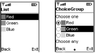
The same List as displayed on the PalmOS platform
is shown in Figure 4-24. As you can see, the cell
phone emulator displays both the string and the image associated with
each element in the list, whereas the PalmOS implementation ignores
the image, as it did in the case of the
ChoiceGroup.

The IMPLICIT and EXCLUSIVE
modes are very similar, in that both require exactly one element of
the list to be selected at any time. In fact, all previous comments
regarding EXCLUSIVE mode made in connection with
ChoiceGroup also apply to the
IMPLICIT mode of List. The
difference between these modes can be seen by comparing the
IMPLICIT
List on the left side
of Figure 4-23 with the EXCLUSIVE
ChoiceGroup on the right. As you can see, the
ChoiceGroup has a separate radio button that
indicates which element is selected, whereas the
List does not. This means that the highlighted
element in the ChoiceGroup (Green) need not be the
same as the selected element (Red). In the case of an
IMPLICIT list, however, the highlighted element is
implicitly considered to be the selected
element, which is why this is referred to as
IMPLICIT mode.
Since List is not an Item,
changes in its selection state cannot be notified to application code
via an ItemStateListener. In fact, there is no way
to detect when the selected element of a List
changes, in any of its modes, until the user activates a
Command installed on the List
that would prompt application code to examine its selection
state.[17] In the case of an IMPLICIT
List, however, if the user presses the SELECT key
on the cell phone keypad or presses the arrow to the left of each
item on the PalmOS platform (refer to Figure 4-24),
the List’s
CommandListener, if there is one, is notified of a
selection change. Usually, when the commandAction( ) method of the CommandListener is
called, it is passed a reference to the application-supplied
Command that was activated and the
Displayable to which the
Command was attached. In this case, however, there
is no application Command associated with the
selection action, so the List provides a private
Command called
List.SELECT_COMMAND, which indicates that the
commandAction( ) method has been called as a
result of an IMPLICIT
List
selection. The Displayable argument passed to
commandAction( ) refers to the
List itself.
To associate a CommandListener with a
List, you use the setCommandListener( ) method inherited from Displayable:
List list = new List("List", Choice.IMPLICIT);
list.setCommandListener(new CommandListener( ) {
    public void commandAction(Command c, Displayable d) {
        // Handle notification from the List
    }
});
The ItemMIDlet
commandAction( )
method includes a case that detects the List
selection change:
public void commandAction(Command c, Displayable d) {
    if (c == List.SELECT_COMMAND) {
        // Selection made in the IMPLICIT LIST
        handleChoiceSelection((Choice)d);
    } else {
         // Other cases not shown
    }
}
Because List implements the
Choice interface, you can use the same methods to
handle the selection as those shown in connection with
ChoiceGroup. In fact, the previous code uses the
same handleChoiceSelection( ) method as was used
to handle the ChoiceGroup selection in Example 4-5. Notice that a reference to the
List is obtained by casting the
Displayable to an object of type
Choice. This is correct because the notification
comes from the List (the
Displayable), which implements
Choice.
Warning
Note carefully that this discussion applies only to
Lists created with type
IMPLICIT. The CommandListener
will not be notified of any selection change for
Lists of type MULTIPLE or
EXCLUSIVE. For these types, it is necessary to
attach to the List a Command
that notifies application code that the List
selection should be checked.
The behavior of the Choice methods concerned with
selection handling in the IMPLICIT mode is the
same as that for EXCLUSIVE mode, as described in
the earlier sections Section 4.2.13.2
and Section 4.2.13.3.
Alert
is a
subclass of Screen that behaves much like a
dialog, albeit with very limited functionality. When an
Alert is displayed by calling the
Display
setCurrent( ) method,
it covers some or all of the device screen and receives all key and
pointer events generated by user action while it is visible. An
Alert may be modal or
nonmodal. In this context, an
Alert is modal if it remains displayed until the
user explicitly dismisses it. A nonmodal dialog, by contrast, is
displayed for a limited maximum time period before being closed
automatically.
Alert has several attributes that determine its
appearance and behavior:
- Title
This attribute is inherited from
Screen. AnAlertis not required to have a title.- String
This attribute contains the message that the
Alertdisplays to the user. Line breaks may be created within the message by including newline characters.- Image
An optional image may be provided to be displayed along with the message. The way in which the image is displayed, and whether it is displayed at all, is device-dependent.
- Timeout
Specifies how long the
Alertis displayed. A default timeout is applied if no explicit timeout value is set. The distinguished valueAlert.FOREVERis used to indicate that theAlertshould be displayed until the user dismisses it. There is no requirement for the device to provide a means for the user to remove anAlertwith a finite timeout value before the timeout expires. This feature should be used with care to ensure that the user does not have to wait an unduly long period for a simple confirmation message to time out and dismiss itself.- Type
This attribute, which is of type
AlertType, conveys the intent of theAlertto the platform. The platform may use this attribute to tailor the alert’s visual appearance to help the user distinguish between errors, warnings, and informational messages. The platform may also generate an appropriate sound to draw the user’s attention to the alert. AnAlertis not required to have anAlertType, and the platform is not required to act upon it even if it does. The available types are:AlertType.ALARMAlertType.CONFIRMATIONAlertType.ERRORAlertType.INFOAlertType.WARNNGNote that the
CONFIRMATIONtype is intended to confirm to the user that an action previously requested has been completed, not to solicit something like a Yes, No, or Cancel response before an action is performed. In fact, it is not possible to construct anAlertthat accepts any input. If you want to get confirmation from a user before performing an action, you must construct and display aFormcontaining the appropriateCommandsto allow the user to approve or cancel the proposed action.
You can see all the available Alert types and how
the timeout works by selecting the Alert example
from the ItemMIDlet. This example lets you
configure the attributes of an Alert and display
the result. When the example starts, you see a
Form containing two
ChoiceGroup
s. Figure 4-25 shows how this looks on the default color
phone, where you need to scroll to see all of the
Form.
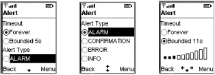
The first ChoiceGroup, shown on the left side of
Figure 4-25, lets you select the timeout for the
Alert, which can be either
Alert.FOREVER or a value specified in seconds. If
you select the second item in the ChoiceGroup, a
Gauge appears so that you can adjust the timeout
value, as shown on the right side of the figure. The second
ChoiceGroup allows you to choose the
AlertType. On the PalmOS platform, this
Form has a more compact representation, shown in
Figure 4-26, but the functionaility is the same.
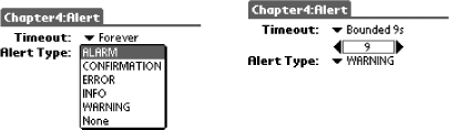
Once you’ve configured the Alert,
you can use the OK command to display it. On the PalmOS platform,
this is available as a button on the Form, but on
other devices you might need to access a soft-key menu to locate it.
Pressing the OK button displays the Alert, and, on
some devices, a sound plays (the specific sound may depend on the
AlertType). If you experiment with different
types, you’ll notice that, with the exception of the
text message (which is constructed by ItemMIDlet
to remind you of the parameters that you selected), there is no
difference in appearance on the default color phone. The alerts all
look like the one shown on the upper left side of Figure 4-27. The exception is when you select a timeout of
Alert.FOREVER: you get a command button labeled
Done that allows you to dismiss the Alert at any
time.
On the PalmOS platform, however, the Alerts use
different icons to indicate the AlertType.
Furthermore, as you can see from Figure 4-27, when a
finite timeout is selected, the time remaining until the
Alert is dismissed counts down in a small circle
in its bottom left. When the timeout value is set to
Alert.FOREVER, there is a Done button in this area
instead.
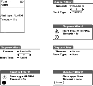
Warning
Only Alerts with the timeout set to
Alert.FOREVER can be dismissed by the user; the
others remain displayed until their timeout expires. You
can’t get around this by trying to add your own Done
button, because Alert overrides the
addCommand and
setCommandListener methods of
Displayable and throws an
IllegalStateException if you try to add a
Command or install a
CommandListener.
The code used to create and display an Alert is
simple:
Alert alert = new Alert("Alert Title", "This is an Alarm", alarmImage,
    AlertType.ALARM);
Display.getDisplay(this).setCurrent(alert);
As you can see, you use the Display
setCurrent( )
method to display an
Alert, just as you would any other type of
Displayable. The Alert
partially or completely covers the screen that was active when the
setCurrent( ) method is called. When the
Alert is dismissed, the original screen is
redisplayed. In some cases, though, it might be appropriate to show a
different screen once the Alert has closed. You
can arrange for this to happen by using a different form of
setCurrent( ):
public void setCurrent(Alert alert, Displayable displayable);
This method first displays the given Alert; when
it closes, the Displayable given as the second
argument appears instead of the screen that was originally displayed.
As a special case, passing null for the
Displayable reverts to the original
screen -- that is, it behaves just like the single-argument
variant of setCurrent( ).
Alert has several methods that you can use to
customize it after creation or to get some of its attributes. The
AlertType can be obtained or changed using the
following methods:
public void setAlertType(AlertType alertType);
public AlertType getAlertType( );
You can get or change the text string and image using similar methods:
public void setString(String string);
public String getString( );
public void setImage(Image image);
public Image getImage( );
When an Alert is created, a default timeout is
applied, which you can get using the getDefaultTimeout( ) method:
public int getDefaultTimeout( );
Note that this is not a static method, so you have to create an
Alert before you can use it. There is no method to
change the default timeout. The returned value is in milliseconds.
Finally, you can get or change the actual timeout for a specific
Alert using the following methods, where the time
is again measured in milliseconds:
public int getTimeout( );
public void setTimeout(int timeOut);
If you call setTimeout( ) with the argument
Alert.FOREVER, then the Alert
will be modal.
Warning
An Alert with timeout set to
Alert.FOREVER is described in the MIDP
specification as a modal dialog, but it is not modal in the same
sense that a J2SE Dialog or
JDialog is. In particular, when you display a J2SE
modal dialog by calling its show( ) or
setVisible( ) method, control is not returned
until the dialog is dismissed. The same is not true of
Alert. That is, in the following code the
setCurrent( ) method returns control immediately;
it does not wait for the Alert to be dismissed:
Alert alert = new Alert("Modal", "Modal Alert", null, AlertType.ALARM);
alert.setTimeout(Alert.FOREVER); // Make the Alert "modal"
Display.getDisplay(this).setCurrent(alert)
// Returns IMMEDIATELY
In fact, the Alert may not actually have been
displayed when it returns, as discussed in Section 4.1.1,
earlier in this chapter.
MIDP does not currently have an API for playing arbitrary sounds, but
it is possible to create a small set of sounds on devices that
support it by using the AlertType method on its
own. The AlertType method has a public method that
plays its associated sound:
public boolean playSound(Display display);
where display is the Display
object associated with the MIDlet. The following code extract
requests that the device play the sound associated with an
ALARM:
AlertType.ALARM.playSound(Display.getDisplay(this));
The device is not obliged to play any sounds or to generate a
different sound for each AlertType. If the
playSound( ) method actually plays a sound, it
returns true. You can experiment with the various
sounds by selecting the Sounds example from
ItemMIDlet, choosing each sound in turn from the
List component that the MIDlet displays, and using
the SELECT key (or its equivalent) to play it. The return value of
the playSound( ) method is written to the Wireless
Toolkit console. If you are running this example on a PalmOS device,
and you don’t hear any sounds, be sure to enable
System Sounds using the Prefs applet from the main screen.
[13] A small number of examples in this section produce output on the MIDlet’s standard output stream. When using the Wireless Toolkit, this stream usually directs its output to the Wireless Toolkit console. However, if you use the PalmOS device emulator, this information is written to a separate file instead. To examine the file content, you must stop the emulator. For further details, see Chapter 9.
[14] Unfortunately, at the time of writing, the MIDP implementation used in the Wireless Toolkit does not do this.
[15] As noted earlier, TextBox
does not have any way of notifying application code that its content
has changed because it is not an Item and
therefore cannot be associated with an
ItemStateListener. Application code normally
retrieves the content of a TextBox (using
getString( ) or getChars( ))
only when prompted to do so by the activation of a
Command attached to the
TextBox.
[16] An
immutable image is one that cannot be changed in situ. Some methods
of building an Image produce an immutable
Image, while others result in one that is mutable.
As you’ll see in Chapter 5, an
immutable Image can always be obtained from a
mutable one, so any Image you create can be used
in conjunction with an ImageItem, either directly
or after being made immutable.
[17] Strictly speaking, this is not true, because
you could periodically examine the selection state from a background
thread or on expiration of a Timer, but such
tactics are not likely to be useful in a real application!
Get J2ME in a Nutshell now with the O’Reilly learning platform.
O’Reilly members experience books, live events, courses curated by job role, and more from O’Reilly and nearly 200 top publishers.

