We’ll begin our look at the Swing components with the
JLabel class. In addition, we’ll look at
Swing’s new Icon interface and an
implementation of this interface called ImageIcon.
With just these few new constructs, you’ll begin to see how
much Swing has done to improve UI development in Java.
Swing
allows you to create labels that can contain text, images, or both.
We’ll begin this chapter with a look at the
JLabel class.
The JLabel
class allows you to add basic,
nonfunctional labels to a user interface. Because of their inherent
simplicity, there is no model class for JLabel
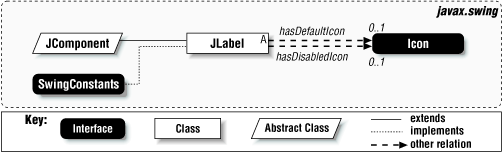
components. Figure 4.1 shows a class diagram for
JLabel. We’ll get into the two relations to
Icon a little later.
Unlike java.awt.Label objects,
JLabel objects may consist of both text and
graphics (icons). For simple text labels, the interface to
JLabel is very similar to that of
java.awt.Label. The code to create and display a
very simple text label looks like this:
//

               SimpleJLabelExample.java
//
import javax.swing*;

public class SimpleJLabelExample {
  public static void main(String[] args) {
    JLabel label = new JLabel("A Very Simple Text Label");

    JFrame frame = new JFrame();
    frame.addWindowListener(new BasicWindowMonitor());
    frame.getContentPane().add(label);
    frame.pack();
    frame.setVisible(true);
  }
}
Running this simple program produces the display shown in Figure 4.2.
The JLabel class contains the properties shown in
Table 4.1. The
icon
and disabledIcon
properties specify the icon to be displayed by default and when the
label is disabled respectively. If no disabledIcon
is specified, a grayscale version of the default icon is created
automatically. The font
property
is shown in this table only because the setFont()
method is overridden to call repaint() after
calling super.setFont().
Table 4-1. JLabel Properties
|
Property |
Data Type |
get |
is |
set |
bound |
Default Value |
|---|---|---|---|---|---|---|
| See also properties from the JComponent Class (xref linkend="SWING-CH-3-TABLE-10"/>). | ||||||
|
|
|
• |
• |
from L&F
| ||
|
|
|
• |
| |||
|
|
|
• |
• |
• |
| |
|
|
|
• |
• |
• |
| |
|
|
|
• |
• |
from L&F | ||
|
|
|
• |
• |
• |
| |
|
|
|
• |
• |
| ||
|
|
|
• |
• |
• |
| |
|
|
|
• |
• |
• |
| |
|
|
|
• |
• |
• |
| |
|
|
|
• |
• |
• |
| |
|
|
|
• |
• |
• |
| |
|
|
|
• |
• |
• |
|
displayedMnemonic
indicates the character to be
rendered as an accelerator key (typically meaning that the first
occurrence of this character in the label text is underlined). If the
labelFor
property has been set, the referenced
component will gain focus when the mnemonic is pressed in conjunction
with the ALT key.[11] One common use of this feature is to apply mnemonics to
labels appearing next to text fields, allowing the fields to gain
focus when the shortcut key is pressed. We’ll see an example of
this strategy later in this section.
Note
displayedMnemonic is an
integer property. However, a
setDisplayedMnemonic()
method is defined, which takes a
char. If you use the version that takes an
int, be aware that specifying the value of a
lowercase character will cause the character to appear underlined,
but will not generate the expected action when pressed. Even if the
character appears in lowercase in the labels, the mnemonic should
still be set to uppercase. Typically, it makes more sense to use the
char method anyway.
The
horizontalAlignment
and verticalAlignment properties are used to
specify the alignment of the label’s content (text and icon).
The values for these properties are defined in
SwingConstants, and must be
LEFT, RIGHT, or
CENTER for horizontalAlignment;
for verticalAlignment it must be
TOP, BOTTOM, or
CENTER.
horizontalTextPosition
and
verticalTextPosition indicate the position of the
label’s text relative to the its icon (if both
icon and text are defined).
Like the alignment properties, the valid values for the text position
properties are LEFT, RIGHT,
TOP, BOTTOM, and
CENTER. We’ll cover these properties in more
detail in the sections that follow. Note that
JLabel implements
SwingConstants, so you can refer to the constant
values listed in this paragraph as either
SwingConstants.XYZ or
JLabel.XYZ—whichever you prefer.
The iconTextGap
property reflects the space
(in pixels) between the label’s icon and text (if both are
defined). The text property is simply the
label’s textual content. Finally, the UI
property holds a reference to the LabelUI object
used to render the label.
The following example shows how the
displayedMnemonic
and
labelFor properties can be used to direct focus to
a component, based on the mnemonic assigned to a label. All we do
here is create three labels and three text fields, assigning one
field to each label:
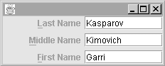
//


                  MnemonicLabels.java
//
import javax.swing.*;
import java.awt.*;

// Shows how displayedMnemonic and labelFor properties work together
public class MnemonicLabels {
  public static void main(String[] args) {

    // Create labels and text fields
    JLabel lastName = new JLabel("Last Name", JLabel.RIGHT);
    JLabel middleName = new JLabel("Middle Name", JLabel.RIGHT);
    JLabel firstName = new JLabel("First Name", JLabel.RIGHT);

    JTextField lastField = new JTextField(10);
    JTextField middleField = new JTextField(10);
    JTextField firstField = new JTextField(10);

    // Add displayedMnemonic and labelFor property values
    lastName.setDisplayedMnemonic('L');
    middleName.setDisplayedMnemonic('M');
    firstName.setDisplayedMnemonic('F');
    lastName.setLabelFor(lastField);
    middleName.setLabelFor(middleField);
    firstName.setLabelFor(firstField);

    // Layout and Display
    JPanel p = new JPanel();
    p.setLayout(new GridLayout(3,2,5,5));
    p.add(lastName);
    p.add(lastField);
    p.add(middleName);
    p.add(middleField);
    p.add(firstName);
    p.add(firstField);

    JFrame f = new JFrame();
    f.addWindowListener(new BasicWindowMonitor());
    f.setContentPane(p);
    f.pack();
    f.setVisible(true);
  }
}
When executed, this example produces the display shown in Figure 4.3. The first letter in each label is underlined, based on the assigned mnemonic. Pressing ALT-L, ALT-M, or ALT-F will cause focus to shift to the corresponding text field.
Like
java.awt.Labels, JLabels allow
the specification of a horizontal alignment to indicate whether the
label’s contents should be left justified, right justified, or
centered. These values can be set in the constructor or by a call to
the
setHorizontalAlignment()
method. In addition, the
JLabel class provides the same type of flexibility
for specifying the vertical position of the label. However, since the
JLabel constructors were modeled after those of
java.awt.Label, vertical alignment may only be
specified via the
setVerticalAlignment()
method.
The following example shows the effects of horizontal and vertical alignment:
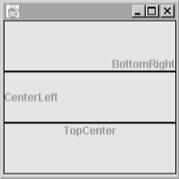
//
                  AlignmentExample.java
//
import javax.swing.*;
import java.awt.*;

public class AlignmentExample {
  public static void main(String[] args) {

    // Create the labels and set alignment
    JLabel label1 = new JLabel("BottomRight", SwingConstants.RIGHT);
    JLabel label2 = new JLabel("CenterLeft", SwingConstants.LEFT);
    JLabel label3 = new JLabel("TopCenter", SwingConstants.CENTER);
    label1.setVerticalAlignment(SwingConstants.BOTTOM);
    label2.setVerticalAlignment(SwingConstants.CENTER);
    label3.setVerticalAlignment(SwingConstants.TOP);

    // Add borders to the labels . . . more on Borders later in the book!
    label1.setBorder(BorderFactory.createLineBorder(Color.black));
    label2.setBorder(BorderFactory.createLineBorder(Color.black));
    label3.setBorder(BorderFactory.createLineBorder(Color.black));

    // Put it all together . . .
    JFrame frame = new JFrame();
    frame.addWindowListener(new BasicWindowMonitor());
    Container c = frame.getContentPane();
    c.setLayout(new GridLayout(3,1));
    c.add(label1);
    c.add(label2);
    c.add(label3);
    frame.setSize(200,200);
    frame.setVisible(true);
  }
}
Figure 4.4 shows the result of running this program.
To
this point, there have not been many striking differences between
Swing JLabels and good old AWT
Labels. The fundamental difference between the two
is that JLabel allows the label to be composed of
text, graphics, or both, while the old Label class
only allowed simple text labels. This is a powerful enhancement,
making it very simple to add graphics to your user interface. Images
used in JLabels (as well as buttons) are of type
javax.swing.Icon, an interface described in detail
in the next section.
The following two lines of code show how simple it is to create a label containing an image:
ImageIcon icon = new ImageIcon("images/smile.gif");
JLabel label = new JLabel(icon);
For labels that contain both graphics and text, Swing provides
considerable flexibility with respect to the relative location of the
text and image. The text for the label may be displayed at any one of
nine locations relative to the image. These locations are specified
via the
setVerticalTextPosition()
and
setHorizontalTextPosition() methods, which take
values from the SwingConstants class discussed
earlier. Note the distinction between the label’s text position
and its alignment; text position reflects the position of the text
relative to the image, while alignment specifies the location of the
label’s contents (image and text) relative to the borders of
the label.
Another useful feature of the JLabel class is the
ability to enable and disable the label by “graying out”
the label and text. By default, a call to
JLabel.setEnabled(false)
will switch the image to an
automatically generated grayscale version of the original image and
alter the text rendering in some (L&F-specific) way. However, the
grayscale image is only used if no disabled icon has been set. The
setDisabledIcon()
method can be used to set an alternate
image for the disabled label.
Additionally, the spacing between the image and the text can be
specified by a call to
setIconTextGap()
, which takes a single parameter
specifying the number of pixels between the image and the icon. This
setting has no effect if both the horizontal and the vertical text
positions have been set to SwingConstants.CENTER,
since in this case the text will be placed directly over the image.
Figure 4.5 shows a group of labels with text and image, with the text at each of the nine locations relative to the image. Labels 0 and 1 are disabled, the first one using the default disabled image and the second one using an explicitly specified alternate image. Labels 2 and 3 show nondefault text gap settings. Here’s the source code that produces these labels:
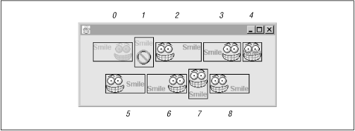
//
                  ImageLabelExample.java
//
import javax.swing.*;
import java.awt.*;

public class ImageLabelExample {
  public static void main(String[] args) {
    JLabel[] labels= new JLabel[9];

    labels[0] = makeLabel(JLabel.TOP, JLabel.LEFT);
    labels[1] = makeLabel(JLabel.TOP, JLabel.CENTER);
    labels[2] = makeLabel(JLabel.TOP, JLabel.RIGHT);
    labels[3] = makeLabel(JLabel.CENTER, JLabel.LEFT);
    labels[4] = makeLabel(JLabel.CENTER, JLabel.CENTER);
    labels[5] = makeLabel(JLabel.CENTER, JLabel.RIGHT);
    labels[6] = makeLabel(JLabel.BOTTOM, JLabel.LEFT);
    labels[7] = makeLabel(JLabel.BOTTOM, JLabel.CENTER);
    labels[8] = makeLabel(JLabel.BOTTOM, JLabel.RIGHT);

    // Disable label 0
    labels[0].setEnabled(false);

    // Disable label 1 with a disabled icon
    labels[1].setDisabledIcon(new ImageIcon("images/no.gif"));
    labels[1].setEnabled(false);

    // Change text gap on labels 2 and 3
    labels[2].setIconTextGap(15);
    labels[3].setIconTextGap(0);

    // Add the labels to a frame and display it
    JFrame frame = new JFrame();
    frame.addWindowListener(new BasicWindowMonitor());
    Container c = frame.getContentPane();
    c.setLayout(new FlowLayout(FlowLayout.CENTER, 3, 3));
    for (int i=0;i<9;i++)
      c.add(labels[i]);
    frame.setSize(350,150);
    frame.setVisible(true);
  }

  protected static JLabel makeLabel(int vert, int horiz) {
    JLabel l = new JLabel("Smile", icon, SwingConstants.CENTER);
    l.setVerticalTextPosition(vert);
    l.setHorizontalTextPosition(horiz);
    l.setBorder(BorderFactory.createLineBorder(Color.black));
    return l;
  }

  private static Icon icon = new ImageIcon("images/smile.gif");
}
Don’t worry if you don’t understand everything we did in this example. We’ll explain icons in more detail in this chapter, and will get to borders and frames later in the book. For now, just concentrate on the various properties we set on the different labels and compare the code to the display it produced in Figure 4.5.
JLabel defines a single constant as shown in Table 4.2. A client property set with this constant as a
key is used by
JComponent.AccessibleJComponent
to derive a name for components that haven’t explicitly set
one. If the component has a LABELED_BY_PROPERTY
defined, the text from the JLabel referenced by
the property value will be used as the accessible name of the
component.
- JLabel()
Creates a label with no text or icon.
- JLabel(Icon image), JLabel(Icon image, int horizontalAlignment)
Create labels displaying the given icon. If specified, the horizontal alignment must be one of the following values taken from
SwingConstants:LEFT,RIGHT, orCENTER.- JLabel(String text), JLabel(String text, int horizontalAlignment)
Create labels displaying the given text. If specified, the horizontal alignment must be one of the following values taken from
SwingConstants:LEFT,RIGHT, orCENTER.- JLabel(String text, Icon image, int horizontalAlignment)
Creates a label with an image, text, and specified horizontal alignment. The horizontal alignment must be one of the following values taken from
SwingConstants:LEFT,RIGHT, orCENTER.
- public void setDisplayedMnemonic(char aChar)
Provides a convenient way to set the
mnemonicproperty by passing in achar(instead of the property’s actual type,int). The character is converted to uppercase and passed to the othersetDisplayedMnemonic()method as anint.
- protected int checkHorizontalKey(int x, String s)
Used internally to validate
horizontalAlignmentandhorizontalTextPositionvalues. It returns the given integer if its value isLEFT,CENTER, orRIGHT. Otherwise, it throws anIllegalArgumentException, with the given string as the exception text. You should never need to call this method directly.- protected int checkVerticalKey(int y, String s)
Used internally to validate
verticalAlignmentandverticalTextPositionvalues. It returns the given integer if its value isTOP,CENTER, orBOTTOM. Otherwise, it throws anIllegalArgumentException, with the given string as the exception text. You should never need to call this method directly.
[11] This is actually up to the look-and-feel, but the basic look-and-feel implements it this way, and none of the other Swing L&Fs change this behavior.
Get Java Swing now with the O’Reilly learning platform.
O’Reilly members experience books, live events, courses curated by job role, and more from O’Reilly and nearly 200 top publishers.

