Swing
introduces the concept of an icon for use in a variety of components.
The Icon interface and
ImageIcon class make dealing with simple images
extremely easy.
The Icon
interface is very simple, specifying just three methods used to
determine the size of the Icon and to display it.
Implementors of this interface are free to store and display the
image in any way, providing a great deal of flexibility. In other
words, icons don’t have to be bitmaps or GIF images, but are
free to render themselves any way they choose; as we’ll see
later, an icon can simply draw on the component if that’s more
efficient. The examples at the end of this section show a couple of
different ways the interface might be implemented.
The Icon interface defines the properties listed
in Table 4.3. The iconHeight
and iconWidth properties specify the size of the
Icon in pixels.
- public abstract void paintIcon(Component c, Graphics g, int x, int y)
Paints the
Iconat the specified location on the givenGraphics. TheComponentis provided to allow its properties (such as foreground or background color) to be used when painting, or to allow the component to be used as an image observer (see Section 4.2.2, later in this chapter).
Here’s a class that implements the Icon
interface and uses ovals as simple icons:
// OvalIcon.java
//
import javax.swing.*;
import java.awt.*;

// A simple Icon implementation that draws ovals
public class OvalIcon implements Icon {

  public OvalIcon(int w, int h) {
    width = w;
    height = h;
  }

  public void paintIcon(Component c, Graphics g, int x, int y) {
    g.drawOval(x, y, width-1, height-1);
  }

  public int getIconWidth() { return width; }
  public int getIconHeight() { return height; }

  private int width, height;
}
And a simple class that creates a few labels to show how it works:
// TestOval.java
//
import javax.swing.*;
import java.awt.*;

public class TestOval {
  public static void main(String[] args) {
    JFrame f = new JFrame();
    f.addWindowListener(new BasicWindowMonitor());

    JLabel label1 = new JLabel(new OvalIcon(20,50));
    JLabel label2 = new JLabel(new OvalIcon(50,20));
    JLabel label3 = new JLabel
      ("Round!", new OvalIcon(60,60), SwingConstants.CENTER);
    label3.setHorizontalTextPosition(SwingConstants.CENTER);

    Container c = f.getContentPane();
    c.setLayout(new FlowLayout());
    c.add(label1);
    c.add(label2);
    c.add(label3);
    f.pack();
    f.setVisible(true);
  }
}
Running this test program produces the display shown in Figure 4.6.
Icons
are under no obligation to paint themselves the same way every time
they are displayed. It’s perfectly reasonable (and often quite
useful) to have an icon that uses some sort of state information to
determine how to display itself. In the next example, we create two
sliders (JSlider is explained in detail in Chapter 6) that can be used to change the width and
height of a dynamic icon.
// DynamicIconExample
//
import javax.swing.*;
import javax.swing.event.*;
import java.awt.*;

// Example of an icon that changes form.
public class DynamicIconExample {
  public static void main(String[] args) {

    // Create a couple sliders to control the icon size
    final JSlider width = new JSlider(JSlider.HORIZONTAL, 1, 150, 75);
    final JSlider height = new JSlider(JSlider.VERTICAL, 1, 150, 75);

    // A little Icon class that uses the current slider values.
    class DynamicIcon implements Icon {
      public int getIconWidth() { return width.getValue(); }
      public int getIconHeight() { return height.getValue(); }

      public void paintIcon(Component c, Graphics g, int x, int y) {
        g.fill3DRect(x, y, getIconWidth(), getIconHeight(), true);
      }
    };
    Icon icon = new DynamicIcon();
    final JLabel dynamicLabel = new JLabel(icon);

    // A listener to repaint the icon when sliders are adjusted.
    class Updater implements ChangeListener {
      public void stateChanged(ChangeEvent ev) {
        dynamicLabel.repaint();
      }
    };
    Updater updater = new Updater();

    width.addChangeListener(updater);
    height.addChangeListener(updater);

    // Lay it all out
    JFrame f = new JFrame();
    f.addWindowListener(new BasicWindowMonitor());

    Container c = f.getContentPane();
    c.setLayout(new BorderLayout());
    c.add(width, BorderLayout.NORTH);
    c.add(height, BorderLayout.WEST);
    c.add(dynamicLabel, BorderLayout.CENTER);
    f.setSize(210,210);
    f.setVisible(true);
  }
}
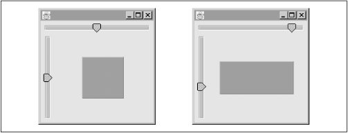
Figure 4.7 shows the dynamic icon in its initial state, and then again after we’ve moved the sliders around a bit.
The important thing to notice is that the Icon
class does not actually store any information. In this case,
we’ve made the Icon class an inner class,
giving it direct access to the sliders. Whenever the icon is told to
paint itself, it gets its width and height from the values of the
sliders. You could also choose to make your Icon
class an event listener and have it update itself according to
changes in certain events. The options here are wide open.
No matter how your icon gets its data, you need to make sure that any
time you want to change the way the icon looks, you trigger a repaint
of the icon. In this example, we’ve done this by listening to
change events from the sliders and calling
repaint() on the label that’s holding the
icon any time one of the sliders changes.
Swing provides a concrete implementation
of the Icon interface which is considerably more
useful than our OvalIcon class.
ImageIcon uses a java.awt.Image
object to store and display any graphic and provides synchronous
image loading (i.e., the Image is loaded
completely before returning), making ImageIcons
very powerful and easy to use. You can even use an
ImageIcon to display an animated
GIF.89a, making the ubiquitous “animation
applet” as simple as this:
// AnimationApplet.java
//
import javax.swing.*;

// A simple animation applet
public class AnimationApplet extends JApplet {
  public void init() {
    ImageIcon icon = new ImageIcon("images/rolling.gif");    // animated gif
    getContentPane().add(new JLabel(icon));
  }
}
All we did here was load an animated GIF in the
init() method and then add it to the applet in
start(). For more information on
JApplet, see Chapter 8.
The ImageIcon class defines the properties listed
in Table 4.4. The description
property allows an arbitrary description of the image to be
specified. One possible use of this property might be to give a blind
user an audio description of the image.
Table 4-4. ImageIcon Properties
|
Property |
Data Type |
get |
is |
set |
bound |
Default Value |
|---|---|---|---|---|---|---|
|
|
|
• |
• |
| ||
|
|
|
• |
| |||
|
|
|
• |
| |||
|
|
|
• |
• |
| ||
|
|
|
• |
| |||
|
|
|
• |
• |
|
The iconHeight
and
iconWidth properties default to -1 if no image is
loaded by the constructor, while the image
property simply contains the Image object rendered
by the icon.
ImageLoadStatus
indicates the success or
failure of the image load process, using the constants defined in
java.awt.MediaTracker (ABORTED,
ERRORED, or COMPLETE). The
default for this property is zero, which does not map to any of these
constants.
The imageObserver
property contains the
ImageObserver specified to receive notifications
of changes to the image. If this property is null
(as it is by default), the component containing the icon will be
treated as the image observer when the image is painted.
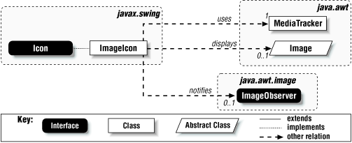
Figure 4.8 shows a class diagram for
ImageIcon and the classes related to it.
Like most Swing classes,
ImageIcon implements
Serializable. The keen observer may see a problem
with this: the java.awt.Image class used by
ImageIcon is not
serializable. By default, this would keep
ImageIcon objects from serializing properly. The
good news is that ImageIcon implements the
readObject()
and writeObject()
methods, so that the pixel representation of the image is stored and
retrieved correctly.
The protected constants defined in ImageIcon are
in Table 4.5.
- ImageIcon()
Creates an uninitialized
ImageIcon.- ImageIcon(Image image), ImageIcon(Image image, String description)
Create
ImageIconobjects from existing images. A textual description of the image may be provided. If no description is provided, an attempt is made to retrieve the “comment” property from the inputImage. If this is a non-null string, it will be used as the description.- ImageIcon(String filename), ImageIcon(String filename, String description)
Create
ImageIconobjects from the contents of the specified GIF or JPEG file. The image is guaranteed to be completely loaded (unless an error occurs) when the constructor returns.- ImageIcon(URL location), ImageIcon(URL location, String description)
Create
ImageIconobjects from the contents of the specified URL. The image is guaranteed to be completely loaded (unless an error occurs) when the constructor returns.- public ImageIcon(byte imageData[]), public ImageIcon(byte imageData[], String description)
Create
ImageIconobjects from an array of bytes containing an image in a supported format, such as GIF or JPEG. The image is guaranteed to be completely loaded (unless an error occurs) when the constructor returns.
- public synchronized void paintIcon(Component c, Graphics g, int x, int y)
Paints the
Imageat the specified location on the inputGraphics. The givenComponentis passed to theGraphic’sdrawImage()method as theImageObserver(recall thatjava.awt.ComponentimplementsImageObserver), if no image observer has been explicitly set.
- protected void loadImage(Image image)
Called by the constructors and
setImage(). It uses ajava.awt.MediaTrackerobject to load an image synchronously. On completion, the image is guaranteed to be completely loaded, unless an error occurred, in which case theimageLoadStatusproperty will reflect the error.
Get Java Swing now with the O’Reilly learning platform.
O’Reilly members experience books, live events, courses curated by job role, and more from O’Reilly and nearly 200 top publishers.


