The JProgressBar Class
Like sliders, progress bars are also a new feature in Swing. The bars themselves are simply rectangles of an arbitrary length, a percentage of which is filled in based on the value of their model. Applications typically use progress bars to report the status of time-consuming jobs, such as software installation or large amounts of copying. Swing progress bars come in two flavors: horizontal and vertical. If the orientation is horizontal, the bar fills from left to right. If the bar is vertical, it fills from bottom to top. The class hierarchy is illustrated in Figure 6.13.
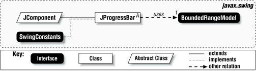
Figure 6-13. JProgressBar class diagram
Different look-and-feels can contain different filling styles. Metal,
for example, uses a solid fill, while the Windows look-and-feel uses
an LED style. The latter means that the bar
indicates progress by filling itself with dark, adjacent rectangles
instead of using a fluid line. The JProgressBar
class also contains a boolean that specifies
whether the progress bar draws a dark border around itself. You can
override this default border by setting the border property of the
JComponent. Figure 6.14 shows a
Swing progress bar with three different look-and-feels.
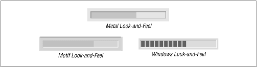
Figure 6-14. Progress bars in the three look-and-feels
Properties
The basic properties of the ...
Get Java Swing now with the O’Reilly learning platform.
O’Reilly members experience books, live events, courses curated by job role, and more from O’Reilly and nearly 200 top publishers.

