The JComboBox Class
JComboBox
is the Swing version of a combo box component. It is very similar to
the AWT Choice component, and
even implements the ItemSelectable interface for
backward compatibility. By default, the JComboBox
component provides a single text edit field adjacent to a small
button with a downward arrow. When the button is pressed, a popup
list of choices is displayed below the text edit field, one of which
can be selected by the user. If a selection is made, the choice is
copied into a text edit field and the popup disappears. If there was
a previous selection, it is erased. You can also remove the popup by
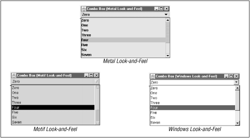
pressing the TAB key while the combo box has the focus. Figure 7.11 shows combo boxes for three look-and-feels.

Figure 7-11. The JComboBox component in the three look-and-feels
The text field in the
JComboBox component can have one of two states:
editable or static.
This state is given by the editable property. If
the text field is editable, the user is allowed to type information
into the text box, as well as make selections from the list. If the
component is not editable, the user can only make selections from the
list.
Unless you specify a set of objects in the constructor, the combo box
comes up empty. You can use the
addItem()
method to add objects to the combo
box list. Conversely, the removeItem() and
removeItemAt() methods remove a specified object ...
Get Java Swing now with the O’Reilly learning platform.
O’Reilly members experience books, live events, courses curated by job role, and more from O’Reilly and nearly 200 top publishers.

