Plug-ins for Tablets
When we are delivering webapps for tablets, sometimes it’s useful to split the page in two columns instead of using a full-width menu as in standard jQuery Mobile. That is why two plug-ins provides us with solutions for tablet applications: SplitView and MultiView.
SplitView
SplitView is available at http://asyraf9.github.com/jquery-mobile and it allow us to define two main areas inside a document called panels.
Each panel is a jQuery Mobile page, with a header, content, and footer. A SplitView allows two panels to be on screen at the same time in portrait orientation as seen in Figure 10-7. That means that we will have two pages, typically a menu at the left and a content area at the right.
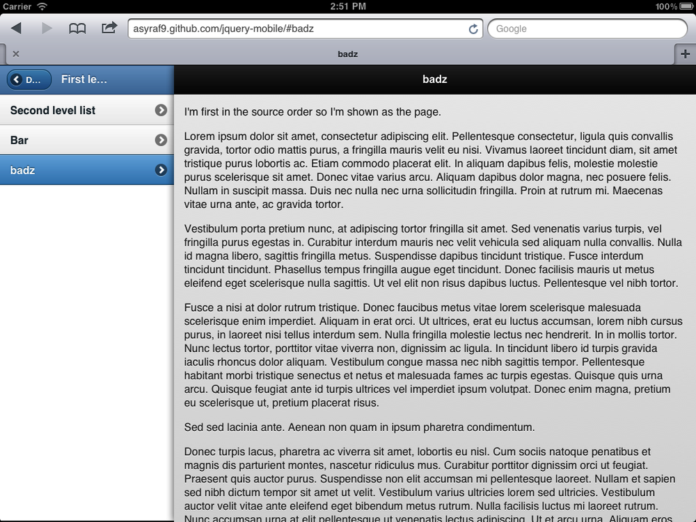
Figure 10-7. With SplitView, we can create tablet applications with support for multiple pages at the same time, typically a menu and a content area
In portrait orientation, the menu panel is hidden inside a top-left button and it will open as a pop-up menu as seen in Figure 10-8.
Every panel has a data-id attribute
defining the name of the panel. This will be useful for links:
<body>
  <div data-role="panel" data-id="menu">
    <div data-role="page">

    </div>
  </div>
  <div data-role="panel" data-id="main">
    <div data-role="page">

    </div>
  </div>
</body>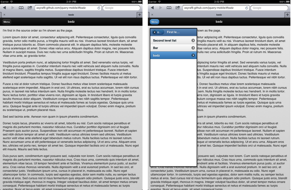
Figure 10-8. When rotating the device to ...
Get jQuery Mobile: Up and Running now with the O’Reilly learning platform.
O’Reilly members experience books, live events, courses curated by job role, and more from O’Reilly and nearly 200 top publishers.

