Chapter 1. Meet jQuery Mobile
jQuery Mobile is a set of jQuery plug-ins and widgets that aim to provide a cross-platform API for creating mobile web applications. In terms of code implementation, jQuery Mobile is very similar to jQuery UI, but while jQuery UI is focused on desktop applications, jQuery Mobile is built with mobile devices in mind.
As of this writing, jQuery Mobile is still in its Alpha 4 release, with beta just around the corner. There are still plenty of issues that are being fixed, but the jQuery Mobile development team has said that they consider the library to be feature-complete for their 1.0 release. Although the documentation is sparse, especially compared to the extensive documentation for the jQuery project itself, the forums are very active.
Even so, many people are already using jQuery Mobile in production, which is a testament not only to the stability and quality of the library, but of how easy it is to use.
Overview of the jQuery Mobile Library
As of this writing, jQuery Mobile consists of four files: a JavaScript file, a CSS file, and two PNG graphic sprites.
The JavaScript file is meant to be loaded after the base jQuery library. This script file performs various tasks, like creating widgets, applying event listeners, and enabling the API.
jQuery Mobile also includes a Cascading Style Sheet which specifies layout and appearance of jQuery Mobile page elements. The Style Sheet also specifies transitions and animations with CSS3 transforms.
Finally, jQuery Mobile includes a small set of graphics for user interface elements. These are simple, standardized icons for navigation.
You can download the entire jQuery Mobile package (the JavaScript library, the CSS, and the graphics) or you can access them through the project’s CDN. See the jQuery Mobile project download page for specifics. In the examples for this book, we will be using the CDN.
How jQuery Mobile Works
jQuery Mobile uses HTML 5 and CSS 3 features to enhance basic HTML markup to create a
consistent mobile experience across supported platforms. jQuery Mobile makes heavy use of
the HTML 5 specification for custom data- attributes
(available for review at http://dev.w3.org/html5/spec/elements.html#embedding-custom-non-visible-data-with-the-data-attributes). Using this method, it is possible to embed data into valid HTML 5 markup. jQuery Mobile
has a large vocabulary of data- attributes.
Upon initialization, jQuery Mobile selects elements based on their data- attributes and enhances them by inserting extra markup,
adding new CSS classes, and applying event handlers. This enables you to quickly write basic
semantic markup and leave it to jQuery Mobile to transform your simple markup into complex
user interface elements.
Note
It’s actually an interesting exercise to see what jQuery Mobile adds to your basic markup. To do this, you will need the ability to view source both before and after JavaScript has been applied to a page—in most browsers, the “view source” menu option will only show you the unenhanced source. However, most browsers have “view generated source” plug-ins available, and the ability to view generated source is built into some browser-based web development toolbars.
Create Your First jQuery Mobile Application
The best way to understand jQuery Mobile is to dive right in. Begin by creating a simple HTML 5 page that includes the jQuery and jQuery Mobile libraries, as shown in Example 1-1.
<!DOCTYPE html>
<html>
  <head>
    <title>jQuery Mobile Application</title>
    <link rel="stylesheet" href="http://code.jquery.com/mobile/1.0a4.1/
     jquery.mobile-1.0a4.1.min.css" />
    <script src="http://code.jquery.com/jquery-1.5.2.min.js"></script>
    <script src="http://code.jquery.com/mobile/1.0a4.1/jquery.mobile-1.0a4.1.min.js">
  </script>
  </head>
  <body>
  </body>
</html>
This includes everything you need to start building a jQuery Mobile application.
Next, we need to include some content. Content should be marked up semantically, and
since we’re using HTML 5, we have access to all of the new tags like header, footer, section, nav, etc. We can
mark up our content using those tags, or we simply block off our content using div tags.
For our first example, we want to create a page in our application that is a self-contained section, with a header, content area, and footer. (We’ll discuss the details of pages and views in jQuery Mobile in the next chapter. For now, we’ll just focus on the simplest case.) Using div-based markup, we would create something like what is shown in Example 1-2.
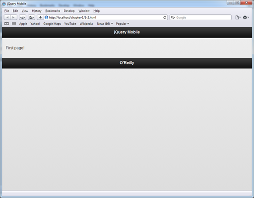
<div class="section" id="page1">
  <div class="header"><h1>jQuery Mobile</h1></div>
  <div class="content">
    <p>First page!</p>
  </div>
  <div class="footer"><h1>O'Reilly</h1></div>
</div>
Or we can mark up the same content using the HTML 5 tags section, header, and footer, as shown in Example 1-3.
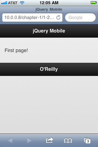
<section id="page1">
  <header><h1>jQuery Mobile</h1></header>
  <div class="content">
    <p>First page!</p>
  </div>
  <footer><h1>O'Reilly</h1></footer>
</section>
jQuery Mobile will work with either markup style, though as we move forward in this book, we will use the HTML 5 markup.
jQuery Mobile doesn’t need specific markup, but it does need us to indicate the roles of
the content areas somehow. To do this, jQuery Mobile uses a custom data- attribute: data-role. Valid data-role values include page, header, content, and footer.
This is our first encounter with a custom data-
attribute. jQuery Mobile uses them extensively to designate functionality, layout, and
behaviors. We’ll learn more about them in later chapters, so for right now we’ll just focus
on the data-role attribute.
Applying the appropriate data-role attributes, our
HTML 5 markup would be written as shown in Example 1-4.
<section id="page1" data-role="page">
  <header data-role="header"><h1>jQuery Mobile</h1></header>
  <div class="content" data-role="content">
    <p>First page!</p>
  </div>
  <footer data-role="footer"><h1>O'Reilly</h1></footer>
</section>
That is all you need to do to create an application in jQuery Mobile. It will do all the rest for you.
To view your new web application, you can run it locally in an HTML 5 capable browser (such as Safari), as shown in Figure 1-1.
This will give you an idea of what it will look like and how it will perform, but to really test the application you will need to view it in a mobile device.
You can use various emulators that come with the platform application development SDKs, but the ideal way to test the application is to serve it via a web server and use a mobile device to browse it. This will give you the best feel for how the application behaves.
Note
Setting yourself up to serve your content locally is actually quite easy. My favorite drop-in tool is XAMPP, available at http://www.apachefriends.org/en/xampp.html. It is available for Windows, OS X, Linux, and Solaris, and has great step-by-step tutorials and how-to guides.
Throughout this book, we will be using screen shots from an iPhone, and our current application is shown in Figure 1-2.
Adding another page is a simple matter of copying and pasting our code and changing the
id of the containing section and updating the content to reflect a new page, as shown in Example 1-5.
<section id="page2" data-role="page">
  <header data-role="header"><h1>jQuery Mobile</h1></header>
  <div class="content" data-role="content">
    <p>Second page!</p>
  </div>
  <footer data-role="footer"><h1>O'Reilly</h1></footer>
</section>
Navigation between pages is simple: just add a link to your content area in the first page of the application, as shown in Example 1-6.
<div class="content" data-role="content">
  <p>First page!</p>
  <p><a href="#page2">Go to the second page!</a></p>
</div>
Now when you refresh the application, you will see a link to tap, as shown in Figure 1-3.
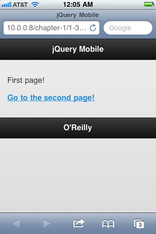
Tapping the link will transition to the next screen. jQuery Mobile will automatically handle the page transition animation, and will automatically provide a back button in the header.
Tapping on the back button will return you to the previous page, and again jQuery Mobile will automatically handle the page transition.
There you have it, your first jQuery Mobile application. It doesn’t do much, but it
should give you some insight into the simplicity of the framework. All you have to do is
mark up your content semantically and then designate roles, functionality, and interactions using custom data- attributes. Then sit back and allow jQuery Mobile to do all the work for
you.
Under The Hood: the jqmData() Custom Selector
jQuery Mobile has a new custom selector that it uses to select elements with data- attributes. You’re probably already familiar with
jQuery’s other built in custom selectors, which include :has(), :contains(), :eq(), etc. These selectors can be used either to directly
select elements (e.g. $("div:contains('foo')")) or they
can be used to filter other selectors (e.g. $("div").contains('foo')).
You can select all elements with a data-role="page"
attribute using the standard jQuery selector $("[data-role='page']"). This works fine, but since jQuery Mobile relies so
heavily on custom data- attributes, it made sense to
build a custom selector: jqmData().
To use jqmData() to select all elements with a
data-role="page", you would use $(":jqmData(role='page')"). To select all elements with any custom
data- attribute within
those selected pages, you could use $(":jqmData(role='page')").jqmData(role).
The jqmData() selector also automatically handles
namespacing. Since jQuery Mobile relies so heavily on data attributes, you should be able
to apply a namespace to them to avoid conflicts with other data attributes that won’t be
used by jQuery Mobile. (For example, instead of data-role="page", it could use data-namespace-role="page" where namespace- is a configurable
string.) By default, jQuery Mobile does not apply a namespace, but it can be configured to
do so using the $.mobile.ns configuration option (see
Configuring jQuery Mobile in Chapter 5 for
more information). If you do configure a namespace, the jqmData() selector will automatically account for it. There was an interesting discussion around adding the namespacing
feature to jQuery Mobile, which you can read over on the project’s GitHub at https://github.com/jquery/jquery-mobile/issues/196.
Get jQuery Mobile now with the O’Reilly learning platform.
O’Reilly members experience books, live events, courses curated by job role, and more from O’Reilly and nearly 200 top publishers.

