Tab Controls
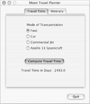
The tab control provides a convenient way to present information in a multipage format. Figure 14.6 shows two tabs centered horizontally in a window. The content area below a tab is called a pane. Panes are often used to organize settings for a utility program or control panel. When panes are used in combination with tabs, users can see, at a glance, all the categories of settings or features available. Tabs allow users to quickly switch from one pane to another with a single click.
As shown in the figure, you can use other controls, such as push buttons, radio buttons, and text fields, in a tabbed window. The controls can be global—affecting the settings of all panes—or specific to an individual pane. Make it clear through labeling and placement (within or outside of a tab pane’s boundary, for example) whether a control affects one pane or all panes. In the figure shown, the Quit button is outside the pane area, so it’s available regardless of which pane is visible.

Figure 14-6. A tab control with two tabs
When the user clicks a tab, the pane should switch appropriately. For example, when the user clicks the Itinerary tab, the Travel Time pane should disappear and the Itinerary pane should appear, as shown in Figure 14.7. Although it appears to the user as if the pane and the tab are one, you must implement this illusion in your code, because the tab and the pane operate ...
Get Learning Carbon now with the O’Reilly learning platform.
O’Reilly members experience books, live events, courses curated by job role, and more from O’Reilly and nearly 200 top publishers.

