August 2012
Beginner
583 pages
16h 1m
English
A number of new effects can now be applied to text with the help of CSS3, including text shadows, text overlapping, and word wrapping.
This property is similar to the box-shadow property and takes the same set of
arguments: a horizontal and vertical offset, an amount for the blurring,
and the color to use. For example, the following declaration offsets the
shadow by 3 pixels both horizontally and vertically, and displays the
shadow in dark gray, with a blurring of 4 pixels:
text-shadow:3px 3px 4px #444;
The result of this declaration looks like Figure 19-6; it works in recent versions of all major browsers (but not IE9 or lower).

When using any of the CSS overflow properties with a value of
hidden, you can also use the text-overflow property to place an ellipsis
(three dots) just before the cutoff to indicate that some text has been
truncated, like this:
text-overflow:ellipsis;
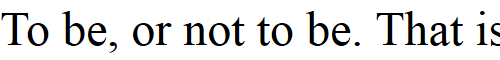
Without this property, when the text “To be, or not to be. That is the question.” is truncated, the result will look like Figure 19-7, but with the declaration applied the result is like Figure 19-8.
Read now
Unlock full access


 O’Reilly covers everything we've got, with content to help us build a world-class technology community, upgrade the capabilities and competencies of our teams, and improve overall team performance as well as their engagement.I wanted to learn C and C++, but it didn't click for me until I picked up an O'Reilly book. When I went on the O’Reilly platform, I was astonished to find all the books there, plus live events and sandboxes so you could play around with the technology.I’ve been on the O’Reilly platform for more than eight years. I use a couple of learning platforms, but I'm on O'Reilly more than anybody else. When you're there, you start learning. I'm never disappointed.I'm always learning. So when I got on to O'Reilly, I was like a kid in a candy store. There are playlists. There are answers. There's on-demand training. It's worth its weight in gold, in terms of what it allows me to do.