December 2017
Beginner to intermediate
168 pages
3h 53m
English
Visualization is a vital tool for understanding and sharing insights around data. The right visualization can help express a core idea or open a space to examination; it can get the world talking about a dataset or sharing an insight Figure P-1.
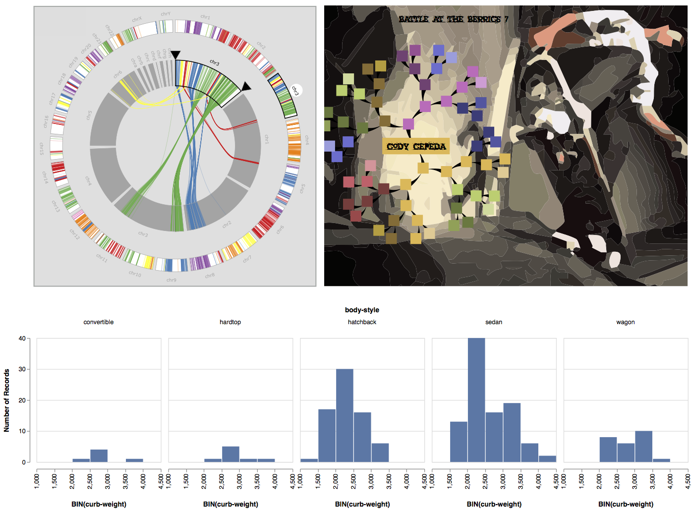
Visualizations provide a direct and tangible representation of data. They allow people to confirm hypotheses and gain insights. When incorporated into the data analysis process early and often, visualizations can even fundamentally alter the questions that someone is asking.
Creating effective visualizations is hard. Not because a dataset requires an exotic and bespoke visual representation—for many problems, standard statistical charts will suffice. And not because creating a visualization requires coding expertise in an unfamiliar programming language—off-the-shelf tools like Excel, Tableau, and R are ample enough to suffice.
Rather, creating effective visualizations is difficult because the problems that are best addressed by visualization are often complex and ill-formed. The task of figuring out what attributes of a dataset are important is often conflated with figuring out what type of visualization to use. ...
Read now
Unlock full access


