Chapter 5. Fonts
All of the common TeX macro packages use the Computer Modern fonts by default. In fact, the Computer Modern fonts are so frequently used in TeX documents that some people believe they are the TeX fonts and that no other options are available.
This is not the case. In fact, using different fonts in TeX is quite easy. However, many interrelated font issues can be quite complicated, and it is possible to do things that make your documents print incorrectly (or make them unprintable).
This chapter explores all of the issues related to fonts and how these issues are resolved by a combination of font files, TeX macros, DVI drivers, and careful planning. At a high level, it works like this:
- TeX macros select a font (by assigning \font\fontid=fonttfm). The macros may be very simple or quite complex (as is the case in LaTeX's New Font Selection Scheme).
- TeX loads the metric information from fonttfm.tfm. Many implementations of TeX look for this file in the directories on the TEXFONTS path. TeX cannot process your document if it cannot find the TFM file.[53]
- TeX writes a DVI file. The DVI file contains the name of each font (the name of the TFM file) and the magnification used (magnification is discussed in the section “the section called “What TeX Needs To Know”” later in this chapter).
- The DVI driver attempts to locate font files for each font used at each magnification. Depending on the DVI driver, fonts can come from many places. Many drivers consult a list of built-in fonts to see if the desired font resides in the printer. Some also consult a list of font substitutions. (This can be used to substitute existing fonts for fonts that you do not have, like Computer Modern Roman in place of Times Roman if you don't have Times Roman.)
Assuming that the font is not built-in or replaced by substitution of a built-in font, the DVI driver looks for a font file. Most modern DVI drivers look for PK fonts, although some also look for GF and PXL fonts as well.
The exact location of these files varies. Some implementations look in the directories on the TEXFONTS path, others look in the TEXPKS or PKFONTS paths.
A typical font directory on a unix system is /usr/local/lib/tex/fonts/pk. The files in this directory typically have names of the form tfmname.999pk; where tfmname is the name of the font and 999 is the resolution.
On file systems which have short filenames (for example, MS-DOS) a typical font directory is \bs tex\bs fonts\bs 999dpi (or \bs tex\bs fonts\bs dpi999).[54] The files are then simply tfmname.pk.
Some DVI drivers employ automatic font generation to attempt to create the font if it cannot be found.
- The DVI driver produces output suitable for a particular device. This may include one or more forms of downloaded fonts as well as requests for built-in fonts that are assumed to exist.
Note
TeX output isn't printable directly. TeX typesets a document in a device-independent fashion; it's the DVI driver that actually prints the document. This is important because many of the font issues are really DVI driver issues more than TeX issues, and because the distinction between TeXing a document and printing a document is another layer of complexity that can be a source of difficulty.,
What TeX Needs To Know
TeX needs remarkably little information about a font. Recall from Chapter 1, Chapter 1, that TeX typesets each page using “boxes and glue.” In order to perform this function, TeX needs to know only the size of each character (its width, height, and depth). In practice, TeX fonts contain a little bit more information than simply the size of each character. Generally, they contain ligature and kerning information as well.
Ligatures are a typographic convention for replacing some letter combinations with single symbols. In English, this is done solely to improve the appearance of the letter combinations. Figure 5.1 shows a common ligature in English, “fi.” Other common ligatures in English are “ff”, “fl”, and the combinations “ffi” and “ffl.” Other languages have different ligatures.
Figure 5.1. “fi” as two characters and as a ligature
Kerning is the process of adding or removing small amounts of space between characters to improve the appearance of particular letter combinations. Although every character has a natural width, some combinations of characters give the illusion of too much or too little space. Figure 5.2 shows a common example in the word “We.”
Figure 5.2. “We” unkerned and kerned
This is all the information that TeX needs, and it is all that is contained in the TFM files that TeX uses.[55]
Selecting a Font in TeX
TeX's macro language includes a \font primitive for loading a font. This primitive operation associates a control sequence with the metrics in a particular TFM file. For example, the following line associates the control sequence \tinyfont with the metrics in cmr5.tfm (the Computer Modern Roman 5pt font):
\font\tinyfont=cmr5
Note
Remember, only letters can appear in a TeX control sequence. You cannot say \font\cmr5=cmr5 because \cmr5 is not a valid control sequence.
The control sequence defined with \font can subsequently be used to change the current font. After the above command, \tinyfont in your document selects the Computer Modern Roman 5pt font as the current font.
In practice, using the primitive operations to select fonts has a number of disadvantages. Later in this chapter, the worst of these disadvantages is described and a better alternative is offered. For simplicity, the primitive operations are used in most of the examples in this chapter.
Which Character Is Which?
How does TeX know which character to use when it reads a symbol from an input file? The answer is simple: TeX considers each font to be an array of characters. It uses the numeric ASCII code of each character to determine what element in the array to use.[56] This is a reasonable and efficient scheme as long as the ASCII values of the characters in your input file are the same as the metric information that TeX is using.
The section called “the section called “Declaring a family”” in this chapter describes how the ordering of characters in a font is determined. It also discusses some of the problems that can arise when TeX and your printer have conflicting information about the arrangement of characters in the font. The “the section called “Virtual Fonts”” section describes the TeX mechanism for constructing fonts with different arrangements of characters.
The Issue of Size
In the purest sense, selecting a font determines only what shape each character will have; it does not determine the size of the font. Unfortunately in practice, the issue of shape and size cannot be separated. The same shapes appear to be different at different sizes. Optical scaling uses different designs to make letters at different sizes appear to have the same shape. Conversly, linear scaling produces characters with exactly the same shape at different sizes, although they appear slightly different.
Because the size of an object affects the way that the human eye and the brain perceive its shape, a simple linear scaling of each character does not produce the most aesthetically pleasing results. To overcome this problem, TeX uses two different quantities to express the notion of size: design size and magnification.
Design size addresses the issue of perception: a font looks most like the way it was designed to appear when printed at or close to its design size. Furthermore, two fonts with different design sizes (say 8pt and 12pt) that are the same typeface should appear identical when printed at 8pt and 12pt, respectively, even though the actual shapes may be slightly different. The design size of a font is intrinsic to the font itself and cannot be changed or influenced by TeX. It is important because it has a direct impact on the aesthetics of the typeset page.
Magnification addresses the notion of linear scaling. Changing magnifications changes the size of each character without altering its actual shape. Although, as noted above, changing its size may change its apparent shape. In general, you should print fonts as close to their design size as possible---in other words, with a magnifcation as close to 1.0 as possible. Figure 5.3 demonstrates how different characters may look when printed at very large magnifications.
Figure 5.3. The Computer Modern Roman letter “R” at 150pt: (a) from a 5pt design; (b) from a 17pt design
Expressing Design Size in TeX
The design size of a font is an integral part of the TFM file (because it is intrinsic to the font that the TFM file describes). In order to select a different design size, you must select a different TFM file. For example, the Computer Modern Roman font is usually distributed at eight design sizes: 5, 6, 7, 8, 9, 10, 12, and 17 points. Metrics for these sizes are stored in the TFM files cmr5.tfm, cmr6.tfm, cmr7.tfm, $...$, and cmr17.tfm.
Every font that you select has a specific design size, even though you may elect to use the font at another size.
Expressing Magnification in TeX
Magnification can be expressed either implicitly or explicitly in TeX. Implicitly, magnification can be expressed by selecting a particular font at a particular size. For example, the following line defines the control sequence \big to be the Computer Modern Roman 10pt font at a size of 12pt (an implicit magnification of 120\%):
\font\big=cmr10 at 12pt
Explicit magnification is selected by requesting a font scaled to a particular extent. For example, the following line defines the control sequence \bigger to be the Computer Modern Roman 10pt font at a magnification of 144\% (in other words, at 14.4pt):
\font\bigger=cmr10 scaled 1440
As you can see, TeX expects the scaled magnification to be ten times the percentage of magnification. The magnification that you request must be an integer (you can't say scaled 1440.4). Multiplying the magnification by 10 allows TeX to accept fractional percentages like 104.5\%.
Standard Magnifications
TeX provides seven standard magnifications. There are several good reasons to use these magnifications whenever possible. The most important is that most TeX systems can easily print fonts at these sizes. As described later in the section “the section called “Printing Fonts”,” TeX's ability to select any font at any magnification does not guarantee that it can be printed at that size. By using standard sizes, you increase the likelihood that your document will be printable on your system and on other TeX systems (if portability is an issue). Using standard sizes will also give consistency to your documents. If you write many documents separately that may eventually be collected together (as a collection of short stories or a series of technical reports, for example), the internal consistency of sizes will make them appear more uniform. Finally, the standard sizes have aesthetic characteristics as well. Each size is 1.2 times the preceding size. The geometric relationship between the sizes is designed to make them appear pleasing when mixed together.
The standard sizes can be selected with the \magstep control sequence. The standard sizes (or steps) are called magsteps in TeX jargon. The natural size of a font is its \magstep0 size. The \magstep1 size is 20\% larger. And \magstep2 is 20\% larger than that (44\% larger than the original design), etc. To select the Computer Modern Roman 10pt font at its next largest standard size, use:
\font\larger=cmr10 scaled\magstep1
For those occasions when you want a font that is only a little bit larger, TeX includes the control sequence \magstephalf which is halfway between \magstep0 and \magstep1.
Most TeX formats that are based upon Plain TeX define seven magsteps: \magstep0, \magstephalf, and \magstep1 through \magstep5.
By using different design sizes and different standard magnifications, you gain access to a very wide range of sizes. For example, given the seven standard design sizes and seven standard magsteps, it is possible to print Computer Modern Roman at any of the following sizes (all sizes are in points):
5     7.67 9.6     10.95 13.15 16.59 19.91 29.38
5.48 8     9.86     11.52 13.82 17     20.4     29.86
6     8.4 10     12     14.4     17.28 20.74 35.25
6.57 8.64 10.08 12.1     14.52 17.42 22.39 42.3
7     8.76 10.37 12.44 14.93 18.62 24.48 7.2
9     10.8 12.96 15.55 18.66 24.88
Where Do TFM Files Come From?
In order to use any font in TeX, you must have a TFM file for it. How you can acquire TFM files for the fonts you use depends on the kinds of fonts and where they were developed. The following list offers suggestions for the most commonly used fonts:
PostScript fonts
Every vendor that supplies PostScript fonts (either as font files or built-in to a printer or cartridge) should also supply Adobe Font Metric (AFM) files. AFM files provide complete metric information about the fonts.[57] The AFM files can be converted into TFM files with the afm2tfm utility distributed with dvips.
LaserJet built-in fonts
The complete metric information for LaserJet built-in fonts is supplied by Hewlett-Packard in “Tagged Font Metric” files. These are available directly from Hewlett-Packard (unfortunately, they are not distributed with the printers). The Tagged Font Metrics can be converted into TeX TFM files with hptfm2pl, a free utility written by, well, me, actually.
A collection of TFM files for the standard built-in fonts on the LaserJet III and IV printers is available in the CTAN archives in /tex-archive/fonts/ljmetrics.
LaserJet softfonts
Bitmapped LaserJet softfonts can be converted into TeX fonts with the SFPtoPK utility. The resulting font includes both TeX PK and TFM files.
Scalable LaserJet softfonts should be distributed with Hewlett-Packard Tagged Font Metric files. These can be converted into TeX TFM files with the free utility hptfm2pl.
TeX fonts (MetaFont)
The MetaFont program renders TeX MF files and produces a TFM file. Usually it produces a GF file as well, but the special mode tfmonly can be used to create just the TFM file.[58] MetaFont modes and other aspects of font creation with MetaFont are described in Chapter 11, Chapter 11.
TrueType fonts
Incomplete metrics are frequently distributed in the form of Windows' PFM files. Some commercial previewers for Windows can extract metric information and build a TFM file. However, at present, I do not know of any free utilities which can build TeX metrics from TrueType fonts.
The New Font Selection Scheme
The New Font Selection Scheme is a method for selecting fonts in Plain TeX and LaTeX. It was introduced briefly in the section “the section called “Installation: Making Format Files”” of Chapter 4, Chapter 4. This section describes release two of the New Font Selection Scheme (known as the NFSS2) as it exists in the LaTeX2e format. Because version one is now obsolete, it is not described.
The NFSS defines a method of font selection used in place of TeX's primitive \font command. The problem with font selection using \font is that it ties a control sequence to a particular font at a particular size, which has unpleasant consequences when more than one font is used in a document. Consider the definition \font\it=cmti10. This associates the control sequence \it with the italic Computer Modern font (at 10pt). After this definition, a sentence like:
This requires emphasis.
has the desired result, if Computer Modern Roman at 10pt is the font in use when \it is encountered:
\fontfamily{cmr}\selectfont
This requires emphasis.
If you are using some other font, perhaps in a chapter heading, you get:
\fontfamily{cmr}\fontseries{bx}\fontsize{14}{16pt}\selectfont
This requires {\fontfamily{cmr}\fontseries{m}\fontsize{10}{12pt}\selectfont
\it emphasis}.
This is almost certainly not what you wanted. The NFSS overcomes this difficulty by describing each font with five independent parameters: encoding, family, series, shape, and size.
Font encoding
The encoding parameter identifies the encoding vector of the font. Encoding vectors play an important role in the selection of characters in a font. Encoding vectors are described more thoroughly later in this chapter. TeX Text, TeX Math Italic, and Adobe Standard are all encoding vectors.
Font family
The family parameter describes the typeface of the font. Computer Modern, Times Roman, Helvetica, Galliard, and Gill Sans are all families.
Font series
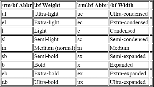
Font series describes the joint notions of weight and width. Weight is a measure of how darkly each character is printed, and width is a measure of how wide or narrow the font is. Standard abbreviations for weight and width are shown in Table 5.1. Normal, bold-compressed, extrabold-ultraexpanded, and light-medium are all examples of font series.
Table 5.1. Standard Weight and Width Designations
The general rule for combining weight and width to form a series abbreviation is to use the abbreviation for weight followed by the abbreviation for width, unless one is “medium,” in which case it is left out. Table 5.2 shows how several weight/width combinations are used to form the series. The series designation for a light-medium font demonstrates that a single medium attribute is omitted. If both the width and weight are medium, use a single “m” for the series.
Table 5.2. Weight and Width Are Combined to Form Series
| \bf Weight and Width | \bf Series |
| Bold extended | bx |
| Light medium | l |
| Medium extra-expanded | ex |
| Light extra-expanded | lex |
| Normal (medium, medium) | m |
Font shape
The shape, in conjunction with series, defines the appearance of the font. Shape generally refers to the style of the face. Bold, italic, slanted, and outline are all examples of font shape.
The standard designations of font shape are shown in Table 5.3.
Table 5.3. Standard Abbreviations of Font Shape
| \rm\bf Abbr. | \bf Shape |
| n | Normal |
| it | Italic |
| sl | Slanted |
| sc | Small caps |
| u | Upright italics |
Font size
Font size defines both the size of the characters and the spacing between lines of text in that size. The distinction between design size and magnification, discussed at length in the first part of this chapter, is hidden within the NFSS; you need only select the size you want.[59]
The spacing between lines of text is described as the (vertical) distance between the baselines of two consecutive lines of type. It is usually about 20\% larger than the size of the font. For example, a 10pt font is usually printed with 12pts between the baselines of consecutive lines. The inter-line distance that looks best depends on the font and other design elements of the document. There really isn't a good rule for the value that looks best, which is why you have to specify it.
Selecting Fonts with the New Font Selection Scheme
One of the most visible differences in the NFSS2 is that you are encouraged to change the way you select fonts. The NFSS2 defines nine control sequences for user-level font selection. They are shown in Table 5.4.
Table 5.4. User-level Font Selection Control Sequences in NFSS2
| \bf Control Sequence | \bf Resulting Change |
| \textrm\verb|{}| | Switch to roman family |
| \textsf\verb|{}| | Switch to sans-serif family |
| \texttt\verb|{}| | Switch to typewriter family |
| \textbf\verb|{}| | Switch to bold face weight/width |
| \textmedium\verb|{}| | Switch to medium weight/width |
| \textit\verb|{}| | Switch to italic shape |
| \textsl\verb|{}| | Switch to slanted shape |
| \textsc\verb|{}| | Switch to small-caps shape |
| \emph\verb|{}| | Switch to emphasized text |
Instead of using \it, for example, to change to an italic font within a group, you should use the \textit command with the text as an argument. For example, instead of using:
This is some italic text.
you should use:
This is some italic text.
The advantage of the new scheme is that these macros are much more intelligent than the old ones. Notice that I did not specify italic correction () in the second case. This is because the \textit macro is able to determine if the correction is necessary, and if so, inserts it automatically.\ff{If you wish to suppress italic correction, use \cs{nocorr} at the end (or beginning) of the text.} The macros can also be nested.
The NFSS2 allows you to use the old font selection macros, so existing documents will not be affected. If you want to set several paragraphs in a different font, you should continue to use the old selection macros because you cannot pass more than one paragraph of text to a macro.\ff[2]{It is possible to write macros that accept multiple paragraphs of text, but the NFSS2 font selection macros do not do so.}
Low-level interface to NFSS
The user-level font selection commands are implemented in terms of six low-level commands. At this level, you must specify the encoding, family, series, shape, and size of the font in order to select it. There are six control sequences for selecting a font: one each for specifying the font parameters and one for actually switching to the new font. This strategy allows the parameters to be independent; any parameters that you do not explicitly change remain the same as the current font.
These six control sequences are:
\fontencoding{enc}
Selects the encoding scheme \textitenc. The encoding schemes officially supported by the NFSS2 are shown in Table 5.5.
Table 5.5. Encoding Schemes Supported by NFSS2
| \bf Encoding | |
| \bf Scheme | \bf Encoding Name |
| T1 | TeX text Cork encoding |
| OT1 | Old TeX text encoding (the CMR encoding) |
| OT2 | University of Washington Cyrillic encoding |
| OT3 | University of Washington IPA encoding |
| OML | TeX math (italic) letters |
| OMS | TeX math symbols |
| OMX | TeX math extended |
| U | Unknown encoding |
\fontfamily{fam}
Selects the family \textitfam.
\fontseries{ser}
Selects the series \textitser.
\fontshape{shp}
Selects the shape \textitshp.
\fontsize{ptsize}{bskip}
Selects the font size \textitptsize with a distance of \textitbskip between lines. Note that \textitptsize is a simple number, whereas \textitbskip is a TeX distance and you must specify units after the number. Under the NFSS2, \textitptsize specifies the actual size of the font, \ff{Under the NFSS1, the \textit{\texttt{ptsize}} was simply a label; the actual font loaded was the nearest magstep.} but the NFSS2 will attempt to find a closest match if there is no exact match for the requested size. A warning message is issued if the size does not exist and a closest match has to be selected. You can control the sensitivity of the warning with the \fontsubfuzz parameter. It is initially set to 0.4pt, meaning that any font within 0.4pt of the requested size will be used without issuing a warning.
\selectfont
Switches to the font described by the current values of encoding, family, series, shape, and size.
From this description, can you figure out how the control sequence could be defined under the NFSS? See this footnote[60] for the answer.
Defining Fonts with NFSS2
The standard Computer Modern fonts and most PostScript fonts can be selected by using the appropriate style files or inputting the appropriate macros. However, if you have nonstandard fonts or fonts for some other device, you can easily add them to the NFSS.
The internal interface to the NFSS has been entirely redesigned. The new interface is much cleaner than the interface to the NFSS1, but similar in design.
If you are not very familiar with TeX, what follows may be a bit confusing; treat this example as a sort of “cookbook recipe” and substitute the font you wish to define for the logo font (the logo font is the typeface used for the MetaFont logo).
Declaring a family
In order to add a new typeface, you must declare a new font family with the control sequence \DeclareFontFamily. If you are only adding new sizes or shapes to an existing family, do not redeclare the family.
The parameters to \DeclareFontFamily are the encoding, name, and loading options for the family. Loading options are any commands that should be executed every time this family is selected. For most fonts, there are no loading options.[61]
The following declaration creates the logo family with the old TeX encoding and no loading options:
\DeclareFontFamily{OT1}{logo}{}
Declaring shapes
After a family has been created, you must specify what font shapes are available with \DeclareFontShape. To make the font usable, you must declare at least one font shape for each family.
The general form of a call to \DeclareFontShape is:
\DeclareFontShape{enc}
   {fam}
   {series}
   {shape}
   {sizes}
   {loading options}
The family fam (with the appropriate encoding enc) must already have been created with \DeclareFontFamily. The series and shape parameters identify the name of the series and shape. Table 5.2 and Table 5.3 list some common series and shapes. The \textitsizes parameter is a list of font-shape declarations, described below, and the \textitloading options, if specified, override the loading options for the font family.
Each font-shape declaration indicates how the request for a font should be handled. The complete syntax for font-shape declarations is described in Interface Description of NFSS2 [nfss2interface]. Here we look at three simple cases: substituting another font for the one requested, generating the name of the TFM file for the requested font, and identifying a particular TFM file for a size or range of sizes. Each of these techniques is used in the declaration of the medium, normal logo font in Example 5.1. There should be no extra spaces in the font size parameter. If you spread it over multiple lines in your input file, make sure that a comment character (\%) appears at the end of each line.
Example 5.1. Font-shape Declaration with NFSS2
\DeclareFontShape{OT1}{logo}{m}{n}{
  <-8>sub * cmr/m/n
  <8><9><10>gen * logo
  <10.95>logo10 at 10.95pt
  <12->logo10}{}
Each font-shape declaration begins with one or more size specifications in angle brackets. This indicates either a specific size (<10> for a 10pt font) or a range of sizes (<8-9> for any size larger than or equal to 8pt and less than 9pt, <-8> for all sizes less than 8pt, or <10-> for all sizes larger than or equal to 10pt).
In Example 5.1, the first font-shape declaration indicates that font substitution should be performed for any request at a size smaller than 8pt. The string cmr/m/n indicates that medium, normal, Computer Modern Roman should be substituted in its place. In general, the substitution specifies the family/shape/series to be substituted.
The second declaration indicates that the name of the external font for 8pt, 9pt and 10pt fonts should be generated from the string logo and the size (at 8pt, logo8 will be used; at 9pt, logo9; and at 10pt, logo10).
The third declaration demonstrates that the font specified ({logo10 at 10.95pt}) can be any valid TeX font selection command. After special declarations have been processed (substitution, generation, etc.), the remaining declaration text is passed to the TeX \font primitive.
The last declaration specifies that any size larger than 12pt is valid. Any size larger than 12pt will use the font logo10, scaled appropriately. Automatic font generation, if it is being used, can take care of actually generating the font. Example 5.1 was constructed to demonstrate several features of the font-shape declaration syntax. A simpler, more likely declaration for the medium normal logo font is shown in Example 5.2.
Example 5.2. Font-shape declaration with NFSS2 (simplified)
\DeclareFontShape{OT1}{logo}{m}{n}{
  <-8>sub * cmr/m/n
  <8-9>logo8
  <9-10>logo9
  <10->logo10}{}
The 8pt design could have been scaled down for sizes less than 8pt, but you should try to avoid large deviations from the design size. Because the design for my book does not require the logo font at sizes less than 8pt, substitution was the best choice.[62]
Storing Font Definitions
The NFSS will load your font definitions automatically if you store them in FD files in a directory where TeX looks for input files. Whenever an unknown encoding/family is requested, NFSS attempts to load the file encfamily.fd. For example, if the font declarations described in the preceding sections are stored in a file called OT1logo.fd, nothing special has do be done to use the logo family. The first time the logo family is selected, the definitions will be read from OT1logo.fd.
If you are using LaTeX2e (or LaTeX with the NFSS), there must already be a large number of FD files on your system. For more information about building the LaTeX2e format (which includes the NFSS2), consult the section “the section called “Building the LaTeX2e format”” in Chapter 4, Chapter 4.
Changing the Defaults
Sometimes you want the fonts that you define to replace the standard Computer Modern fonts. This is easily accomplished. The NFSS defines control sequences which identify the default fonts. These control sequences are listed in Table 5.6.
| \bf Control Sequence | \bf Font |
| \rmdefault | The default normal (roman) font |
| \bfdefault | The default boldface font |
| \sfdefault | The default sans-serif font |
| \itdefault | The default italic font |
| \scdefault | The default caps and small-caps font. |
| \defaultshape | The default shape (n) |
| \defaultseries | The default series (m) |
If you have defined a new font, perhaps garamond as I did for this book, you can make it the default normal font by changing \rmdefault. In LaTeX, the following command makes garamond the default normal font:
\renewcommand{\rmdefault}{garamond}
In Plain TeX, it's written like this:
\def\rmdefault{garamond}
NFSS Pitfalls
Defining your own fonts with the NFSS is straightforward, but it is not without its subtleties. There are several things going on behind the scenes that you must be aware of if you are going to define your own fonts.
The first consideration is font substitution. When NFSS cannot find a font, it tries to substitute a different one. First, it tries to find the font you requested in the default shape, then in the default series, and finally, in the default family. You can change the defaults used by NFSS2 with the \DeclareFontSubstitution command:
\DeclareFontSubstitution{encoding}{family}{series}{shape}
You must specify the defaults for each encoding you use because the encoding is never substituted.
The next consideration is the use of mathematics, which is typeset using an entirely different set of fonts. Even if you don't use any math in your document, the NFSS is prepared to function in math-mode at a moment's notice. In order to be prepared, it has to know what fonts to use. Ordinarily, mathematics is typeset using fonts at the same size as the current text font. This means that every time you change font sizes for text, NFSS changes font sizes for mathematics as well.
By default, the NFSS defines math fonts only at the following sizes: 5, 6, 7, 8, 9, 10, 11, 12, 14, 17, 20, and 25pt. If you define a new font at a different size, 24pt for example, the first time you try to use that font, you will get several warning messages indicating that cmr/m/n/24 (Computer Modern Roman), cmm/m/it/24 (Computer Modern Math Italic), cmsy/m/n/24 (Computer Modern Math Symbols), and lasy/m/n/24 (LaTeX Symbols, if using LaTeX), are not available. This is very confusing because it won't appear that you have selected 24pt Computer Modern anywhere in your document.
There are two ways to solve this problem:[63]
- Redefine the required fonts at the sizes requested. This involves copying the definition of each of the fonts from NFSS FD files and adding new sizes.
- Tell NFSS to use existing math sizes for the new text sizes that you define. This option is reasonable only if you won't be using any math at the new sizes (or the sizes are so close that the mathematics doesn't appear disproportional). NFSS includes a macro called \DeclareMathSizes for this purpose. Insert it directly after the \DeclareFontShape command that declares the new font sizes. You must call \DeclareMathSizes once for each new size. For example, to use the 25pt math sizes with 24pt text, insert the following control sequence after you define the 24pt font:
\DeclareMathSizes{25}{24}{20}{17}The general form of a call to \DeclareMathSizes is:
\DeclareMathSizes{text-size}
   {math-size}
   {script-size}
   {script-script-size}
Where math-size, script-size, and script-script-size are the normal (123), script ($x^{123}$), and script-script ($x^{y^{123}}$) math sizes for the specified text-size.
LaTeX sometimes resets the current font to the \rmdefault font. For example, it does this when a \ref is going to be printed. This means that the font you define as the \rmdefault font should be available in every size that you use. This may require redefining the Computer Modern Roman font, as described above, if you add a new size but leave Computer Modern as the default font.
PostScript Fonts Under NFSS
PostScript fonts and other scalable font technologies like TrueType differ from the way the “standard” TeX fonts work. They do not separate the notions of design size and magnification. Instead, PostScript fonts can be rendered at any size from a single design. In daily use, the PostScript fonts under NFSS are indistinguishable from non-PostScript fonts. The NFSS distribution includes style files for accessing the 35 standard PostScript fonts.
Adjustments to Scale
Some combinations of PostScript fonts, particularly PostScript fonts with Computer Modern mathematics, look bad because there is a large discrepancy between the apparent sizes of the fonts. For example, as a consequence of design, 10pt Helvetica looks bigger than 10pt Computer Modern Math Italic. In order to correct this problem, you can specify a scaling factor when declaring PostScript fonts.[64] The scaling factor is specified in square brackets at the beginning of the font-shape declaration in the \DeclareFontShape command.
The easiest way to find an approximation of the correct scaling factor is to look at the x-height of each font.[65] The x-height is the height of a lowercase “x” in the font. The following macro will print the x-height of a font:
\def\showxheight#1{
  \font\fontfoo=#1 at 10pt
  \message{The x-height of #1 at 10pt is \the\fontdimen5\fontfoo}}
The following TeX input will print the x-heights of Helvetica and Computer Modern Roman (assuming that your Helvetica font is called phvr):
\input showxheight
\showxheight{phvr}
\showxheight{cmr10}
\bye
On my system, the x-height of Helvetica is 5.23pt and the x-height of Computer Modern Roman is 4.30554pt. The following font declaration makes Helvetica have the same apparent size as Computer Modern Roman:
\DeclareFontShape{OT1}{phv}{m}{n}{
  <-> [0.8232] phvr}{}
Compare scaled Helvetica to unscaled Helvetica:
FIXME: Unscaled Helvetica, Computer Modern Roman, Scaled Helvetica
Unscaled Helvetica looks much larger than Computer Modern, but the scaled Helvetica appears a little too small. Experimentation is the only way to find the scale that looks best.
When Things Go Wrong
A number of font-related problems can arise which either prevent you from formatting and printing your document or cause the output to differ from what you anticipated. The following sections describe many common problems and their solutions.
When TeX Complains
The first time an error can occur is when TeX is processing your document. Some of these errors prevent TeX from continuing while others are simply warnings.
! Font \myfont=xxxxx not loadable: Metric (TFM) file not found.
This error indicates that TeX tried to process a \font control sequence which assigned the font xxxxx to the control sequence \myfont, but TeX could not find a TFM file for the font xxxxx. All the characters from the missing font will be blank in the resulting DVI file.
You cannot process your document until this error is corrected, which is a matter of fixing the offending \font command if you are using the old font selection scheme.
Under the NFSS2, this error occurs if you specify an invalid font in the command \DeclareFontShape. Examine the font that you were attempting to select and make sure that it exists.
Warning Font/shape ‘x/y/z’ undefined on input line n
This is a warning message from the NFSS. It indicates that you requested the font family x, series y, and shape z, but the requested font does not exist. This message is followed by another indicating which font NFSS chose to substitute in place of the one you requested. NFSS substitutes the closest possible font to the one you requested. It is usually an acceptable replacement.
For example, if you are currently using Computer Modern Bold Extended and you select Computer Modern Typewriter, the NFSS will report that there is no bold-extended-typewriter font and that normal typewriter is being substituted in its place.
! Font x/y/z/999 not found.
This is a fatal error from the NFSS. It indicates that you selected font family x, series y, shape z at a size of 999pts and that no such font exists. This error occurs when the size 999 is not defined in the \DeclareFontShape command for x/y/z.
Missing character: There is no X in font foo!
This is a warning message from TeX. Usually it occurs only in the log file. This error occurs when you attempt to access a character that does not exist in the current font. This can happen if you select the wrong font or if the selected font has a different encoding vector than anticipated. See the section “the section called “Declaring a family”” in this chapter for more information.
When the DVI Driver Complains
Getting TeX to successfully produce a DVI file is only half the battle. The next hurdle is getting a DVI driver to print it. Here are some of the things that can go wrong:
Can't find PK file
When a DVI driver complains that it cannot find the appropriate PK file, there are several things that could be wrong.
- The font is built into the printer.
If the DVI driver complains that it cannot find the PK file for a built-in font, you need to adjust the DVI driver's configuration to indicate that the font is built-in. Exactly how this is done depends on the DVI driver that you are using. For example, if you are using dvips, add an entry to the psfonts.map file. If you are using emTeX, add an entry to the font substitution file specified in the configuration file. Consult the references for your particular DVI driver for more information about using built-in fonts.
- The font does not exist on the printer you are using.
This is the same problem as the error above except that it cannot be fixed. For example, I have TFM files for many PostScript fonts at home because it helps me format bits of documentation that I bring home from work without error. However, if I try to print one of these documents without first changing the fonts, the DVI driver complains that it cannot find several fonts. There is no way that I can correct this because the missing fonts are built-in fonts for a printer that I do not have at home. In this case, font substitution by the DVI driver may allow you to preview (and even print) the document, but it won't look very good unless the font metrics of the substituted font are very close to the metrics for the original.
- Uncommon size or font (no PK file).
The Computer Modern family contains a number of fonts that are very rarely used. If you don't keep PK files for these fonts around all the time and attempt to use one of them (or attempt to use a common font at a very unusual size), the DVI driver will not be able to find the necessary PK file. You have to build the PK file first. Consult Chapter 11 for more information about building PK files with MetaFont. Also consult the section called “the section called “Automatic Font Generation by DVI Drivers”” later in this chapter.
Accents don't work or the wrong characters are printed
This problem is usually caused by a bad encoding vector. See the section “the section called “Declaring a family”” in this chapter for more information.
Printer prints the right characters but the wrong font
This is usually an indication that you are trying to use a font that does not exist on the printer. PostScript printers, for example, substitute Courier for any font that does not exist.
Another possibility is that you have configured your DVI driver incorrectly. I once told dvips to download Galliard when I used Garamond. It took me quite a while to find that error. Make sure that the printer contains the fonts that you think it does and make sure that you are mapping the TeX font names to the correct printer fonts.
Encoding Vectors
An encoding vector describes the order and position of characters within a font. The purpose of this section is to help you understand the role that encoding vectors play in the translation of text from your input file to printed output.
Encoding vectors cause a lot of confusion. Whenever the characters that you type in your input file are printed incorrectly (“flight” in your input file prints out as “ight”; “\oe{}vres” prints out as “\'uvres”; or “---” prints out as “-{}-{}-” instead of “---”), you've probably encountered some sort of encoding problem.
The root of this problem is that the characters in your input file are really just numbers between 0 and 255.[66] The number 65 is usually a capital A, but there is nothing intrinsic to the value 65 to signify this. In order to display these byte values, they have to be translated into symbols.
These problems arise because there are at least four different translations occurring between what you type and what appears on the printed (or previewed) page:
- You type some symbols on the keyboard, and they are displayed by your editor. The configuration of your system determines how these characters appear. Sometimes they are from the ISO Latin-1 symbol set, sometimes US ASCII, sometimes something else, and sometimes it is user configurable. If you confine yourself to pure ASCII, you're pretty safe, but that's not convenient for languages other than English. When you are typing documents in Spanish, it's very convenient to be able to type “\ n” directly in your document.
- TeX reads your input file and translates it into an internal encoding (basically ASCII). (The reverse translation is performed before TeX prints any output to the terminal or the log file.) The translation tables used in this step are generally determined when the TeX program is compiled, but several modern TeXs allow you to modify these tables at runtime.
TeX assumes that fonts use TeX's internal encoding. For example, on an IBM mainframe, which uses the EBCDIC character set, TeX translates a capital A (EBCDIC 193) into ASCII 65 and assumes that position 65 of the metric information for the current font contains the information (including ligature and kerning information) for a capital A.
- If you use control sequences to represent special characters (\oe for “\oe”, for example), the macro package you use is responsible for defining those control sequences so they produce the correct characters. If the macro package assumes that the “\oe” character appears at position 247 of the current font, the output will not be correct in a font with a different encoding.
- The DVI driver reads TeX's DVI file and assumes that the encoding vector of each font used in the DVI file is the same as the encoding vector of the actual fonts in the output device. For PK fonts, this is probably true (since the DVI driver sends the font to the printer), but for fonts built into the printer, it is less likely to be true.
You may think of a font as a collection of 1 to 256 different symbols in a particular order. This is really a font plus a particular encoding vector. It is more accurate to think of a font as simply a collection of symbols (with no particular number or ordering). An encoding vector selects which symbols are used and in what order they appear. Typically, an encoding vector can contain only 256 different symbols. It is important to note that changing an encoding vector of a font does not simply permute the order of the characters in the font, it can change which symbols are actually present as well.
Encoding vectors are either implicit or explicit. Most fonts have an implicit encoding, but some (for example, Adobe Type 1 fonts) contain an explicit, configurable encoding. TeX fonts have an implicit encoding. TeX actually uses several different encoding vectors (it uses more than one because it has both text or body fonts and several kinds of math and symbol fonts). The character set tables in Appendix B, Appendix B, show the encoding of several different fonts.
\font\mathit=cmmi10 Most macro packages assume that the TEX TEXT encoding is being used. For example, Plain TeX defines the control sequence \AE as an abbreviation for character number 29 in the current font. Even when control sequences aren't involved, problems can arise if the output font does not have the anticipated encoding. The byte-value 34 in your input file is almost always the literal double quote character (”) and usually prints as a double quote (which is probably what your editor displays and probably what you expect). If the font encoding is something different, the result will not be what you expect. For example, if the current font has the TEX MATH ITALIC encoding, the result is “{\mathit\char34}”.
Virtual Fonts
Virtual fonts (stored in VF files[67]) are a relatively new addition to the TeX family. When TeX was originally defined in 1970, Knuth chose a character encoding that suited his purposes, and very little effort was made to parameterize the encoding. (In fact, any TeX macro writer can use any encoding she wants, but no general mechanism for identifying the encoding exists.[68]) Virtual fonts combat this problem by allowing the creator to define a virtual font in terms of (multiple) characters from one or more fonts.
Virtual fonts are used most commonly to change the encoding vector of a font. This provides a convenient way of mapping different fonts into the required encoding so that they are easy to use in TeX. A virtual font consists of a VF file and a TFM file. TeX uses the TFM file as it would any other.
Figure 5.4 shows how a virtual font is used by the TeX system. In this case, a virtual font ctmr has been created combining characters from the fonts trr0n, trr6m, trr6j, and trr10j.
Figure 5.4. How TeX uses a virtual font
The document uses the font ctmr. TeX uses the font metric information in ctmr.tfm to compose the DVI file. The DVI driver, however, discovers a VF file named ctmr, so it uses the instructions in the virtual font to select characters from the four built-in fonts. This is a practical example. It shows how the HP LaserJet built-in fonts may be accessed with the standard TeX text encoding.
In practice, virtual fonts suffer from one limitation: A virtual font can only permute the encoding vector; it cannot access characters that do not appear in the encoding vector of the “real” font. For example, an Adobe Type 1 font might contain all of the characters that appear in the TeX text encoding, but many of them do not appear in the standard Adobe encoding vector. A virtual font alone cannot remap the characters into the TeX text encoding. The encoding vector of the font must also be changed. Several PostScript DVI drivers have this ability.
Virtual fonts are binary files and are very difficult to edit. To make it possible to construct virtual fonts by hand, TeX includes standard utilities (VFtoVP and VPtoVF) for converting the binary VF format into a human-readable VPL format. The VPL files are text files that can be edited with a text editor.
A complete description of how to create virtual fonts is beyond the scope of this book. If you are interested in experimenting with virtual fonts, I strongly recommend that you examine the fontinst package.[69] fontinst allows you to construct VPL files with TeX documents. This isn't as strange as it first sounds. Virtual font files have to include the metric information from TFM files for each font that they include. Because TeX can easily read this information, and the output is a plain text document anyway, TeX is a very capable, if somewhat slow, tool.
Automatic Font Generation by DVI Drivers
Recent releases of many popular DVI drivers (\dvips, xdvi, \SeeTeX, and emTeX's DVI drivers, to name a few) include the ability to generate missing fonts automatically. Automatic font generation overcomes two problems simultaneously: it reduces disk space requirements, and it makes font generation easier. Most implementations of TeX are distributed with a complete set of Computer Modern fonts at seven or more magnifications. This can easily amount to several megabytes of disk space (even more if you are using other fonts, like the \AmS fonts from the American Mathematical Society). In practice, you probably use only a small subset of these fonts.
One way to combat the disk-space problem is to delete all of the TeX fonts on your system and build just the ones you actually use. In the days before automatic font generation, this would have been quite unpleasant. The first time you discovered that you needed a font that you did not have, you would have to stop your DVI driver, figure out what size was missing, figure out how to get MetaFont to build the font that was missing at the appropriate resolution, run MetaFont, store the font in the right place, and return to your DVI driver. Moments later, you might discover that you had to do the whole process again for some other font.
Using a driver that provides automatic font generation makes it nearly painless to delete fonts and let them be built automatically.[70] The DVI driver determines the resolution required, runs MetaFont with the appropriate parameters, stores the font in the correct place, and continues processing the document uninterrupted.
The down side of automatic font generation is that you must keep the MetaFont program around and make available the source files for the Computer Modern fonts (and any other MetaFont fonts that you use). If you do not already have these files on your hard disk, the potential disk space savings are somewhat reduced. (MetaFont is discussed fully in Chapter 11.) Moreover, automatic font generation can only build PK files; if TFM files are also missing, you will have to build those by hand before TeX can process your document.[71]
Another benefit of automatic font generation is that it can be used to provide previewers, even non-PostScript previewers, with the ability to preview documents that use PostScript fonts, provided that you have the Printer Font ASCII (PFA) or Printer Font Binary (PFB) font sources and Adobe Font Metric (AFM) for your PostScript fonts.
The following lines, added to the MakeTeXPK script distributed with dvips, provide automatic font generation for PostScript fonts with ps2pk. This is useful even on systems where PostScript printers are used for output, because previewers like xdvi also use MakeTeXPK to build missing fonts.
# Look for a PostScript outline font...
if [ -r /usr/local/lib/tex/ps/outlines/$NAME.pfa ]
then
  echo Building TeX font from PostScript outline
  # Hack.  If $6 is null, $DESTDIR => $6 ...
  PStoTeXfont $1 $2 $3 $4 $5 $6 $DESTDIR
  exit 0
else
  echo Building TeX font from MetaFont outline
fi
In this example, PostScript fonts are stored in the /usr/local/lib/tex/ps/outlines directory. You should change this directory to something appropriate for your system. On a unix system, the PStoTeXfont script shown in Example 5.3 is appropriate.[72] A Perl version of MakeTeXPK that handles both MetaFont and PostScript fonts is shown in Example D.1 in Appendix D, Appendix D.
Example 5.3. The PStoTeXfont script
#!/usr/local/bin/bash
#
#   This script file makes a new TeX font from a PS outline.
#
#   Parameters are:
#
#   name dpi bdpi [mag mode destdir]
#
#   ‘name’ is the name of the font, such as ‘ptmr’.  ‘dpi’
#   is the resolution the font is needed at.  ‘bdpi’ is
#   the base resolution.
#
#   This script ignores the remaining parameters.  They are
#   left here to document the fact that the caller may provide
#   them.  They may be provided because the caller thinks
#   MetaFont is going to do the work...
#
#   Of course, this needs to be set up for your site.
#
# TEMPDIR needs to be unique for each process because of the
# possibility of simultaneous processes running this script.

TEMPDIR=/tmp/temp-tex-PS.$$
NAME=$1
DPI=$2
BDPI=$3

LOCALDIR=/usr/local/lib/mf/fonts
DESTDIR=$LOCALDIR/pk

BASENAME=$NAME.$DPI
PFADIR=/usr/local/lib/tex/ps/outlines

# Clean up on normal or abnormal exit
trap "cd /; rm -rf $TEMPDIR" 0 1 2 15

mkdir $TEMPDIR
cd $TEMPDIR

# We proceed by making a 10pt font at the resolution
# requested...
echo Making ${DPI}dpi version of $NAME.
ps2pk -X$DPI -P10 -a$PFADIR/$NAME.afm      $PFADIR/$NAME.pfa ${BASENAME}pk

mv ${BASENAME}pk $DESTDIR

exit 0
A similar script for using automatic font generation under emTeX with 4DOS is shown in Example D.3 and Example D.4 in Appendix D. Several other options are available for performing automatic font generation on a number of platforms, including a REXX version for OS/2 and a compiled program called MKTeXPK.
Math Fonts in TeX
Changing math fonts is more difficult than changing text fonts. In addition to the large number of special symbols that must be available, TeX needs a lot more information to use the fonts because the characters are combined more frequently and in more complex ways. For example, the open brace character (\{) in math mode is “extensible;” this means that it can be as large as required. In order for TeX to construct a brace of arbitrary size, one of the math fonts (the math extensions font) contains four different characters that TeX combines to form the brace:
FIXME: brace pieces
Extensible recipes for characters like “\{”, “\}”, “(”, and “)” are examples of additional metric information that must be available in math fonts for TeX.
In addition to the Computer Modern math fonts, there are really only three other choices at present: the \AmS fonts (MetaFont fonts freely distributed by the American Mathematical Society which extend but do not replace the Computer Modern math fonts), the Lucida Bright+New Math fonts, and the MathTime fonts. Lucida Bright and MathTime are both sets of commercial PostScript Type 1 fonts.
Concrete Examples
The following sections describe by example how you can use several different kinds of fonts in TeX. The tools described are generally free and generally available for multiple platforms. Where specific commercial tools are used, free alternatives are discussed.
The specific tools I mention here are not the only tools available nor are they necessarily the best, although I hope I've found the best ones. If you have found a different and better solution, don't abandon it in favor of what I use here. But please do tell me about the method that you have found. With every passing day, more free software becomes available.
MetaFont Fonts
Chapter 11 describes how to use MetaFont to create fonts for TeX. If you have MetaFont installed, you can easily create fonts that are usable in TeX.
MetaFont reads MF files, which are plain text files that describe a font analogous to the way TeX reads TEX files that describe a document.
Appendix B, Appendix B, contains examples of many MetaFont fonts. Consult the “Definitive List of All Fonts Available for {MetaFont}” [lreq:metafonts] for an up-to-date list with availability information.
PostScript Type 1 Fonts
PostScript printers have many PostScript Type 1 fonts built in. If you want to use built-in fonts, you only need the metric information for them and a PostScript DVI driver. The dvips driver is the most popular free DVI driver. Several commercial drivers are also available.
The metric information should be available in the form of Adobe Font Metric (AFM) files from the printer vendor or directly from Adobe Systems, Inc. You need a program that will convert AFM files into TFM files. There are several free programs that will do this conversion (one is included with dvips), and your DVI driver may have included one. In general, if one came with your DVI driver, that is the one you should use.
If you want to use PostScript Type 1 fonts on non-PostScript devices, like most screen previewers, you need the “sources” for the fonts that you want to use. Many font vendors sell fonts in Adobe Type 1 format. In addition, there are many Type 1 fonts available on the Internet and on bulletin board systems.[73]
Several companies have made complete, high-quality fonts available. They are:
| IBM Courier | URW Antiqua |
| Bitstream Courier | URW Grotesk Bold |
| Bitstream Charter | Nimbus Roman No9 |
Check the license that accompanies these fonts to make sure that you can use them legally.
PostScript Type 1 font sources are available in Printer Font ASCII (PFA) and Printer Font Binary (PFB) formats.[74] The PFB format is more compact, but less portable. unix systems usually use PFA files, while MS-DOS and OS/2 systems use PFB files. Several existing programs can convert PFB files into PFA files and vice-versa. For the remainder of this section, I will consistently refer to PostScript Type 1 source files as PFA files, although you can use PFB files instead if they are supported on your platform.
In addition to the PFA files, you will also need metric information for the fonts. The metric information should be available in AFM format. If you purchased fonts from a vendor and did not receive AFM files, you should complain. Fonts from free sources, like Internet archive sites and bulletin board systems sometimes include only Printer Font Metric (PFM) files. These are Microsoft Windows printer metric files, and they do not contain enough information to make a TFM file.
It is possible to create a TFM file from the PFM file, but the metrics are not particularly good. To do this:
- Convert the PFM file into an incomplete AFM file with the PFM2AFM utility.
- Use the PS2PK program to make a PK file.
- Use PKBBOX to create a more complete AFM file from the incomplete AFM file and the PK file.
The AFM file manufactured in this way can be used to create a TFM file. The PK file can be used by any DVI driver that understands TeX PK fonts (almost all drivers have this ability).
Creating PK files does require more disk space, but it has the advantage that you can print TeX documents which use PostScript Type 1 fonts on non-PostScript devices. This includes fast, PK-based screen previewers like xdvi and emTeX's dviscr that do not understand PostScript.
Programs like dvipsone and dviwindo which run under the Microsoft Windows environment can use PostScript fonts directly if Adobe Type Manager (ATM) is installed on the system. However, it is still necessary to construct the TFM files for TeX.
{Using a new PostScript font in TeX (for PostScript printers)}
This section presents a step-by-step description of how to use a new PostScript font in TeX with a PostScript printer or previewer. In this situation, you have a PostScript printer, and you use dvips to print your documents. This method also allows you to preview your documents with Ghostscript.
For either method, you must first obtain the PostScript sources for the font that you want to use. You must have a PFA or PFB file and an AFM file. As a concrete example, I'll use the “Nimbus Roman 9L Regular” font. For this font, I obtain unmr.pfa and unmr.afm. These fonts are available from the CTAN archives in the directory fonts/urw.[75] In order to use the font in TeX, you must create TeX font metrics for it using afm2tfm (in particular, the version of afm2tfm that comes with dvips).
First, however, we must decide what encoding vector to use. Frequently, the fonts you obtain use Adobe Standard Encoding. The problem with this encoding is that it isn't very complete; it leaves out a lot of standard TeX characters (like the ligatures “fi” and “fl” as well as many accented and international letters). Instead of using Adobe Standard Encoding, I recommend using the Cork Encoding. The Cork Encoding has several advantages; it is a superset of the original TeX text encoding; it is becoming a new standard for TeX; and it is supported by the NFSS2. Of course, the Cork Encoding is not suitable for all fonts; there's no reason to try to re-encode a symbol font into the Cork Encoding---that doesn't even make any sense.
Luckily, using the Cork Encoding is no more difficult than using whatever encoding the distributed font contains. afm2tfm will do all the work. You only need to obtain the appropriate encoding file. In this case, the file is ec.enc, and it is distributed with both dvips and NFSS2. Use afm2tfm to generate the metrics:
\$ {\bf afm2tfm unmr.afm -v unmr.vpl -T ec.enc unmr0.tfm}
This command reads unmr.afm, the original AFM file with an arbitrary encoding, and the encoding vector ec.enc. It creates the virtual font unmr.vpl and the TFM file unmr0.tfm.
The relationship between these files is subtle. The AFM file contains metric information for all the possible glyphs in the font. The encoding file establishes the encoding vector---which particular characters occur in exactly what order. These two files are combined to produce character metric information for the specific encoding vector. This information is saved in the TFM file. This is a “raw” TFM file.[76] It does not have any ligature or kerning information and may have a different encoding from the virtual font (although, in this case it has the same encoding).
The next step is to produce a virtual font from the VPL file:
\$ {\bf vptovf unmr.vpl unmr.vf unmr.tfm}
This produces a virtual font file, unmr.vf, and an appropriate TFM file. This TFM file has ligature and kerning information for the characters in the font as well as the metrics for the individual glyphs.
The names of the virtual font files and the related TFM files are entirely arbitrary. You can give them any names you wish. In the long run, you will benefit if you choose a naming scheme that allows you to determine which files are which simply by examining the names. If you have a lot of fonts, take a look at {Filenames for Fonts} [tug:filenames-fonts]. It is also available electronically from CTAN in the directory info/filename.
Now you should install the VF and TFM files in the appropriate directories and proceed to use the unmr font. TeX will do the right thing because the TFM file contains the appropriate metric information, and the DVI driver will do the right thing because it has a virtual font which specifies how the characters should be mapped into the printer.
Now that TeX is happy, we have the additional problem of making the PostScript printer happy. The easiest way to do this is to tell dvips to do it for us. The psfonts.map file used by dvips identifies which fonts are built into the printer and which fonts need to be downloaded.
Each line in the psfonts.map file describes how a particular TeX font should be interpreted. The simplest lines identify the PostScript name of fonts built into the printer. For \linebreak
example, the following line indicates that dvips should use the PostScript font Times-Roman (which is assumed to be resident in the printer) everywhere that the DVI file uses the font rptmr:
rptmr Times-Roman
To automatically download a PostScript font, add <fontfile to the corresponding line in the psfonts.map file. The following entry indicates that the PostScript font CharterBT-Roman should be used where rbchr is used in the document. In addition, dvips should download the font from the file /usr/local/lib/fonts/psfonts/bchr.pfa if it is used in the document.
rbchr CharterBT-Roman </usr/local/lib/fonts/psfonts/bchr.pfa
Additional PostScript commands can be added to the entry to perform special effects. Some of these are described in the documentation for dvips. They require a knowledge of PostScript that is beyond the scope of this book.
Adding the following line to psfonts.map will download and use the Nimbus URW font we installed above. (It is shown on two lines only because of the constraints of the page; you should enter it on one line):
unmr0 NimbusRomanNo9L-Regular <unmr.pfa
      "ECEncoding ReEncodeFont" <ec.enc
This line identifies the font unmr0 as the NimbusRomanNo9L-Regular PostScript font, re-encoded with the ECEncoding described in the file ec.enc. Because this font is not resident in the printer, you must also tell dvips to download the font from unmr.pfa. If you keep encoding files or PostScript fonts (PFB or PFA files) in nonstandard locations, you will have to specify the full path of ec.enc and/or unmr.pfa.
Notice that you specify the raw font in the psfonts.map file. TeX and dvips will use the virtual font to determine which character(s) from which raw font(s) should actually be used to print your document. afm2tfm prints the line that should be added to the font map file when it is finished converting the font, so you don't always have to remember which is which.
The psfonts.map file (and the encoding and font files) are typically stored in a system-default location. On unix systems, this is frequently /usr/local/lib/tex/ps. If you can't (or don't want) to change files in this directory, you can use your own font map file.
When you run dvips, it loads a initialization file (typically ~/.dvipsrc). If you put the following line in that file:
p +/home/jdoe/myfonts.map
it extends the system-wide font map using the file /home/jdoe/myfonts.map, which has the same format as the psfonts.map file.
If you use the <font.pfa syntax in your font map file to download PostScript fonts, you may discover that dvips is producing very large output files (or takes a long time to print, if output is going directly to a printer). The reason is that dvips is downloading the font at the beginning of every document that uses it. If you have a few fonts that you use all the time, it may be faster and more convenient to download the fonts manually at the beginning of the day and then remove the <font.pfa portion of the font mapping line (leave the encoding file, however). This will produce smaller output files because dvips will assume that the fonts are already downloaded. Of course, the trade-off is that your documents will not print correctly (because the appropriate fonts are not attached to the PostScript file) if you mail them to a colleague who doesn't download the same fonts you do, or if you forget to download the fonts again after someone power-cycles the printer.[77]
{Using a new PostScript font in TeX (for non-PostScript devices)}
Using PostScript fonts for screen previewing or printing on non-PostScript printers is a very different process from printing on PostScript devices. You still need the AFM and PFA files.
This time you're going to create PK files with ps2pk, so virtual fonts are less useful. In fact, you have to give the AFM file the correct encoding in order to get the right PK file, so we'll avoid virtual fonts altogether. Of course, if you need several different encodings (perhaps TeX Text, Cork, and Adobe Standard) for different documents, you'll be better off with one or two raw font files and several virtual fonts, but for the moment let's imagine that that is not the case.
Example D.5 in Appendix D, Appendix D, is a Perl script that changes the encoding vector in an AFM file to reflect the encoding specified in an encoding file (like the ones used in the preceding section). This is an important step because ps2pk uses the encoding in the AFM file to determine which glyphs to render.[78]
To install this script, save it in a file called enc-afm.pl and change the top of the script (the #! line) to reflect where Perl is installed on your system. Users of Perl on non-unix systems may have to work a little harder, or simply use the syntax {perl enc-afm.pl} to run the script. unix users can create a symbolic link to enc-afm.pl called enc-afm, and mark it as executable.
Using this script, transform unmr.afm into unmrX.afm:
\$ enc-afm unmr.afm ec.enc > unmrX.afm
Now the unmrX.afm file has the Cork encoding. We can use this file to create a TFM file for TeX:
\$ afm2tfm unmrX.afm unmr.tfm
This TFM file should be moved to the directory where you store TFM files for TeX.
Unlike PostScript fonts on PostScript devices, different PK files must be created for each size required. As a concrete example, let's assume we want a 14pt font. The easiest way to create a 14pt font with ps2pk is to use the -P parameter to specify the size. Unfortunately, this will cause some DVI drivers to complain because -P sets the design size of the PK file, and it won't match the design size in the TFM file. A better solution is to determine the resolution you need with the following formula:
$$\hbox{resolution} = {{\hbox{base resolution} * \hbox{point size}}\over{10}}$$
The factor 10 is used because it is the nominal design size of PostScript fonts (at least, that's what afm2tfm uses). For example, if we are creating a 14pt font for a 300dpi laser printer, the desired resolution is $300*14/10 = 420$. Now we can create the font:
\$ ps2pk -X420 -aunmrX.afm unmr.pfa unmr.420pk
This command creates a 420dpi PK file using the AFM file unmrX.afm. The font source comes from unmr.pfa, and the resulting PK file is called unmr.pk. On MS-DOS systems, name the output PK file unmr.pk because unmr.420pk is not a valid filename. Move the resulting PK file to the appropriate directory. On unix systems, it is probably /usr/local/lib/tex/fonts/pk; while on MS-DOS and other systems, it is probably something like /texfonts/420dpi.
HP LaserJet Softfonts
Bitmapped HP LaserJet Softfonts can easily be converted into TeX PK files with the SFPtoPK utility. Then they can be used with almost any DVI driver.
Scalable LaserJet Softfonts can be used by TeX if two conditions are met: metric information is available, and the DVI driver that you are using can access built-in printer fonts. Metric information for Scalable LaserJet Softfonts distributed by Hewlett-Packard come in the form of Tagged Font Metric files. Tagged Font Metric files have the extension TFM, but they should not be confused with TeX TFM files. The utility hptfm2pl converts Tagged Font Metric files into TeX PL files (PL is a human-readable text format of TFM files). PL files are transformed into TFM files by the standard TeX utility PLtoTF.
To use Scalable LaserJet Softfonts, you must convert the metric information into TeX TFM files so that TeX can use the font, and then you must inform your DVI driver that the fonts are built into the printer. Before printing your document, download the Scalable LaserJet Softfont to your printer. The sfload utility that is part of Sfware can download Scalable LaserJet Fonts. Many other free and shareware font downloading programs exist, too.
TrueType Fonts
At present, TrueType fonts can be used only on systems that have built-in TrueType support (the Macintosh and MS-DOS computers running Microsoft Windows 3.1 fall into this category). You must use DVI drivers that communicate with the printer through the system's printer interface.
[53] {Some fonts may be preloaded in the format file. TeX does not need TFM files for those fonts since the metric information is already available.}
[54] {Older DVI drivers may still use PXL files. They are frequently stored in directories with names like pxl999.}
[55] {Actually, TFM files contain a little bit more information. The width of a space, the amount of stretch and shrink allowed between words, the amount of extra space allowed after a punctuation mark, and some specialized information used only in fonts for mathematics also appear in the TFM files. In principle, TFM files can contain even more information, although they rarely do. For a complete, detailed description of the information stored in a TFM file, consult Appendix F of The TeXbook [kn:texbook] and {The TF To PL Processor} [texware:tftopl].}
[56] {This is true even if your computer's natural character set is not ASCII. It is the responsibility of the implementor to map the computer's natural character set into ASCII.}
[57] {Actually, for math fonts, TeX requires several metrics that are not usually provided. afm2tfm has options which allow you to specify these extra metrics when you convert the AFM file.}
[58] {If your MetaFont distribution does not include a tfmonly mode, you can find one in the modes.mf file on CTAN. Consult Chapter 11, Chapter 11, for more information.}
[59] {This doesn't mean that every size you want is available. See the section “the section called “Selecting Fonts with the New Font Selection Scheme”” for information about defining font sizes in the NFSS.}
[60] “$\backslash$fontshape{it}$\backslash$selectfont”
[61] {One possible use of loading options is to inhibit hyphenation in fixed-width fonts intended for use in verbatim material. The loading options {\ hyphenchar\ font=-1} have this effect.}
[62] {The only reason that sizes less than 8pt need to be declared at all is that marginal notes (used for editorial comments while the book was in revision) were set in 5pt, and the logo font occasionally turned up in a marginal note.}
[63] {Under earlier versions of the NFSS, this problem actually resulted in an error rather than a warning. If you wish, you can simply ignore the warning; you no longer have to fix the problem.
[64] {Actually, you can declare a scaling factor in any font declaration, although it seems to make less sense for non-PostScript fonts.}
[65] {Usually, scaling fonts to the same x-height makes them look acceptable together, but depending on the particular fonts involved, a little more or a little less scaling may be required to achieve a pleasant balance.}
[66] {In some special versions of TeX, notably those for handling languages like Japanese, this may be extended to a much larger number, but the problem is the same.}
[67] {For a complete description, consult {The VP To VF Processor} [texware:vptovf] and {The VF to VP Processor} [texware:vftovp].}
[68] {Version 2 of NFSS includes “encoding” as a parameter in font selection. In the long run, this will allow macro writers to hide many of these difficulties, dramatically reducing the burden currently placed on the user.}
[69] {You can retrieve the fontinst package from the CTAN archives in the directory fonts/utilities/fontinst.}
[70] {It's still a bit tedious, at least on slow machines, but now you can walk away and get a cup of coffee ;-). All the fonts will be built automatically.}
[71] {Recent versions of TeX derived from the \Web2C package can build TFM files automatically as well.}
[72] {OK, so not every example in this book is in Perl.}
[73] {Before you use these “free” fonts, be aware that many are of questionable legality.}
[74] {PostScript fonts for the Macintosh are stored in PFB format (essentially) in the resource fork of the printer font file. The metric information is stored in the screen font, which also contains bitmaps for on-screen display.}
[75] {The Nimbus fonts actually come with TFM and VF files which makes some of the following steps redundant. But because most fonts don't come with TeX metrics, the example is important.}
[76] {Raw TFM files used to be identified with an “r” prefix, but recently the trend has turned towards a “0” suffix. For a more complete discussion of font names, consult Filenames for Fonts [tug:filenames-fonts].}
[77] {Some spooling software will transparently handle these problems (by downloading fonts that you forget) if the fonts are available.}
[78] {This step isn't necessary when using a PostScript printers because the PostScript font always contains all the glyphs. The font created by ps2pk will only contain the characters in a single encoding.}
Get Making TeX Work now with the O’Reilly learning platform.
O’Reilly members experience books, live events, courses curated by job role, and more from O’Reilly and nearly 200 top publishers.

