The Label Widget
A Label is like a Button that doesn’t do anything. It is a noninteractive widget and by default cannot have the keyboard focus (meaning you can’t tab to it). It does nothing when you click on it (see Figure 5-1).
Figure 5-1. Label widget
Excluding Frame-like widgets, the Label is the simplest widget. It is
similar to a Button in that it can show text (or a bitmap), have
relief (default is flat), display multiple lines
of text, have a different font, and so on. Figure 5-2 shows a simple window, with both a Button and
Label, created with this code:
use Tk;
$mw = MainWindow->new(  );
$mw->Label(-text => "Label Widget")->pack(  );
$mw->Button(-text => "Exit", -command => sub { exit })->pack(  );
MainLoop;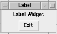
Figure 5-2. A simple window with Label and Button
Here are some typical uses for a Label:
Put a Label to the left of an Entry widget so the user knows what type of data is expected.
Put a Label above a group of Radiobuttons to clarify its purpose (e.g., “Background Color:”). You can do the same with Checkbuttons if they happen to be related or along the same theme.
Use a Label to tell users what they did wrong: “The number entered must be between 10 and 100.” (Typically, you would use a Dialog composite widget to give messages to the user like this, but not always.)
Put an informational ...
Get Mastering Perl/Tk now with the O’Reilly learning platform.
O’Reilly members experience books, live events, courses curated by job role, and more from O’Reilly and nearly 200 top publishers.

